Round one is done and dusted, but it’s going to take some time to get used to some of the driver and sponsor changes for 2019. Add in the new Mustang, and it’s a few new things to wrap your head around. Let’s take a look at the best and the worst of this year’s grid.
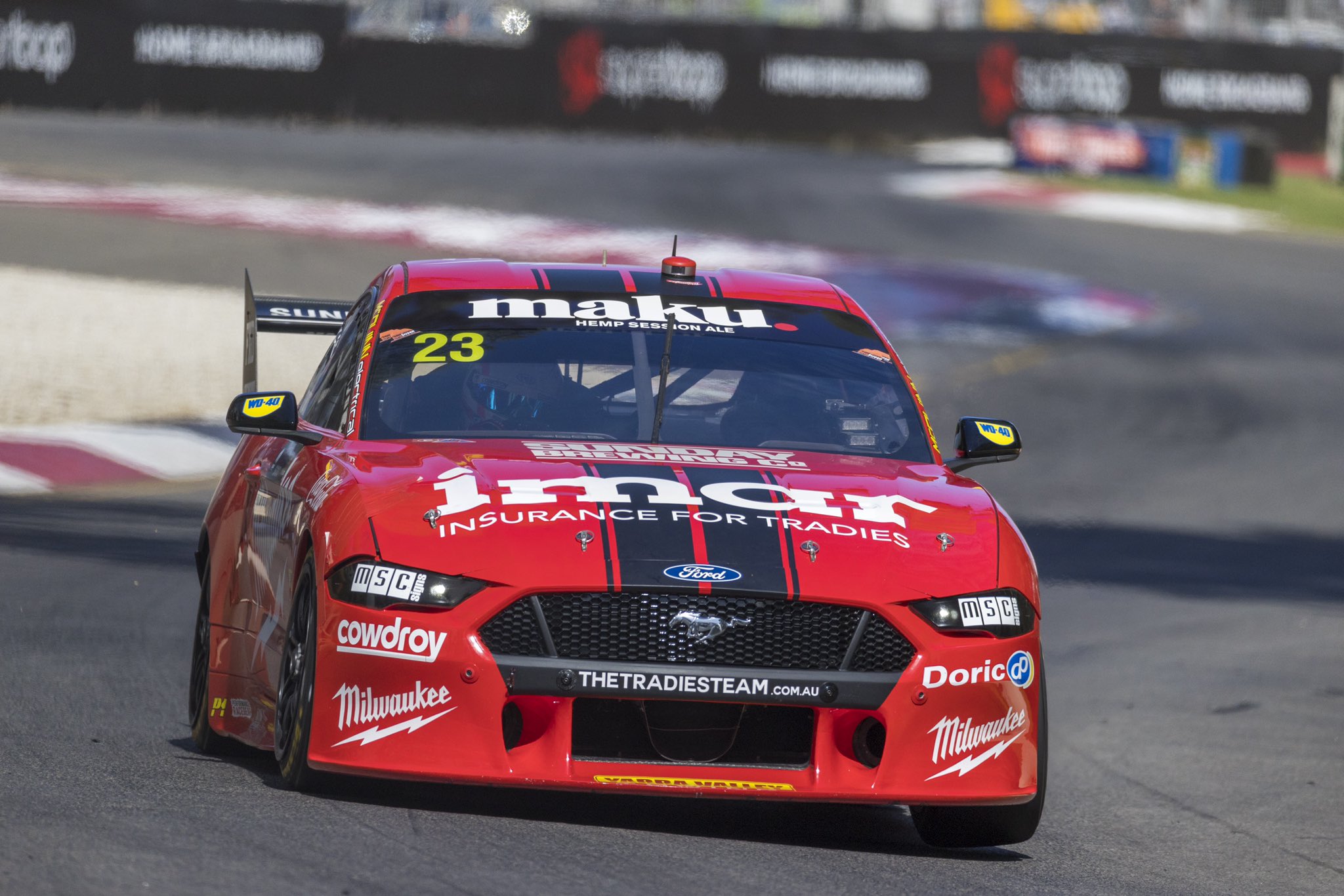
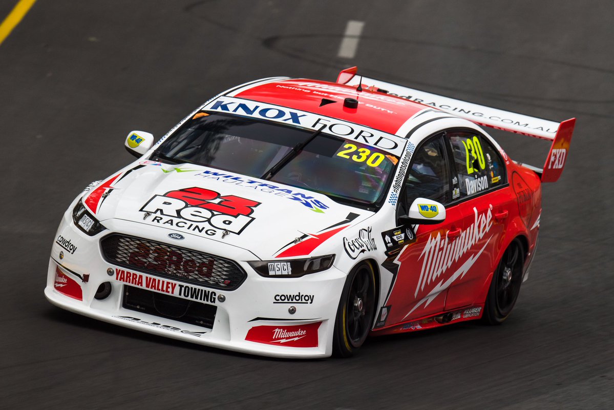
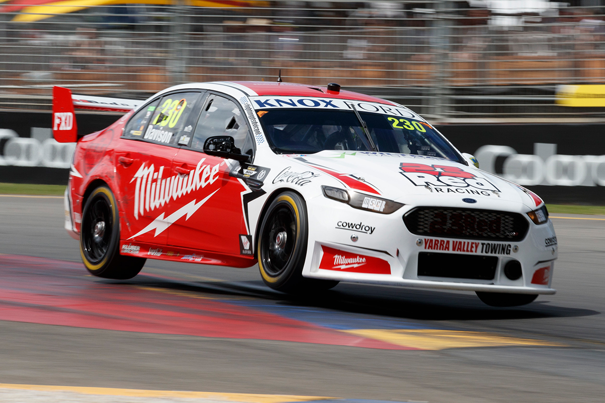
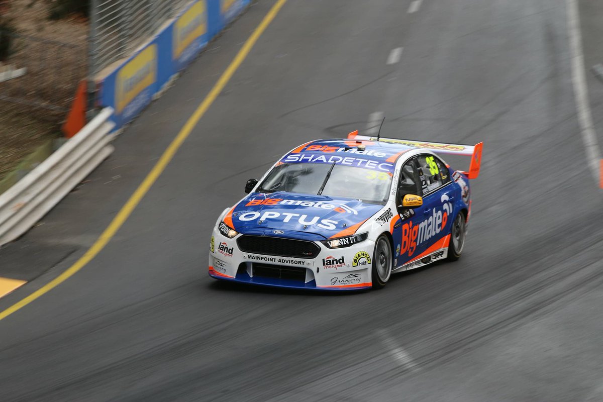
23Red Racing Milwaukee Racing
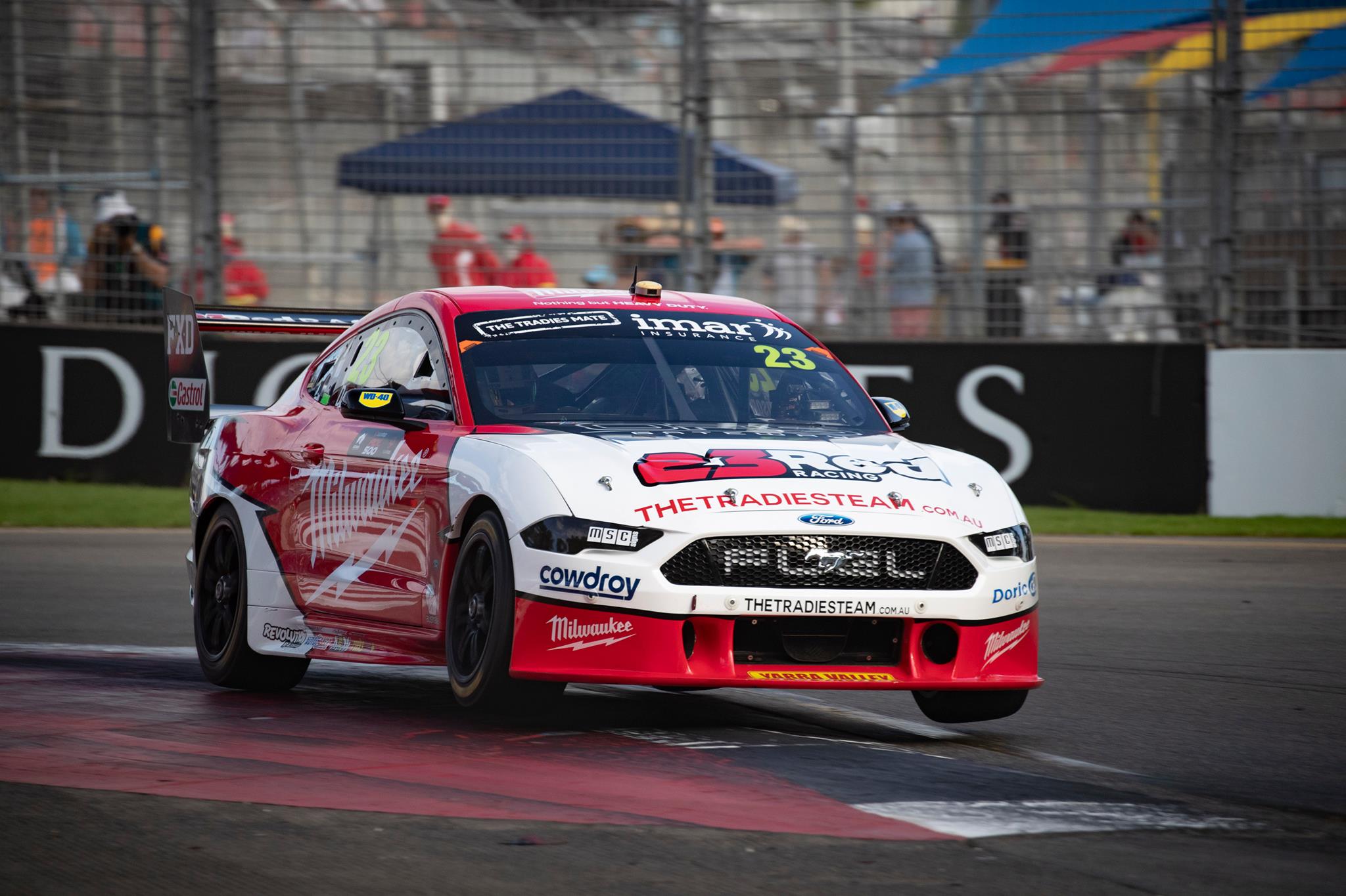
After a reasonable first season as a standalone organisation, Milwaukee have moved under the Tickford banner, and seem to have reaped the rewards so far with some solid top ten running for Davison in Adelaide. In terms of livery, the colours haven’t changed, but the overall design is neater.
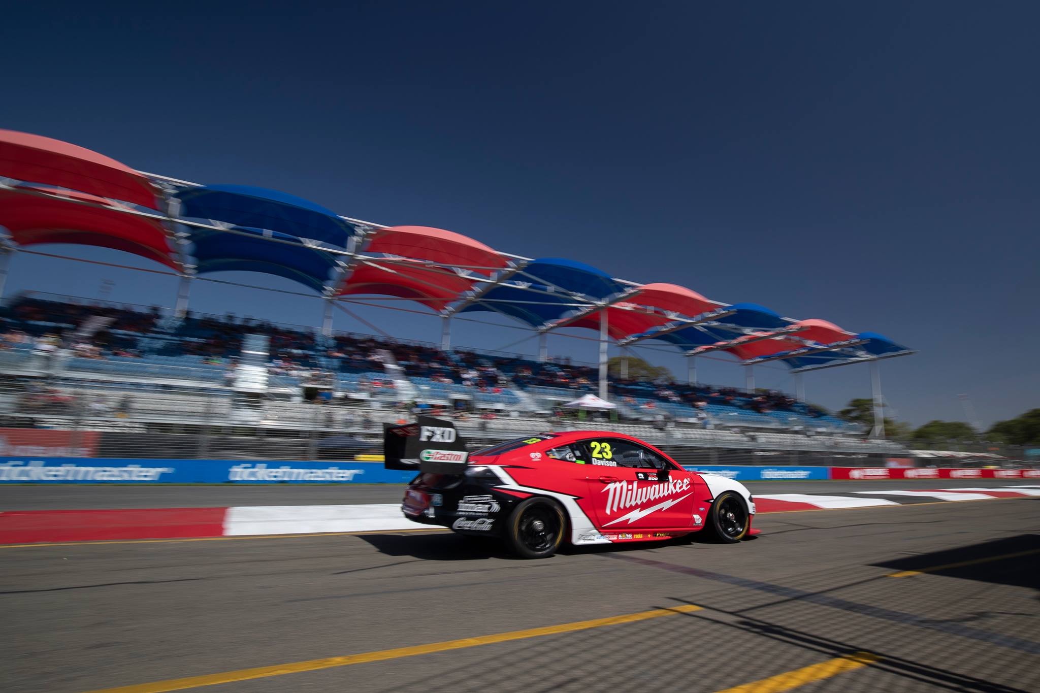
The edgy angled lines are jarring against the curvy, flowing bodywork of the Mustang, especially over the rear wheel, but isn’t necessarily a bad look. However, the whole livery is just a little underwhelming, and can’t find an aspect about it that I love, not any more so than last year.
★★★
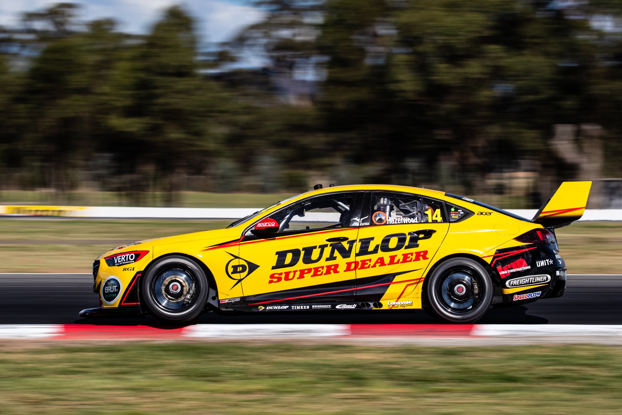
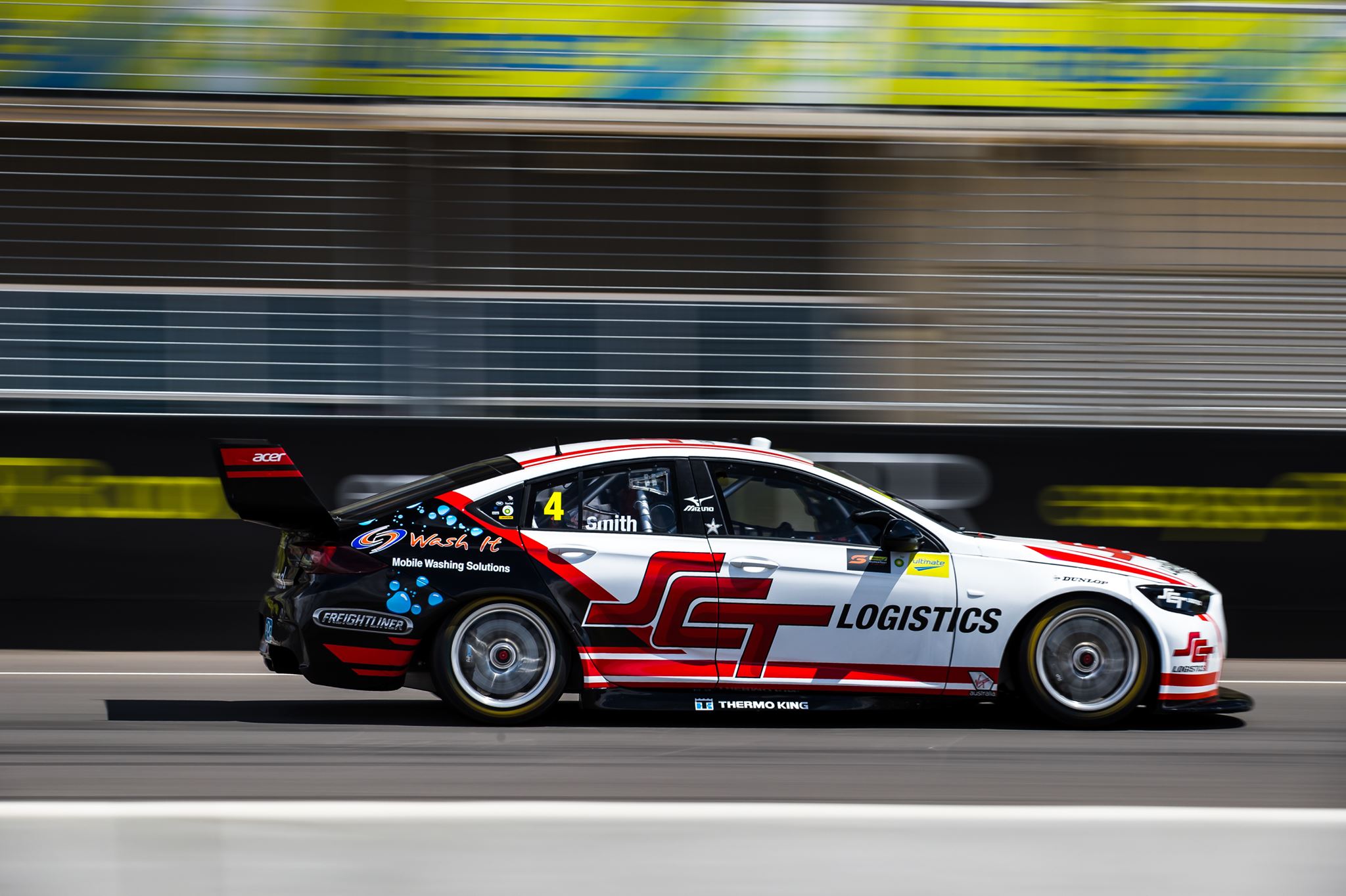
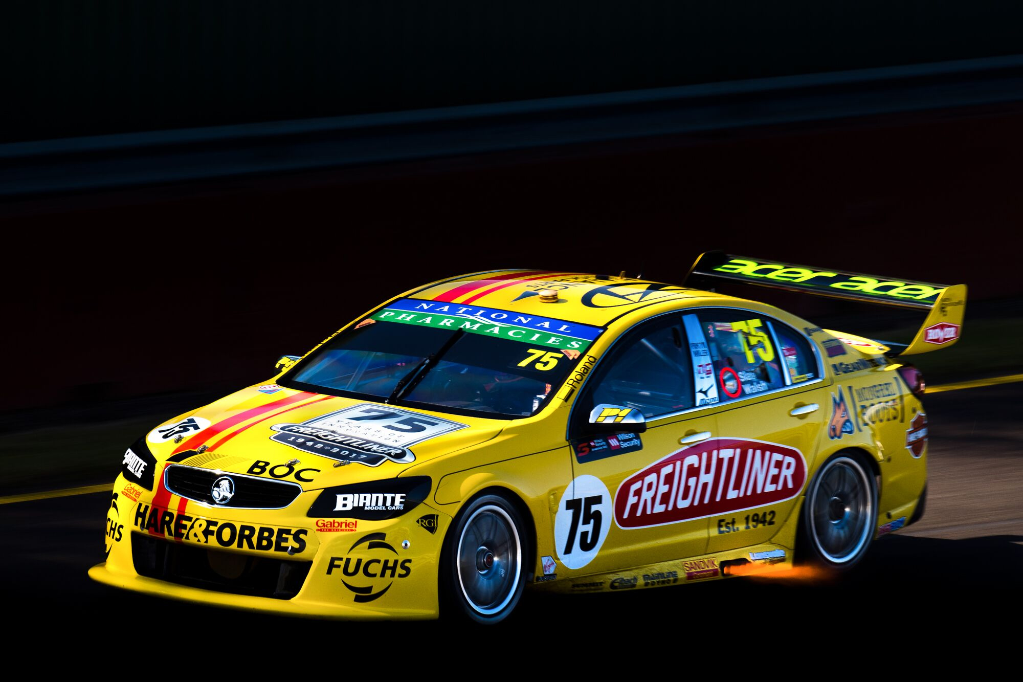
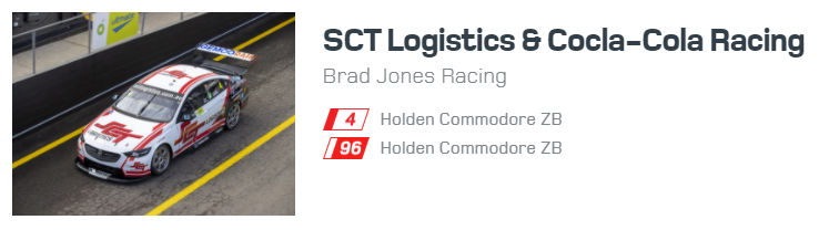
Brad Jones Racing Freightliner Racing
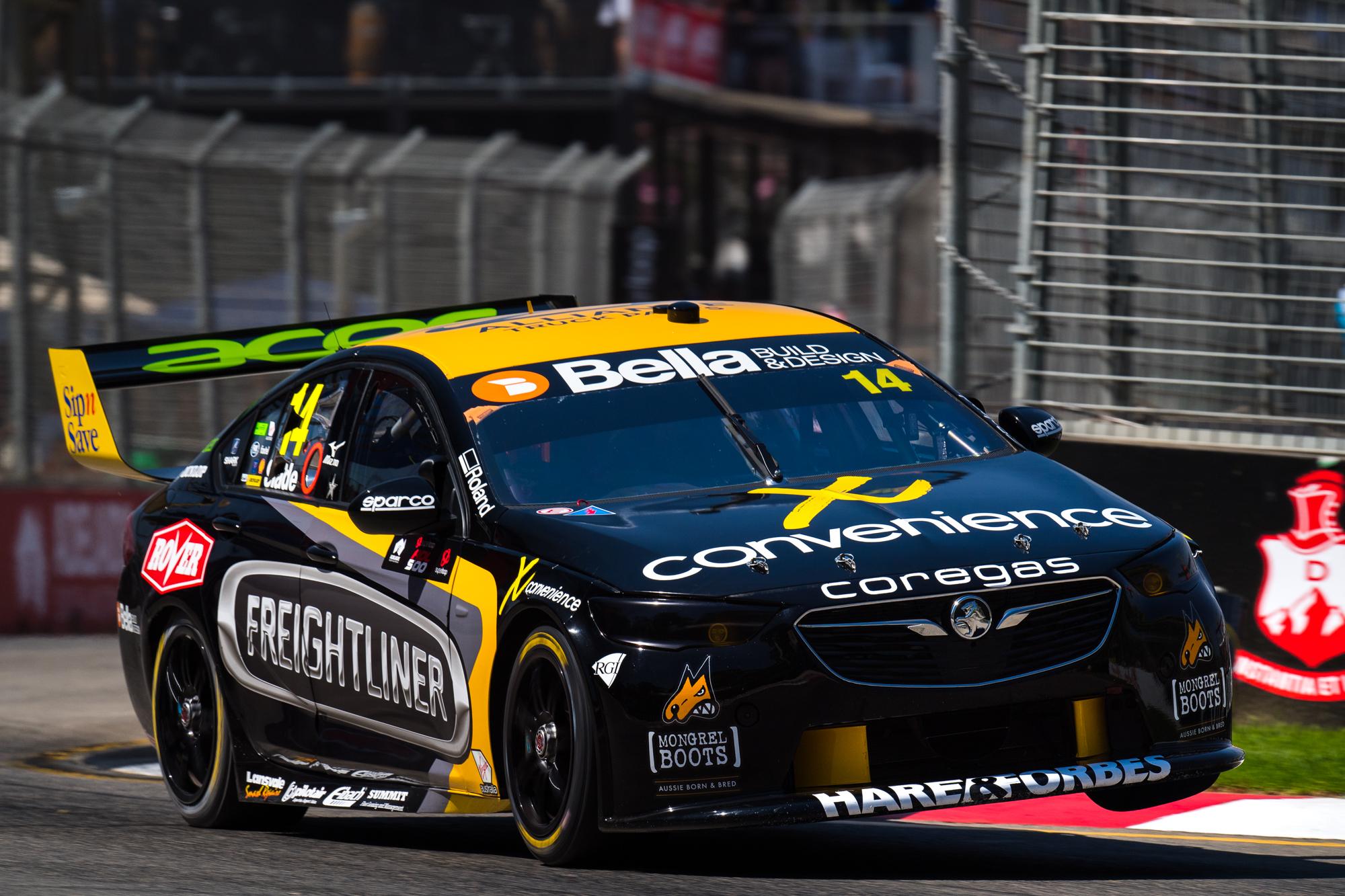
Freightliner Racing have inverted their main colours, with black and yellow just about swapping places for 2019. Annoyingly, in my eyes, they’ve stuck with almost the same design on the side of the car. I don’t want to dwell on this for another year, but I really wish they’d make some lines that fit the Freightliner logo better, and didn’t look like the logo was slapped on after the fact.
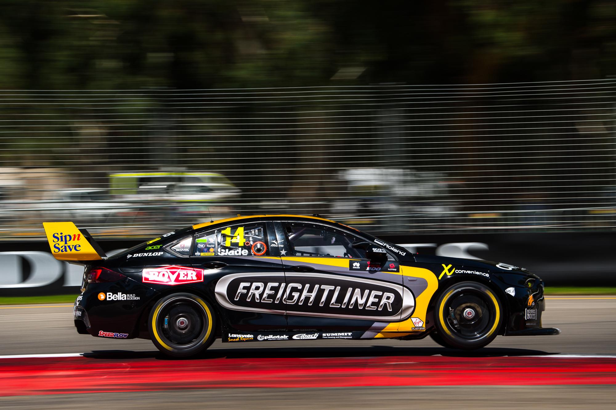
That said, black and yellow are foolproof colours, and they still looks nice here. I can’t say the same for the silver, but must be used to tie in the main sponsor. In fact, one of the few teams where silver wheels would have made sense, decided to go with black ones – not that they don’t look great in black. Overall, it’s neither here nor there in terms of improvement, so receives the same rating as last year.
★★☆
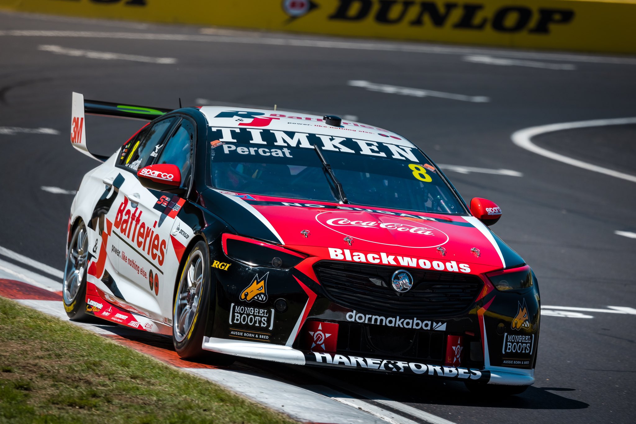
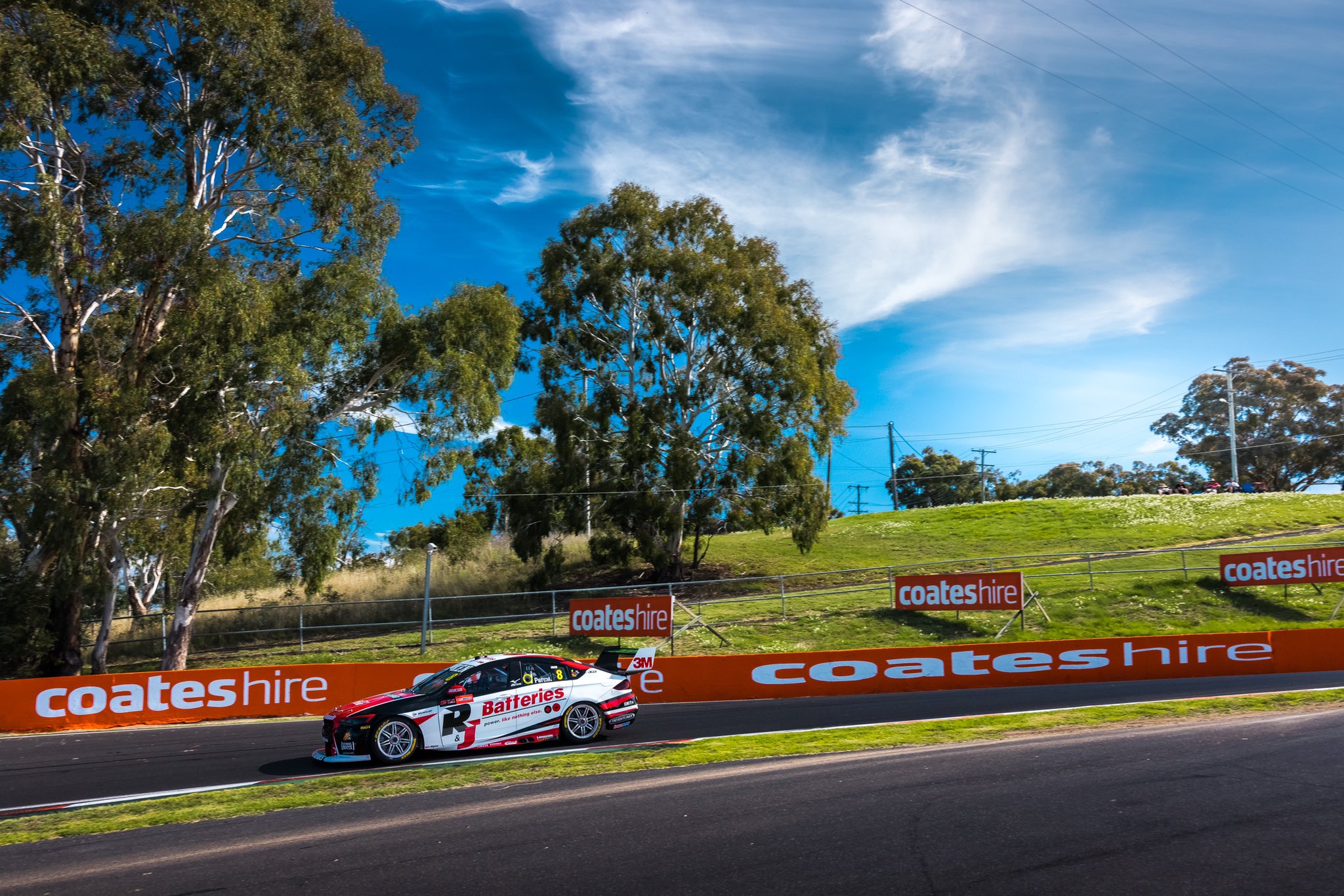
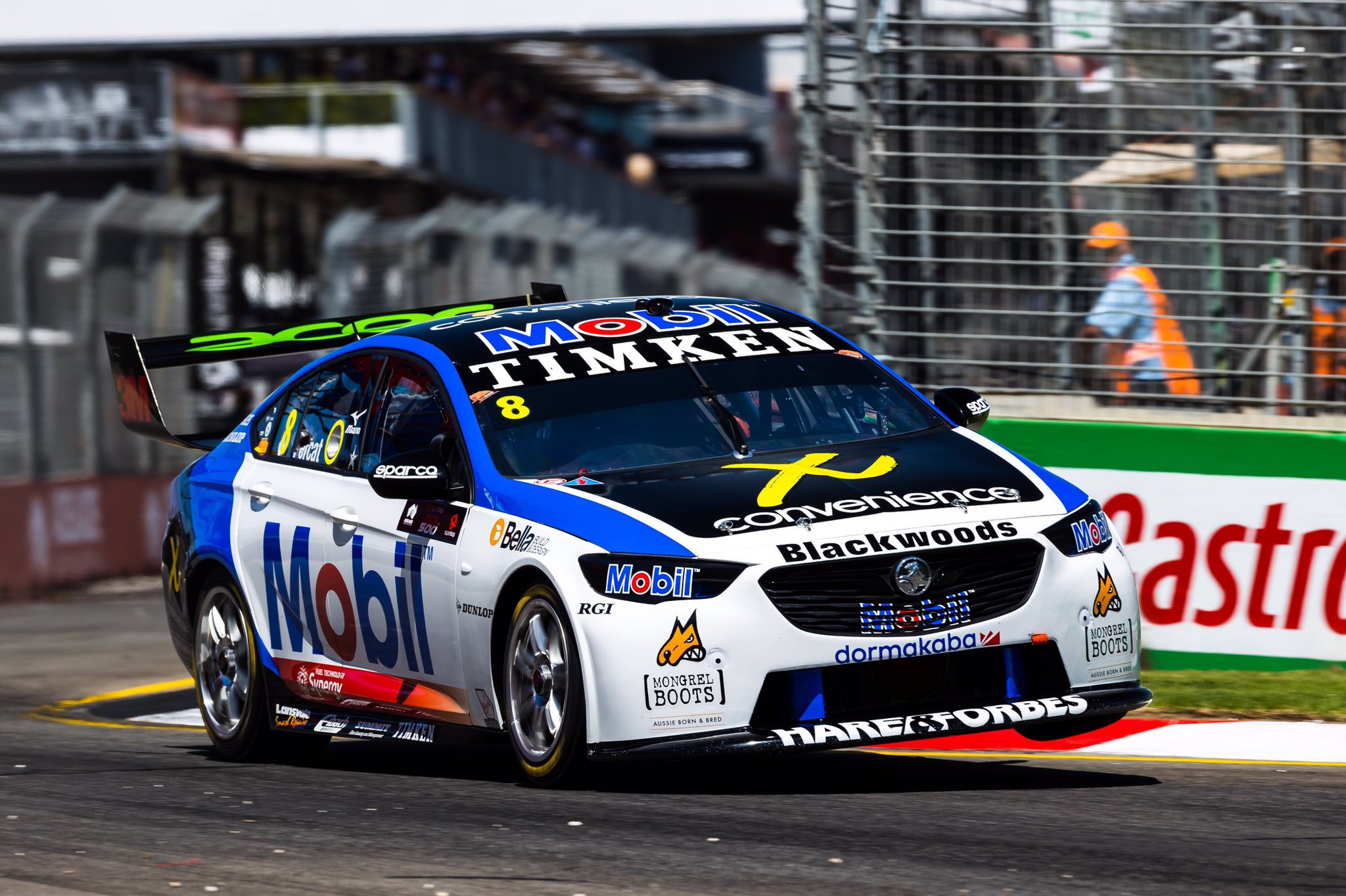
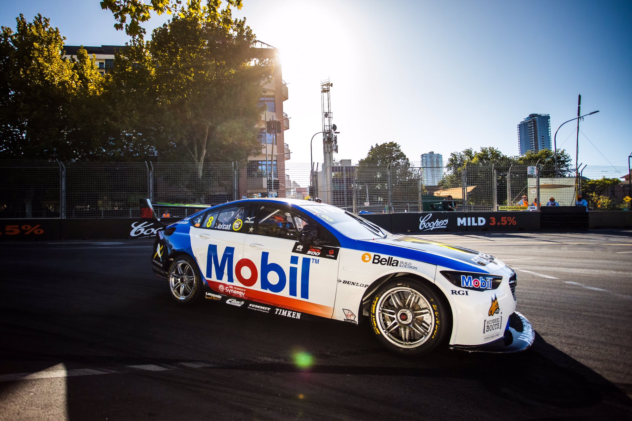
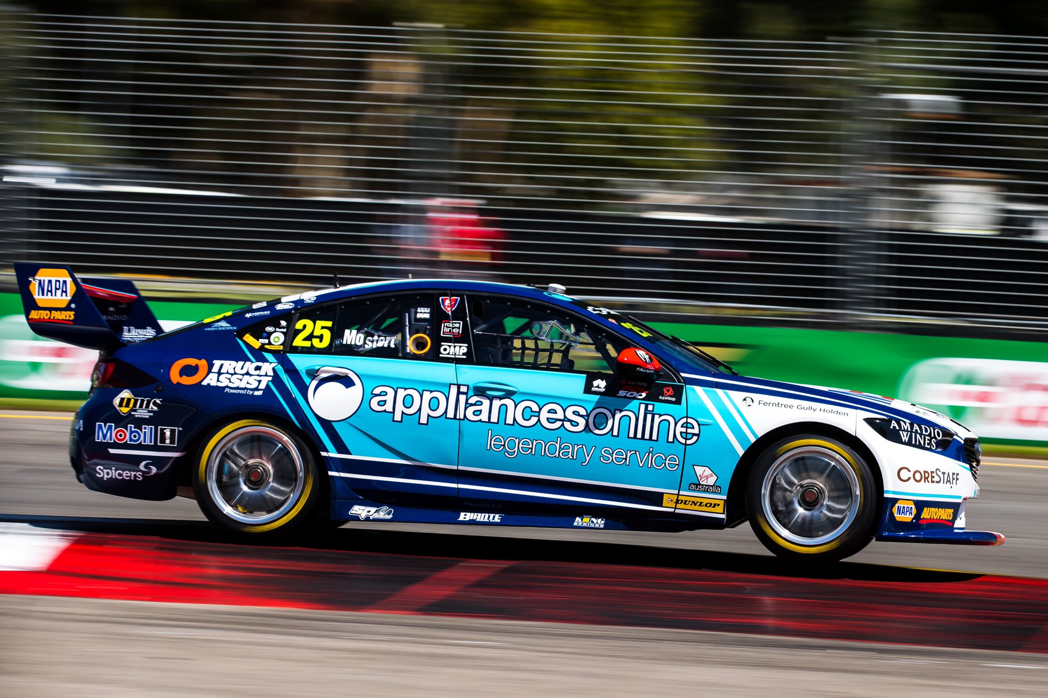
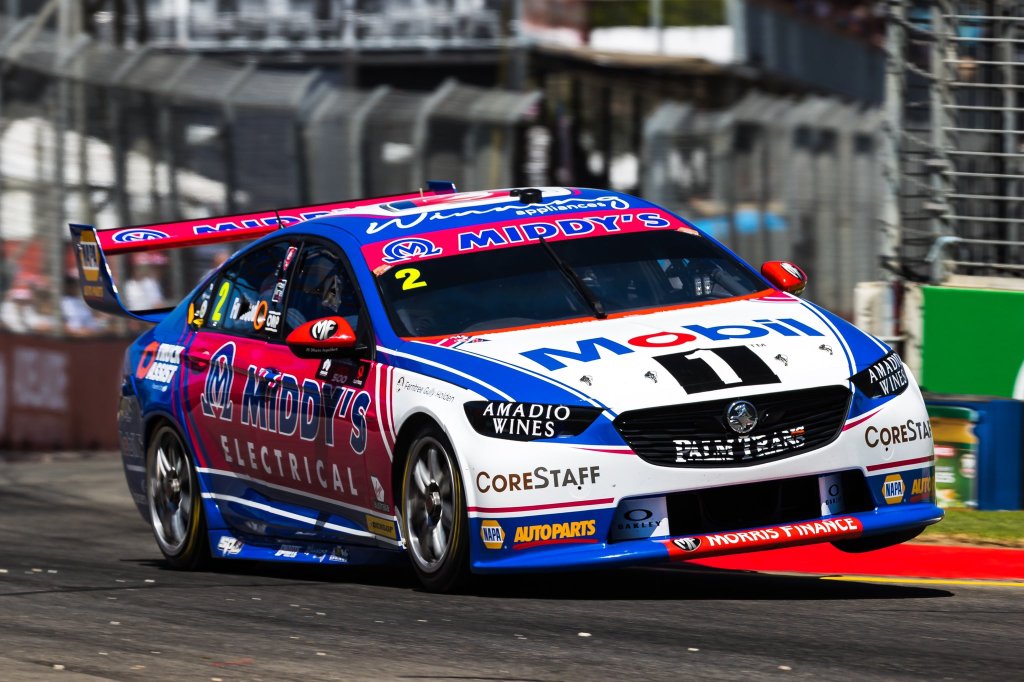
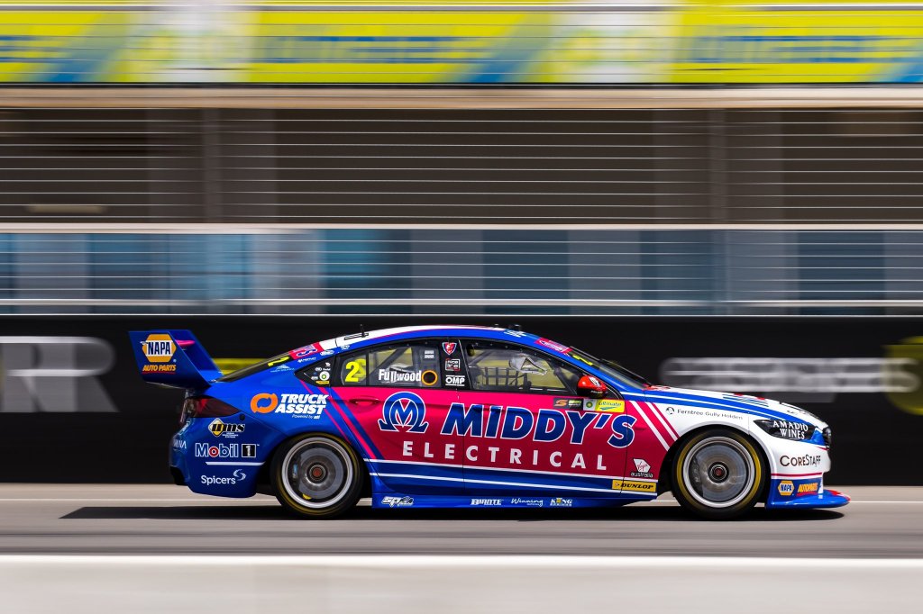
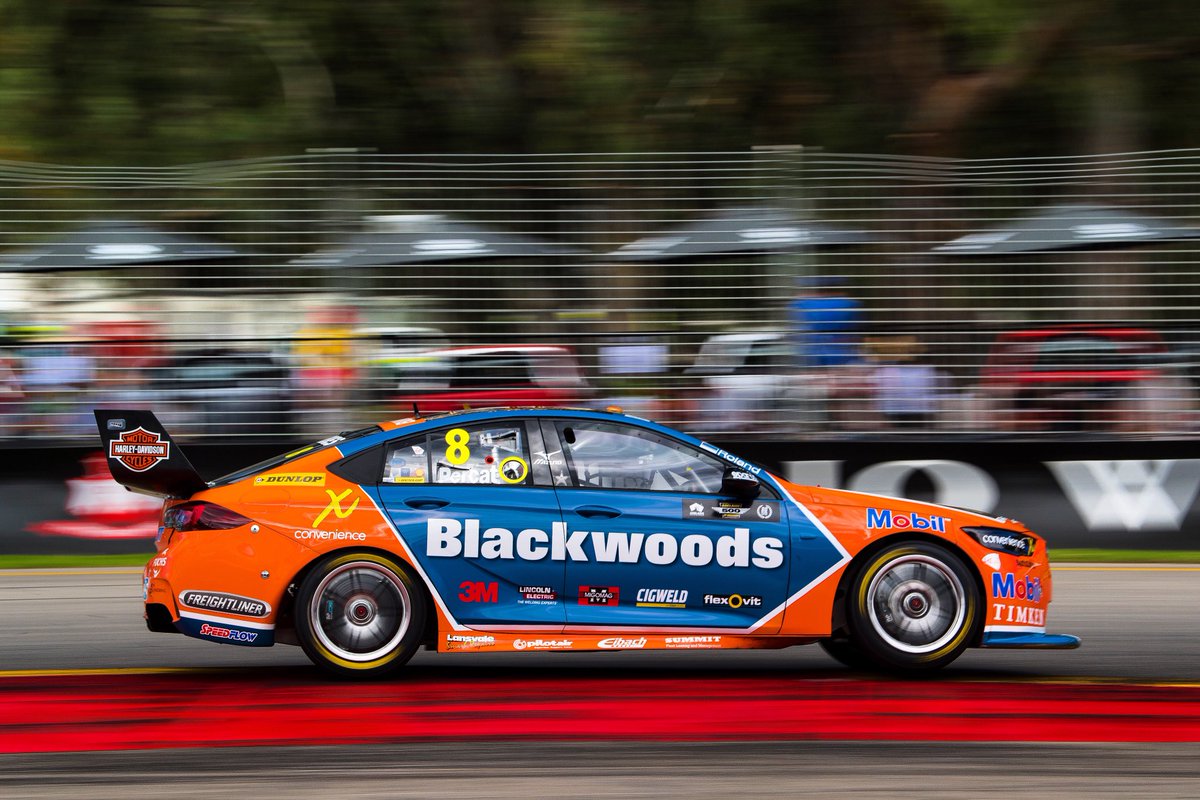
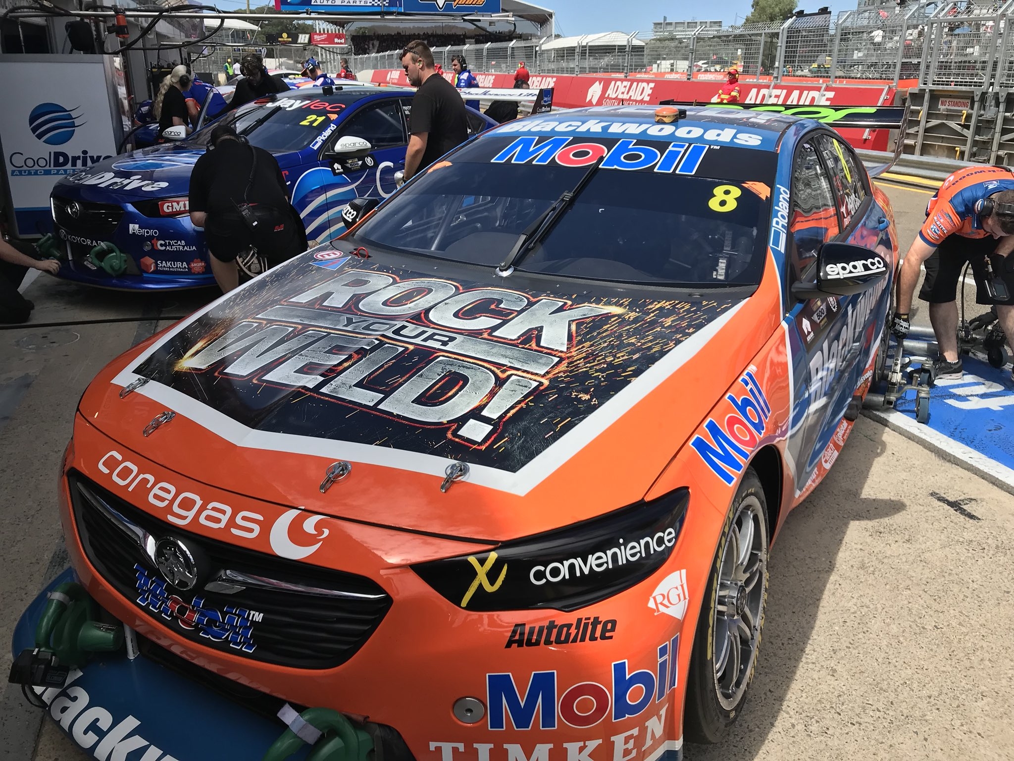
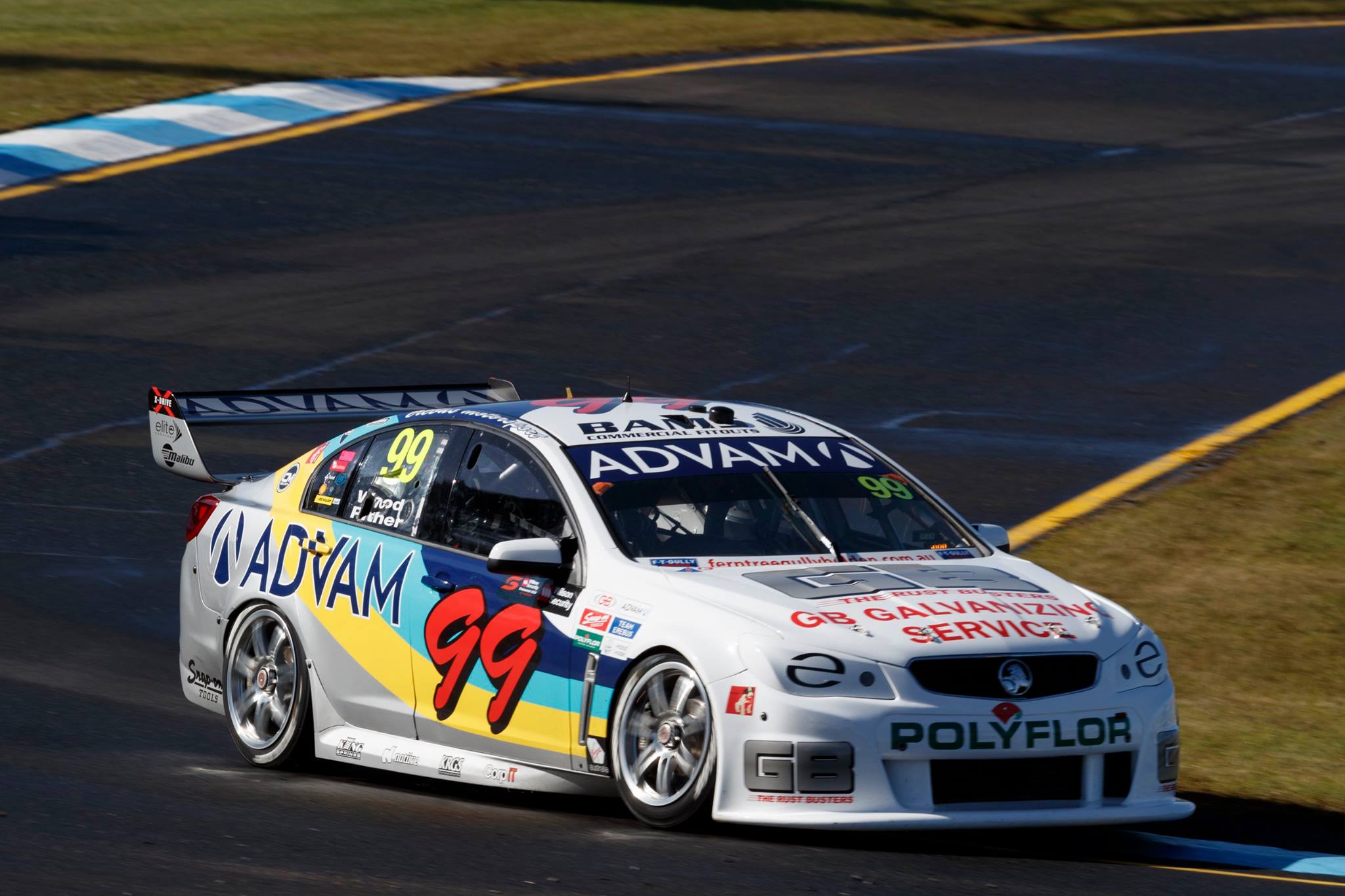
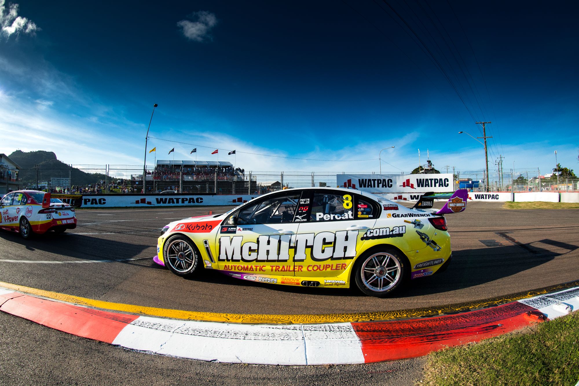
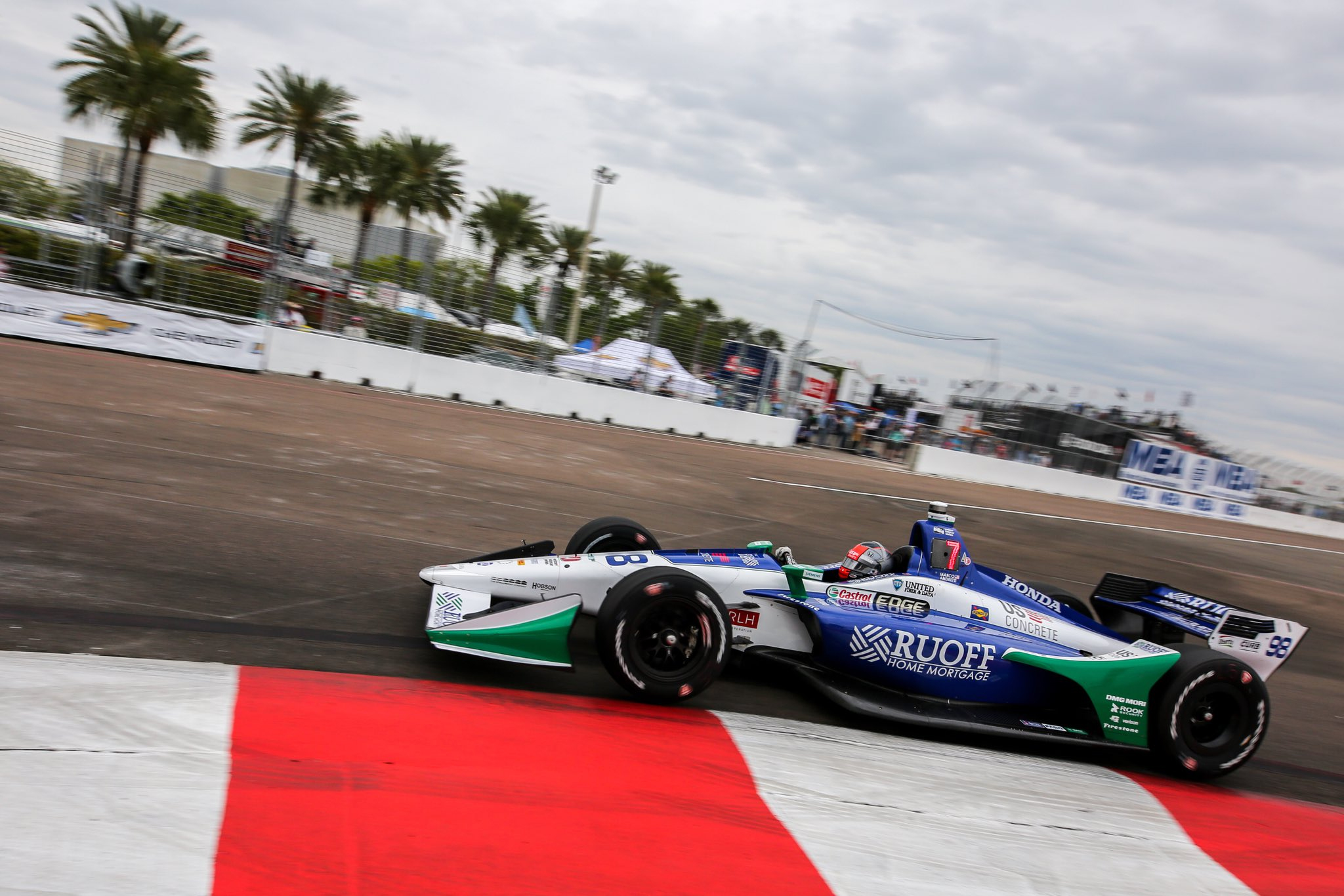
Brad Jones Racing National Pharmacies
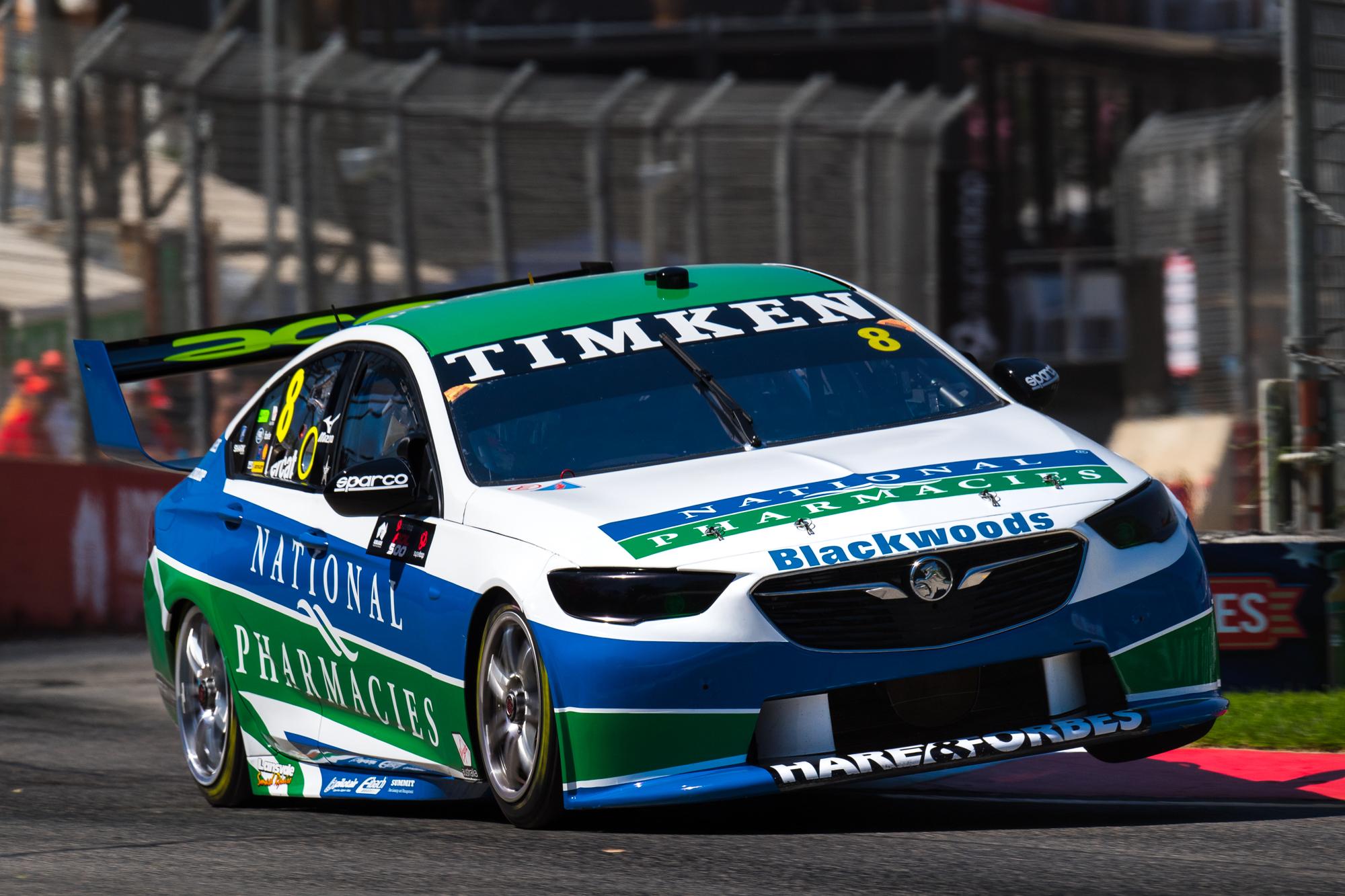
Nick Percat’s #8 machine appears as though it will have different sponsors race by race again this year, and first cab off the rank is National Pharmacies. These blue and teal colours are some that were pretty unfamiliar to Motorsport, up until Ruoff brought them to Indycar. Mixed with a good chunk of white, they work really well together.
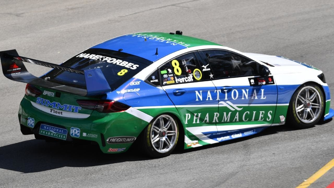
The design is simple, and a racing staple, with the two colours in thick parallel lines running nearly from bumper to bumper. The logo is a perfect size and shape for this design. Some complexity is added at the rear wheel with two white lines added, but feel it may have looked nicer with just the one on the rear door, as it completes the bottom blue section, whilst the other is doesn’t suit so well. Let’s see what’s up next for #8.
★★★☆
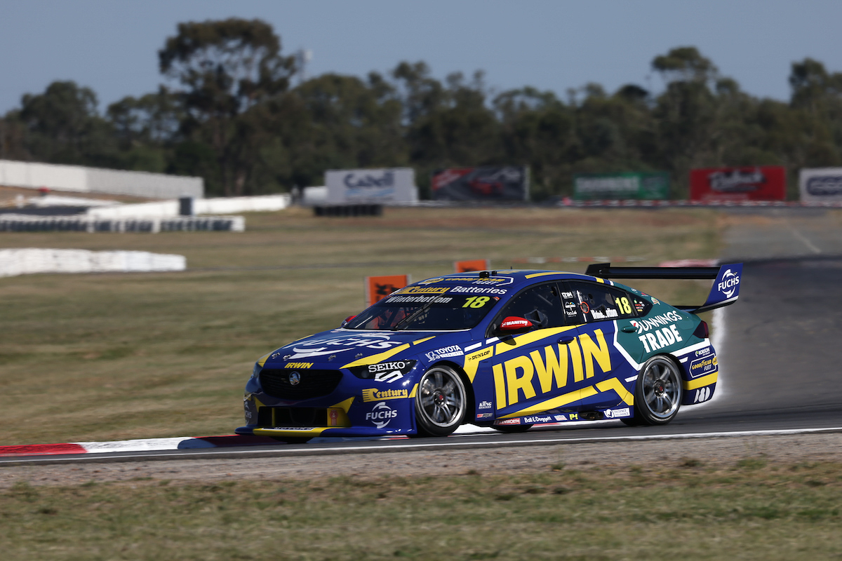
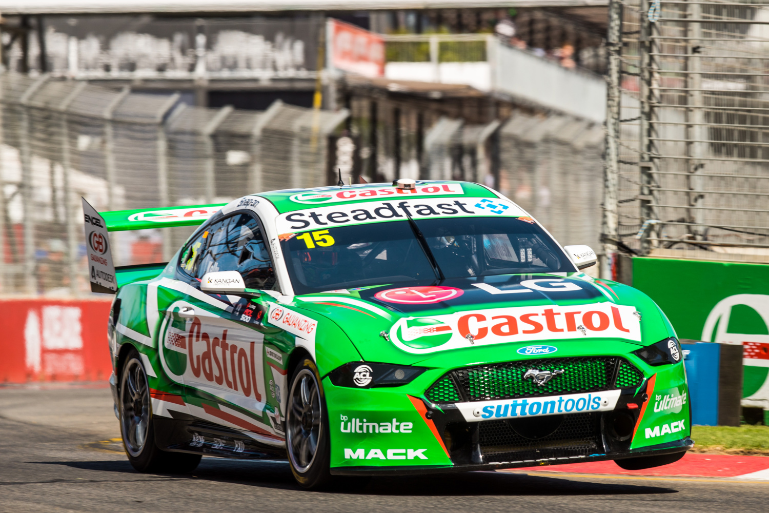
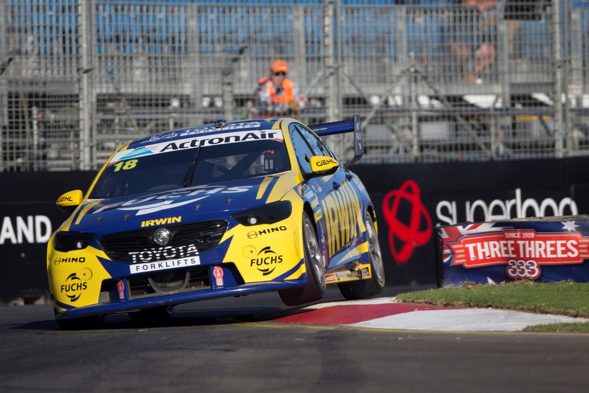
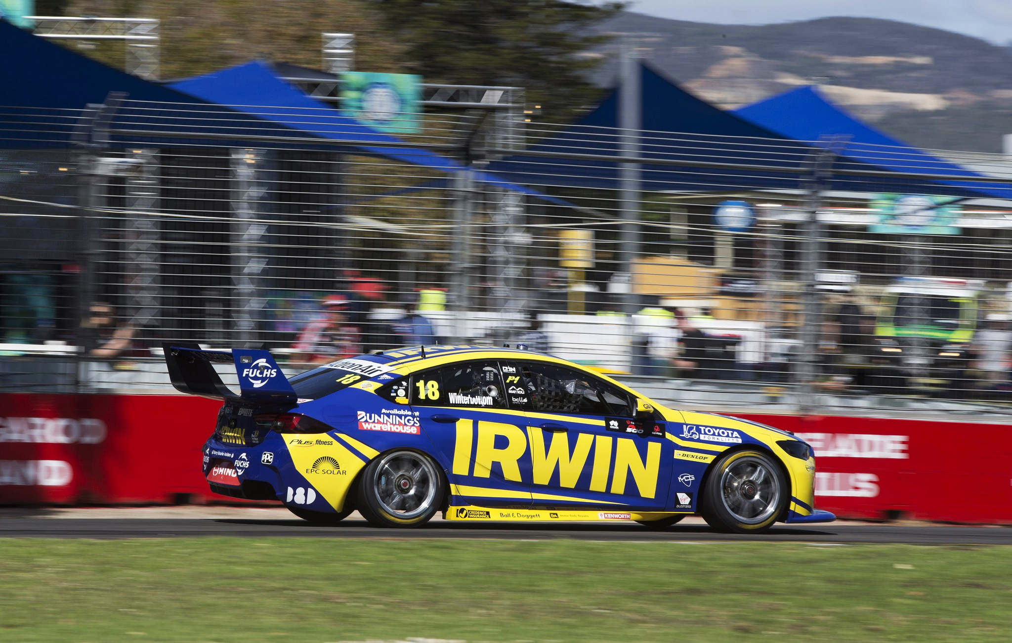
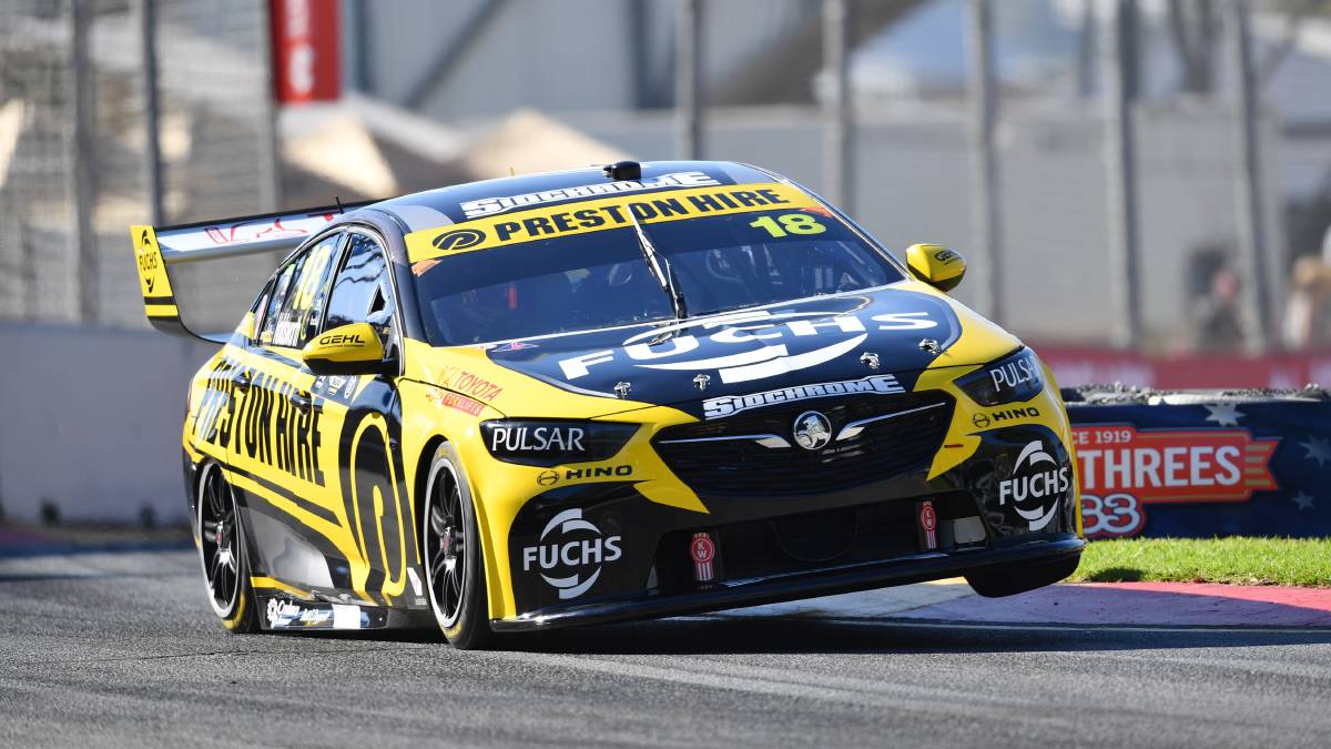
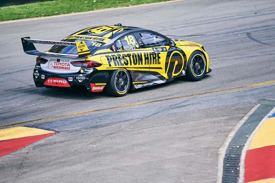
Charlie Schwerkolt Racing IRWIN Racing
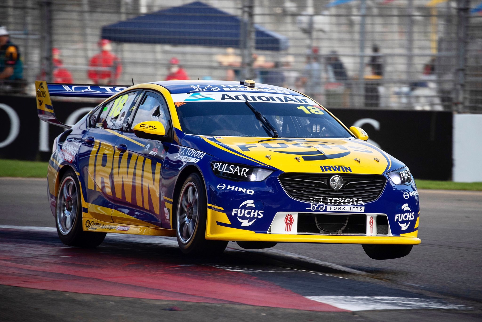
I’m sad to see the back of what was a superb couple of years this car had in Preston Hire colours, but glad to see that they’ve produced something just as good in 2019. Irwin have joined Frosty at Charlie Schwerkolt Racing, and have put a big fat logo on the side of the car. Along with that comes a really pleasing design and combo of blue and yellow.
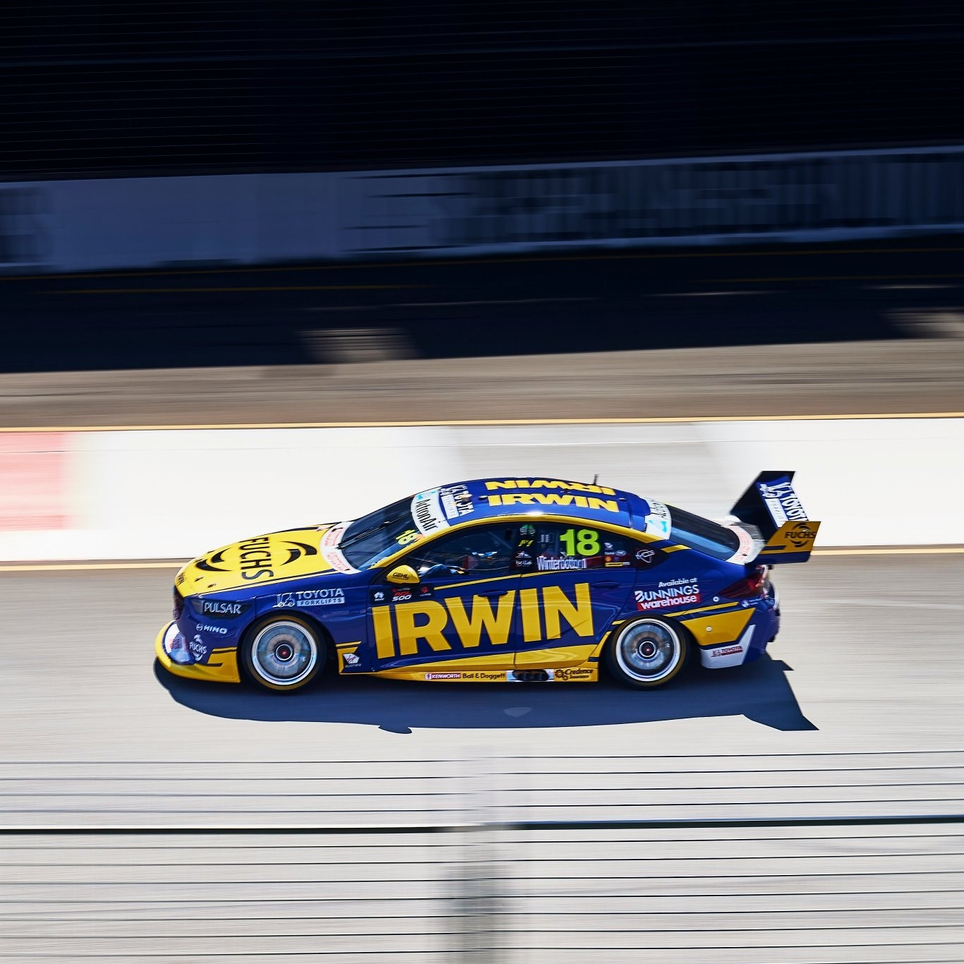
The logo and main lines are angled nicely, with the solid yellow sections featuring yellow pinstripes on their borders. These lines are fragmented along the sides, ensuring it isn’t just another plain livery. There are also a couple of white sections – I’m not sure a third colour is necessary in this instance, but they’ve done well to fit in what are likely a sponsor requirement. One irk, however, is the Toyota logo that’s half on the bonnet, half on the grille. I get they’re making the most of the space that’s available, but an OCD I didn’t know I had is definitely flaring up looking at it.
★★★★☆
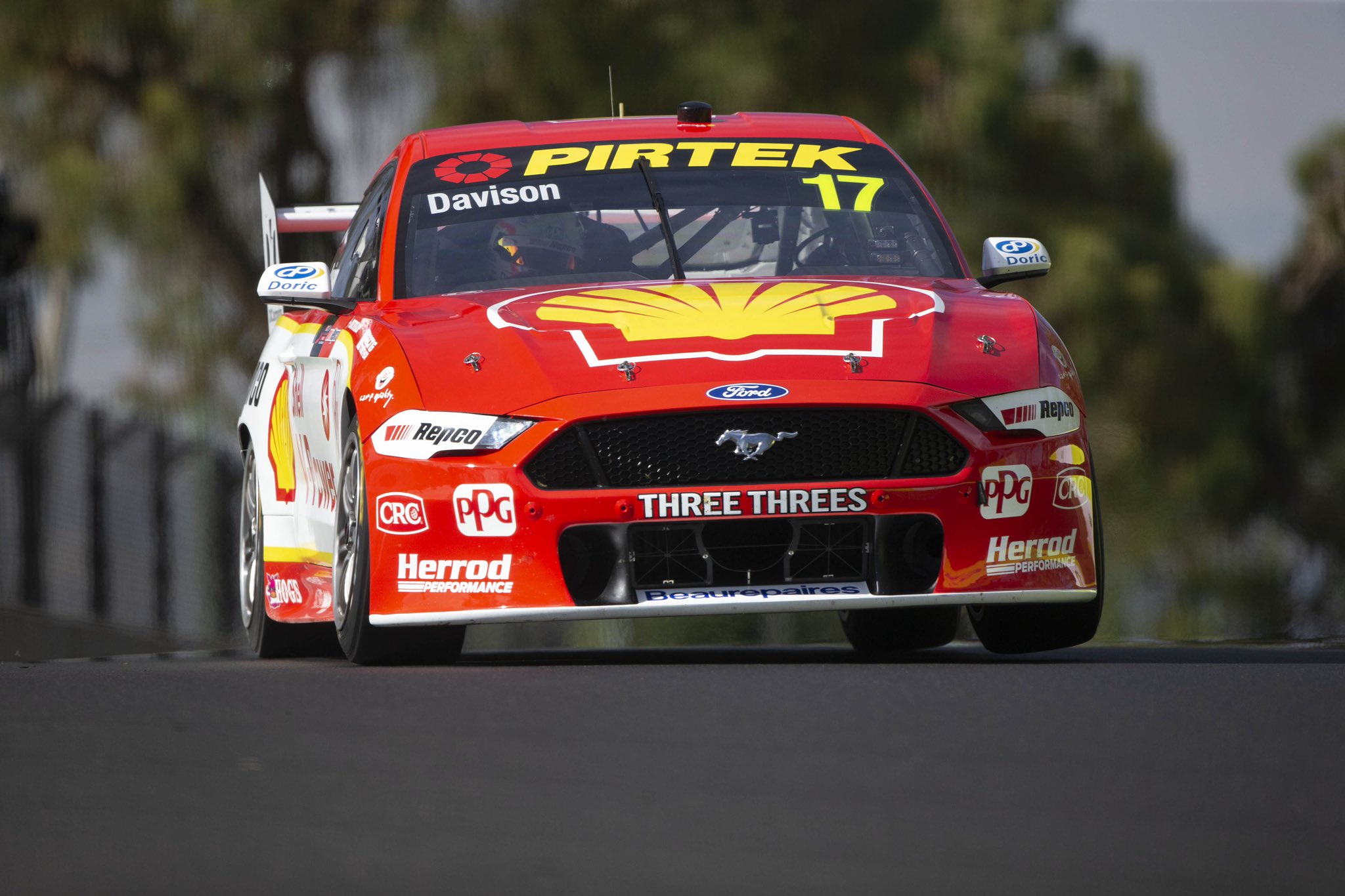
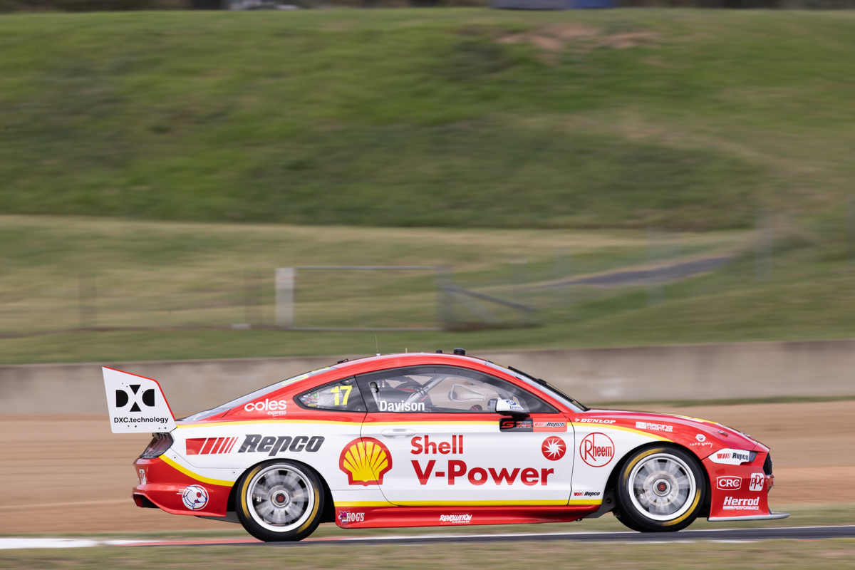
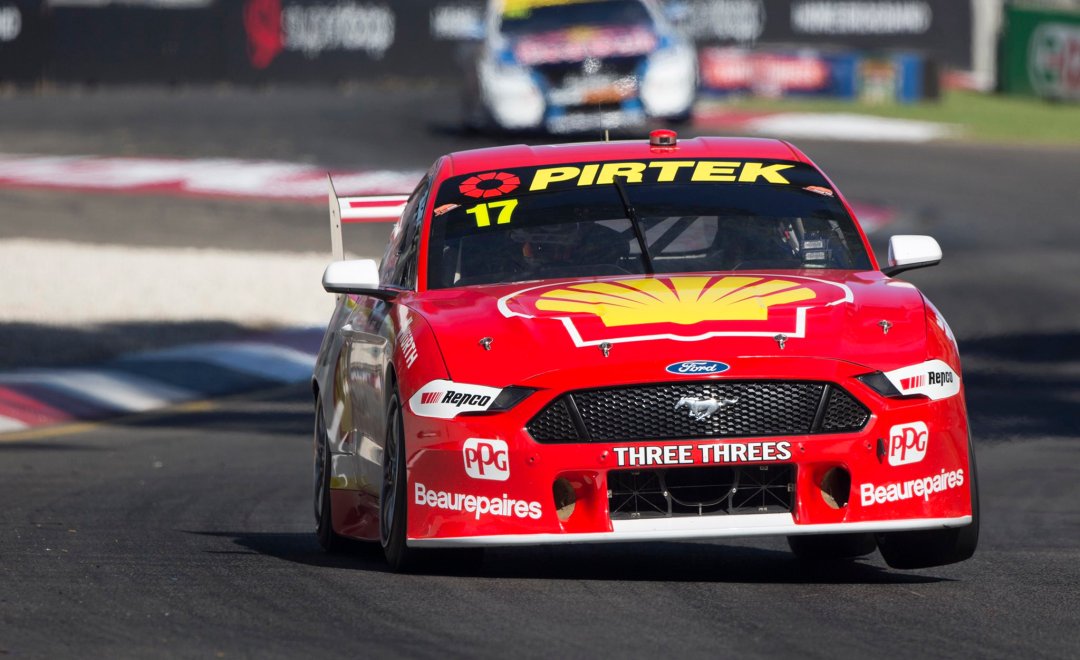
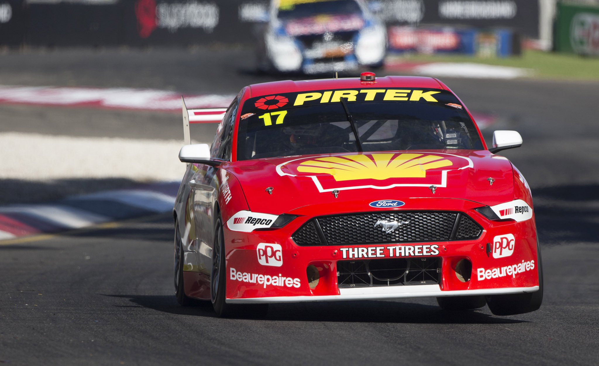
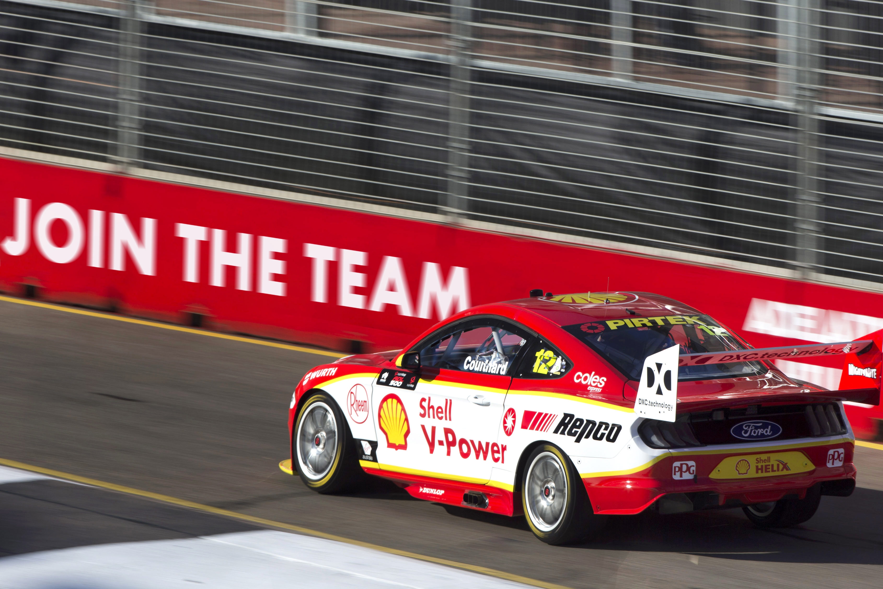
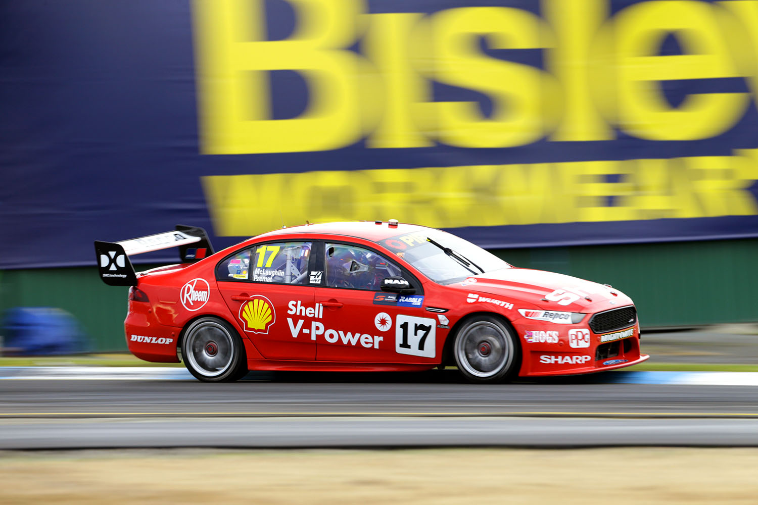
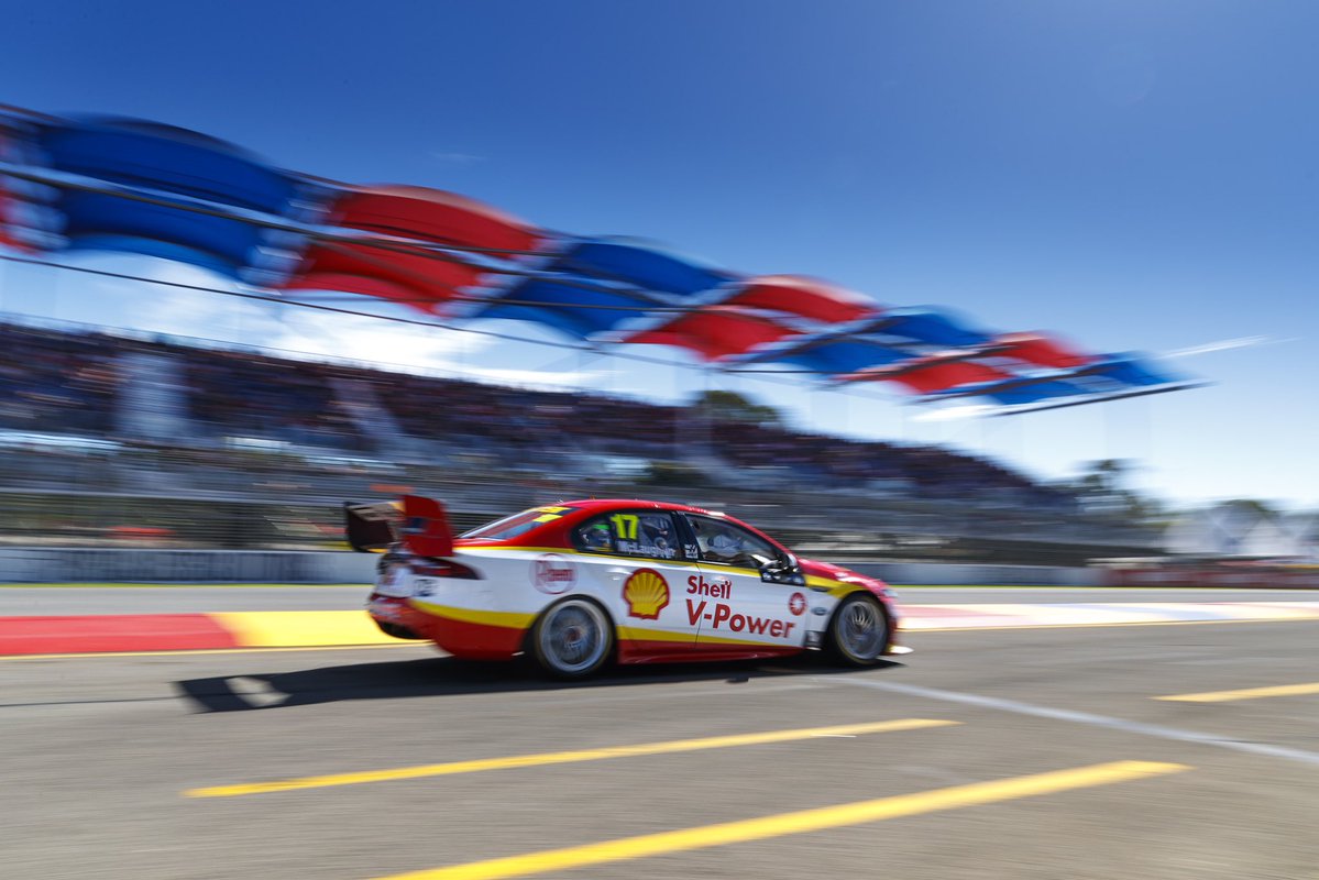
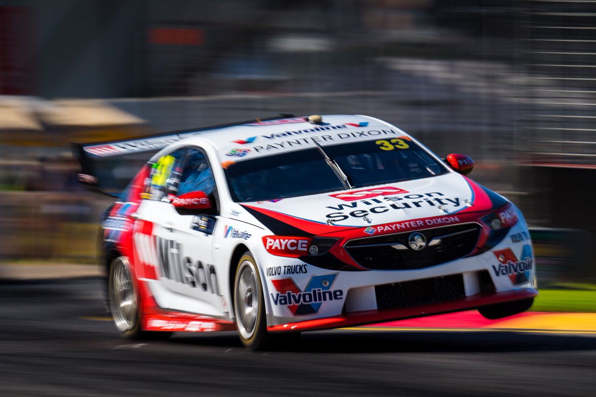
DJR Team Penske Shell V-Power Racing Team
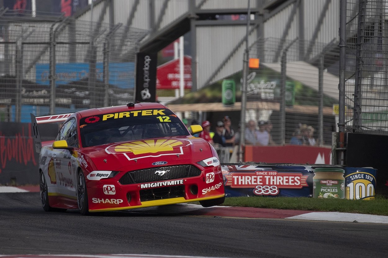
The Shell V-Power livery is probably the one most affected by the move to the Mustang. They’ve tried to mould the existing livery as best they can into the shape of the new car, which itself has been transformed into a really awkward shape to fit the requirements. What was a gradual slope of the yellow line over the front wheel arch is now a steep drop off, which I’m not a fan of, whether or not its intent is to deceive the viewer of the bonnet’s droop.
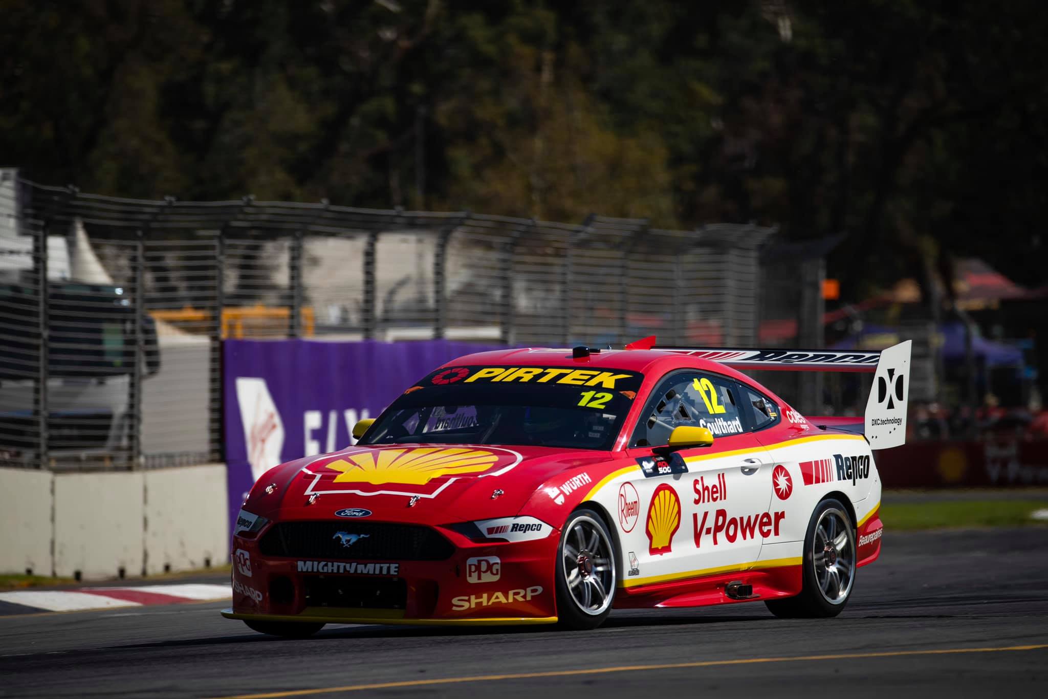
Apart from that, there aren’t any significant changes, although the shade of red looks to be deeper, which is a big improvement and just about makes up for the aforementioned alteration. Although it’s still a nice livery overall, I hope for a new livery on these cars next year.
★★★☆
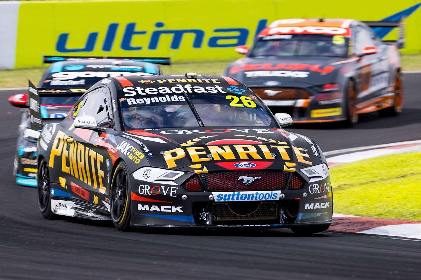
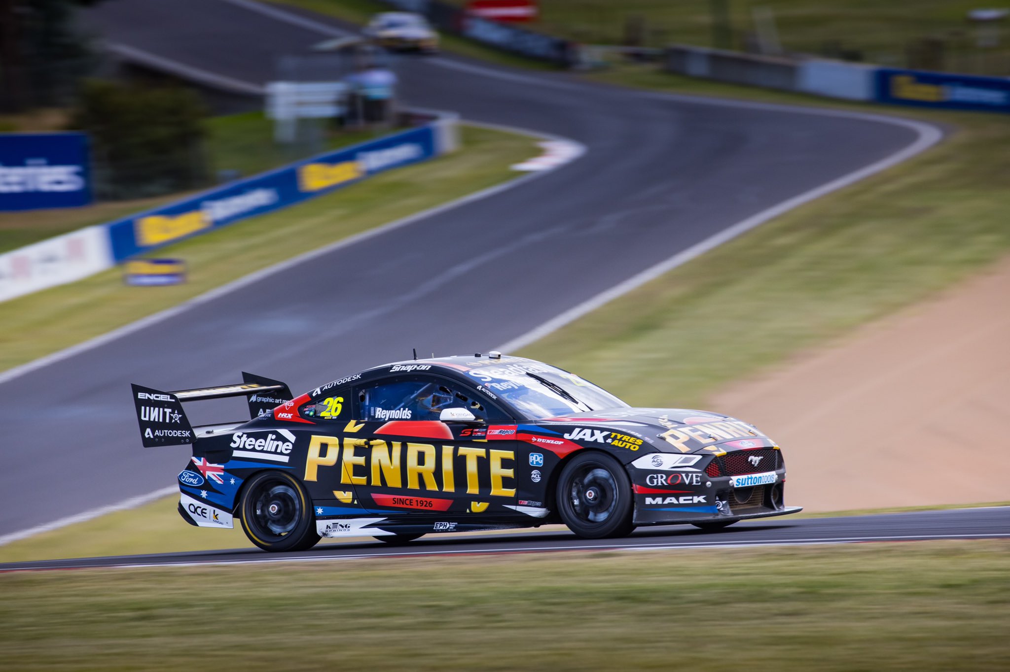
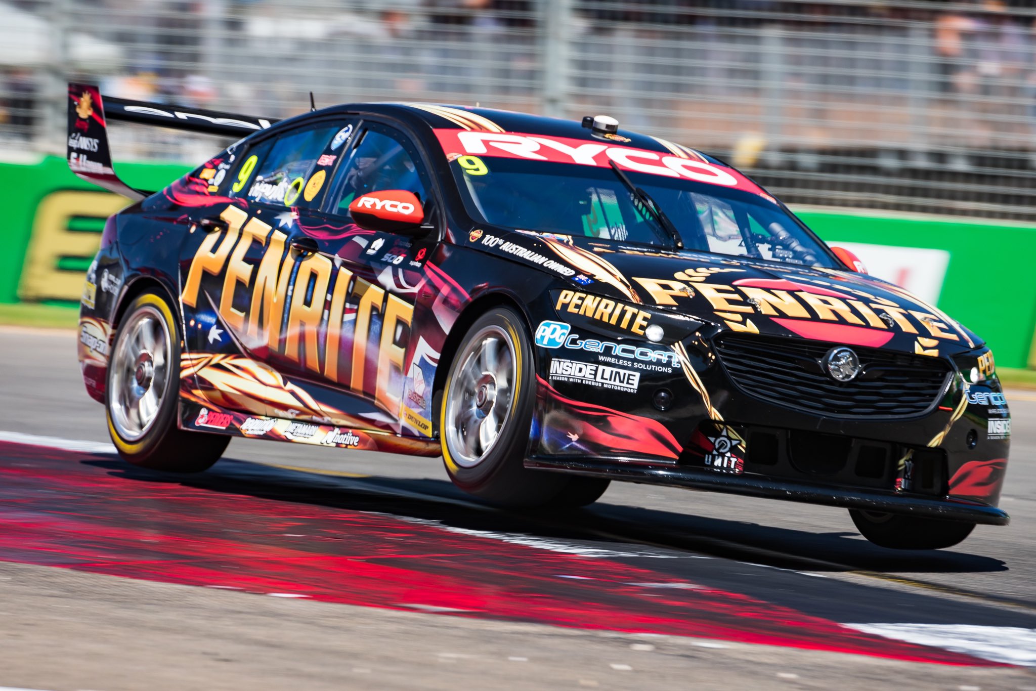
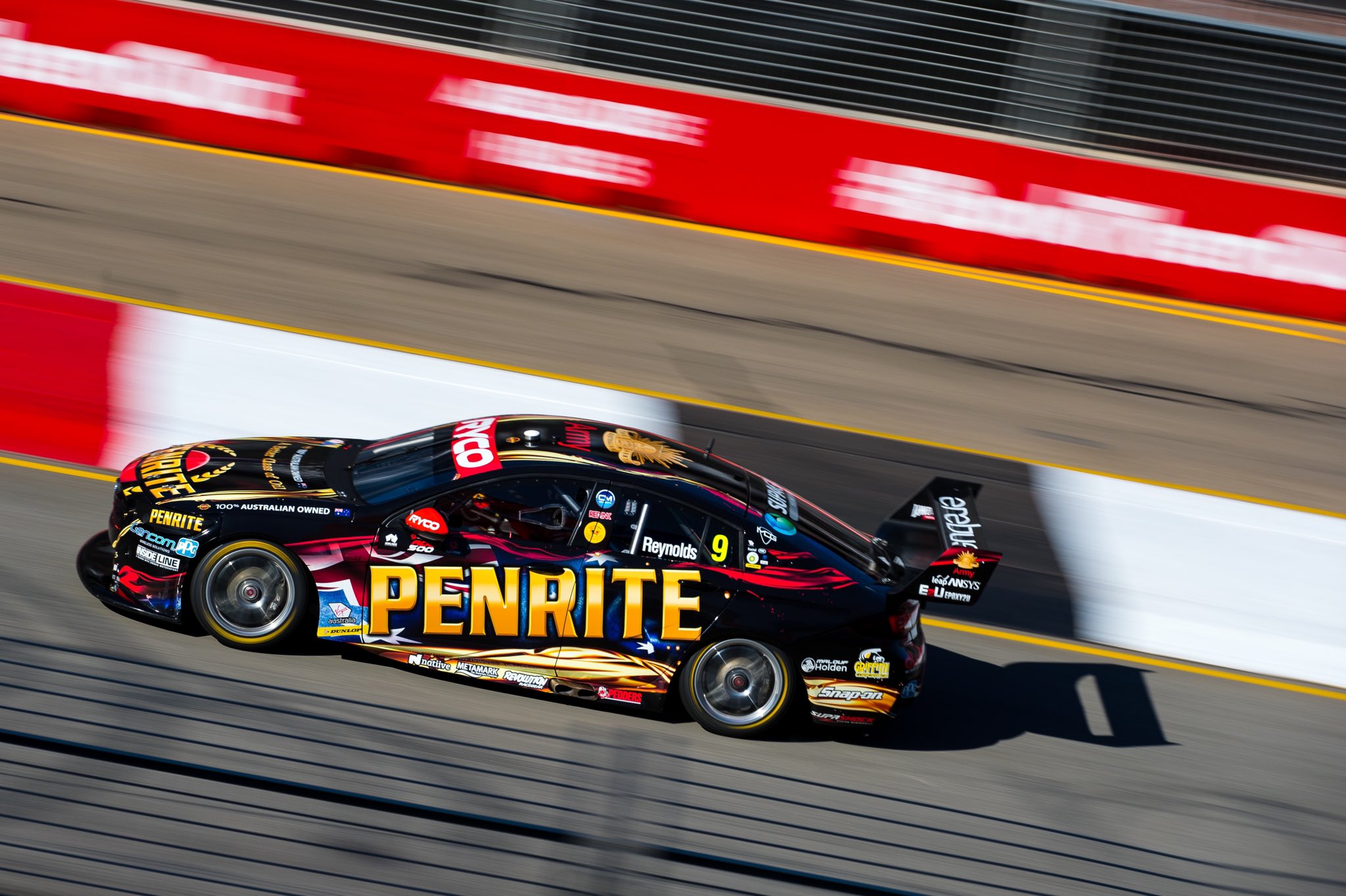
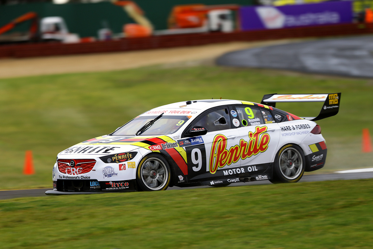
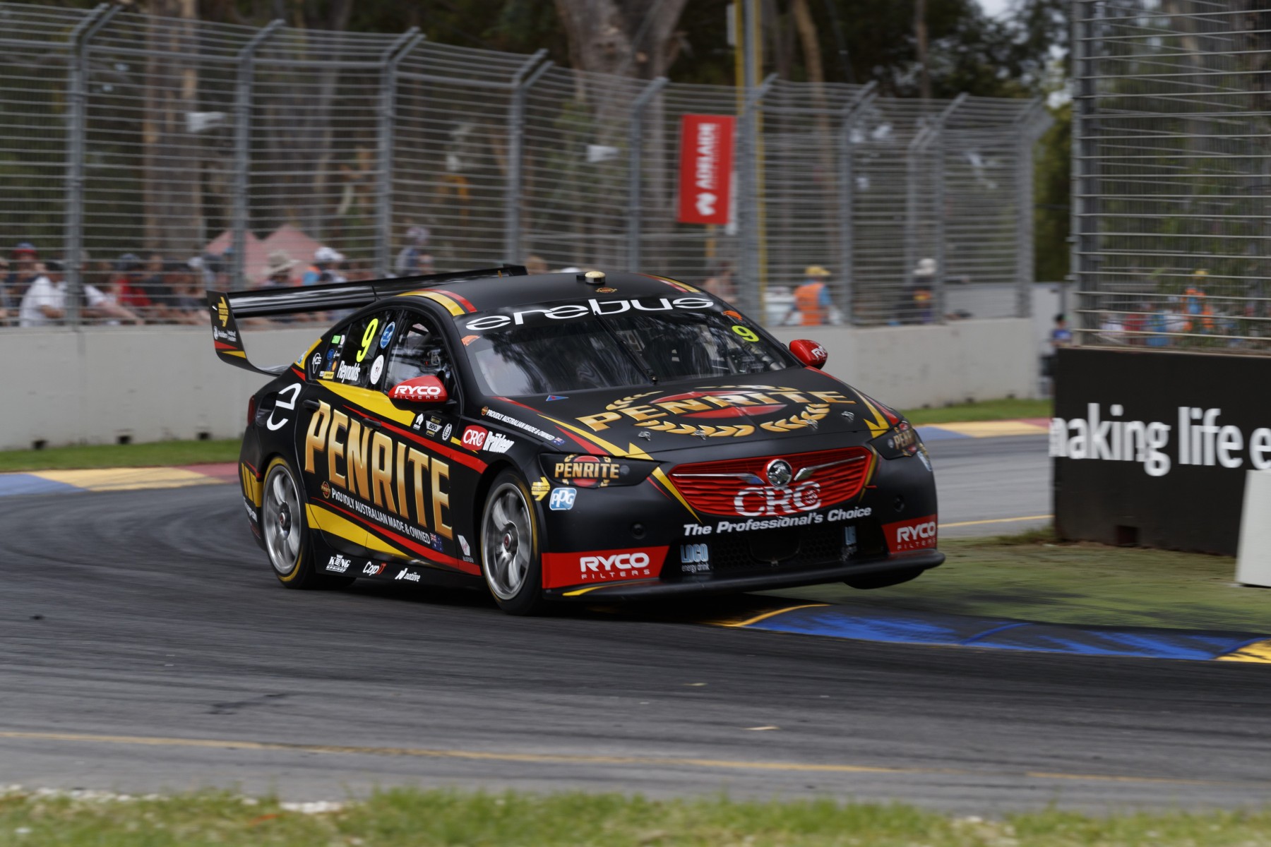
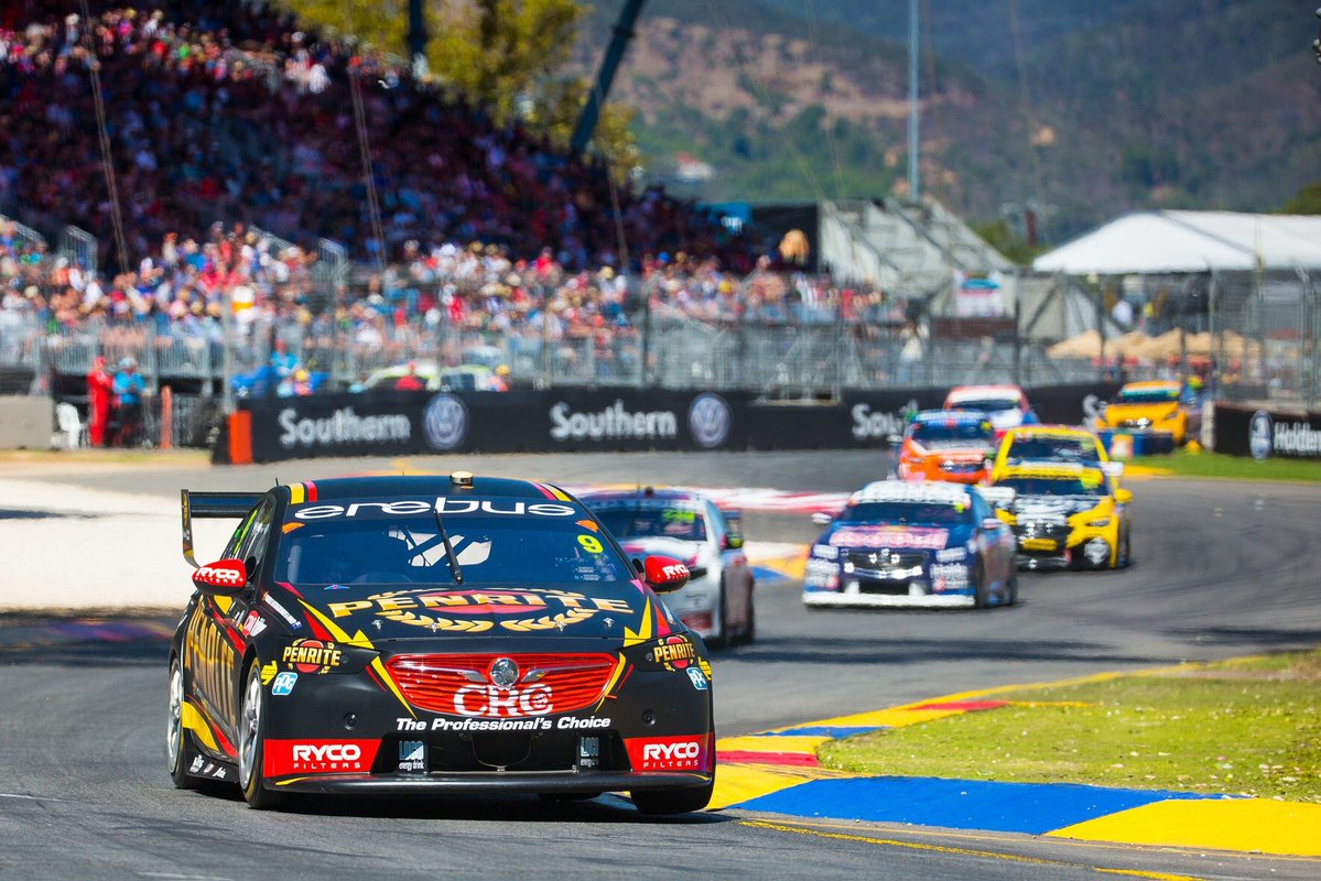
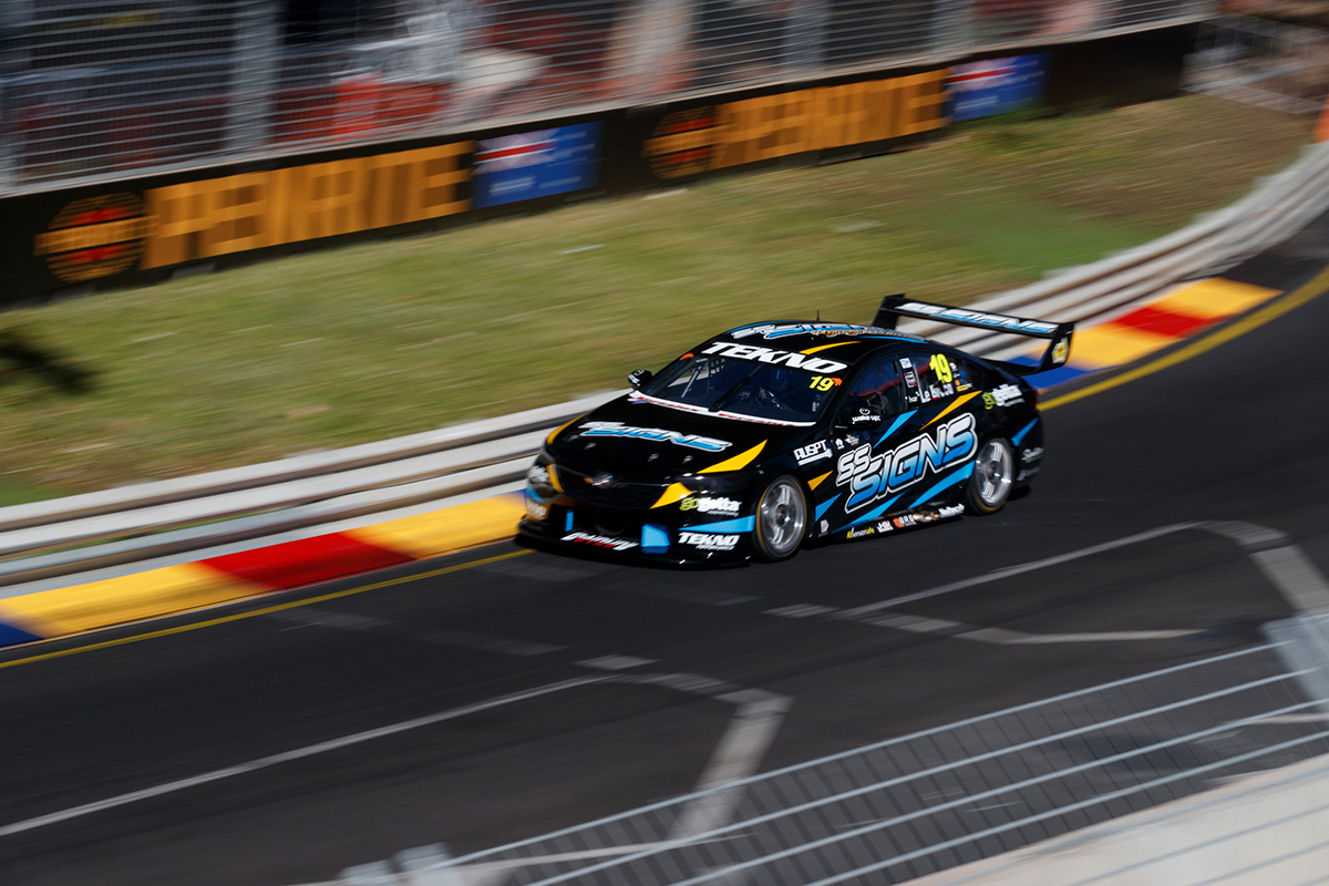
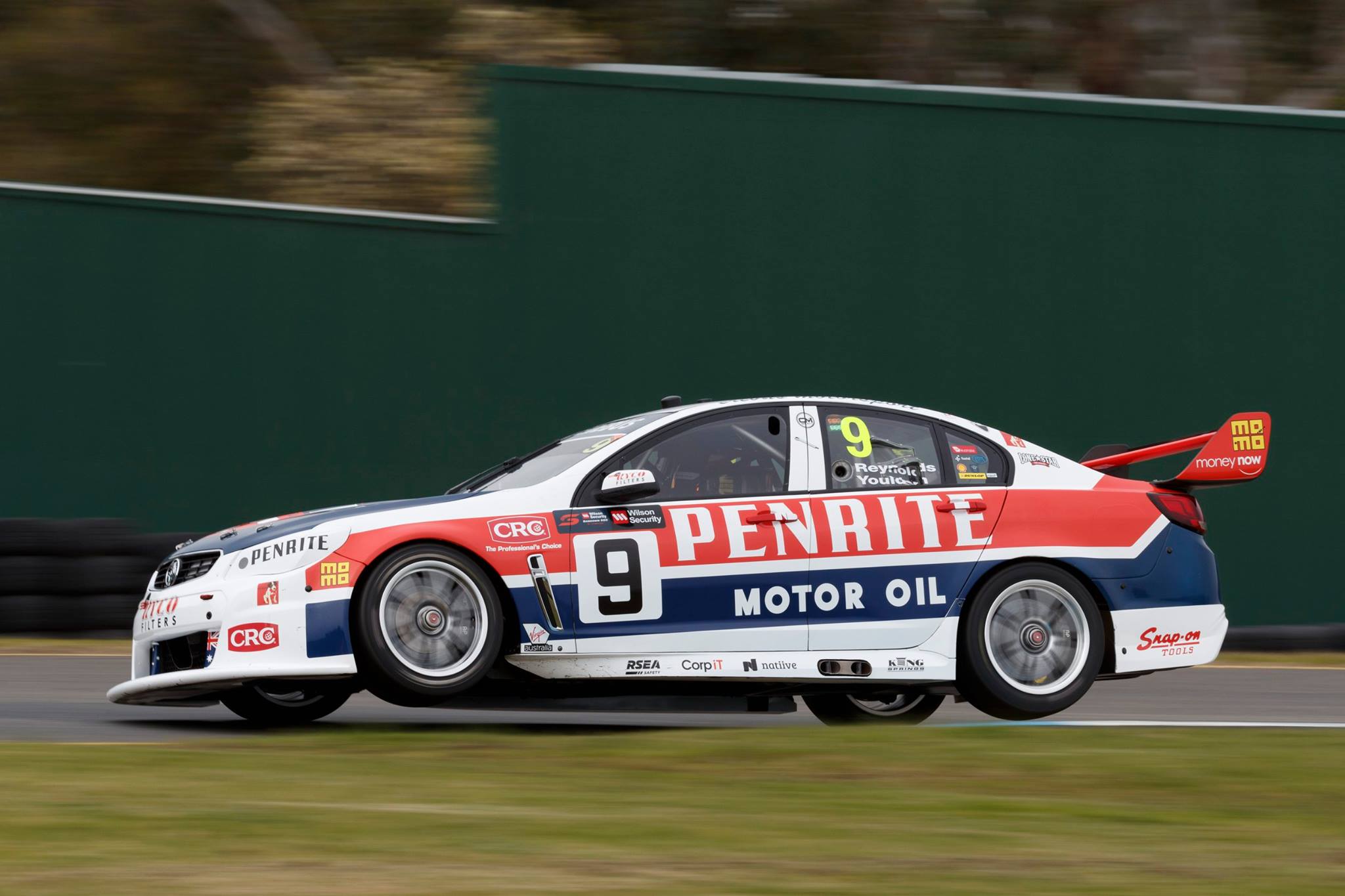
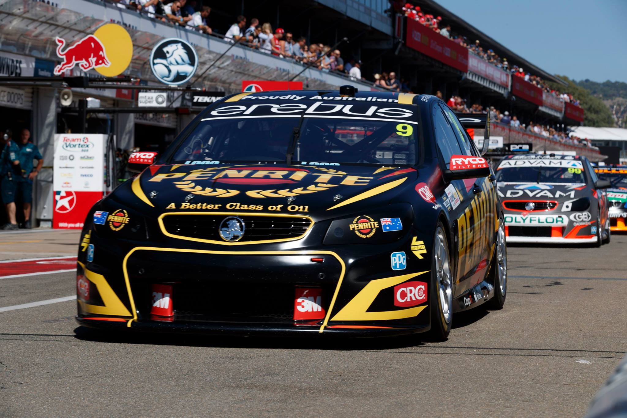
Erebus Motorsport Penrite Racing
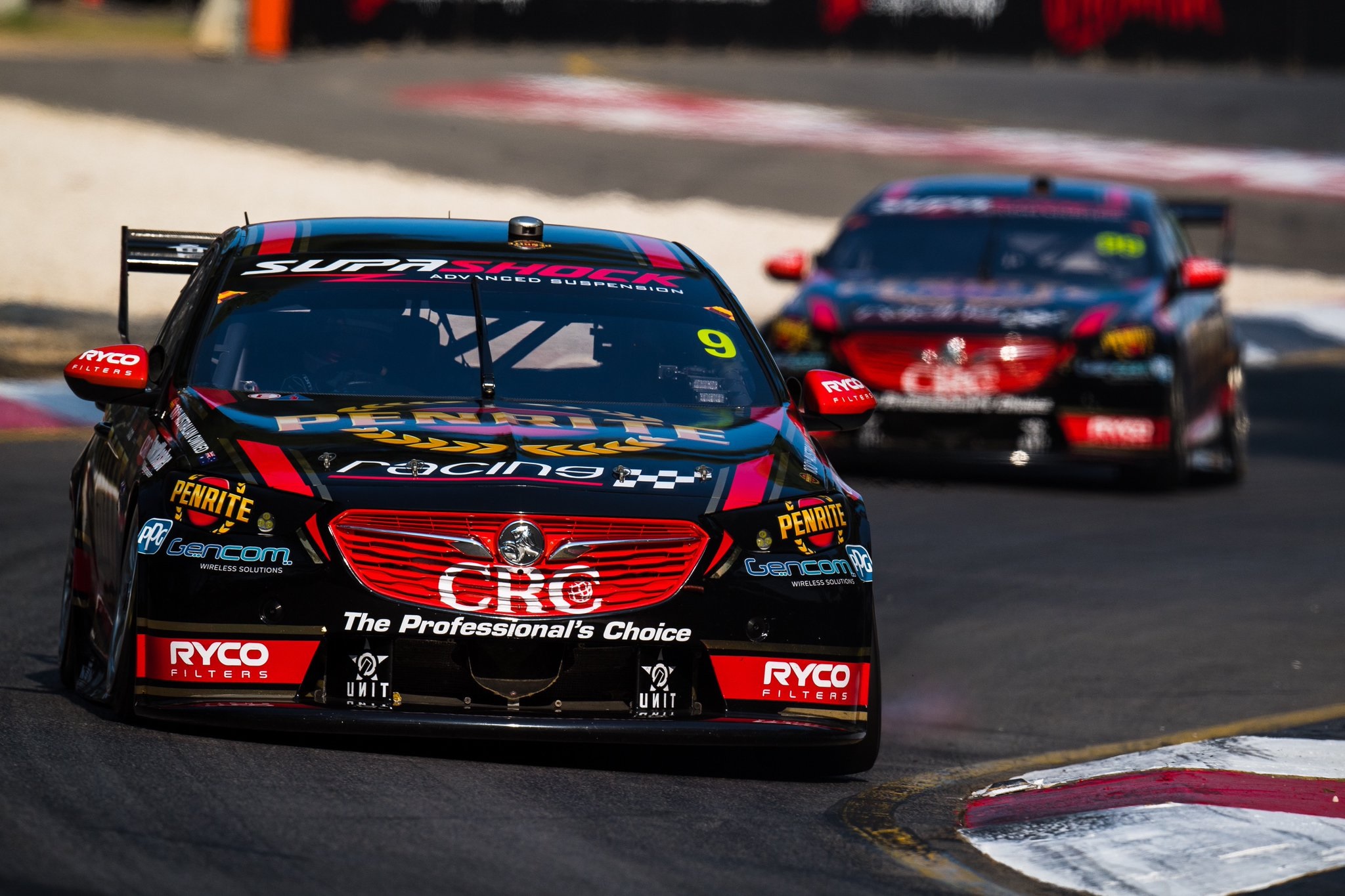
Penrite are back for another year, and back in gloss paint! They’ve also gone for some traditional racing stripes, in this instance thick red, with hyper reflective gold pinstripes. They’re simple, but effective, and are also included on either side of the bonnet and roof.
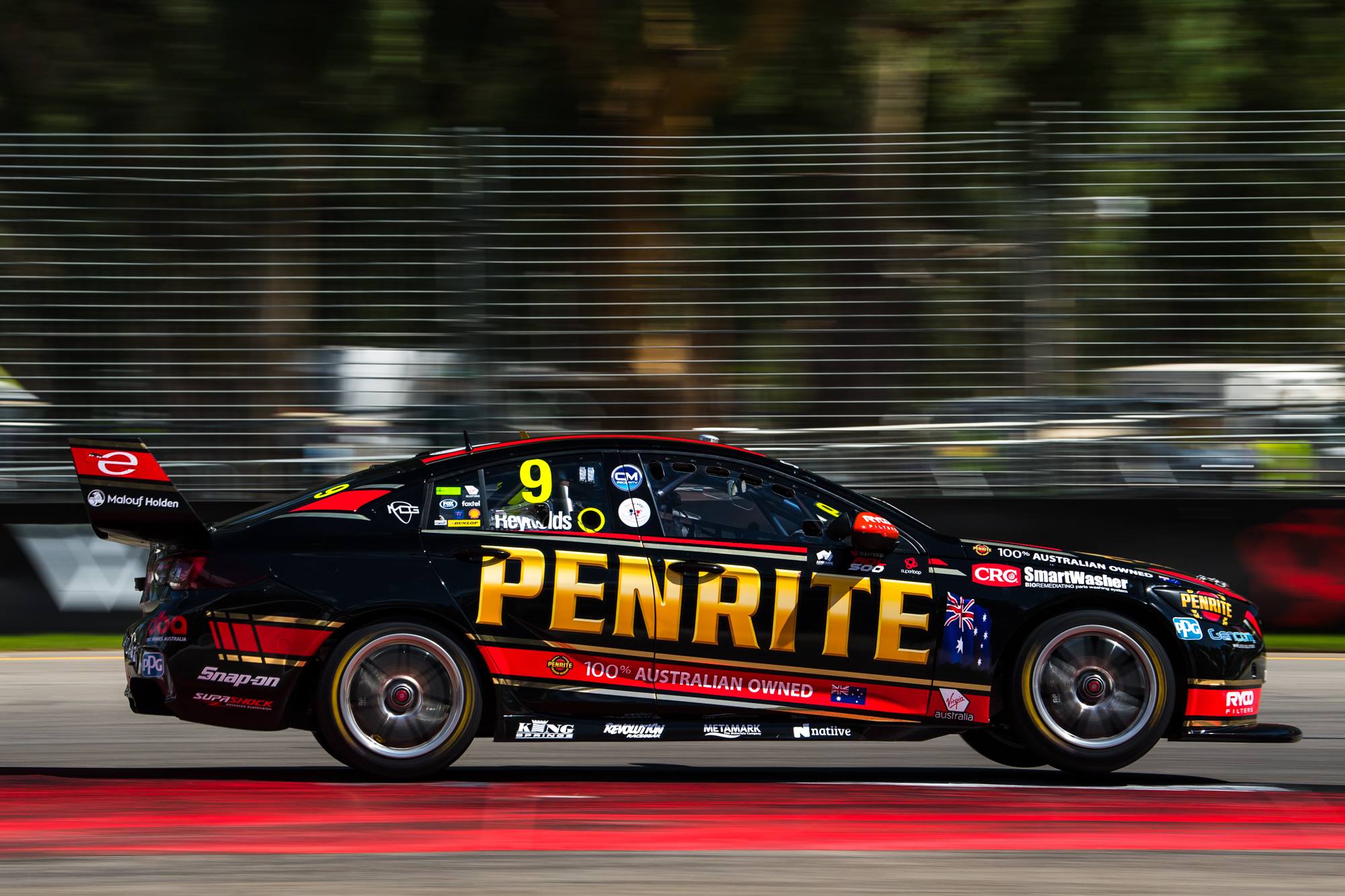
My main issue is with the Penrite logo. The stylised gold looks dated, and would look a lot neater and more modern in a flat gold colour. Further to this, it clashes with the rest of the gold on the car; it may stand out more, but at the expense of non-uniformity. Still a looker and improvement, especially from front on. Super aggressive.
★★★★☆
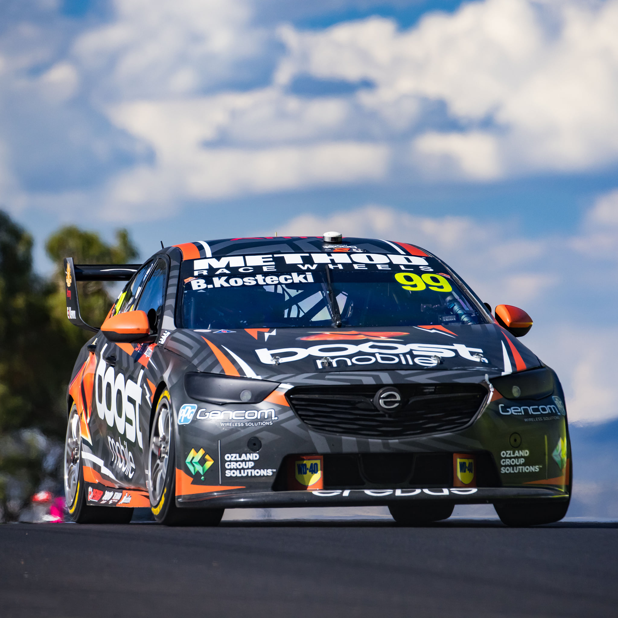
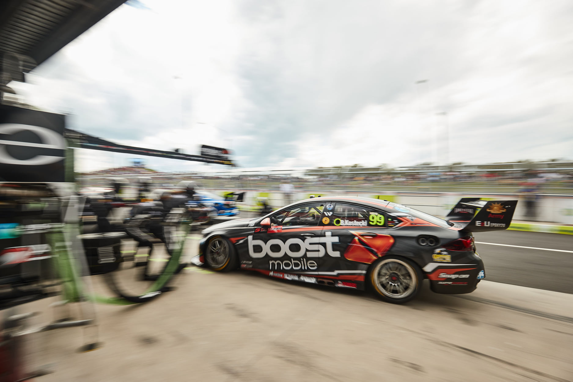
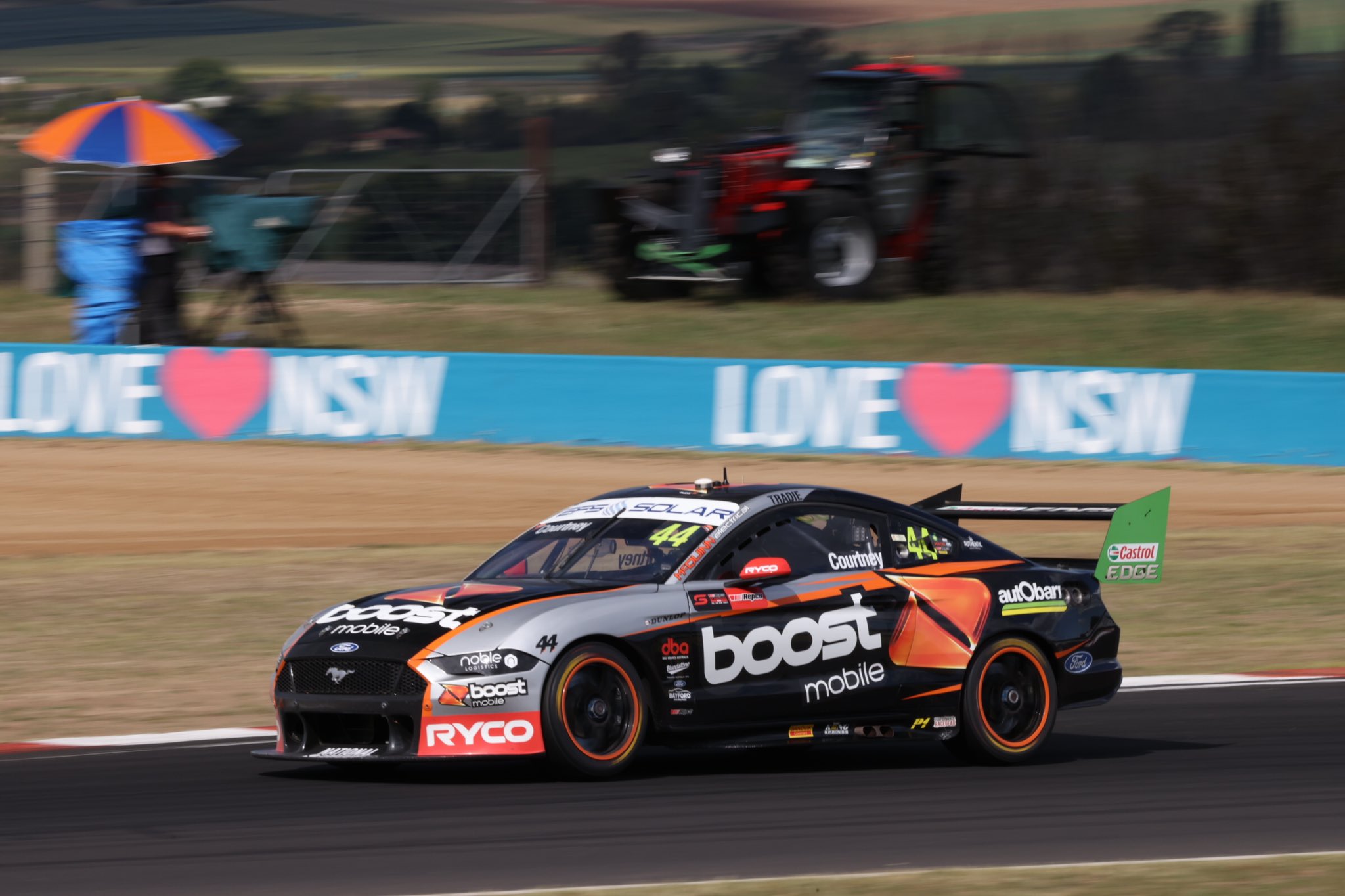
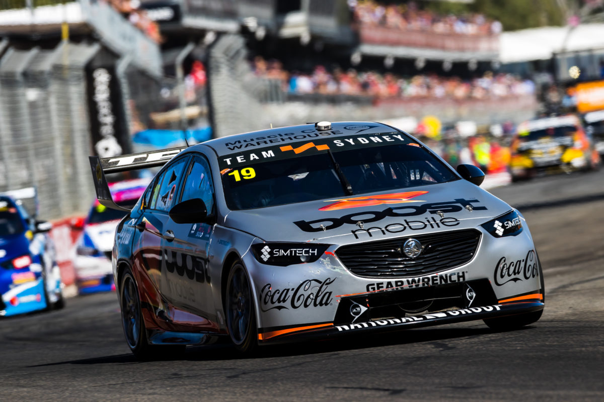
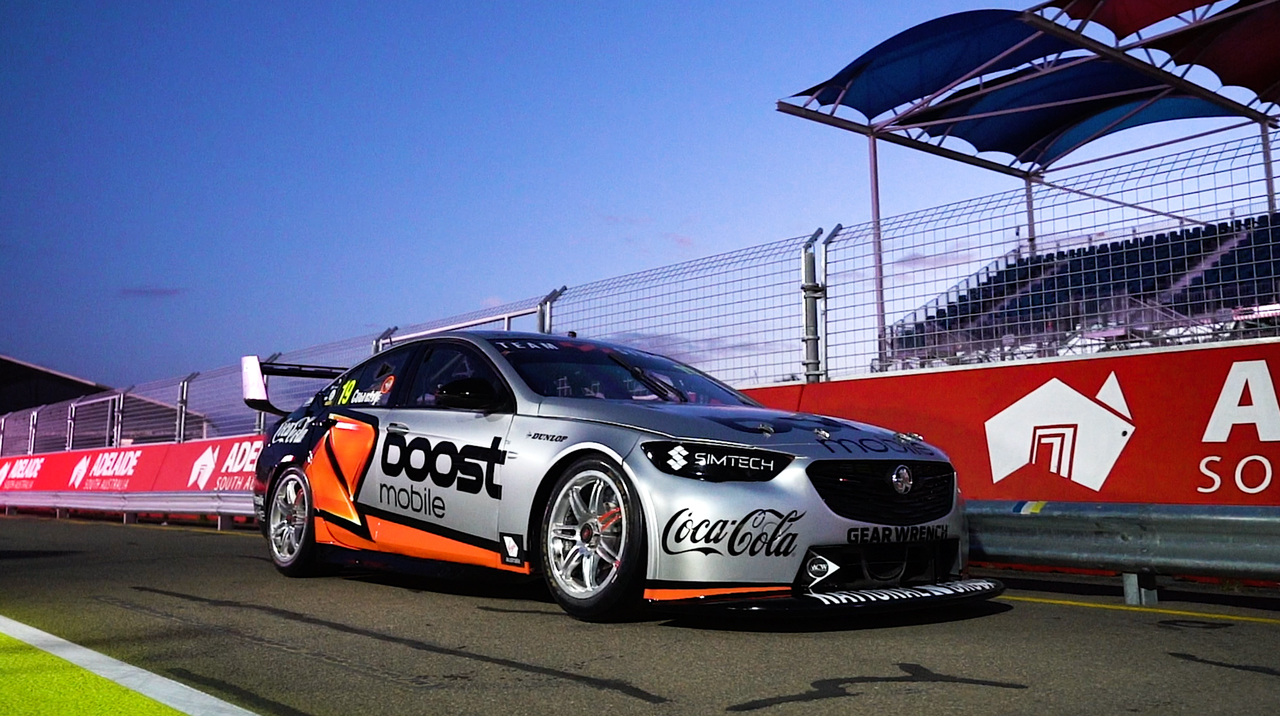
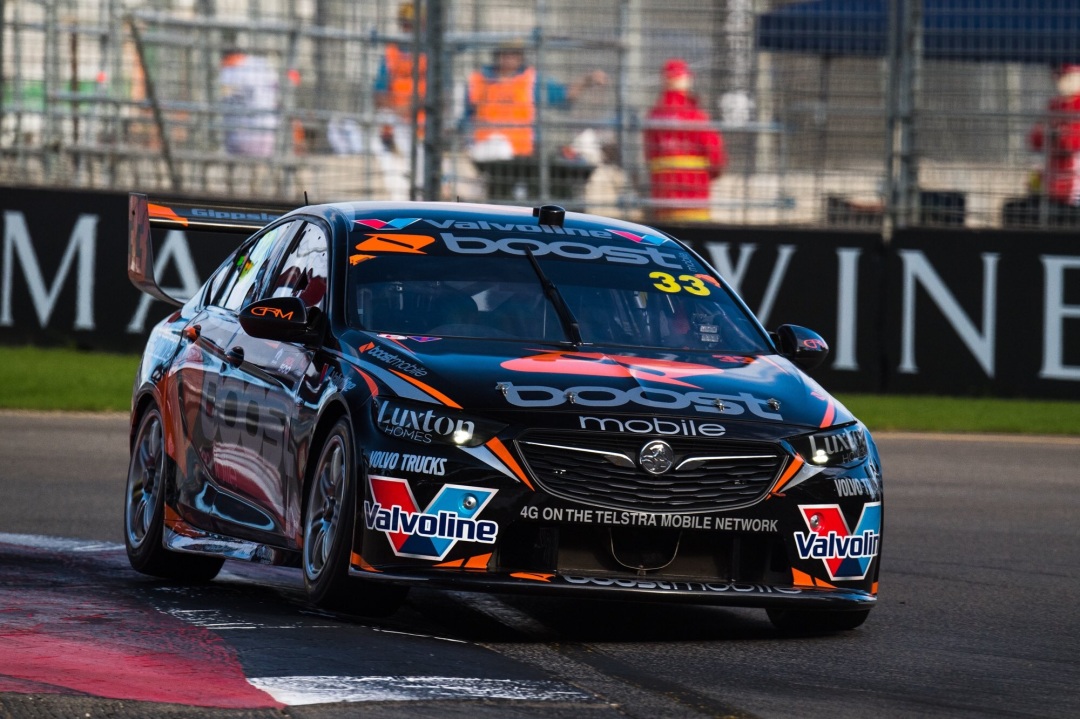
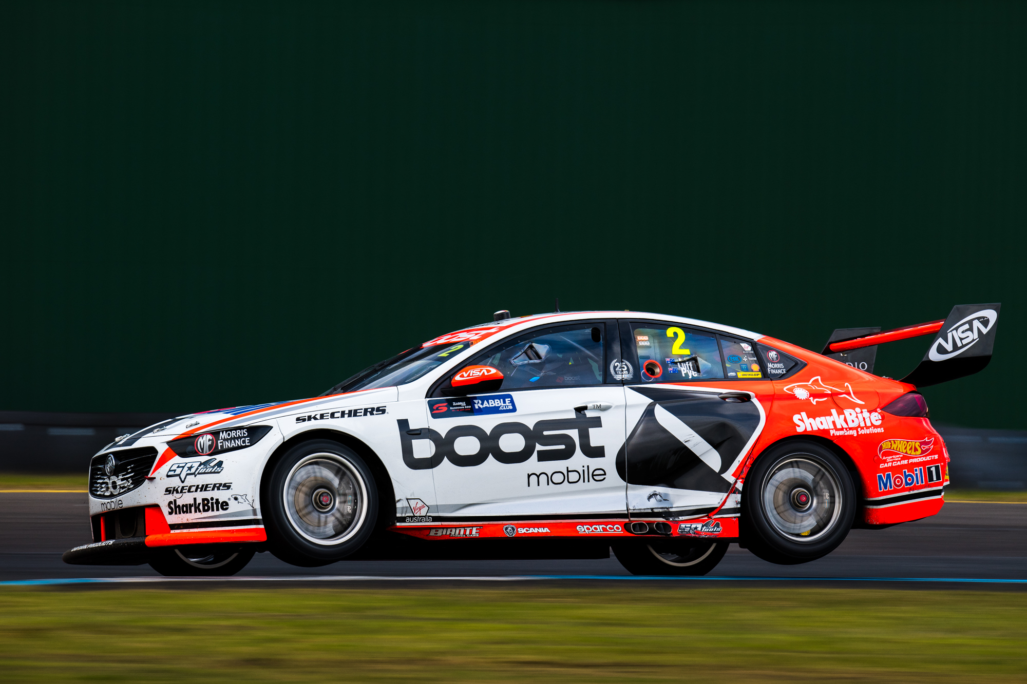
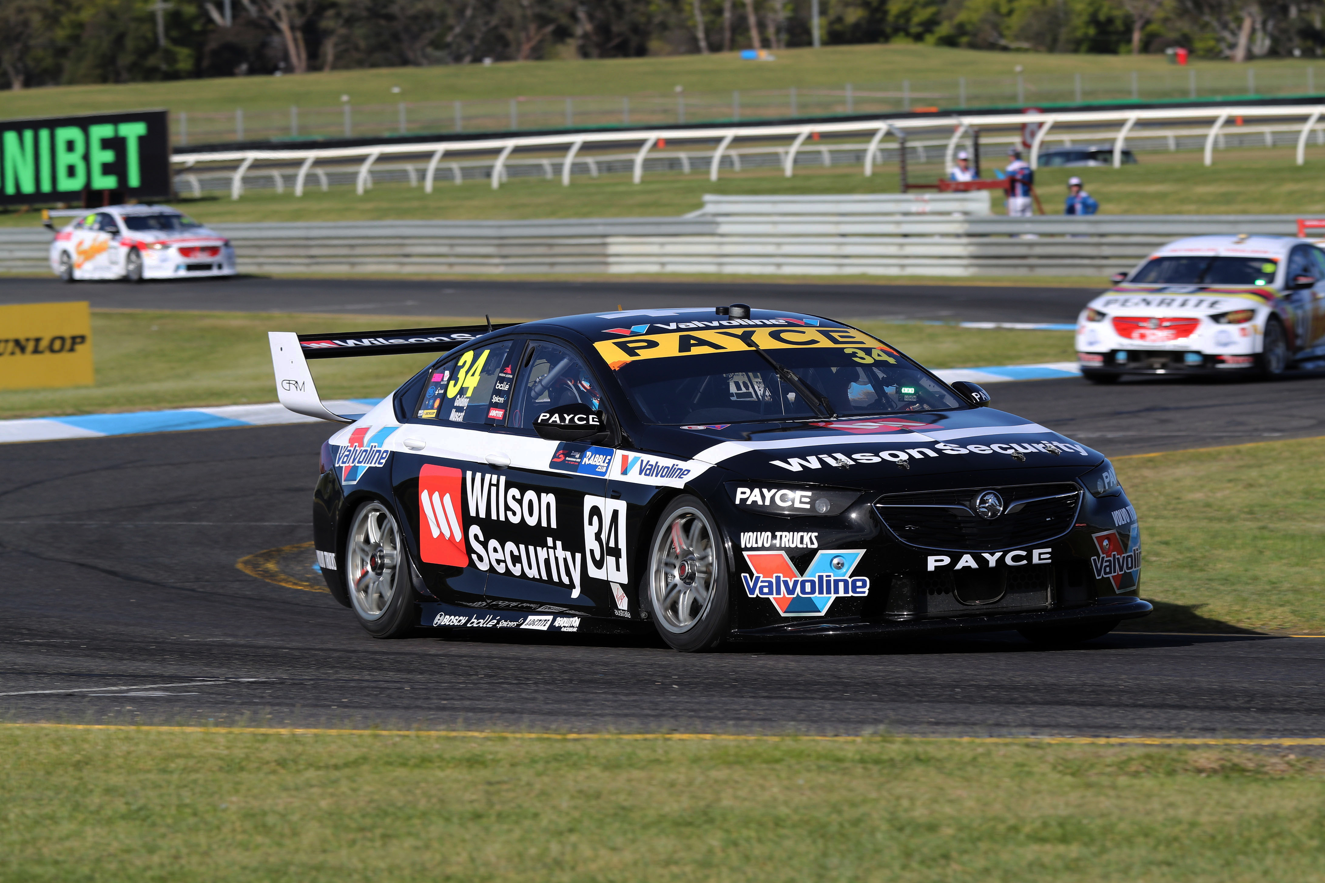
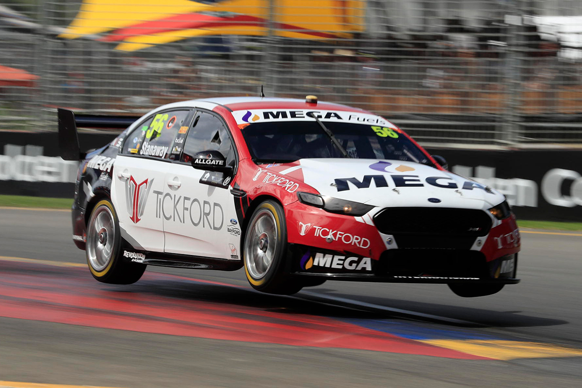
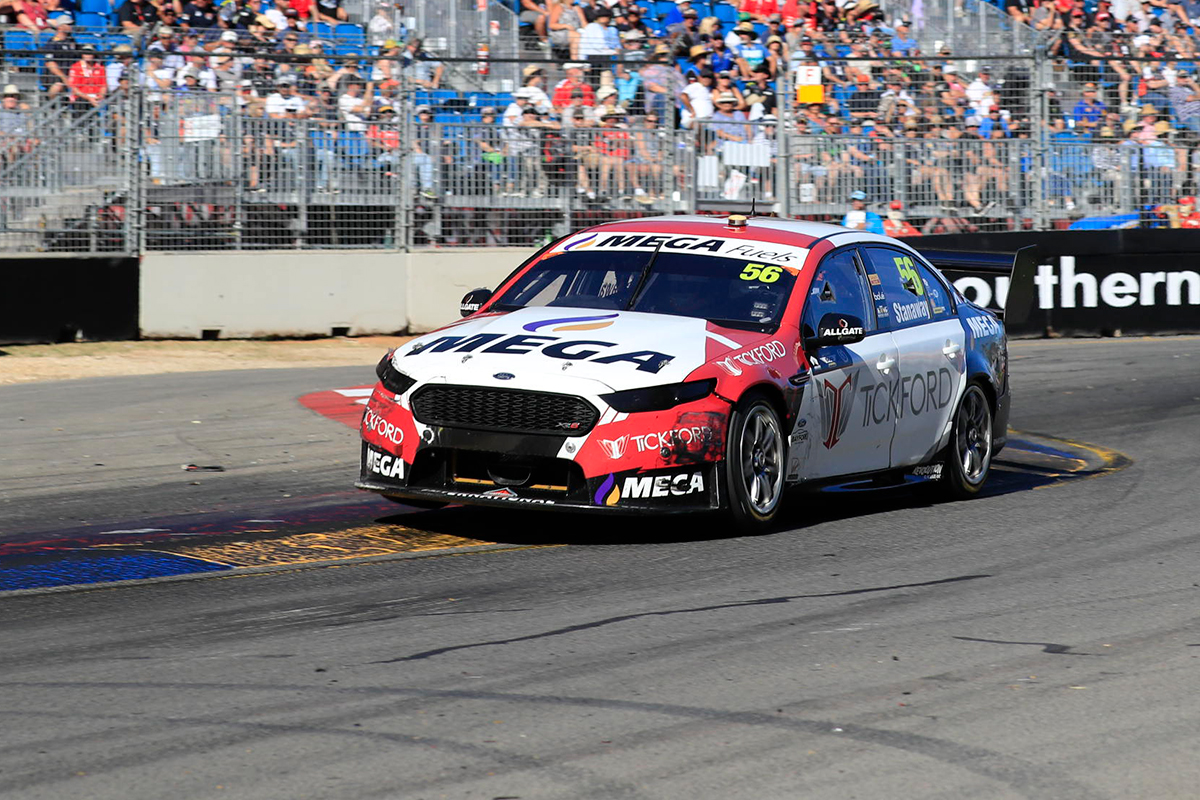
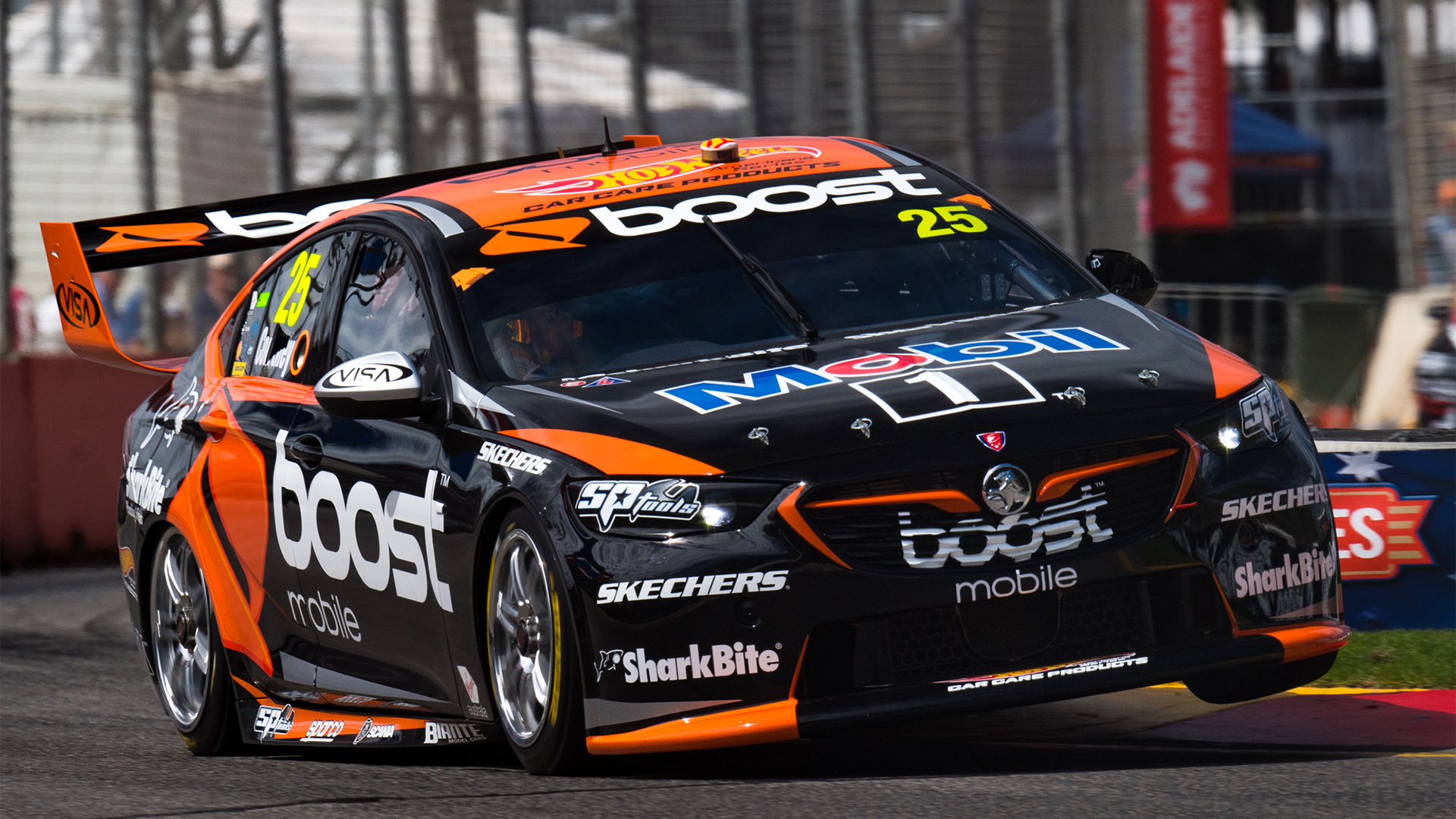
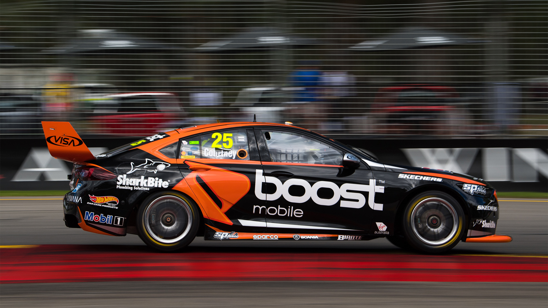
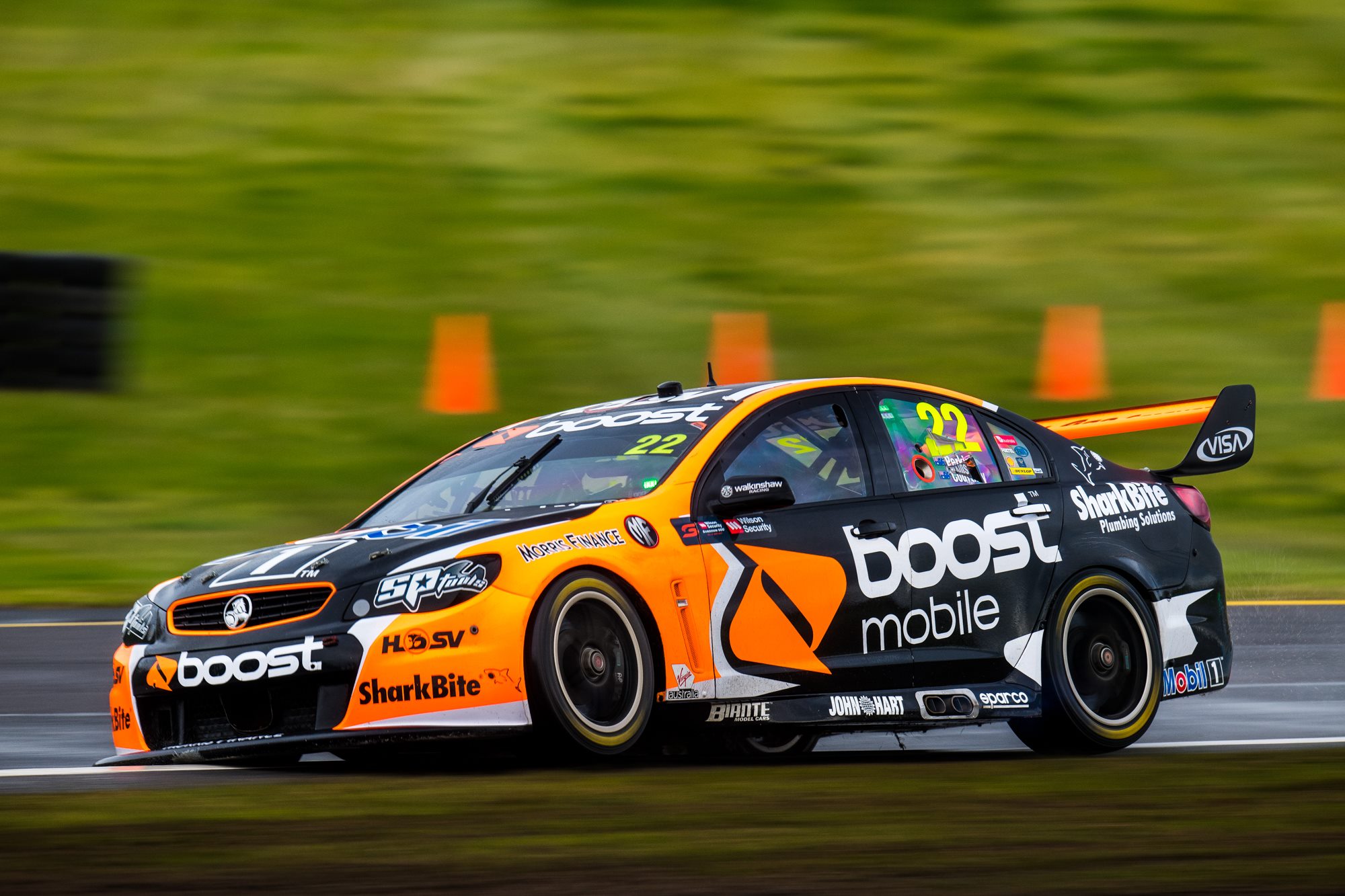
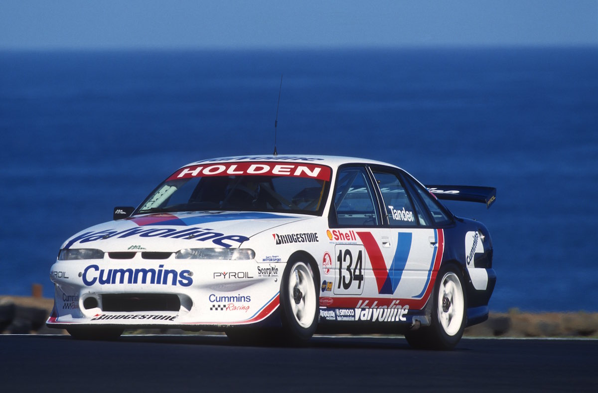
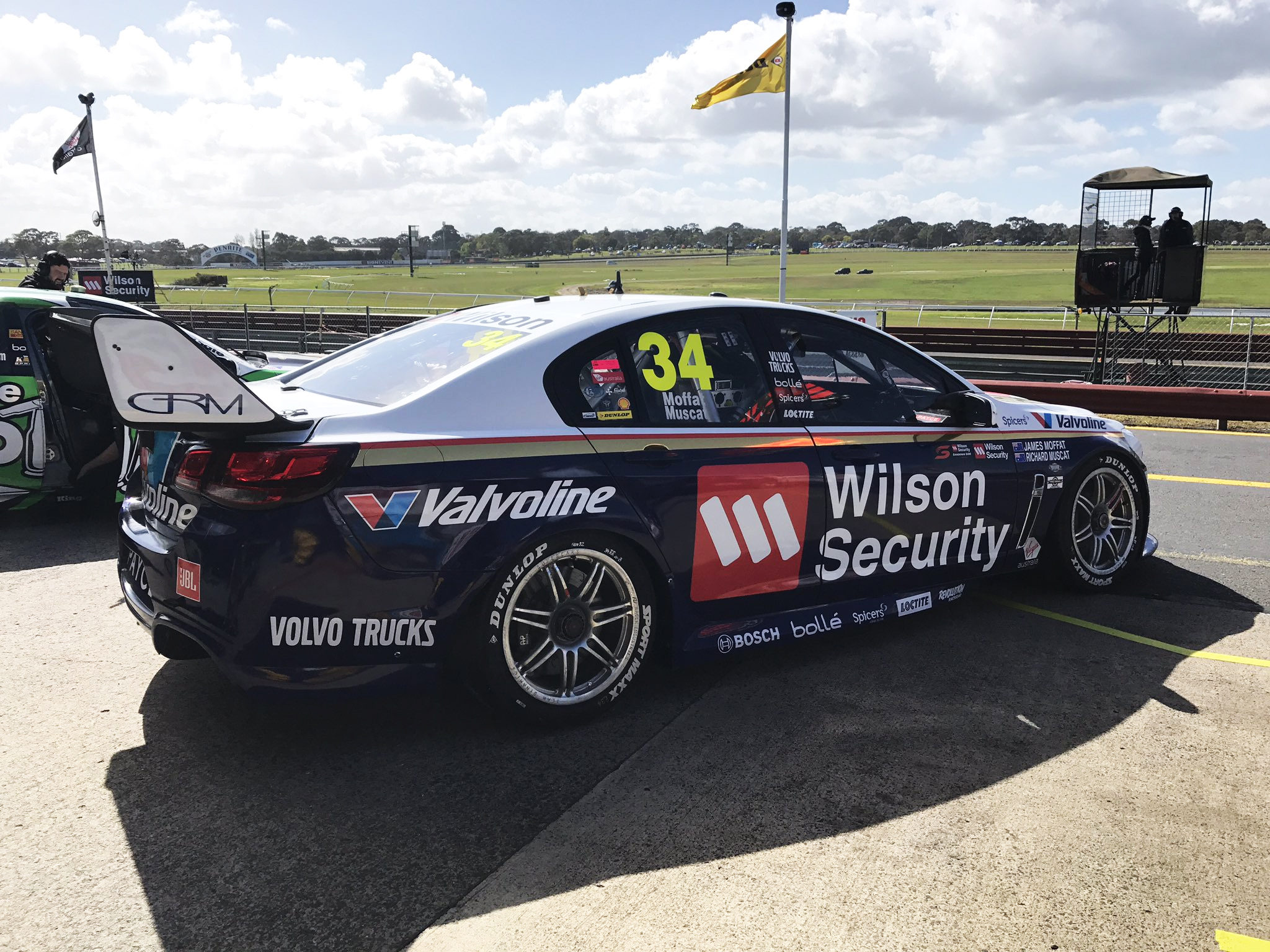
Garry Rogers Motorsport Boost Mobile Racing

It’s a new look GRM. Out with Tander and Wilson, in with Stanaway and Boost Mobile. It’s a sleek black and orange design, understandably very similar to last year’s WAU livery. There’s a bit more silver to this one which is slightly to it’s detriment, as orange worked well to contrast the black in larger sections last year.
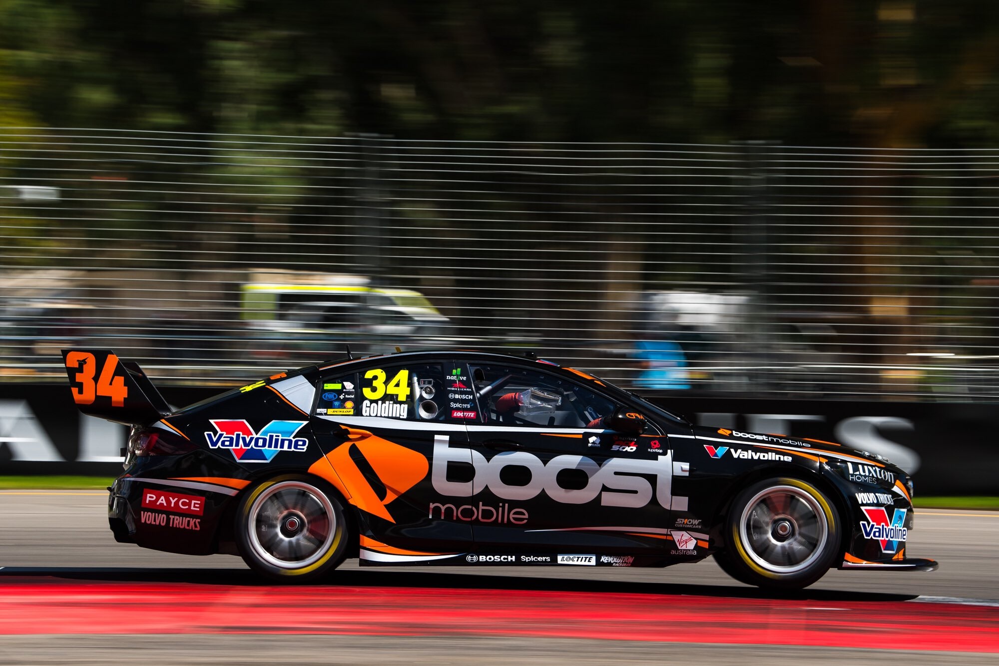
There’s a bit of a Coca Cola vibe at the bottom of the side, and wish the top lines were split as evenly between the two colours as the bottom, but that’s probably just nitpicking. The deeper I look into it the less I like it (look at the chopped off rear wing number…), so I’ll keep it a distance. Looks lovely from there.
★★★★☆
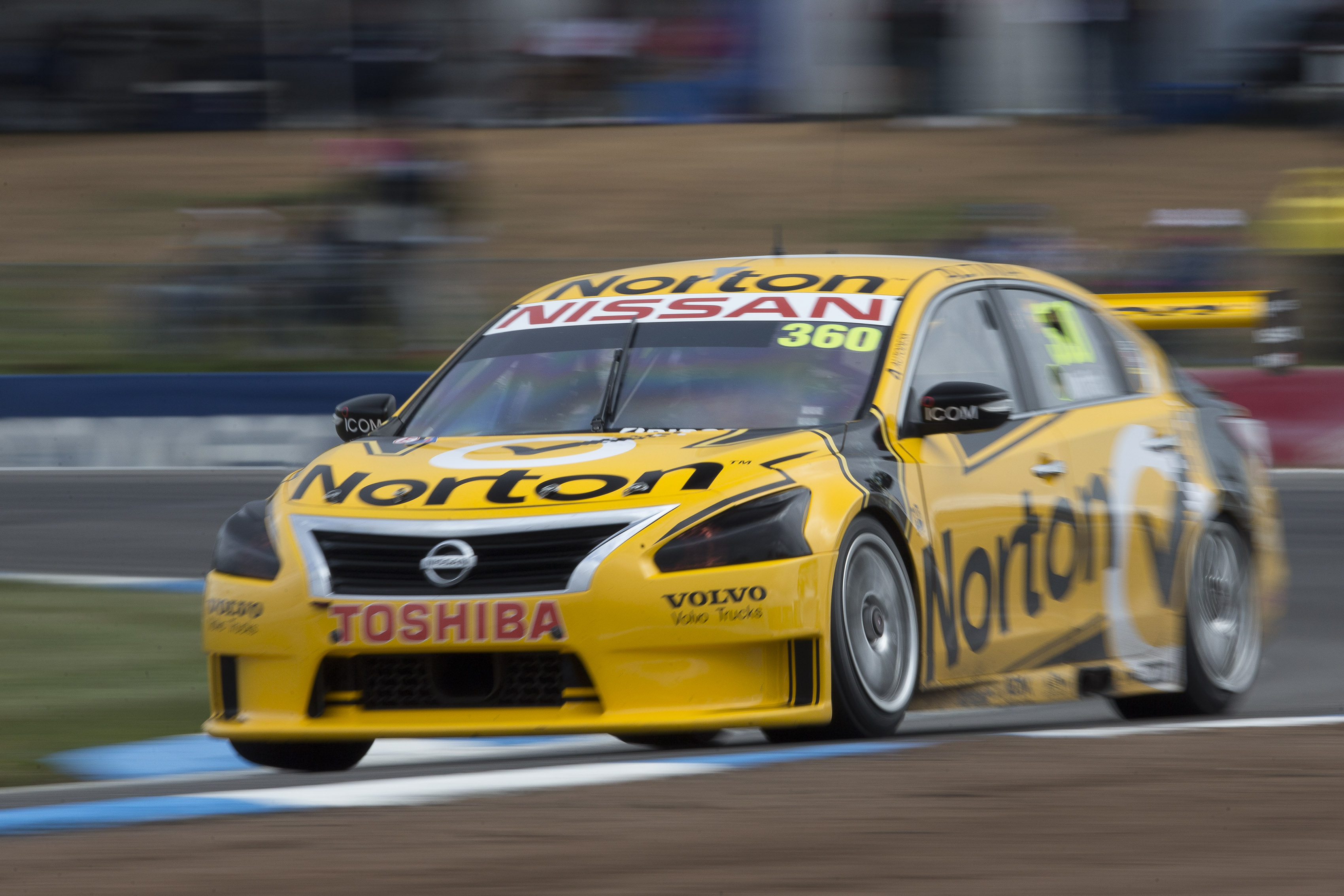
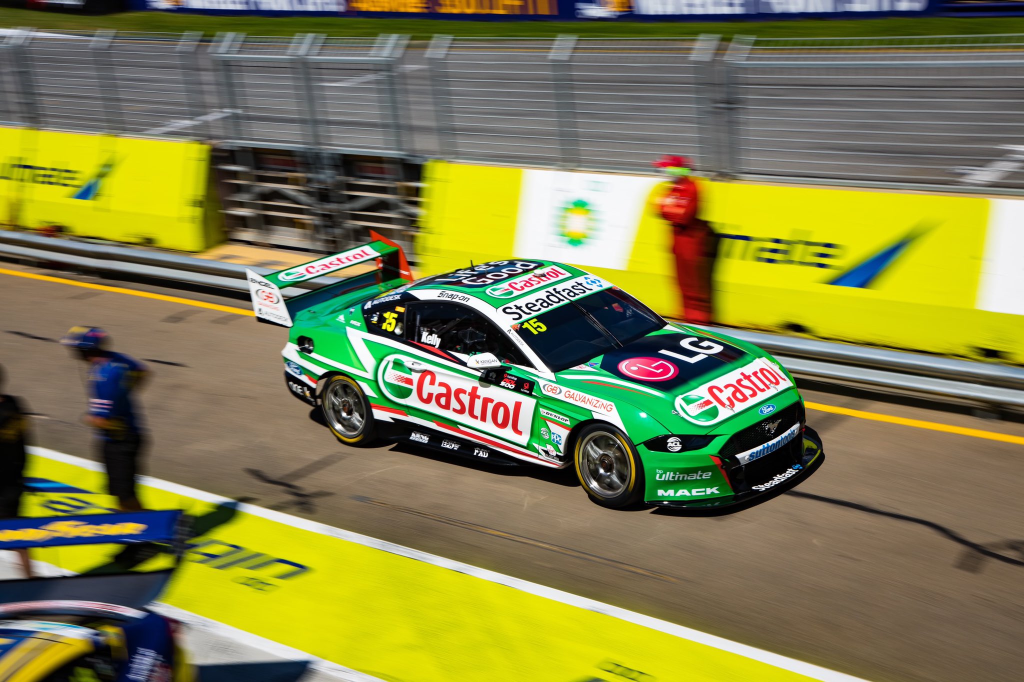
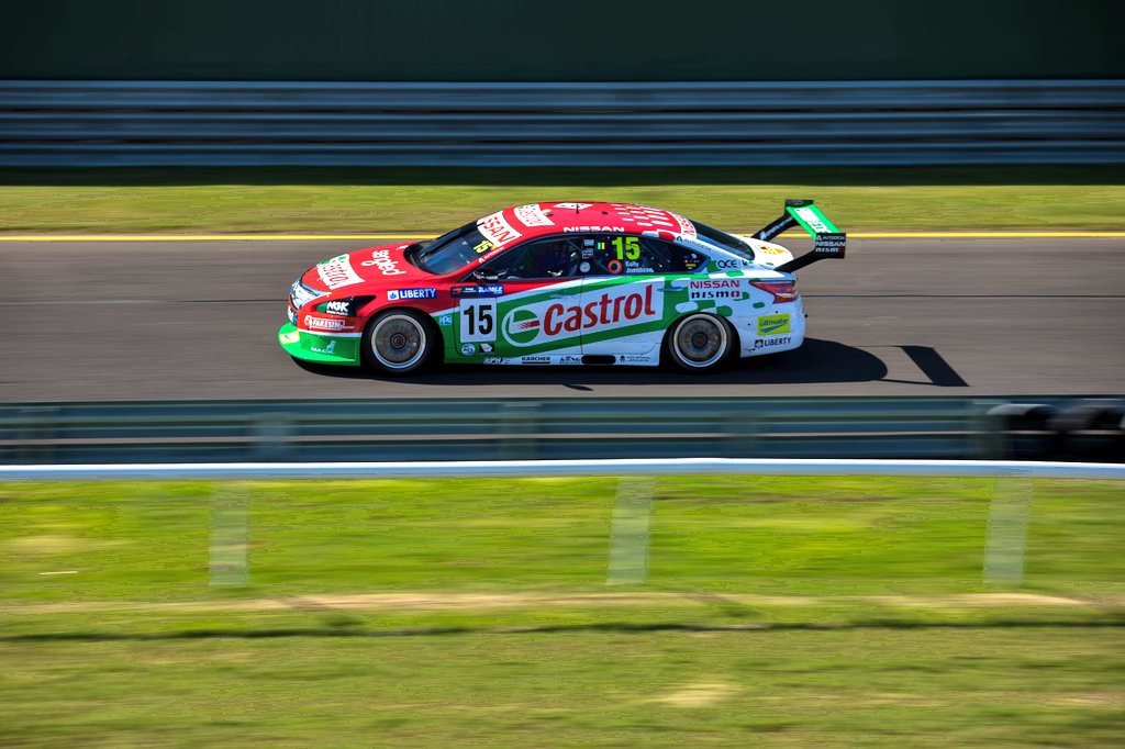
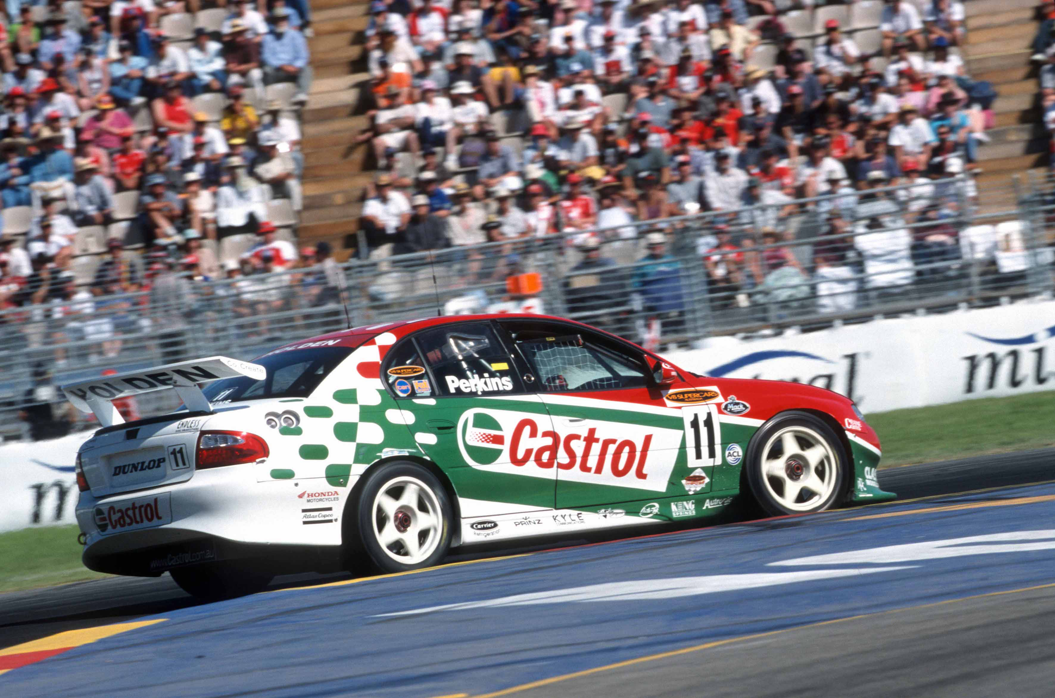
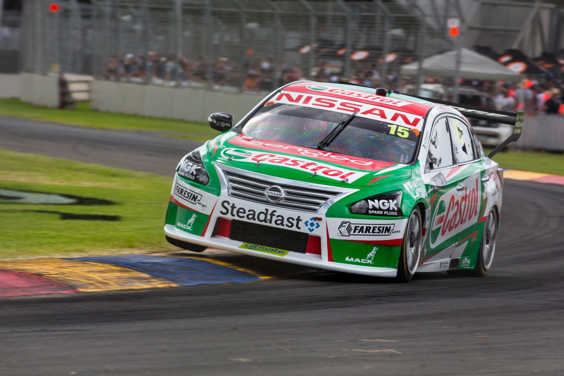
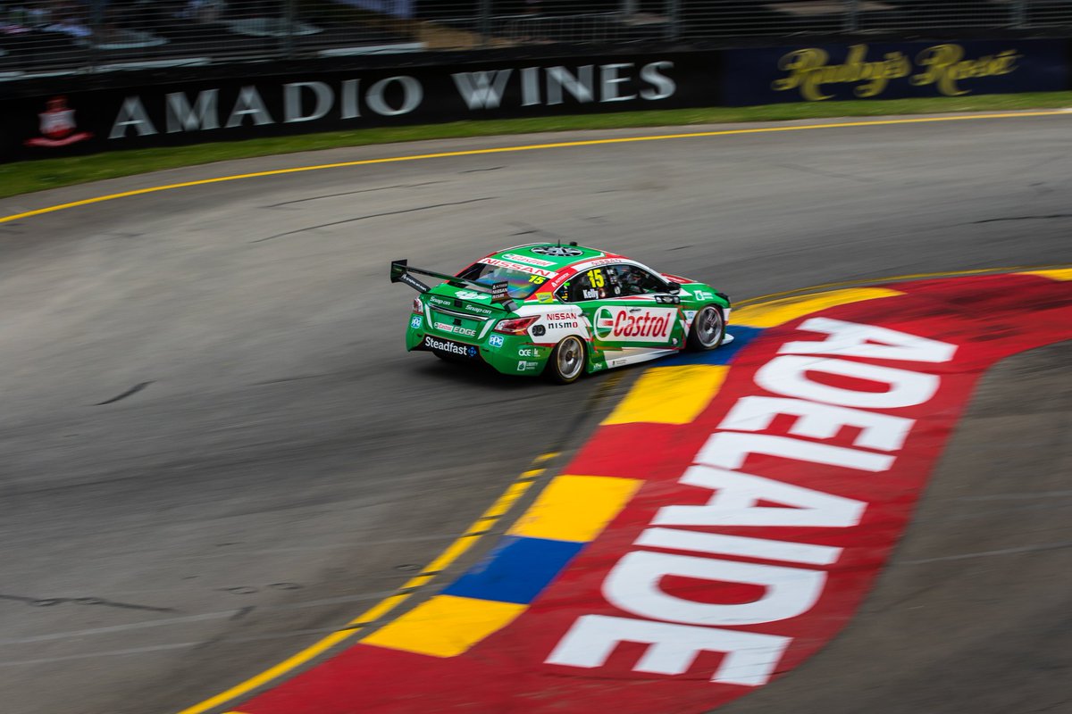
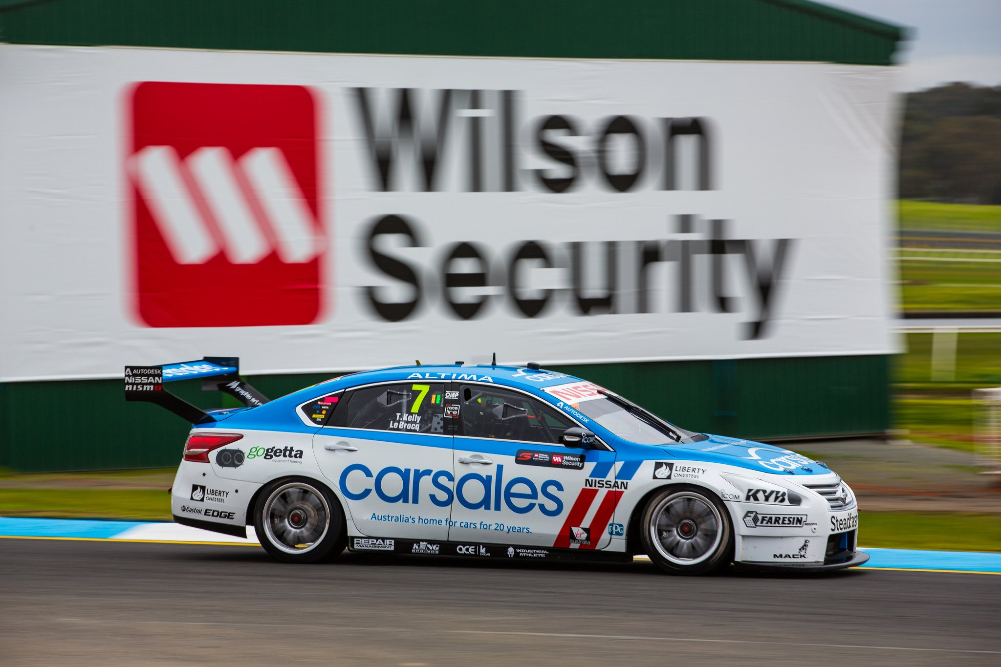
Kelly Racing Castrol Racing
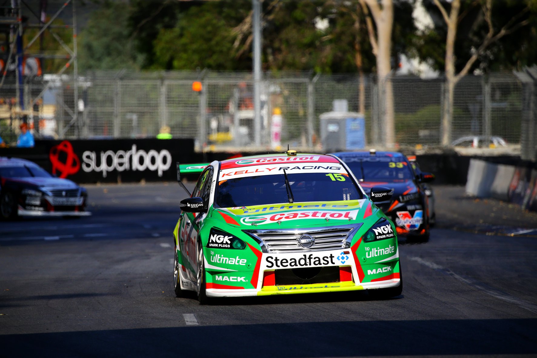
The Kelly Racing liveries seem to have minor changes year on year, but the overall ethos is consistent – sharp, jagged edges with flashes of the third colour. It’s a decent look, but gives the team an identity.
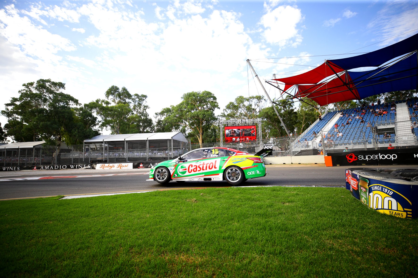
Therefore, there’s not a whole heap to comment on as it’s like they’re putting in values and pressing randomise on a livery generator, apart from the fact that BP Ultimate lime green is hideously jarring against the Castrol green. We’ve seen a similar issue with Castrol in the past, especially on the FPR/Prodrive blue liveries, but here it’s just gross. Derails the livery.
★★
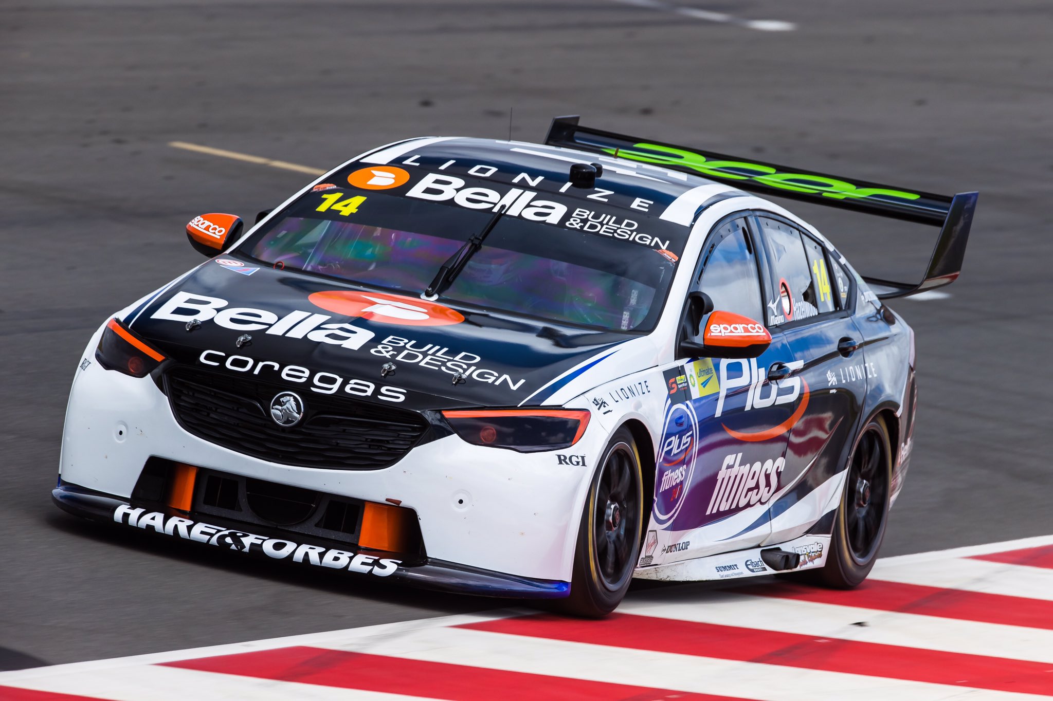
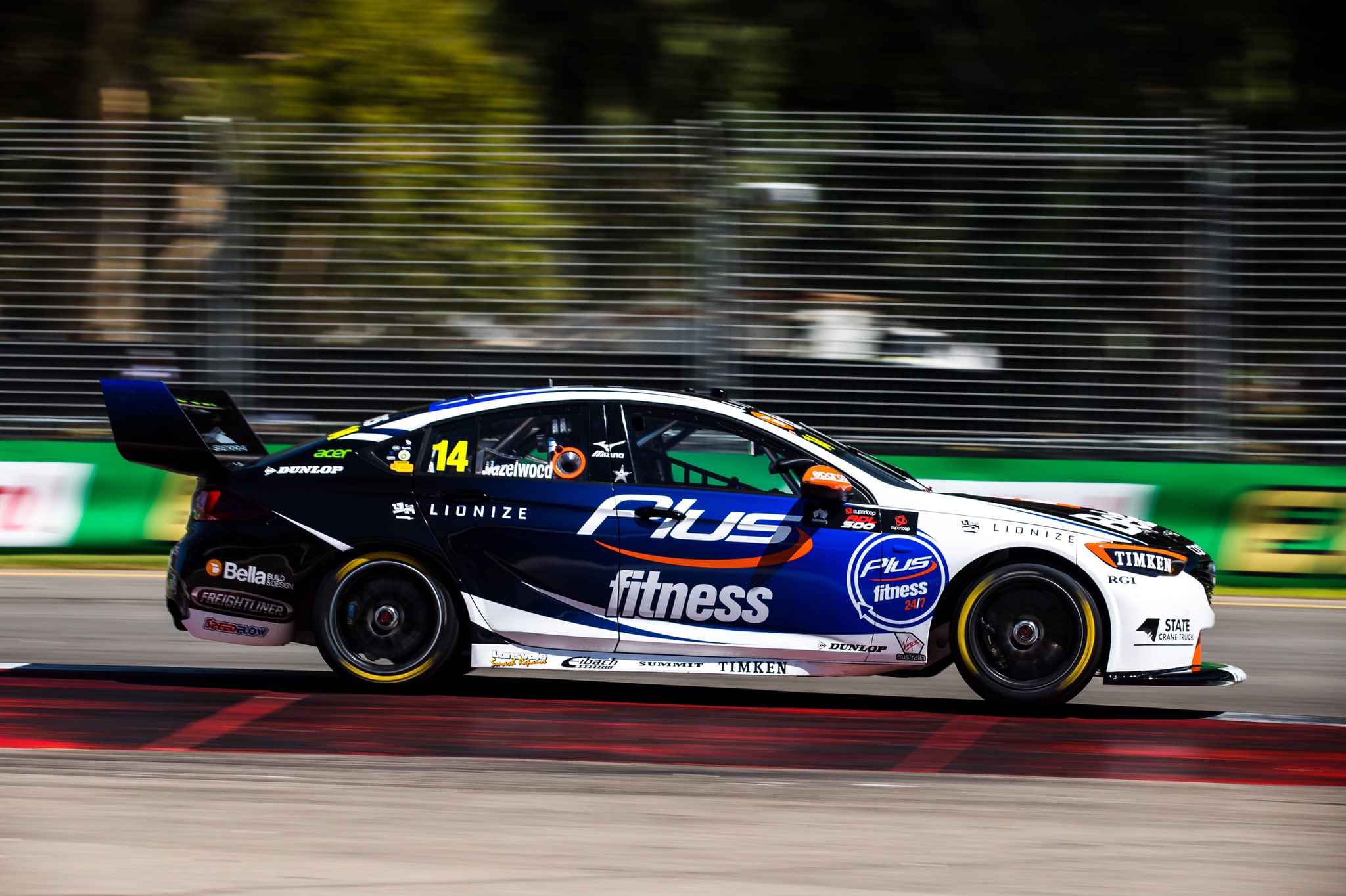
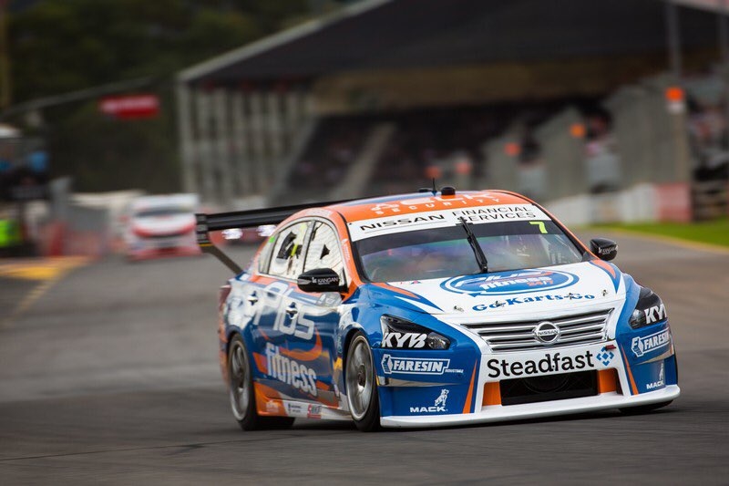
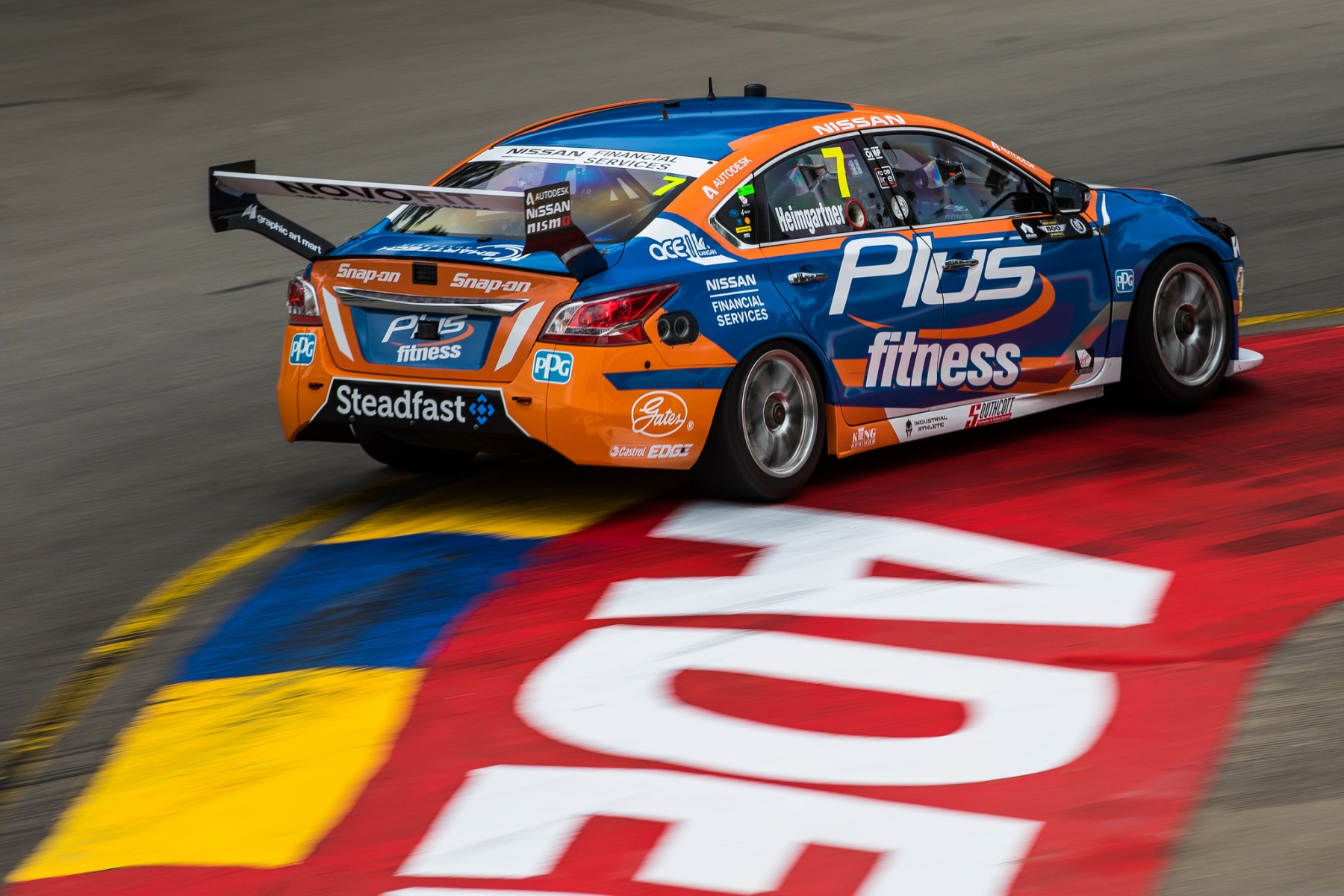
Kelly Racing Plus Fitness Racing
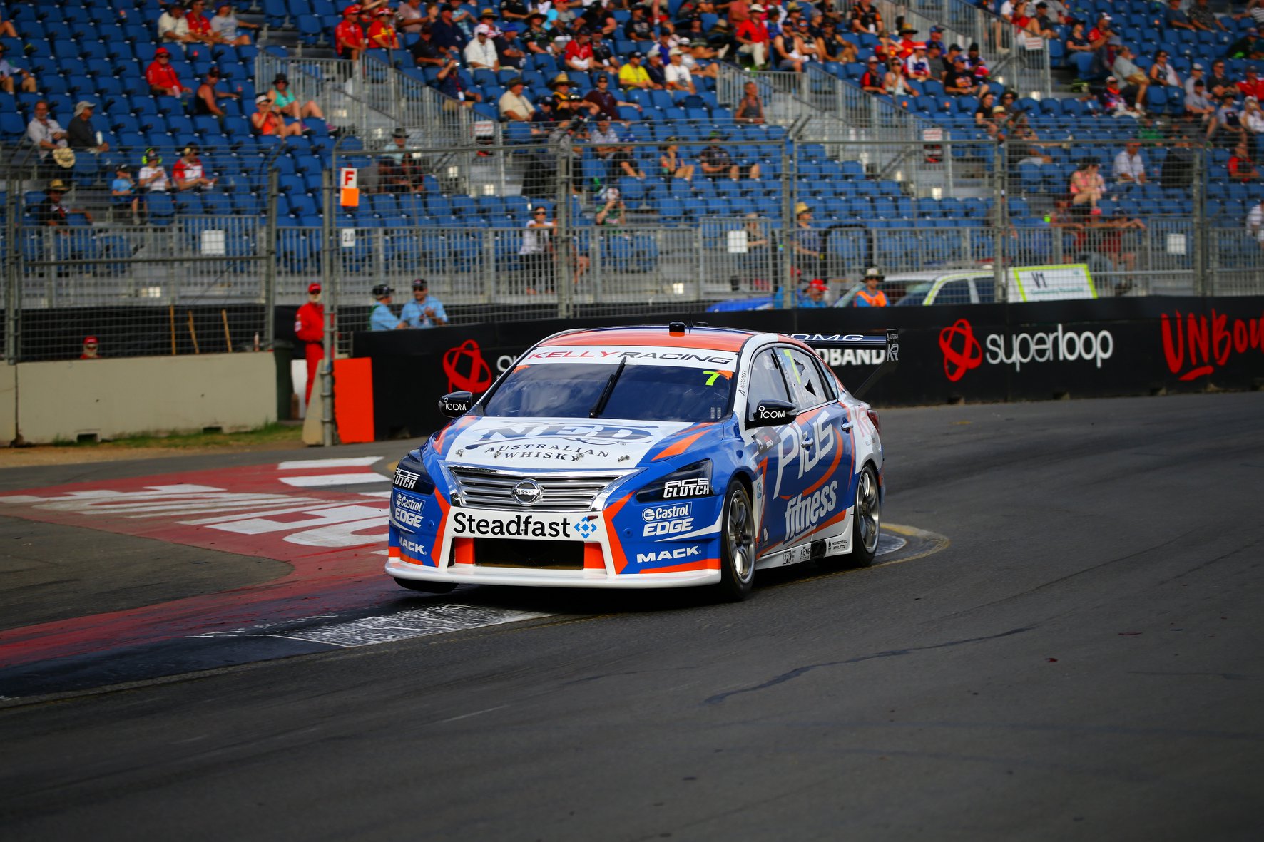
As above, it’s the same design, but without the BP Ultimate problem. I thought it looked better with more blue and more orange last season, and the layout was also stronger in 2018.
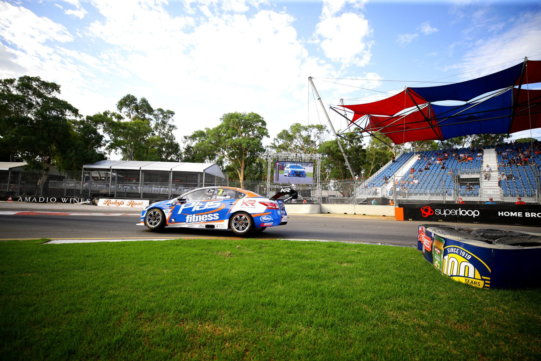
I also like the slightly metallic and darker blue used last year. It’s worse in almost every way, but not significantly so, and certainly isn’t ugly, just closer to middle of the road.
★★★
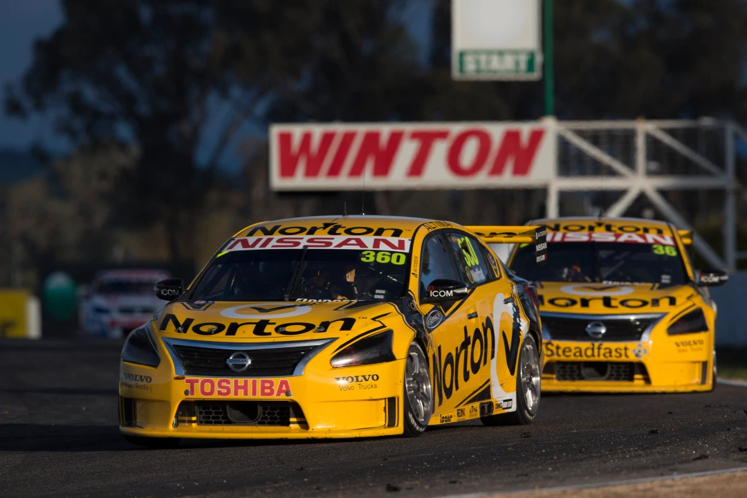
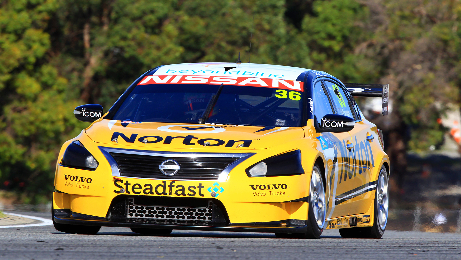
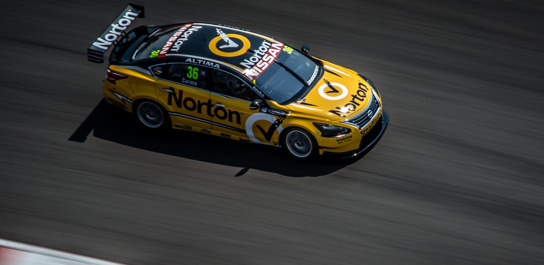
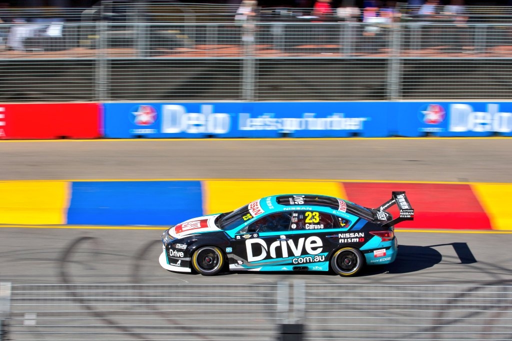
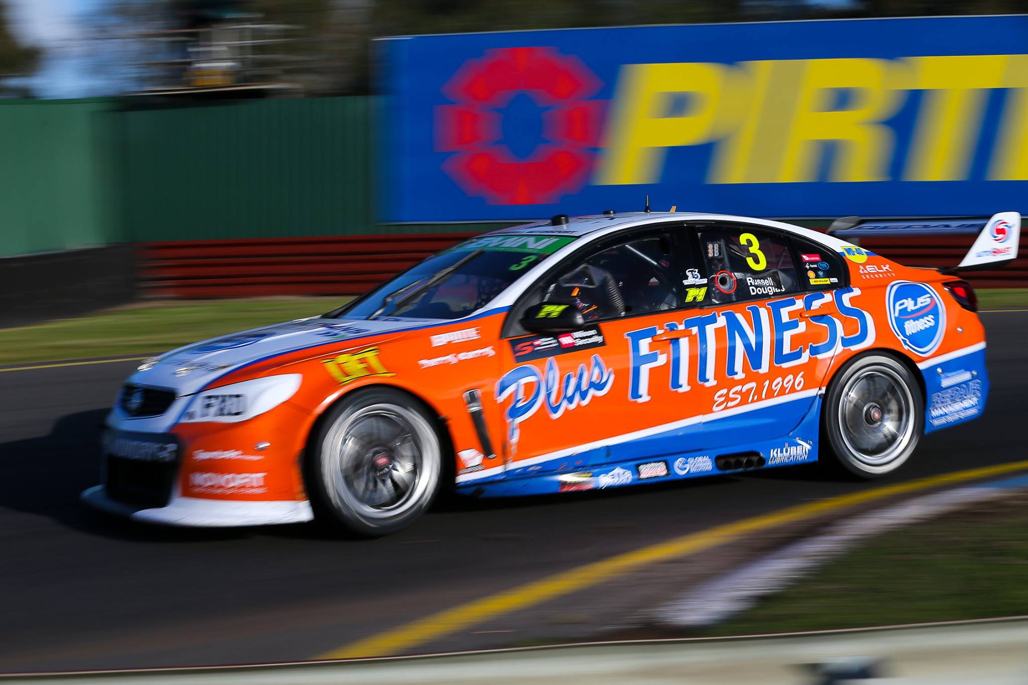
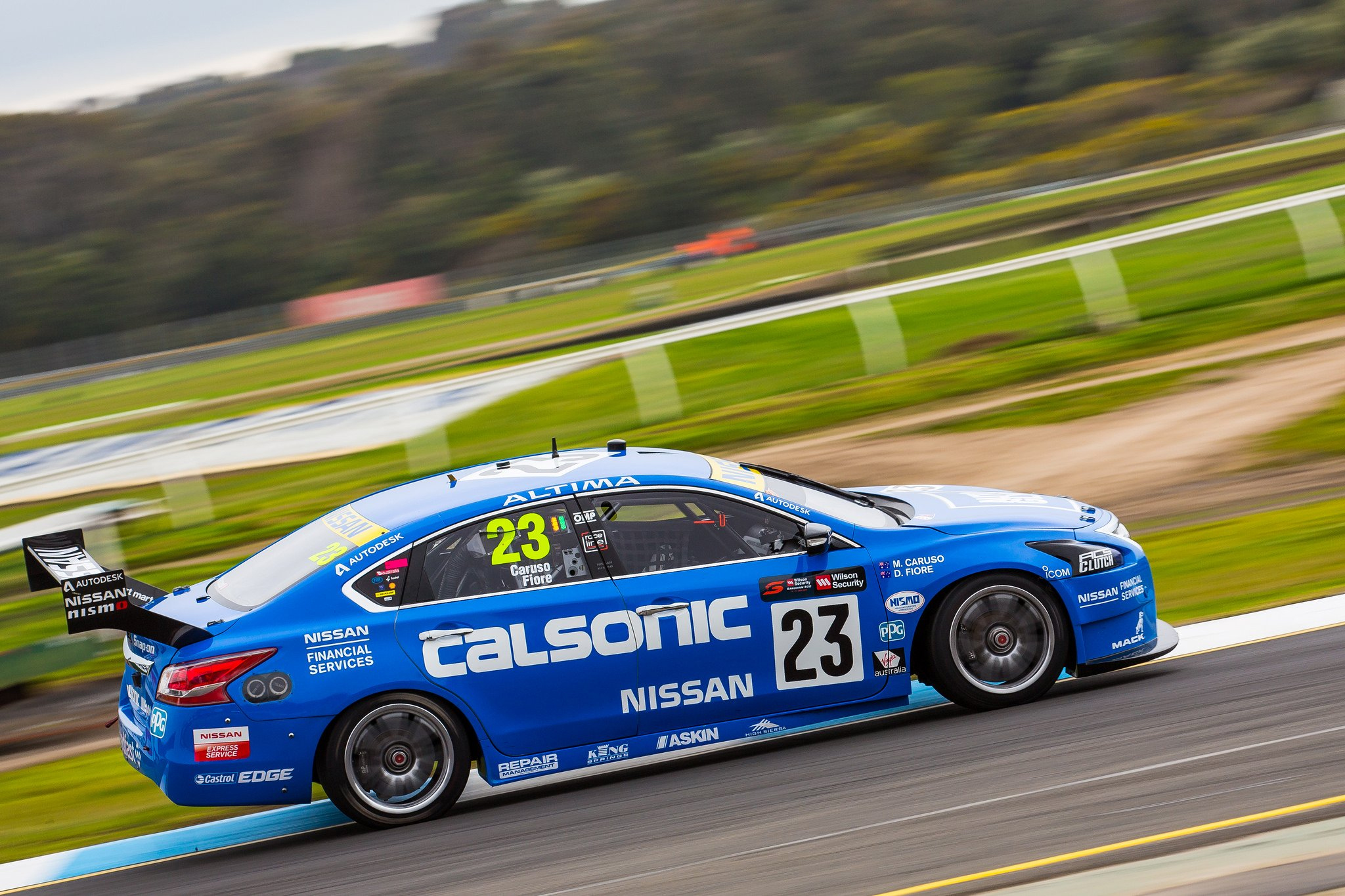
Kelly Racing RABBLE.club Racing
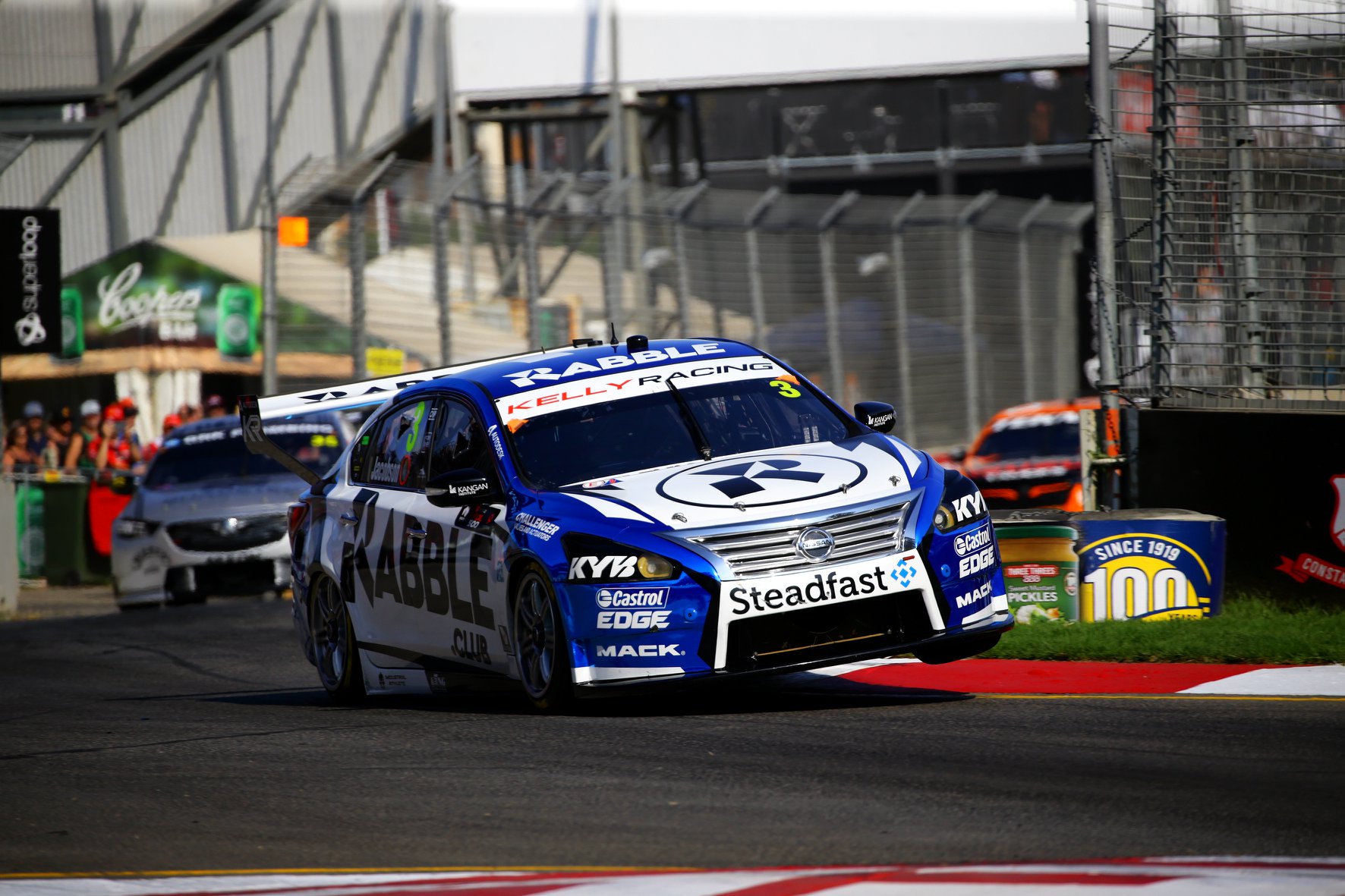
Garry Jacobsen has entered the championship this year, sadly in place of Michael Caruso, who has signed for Tickford for the enduros. Joining Garry on the #3 car is RABBLE.club, which I finally took the time to research. Turns out it’s a ‘digital health & wellness club’, with a fairly shoddy website featuring a poorly designed tiled background, and a promo video of their Falcon livery. All this aside, they’ve made a fairly good effort of painting the Altima.
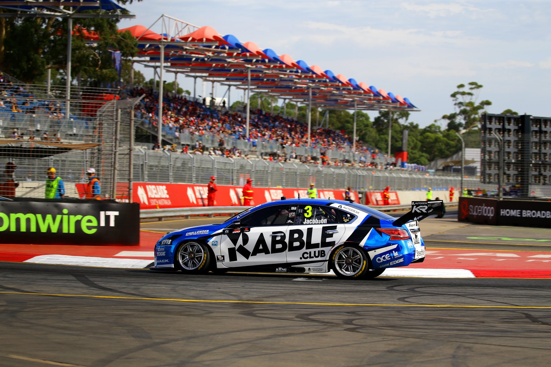
It looks a lot more like last year’s Nissan design, with the large white portion on the side. The jagged edges look a lot better in thicker sections here compared to the other two liveries above. The reflective blue looks great alongside the white and black, and is overall a far more cohesive livery than the other Altimas.
★★★★
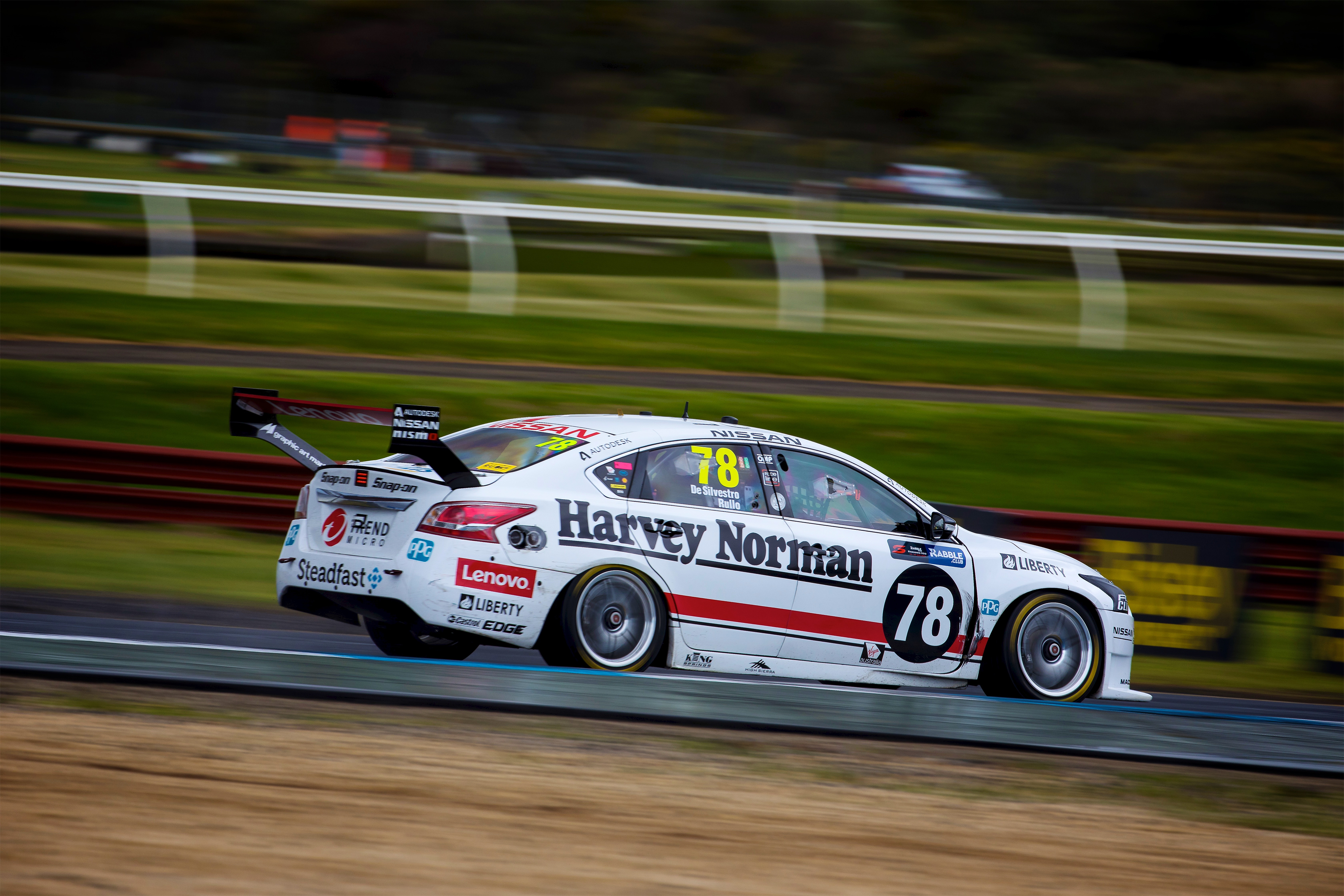
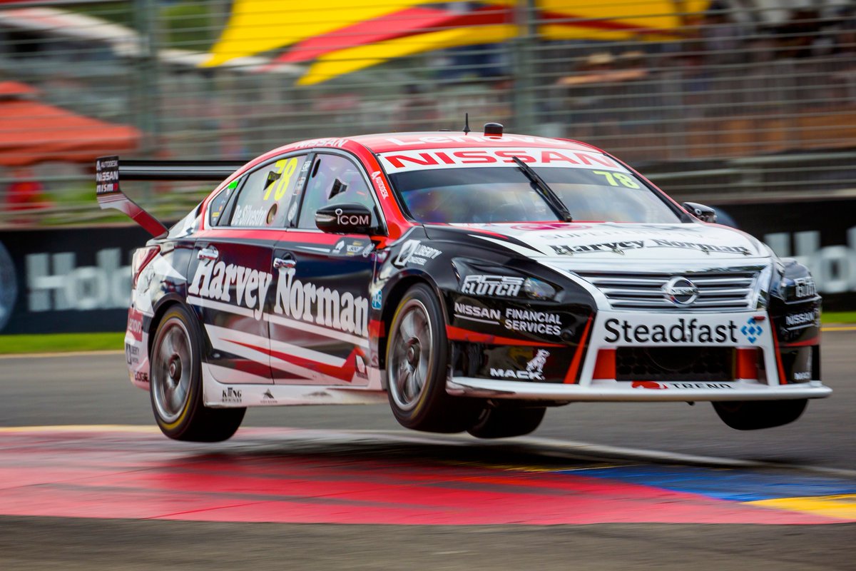
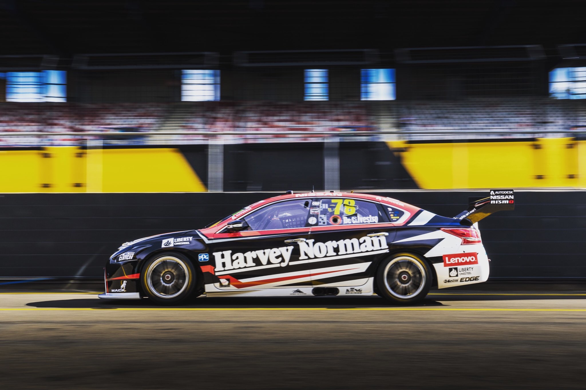
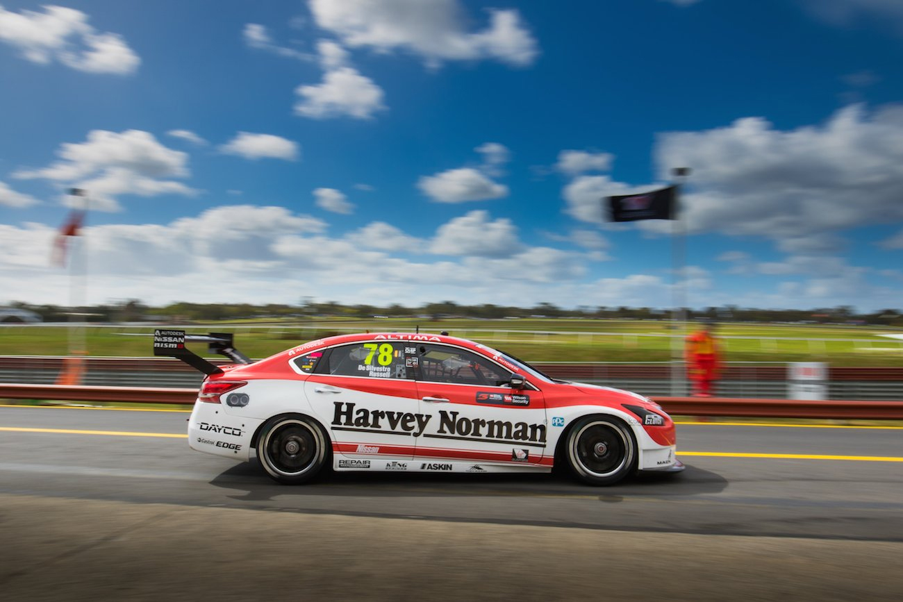
Kelly Racing Team Harvey Norman
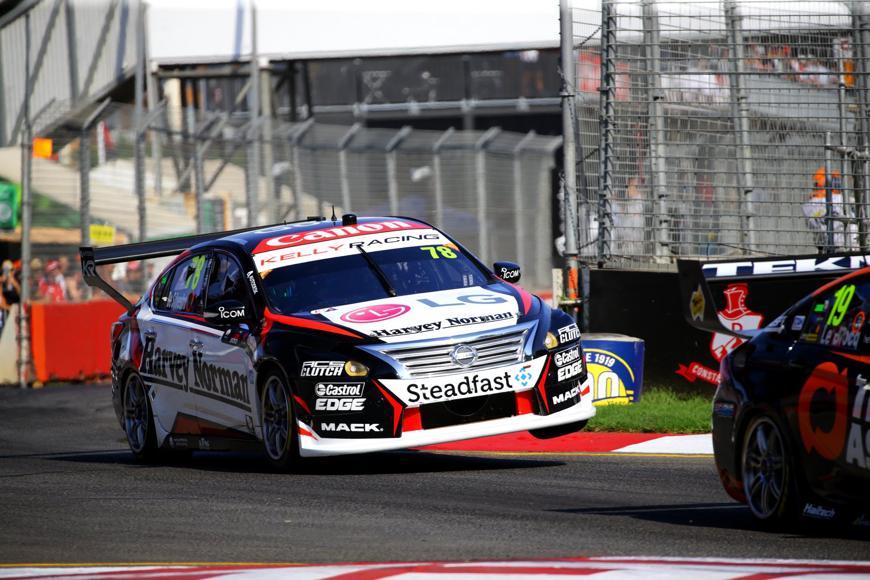
Simona looks set for another season of mediocrity (if that) in the Team Harvey Norman entry. It’s an interesting take on the black, white and red livery, which on this occasion has limited any overlapping of the jagged sections. Each section is separated by black which is nice to see, with some lovely detailing included too, such as the silver lines within the main white section.
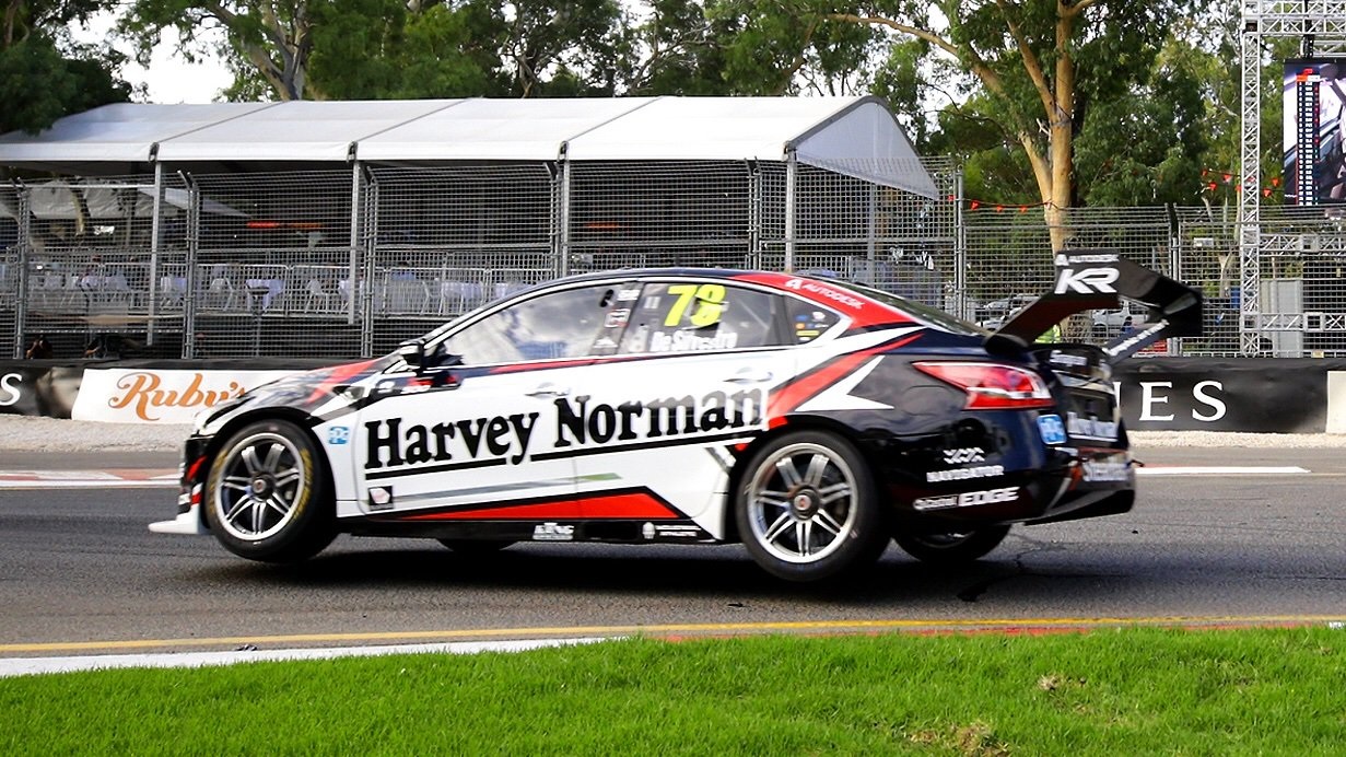
The Harvey Norman logo also looks much better as black on white. The design overall has made a much better attempt to pay attention to the shape of the car, compared to other version that seems slapped on without much care. One little thing that bothers me is the white section sharply dropping off after the mirror. Mainintaing the same angle toward the front bumper would have had a better effect.
★★★
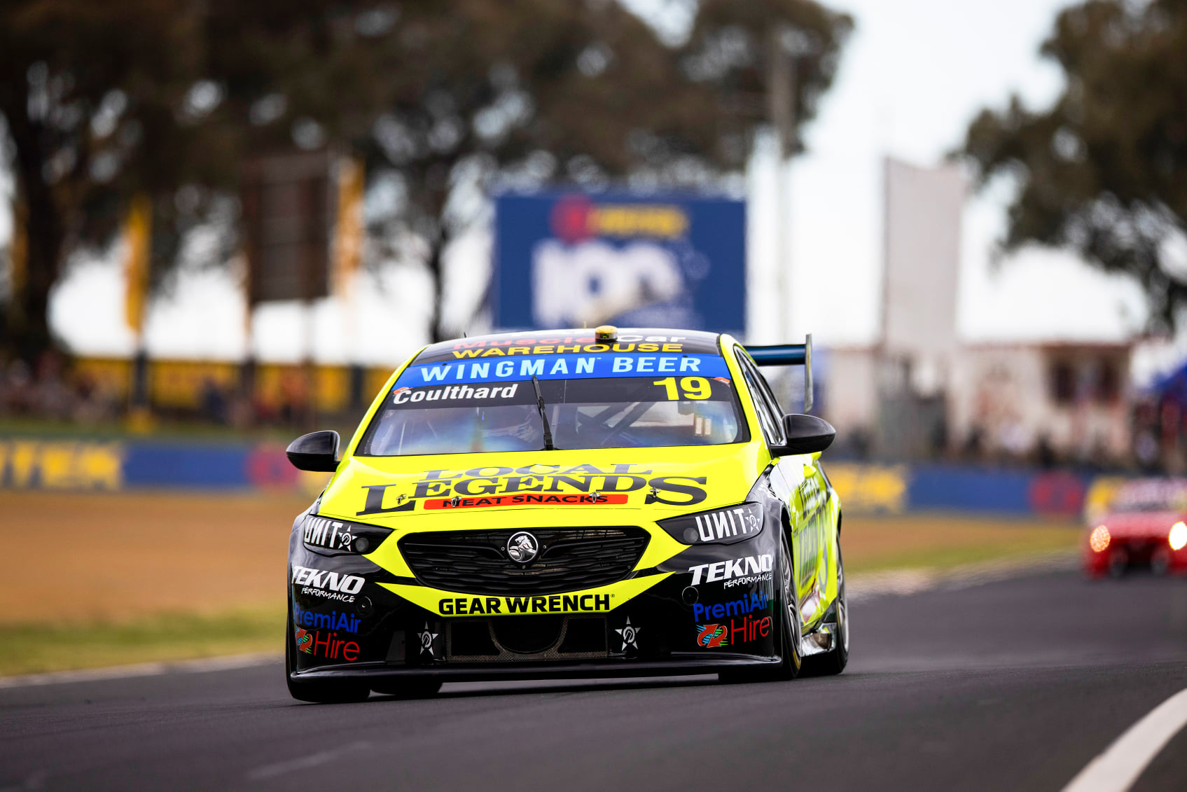
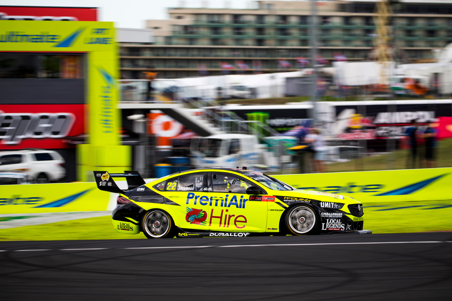
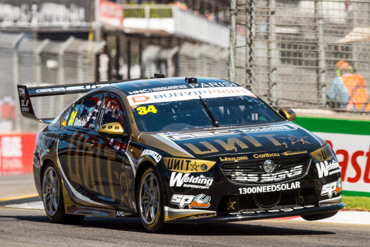
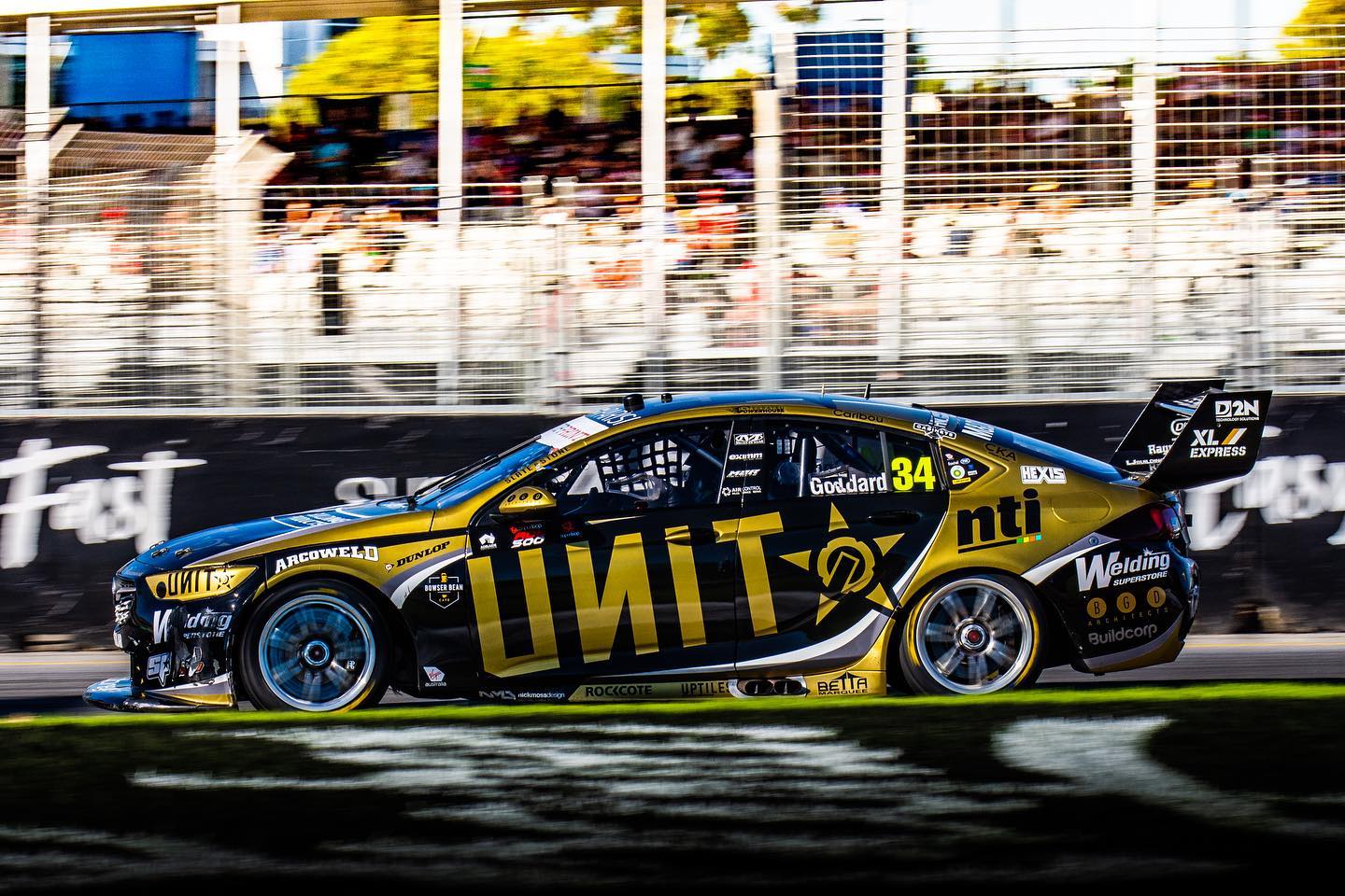
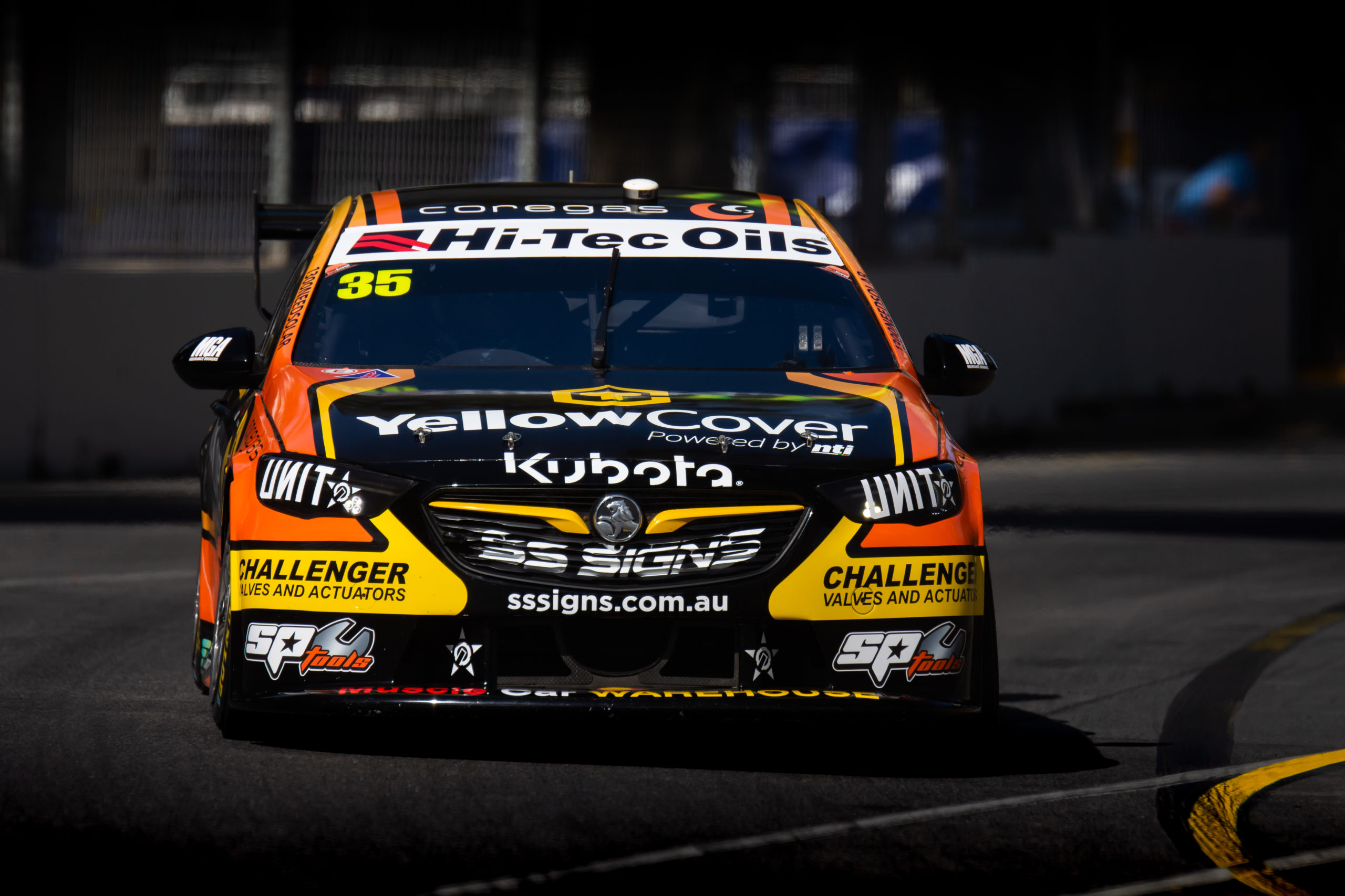
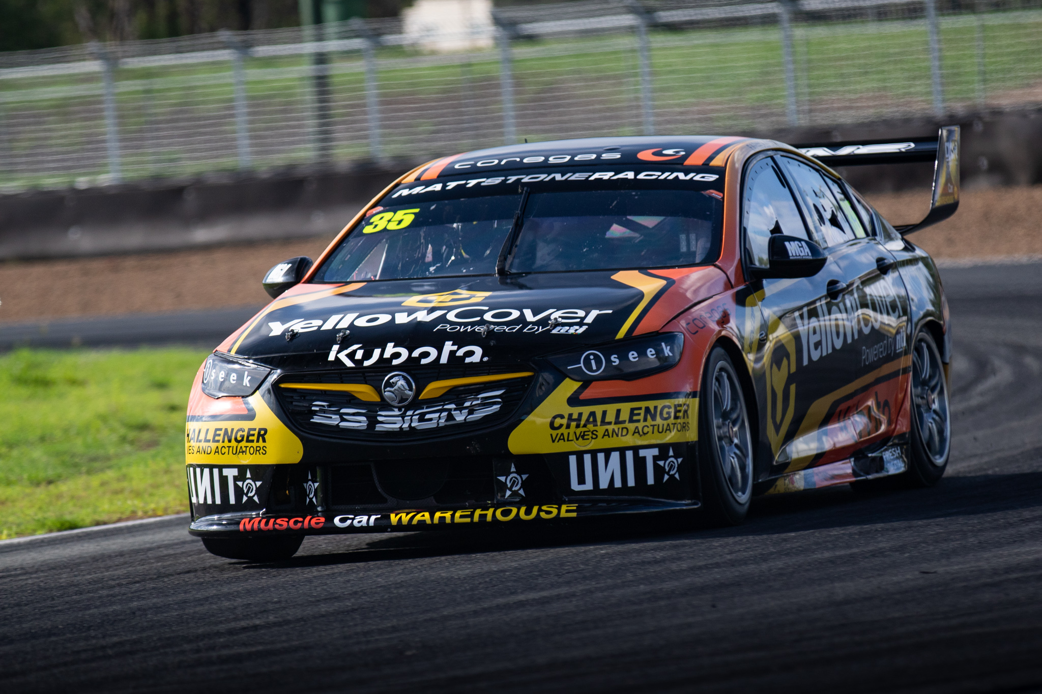
Matt Stone Racing Unit
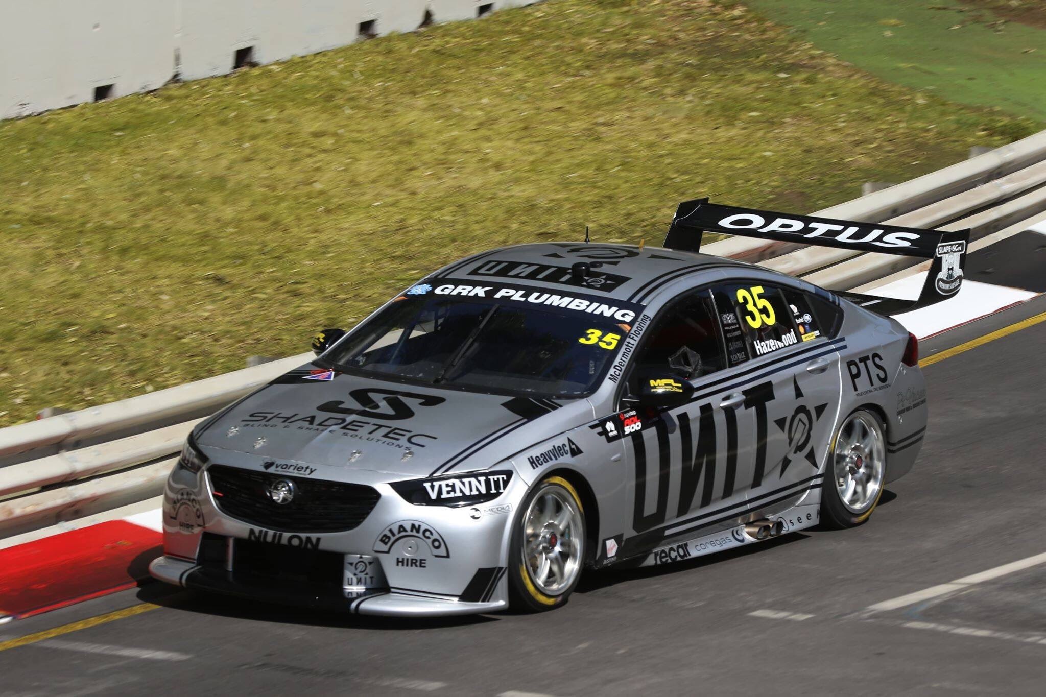
Ironically, the new MSR team and livery remind me very much of Team Penske. It’s rare to see, but props to the team for having all sponsors agree to appear in black in order to make an almost perfect two tone livery. It’s super clean and uniform, with the double stripes working brilliantly along the sides, bonnet and roof.
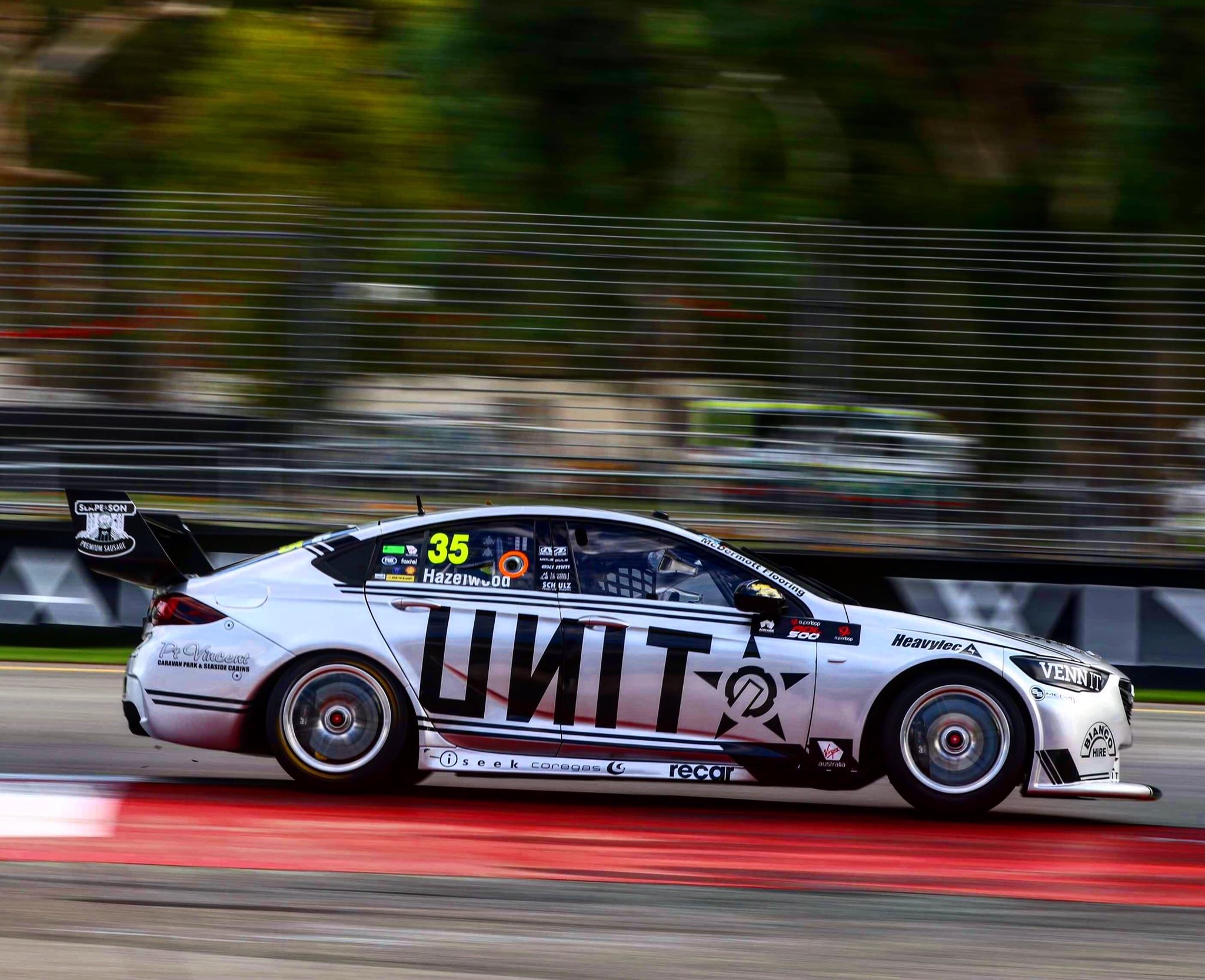
It looks superb from all angles, especially when the sun hits it just right, opening up the silver to a lovely bright shade. There isn’t always a need to complicate things! Unit may only be a one race sponsor, so hopefully this design sticks around, and looks just as good with whoever puts their name on the car next.
★★★★★
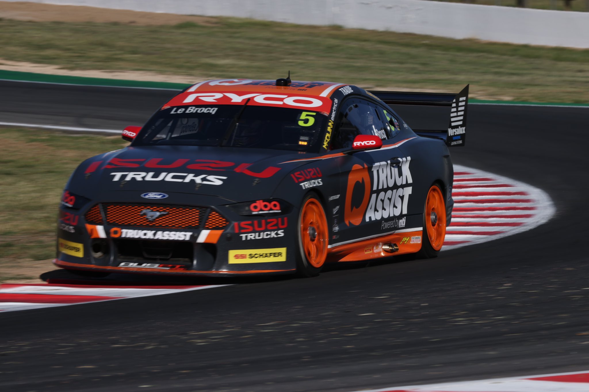
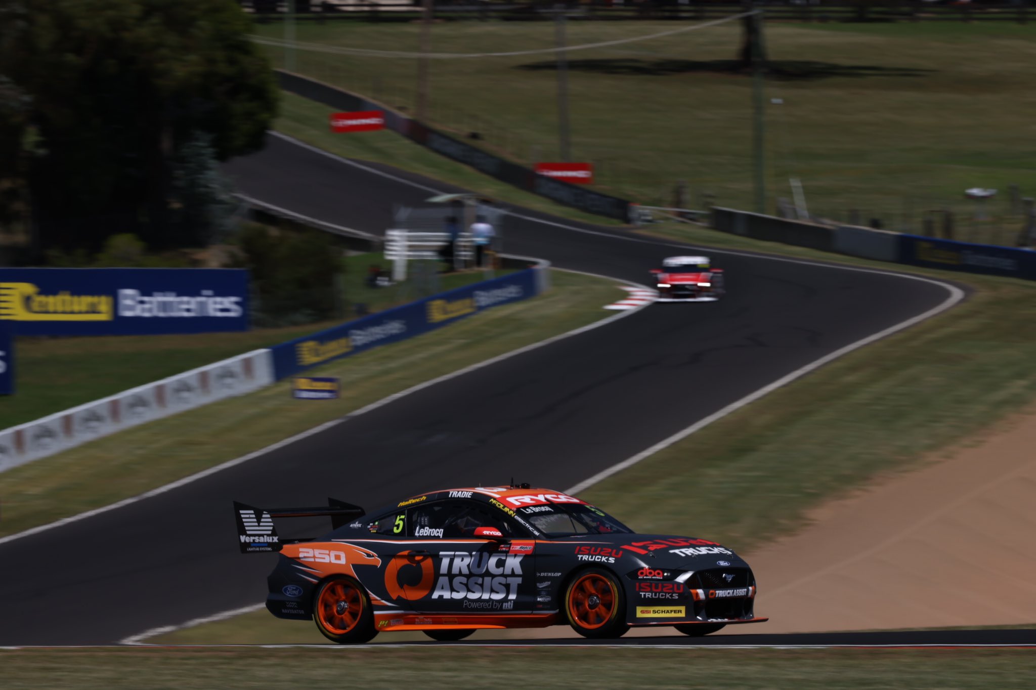
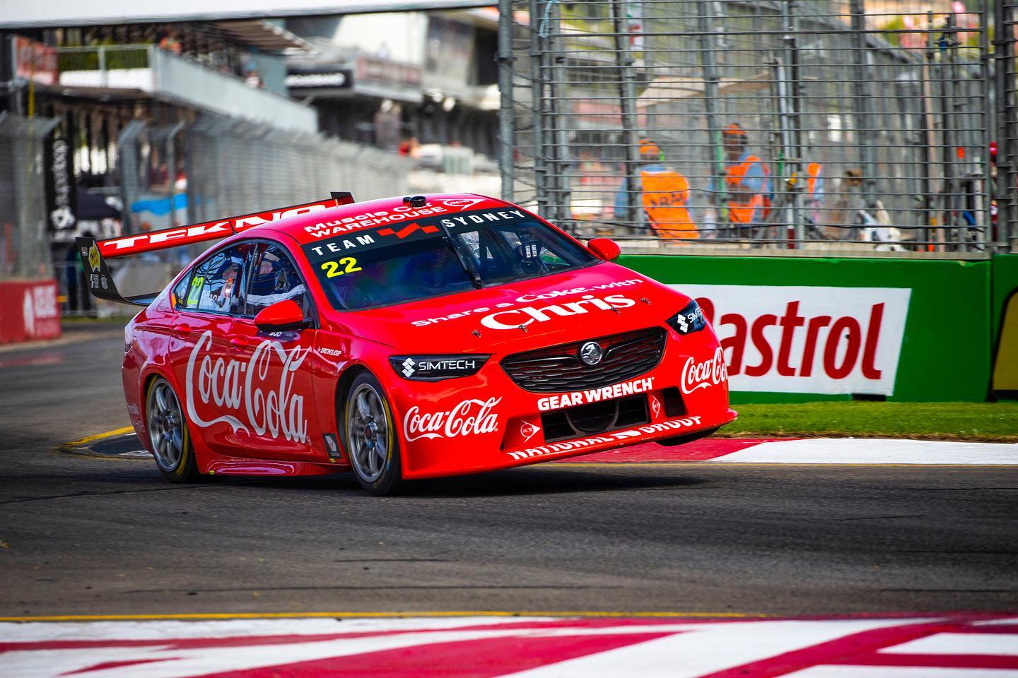
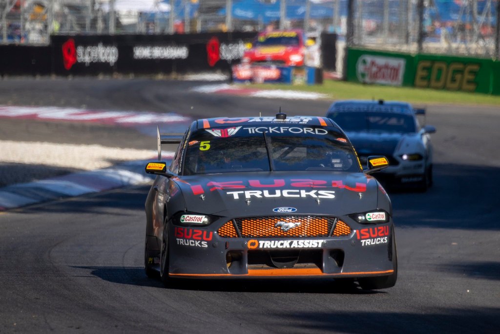
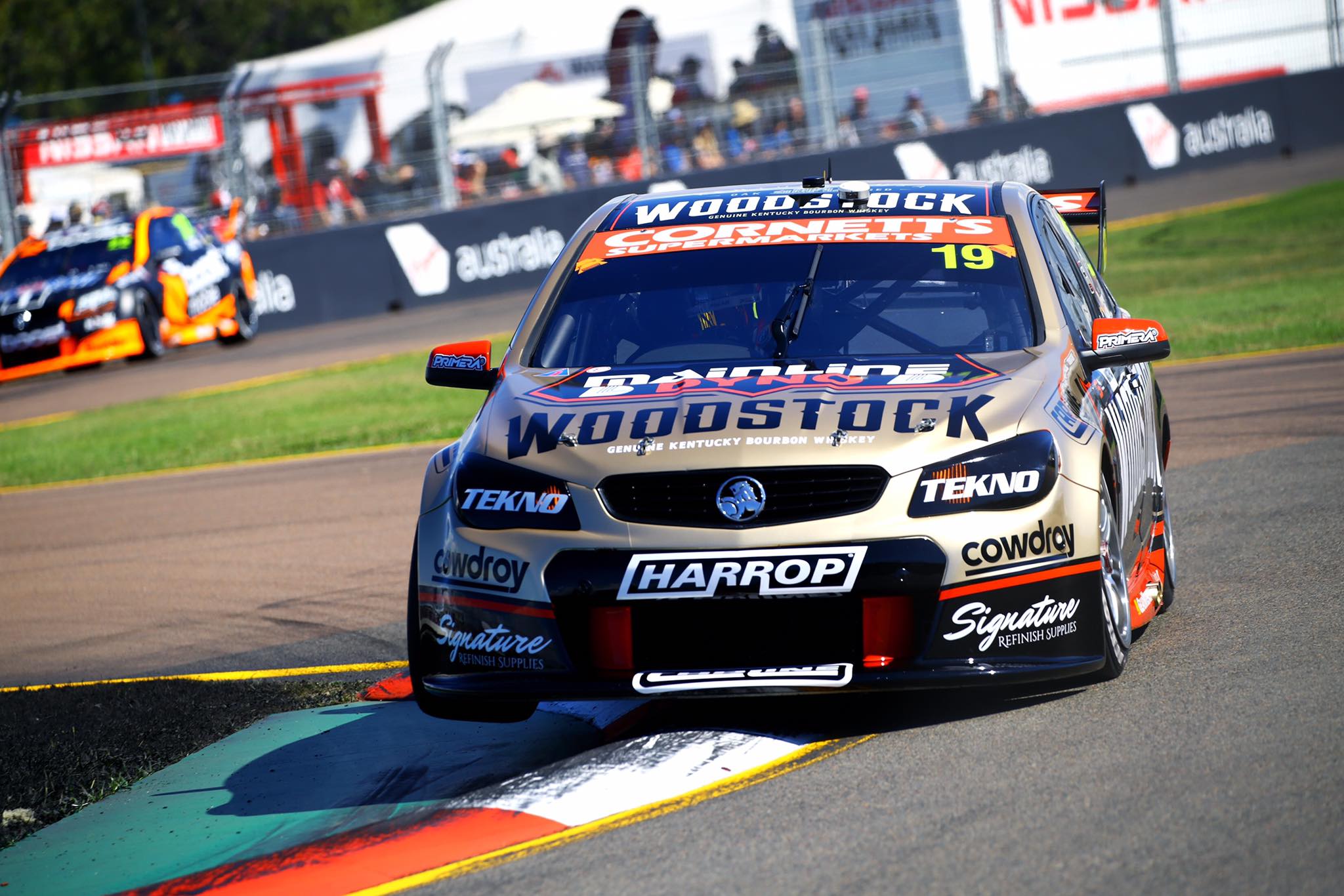
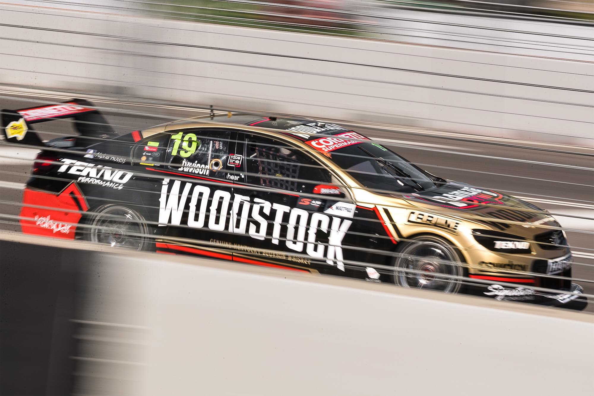
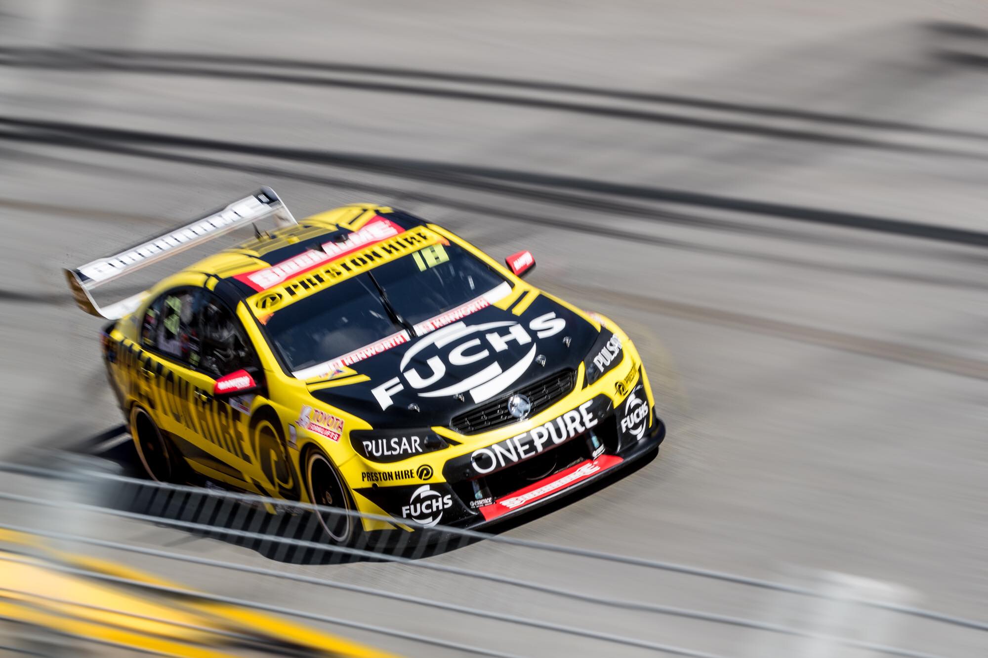
Tekno Autosports Truck Assist Tekno Racing
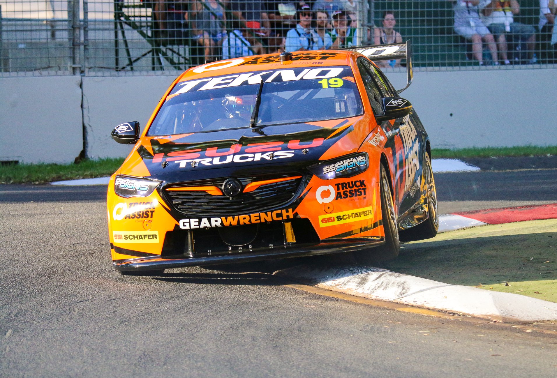
After a short stint with the team last season, Truck Assist are back for a full season with Tekno in 2019. It’s a decent effort, with the orange mainly focused to the front and roof of the car. Not a huge fan of the spiky design on the side, but it looks much better on the bonnet.
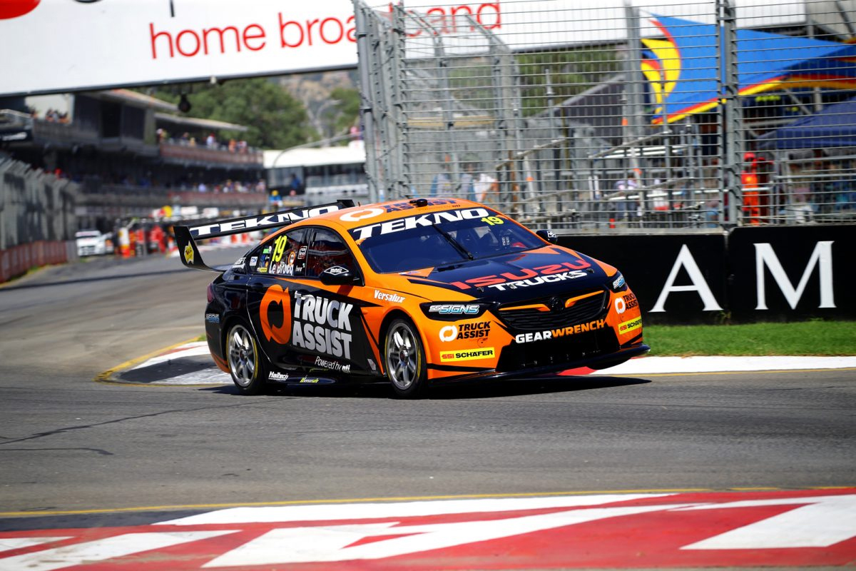
It’s a good distribution of orange and black on the car, although I’d have preferred to see more orange toward the rear to make it more even. That said, it’s a lovely shade of orange, and am glad they’ve gone with a good chunk of it so we can tell it apart from the Boost cars despite the similar colour schemes.
★★★★
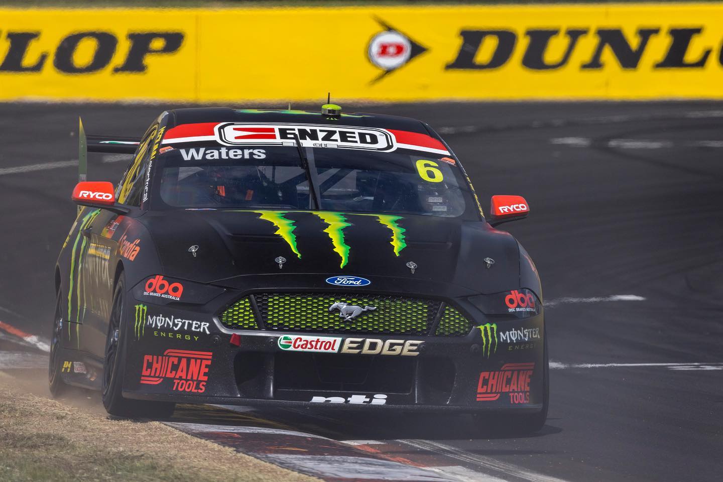
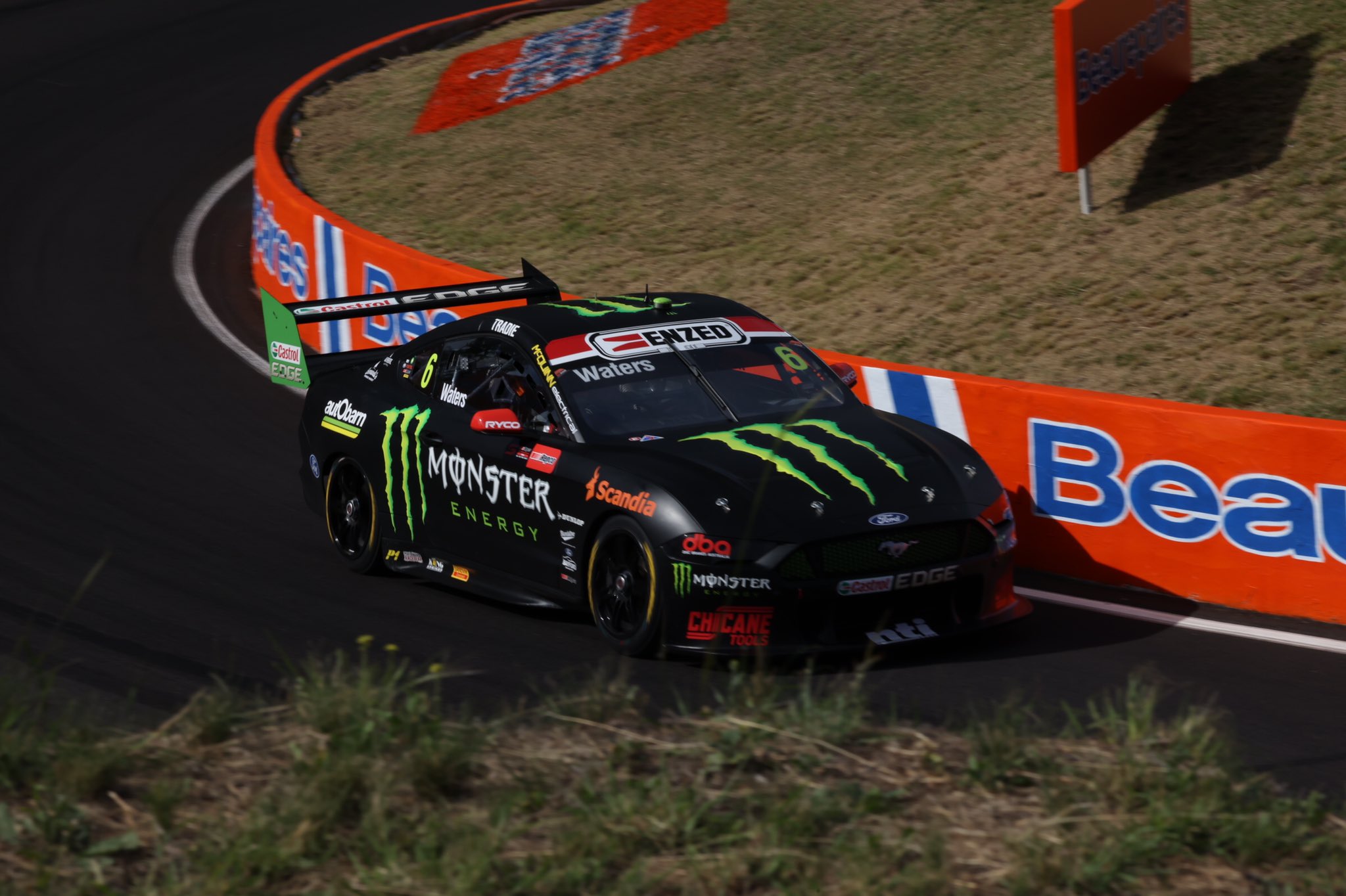
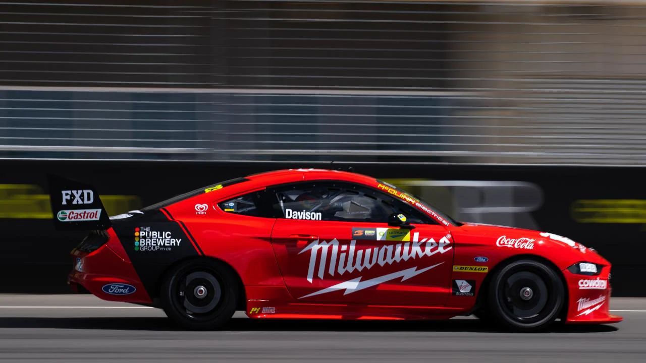
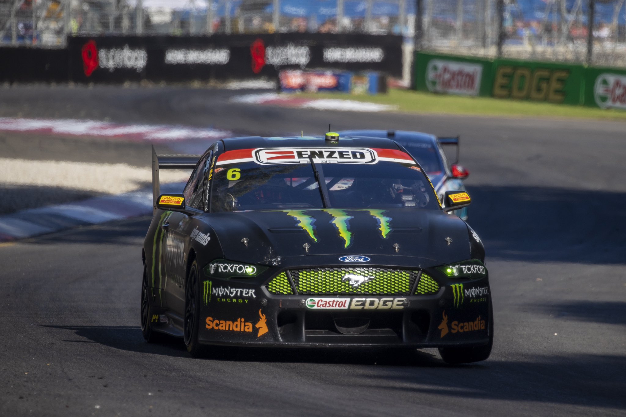
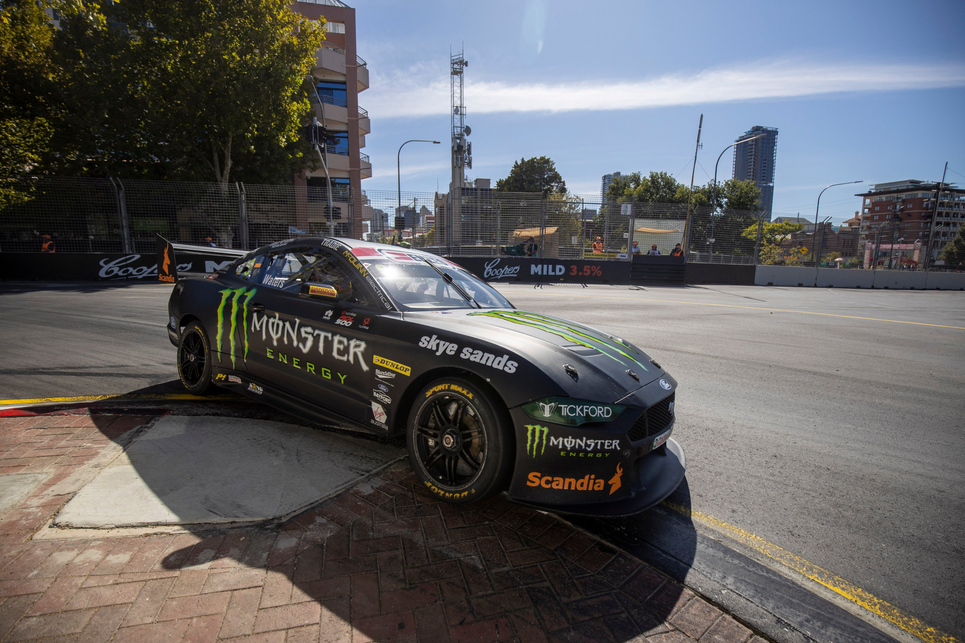
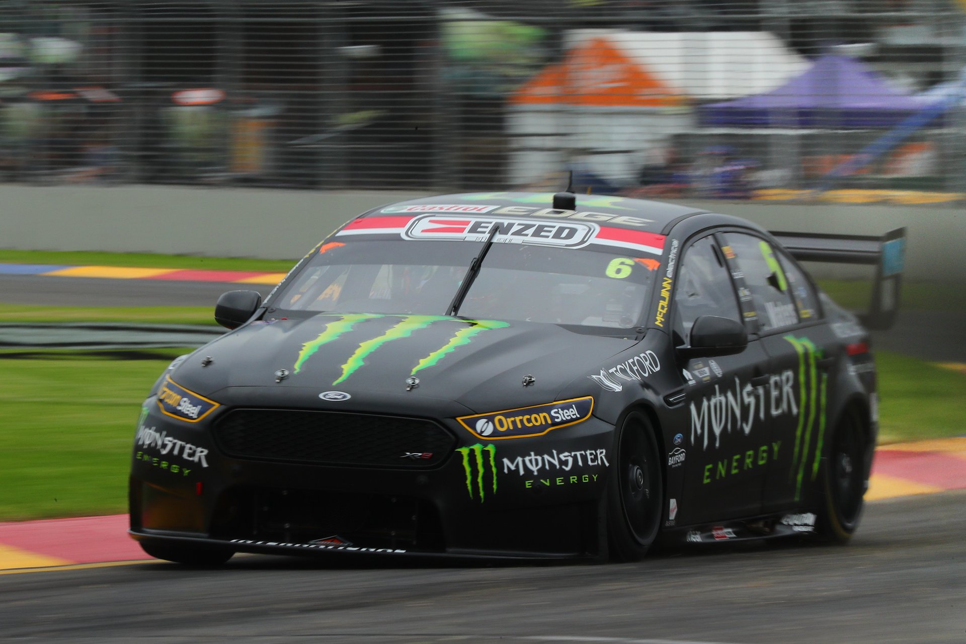
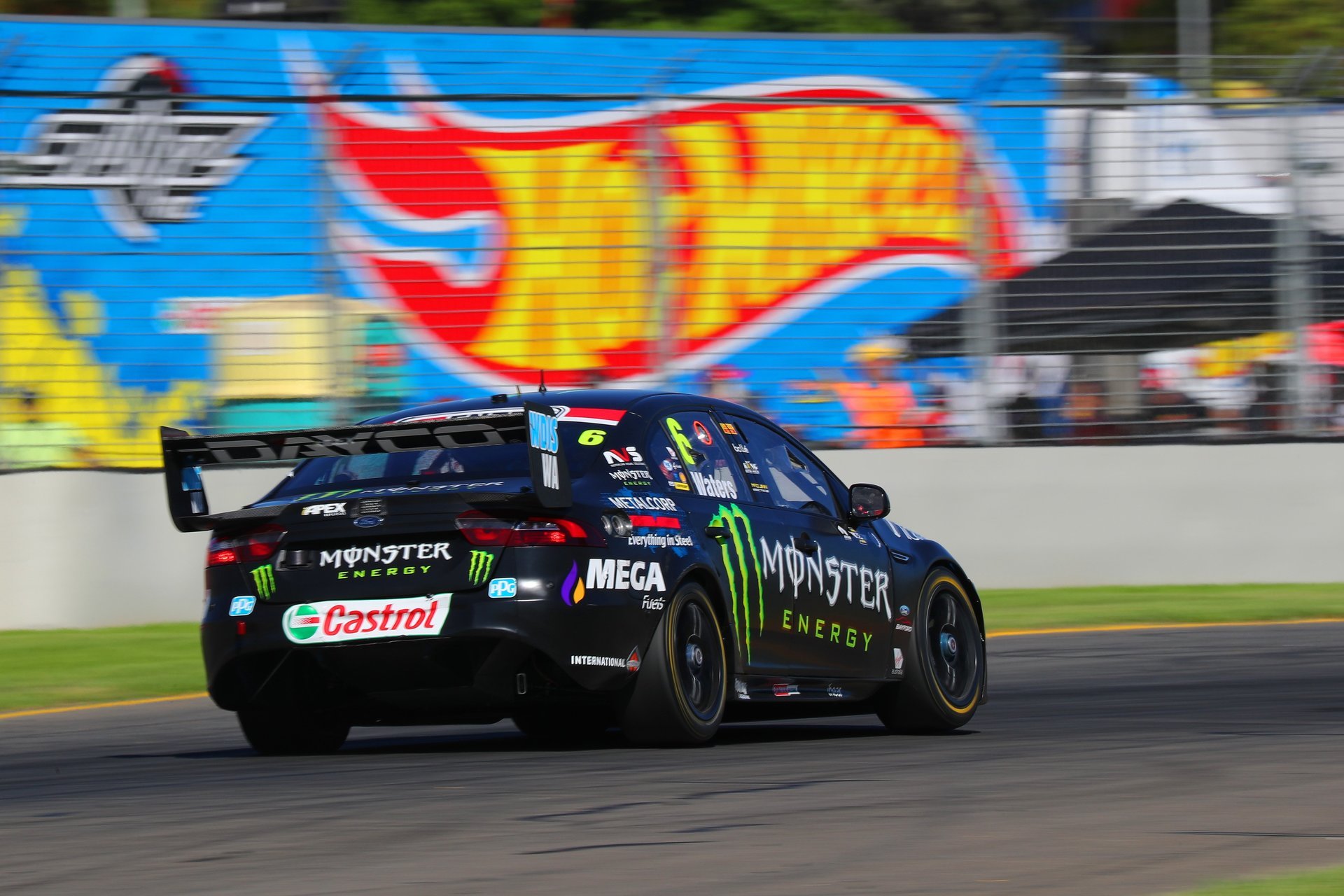
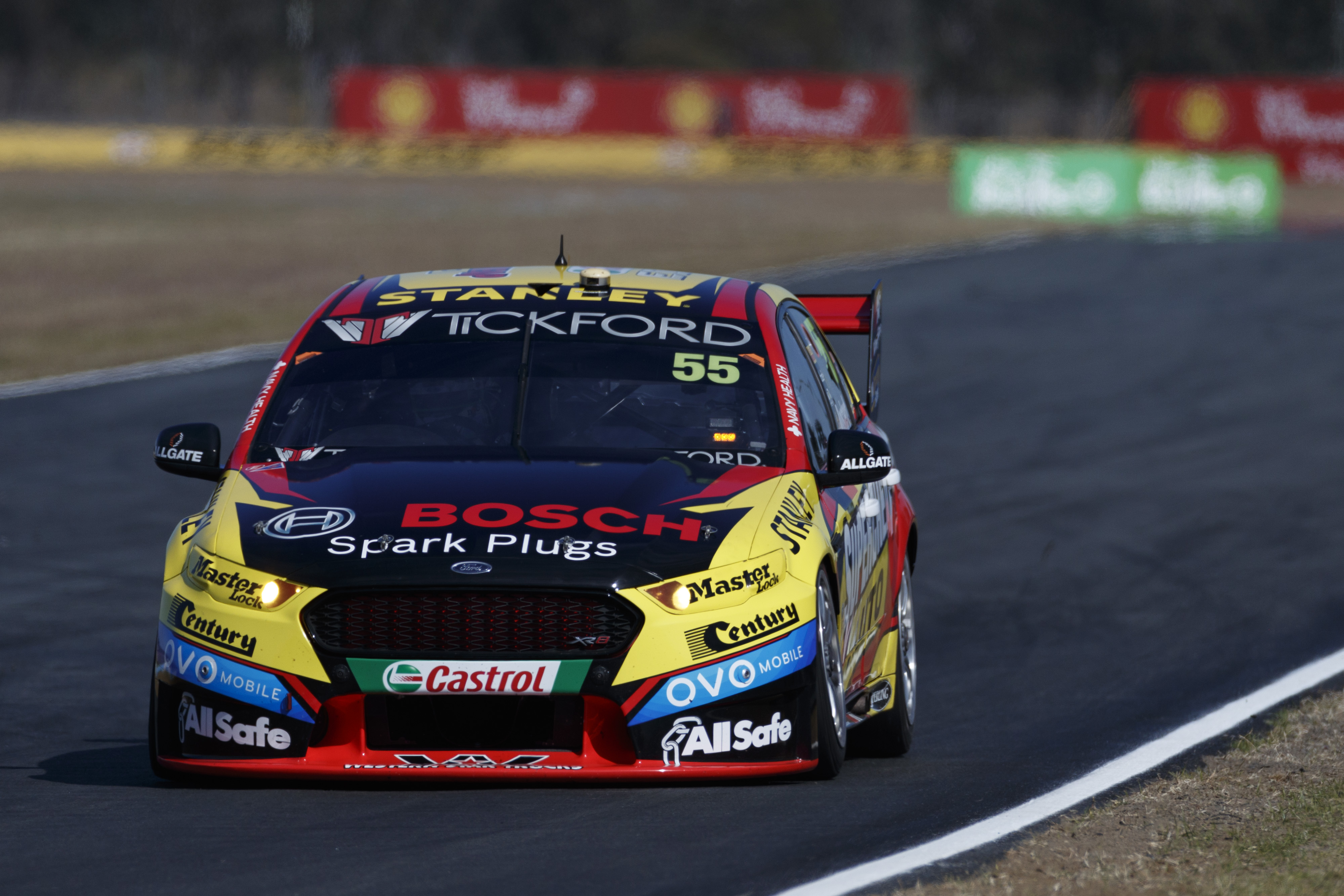
Tickford Racing Monster Energy Racing
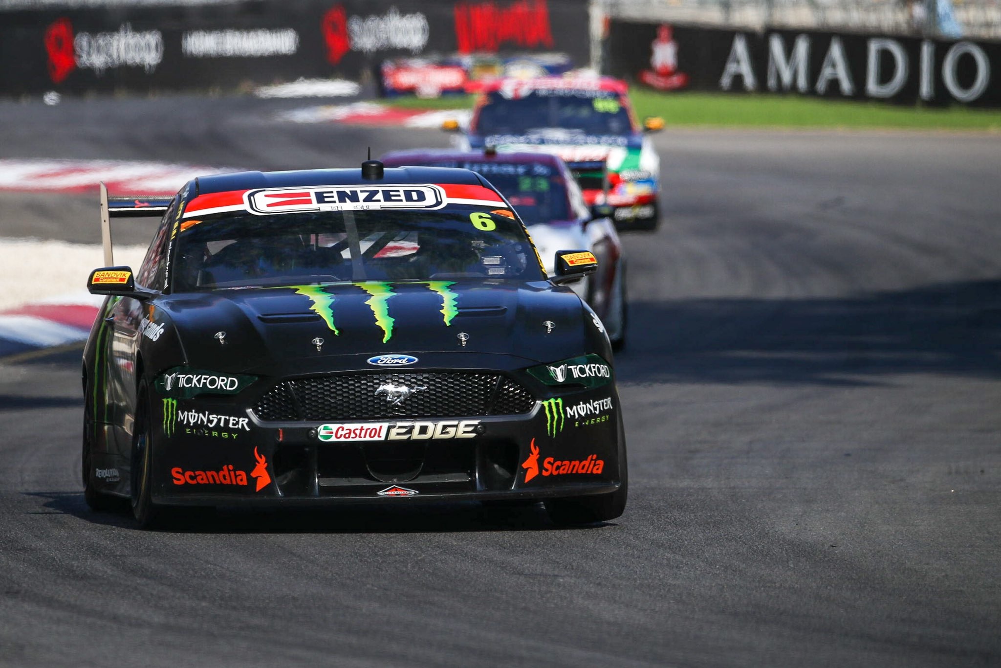
This is essentially the same livery as last year – pure black plus Monster logos. The matte effect works really well on this livery, however, and considering the lack of flashy design elements, it hasn’t tired either. This has also been helped by the transition to the Mustang, which I believe has been pulled off best by this car (probably because it hides all the ugly disproportionate features).
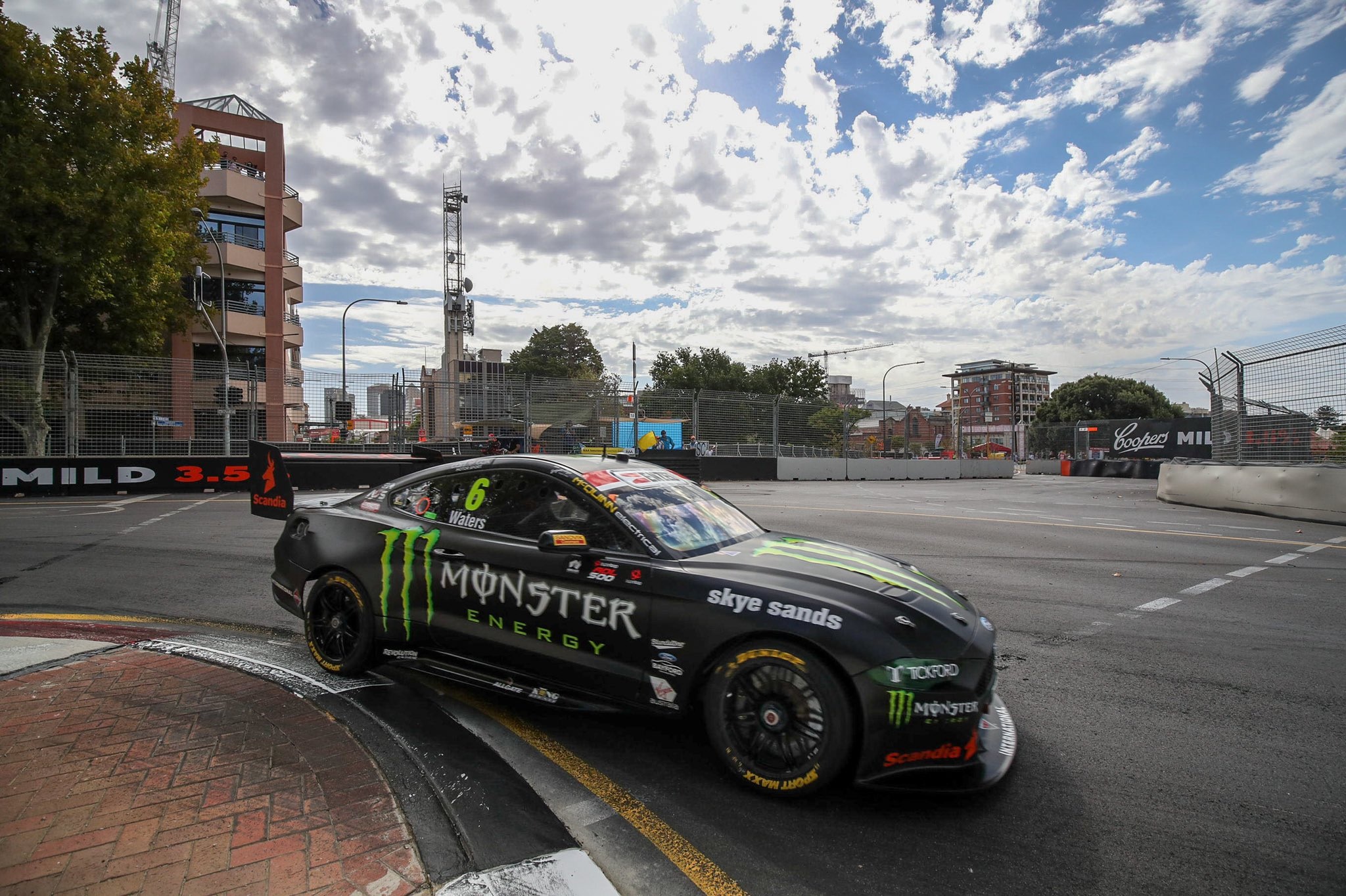
Not a whole lot else to write about. Scandia sticks out as it’s the only prominent sponsor not in white or green, which is great for them. I’m also a fan of the green lights, now that Orrcon has departed. I may have been a little harsh with my previous ratings of this livery, or perhaps my tastes have changed slightly.
★★★★
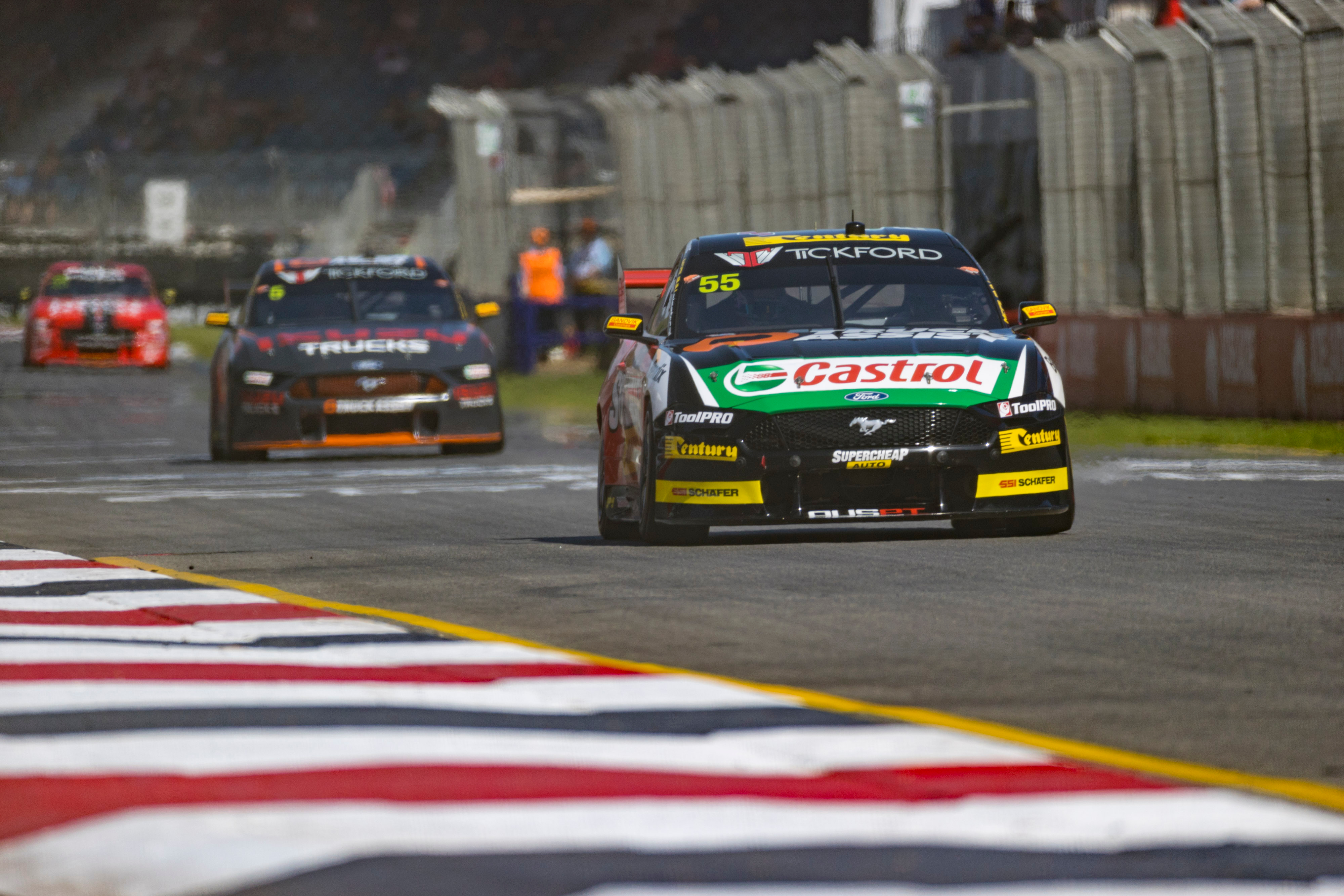
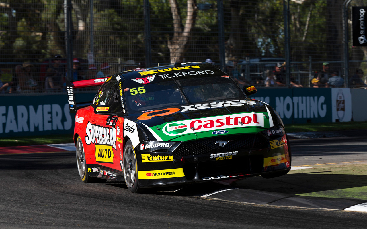
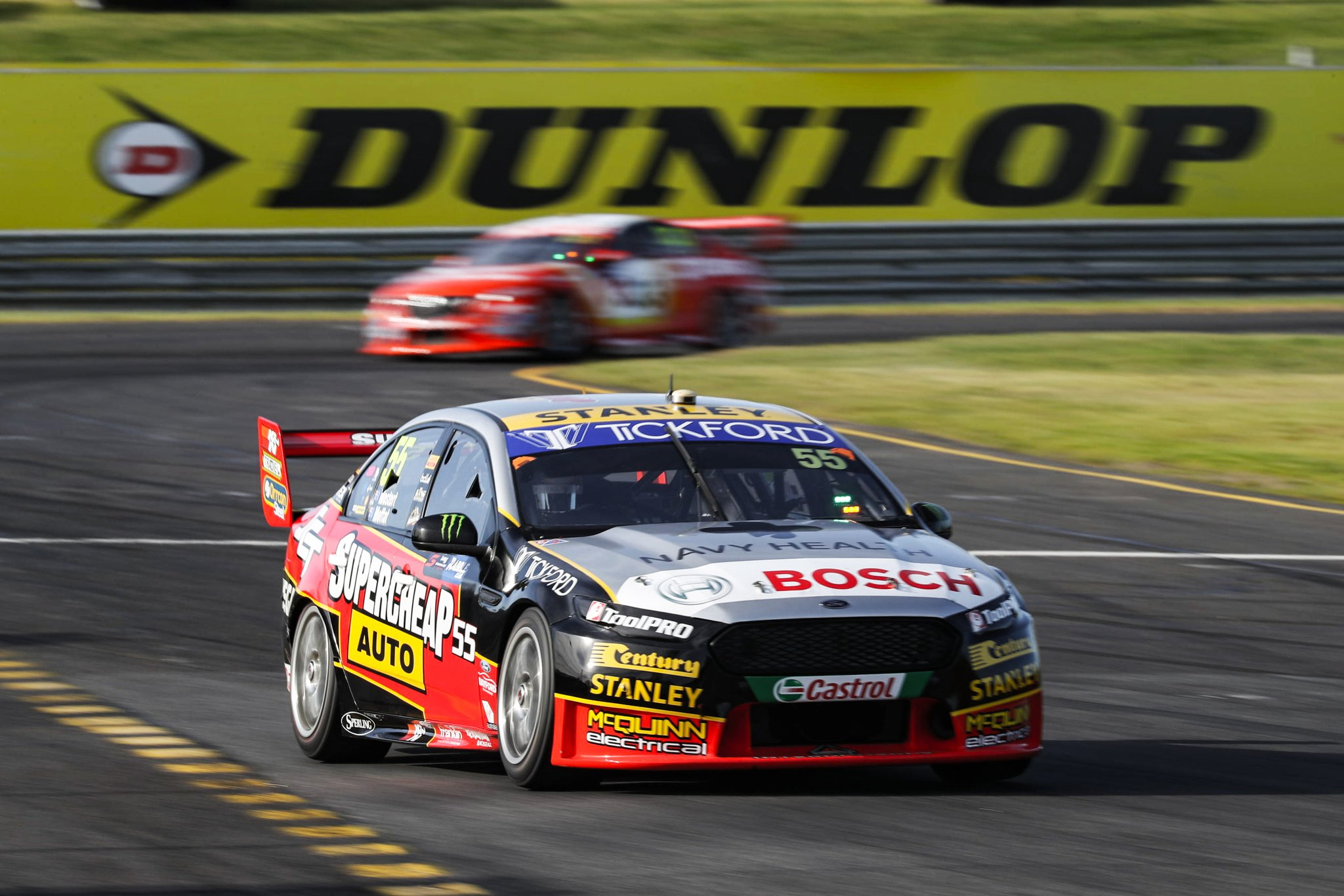
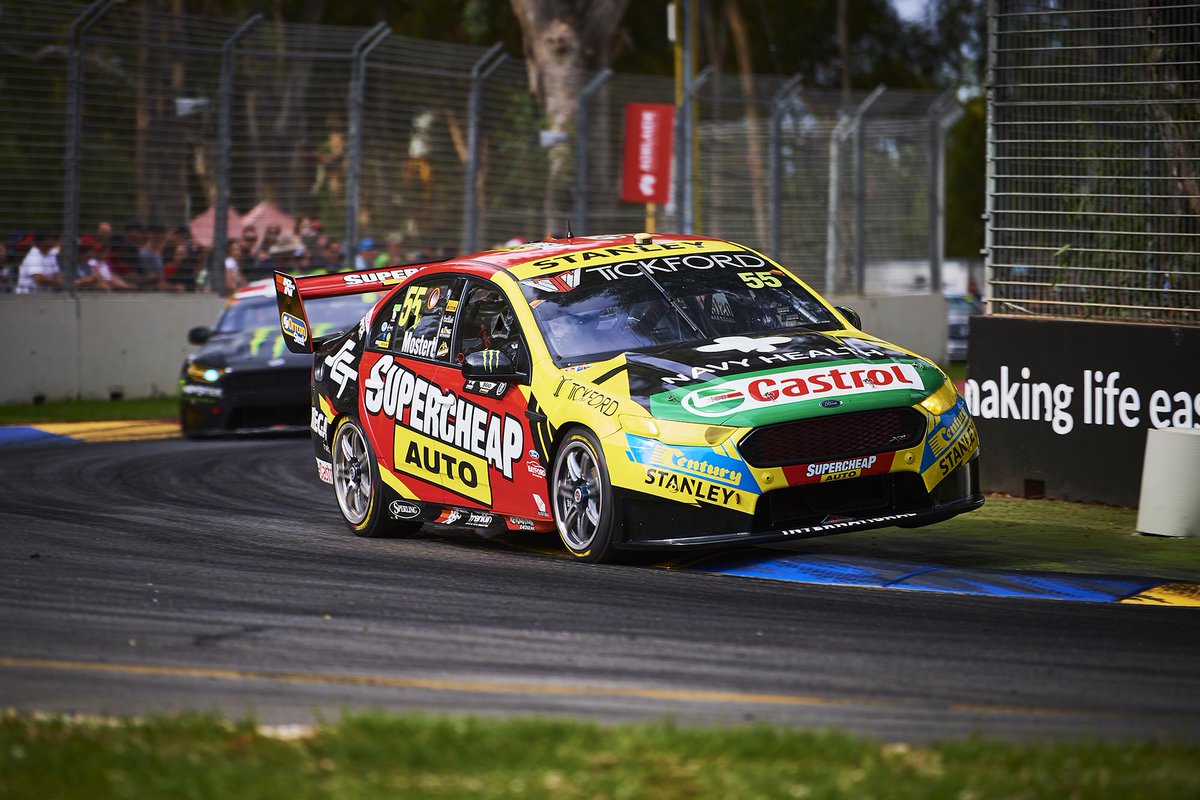
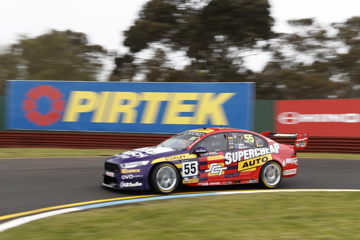
Tickford Racing Supercheap Auto Racing
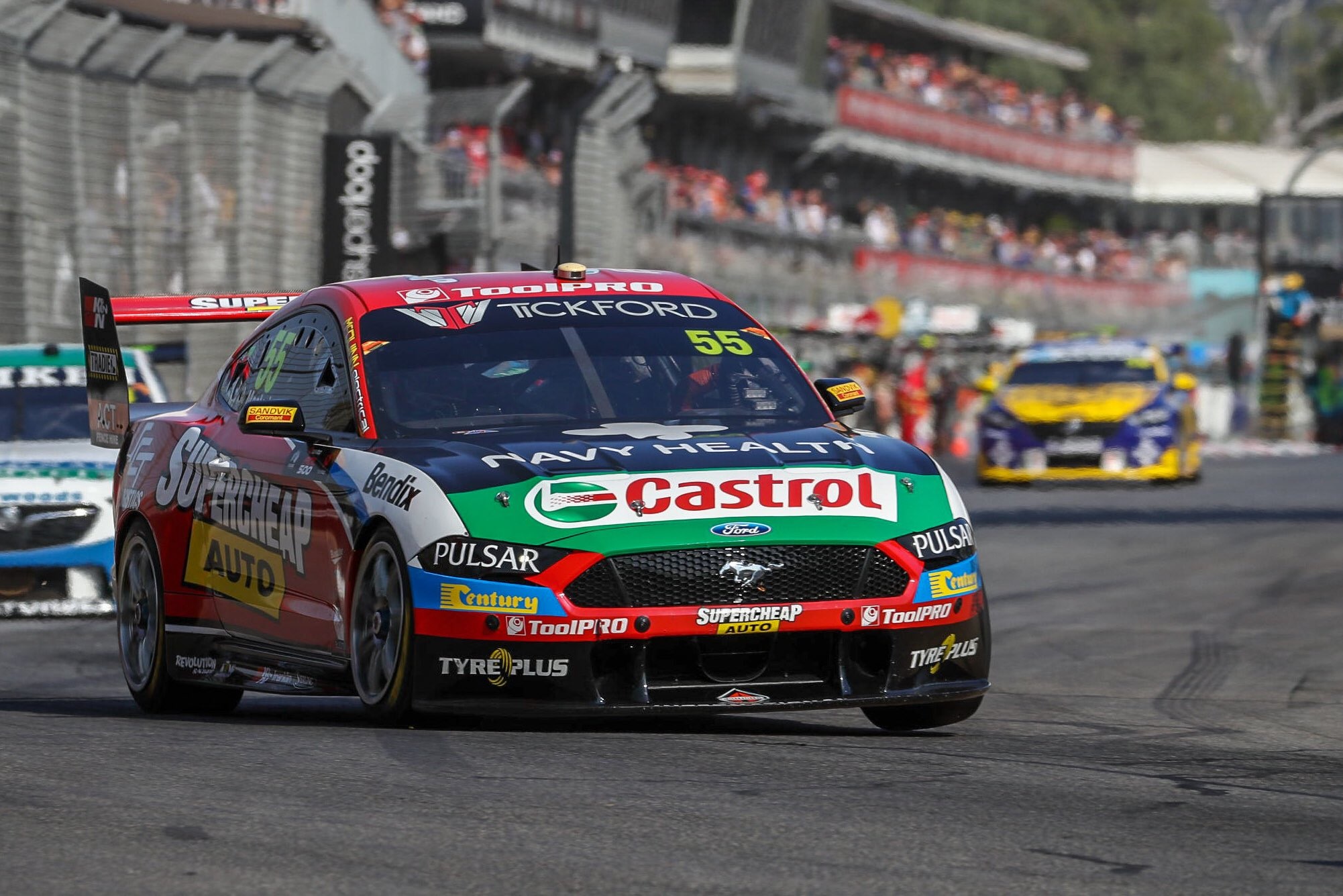
I was disappointed to see the large portion yellow had been taken away from the Supercheap livery this season. At first glance, this car almost looks like a patchwork of a number of different sponsors, like we used to see a lot of in the 90s. The main sponsor’s identity has been diluted, purely because others with their own colours, like Century and Castrol, demand more of the focus. It was not so much the case last year. This also has me questioning whether the blue bands below Bendix are part of the larger livery, or for Bendix itself.
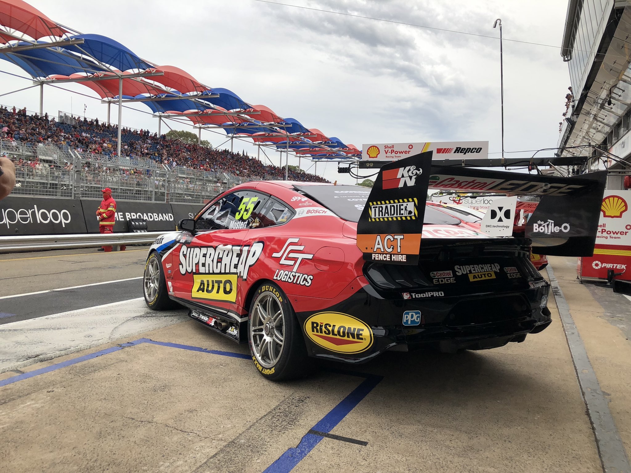
The livery in general is weaker in design than 2018, but I’m just annoyed at how inharmoniously everything has been put together. Especially front on. Imagine the million dollar homepage was a livery…
★★
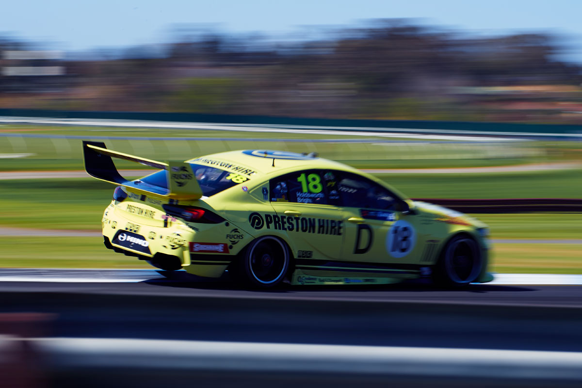
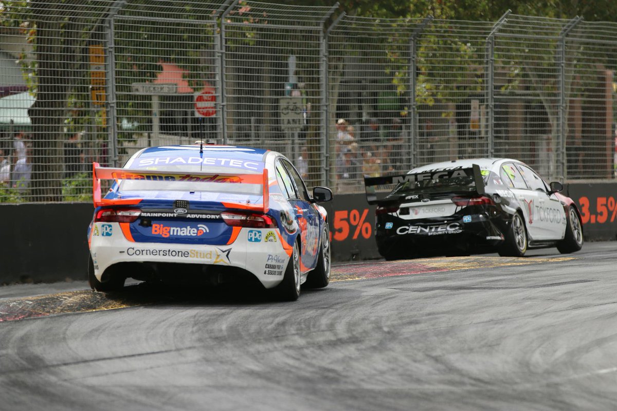
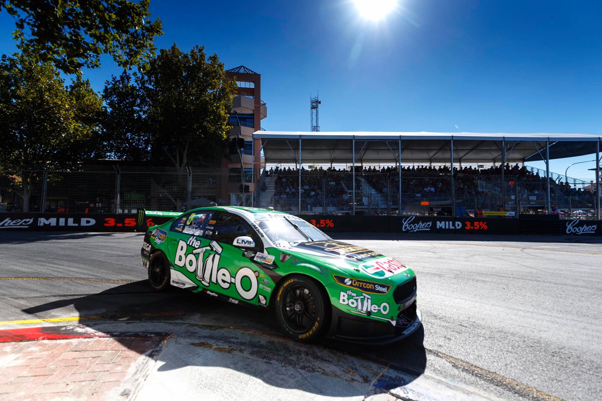
Tickford Racing The Bottle-O Racing Team
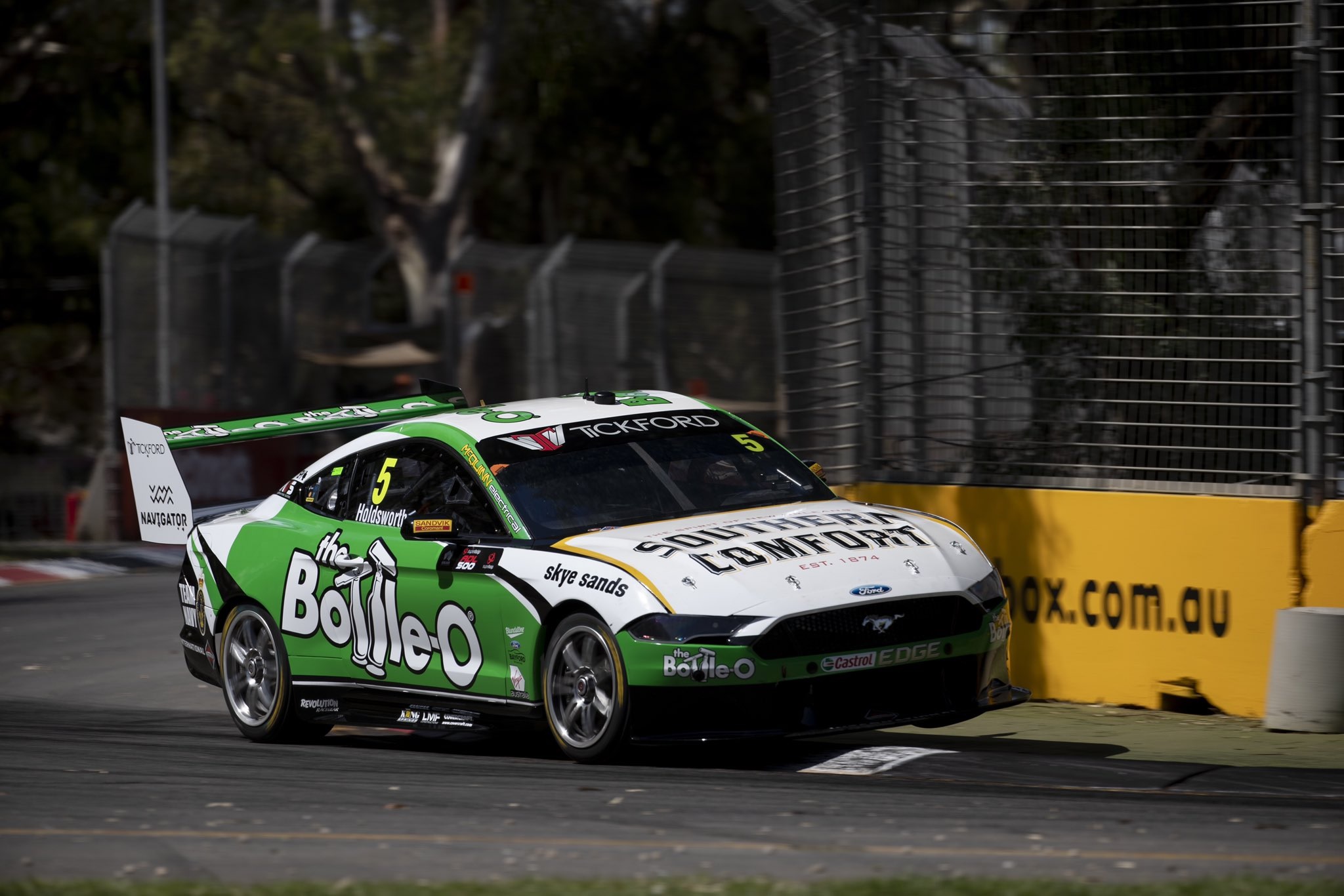
Holdsworth has traded places with Frosty for 2019 and has jumped in the Bottle-O car, which is now in it’s tenth season of competition in the iconic green livery. This isn’t the strongest iteration of the design however, but not disappointing like the effort above. The design would have worked just fine without the curved black line behind the front wheel – it’s out of place between the straight green line and gold Southern Comfort line on the bonnet.
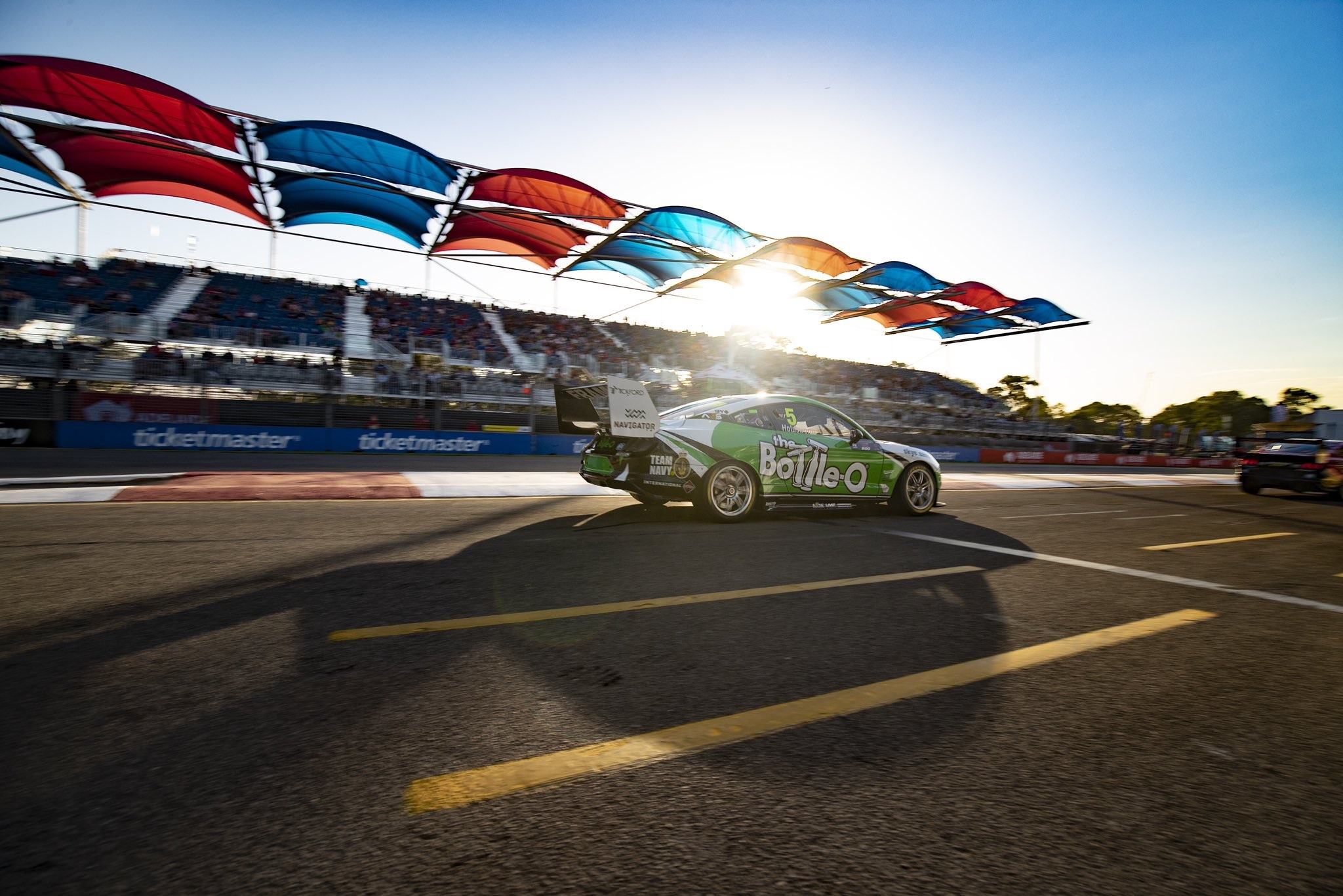
The shade of green used is also a less saturated, which is a good thing as a colour like that can become tiresome quickly. It’s a good idea to swap it in every couple of years like they have been doing. Or maybe the photos I’ve found are not as heavily edited as previous years!
★★★
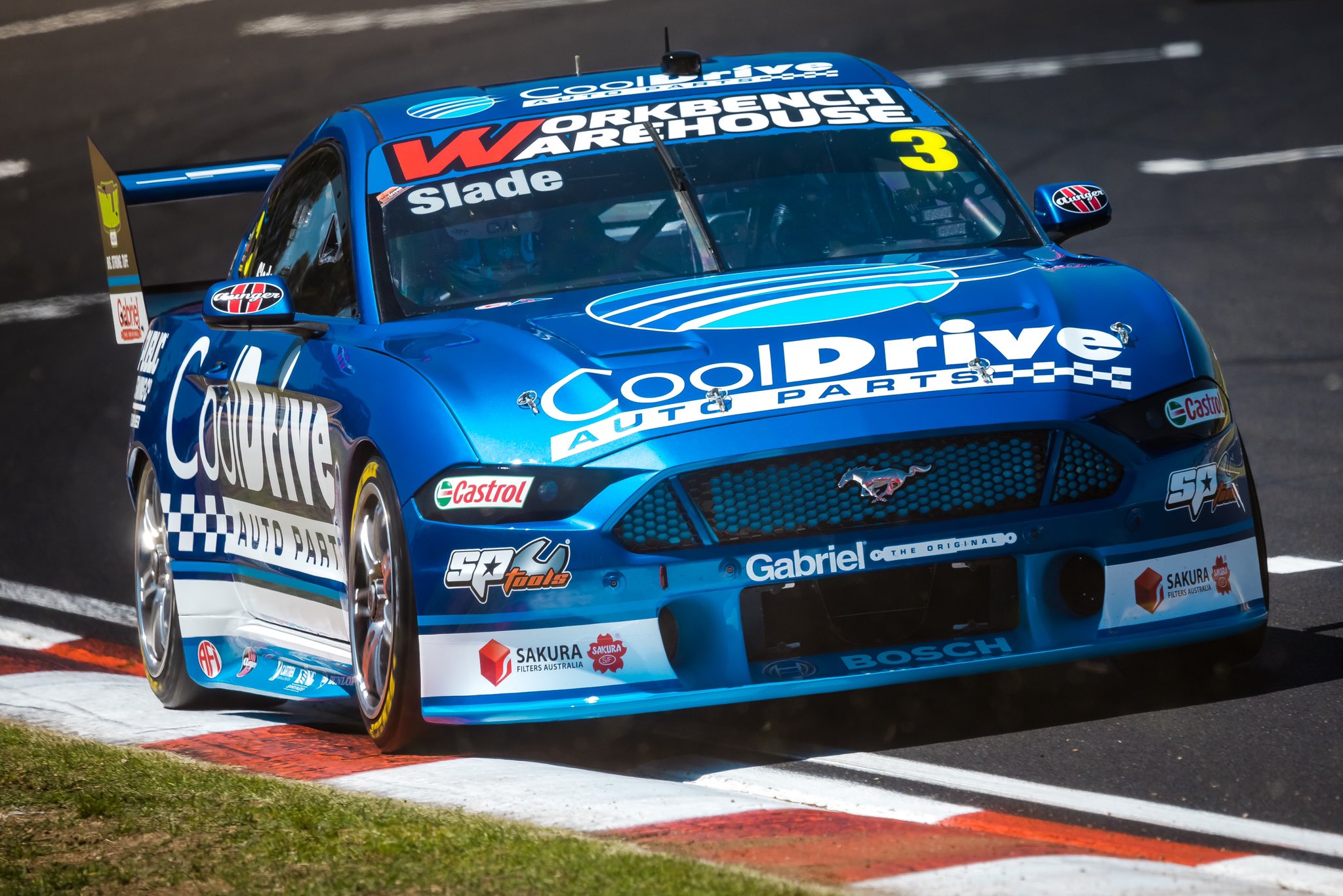
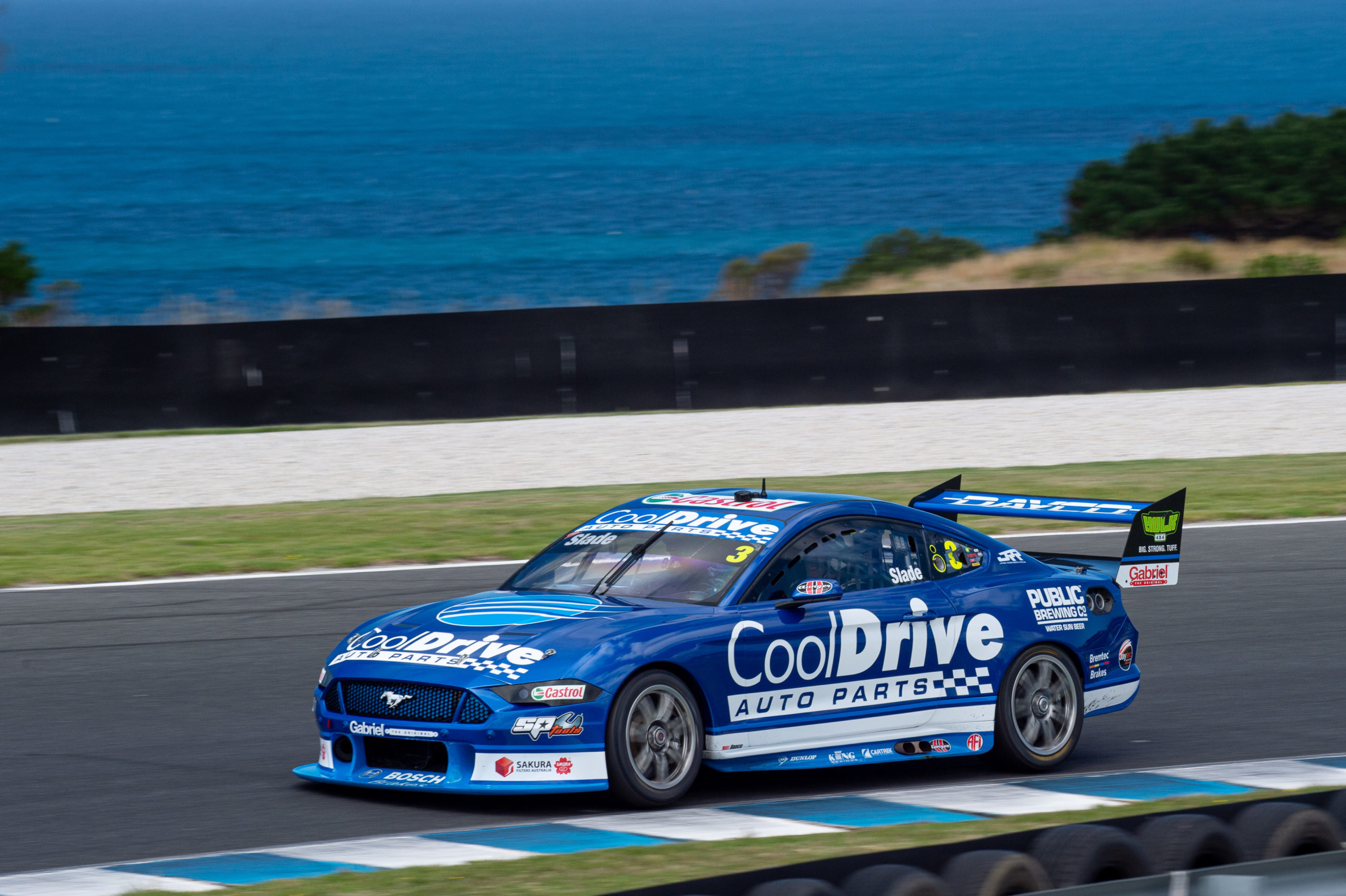
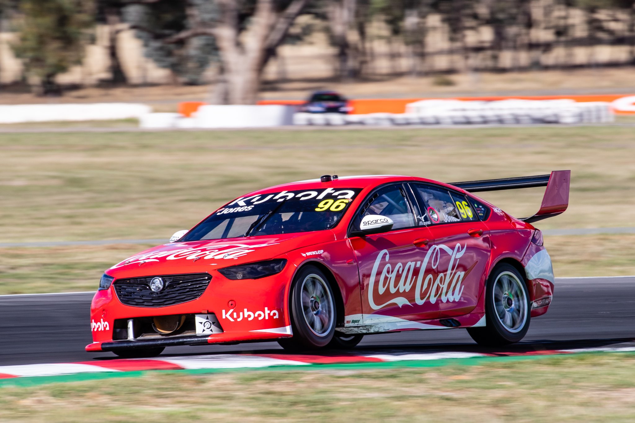
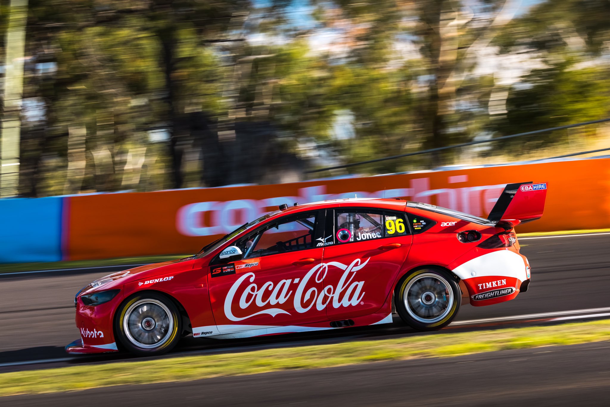
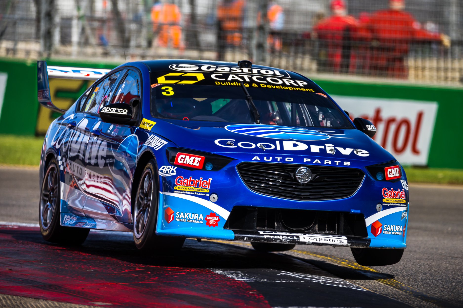
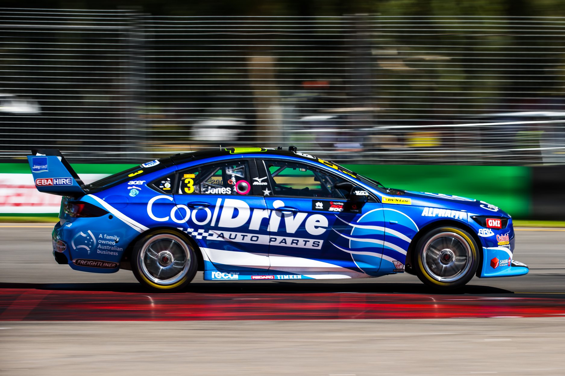
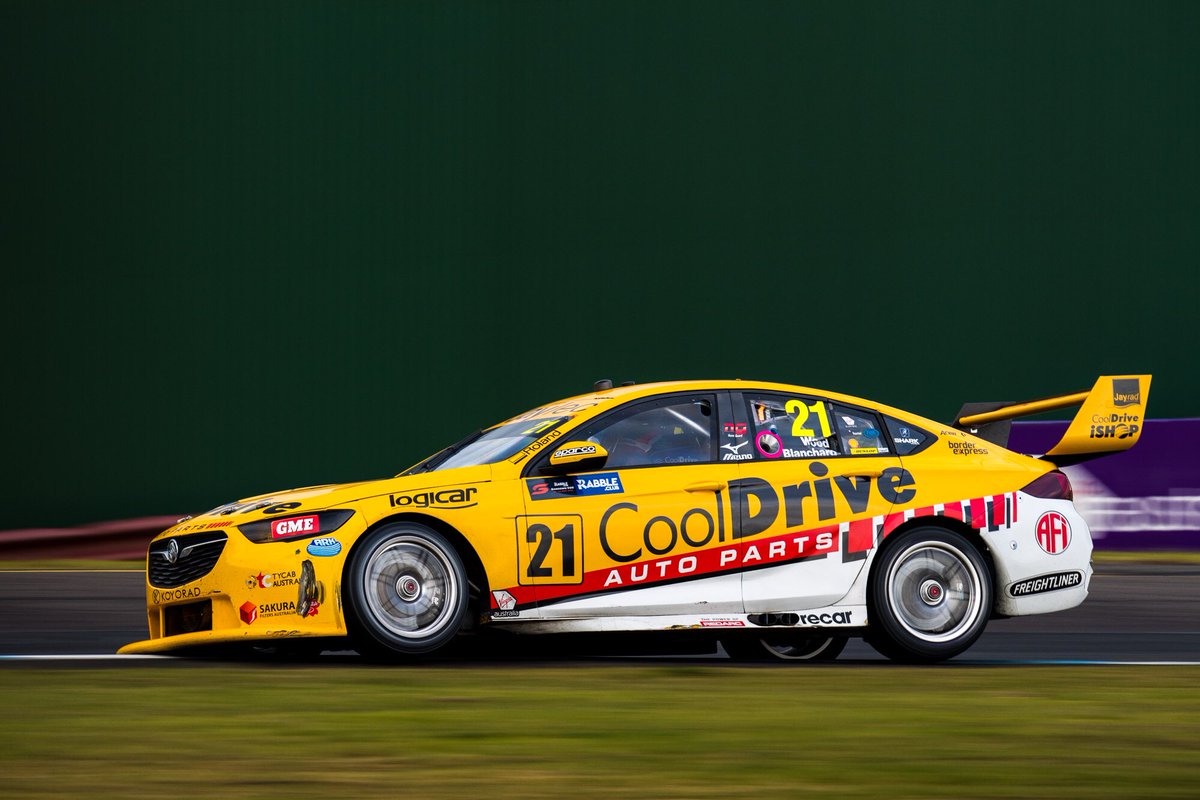
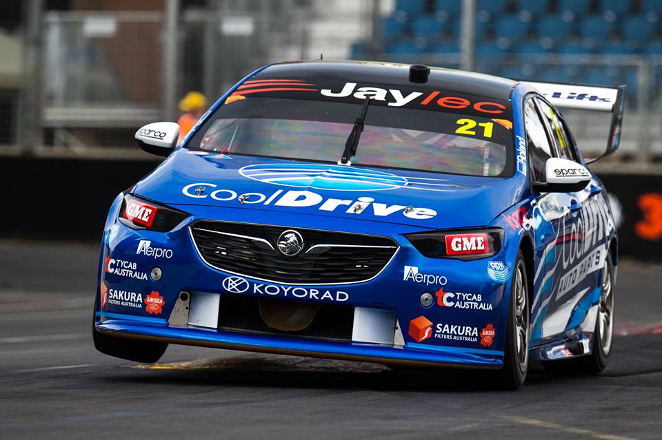
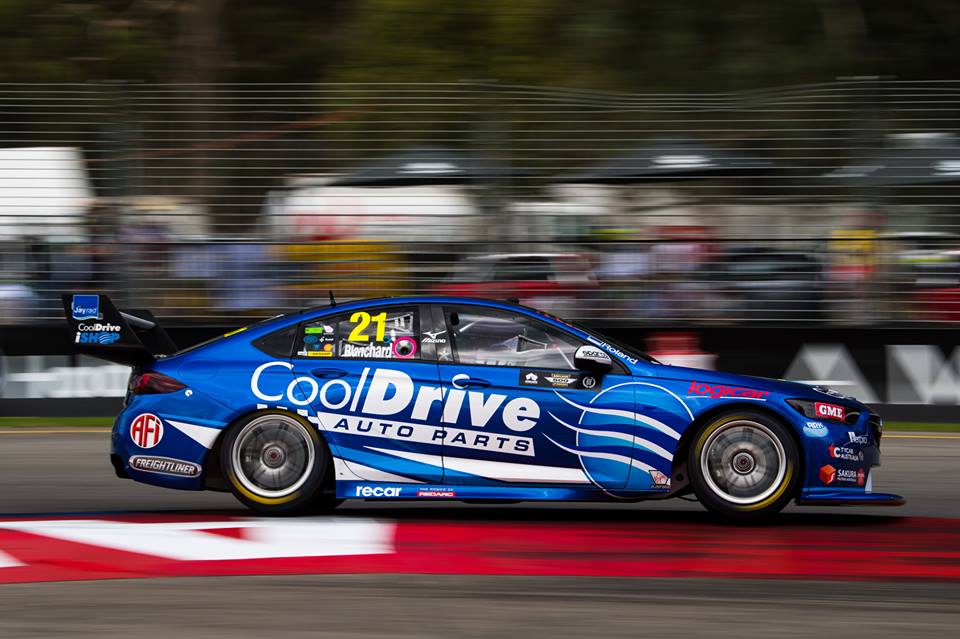
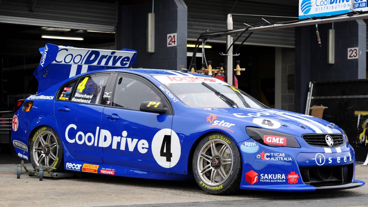
Tim Blanchard Racing Team CoolDrive
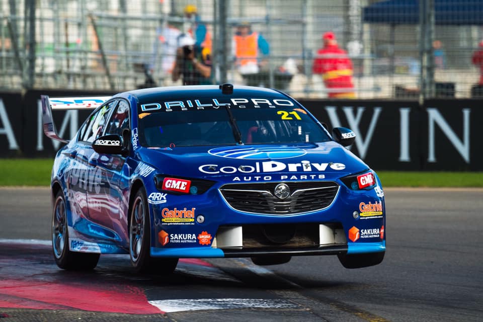
I’ve always been a fan of the CoolDrive livery. Tim Blanchard may have retired after a lacklustre career, but the sponsor remains, with Macaulay Jones now piloting his Dad’s #21 car. There are some subtle changes to the design, with the light blue taking up a lot more real estate along the side of the car. White too is more pronounced this season, taking up most of the rear of the car.
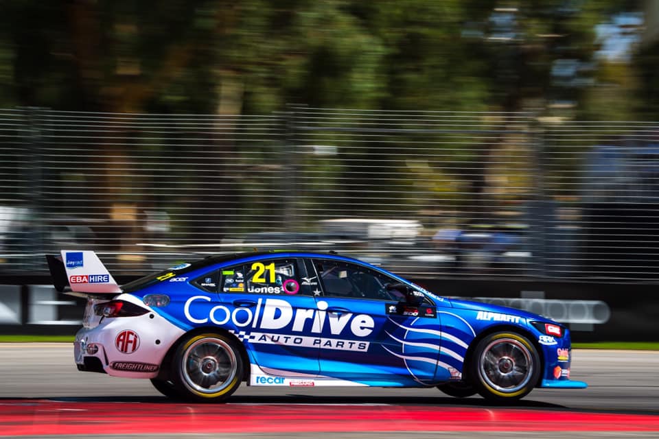
The main attraction to this car is the same, lovely metallic blue from last year, and am only disappointed to see less of it on the car in 2019. However, I’m glad the team makes tweaks year on year to keep it interesting. I also like how the design of the livery follows the wavy theme set by the CoolDrive logo. That’s Cool integration. Sorry.
★★★★
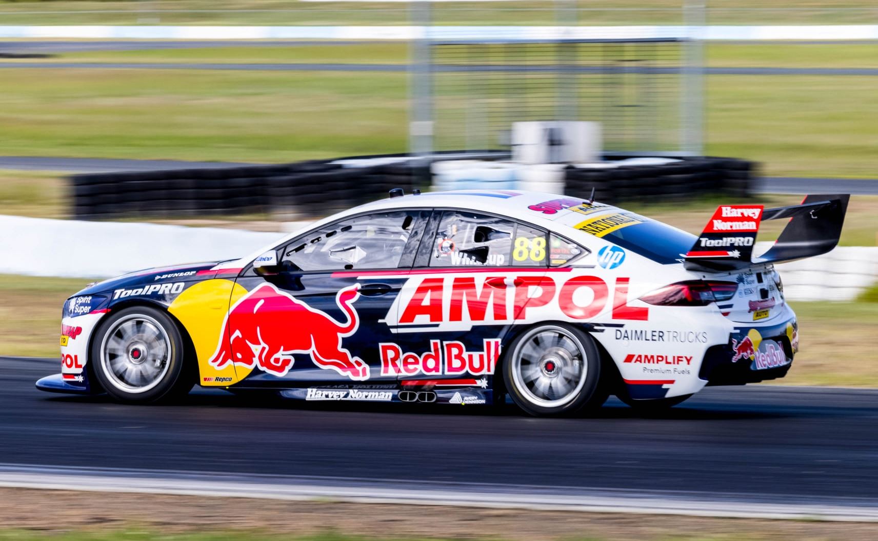
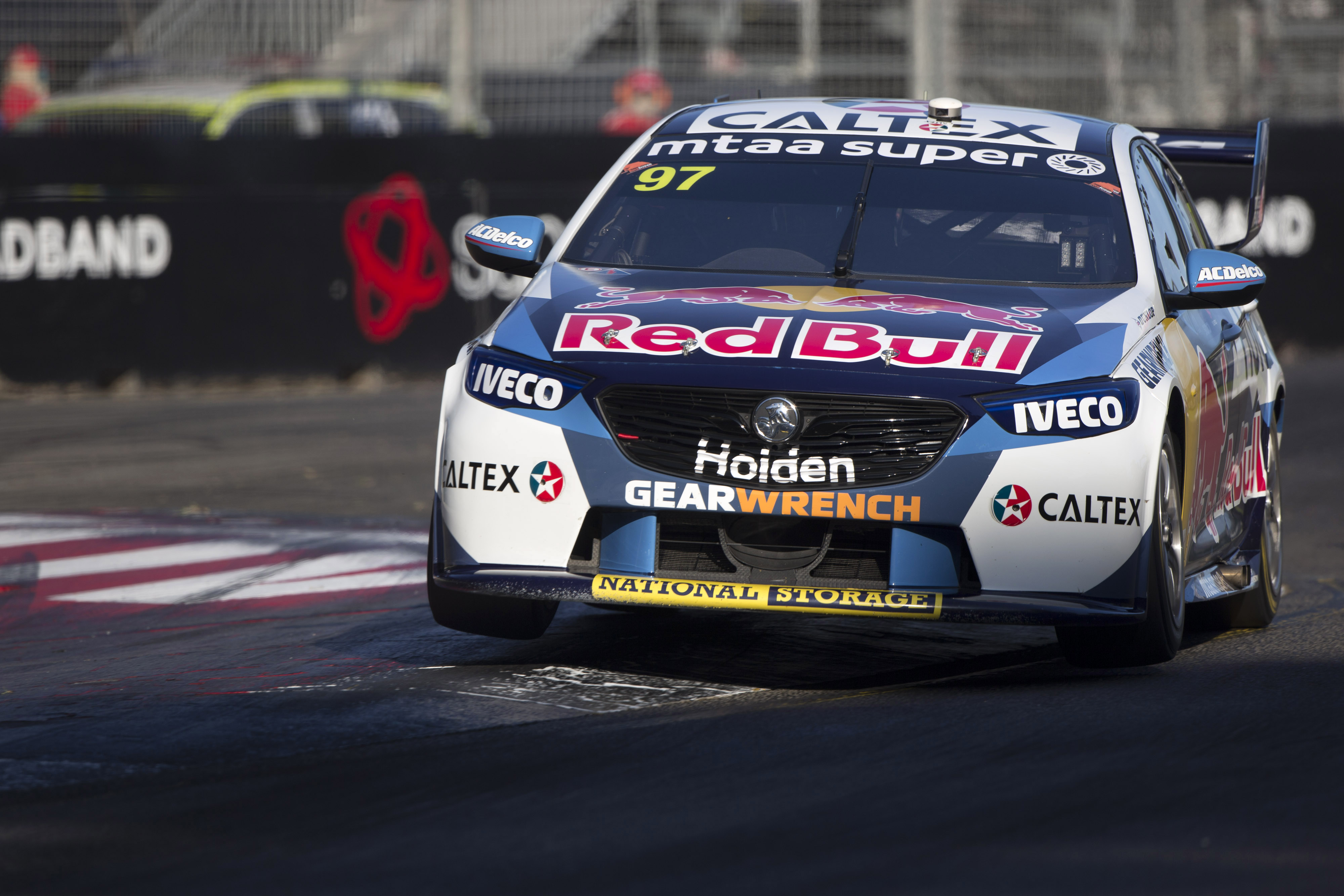
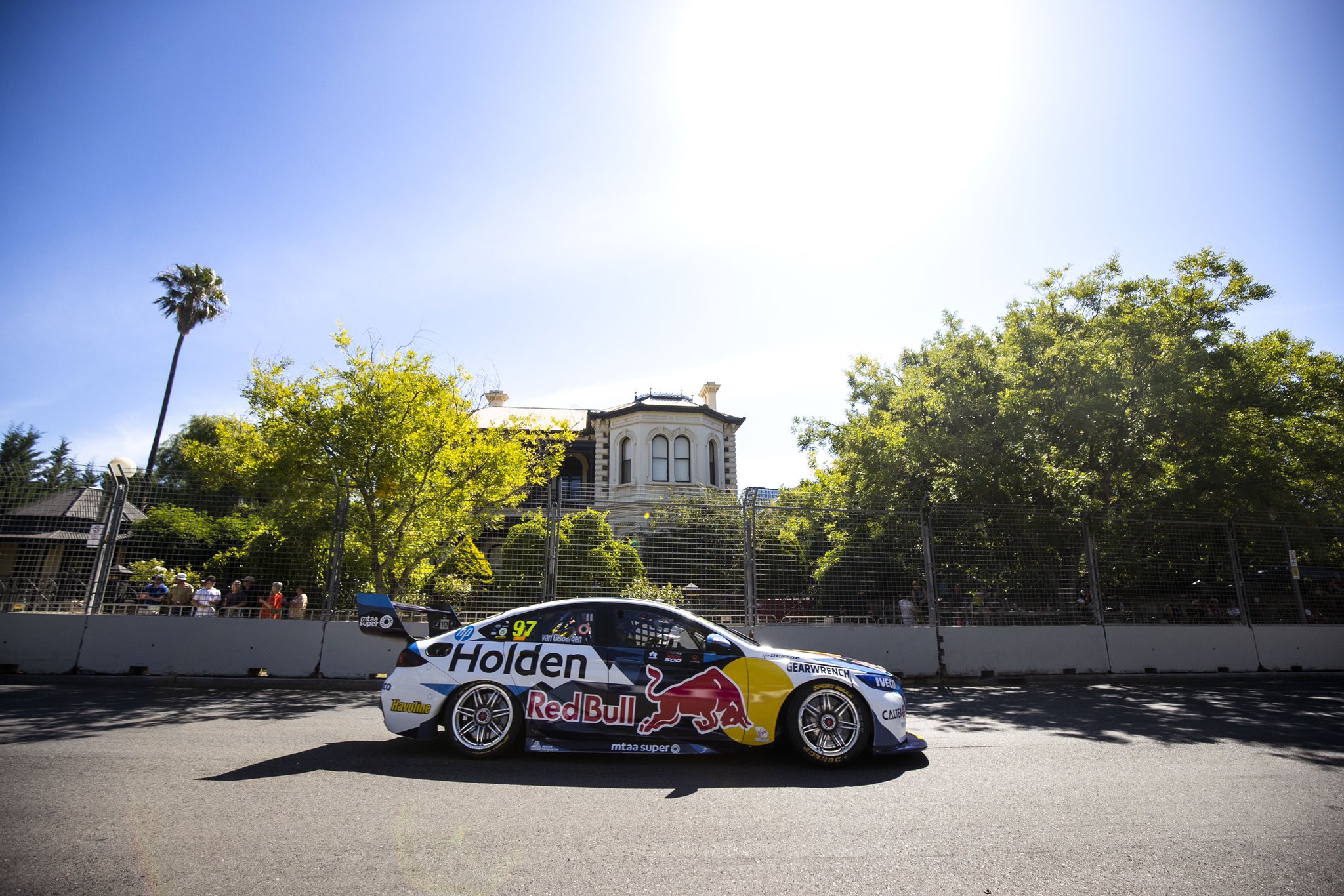
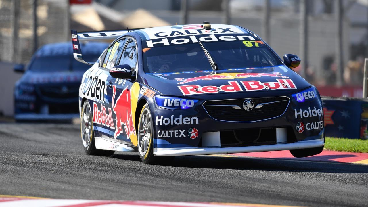
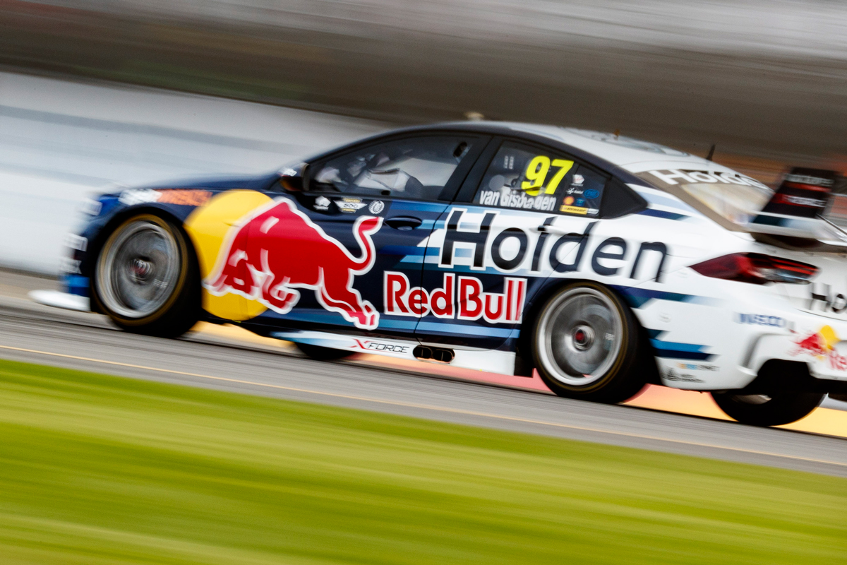
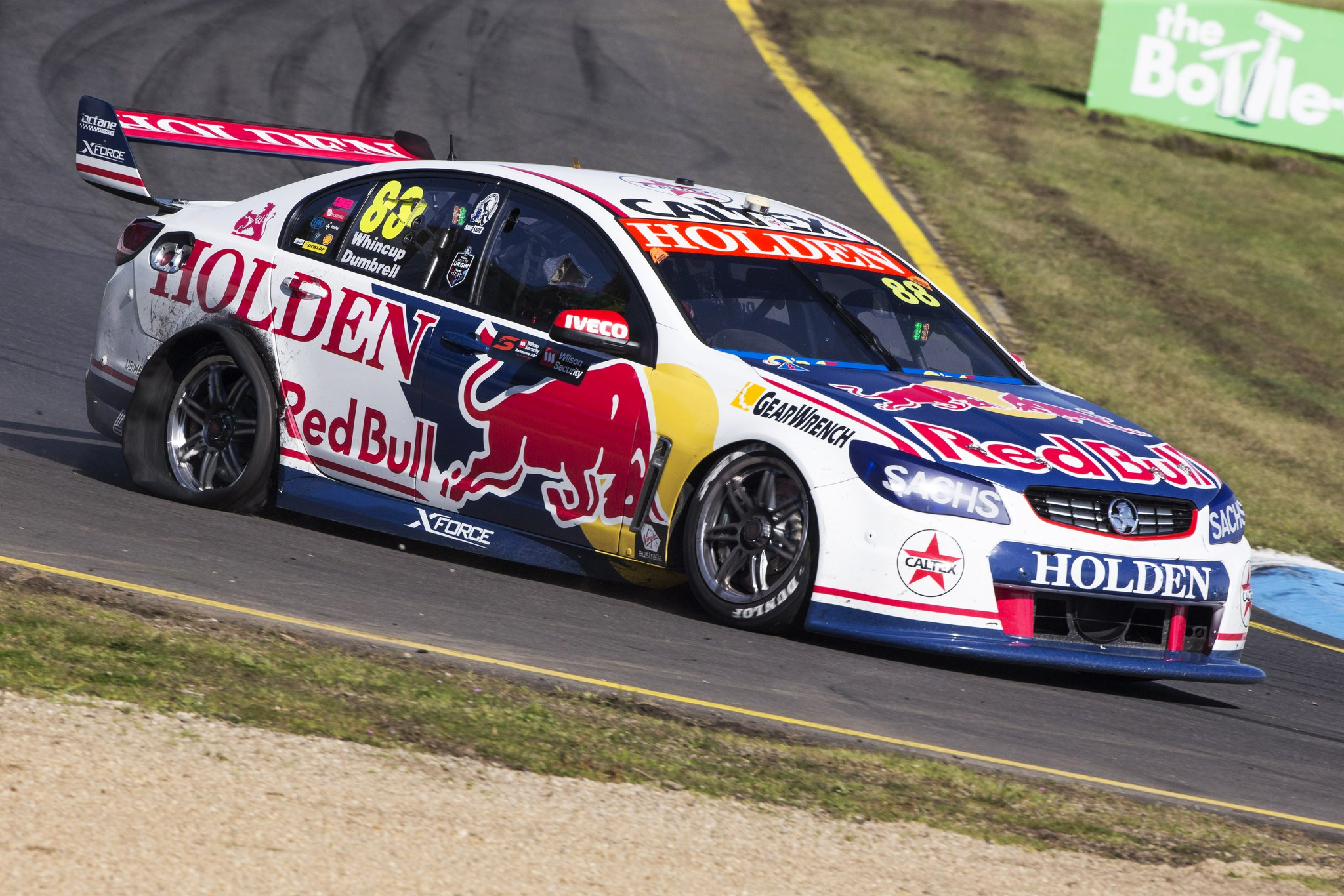
Triple Eight Race Engineering Red Bull Holden Racing Team
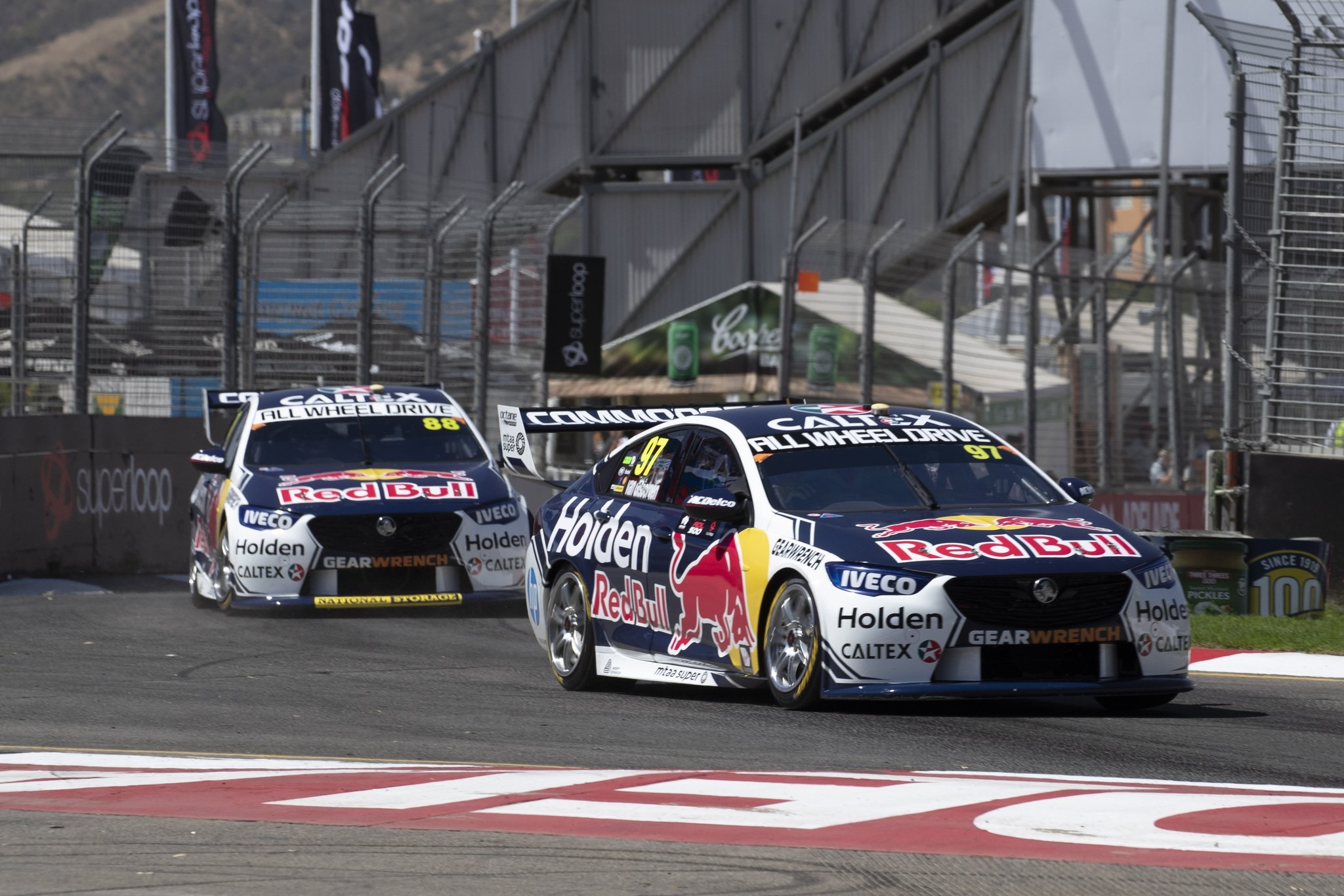
Red Bull were the first team to show off their cars this season, which was really early in fact, just a week into the new year. What they’ve popped out isn’t bad by any means, but doesn’t hit the same standard as season. There’s a lot of white on this one, and comes off looking a little generic, most likely due to how unique the 2018 livery was (which in hindsight I’d rate higher).
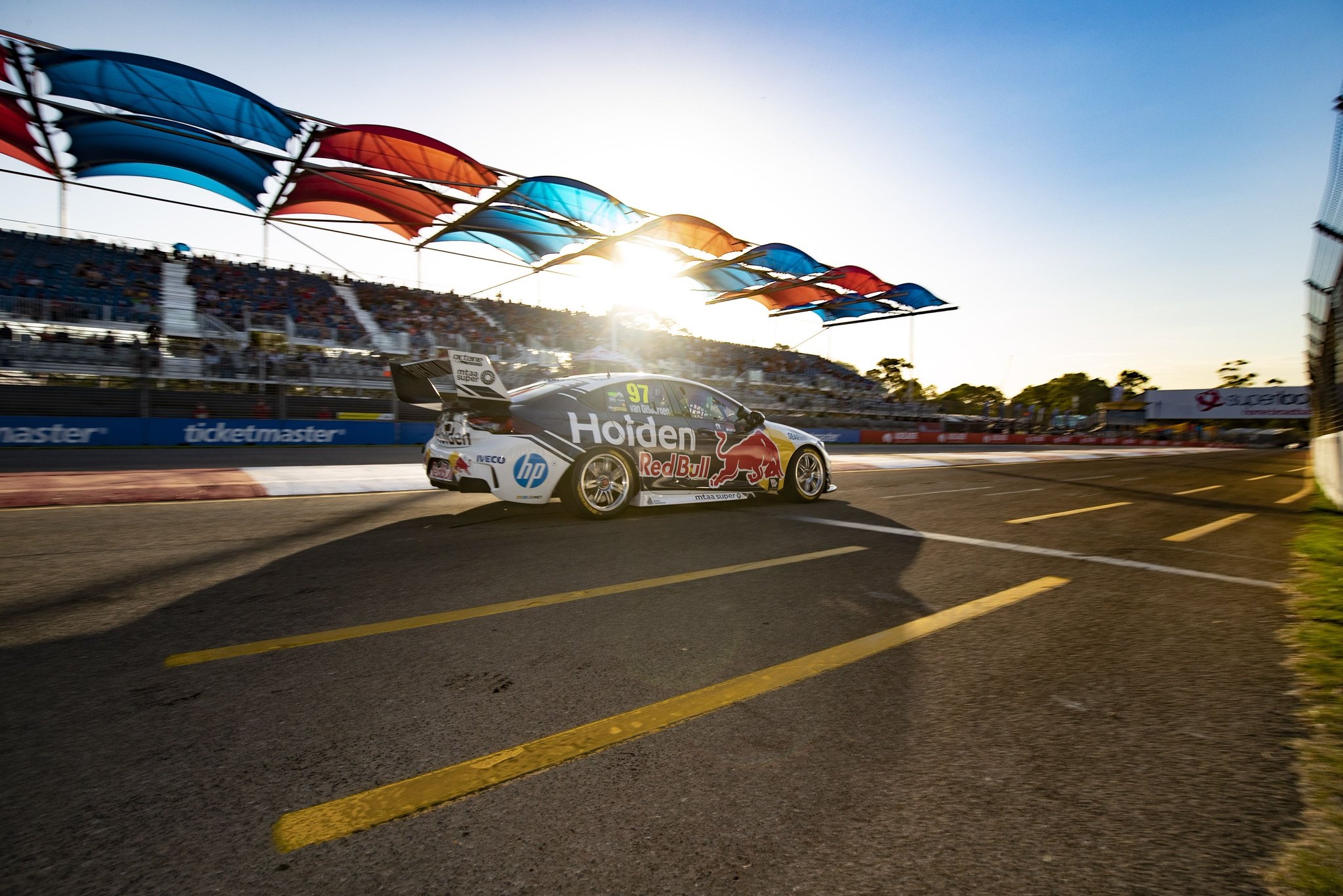
The Red Bull and Holden logos are still awkwardly squabbling for superiority on the sides like a couple of bickering brothers ; two large competing logos in different colours will never completely work on the side of a race car in this fashion. Logos aside, the design sticks mainly to large blue portions on the main panels of the car, with a bit of pin-striping in jagged forms along the edges. It’s an OK livery, but doesn’t get the same originality points as 2018.
★★★
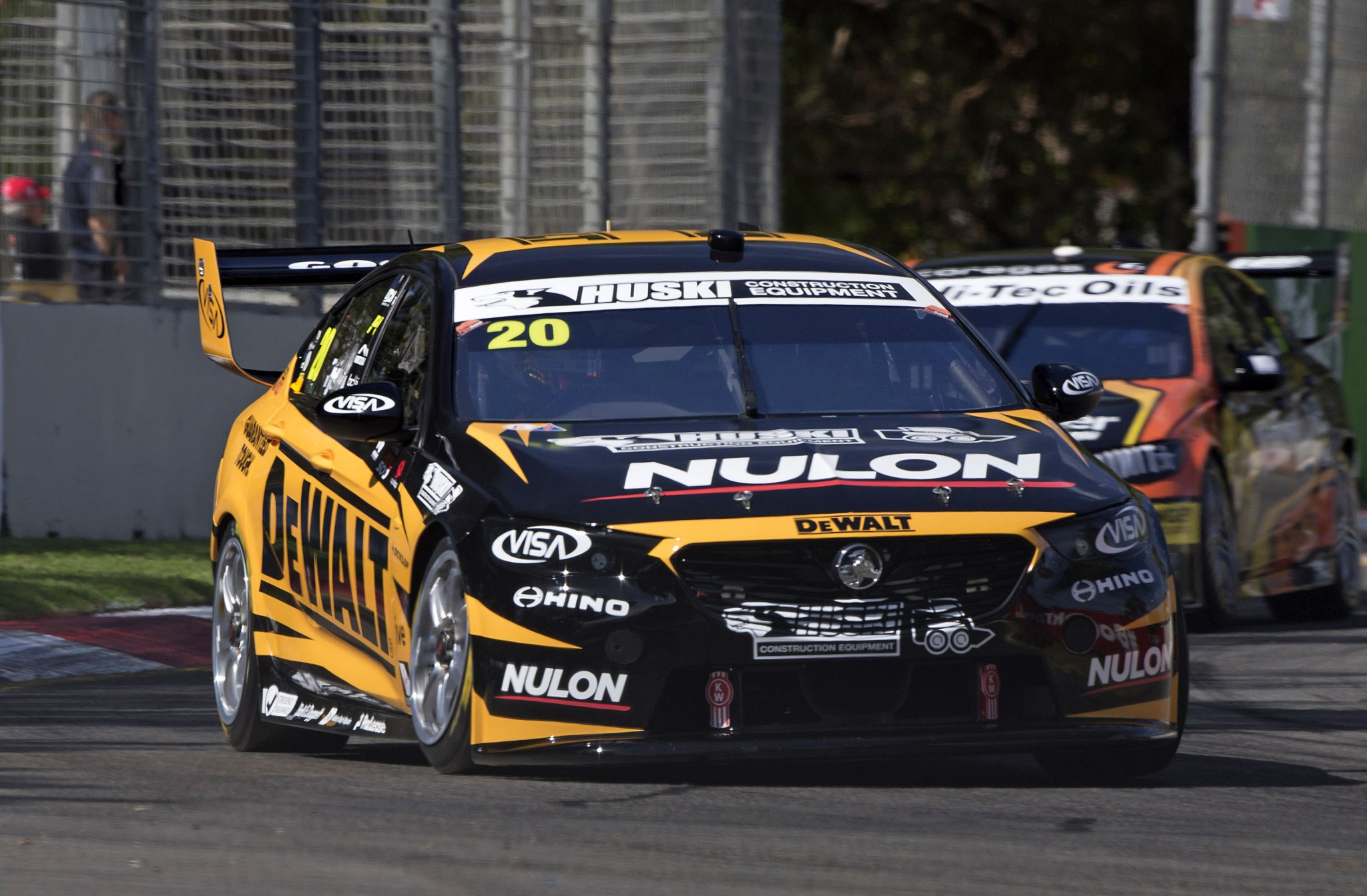
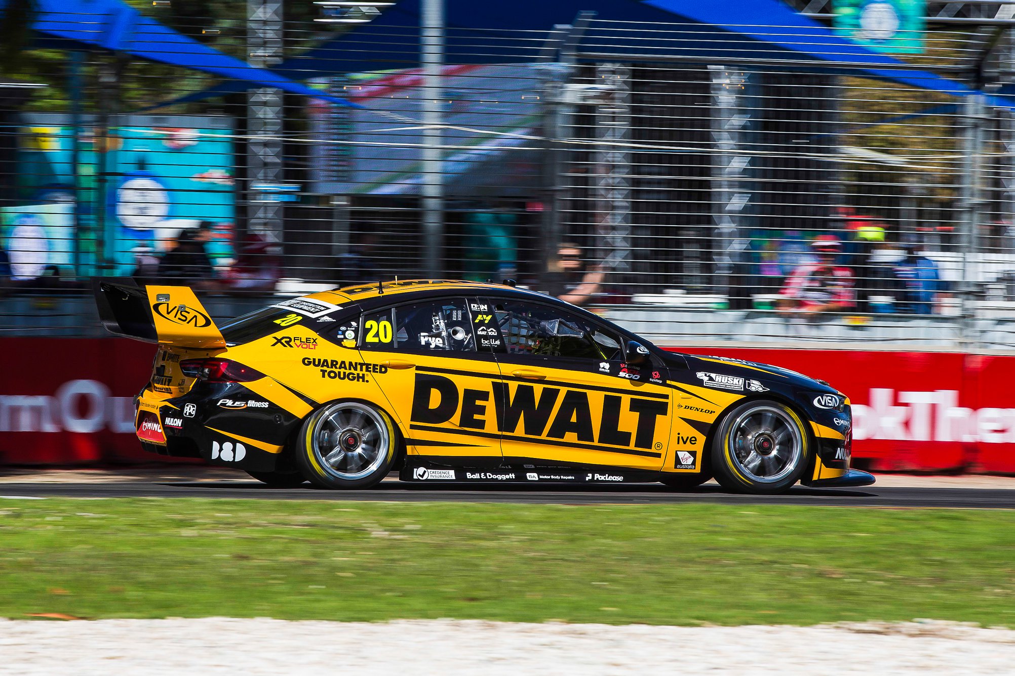
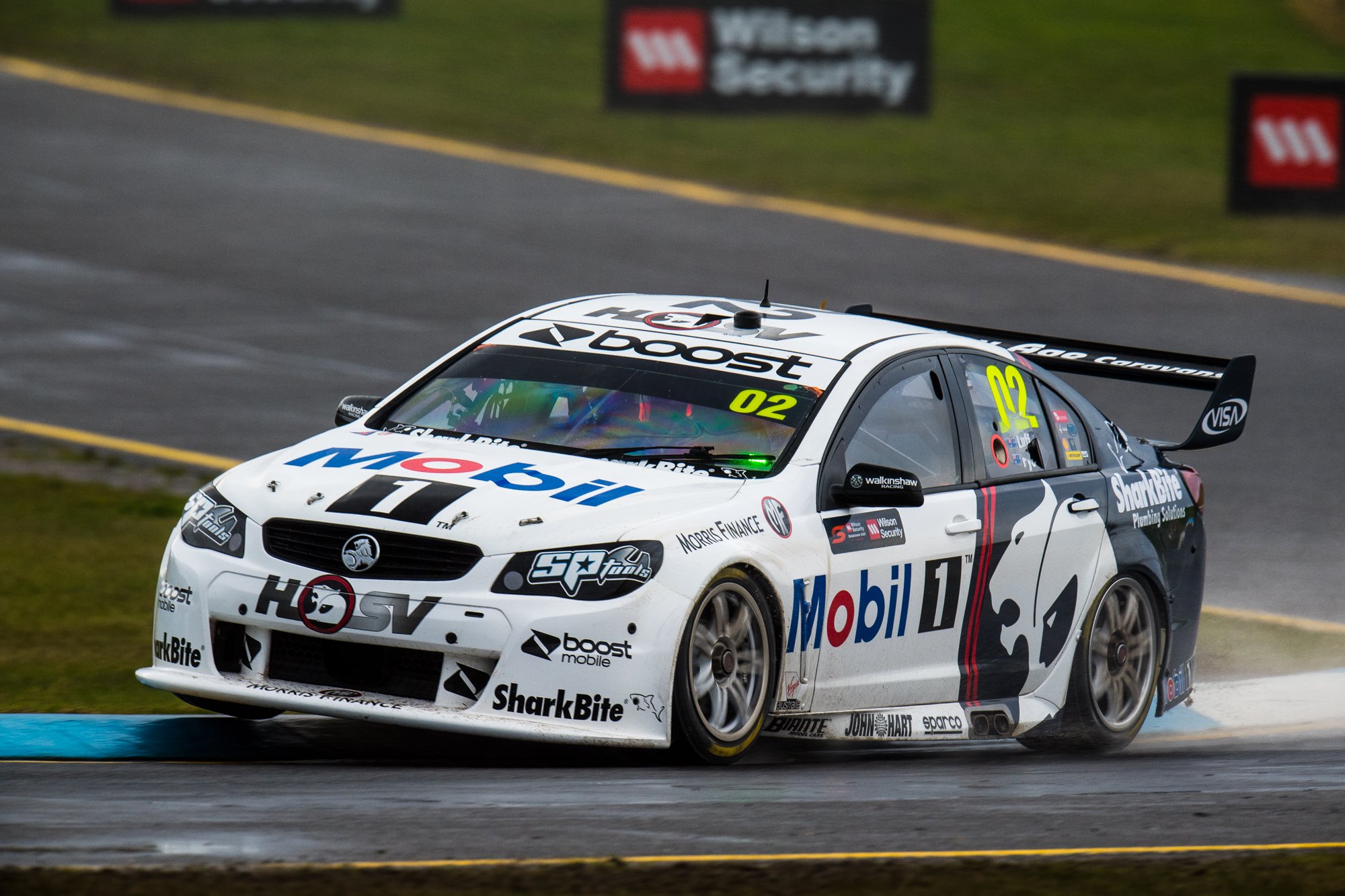
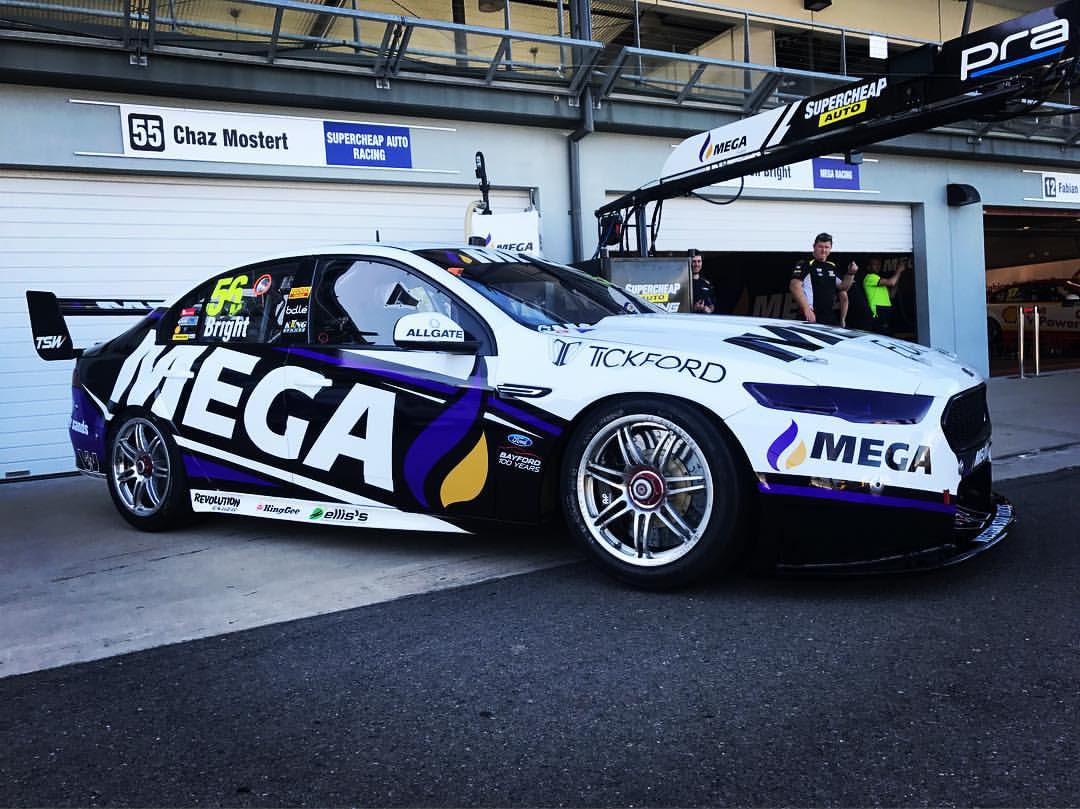
Walkinshaw Andretti United Mobil 1 MEGA Racing
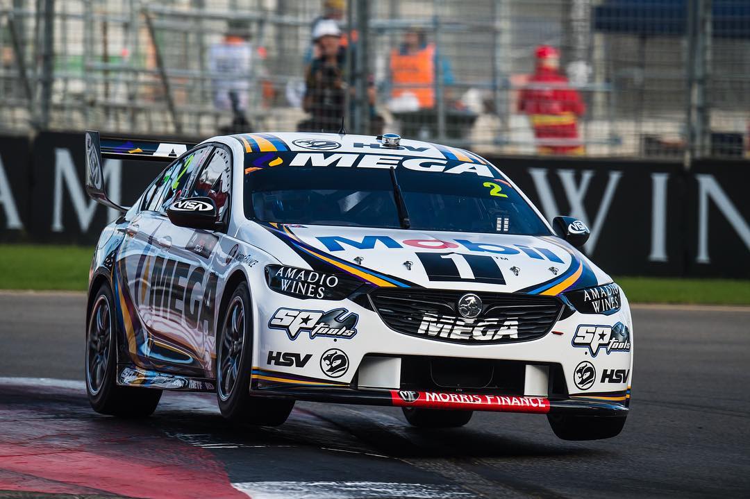
Finally it’s Walkinshaw, who have taken on Mega Fuels as a main sponsor, who have some fairly dodgy photoshops of stock photos on their homepage. This livery, however, is a huge improvement on the sponsors last major design. Here we have a coherent effort, mainly white, taking the odd route of using Mega’s own colours in a less noisy fashion. It’s an inspired choice, as the greater use of purple didn’t work out so well the last time.
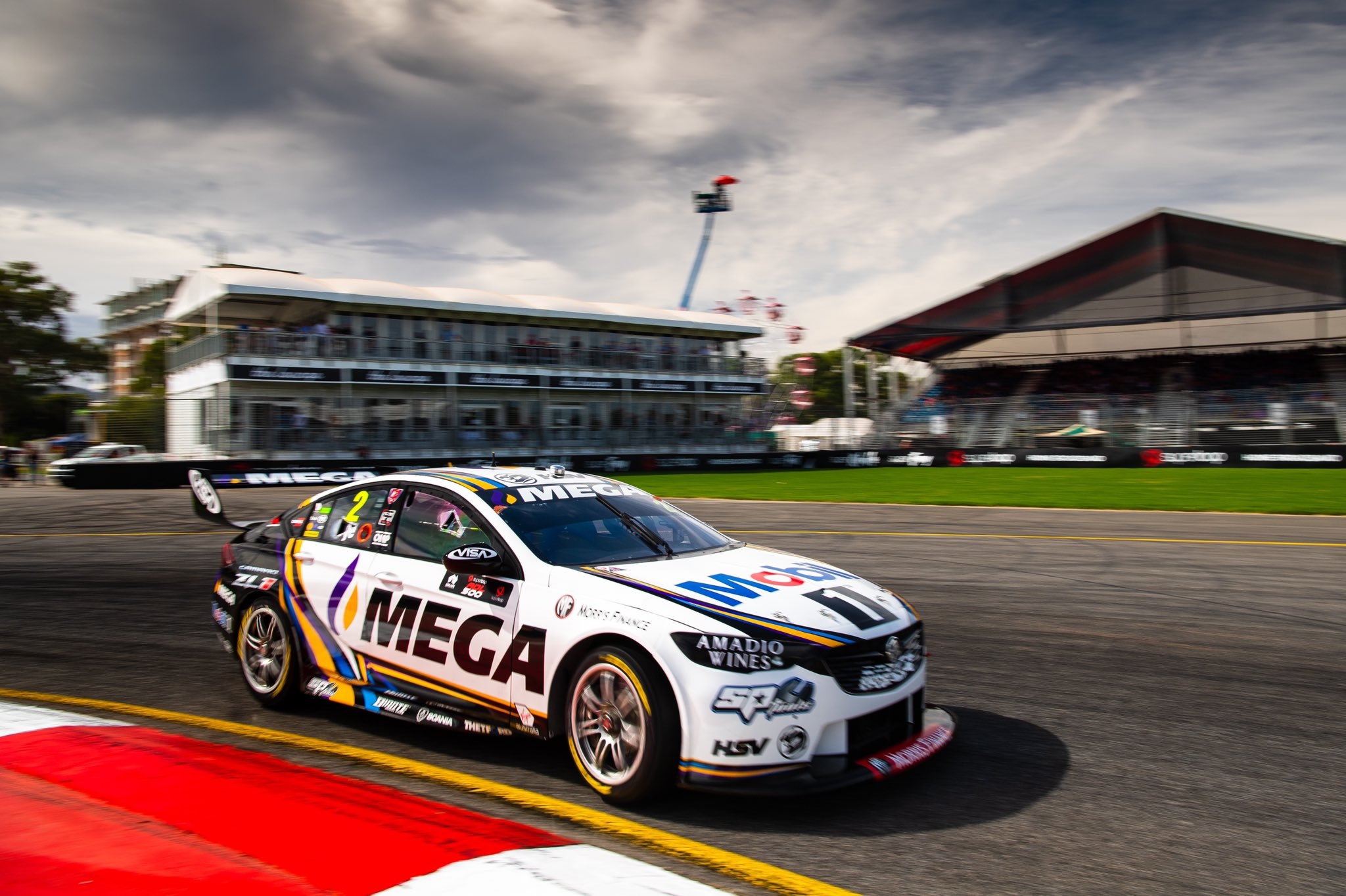
That said, the purple, yellow and blue work very well as intricately intertwined ribbons of colour separating the black and white sections of the car. The theme is maintained across the sides, roof and bonnet and keep us interested enough with a splash of colour, as opposed to a mainly purple and yellow livery (which I’d have been intrigued to see). A good effort, and possibly thanks to Mobil, still maintains a strong Walkinshaw identity.
★★★★☆
Time for the bonus awards!
Best Look Award – Matt Stone Racing
I didn’t think this would be my pick, but it’s just a clean, satisfying car to look at.
Least Attractive Award – Kelly Racing Castrol Racing
BP Ultimate just kills this one, but isn’t the only fault. The weaker red lines don’t work well against the main green either.
Most Improved Award – Brad Jones Racing & WAU
Brad Jones for the National Pharmacies livery is a little unfair as it’s not a season long livery, so it’s probably more fair to give it to Walkinshaw. Mega have come a long way since Jason Bright’s Falcon in 2017, and is a lot better than Stanaway’s Falcon that they featured on last year too.
Almost There Award – 23 Red Milwaukee Racing
They’ve made changes this year, but still have the same rating. Red, white and black have lots of potential – a couple of inspired tweaks could see them move up the ranks in 2020.
Most Annoying Award – Freightliner Racing
So much potential with those colours, but they insist on having those yellow and silver lines more or less ignore the Freightliner logo. Drives me nuts.
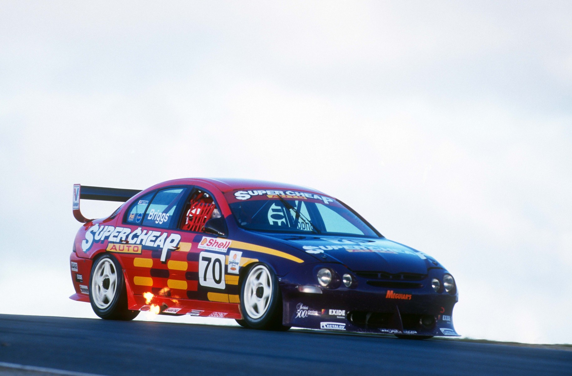
Sponsor That Should Be Angriest Award – Supercheap Auto
I don’t know, maybe they did have a say in the livery design? Regardless, to dictate a livery and be so much less prominent than in previous years…I’d be annoyed if I was on their marketing team. Maybe this is just subjective though?
So, let me know your thoughts in the comments below. Do you agree with my opinions, or am I totally wrong on any of these?


