We started the season with a bombshell, that at the end of the year, the Holden name would be discontinued by GM. While the ‘Commodore’ will run in Supercars until the end of next year, there’s plenty of uncertainty moving forward. There are rumours of Mostert helping to bring BMW to Walkinshaw, and everyone continues to bang on about a KIA Stinger Supercar, but at the end of the day a major overhaul for the series is likely given the biggest (and most favoured) manufacturer in the sport is leaving. All we can do in the meantime is watch the racing that we love, while it lasts, and admire these cars for better or worse.
Boost Mobile Racing
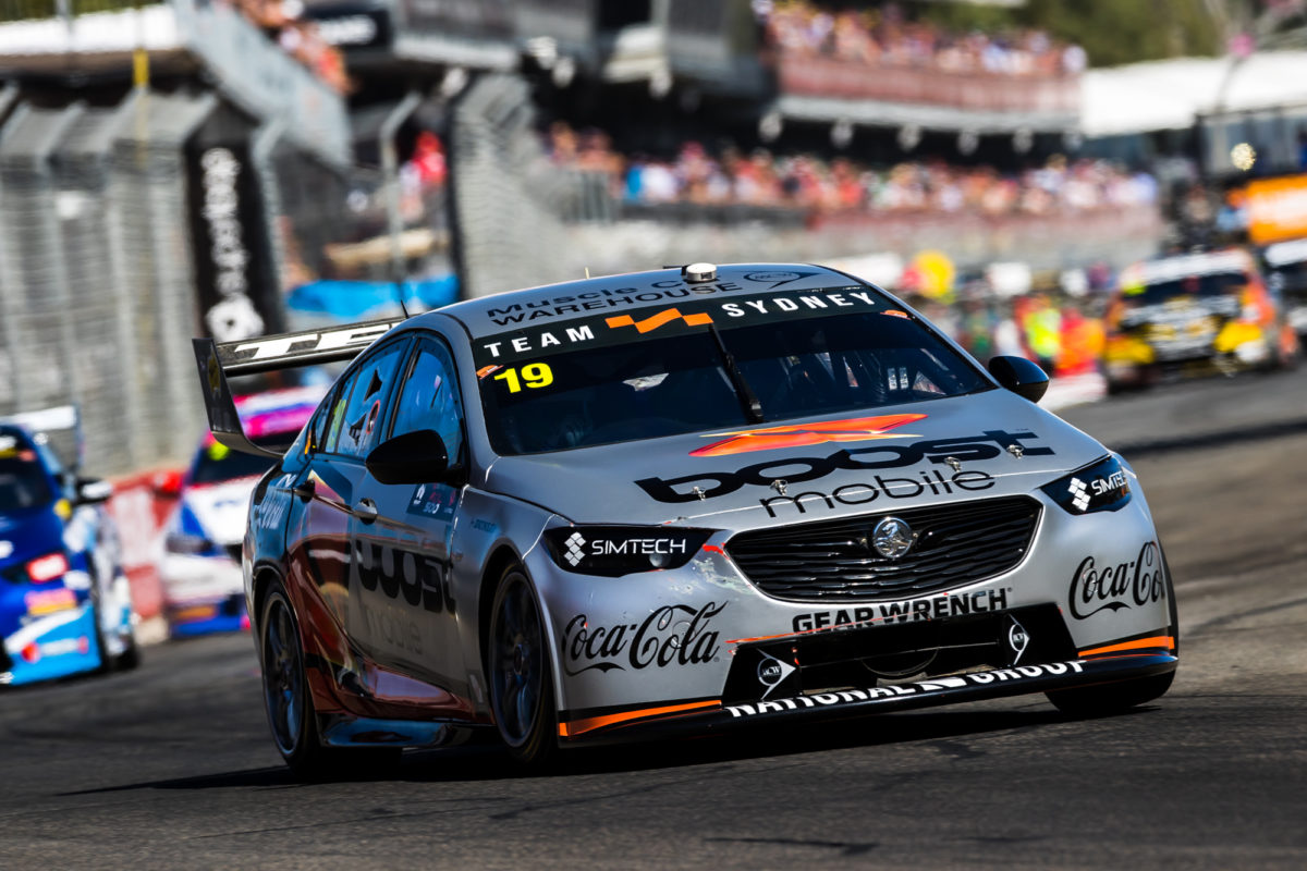
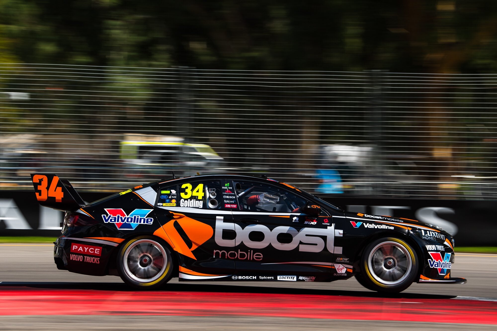
It hasn’t taken long for a Boost Mobile car’s season to get flushed down the toilet. For unknown reasons, Courtney has split with Team Sydney after just one race, but controversy is never far away when Adderton is involved. Either way, they were running silver Boost livery with a similar theme to those that came before it.
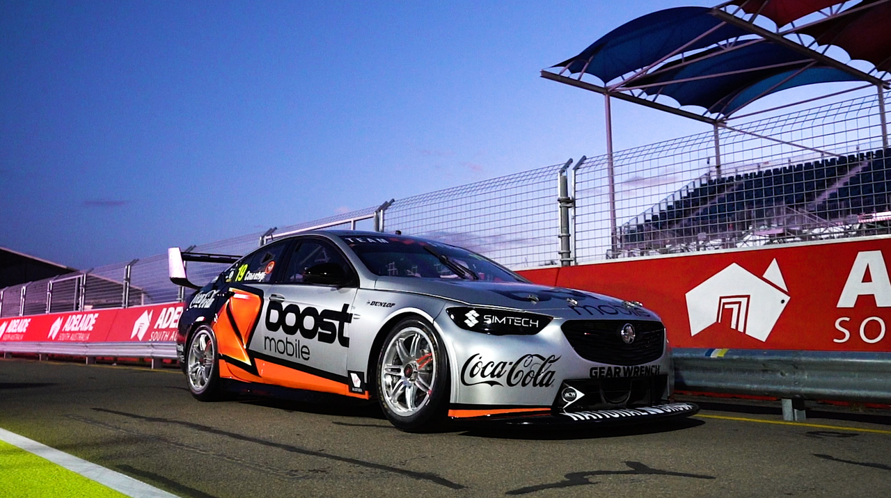
It’s comparatively weaker than last year’s GRM livery, mainly because the black livery looked more aggressive. This one is a lot simpler, which is more detrimental on a lighter car than a darker car. Let’s see where Courtney and Boost end up next!
★★★☆
Brad Jones Racing
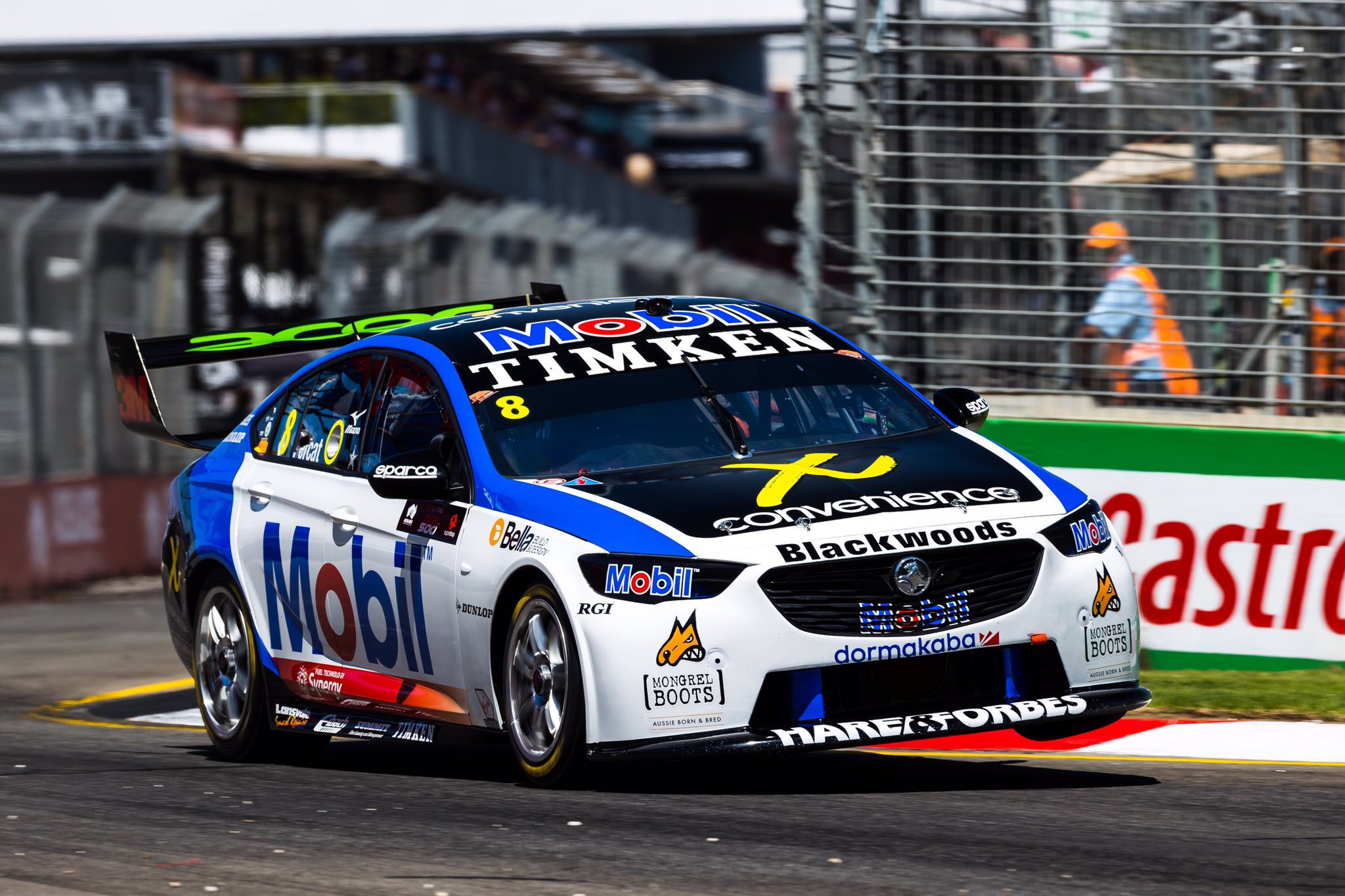
Percat looks to be back to his livery changing ways, starting of with a clean Mobil livery for the Superloop 500. I wonder how much time and resource BJR put into designing and applying a different livery each race?
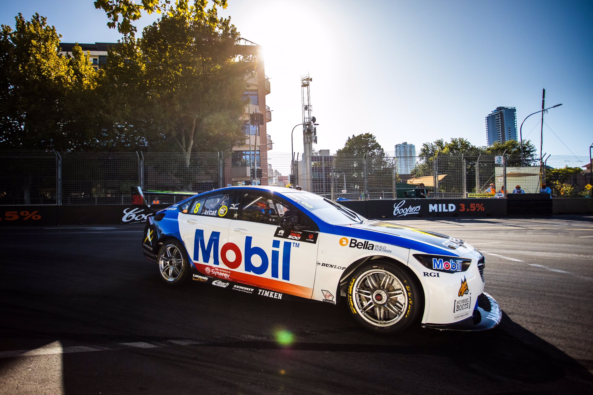
There isn’t that much going on, just a large blue section toward the rear and along the edge of the roof and bonnet. The fading red line is a great idea, but makes the Mobil logo look way off centre because it’s avoiding the series wide sticker on the driver side door. This lopsided look could have been avoided with a parallel red line above, which would have framed the logo far better.
★★★
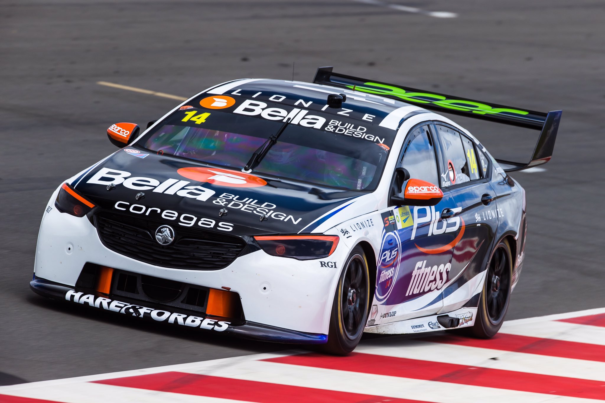
On the other side of the garage, Todd Hazelwood in running in Plus Fitness colours, with a cool fading blue to black design along the side of the car. This is a great effect, but I think they’ve missed a great opportunity to extend this to the bumper, as the white takes away from the car’s identity. Makes it a little generic and bland from the front.
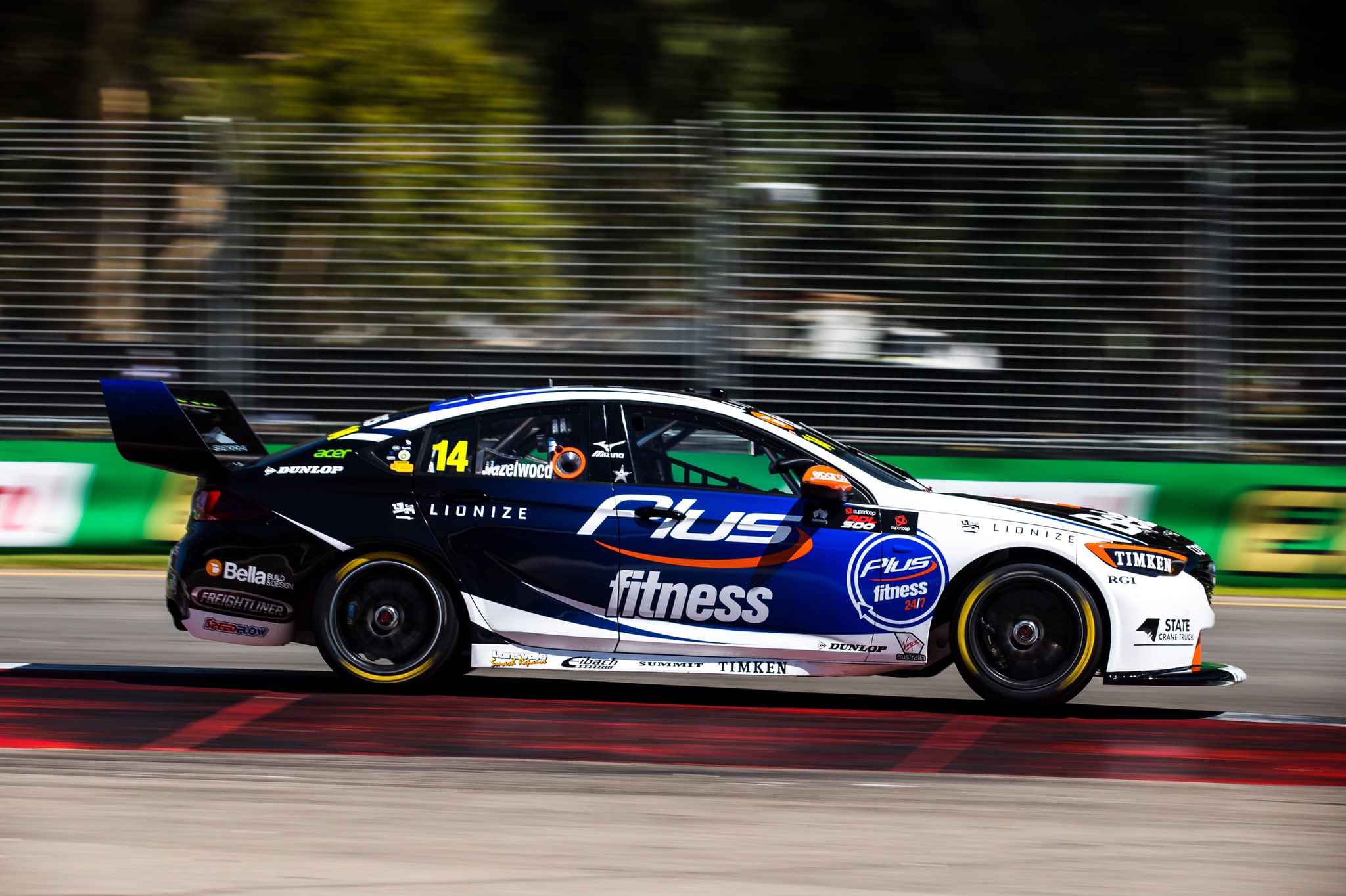
It looks fantastic from the side, the fade from dark to darker is really nice, as are the white spikes that curve up into the empty space. The orange flashes are a great touch too, especially on the headlights, making the car look extra aggressive. Just wish there was less white on the front of the car.
★★★★
Castrol Racing
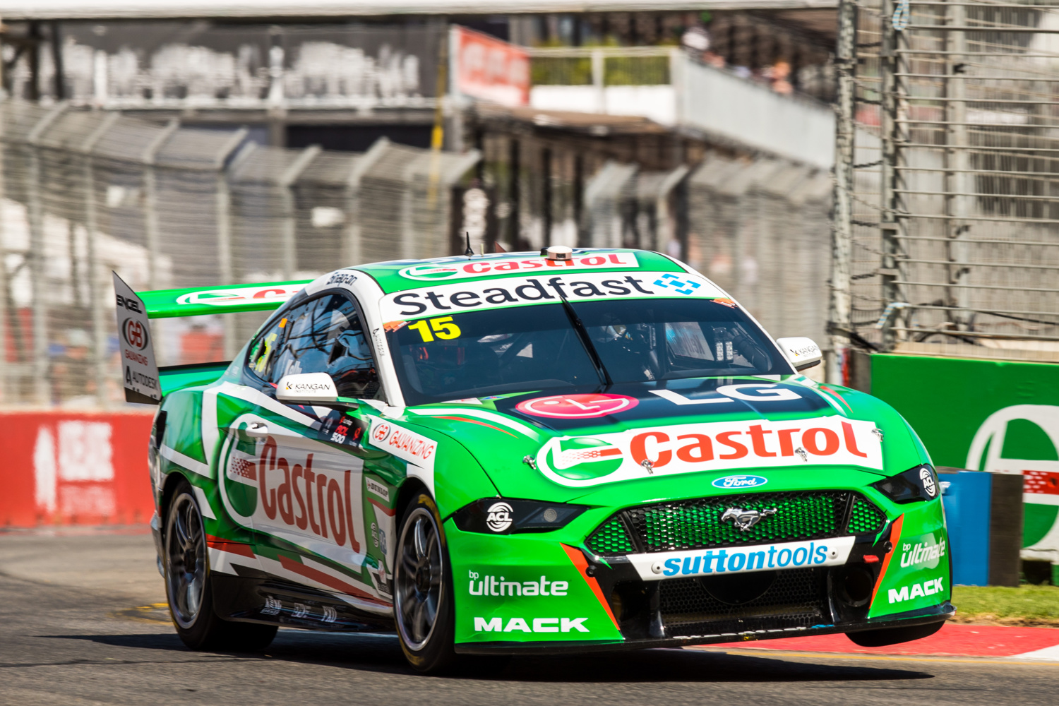
Kelly Racing had a big task over the summer, moving from Nissan to Ford, although downsizing from four to two cars would have helped. There’s also some continuity, Castrol sticking with Rick Kelly and painting a Mustang green. They’ve also stuck with a jagged livery theme, although it’s executed far better on this occasion.
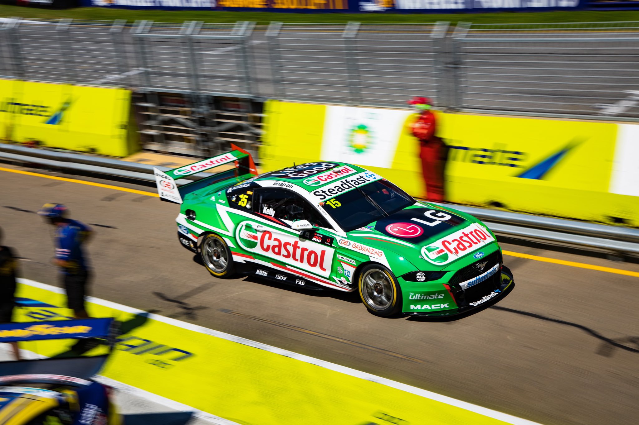
No BP Ultimate on the car helps significantly by removing a colour clash, as does the toning down of the red on the car overall – it was a little rough to look at when overlapping the green. The small black sections toward the bottom of the car work well too, and aren’t bad on the roof and bonnet either.
★★★★
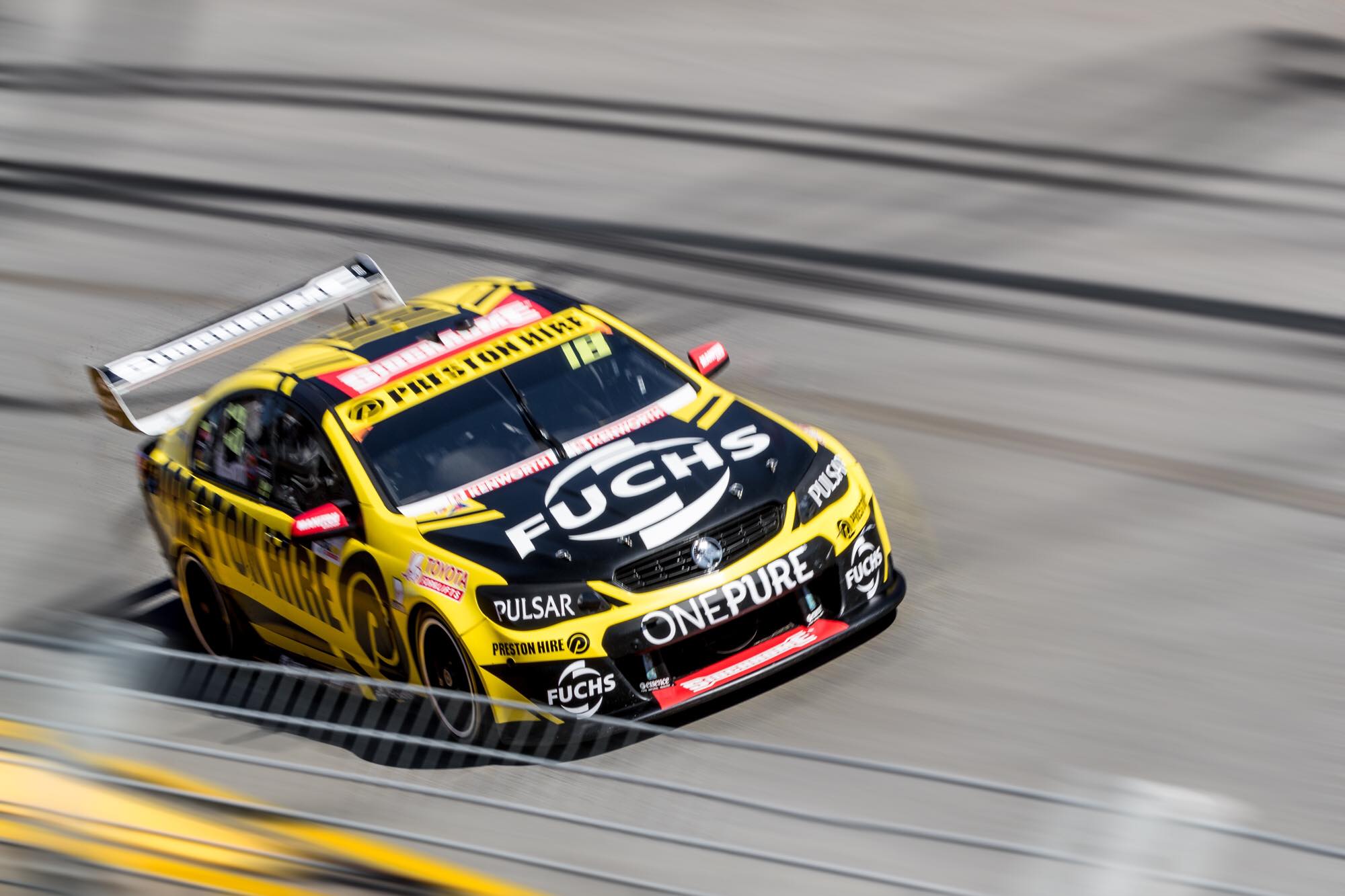
DEWALT Racing
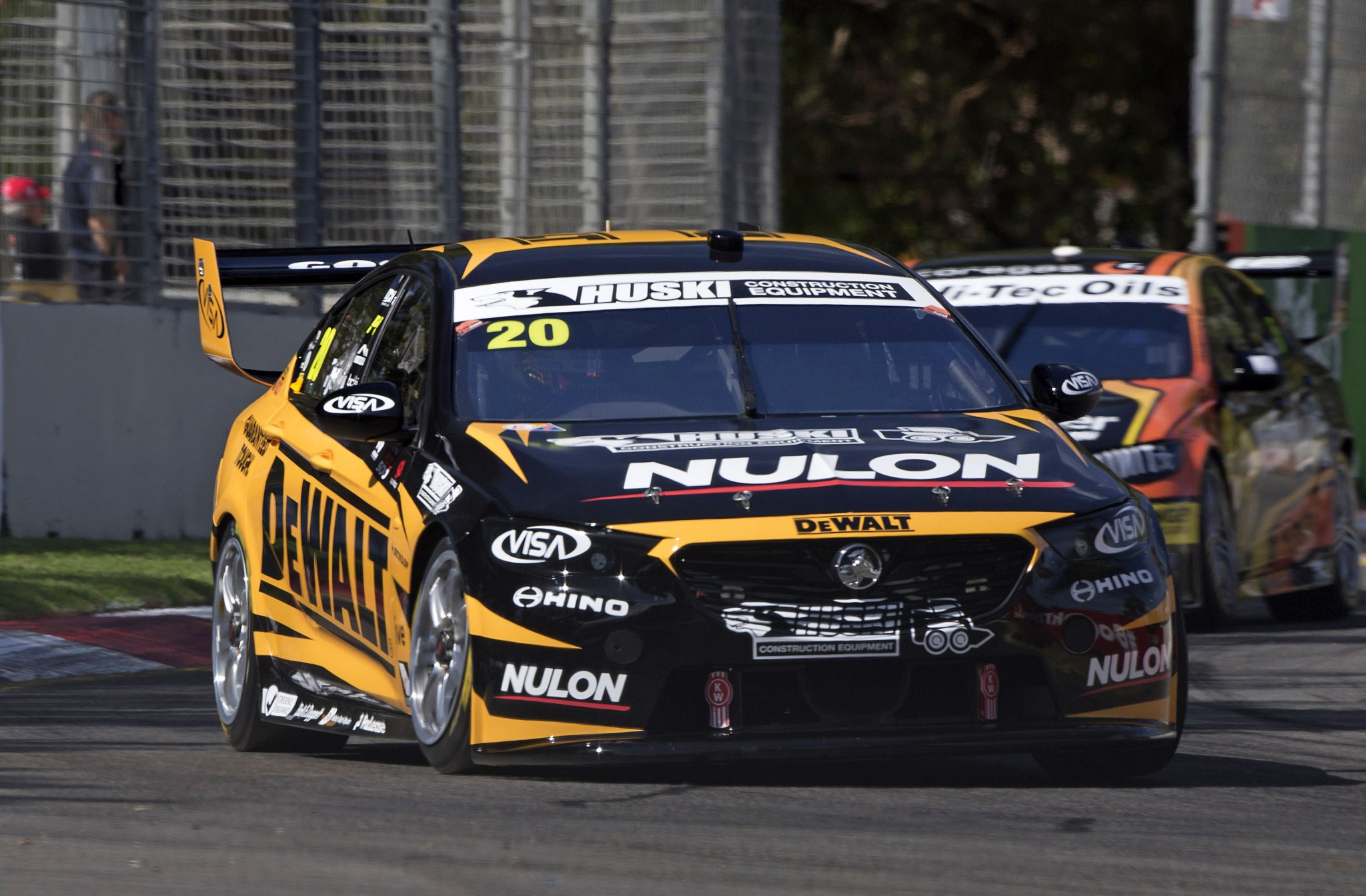
Team 18 expanded to two cars this season, with Scott Pye joining the new DEWALT Racing. DEWALT has brought black and yellow back to the team; Preston Hire used these colours successfully with Holdsworth a few years ago. It’s a strong, near two tone effort with a fairly standard spiky design. The design and main logo are lined up well which is aesthetically pleasing.
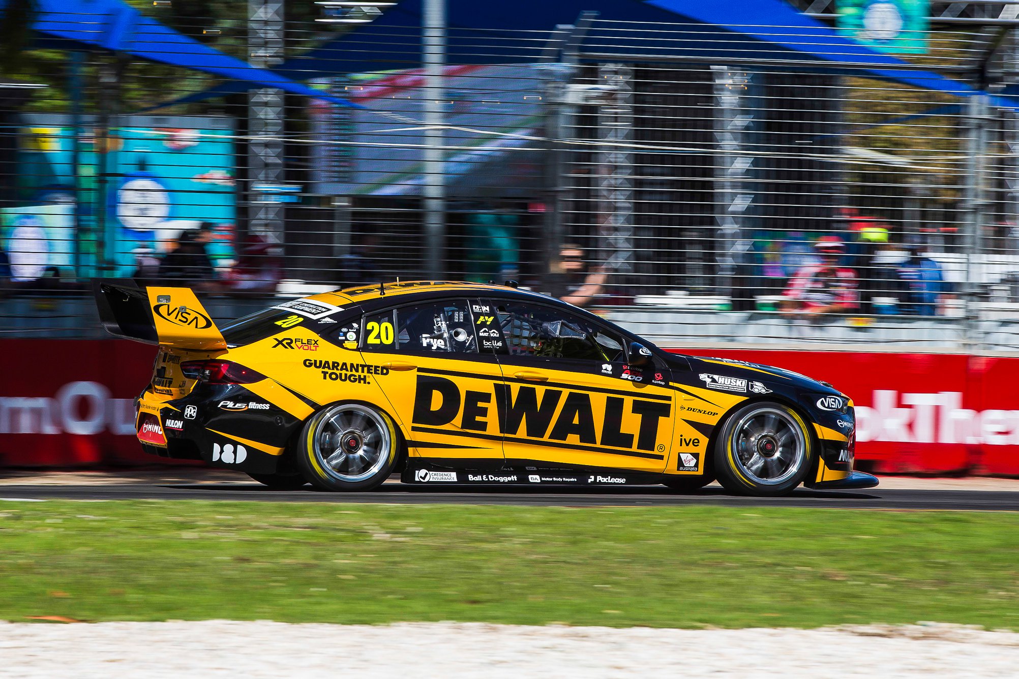
There is not a whole lot to it. Yellow and black is a great combo and everything is planned and laid out well.
★★★★
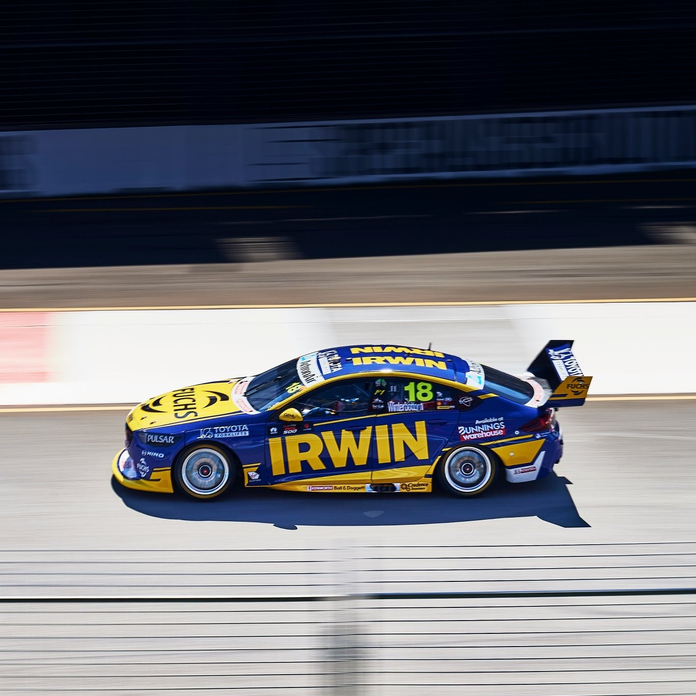
IRWIN Racing
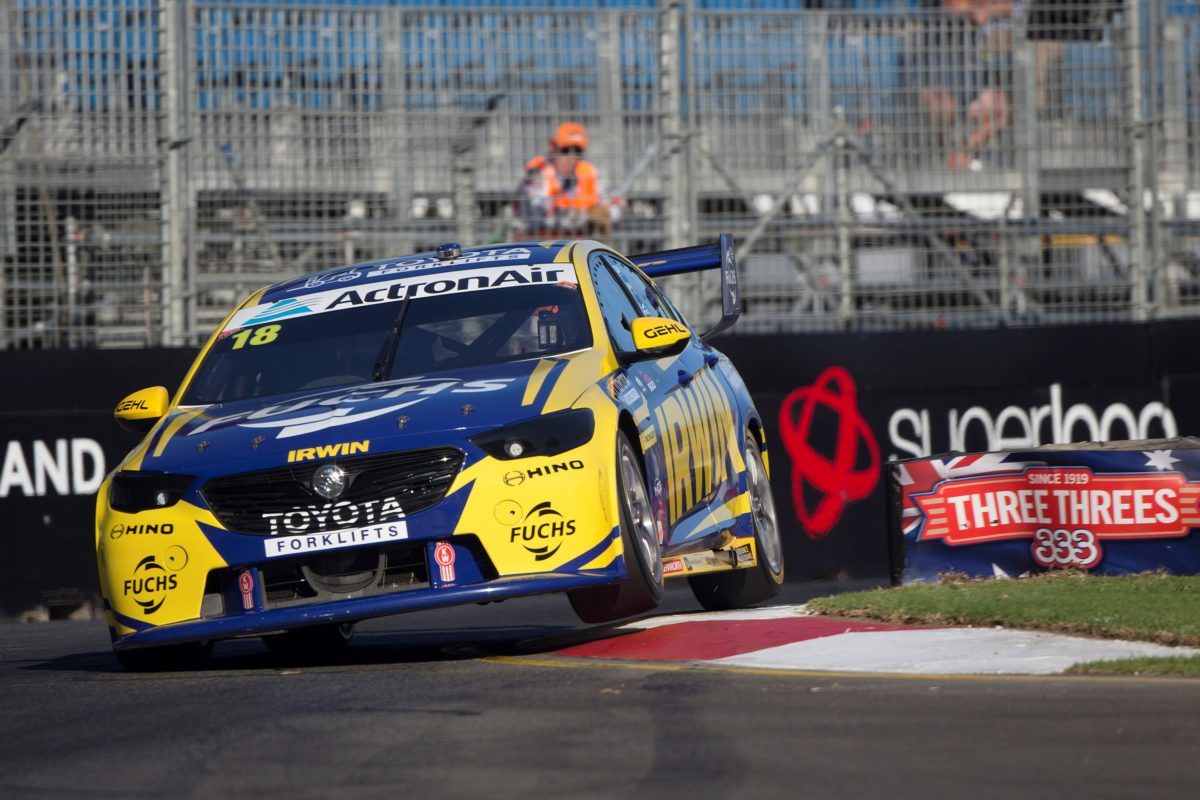
Winterbottom is back in the IRWIN car this year, and the livery is only subtly different. There are parts I prefer about this one, such as the removal of the white sections, and parts of last year’s one I like better, such as the jagged, broken lines along the side of the car.
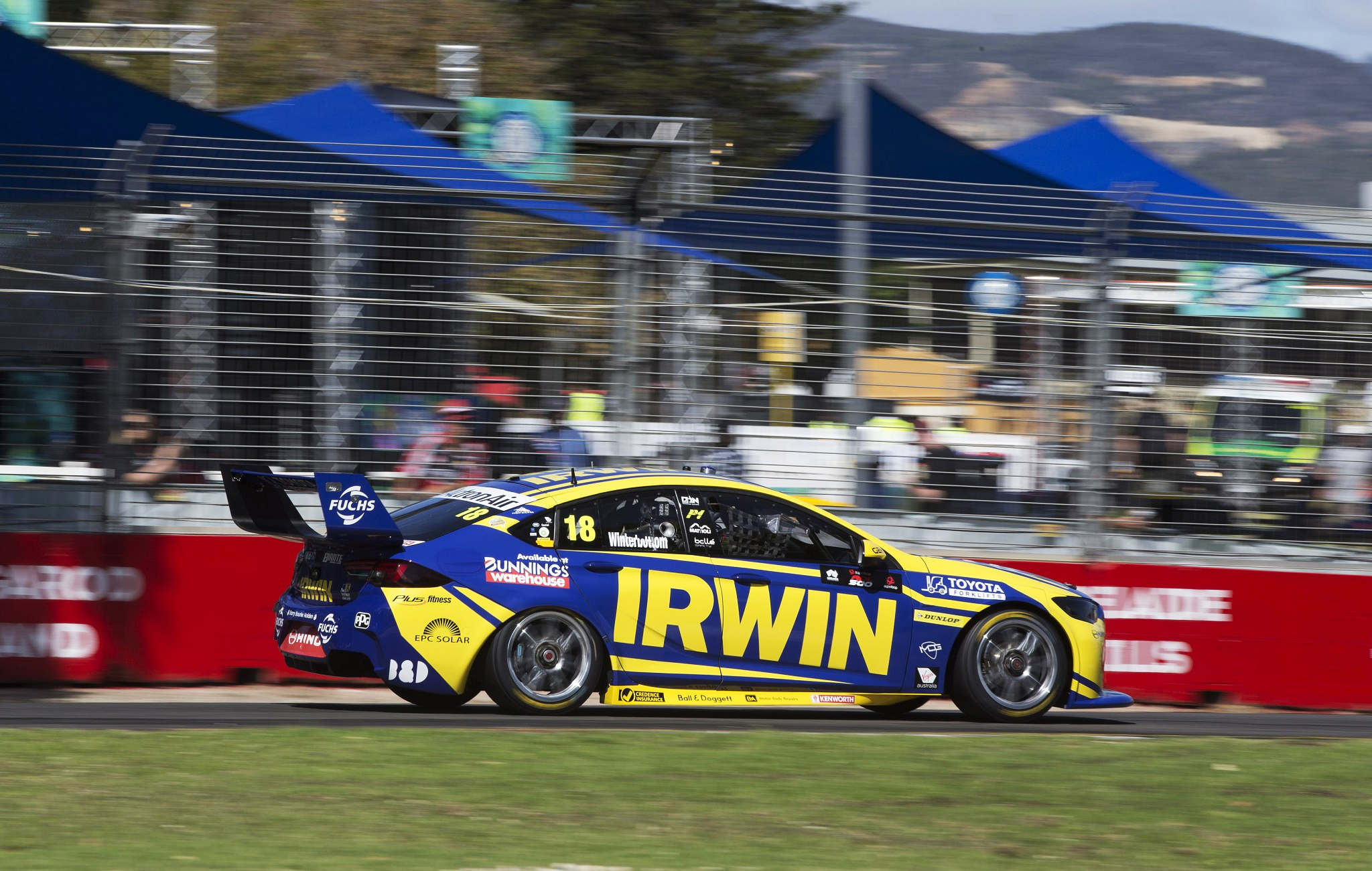
If I had to choose one, I’d choose the 2020 car. It’s super clean and although the designs are different, the teams’ two cars match each other well, which is ironic considering they are competitors. Once again, Team 18 don’t disappoint.
★★★★
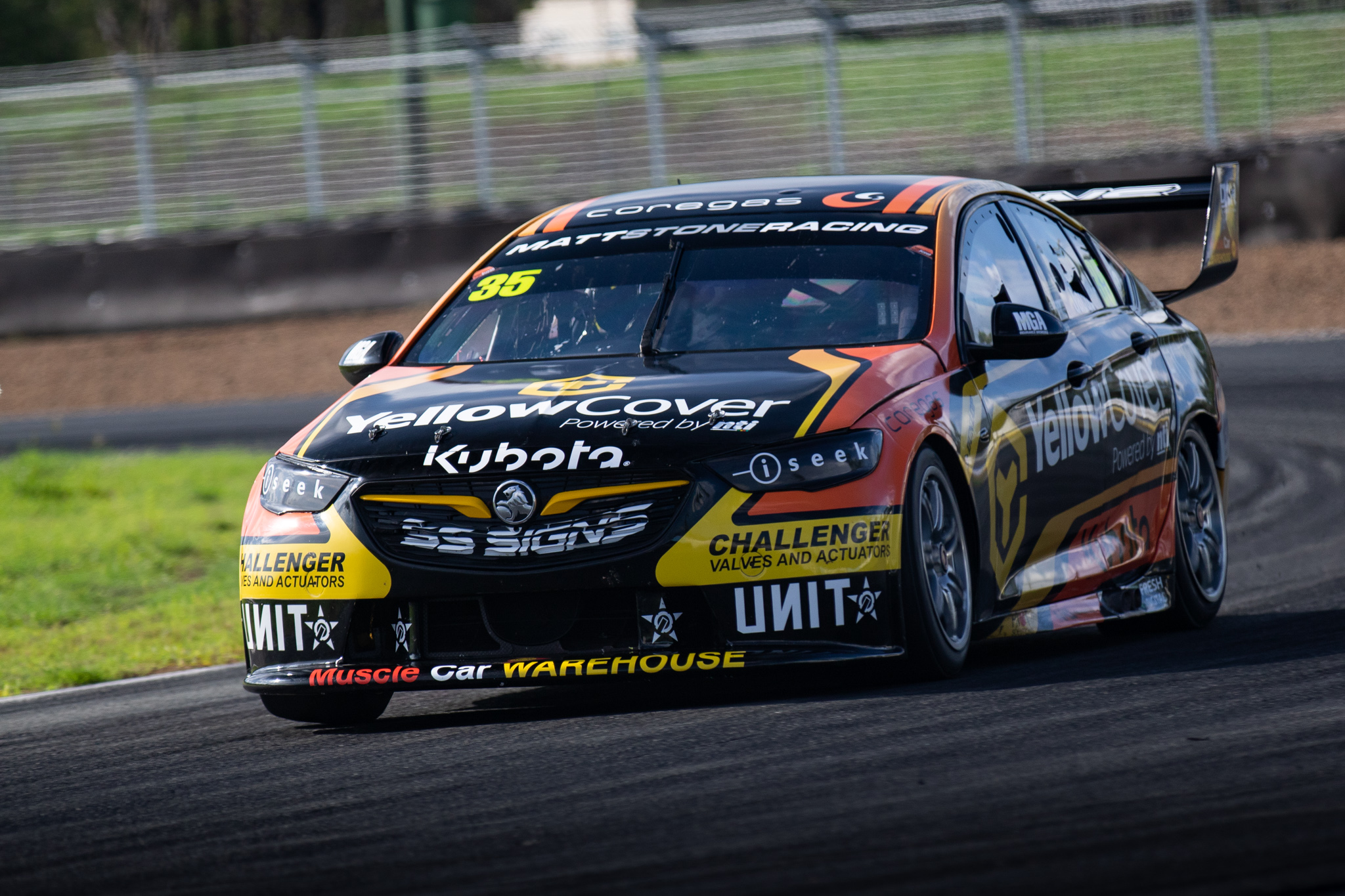
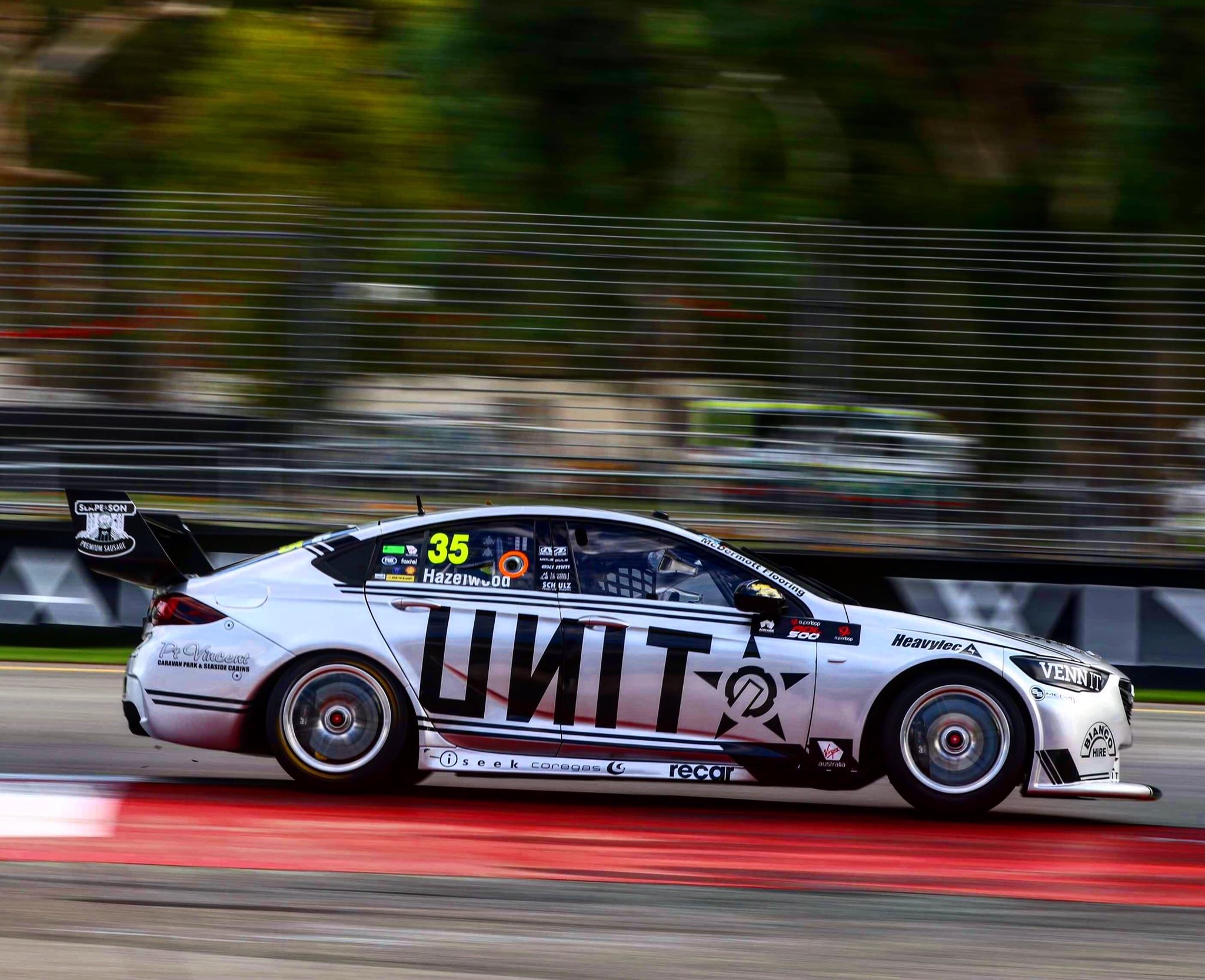
Matt Stone Racing
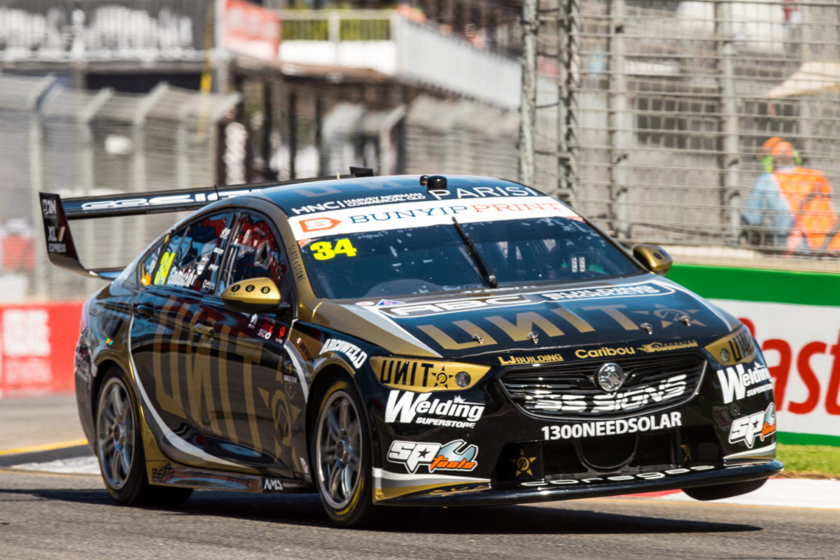
Matt Stone Racing also moved to two cars in 2020 and whilst they’ve retained Unit as a sponsor, they’ve unfortunately gone for a new theme with the livery. Last year’s almost all silver livery was my pick of the bunch, but moved from silver to gold. It’s a slightly too cool (rather than warm) and dark gold, which doesn’t really shine unless you catch it in the right angle, in the sun. Paired with black, it looks quite dull in most cases.
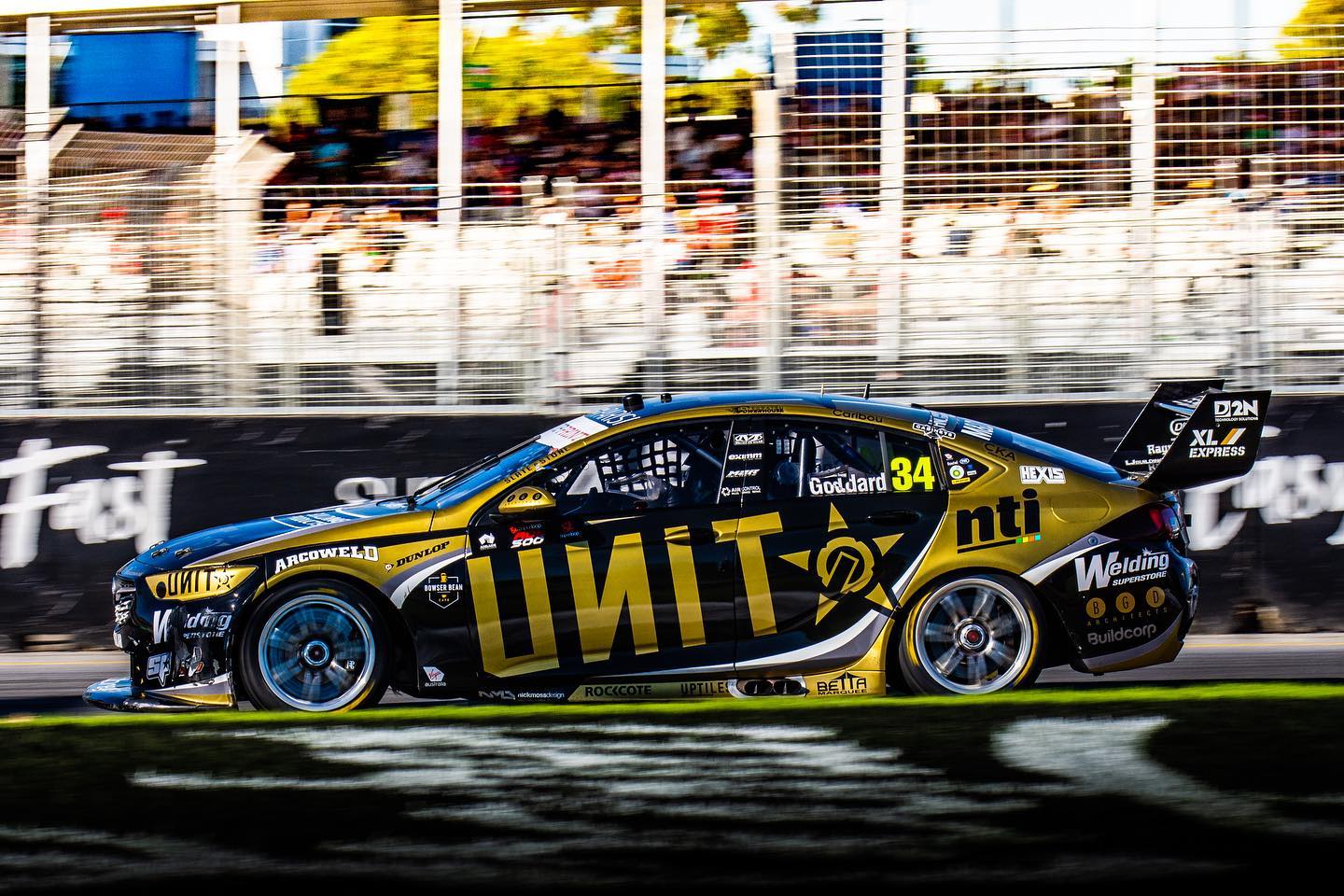
The main Unit logo is well framed by a fairly standard design, with white a silver being used to separate the black and gold sections. I can’t help but compare it to the 2019 livery – it just isn’t on the same level. Sometimes simple is better! That said, not bad at all, but some better choice in colour at the least could have improved this one significantly.
★★★
The other MSR car is piloted by Garry Jacobson. It’s also mainly black, but supported by some vibrant yellow and orange. This helps it pop out in the field, distinguishing itself from the competition.
I’m not a huge fan of the design and how it curves on the bonnet and bumper, and the side is a little bit unimaginative – while the colours stand out to me, the design doesn’t. It’s pros and cons are the opposite to the Unit car. Just lacking some oomph and personality.
★★★
Milwaukee Racing
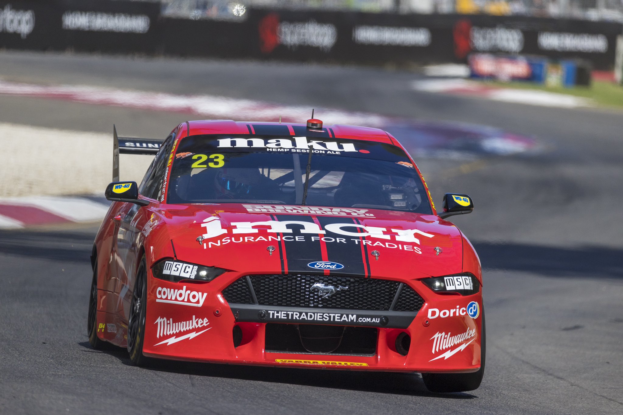
Milwaukee have gone for an absolute Mustang classic – the double racing stripes. It doesn’t get much simpler! With some pinstriping on the sides, you can’t really go wrong, especially when the bumper sponsor doesn’t interfere.
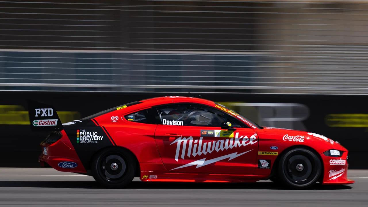
The side also harks back to a prior generation, with one fat stripe coming from the wheel arch on an angle, pinstriped on one side. That’s pretty much it! It detracts as little from the main sponsors as possible and as plain as it is, looks good from all angles. Could there have been a couple of other additions to make it more interesting? Yes. However, I’d rather clean and simple than a little too complicated.
★★★☆
Mobil 1 Appliances Online Racing
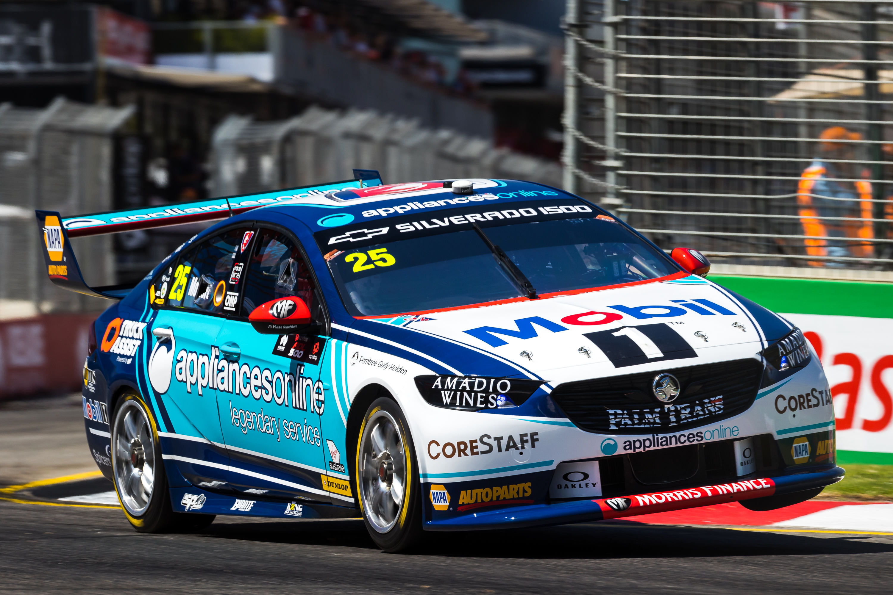
After losing a sponsor mid way through last year and bringing some new ones in for the latter part, WAU have settled on Mobil 1 as a primary sponsor, with a different secondary sponsor on each car. Whilst both cars share the same template, they looks drastically different thanks to these secondary sponsors.
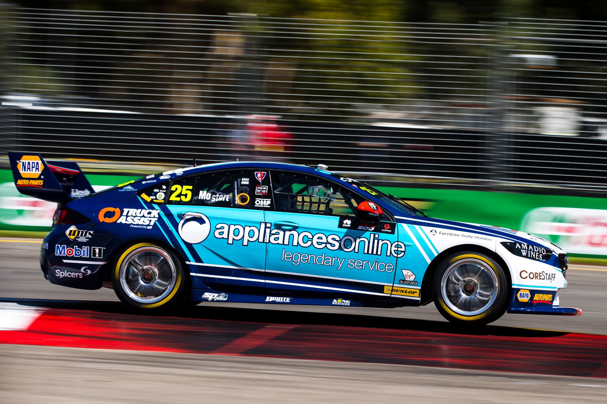
The blue used by Appliances Online pairs very well with Mobil’s blue, as well as with the white on the front of the car. The design is very well thought out and I love the clever transition from dark blue to light blue to white, using the thinning diagonal lines of colour. The parallel white lines on the bottom of the side also work really well, and look great cutting off the light blue sections. The extra flashes and lines of colour about the car are great and I don’t really have any complaints about this one, apart from perhaps the pin striping on the bonnet being a little too thin on the inside.
★★★★★
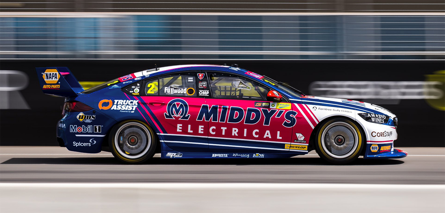
Mobil 1 Middy’s Racing
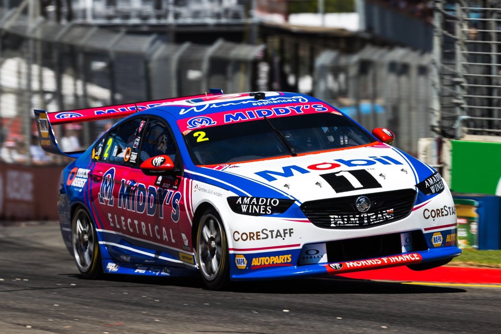
Pretty much everything that was said about the Appliances Online car applies to the Middy’s car. The pink is a fantastic contrast to the team’s other car and pairs well with the blue and white on this one.
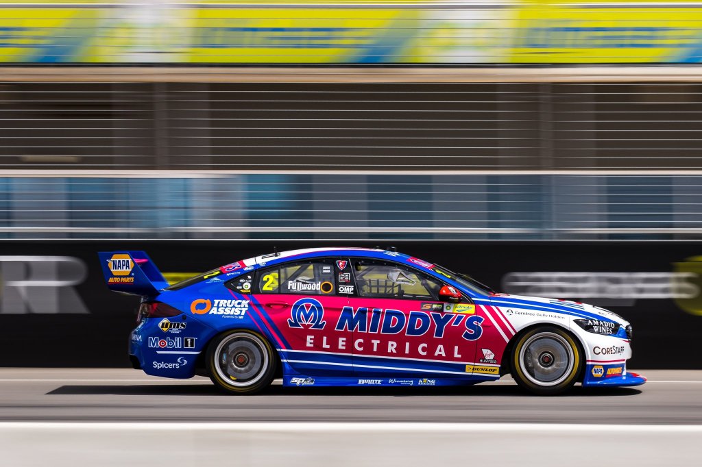
The only issue I have with this one is the shade of blue used it too light. A darker blue would have paired better with the pink, such as in this example. Apart from that, it has all the great qualities of the other WAU car. A great effort from the team.
★★★★☆
Monster Energy Racing
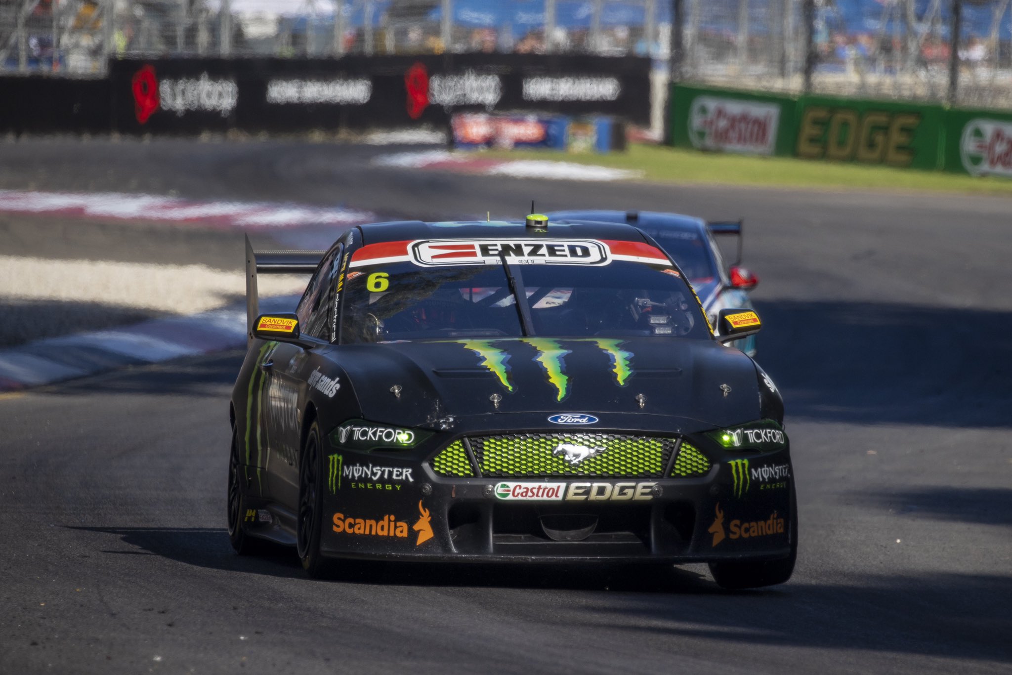
Sadly, little imagination used by the team at Monster Energy Racing. For the fourth season in a row they are going with a plain black livery with Monster logos on it.
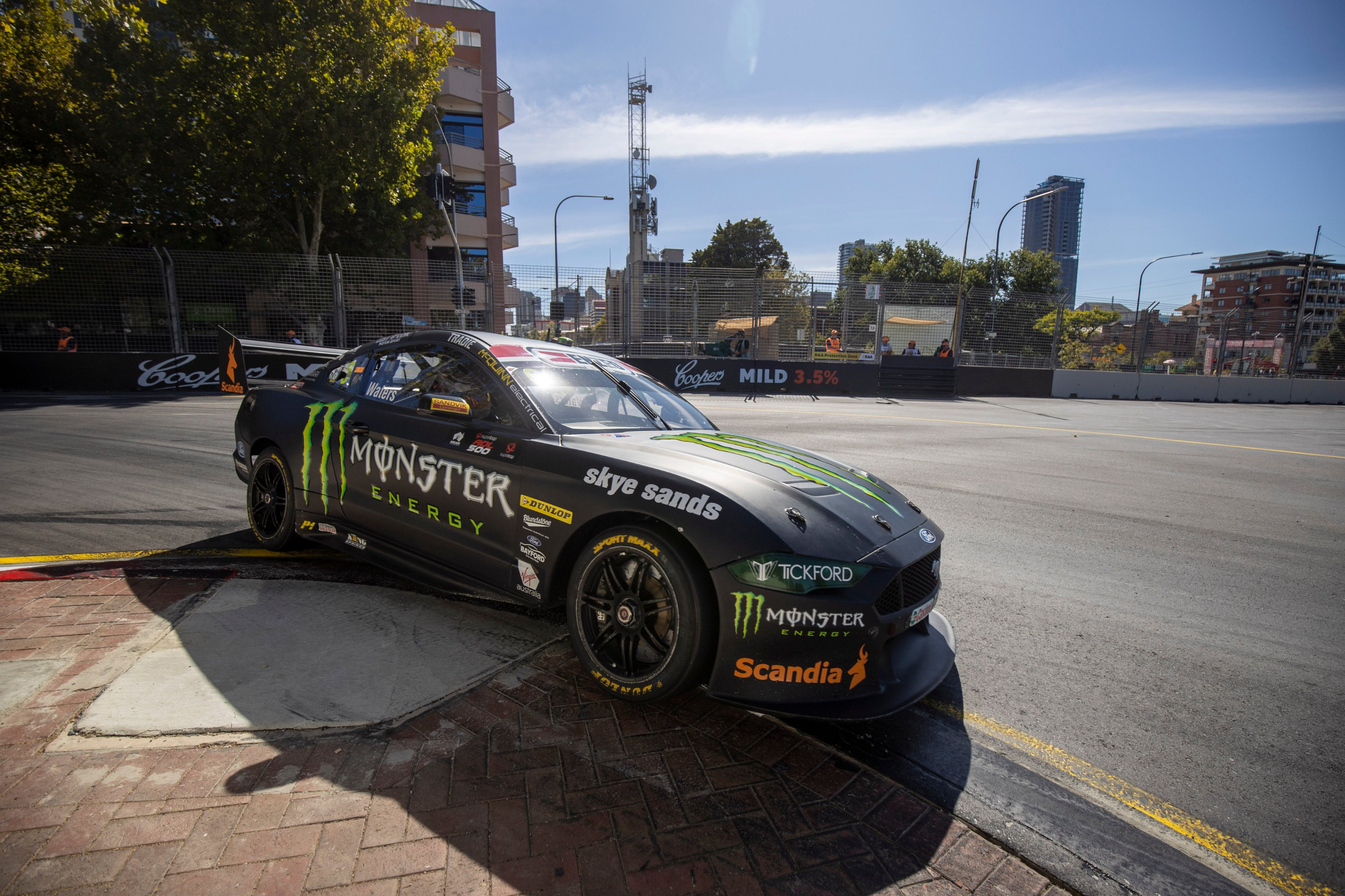
I apparently quite liked this last year, but very much indifferent this year. It’s a little boring without any extra touches year on year. Some sort of evolution would be nice after this many years of no change.
★★☆
NED Racing
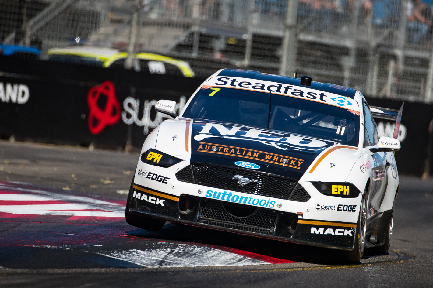
On the other hand it’s all change at Kelly Racing, with NED jumping on board Andre Heimgartner’s new Mustang. The livery definitely brings back Jim Beam Falcon memories with the colour scheme, although the design is understandably more modern and sophisticated. The bonnet section follows the body shape perfectly, with the gold lines framing the black part well.
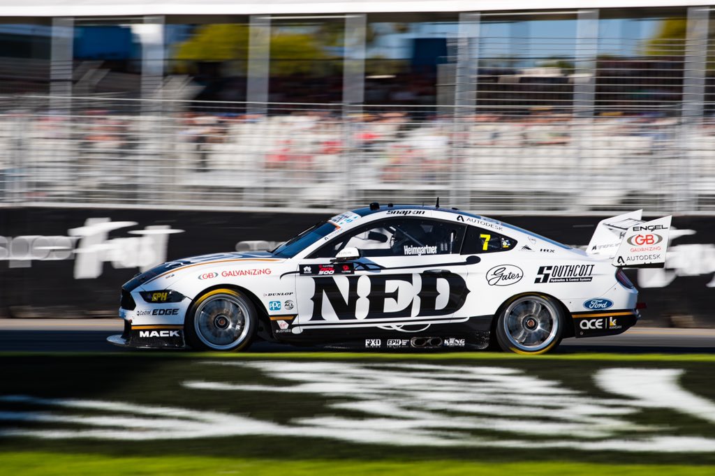
The logo has been integrated on the side of the car seamlessly, using its own design as a priority and blending it in with the rest of the car well. Perhaps it separates the gold lines a little too much, and maybe a plain black and white livery would have been neat, but the extra flashes of colour don’t hurt it at all.
★★★★
Penrite Racing
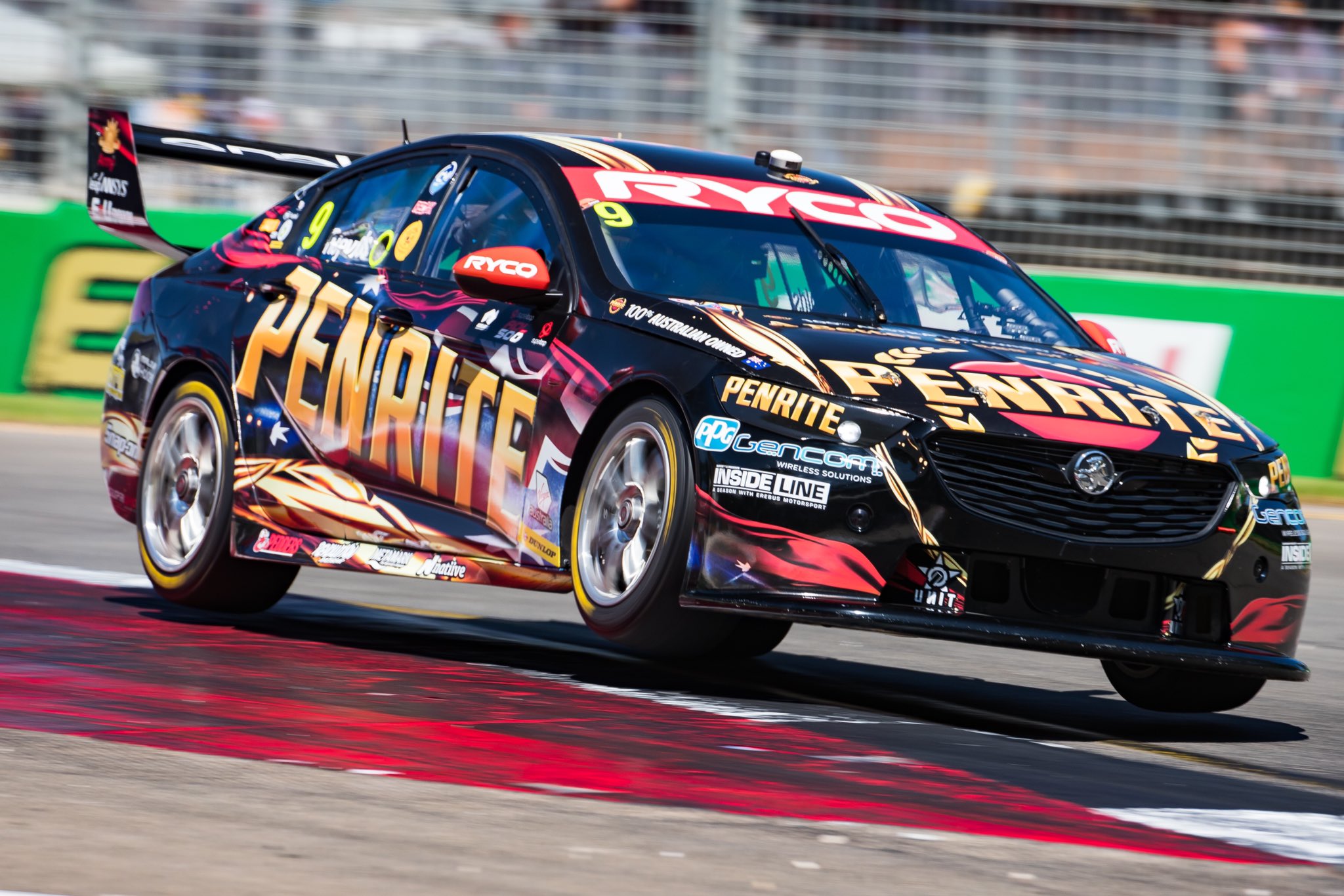
Something new again for Penrite, this time going for a smokey theme. I was initially quite pessimistic as it looked very busy and hard to distinguish, but the closer you look the better it gets. There’s an Aussie flag in there, getting all patriotic alongside Penrite’s gold, and the smoke effect does flow very nicely from the front to the rear of the car.
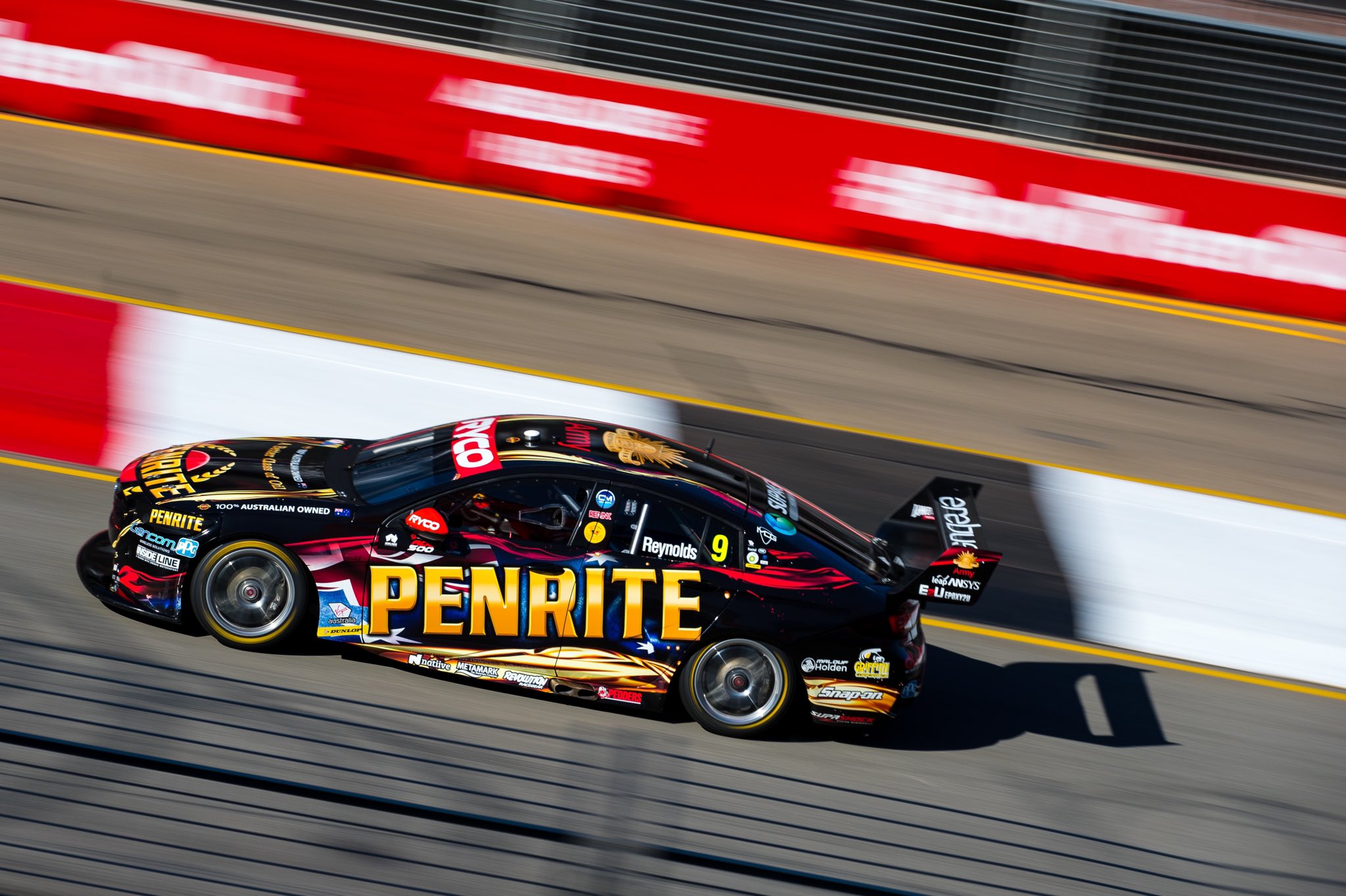
The Penrite logo works better than in recent years as there are no solid colours to harshly contrast against the logo. I’d previously said the logo looked dated, but appears as though it was simply everything else on the canvas that was creating that illusion. It’s an attractive, modern effort, that looks great despite my usual traditional tastes.
★★★★☆
Red Bull Holden Racing Team
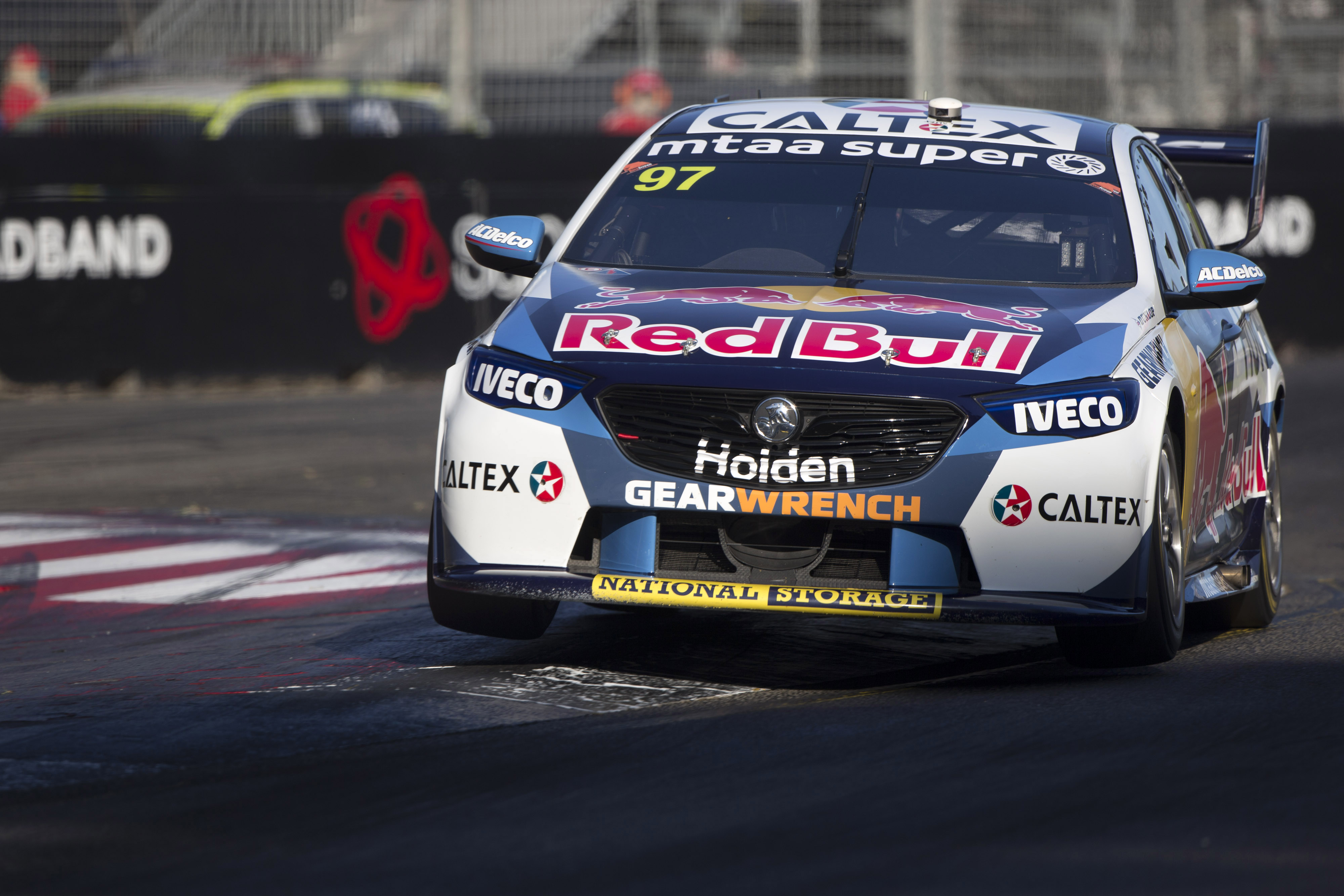
The trickiest part of Red Bull Holden the last few years has been how to balance both of those logos on the car at once. The positioning hasn’t changed this year, but they’ve gone with a white background for Holden this time, keeping most of the rest understandably blue. The fragmented design is actually very nice from the front where Holden doesn’t interfere.
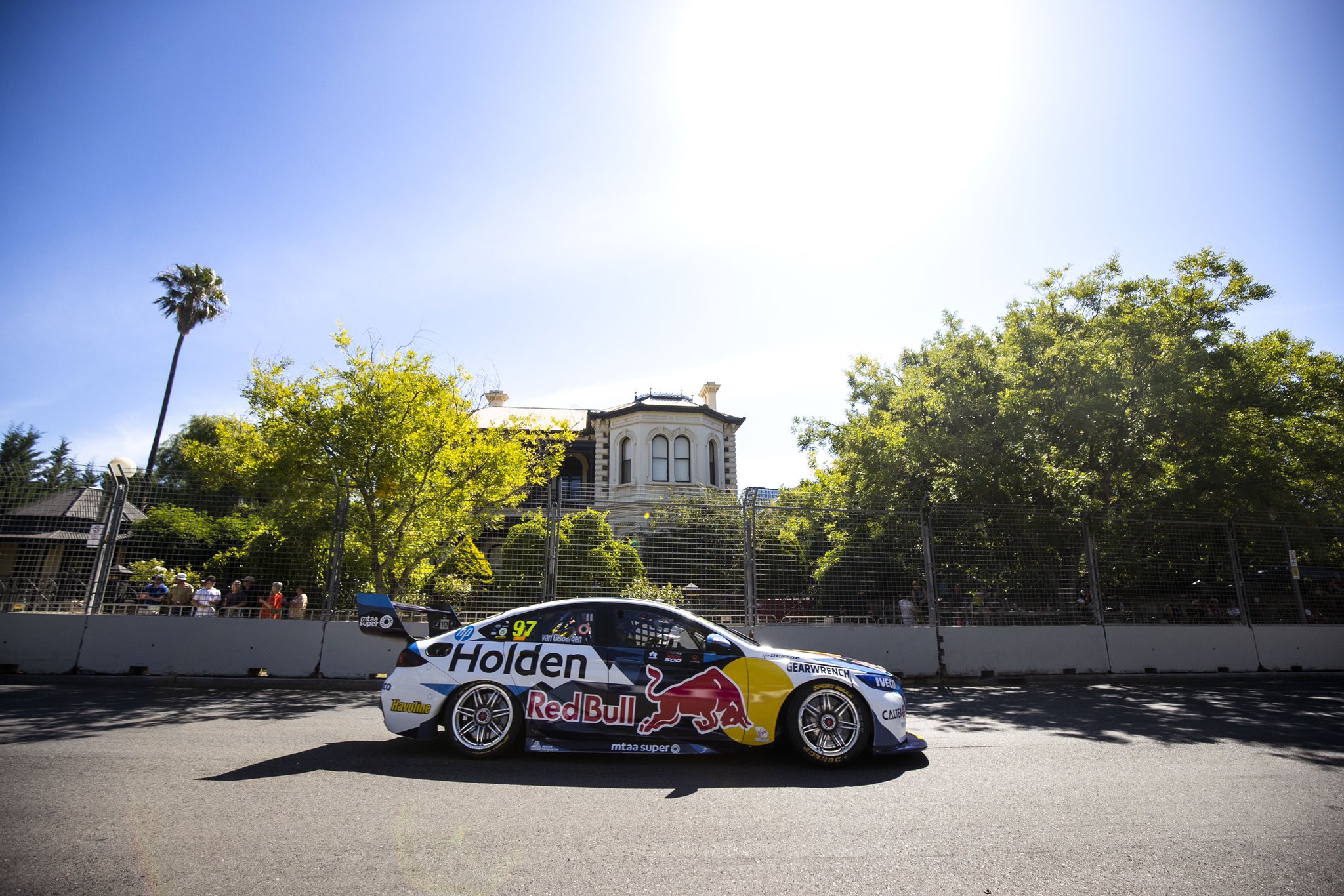
The symmetry makes the front look great, but the side looks a little random with perhaps a few too many little bits and pieces jutting around. Holden also takes up a lot of space on the side, and despite trying to make one cohesive livery, I just don’t think they gel well together. I guess this won’t be a problem next year anyway.
★★★☆
SCT Logistics Racing
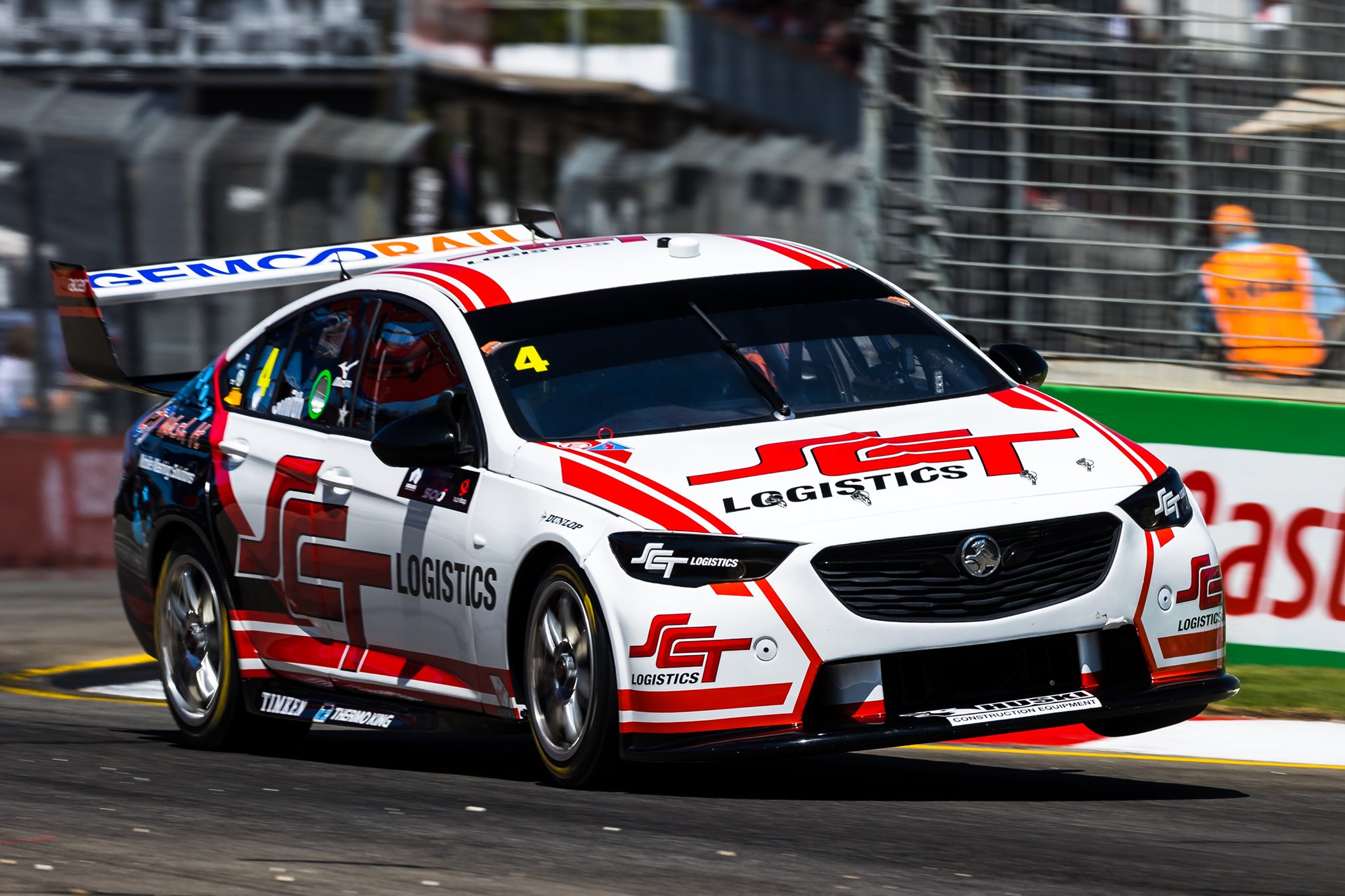
Animosity with whether Jack Smith should be in the series aside, the SCT Logistics Commodore looks pretty good. You’ve got the standard black, white and red, the logo placed well on both the side and bonnet, and support of some speedy red stripes over the car.
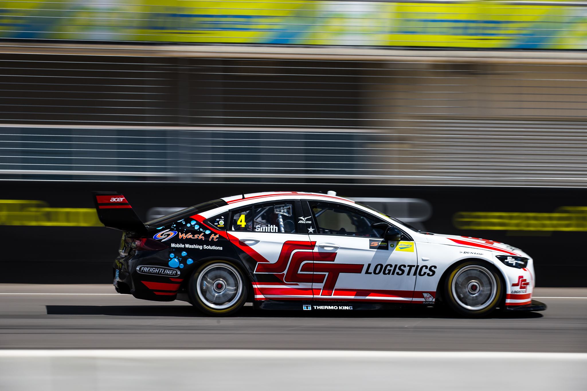
I especially like the bottom most red line which travels all the way from the rear, up from the splitter and along the bonnet and the roof. It does a great job of framing the car and its aggressive angles. The secondary thick red lines also work well and although the black section toward the rear is a little generic, it fits in with the theme and certainly isn’t offensive. That said, his 2019 Super2 livery was a stunner! Shame this couldn’t be carried over.
★★★★
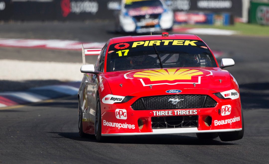
Shell V-Power Racing
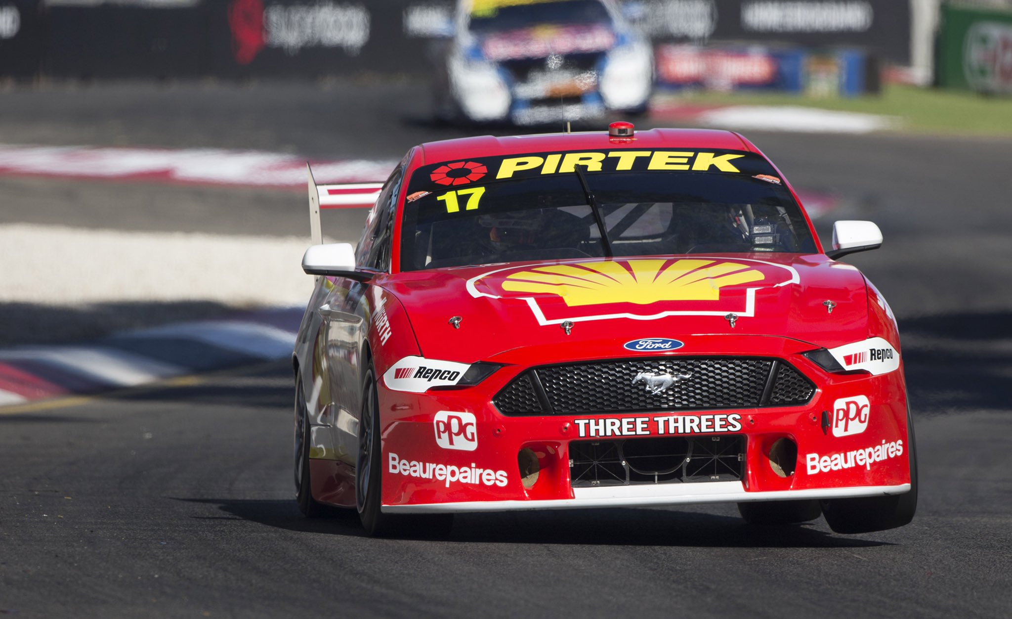
If we’re yawning at Monster Energy Racing, we’re definitely yawning at Shell V-Power Racing. They’ve decided to go with another year in their weakest livery since 2016, which I don’t think ever suited the Mustang as well as it did the Falcon. The way the yellow and white droops off at the front wheel arch is the opposite of racy if you ask me.
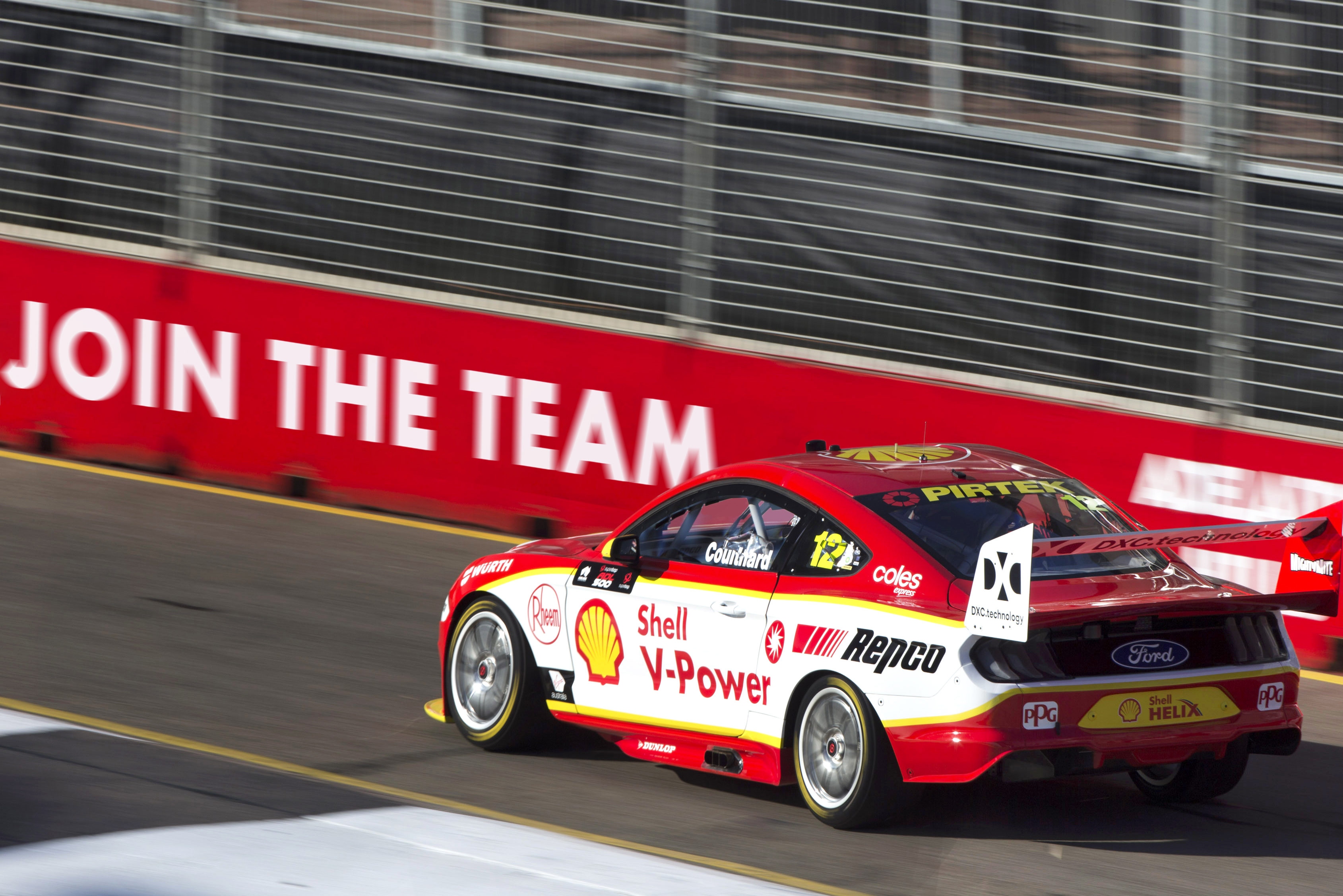
So the same again, but I guess a fitting way to see off Scotty as he competes in his last season in Supercars before embarking on what looks to be an open wheel adventure in the USA.
★★★
Supercheap Auto Racing
Jack LeBrocq has joined Tickford for 2020 and has jumped straight into the Supercheap Auto car. The livery looks a little nicer than its predecessor, but still lacks the punch that the yellow had given it in previous years. As it stands, there are a lot of other logos from other sponsors that really take away from the cars identity, and make it look like a bit of a mish-mash.
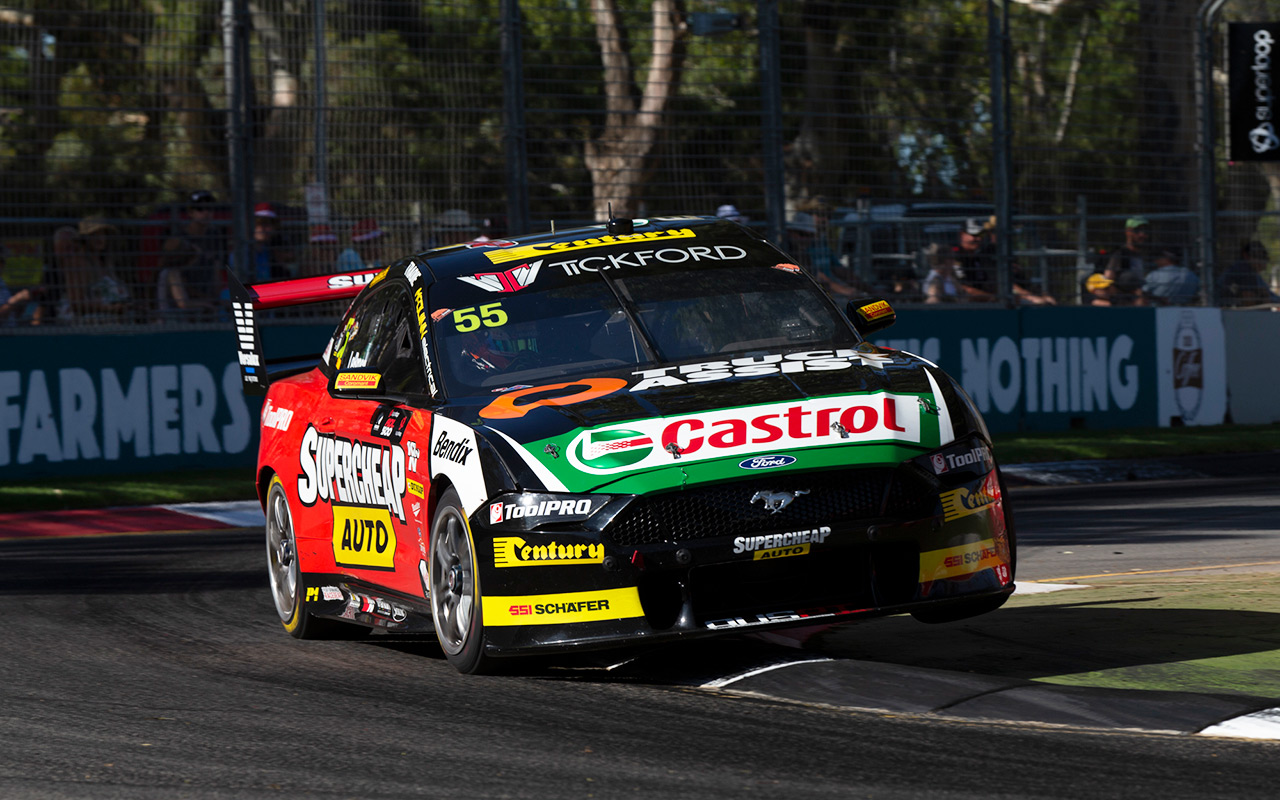
The side is plain but clean, but overall it looks like Supercheap has paid for the sponsorship, then sold off bits and pieces of the livery to the highest bidders. Perhaps a slight improvement on last year with a few more sponsors fitting into the colour scheme, but lots of room for improvement.
★★★
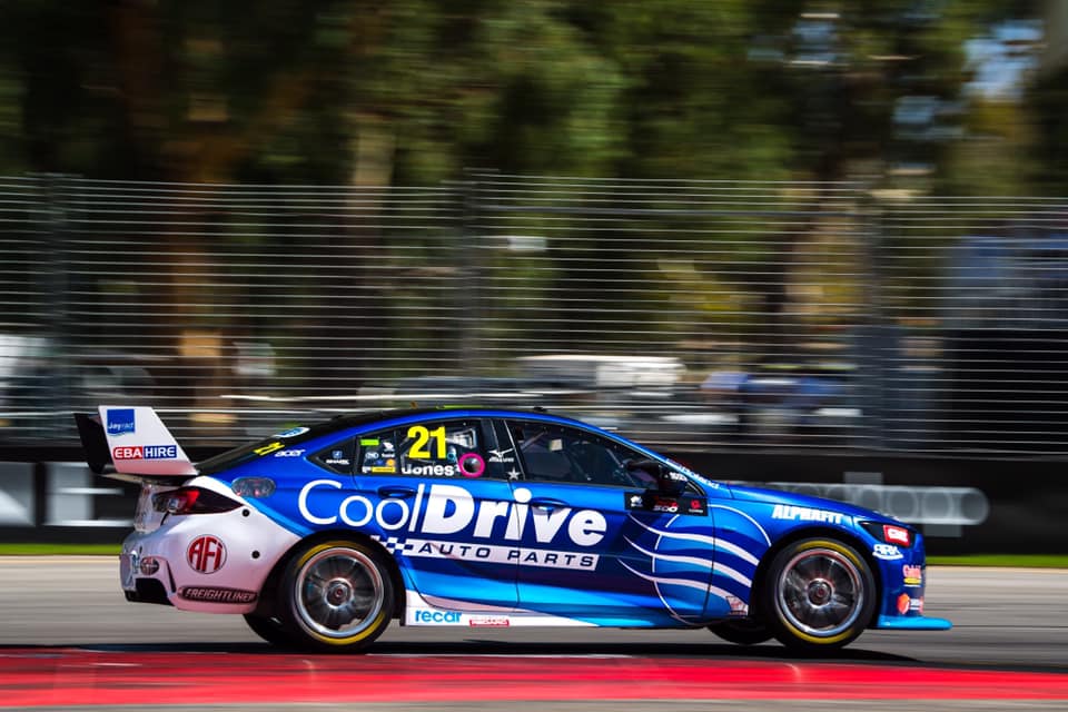
Team Cooldrive
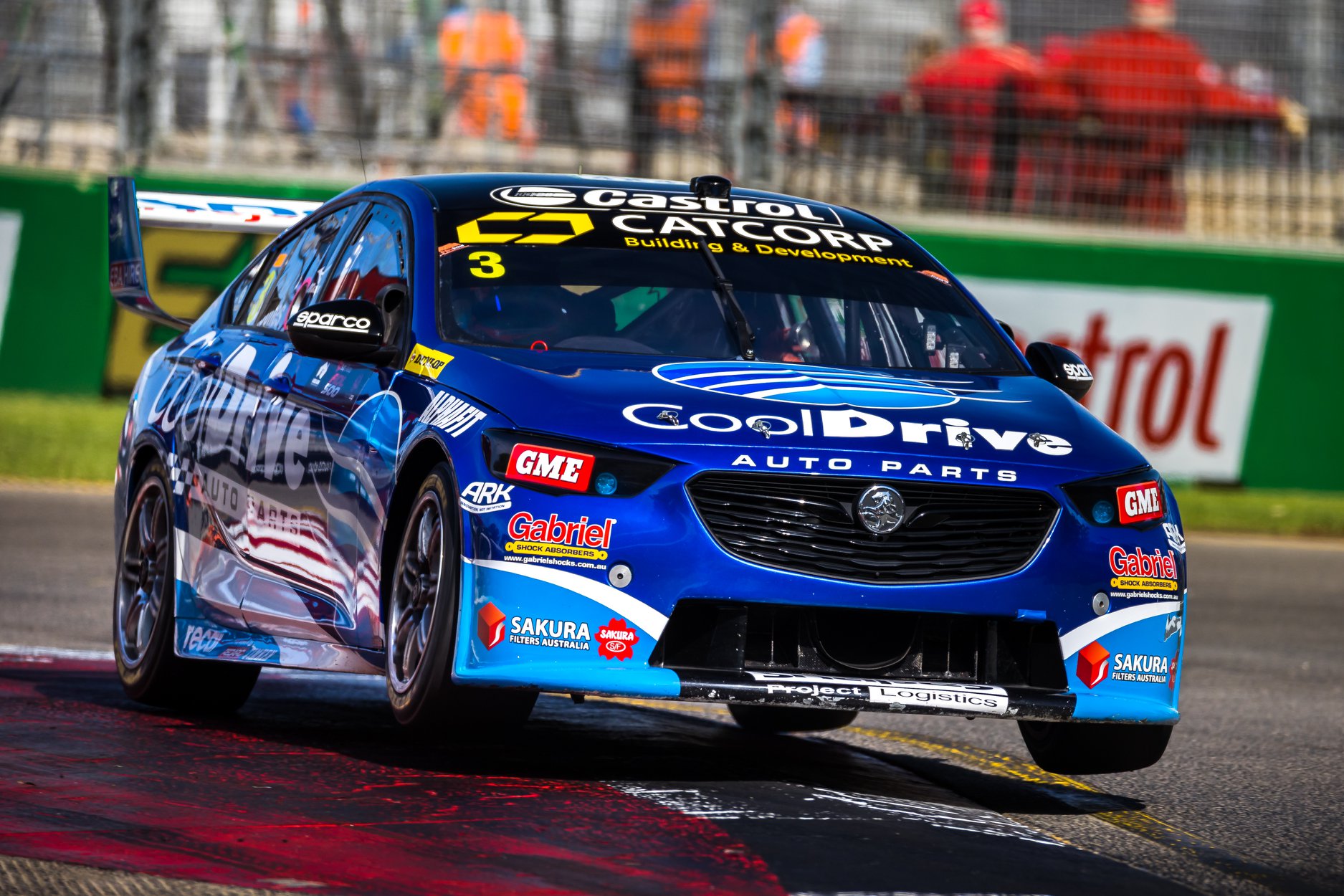
Macauley Jones is back in the CoolDrive Commodore this year, a car that never seems to be in the top half of the field. It’s a shame, because it’s consistently one of the best looking. It’s a similar effort this year, with the brilliant metallic blue supported by a light blue this time, and a neat white stripe along the side.
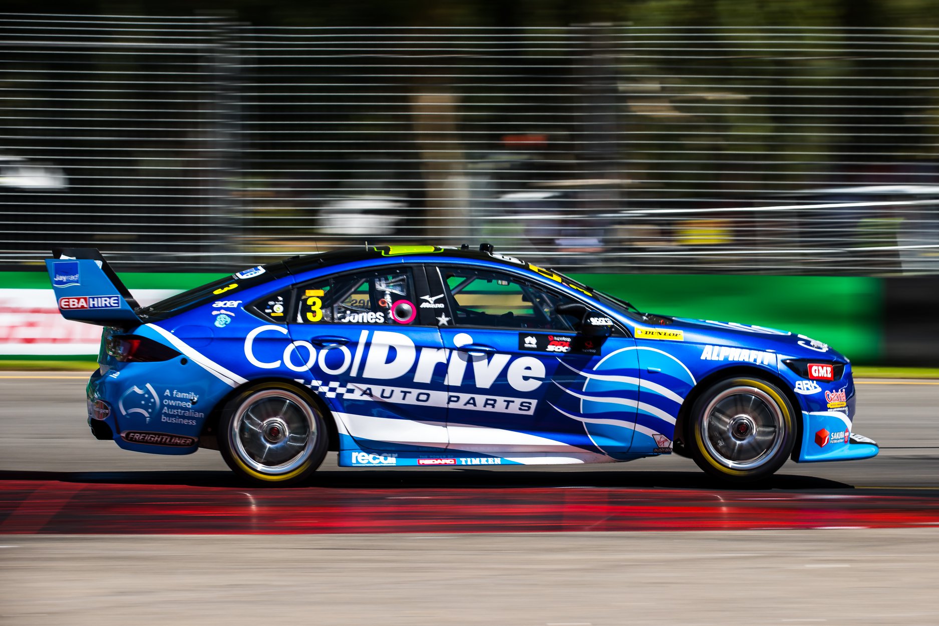
It’s almost like they’ve flipped the white and light blue from last year, but it’s good to see some form of evolution as opposed to stagnation. The main logo placement is great as always, and nothing messy about the other sponsors either. Solid again.
★★★★
Team Sydney
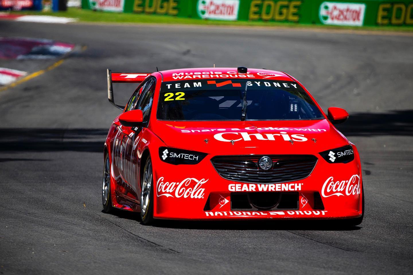
Chris Pither somehow snagged a full time drive for 2020, but who knows how long that will last with Team Sydney! Now every fibre in my body tells me I shouldn’t like this. It’s plain, basically no actual design apart from the logos – should be boring right? Maybe it’s nostalgia or maybe it’s just a livery I’ve wanted to see for some reason. I like it.
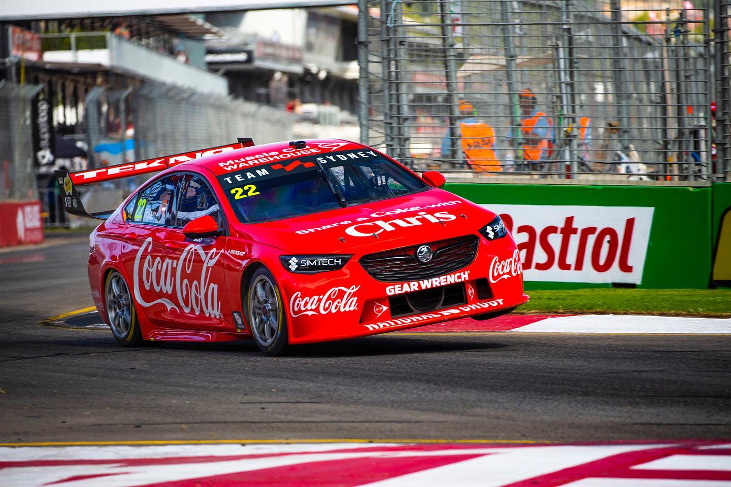
There’s nothing fancy about the red they’ve used, but it is stunningly vibrant. The Coca Cola logo is one of the most recognisable in the world and doesn’t look out of place anywhere. Every brand is on board, making it a perfectly uniform two tone livery. The cheeky branding on the bonnet is clever and relatable. Everything on this livery works. I can’t imagine it would have the same impact if used for another year, but for now, it’s great.
★★★★☆
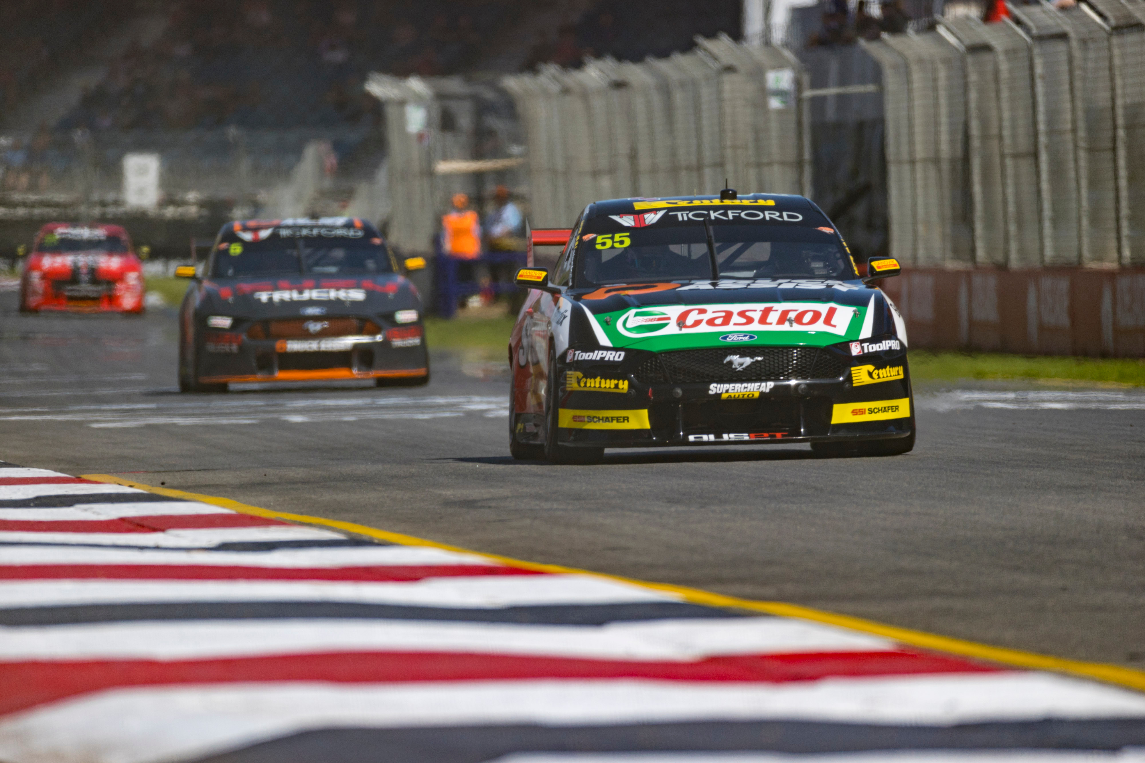
Truck Assist Racing
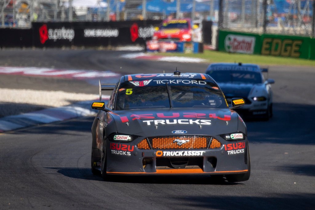
Finally, Truck Assist has joined Tickford, replacing Bottle-O which had backed the team for many a year. Out goes the bright green, in comes the old Hispania grey, which I hate a little less than I used to but I’ve never understood why a team would want their car to blend in with the track.
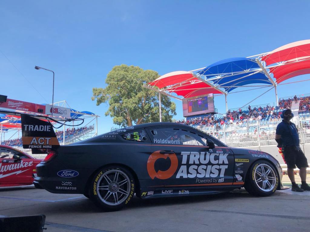
They’ve gone with matte grey as opposed to gloss which adds some form of interest to the car, and just a wee bit of orange – a missed opportunity to bring a more excitement with a lot of orange. It’s simple, the lines are clean and the logos are well placed, although red on grey isn’t ideal for Isuzu. Just not an attractive main colour which hinders the livey from the get go.
★★
And the award goes to…
Best Looker Award – Mobil 1 Appliances Online Racing
The perfect colour and design choice. Thanks Appliances Online!
Least Attractive Award – Truck Assist Racing
Ever look at a car and think “That would look way better in tarmac grey.”? Me neither.
Most Improved Award – Castrol Racing
In previous years Kelly Racing tried to make a design to suit all cars, which didn’t really suit any of the cars. Fortunately they’ve made a livery specially for Castrol, and it shows.
Press Rewind Award – Matt Stone Racing (Unit)
The all silver car was brilliant last year, shame they moved so far away from it.
Award to Enjoy a Coke With – Team Sydney
Maybe with Courtney and Boost gone, we’ll be able to enjoy two Cokes with Team Sydney!
So, thoughts? What’s your fav? Let me know!

I don’t know if you do request, but will you make a Top 20 liveries of the decade for Supercars as well?
LikeLiked by 1 person
I can’t say I had intended to, but if I find some extra time maybe I can!
LikeLike