LIVERY UPDATES – SANDOWN RETRO ROUND 2018

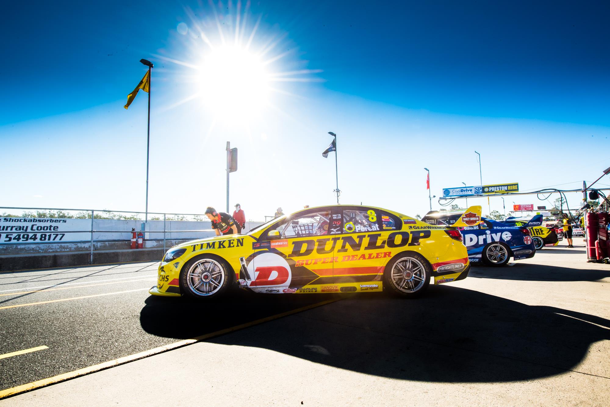
As usual, my review is well after the event; one reason is time of course, but the other is that I always prefer to use on track shots, rather than promo photos, with decent quality shots often taking some time to find. Regardless, here are the retro round updates we saw at Sandown last week.

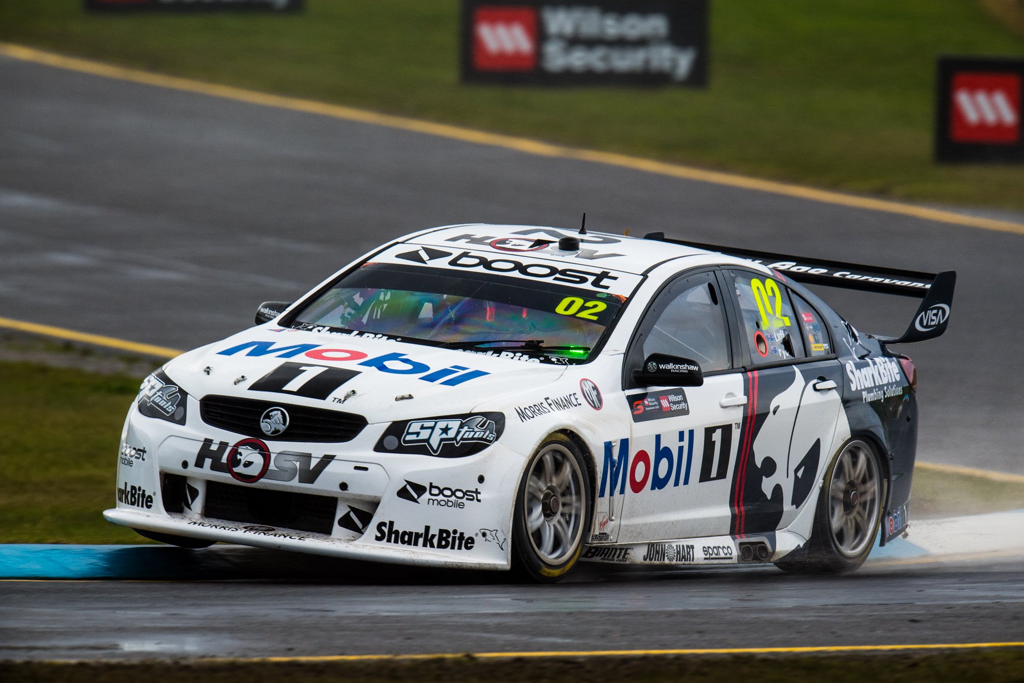
#2 Pye/Luff & #25 Courtney/Perkins

WAU Pye 18WAU Skaife 08

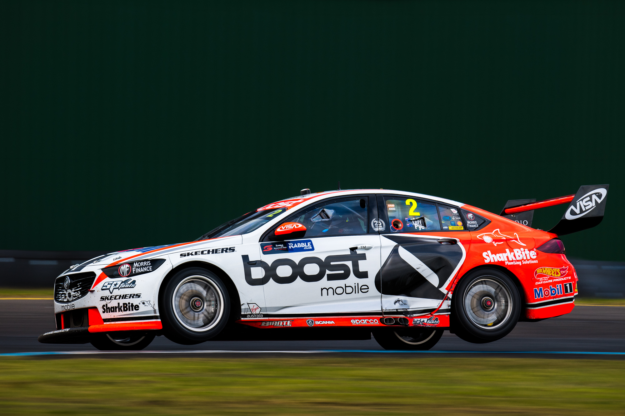
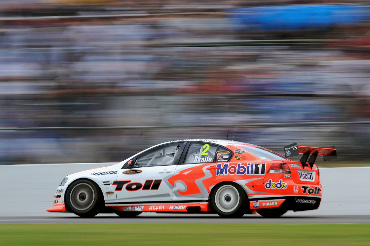
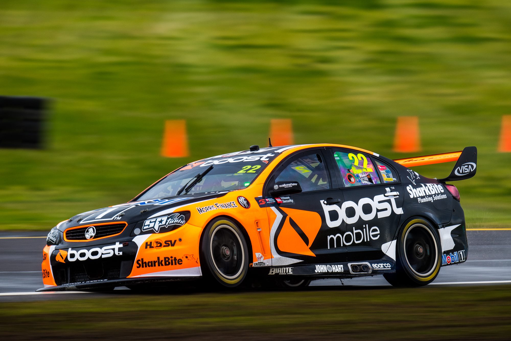
First cab off the rank is Mobil 1 Boost Racing, who paid homage to the 2008 Toll HRT, the last Commodore to be driven full time by Mark Skaife. The first thing I wonder in situations like this is, how should a company feel when they are, in essence, promoting another?

Marketing aside, it’s refreshing but also makes me feel old when we are looking at a 2008 livery as retro. It isn’t completely identical, and can’t be given they are not longer Holden backed, but could have used a little more silver to more strongly replicate the old design. Neat to see, but wouldn’t have it over their usual livery.
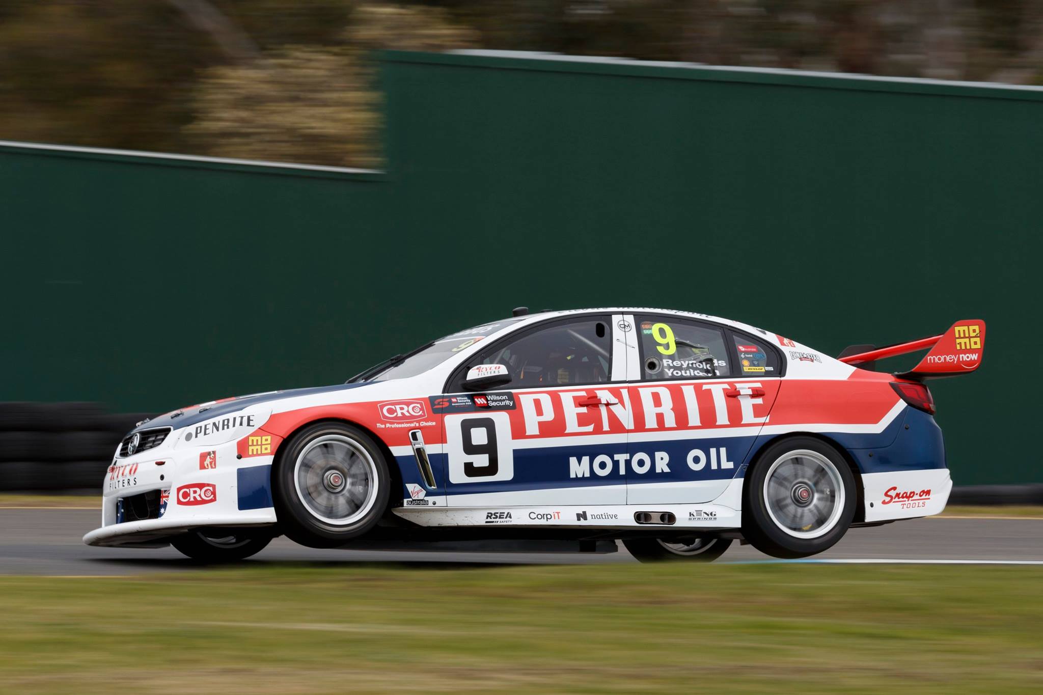
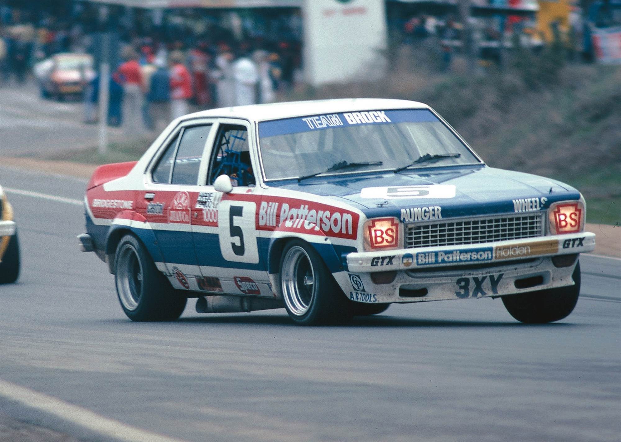
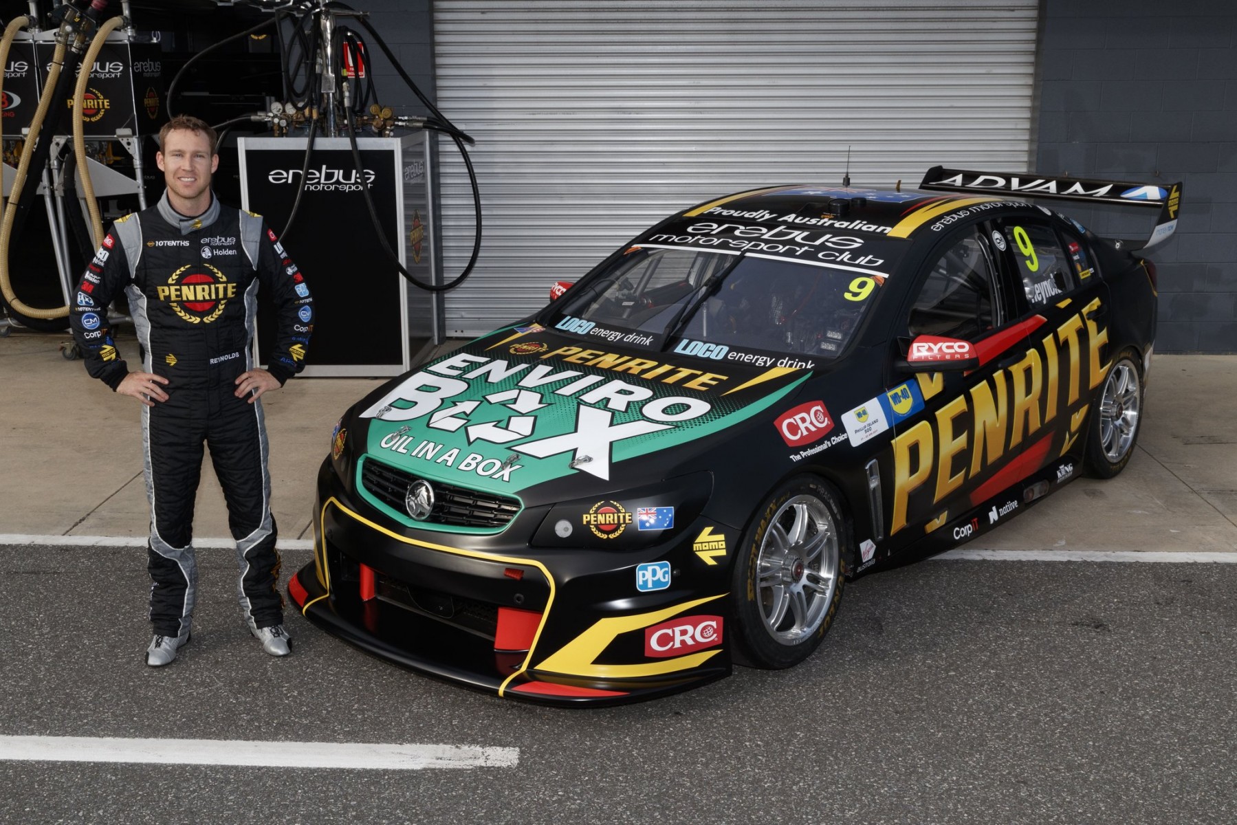
#9 Reynolds/Youlden

Erebus Reynolds 18Erebus Chickadee

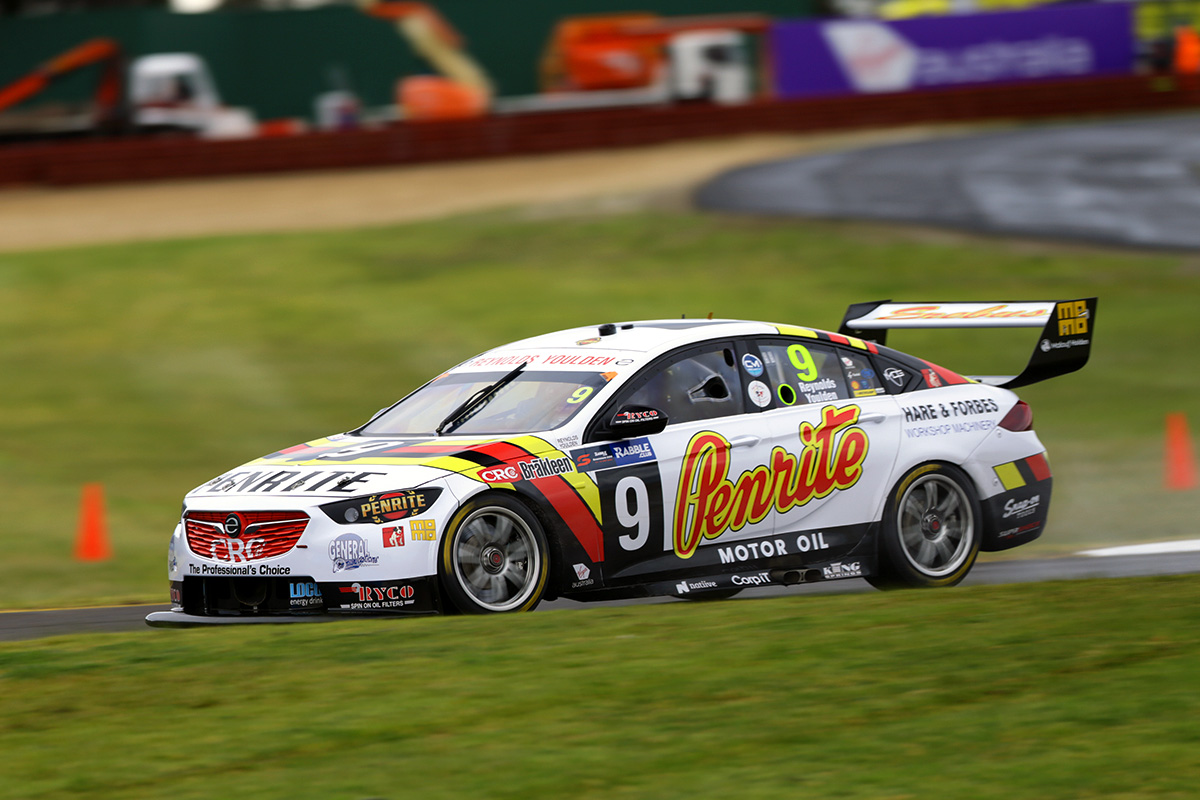
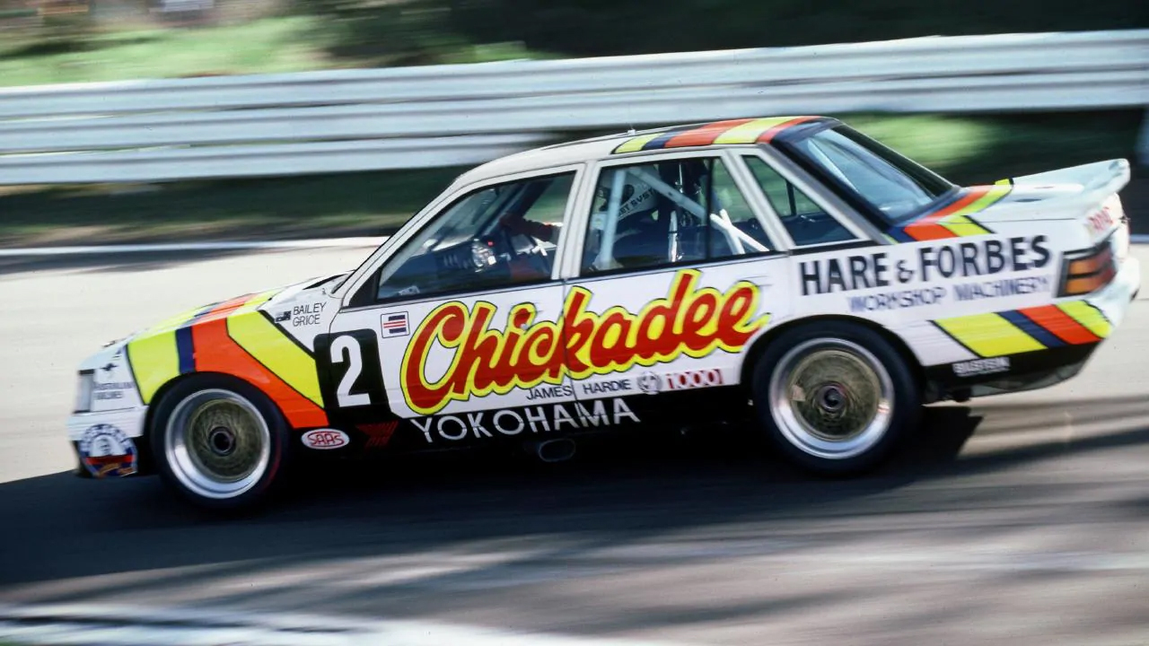
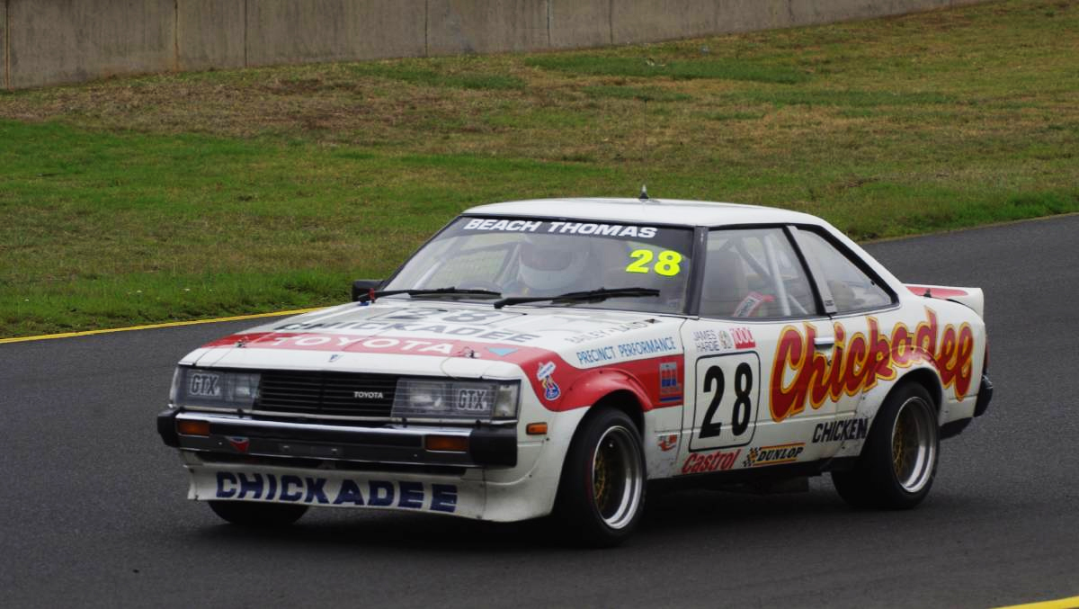
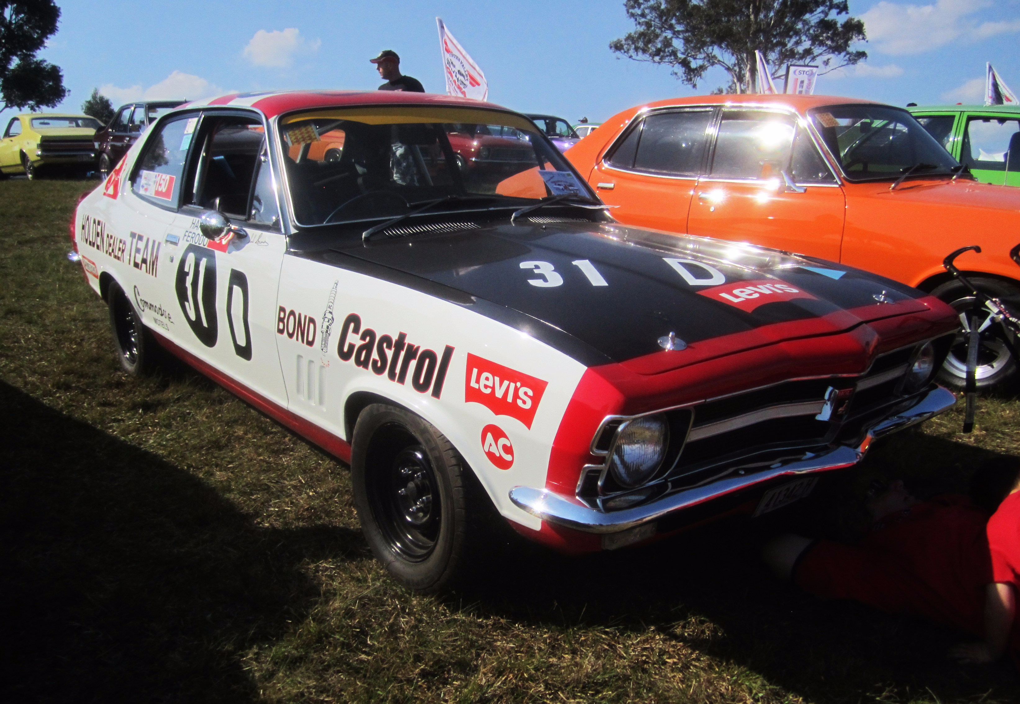
Retro done right! Erebus have done a great job emulating the 1986 Bathurst winner, replicating it almost line for line, including a very nice stylised Penrite logo to match the now defunct Chickadee. This is a style of livery design that has been out of favour for a number of years, but I hope it makes a comeback of sorts.

I personally love flowing liveries, but straight lines with harsh angles have their own odd charm, which is clearly visible on a few of this year’s retro efforts. Probably mine and many others’ pick of the bunch.

#12 Coulthard/D’Alberto & #17 McLaughlin/Prémat

DJR McLaughlin 18DJR Johnson

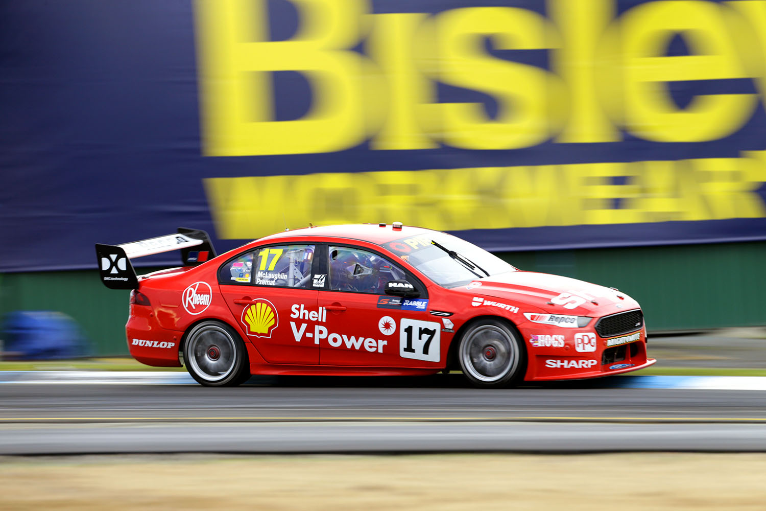
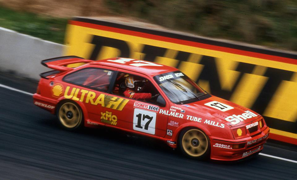
Simple, however, also has its place in retro round. No fuss was also a popular theme back in the day, and the Sierras driven by Dick Jojnson and John Bowe were a leading example.

The key to a simple livery is the right colour, and DJR Team Penske have done well in bringing back this shade of red, which is just different enough to their usual red to be noticeable and eye catching. The clean look is pulled off well, capped off with the warm fuzzy feeling of classic number plates on the doors.

#14 Slade/Walsh

BJR Slade 18BJR Bob Jane Monaro

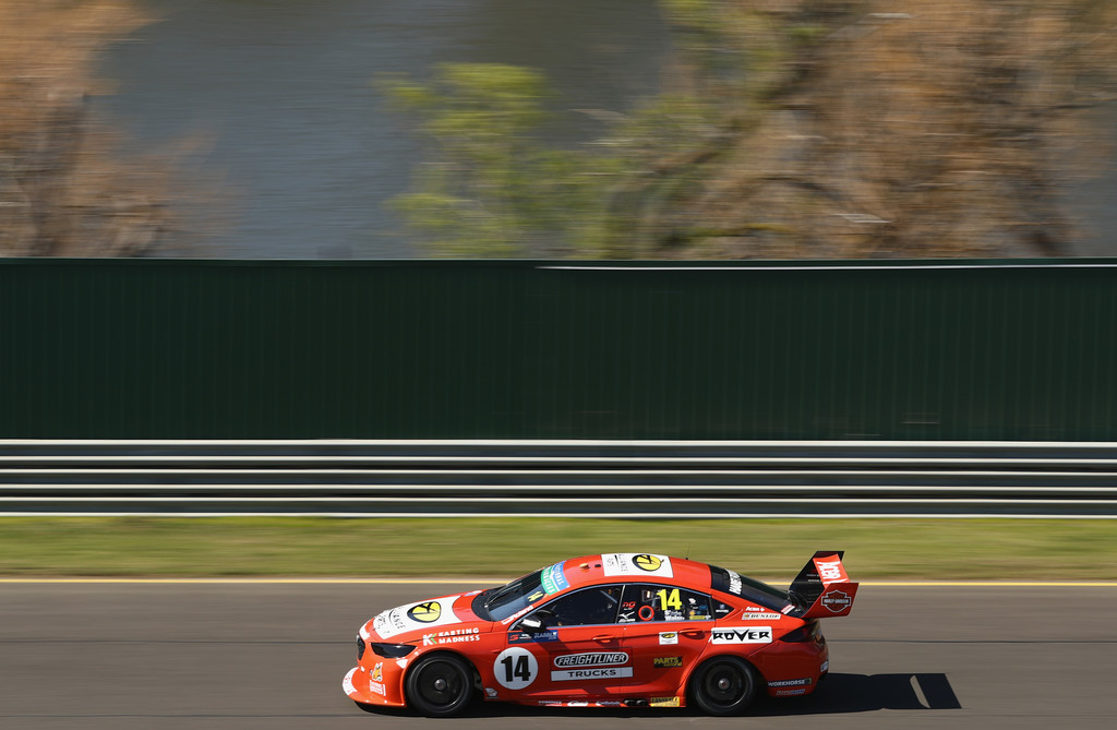
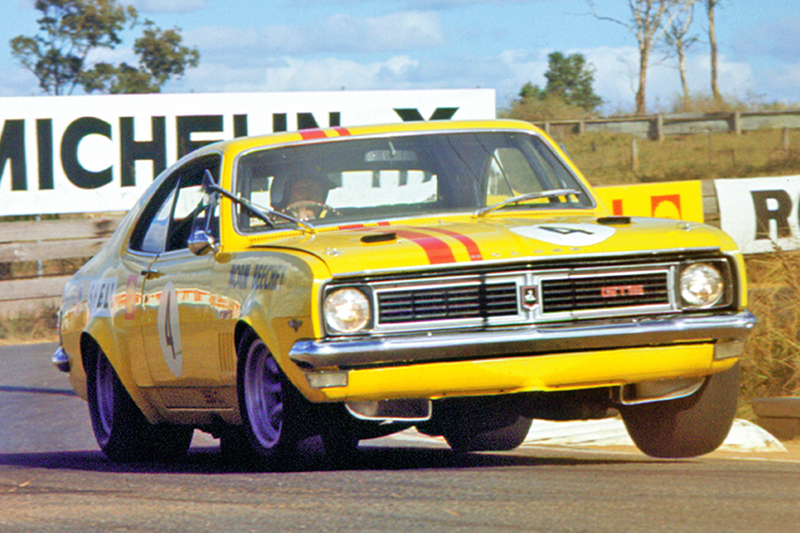
Brad Jones Racing have tipped their hat to Bob Jane and his 1972 Monaro with this orangy-red effort. It’s a quite similar replica to DJR Team Penske, but this one falls apart slightly in that the logo placement just doesn’t quite match the original. The blocky white Alliance logo, despite attempting to match the theme, is the main culrpit, adding a lot of white where it should appear plain red, not to mention the number font. The thought was there, but the execution slightly lacking for the #14.
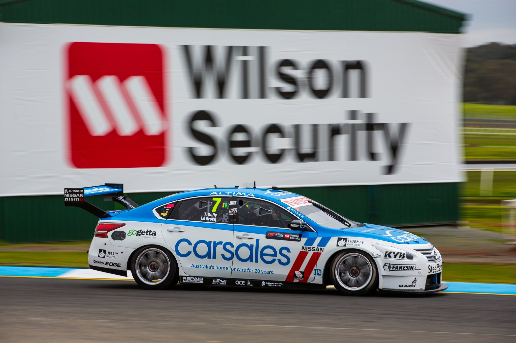
#15 Kelly/Jacobson

Nissan Kelly 18Nissan Perkins 02

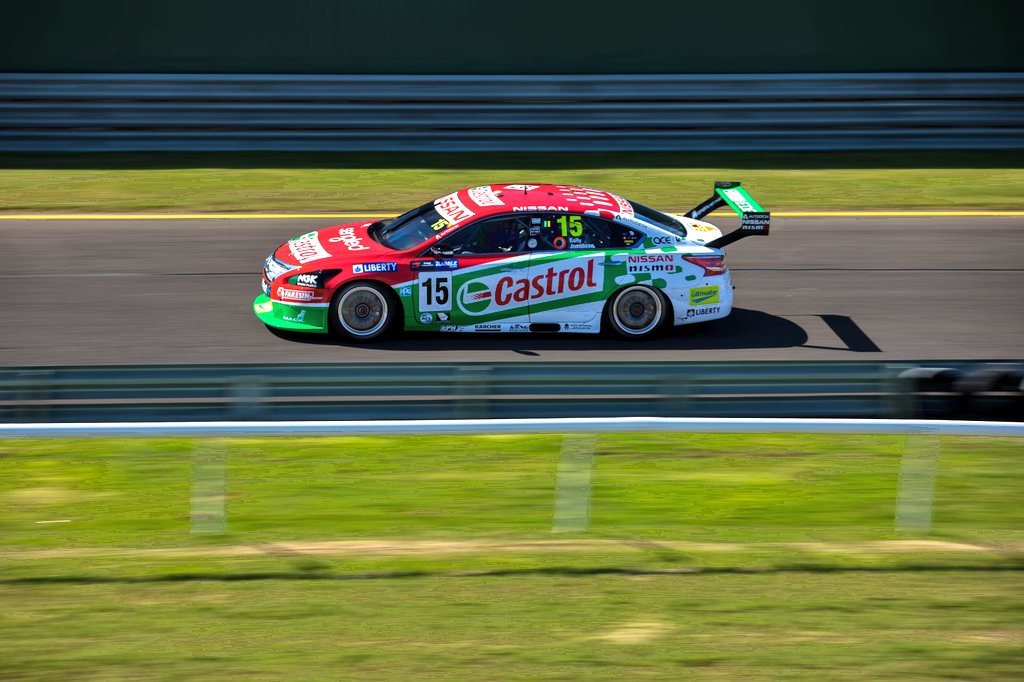
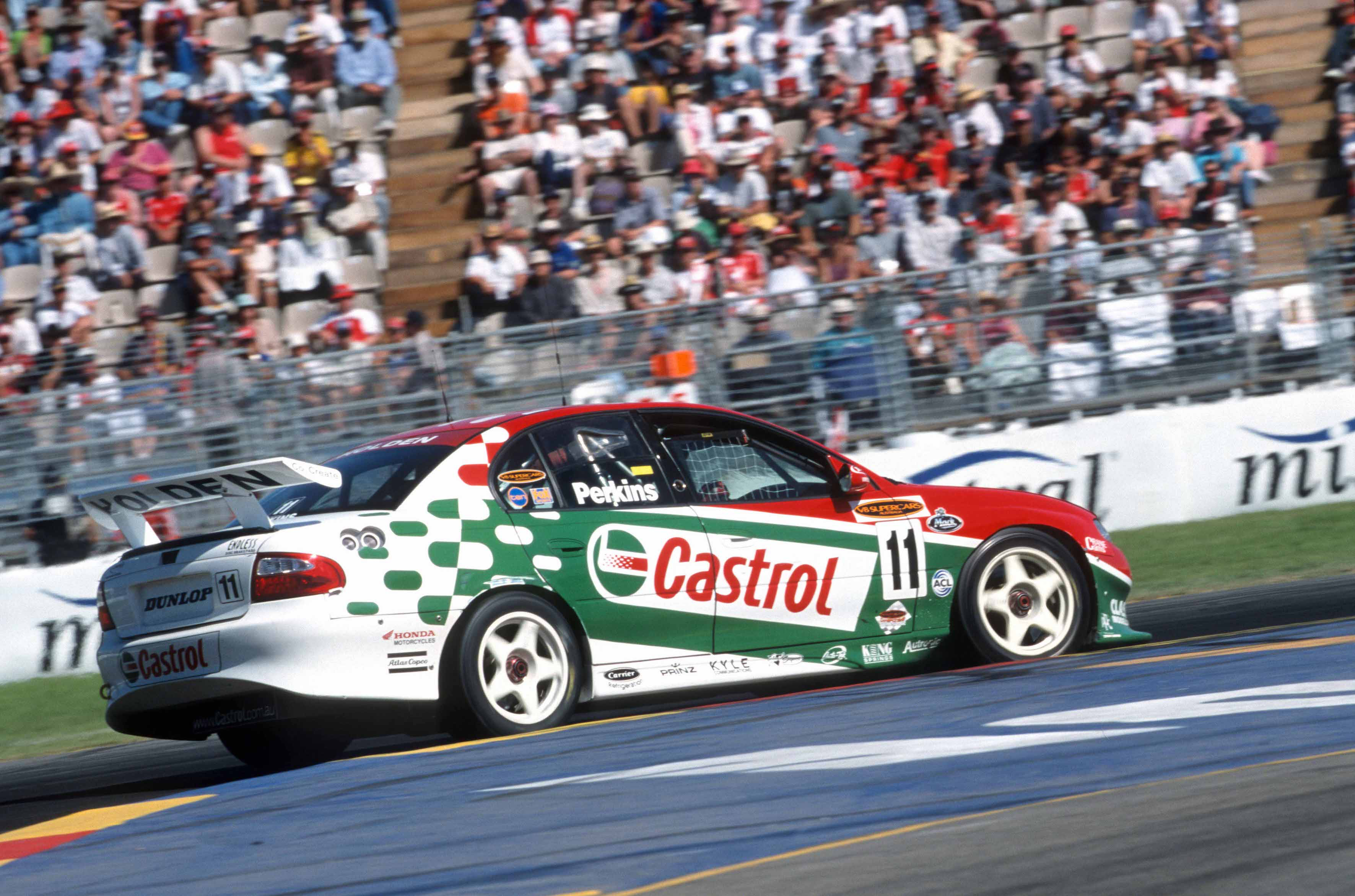
Castrol have decided to throw back to 2002, oddly enough replicating the Larry Perkins Commodore on the#15 Nissan. As strange as that seems to me, the design is near identical which is super pleasing to see. All that’s missing are the thick five spoke wheels in white!

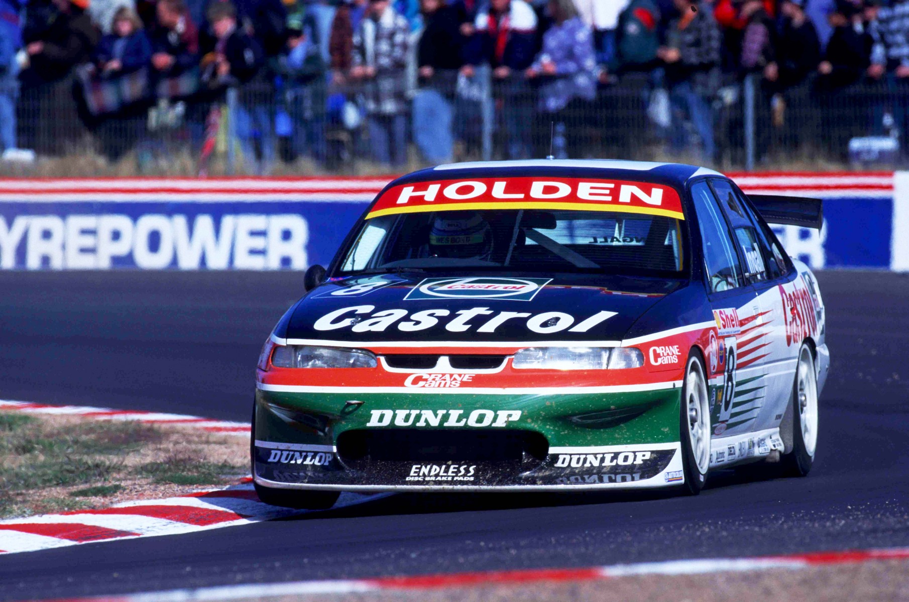
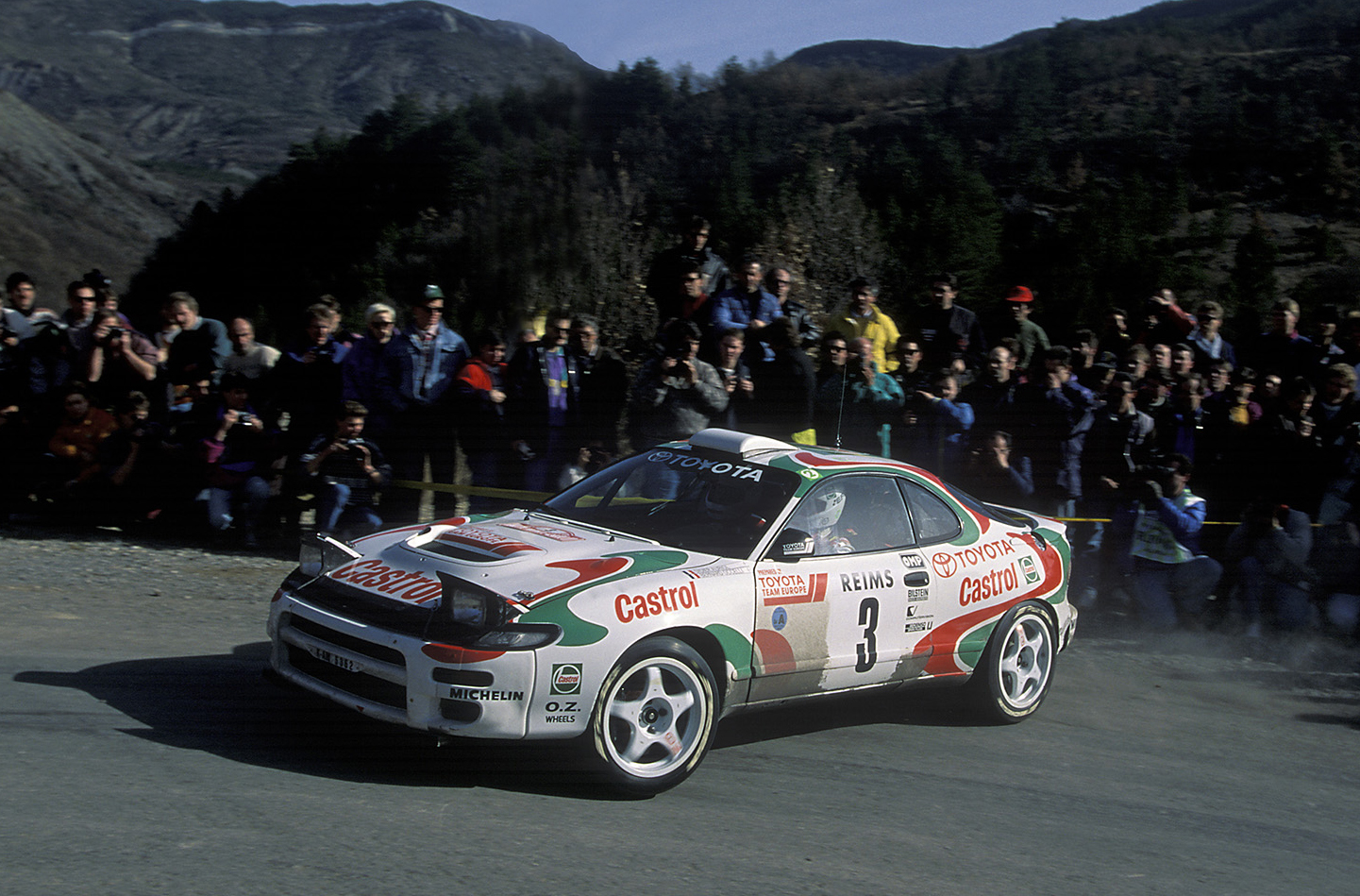
While this was not my favourite Castrol livery of all time (that would probably go to the 1997 Castrol Commodore or the 1993 Castrol Celica), it’s a great nod to the recent motoring past.

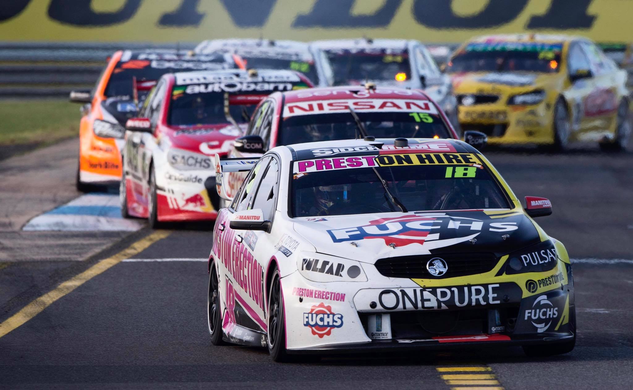
#18 Holdsworth/Bright

Preston Hire Holdsworth 18Preston Hire Holden Bathurst 68

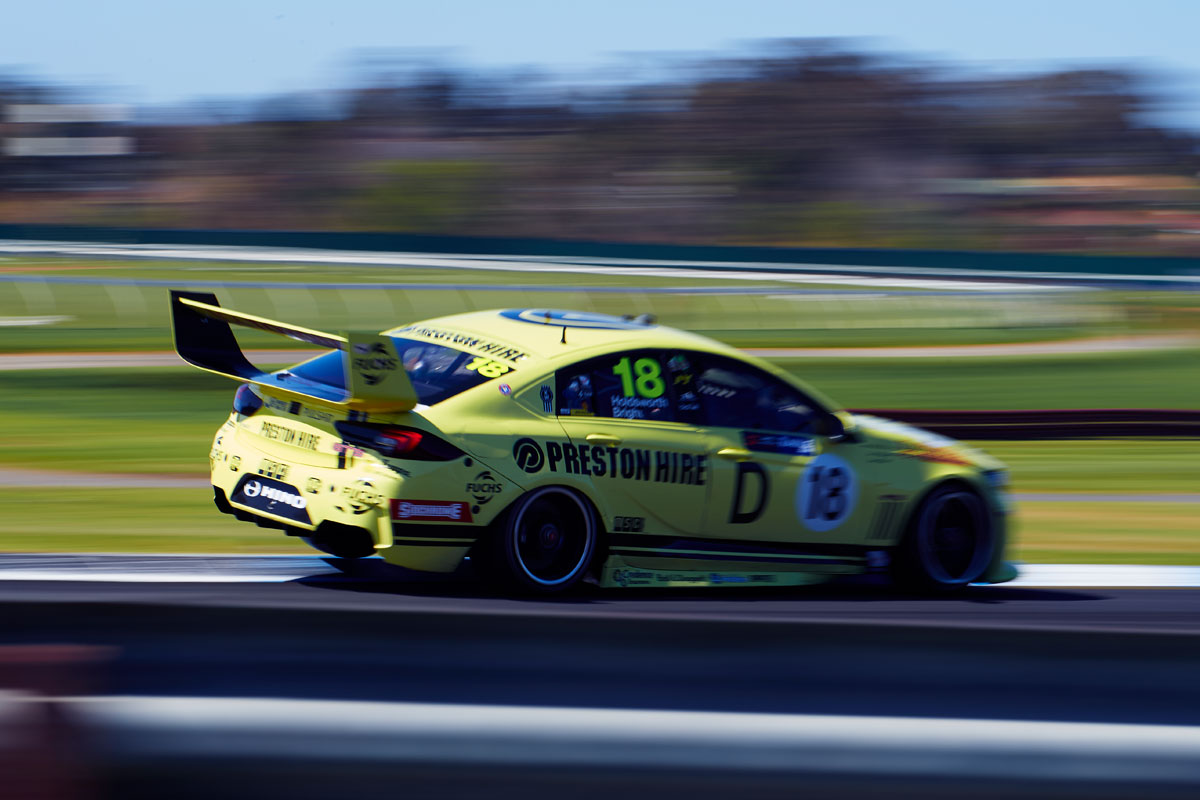
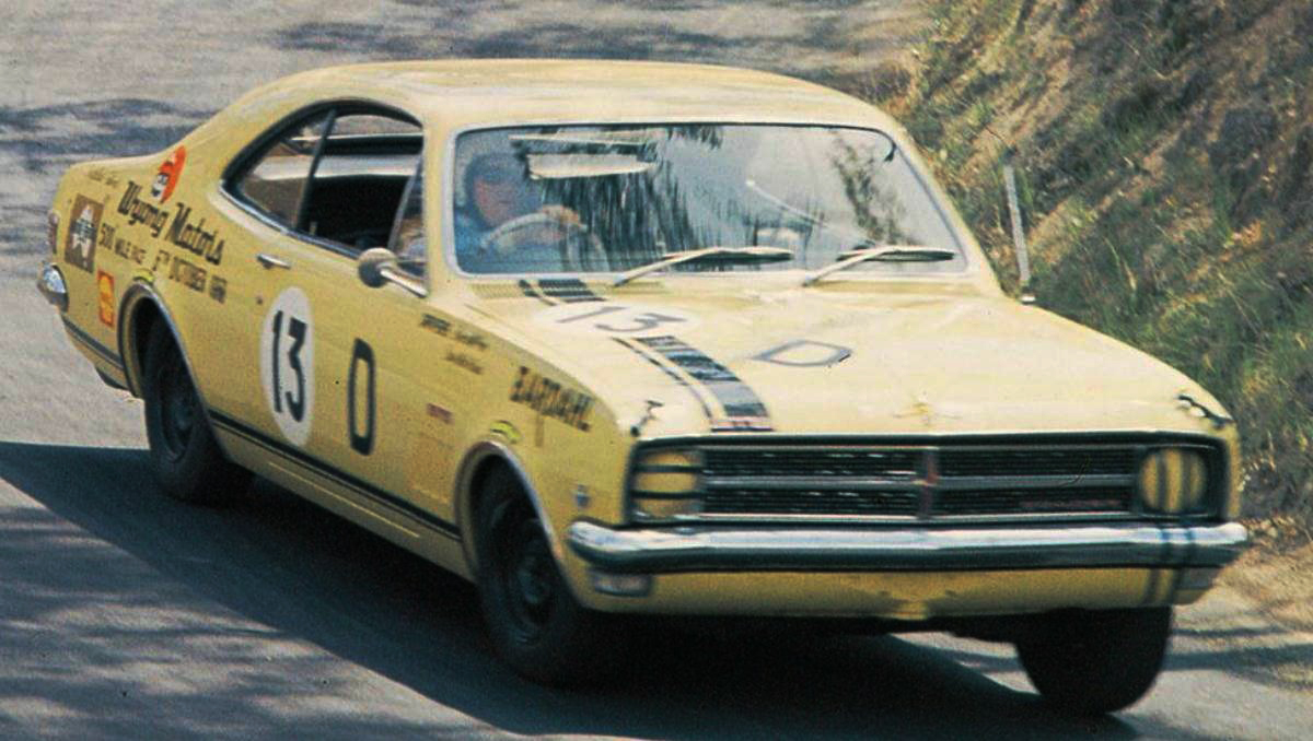
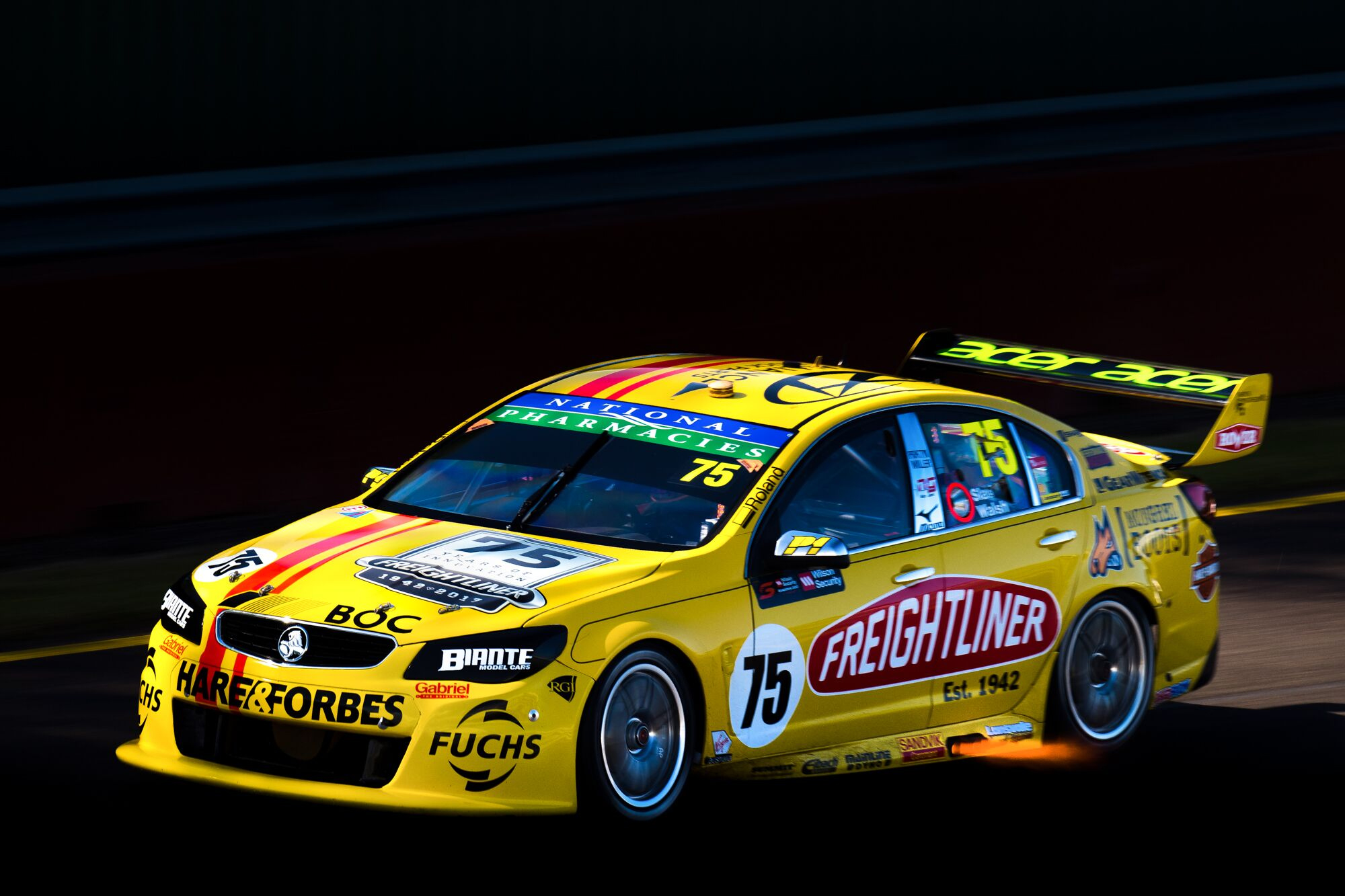
This retro livery isn’t too dissimilar to the Freightliner entry last season, but so was the basic design thinking in the 60s and 70s.

The #18 this year closely resembles the 1968 McPhee Monaro it pays homage to. It’s a completely authentic looking design, with perfectly matching lines, numbers, and even the old ‘Class D’ lettering (on the side at least). The ‘Warwick Yellow’ looks great and is a nice break for the usual, equally nice Preston Hire yellow.

#21 Blanchard/Wood

BJR Blanchard 18BJR Benson Hedges

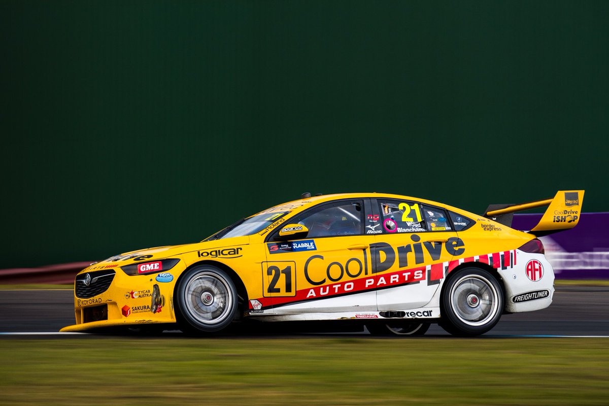
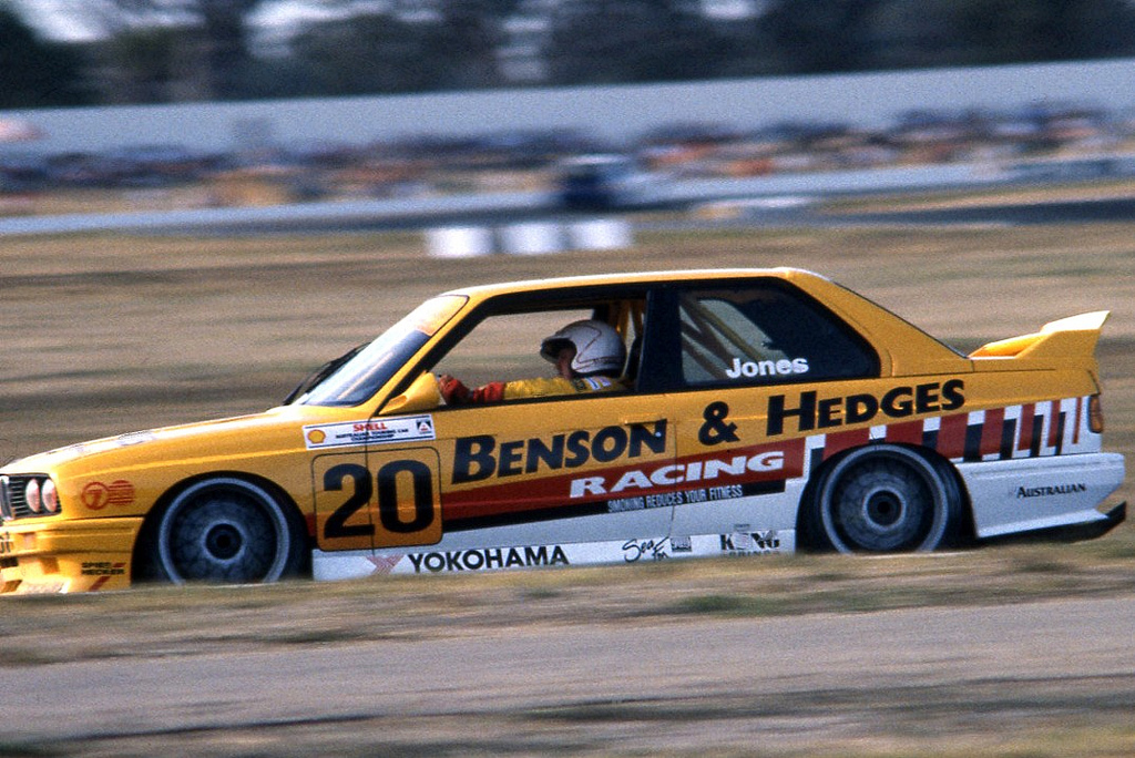
Tim Blanchard kept it classy this year, giving a nod to the BMW his father had once raced. I remember Lotus getting some heat for using the old JPS liveries as inspiration in Formula 1 one year, but you can’t get much closer to a cigarette livery than this Benson & Hedges replica.

Any livery fanatic will tell you that cigarette brands had some of the best and most memorable liveries of all time, and this here is no exception. It’s translates incredibly well to a modern racer, and despite a departure from the usual blue, CoolDrive looks fantastic and in no way out of place on the design. While cigarettes are terrible things, I’m glad in a way that they left an imprint on the Motorsport world.
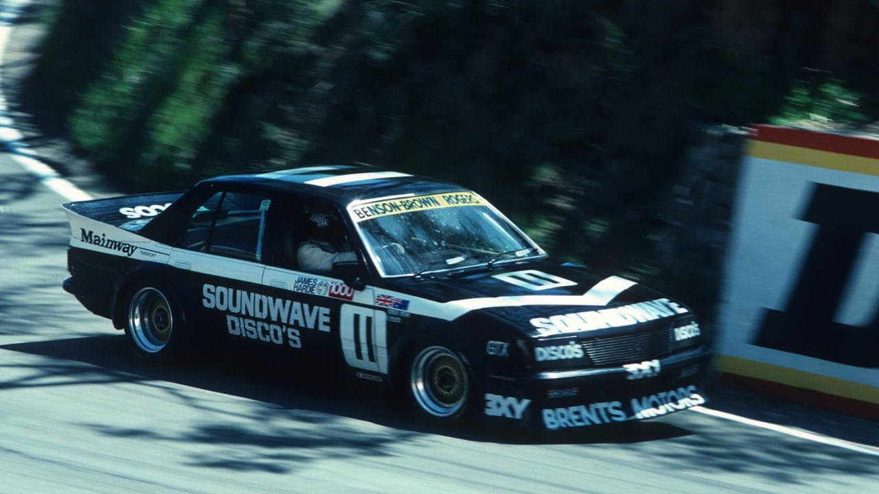
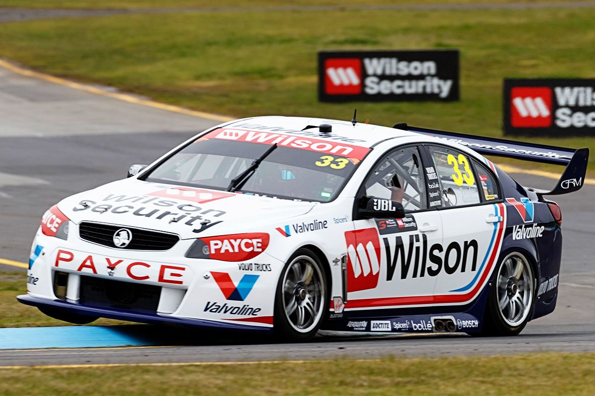
#33 Tander/Pither

GRM Tander 18GRM Garry Rogers Debut

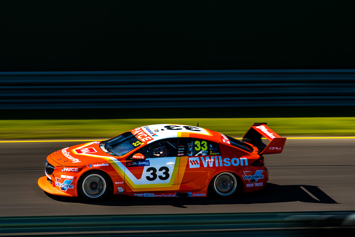
Another set of direct replicas, and don’t these look amazing. Both are depicting cars Garry Rogers himself had driven, this one a 1978 Torana. As I mentioned with the Chickadee Penrite machine, it’s great to see some truly retro shapes and colours going on this year, this one being a true period piece of the 1970s. This too translates well to a modern Supercar, and just looks nice!

Would love to see this used for the rest of the Enduros – fingers crossed.
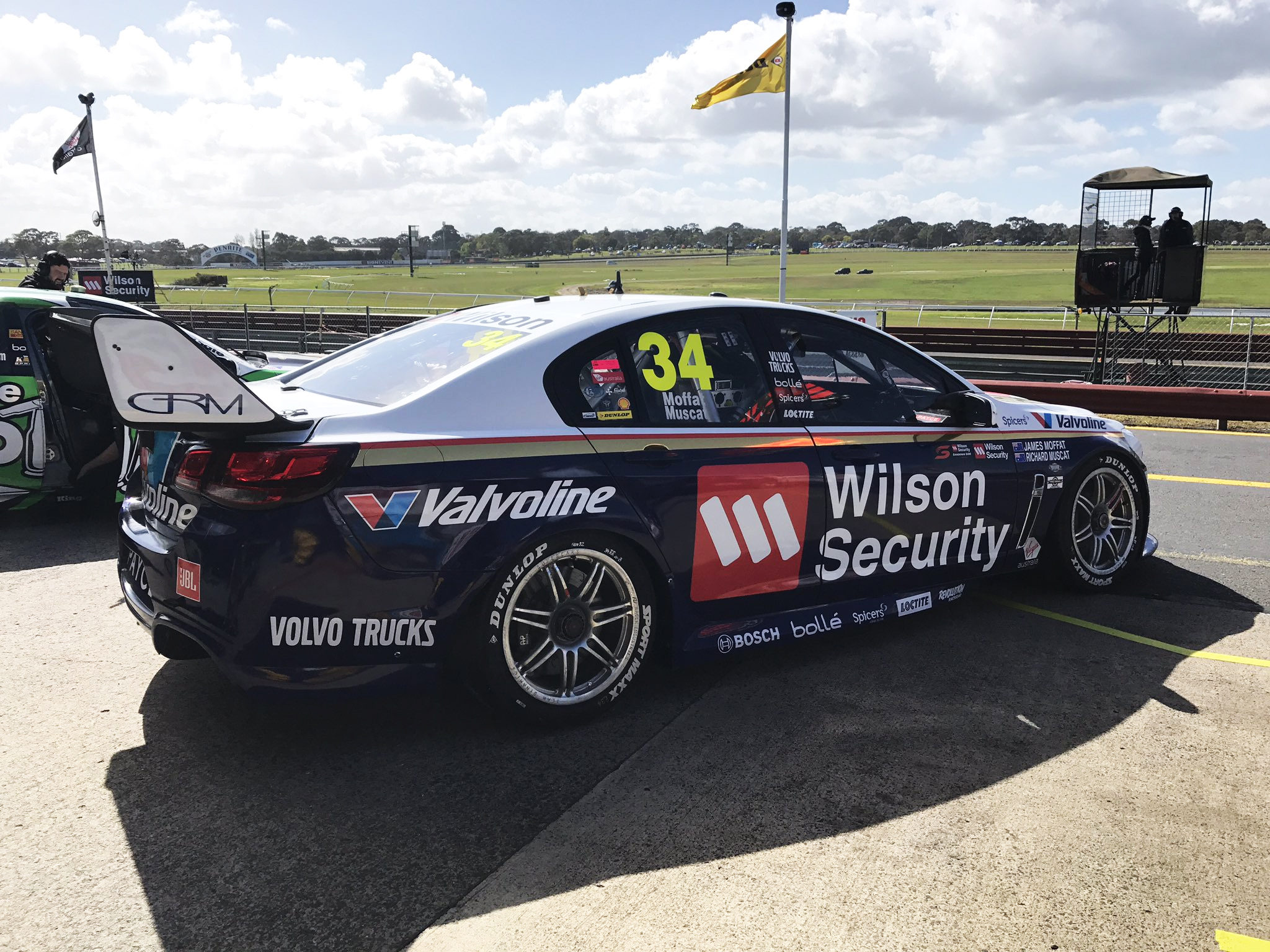
#34 Golding/Muscat

GRM Golding 18GRM Bathurst 83

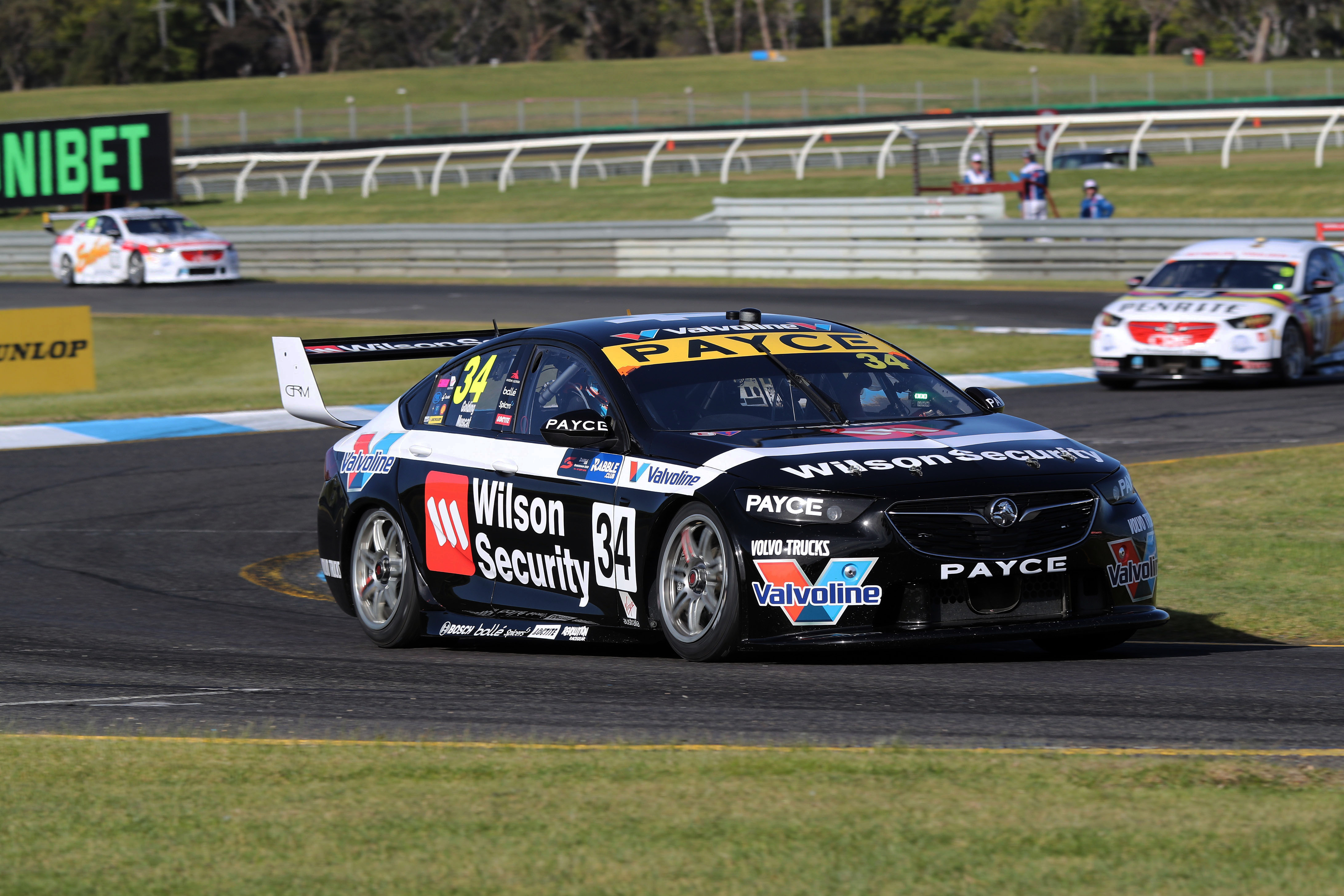
The #34 is an homage to Garry’s 1983 Commodore. The sleek black and simple white line and chevron look great on the 2018 car. It’s nice to see that simple designs can work just as well as the odd and complex ones.
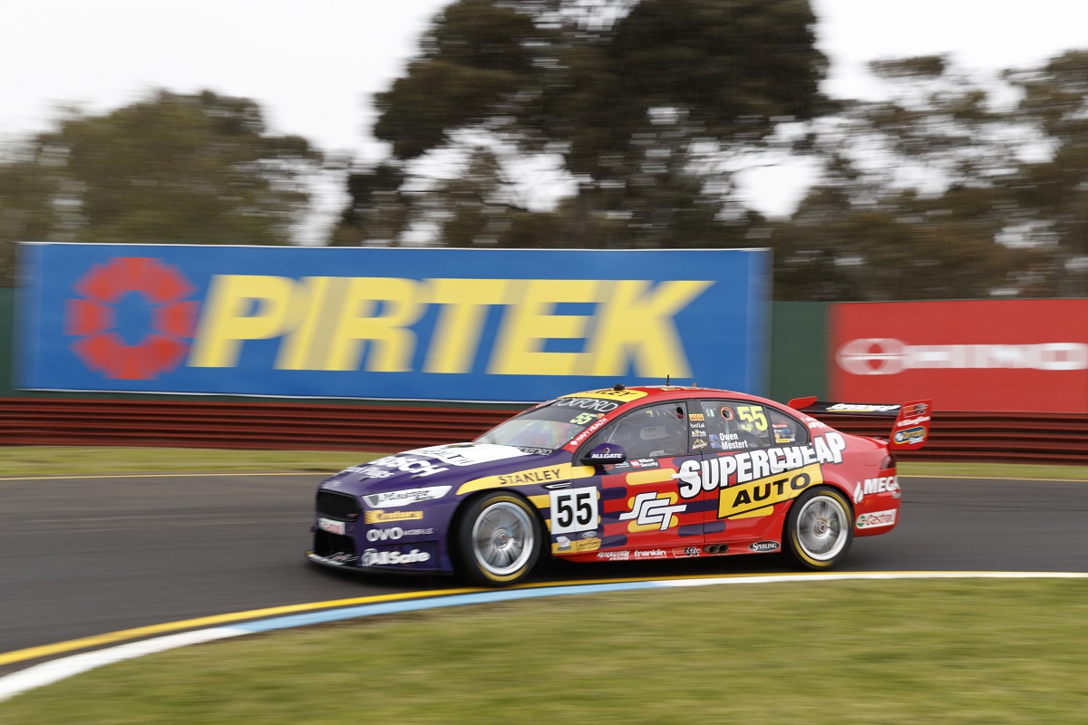
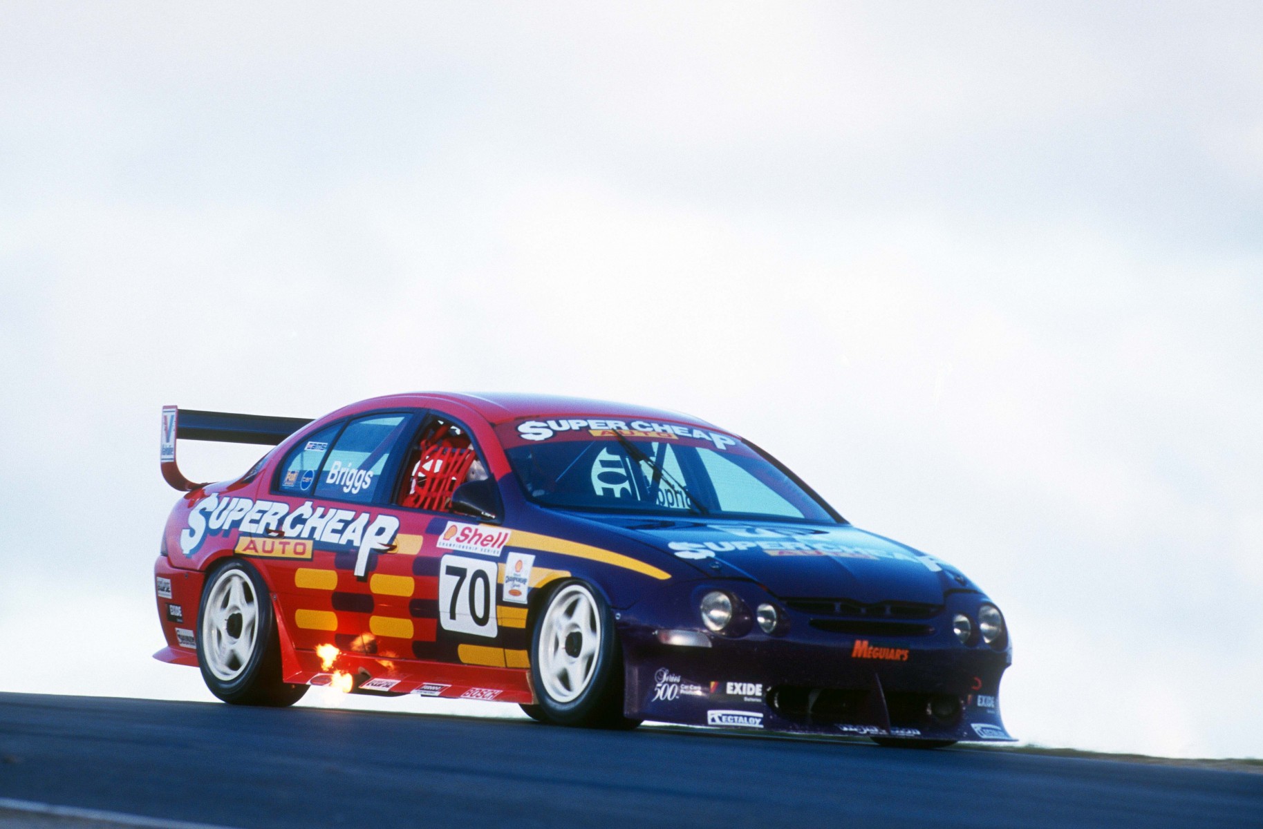
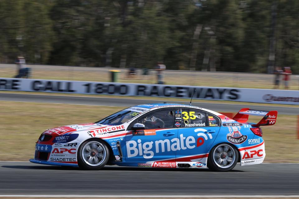
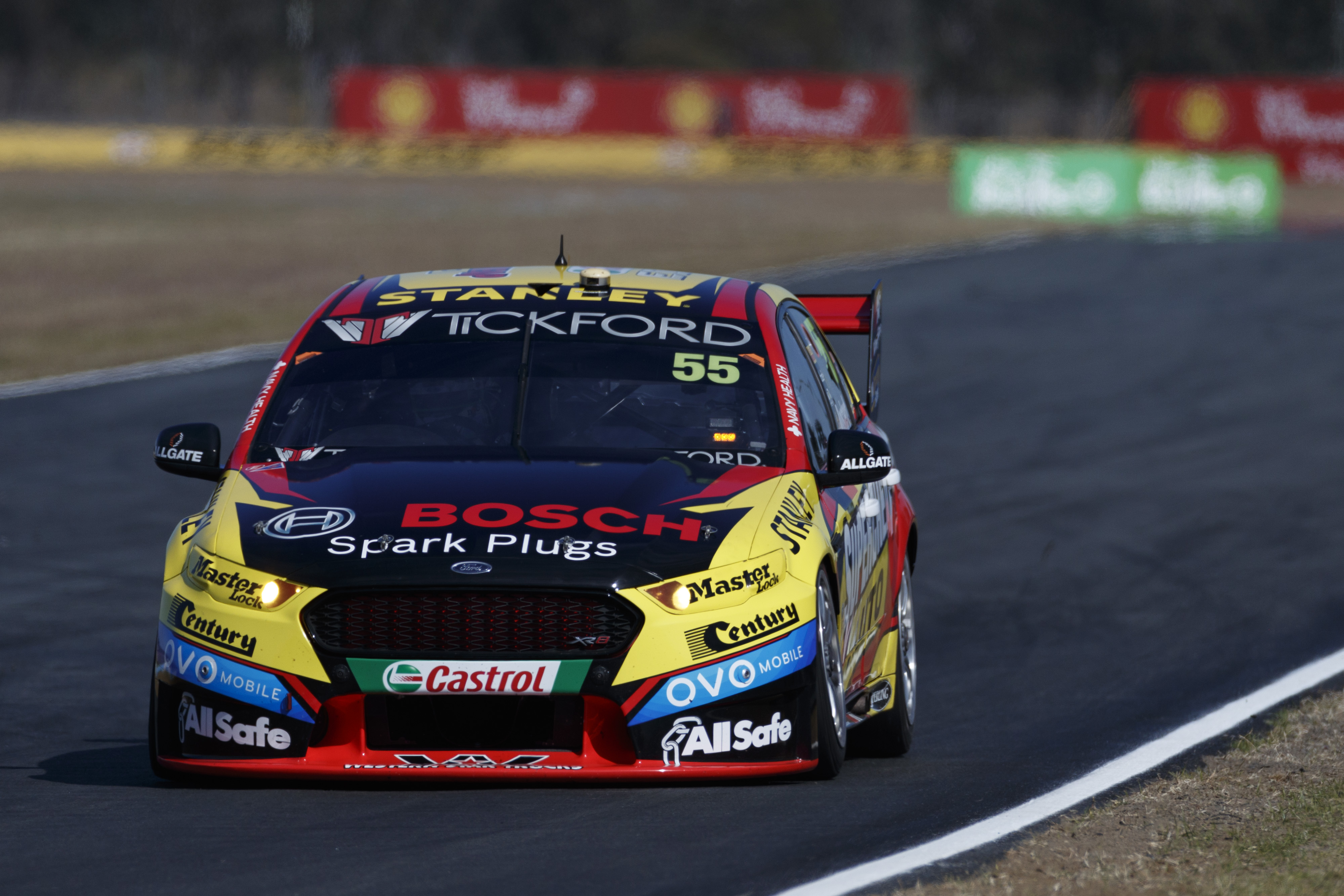
#55 Mostert/Moffat

Tickford Mostert 18Tickford Ellery 04

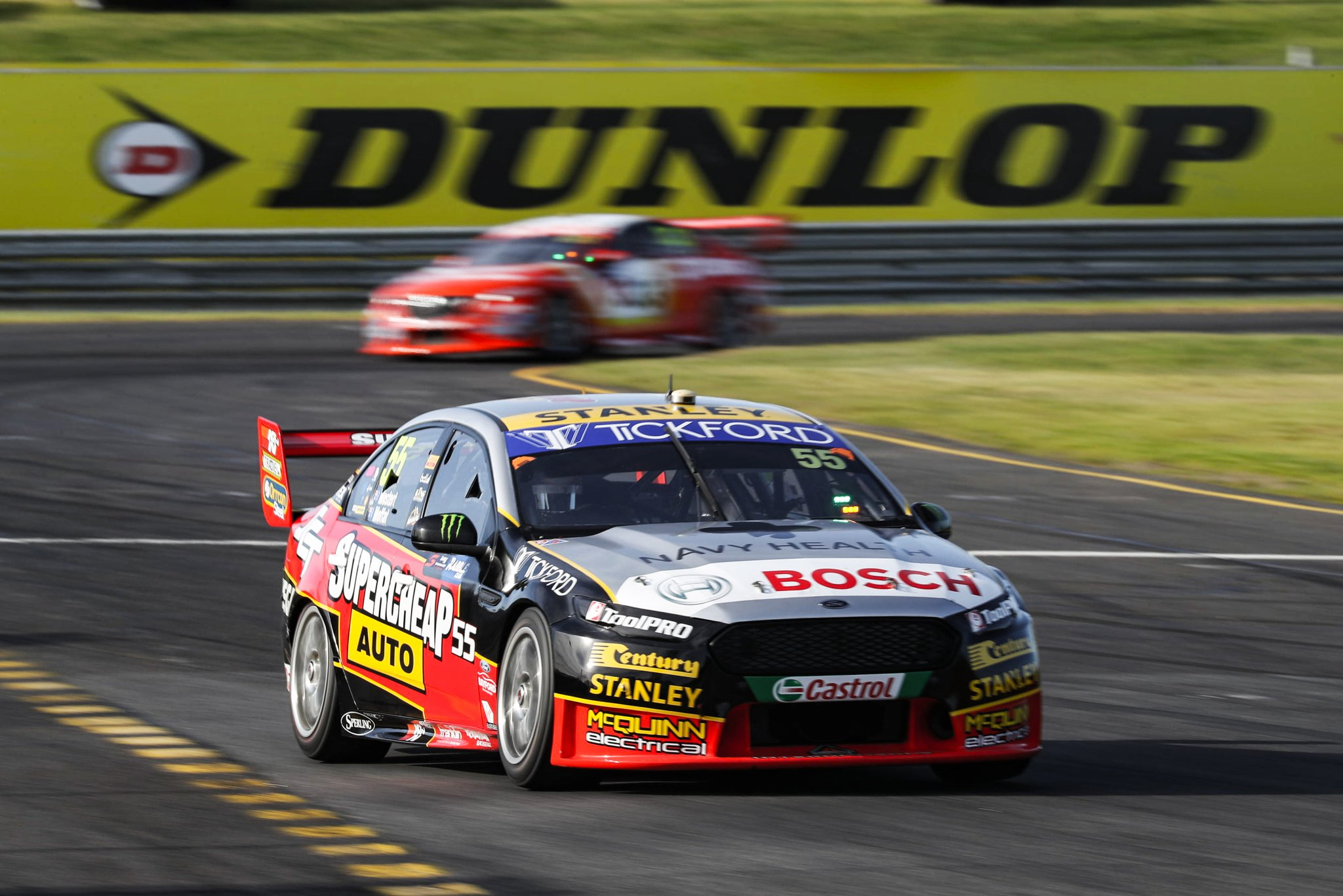
Antother design from the not too distant past, with Tickford choosing to paint the #55 in Steven Ellery’s Supercheap Auto colours from 2004. They’ve steered clear of purple this year, instead going with the blac, red and silver design. They’ve taken some liberties and simplified the livery slightly, removing some of the extra yellow lines, which does modernise the design. It’s great to see not only replicas, but successful modernisation of classic liveries this year.

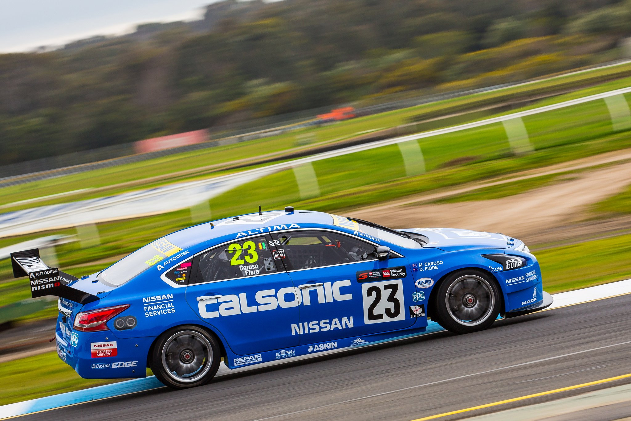
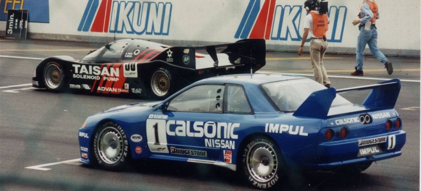
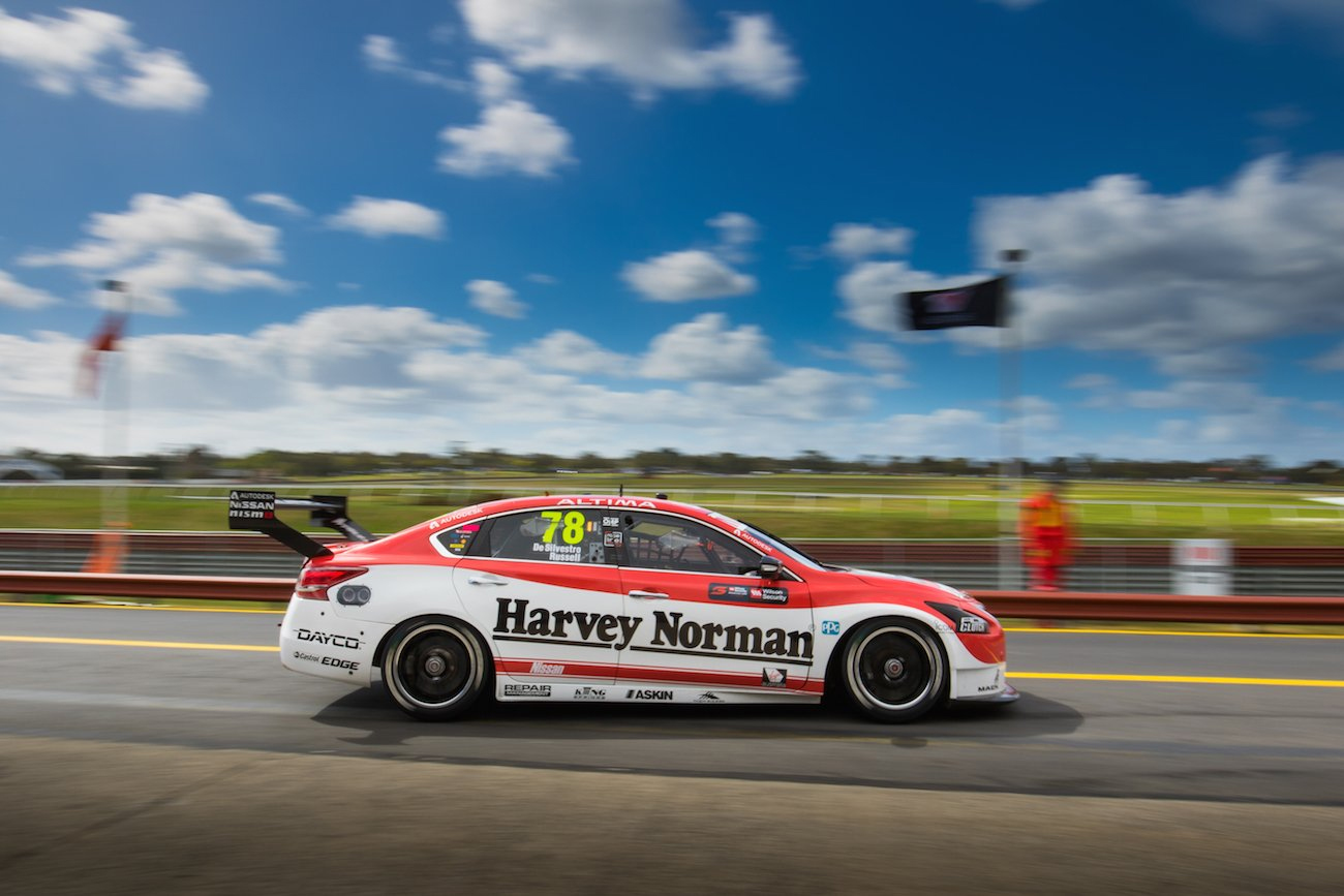
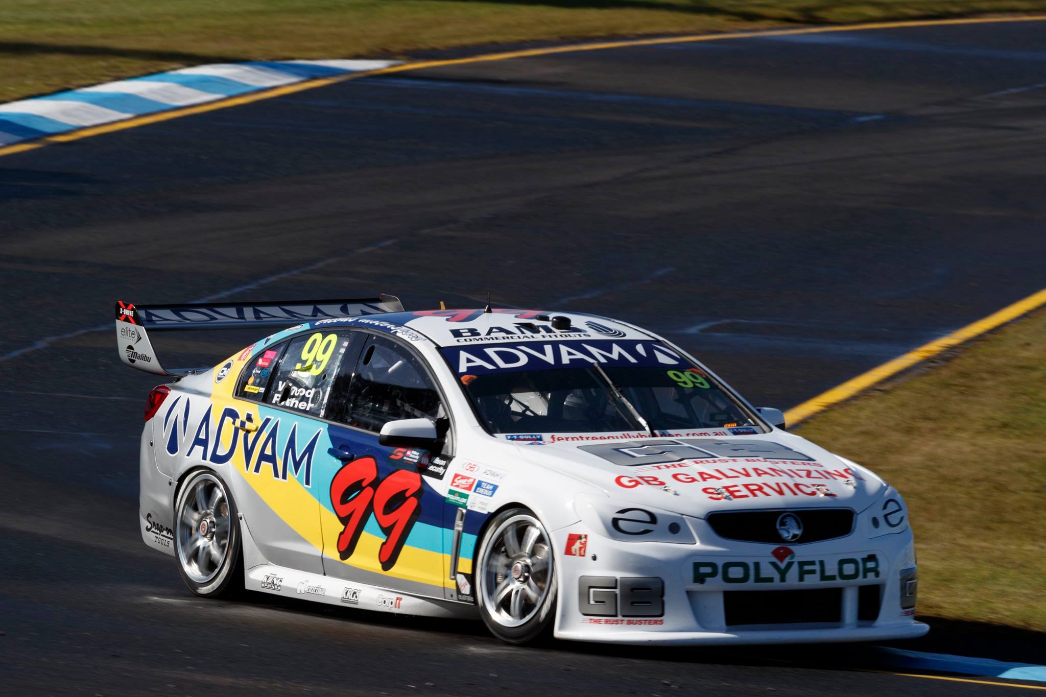
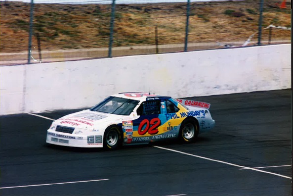
#78 De Silvestro/Rullo

Nissan De Silvestro 18

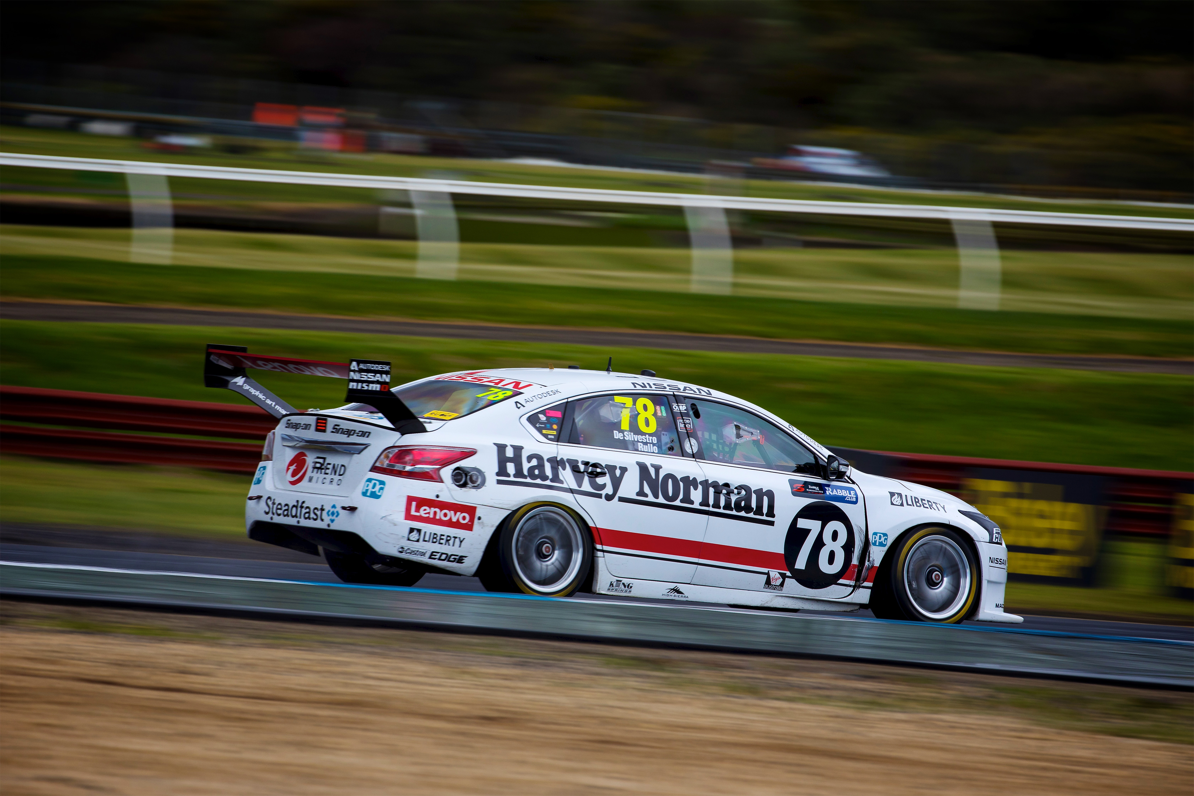
For De Silvestro and Rullo, Nissan have gone with a retro themed design as opposed to immitating an actual past livery. I’m not sure how rich Harvey Norman’s racing history is, but I’m sure there would have been some lovely looking Nissans to choose from, rather than this very basic effort. Whilst it’s very similar in design to others we’ve seen this year and last, red and white doesn’t really excite!

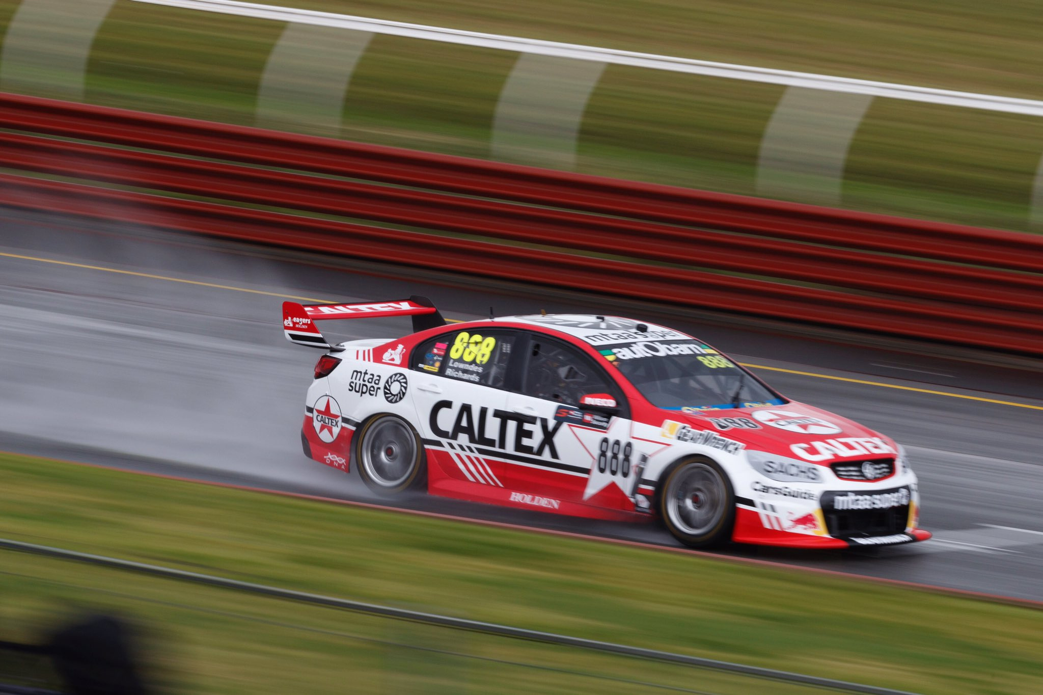
#99 De Pasquale/Brown

Erebus De Pasquale 18Erebus Chickadee 81

I went the whole of last weekend, somehow, thinking both the Erebus cars had the same livery. My usually attentive eye stupidly saw the retro Chickadee font and didn’t ask any further questions. Luckily in writing this post I picked up on my error, and found that the #99 is based on the 1982 Toyota Celica.

In actual fact, the two liveries are completely different, this one focusing simply on a thick red stripe across the bonnet and front quarter panels. It’s a great job again of font replication and logo placement, although the one thing I’d have loved to see on both cars was the Penrite/Erebus logos on the side sprawling all the way above the rear wheel to the rear bumper.


It’s great fun to see retro round increasing in stature year after year, and more teams and fans embracing it with the awesome inspired and replica liveries. Can’t wait for next year.


Livery Updates – Supercars Bathurst and Gold Coast

Let’s take a look at some recent updates for the Supercars, starting with a true nagger. Nick Percat got another major round sponsor on board, this time in the shape of Boost. The only weird thing is, Boost already sponsors James Courtney’s car. What this has resulted in, is a weird situation where a car from Walkinshaw Racing and a car from Brad Jones Racing, are running almost identical liveries, despite being different teams.

It totally weird me out, and as you can see above, apart from a couple of sponsor logos, the designs are identical! Perhaps this is simply opportunistic, with both teams’ other cars sponsorships locked in, but doesn’t make it any less odd. Perhaps next year we’ll a single team with the Boost livery, although their logo is littered up and down the grid.

The design has changed slightly since it was introduced to the #22, with the main colour now a metallic charcoal, supported by a reflective ‘chrome’ orange on the roof. It’s a really nice retro looking design in its simplicity and layout, although is modernised with some spiked edges along the side and piping on the front and rear bumpers.

Prodrive missed the boat for Sandown retro round, and came to Bathurst with an old school livery instead. This was an ode to Alan Moffat’s Ford of the late 70s, and they’ve done a good job in translating the simple livery onto the 2017 Falcon. It’s not a direct copy and has had some slight changes, for example the gap between the red and blue lines is wider and the black outline thinner, which actually makes quite a big difference to the overall look.

caruso bathurst 17Elsewhere, Michael Caruso’s Nissan sported a different blue design, this time sponsored by BIG4 Holiday Parks. The blue had a slight gradient, giving it the feel of a blue summer’s sky, a clever way of getting people to think about their upcoming holidays! This was accompanied by a solid green line along the bottom of the side, outlined with white.

caruso gc 17

Caruso had yet another livery in the Gold Coast, a very Nissan livery, with the tagline ‘Beware of Strangers’ warning owners of  not taking their cars to cars to official Nissan service centers.

Livery Updates – Sandown Retro Round

Retro round is back for another year, and this time, the majority of the field has joined the party! I’m torn, because there’s nothing better than some living nostalgia, but at the same time it takes some of the fun away when everybody does it. It also means I have to write and research for that much longer…anywho, here’s what I thought of the liveries!

#2 Pye/Luff

Pye Sandown 17Brock 94

Emulating Peter Brock’s 1994 HRT car, this design takes the overall theme of the old and truly brings it into the new. The half white half navy element has been nailed here and splitting this cleanly rather than with the lion makes a huge difference in not simply copying the original, and making it very attractive. Super clean and makes what is a mostly white livery lively.

#3 Russell/Douglas

Russel Sandown 17

The #3 Lucas Dumbrell machine takes us back to 1996, displaying the original logo of plus fitness, and a livery design to match. The logo is as basic as you’d expect a brand new business logo to be, with the design appropriately simple. With simple block sections bordered by plain straight lines, there’s not a lot to love, but not much to hate about this livery.

#4 Blanchard/Hazelwood

Blanchard Sandown 17Beechey 65 Mustang

Brad Jones Racing paid homage to Norm Beehcey, Australia Touring Car champion of the 60s and 70s. The first of these was the Cooldrive machine, replicating ironically perhaps, the 1965 Mustang that Beechey drove to his first championship. Sporting some very Ford blue with white racing stripes, there’s not much to it! However, you can see where a lovely colour can make a livery work. Whilst this looks a little boring, the Calsonic Altima is quite pretty in comparison, despite even less design elements.

Hazelwood SandownAlso, how about that crash for Hazelwood. Shame it ended their weekend, but absolutely spectacular.

#7 T. Kelly/Le Brocq & #15 R. Kelly/Wall

R Kelly Sandown 17T Kelly Sandown 17BRE Nissan

Really clever these two liveries from Nissan. The respective colours the Sengled and Carsales sponsorships have presented a great opportunity to replicate a pair of liveries from the 60s. Don’t know a lot about these BRE Datsuns, but they were beautifully simple liveries, which have been transferred very well to a modern day racing chasis. It’s a simple design, with white the main colour and red/blue covering the top section of the car, and two parallel diagonal stripes on the front quarter panel, changing colours at the Nissan logo. One of the better alternating team colour livery combos, with both quickly and easily differentiated.

#8 Percat/Jones

Percat Sandown 17beechey-67-chevy.jpg

The #8 paid tribute to Beechey’s 1967 Chevy. Another simple racing stripe livery, this time mostly black, with one simple red lines down the middle of top, bordered with yellow. Works quite well on a modern car!

#9 Reynolds/Youlden

Reynolds Sandown 17Brock 76

Erebus were another team to celebrate Brock, with the #9 sporting the livery that Peter and Phil Brock raced to victory at Sandown 41 years ago. The design is as identical as could be on a modern car, and looks good in doing so. As so many were back in the day, it’s delightfully simple, with a thick straight line each of red and blue along the side of the car, with a slight upturn toward the rear. The blue hood looks good too, whilst the retro Penrite logo finishes the job.


#18 Holdsworth/Reindler

Holdsworth Sandown 17

Preston Hire Racing went for a cheeky retro round design, making many of us giggle like they were back in high school due to ‘Preston Erection’ adorning half of the car this week. This is the name Preston Hire had begun its life with, so aside from the inuendo, it has a purpose! The design is literally split between the retro and the modern on either side of the #18 machine, in a style that will take most back to the 1999 BAR F1 zipper livery. Preston Hire Racing split the design via a jagged line from front to back, which is great for a one off; very interesting indeed. Great to see as many logos as possible in their retro stylings on the Preston Erection side.

#22 Courtney/Perkins

Courtney Sandown 17Rick Kelly 07

Don’t have to go too far back for this, just 2007! This livery will bring back some unpleasant memories for Ford fans, with the events that were triggered by a nearly identical car at Phillip Island the year before. That said, this was perhaps brought about by fortunately similar sponsor colours with Boost. The general design is more or less the same, minus the lion that adorned the HSV Dealer Team cars. However, this attempt does remind me of an unlicensed video game, where the design has to be similar, but not so similar that it trigger the involvement of lawyers.

#23 Caruso/Fiore

Caruso Sandown 17Calsonic Skyline

You know, if anyone dared to make such a plain ‘original’ livery nowadays, it would likely be trashed by design pundits, but putting on the nostalgia goggles really does wonders for this retro livery. The Caruso/Fiore Altima goes back to the early 90s with this Calsonic R32 Skyline re-creation, and this takes me back to my Gran Turismo days on Playstation. Amazing how such a basic livery can be so memorable, and good looking with the shade of blue they’ve chosen here!

And for those who were GT fans like me, how good is this little video Nissan Motorsport put up on Facebook!

#33 Tander/Golding

Tander Sandown 17Tander 98

A pretty unique opportunity for GRM here, recreating the first livery that Garth Tander had raced in in V8 Supercars (then ATCC) back in 1998, which was also for GRM. Mainly white , with the navy rear split with a curved red line, accompanied by a thin light blue line in a colour scheme that is entirely uniform. It works very well on the 2017 car and it’s fantastic to see that GRM’s Valvoline partnership is still going 19 years on!

#34 Moffat/Muscat

Moffat Sandown 17Moffat Monza Rothmans

James Moffat’s goes back in time to his fathers time of racing, replicating the Rothmans sponsored Commodore that was raced in Europe. Is one of the more basic Rothmans liveries that existed, but clean and simple is all that is required on many occasions. It’s a perfectly appealing livery and makes me wonder why so many modern liveries feel the need to be so complicated.

#55 Mostert/Owen

2017 Virgin Australia Supercars ChampionshipBriggs Supercheap 1999

Prodrive and Supercheap Auto Racing have gone with another blast from the past this year, selecting another classic purple livery, but this time from 1999. It’s fair to say this was never a very attractive design, with the odd, almost netting design along the side, but the colour choice is so bold and unique, it’s almost admirable. Fun to see on a modern car, but really lacking some finesse, such as a retro Supercheap logo and white rims!

#62 Rullo/Davison

Rullo Sandown 17

As with the #3, the #62 LDM goes back in time, to the first logo used by Phil Mundays, when it was a panel beaters in Bayswater, Victoria. It’s actually a very nice logo, and is matched well with a big retro looking number on the side. The design is also simple and definitely has a 70s feel to it. Wouldn’t be unhappy to see this used again.

#75 Slade/Walsh

Slade Sandown 17Beechey Monaro 70

Completing the trio is yellow livery, referencing Beechey’s final championship winning Monaro in 1970. Here we see bright yellow, with uneven parallel red stripes along the top of the car. Again, very simple, but true to the original. It looks nice on the the modern Commodore, but perhaps a few too many logos on the BJR cars, ending in a cluttered look.

#78 De Silvestro/Russell

de Silvestro Sandown 17Nissan R380

This was an interesting choice, perhaps due to the colour scheme of the Harvey Norman machine, but they’ve gone with recreating the Nissan R380 livery. It’s actually a clever design, emulating the very curvy body of the original car simply through the design, which curves above the wheel arches where the R380 does. It looks nice and does it’s best to not entirely disregard the natural flow of the Altima.

#88 Whincup/Dumbrell & #97 van Gisbergen/Campbell

Whincup Sandown 17Bond Torana 1971

Red Bull HRT have gone for the ‘feel’ of the 1970s Toranas, and while it’s kind of there with the main white, blue hood and red trimmings, it’s majorly disrupted by Red Bull taking up most of the side and adding perhaps a tad too much blue to the design. It’s an attractive design overall and makes use of a retro Holden logo, but I’d be keen to see Red Bull use some of their own history in the future, such as the 1995 Sauber, or even the 2004 test livery. The logo doesn’t seem to have changed much at least!

#99 Wood/Pither

Wood Sandown 17Ellis Nascar

Similar to Nissan’s approach last year, Erebus have gone with a NASCAR/AUSCAR look for their second car. This livery gives me retro vibes probably more than any other, with the colour palette on show looking oh so 90s. The big number gives off the NASCAR vibes, but you just can’t get over the white/blue/yellow/silver combo. It’s hideously charming. Really fun to see GB Galvanizing on exactly the same part of the car all these years later.

#888 Lowndes/Richards

Lowndes Sandown 17

It’s a retro look, but a unique design for TeamVortex. They’ve taken the old Caltex logo and come up with a livery that oozes 80s, without actually copying a past livery. Props for the originality. The design uses simple straight lines, along with interesting use of lined gradients to accentuate the theme, whilst the star number plate is totally ridiculous but also fits the bill.

Livery Updates – August Catch Up

Sorry for the lack of posts, but hoping this monthly review of livery changes could lead to more frequent posting of more than just catch ups in the future. Let’s start with Indycar this time!

Phoenix International Raceway - Day 1

Marco Andretti had Oberto as a main sponsor last month, and in doing so, gave the Andretti template a funky new feel. The main red and white’s were well complimented with a light green, giving an undoubtedly Italian theme to the car.

sato august

We also saw Sato in a livery with very minor changes in August. Expedite brought a very slightly lighter blue, along with yellow as for the trimmings, where we’d seen red and teal earlier in the season.

gutierrez august

Gutierrez, and then Bourdais on his return, drove the #18 in straight blue and white last month, in what does look quite empty and dull now. This livery was far more striking in red at the beginning of the season, and without the sponsor on the sidepod, looks empty.

rahal august 2

Graham Rahal sported two different liveries in August, the first a minimal red effort, sponsored by his father’s car dealership. A single white stripe down the side of the car complements an appealing shade of red, with some black on the wings completing the look.

rahal august

It’s the same design as above, but looks entirely different in this colour scheme for Fifth Third Bank. Slightly clashing colours here, the two blues and the minty green not quite gelling. Definitely interesting, but not ugly!

davison august

Off to the Supercars! Tekno was sponsored by Cars 3 at Eastern Creek Sydney Motorsport Park, and went the logical route of painting the car in the film’s main character, Lightning McQueen’s livery. It is gimmicky but makes total sense. Could only imagine it would succeed in making younger Motorsport fans want to watch the movie, and parents think about taking them.

percat august

ACDelco was the latest sponsor for Percat and BJR, putting a pleasant metallic blue on the grid, along with pink and white stripes, in what is a basic livery.

Livery Updates – July Catch Up

Looks like we’re at the end of the month already! Let’s take a look at what we’ve missed throughout July, starting with the good old Supercars.

Percat Ipswich

Another week another sponsor for Percat, who has Dunlop Super Dealer backing this weekend in Ipswich. The iconic lettering never looks out of place on a racing car and the black on yellow background looks as good as ever. Keeping it simple here with two parallel stripes in red and black along the bottom of the car and giant Dunlop logo on the front door, which I associate more with shoes than cars these days.

Hzelwood Ipswich

The last of the wildcards has joined the grid in Ipswich, in the shape of the #35 Commodore, driven by Todd Hazelwood. Big Mate are the main sponsor of the car, who appear to be involved in GPS monitoring solutions, and have brought with them some pretty standard colours in red, white and blue. There’s a main diagonal blue section across the side, bordered by white and red, with white the main colour over the rest of the car. Very logo heavy this one, bringing a cluttered look to the livery.

Just quickly, it appears as though Castrol have reduced their backing on Mostert’s Super Cheap Auto car, which is great news, as Bosch now takes up the bonnet space with a black background. This allows the livery to look uniform and complete once again!

Rahal Iowa 2017

Skipping across to the States, we saw Rahal in an uncustomary yellow livery for Iowa. The Gehl sponsored machine was a beautiful shade of yellow, looking super simple and clean with just the single black line from nose to tail. The majority black wings help contrast the yellow making for a very nice livery overall.

Rahal Toronto

One week later, however, Graham was back in red, but again, not his usual Steak ‘n Shake livery. This Rousseau backed livery was mainly red, with white over the top of the nose, cockpit and engine cover. As far as basic designs go, this is probably my favourite style, having the lighter shade of the ‘top’ surfaces of the car. Black wings bring a welcome third colour to the design.

Rossi Iowa

We’ve also seen Rossi change colours since the start of the season. The blue is the same, but now features red where the yellow of Napa used to be. In this case, the entire sidepod is red rather than just what the Napa logo covered previously, on the usual Andretti design.

Pagenaud Toronot

Penske had a couple of livery changes in Toronto, with Pagenaud switching to a car seemingly in greyscale. While I’m not usually a big fan of liveries without colour *cough* Haas *cough*, this is a decent looking novelty that should only last a race or two. Also important to note that silver, not grey, is used, and as the third colour, not the primary.

A simple change for Newgarden too, with DeVilbiss bringing a bright orange in place of the Verizon silver. I love organge as a colour, but this is certainly a downgrade.

Kanaan Mid-Ohio

Most recently, Chip Ginassi have joined in on the Indycar chrome livery fad, spicing up the usual NTT Data livery. It’s a nice super reflective blue along the engine cover, nose and wings, complementing the plain white well. There are also a neat detail in what resembles a big brush stroke, in different colours of blue, filling up some of the white space. A nice livery but we’ll see if it’s only a one off.

AS Amlin Andretti New York

Finally, switching over to Formula e and MS Amlin Andretti have made significant changes to their livery, adding some big chunks of teal, literally on top of the existing livery. They’ve gone about it with a torn paper effect, which actually looks quite nice and hides to lazy thought behind the idea.
haas-boring.jpg

Finally, this update isn’t new but one I guess I should cover. Haas went and made their livery EVEN MORE BORING since the disappointment they revealed at the beginning of the season. In a corporate move Ron Dennis would have applauded, they’ve made the red sections white, so they could stand out more. Technically this may be the case in terms of copywriting, but I can’t imagine a time that white would be more eye-catching than red? Either way, boo to you, Haas, the biggest livery let down on the grid.

Livery Updates – Supercars Darwin

A few updates for Hidden Valley this year, including some lovely indigenous themed liveries for the race at the top end.

Percat Darwin 17

Up first, the newly progressive Holden brand is ‘supporting diversity’ with its indigenous themed livery. With traditionally earthy colours, along with Aboriginal inspired art work all over, it’s a very unique style of livery, one which we haven’t seen much of in this category. I have a feeling this will become even more popular next year, similar to how the AFL’s indigenous round has become a big thing in recent years.

GRM Darwin 17

Garry Rogers Motorsport has also gone the way of indigenous art, but here adding to their usual blue and white livery. They’ve done this cleverly, filling the blue sections with multicoloured (but mostly blue) artwork, adding some nice textures to what is usually a solid blue. Wouldn’t mind at all seeing this used on other occasions!

Le Brocq Darwin 17

Le Brocq is the latest wildcard to enter the championship, with his first drive outside of the enduros. His Nissan Altima is sponsored by gogetta, which for those didn’t know (like me) are a rent to own equipment company.

Le Brocq Darwin 17 2

The livery itself is multicoloured, featuring mainly black and lime, but also with blue and orange flashes. I feel as though just having one of those last colours would have been enough. The design is very jagged and angular which my preference so I’m quite indifferent to this. Looks at home on the Nissan though.

McConville Darwin 17

Lastly, Cam McConville made a surprise comeback with LDM this week and in doing so, brought green highlights in place of the usual orange thanks to Gemini. It works very well as a substitute and against my traditional thinking, it’s quite refreshing to see the same design in alternate colours like on a livery like this.

Livery Updates – Supercars Winton

A few new liveries this week, including two of the new wildcard entries for Winton.

Percat Winton

A couple of mandatory livery changes to begin with; Percat first up. This week we see Freightliner, a supporter of BJR for a few years now, as the main sponsor on the #8 car. A great combination of colours, similar to Reynolds’ Penrite machine, with a bit of grey in the mix. Some nice, sharp and aggressive lines giving the Commodore a great look.

Kelly Winton

New colours again on Todd Kelly’s Altima, this time a deep blue for trucksales. I’ve got a fairly strong dislike for the clashing blues on this car, but it is what it is,

Jones Winton

Macauley Jones was one of the wildcard entrants today, in his DrillPro sponsored Commodore, run by BJR. A rather basic livery in some standard colours, with a lot of white making the livery look a little boring. Some simple details here with a thick blue line all along the bottom of the car and along with the red Payce moustache, it creates some nice confusion considering this isn’t a GRM entry!

Davies Winton

Shae Davies is a second wildcard at Winton in his Nissan Altima. An interesting design here sponsored by Loco Energy Drink, with some vibrant light blue and red bringing some life to the black and grey. It’s a nice black diagonal strip across the side, although I wish there was less grey, considering the other vibrant colours available on the car. While it’s good to see a new livery on the grid, it isn’t very memorable.

Golding Winton

James Golding is also a wildcard entry for Winton in the #31, although he sensibly racing in a standard GRM livery.

New F1 Name & Number Requirements

Formula 1 has some new regulations, requiring teams to have numbers on the bodywork at a minimum size of 230mm tall, and names or abbreviations at a minimum size of 150mm tall. A little bit pointless, but let’s see how some of the teams have interpreted the rules.

Ferrari Spain 2

Ferrari Spain 1

Ferrari have gone retro, basing their numbers off the classic designs of the 70s. I’m not a big fan of this and feel as though it can only be enjoyed with a nostalgic lense. The nose especially is jarring, without blending into the livery very well.

Mercedes Spain

Mercedes have been a little more creative, having the number and name abbreviation on the shark fin, along with each driver’s respective flag, fading out toward the engine. The font style used for the letters isn’t quite what I’d imagine seeing in this situation, but overall a creative interpretation of the new rules.

Williams Spain

Williams have gone a different route, with an almost hidden abbreviation at the bottom of the rear wing end plate. This matches the rest of the livery very well and fefrains from being obnoxious, using what would have otherwise been an empty part of the livery.

Red Bull Spain

Red Bull have decided on big numbers on the shark fin, but the really good news is that the fin is now blue and the bull’s tail is complete! Overall, fits in very well.

McLaren Spain

Lastly, McLaren have filled in the numbers of the nose and have gone with a basic black on white look. While I’ve not had a close up look at this, it looks as though it’s a great interpretation, but looking forward to inspecting it further.

A couple of neat designs and a few that could use some refinement. I’m glad that while this is a completely pointless rule, it hasn’t managed to make the cars look terrible. Let’s see what all the teams come up with and if any changes will have been made by Sunday.


Livery Updates – Supercars

A couple of livery updates for this weekend’s race at Barbagallo, let’s take a look at them.

percat barb

Holden have decided to promote equality once again, this time with a pink and purple livery. It’s a very basic two tone effort, split in the middle with a simple gradient. The only other details are translucent gender symbols spread over the car. Interesting colours I guess, but doesn’t look like they spend too long designing this. Perhaps a go to when they can’t find a paying sponsor?

LDM Barb

Another Holden change with Alex Rullo’s car sponsored by Strike Drilling for this round, as well as some Lift logos on both LDM cars. Same design with yellow instead of blue on the #62, although it’s not as visually pleasing this way.

carsales barb

Yet another carsales brand on Todd Kelly’s car this weekend, partsales being promoted on this occasion. As above, it’s the same design, but in a unique lavender colour, which at least is a break from the usual.

Livery Updates – Supercars Catchup

So I’ve slacked off a little after hours spent on the round-ups, so let’s take a look at some of what I’ve missed, starting with Percat, who will seemingly be changing sponsors each round.

BJR AGP

Holden used Percat’s car to push some social responsibility during the Australian Grand Prix, painting the #8 in rainbow colours in support of marriage equality. It was a simple and very colourful design and didn’t look awful, passing as a decent art car. I have to say I’ve attempted this many times in the (distant) past to varying levels of success.

BJR Tas

Come Symmons Plains, it was Biante on the side of the car, with something a little more subtle. Traditional white, red and black in a standard but pleasant design.

BJR PI

Then for Phillip Island, Hare & Forbes jumped on board, with something a little less uniform. A few too many colours on this livery, without much design to go with it. The number of slapped on logos can’t be hidden with the plain white, and is easily the weakest of the four efforts so far.

Tekno AGP

Back to Albert Park and Tekno unveiled this monstrosity. This is the definition of why putting a logo on an already established livery can go wrong. Horribly matching colours, especially on the bonnet with the EDG sky blue directly on the Woodstock red *shudders* with what was already a below par livery. I can only imagine they were short on time finding a sponsor for the non championship round.

LDM AGP

Conversely, a livery on short notice can work well, given enough care is given. Lift sponsored Taz Douglas’ LDM car for the Australian GP and turned out an agressive, quite striking yellow and black livery. No real complaints here with all the colours working in unity, and all the jagged bits of yellow looking great. Shame it only stuck around for one race! However, it was promptly replaced with the same RMA livery as on Rullo’s car, which is also good.

RBR Tas

Another piece of good news was RBRA touching up their F1 inspired livery. The Holden logo has now changed to white, which is a great move, considering it was somewhat lost in it’s previous form.

Erebus PI

The Penrite Erebus also has a new look, with Enviro Box (not Castrol for once) bringing some green to the party and ruining the beautiful uniformity that was. That said, it’s not nearly as offensive as it could be and is a much more manageable shade of green in comparison to Castrol.

Walkinshaw PI

Lastly, Walkinshaw have struck a deal with Boost Mobile, to turn James Courtney’s Commodore orange. The design hasn’t change, but the new colour does provide an easy way to distinguish Courtney and Pye. Can’t say this is better or worse. Black and orange go very well together, so no real complaints here.