Retro round is back for another year, and this time, the majority of the field has joined the party! I’m torn, because there’s nothing better than some living nostalgia, but at the same time it takes some of the fun away when everybody does it. It also means I have to write and research for that much longer…anywho, here’s what I thought of the liveries!
#2 Pye/Luff
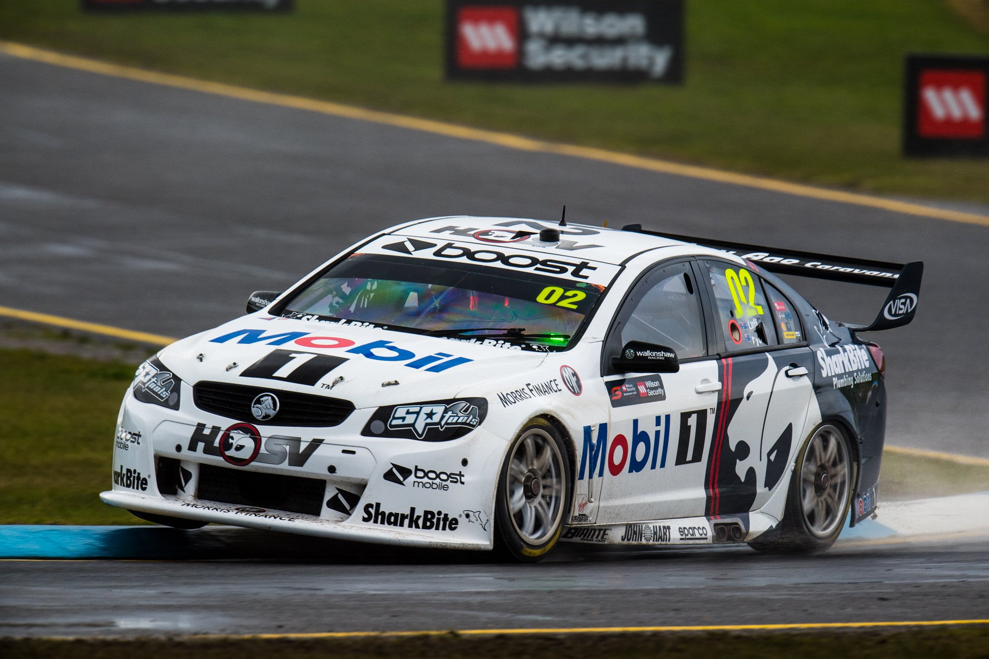

Emulating Peter Brock’s 1994 HRT car, this design takes the overall theme of the old and truly brings it into the new. The half white half navy element has been nailed here and splitting this cleanly rather than with the lion makes a huge difference in not simply copying the original, and making it very attractive. Super clean and makes what is a mostly white livery lively.
#3 Russell/Douglas
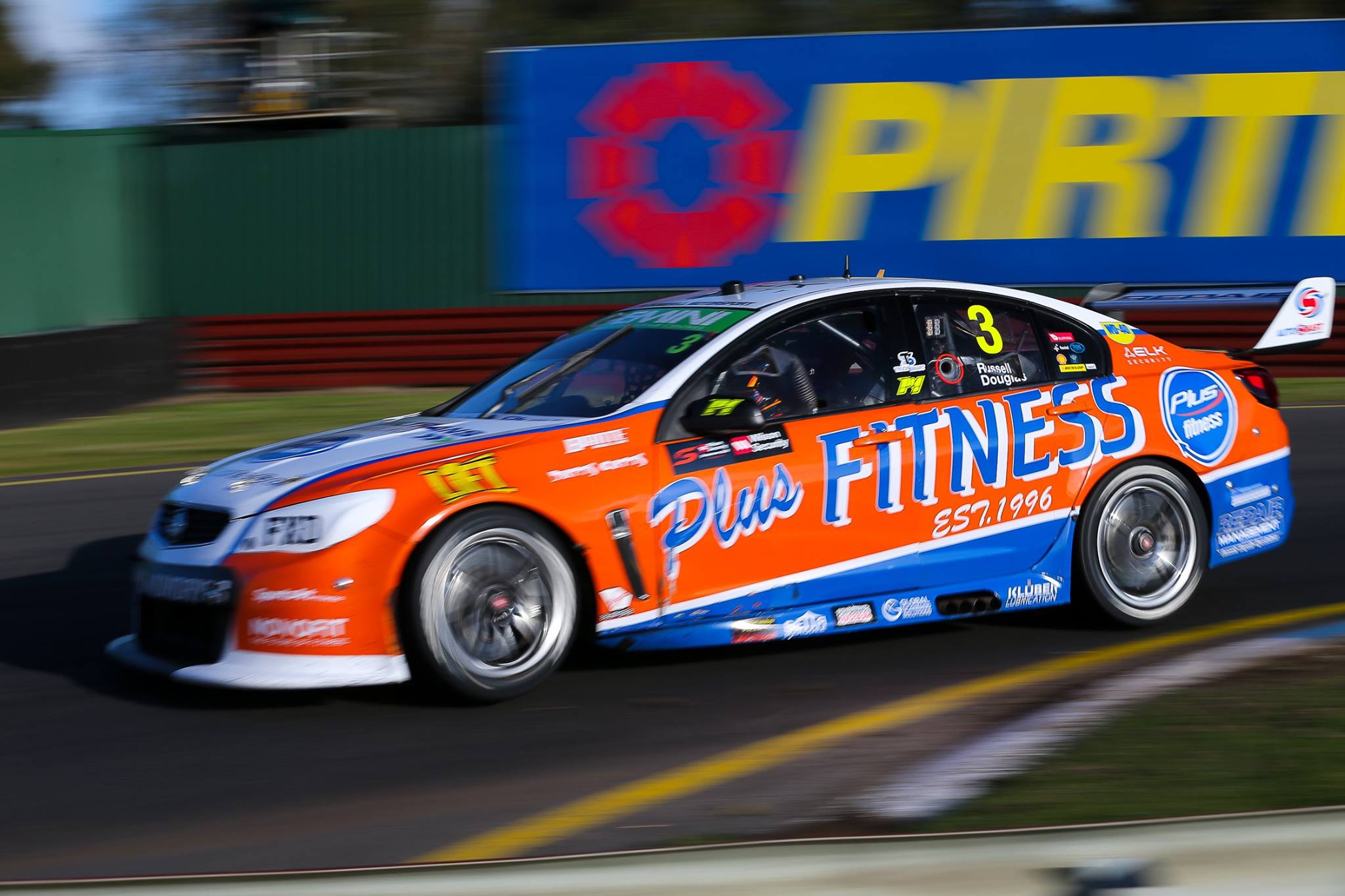
The #3 Lucas Dumbrell machine takes us back to 1996, displaying the original logo of plus fitness, and a livery design to match. The logo is as basic as you’d expect a brand new business logo to be, with the design appropriately simple. With simple block sections bordered by plain straight lines, there’s not a lot to love, but not much to hate about this livery.
#4 Blanchard/Hazelwood
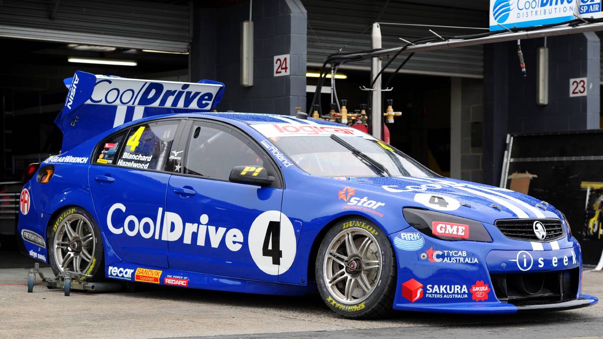
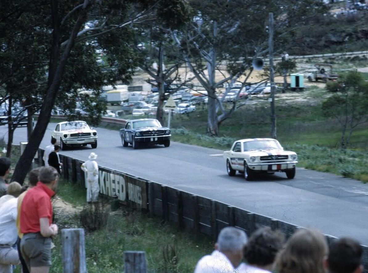
Brad Jones Racing paid homage to Norm Beehcey, Australia Touring Car champion of the 60s and 70s. The first of these was the Cooldrive machine, replicating ironically perhaps, the 1965 Mustang that Beechey drove to his first championship. Sporting some very Ford blue with white racing stripes, there’s not much to it! However, you can see where a lovely colour can make a livery work. Whilst this looks a little boring, the Calsonic Altima is quite pretty in comparison, despite even less design elements.
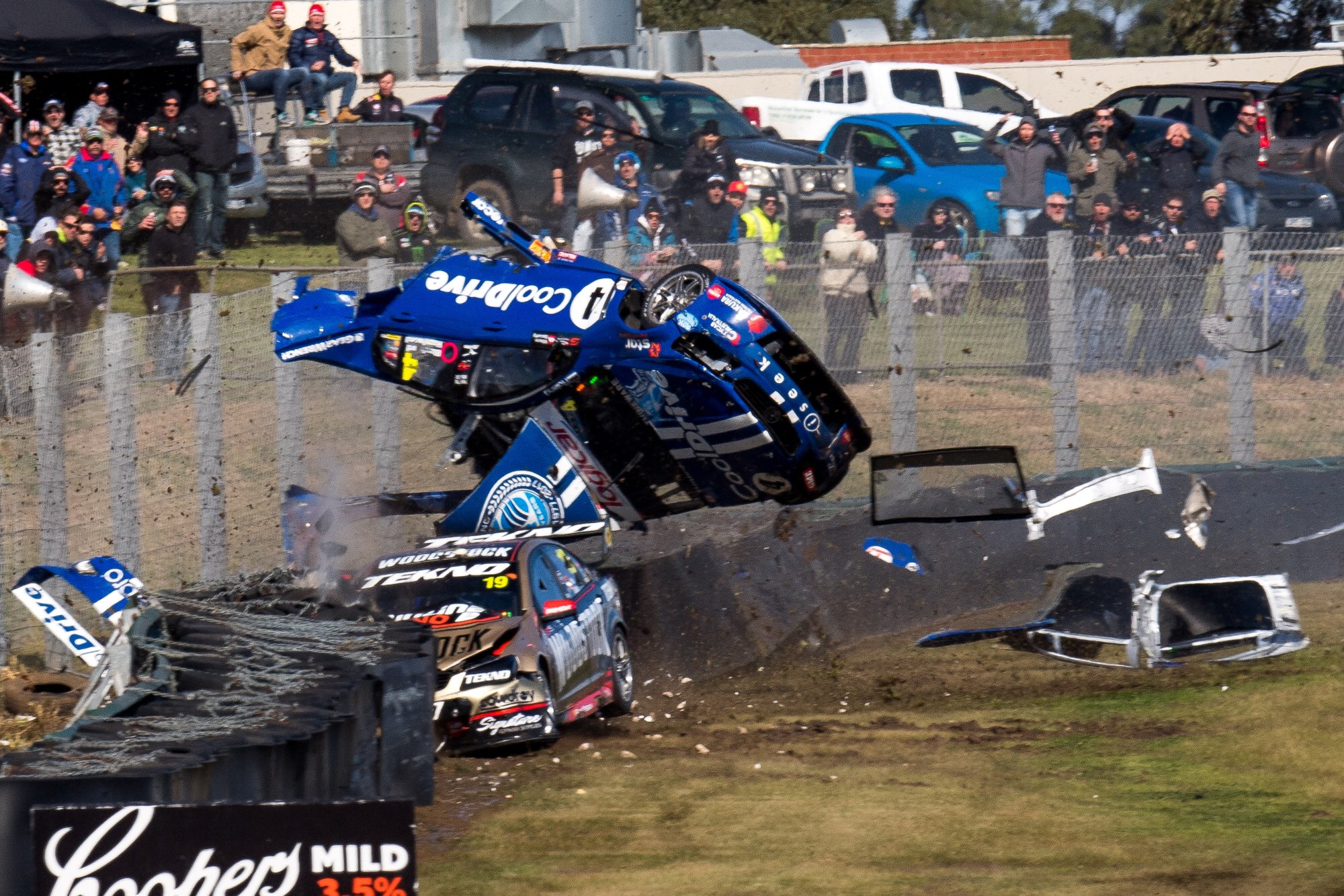 Also, how about that crash for Hazelwood. Shame it ended their weekend, but absolutely spectacular.
#7 T. Kelly/Le Brocq & #15 R. Kelly/Wall

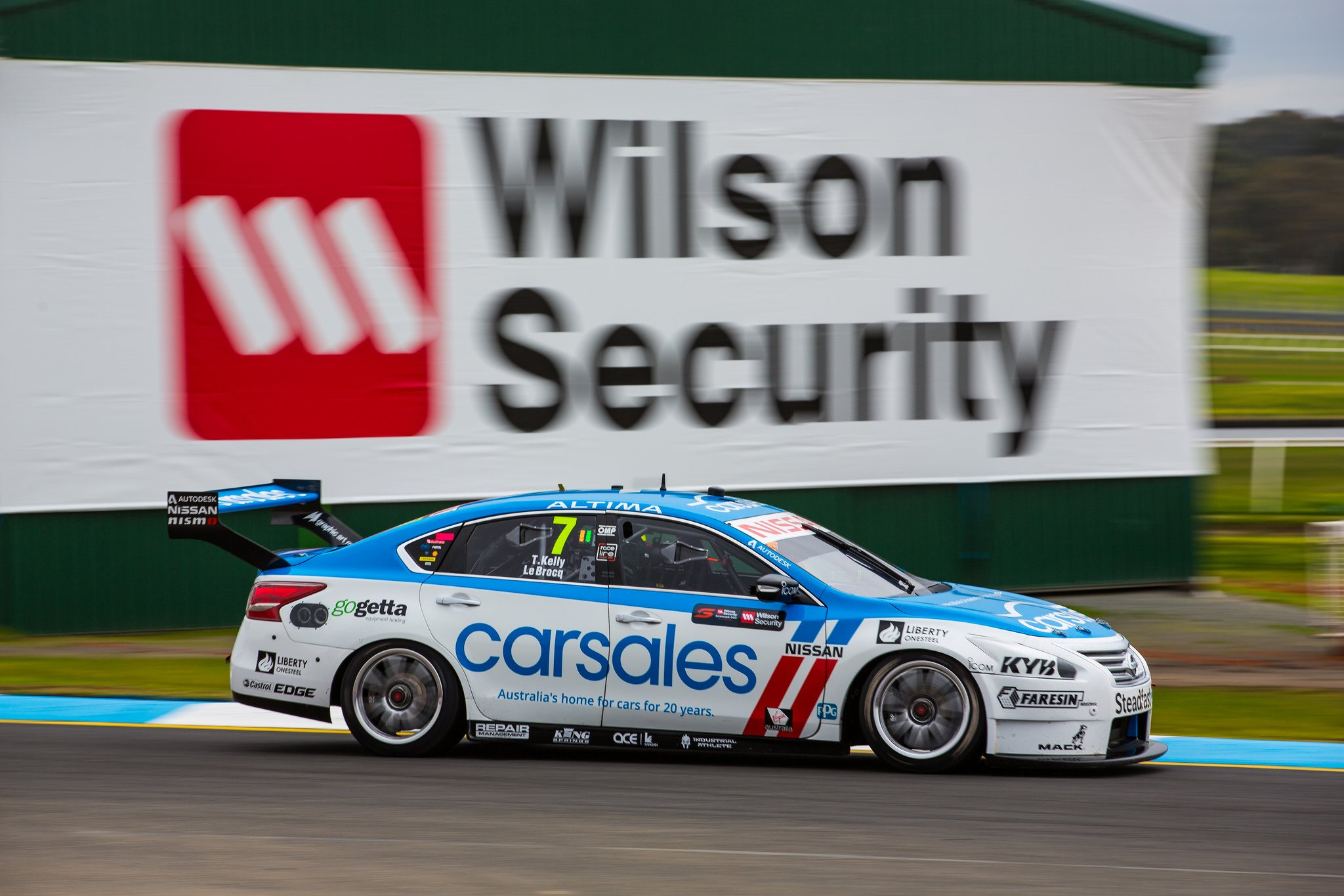
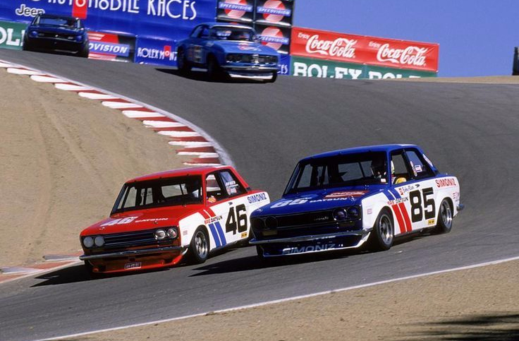
Really clever these two liveries from Nissan. The respective colours the Sengled and Carsales sponsorships have presented a great opportunity to replicate a pair of liveries from the 60s. Don’t know a lot about these BRE Datsuns, but they were beautifully simple liveries, which have been transferred very well to a modern day racing chasis. It’s a simple design, with white the main colour and red/blue covering the top section of the car, and two parallel diagonal stripes on the front quarter panel, changing colours at the Nissan logo. One of the better alternating team colour livery combos, with both quickly and easily differentiated.
#8 Percat/Jones
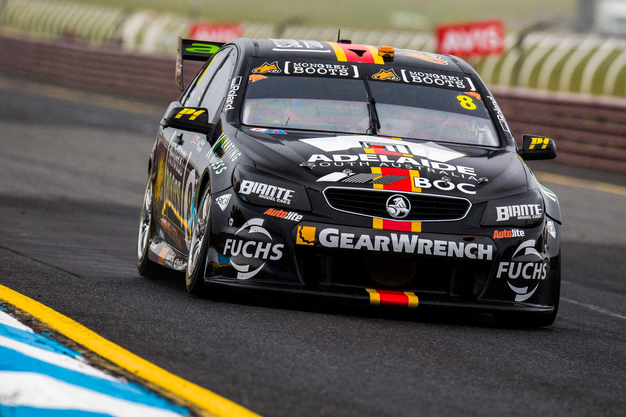
The #8 paid tribute to Beechey’s 1967 Chevy. Another simple racing stripe livery, this time mostly black, with one simple red lines down the middle of top, bordered with yellow. Works quite well on a modern car!
#9 Reynolds/Youlden
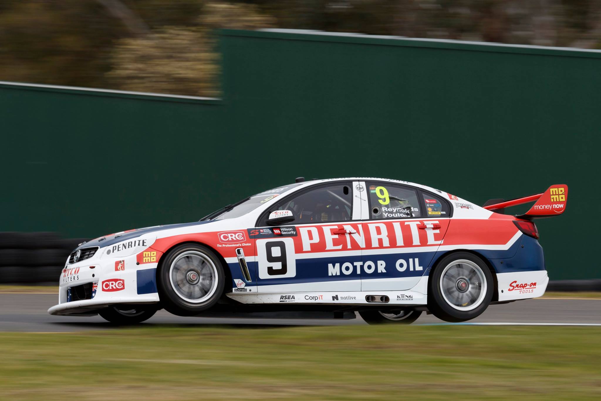
Erebus were another team to celebrate Brock, with the #9 sporting the livery that Peter and Phil Brock raced to victory at Sandown 41 years ago. The design is as identical as could be on a modern car, and looks good in doing so. As so many were back in the day, it’s delightfully simple, with a thick straight line each of red and blue along the side of the car, with a slight upturn toward the rear. The blue hood looks good too, whilst the retro Penrite logo finishes the job.
#18 Holdsworth/Reindler
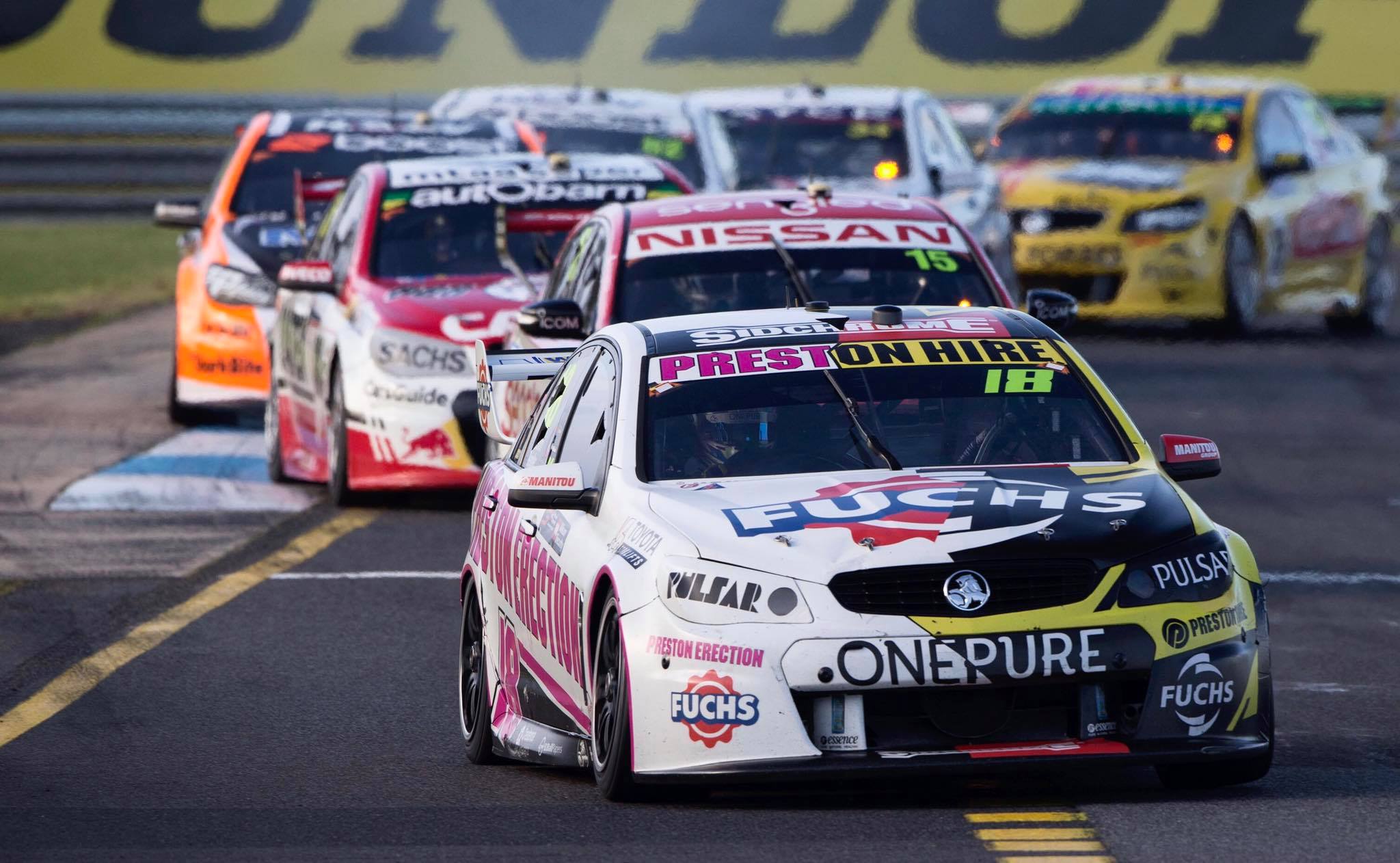
Preston Hire Racing went for a cheeky retro round design, making many of us giggle like they were back in high school due to ‘Preston Erection’ adorning half of the car this week. This is the name Preston Hire had begun its life with, so aside from the inuendo, it has a purpose! The design is literally split between the retro and the modern on either side of the #18 machine, in a style that will take most back to the 1999 BAR F1 zipper livery. Preston Hire Racing split the design via a jagged line from front to back, which is great for a one off; very interesting indeed. Great to see as many logos as possible in their retro stylings on the Preston Erection side.
#22 Courtney/Perkins
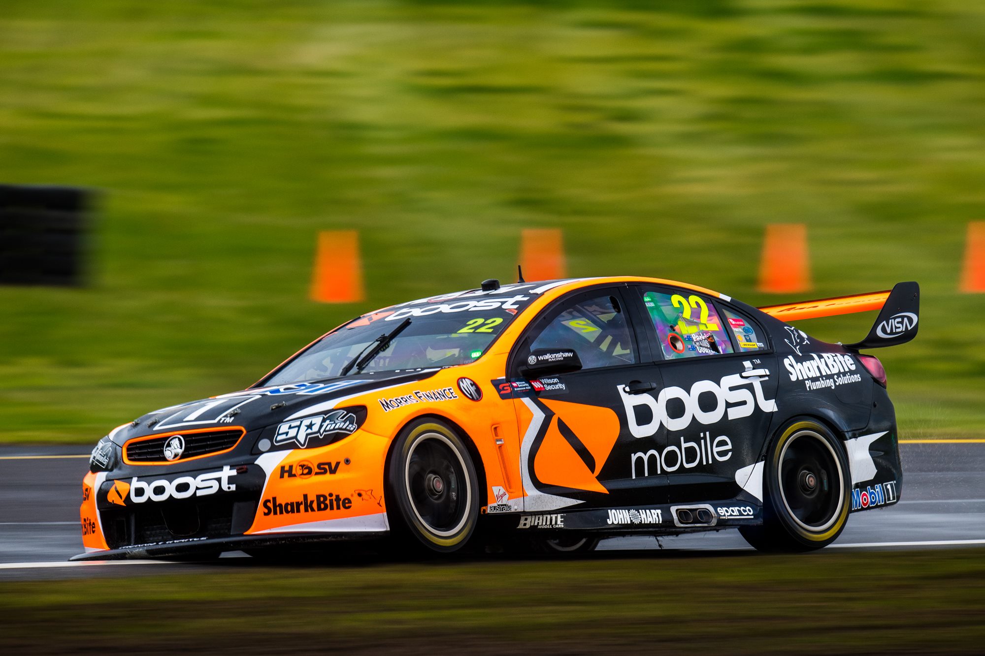
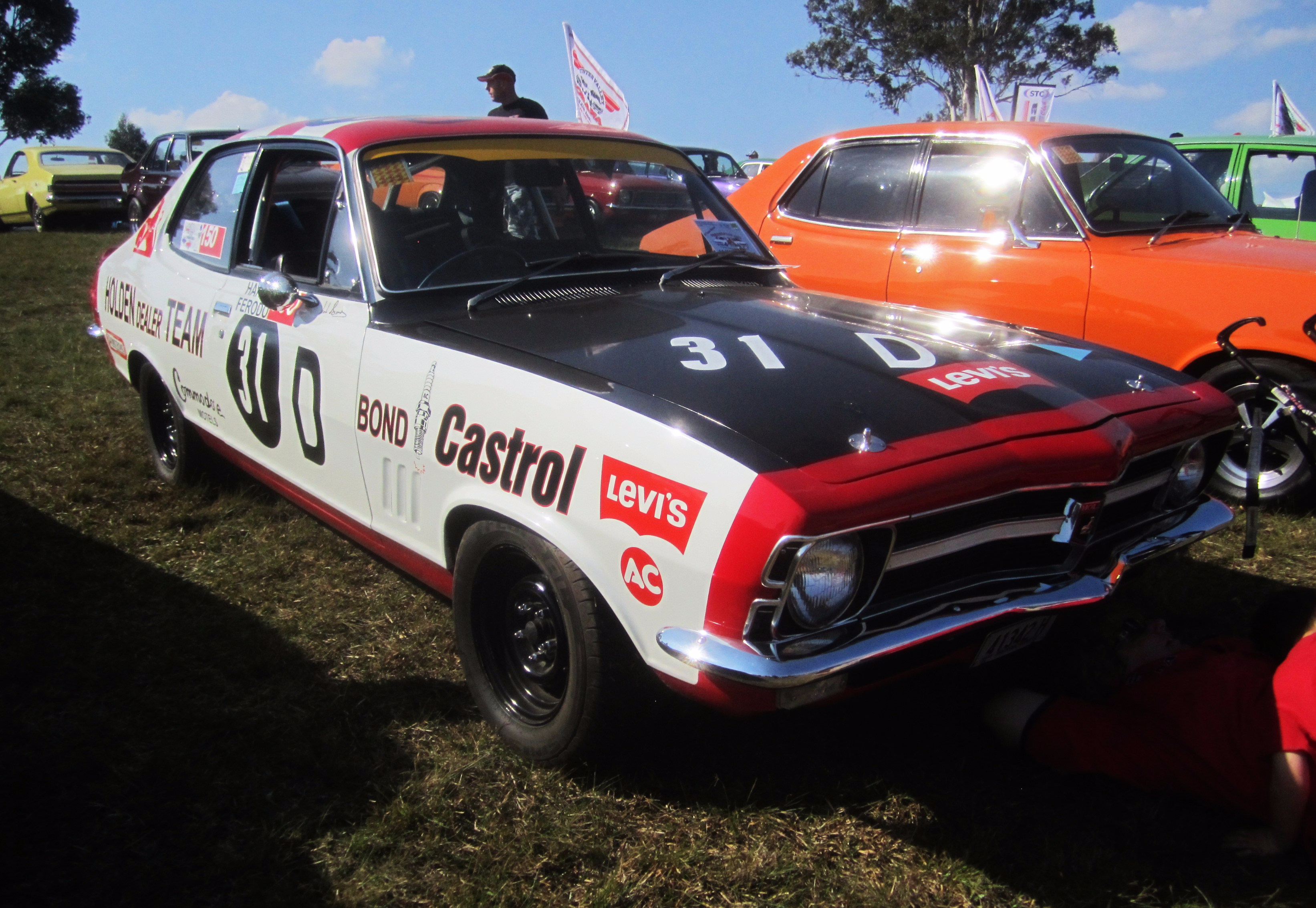
Don’t have to go too far back for this, just 2007! This livery will bring back some unpleasant memories for Ford fans, with the events that were triggered by a nearly identical car at Phillip Island the year before. That said, this was perhaps brought about by fortunately similar sponsor colours with Boost. The general design is more or less the same, minus the lion that adorned the HSV Dealer Team cars. However, this attempt does remind me of an unlicensed video game, where the design has to be similar, but not so similar that it trigger the involvement of lawyers.
#23 Caruso/Fiore
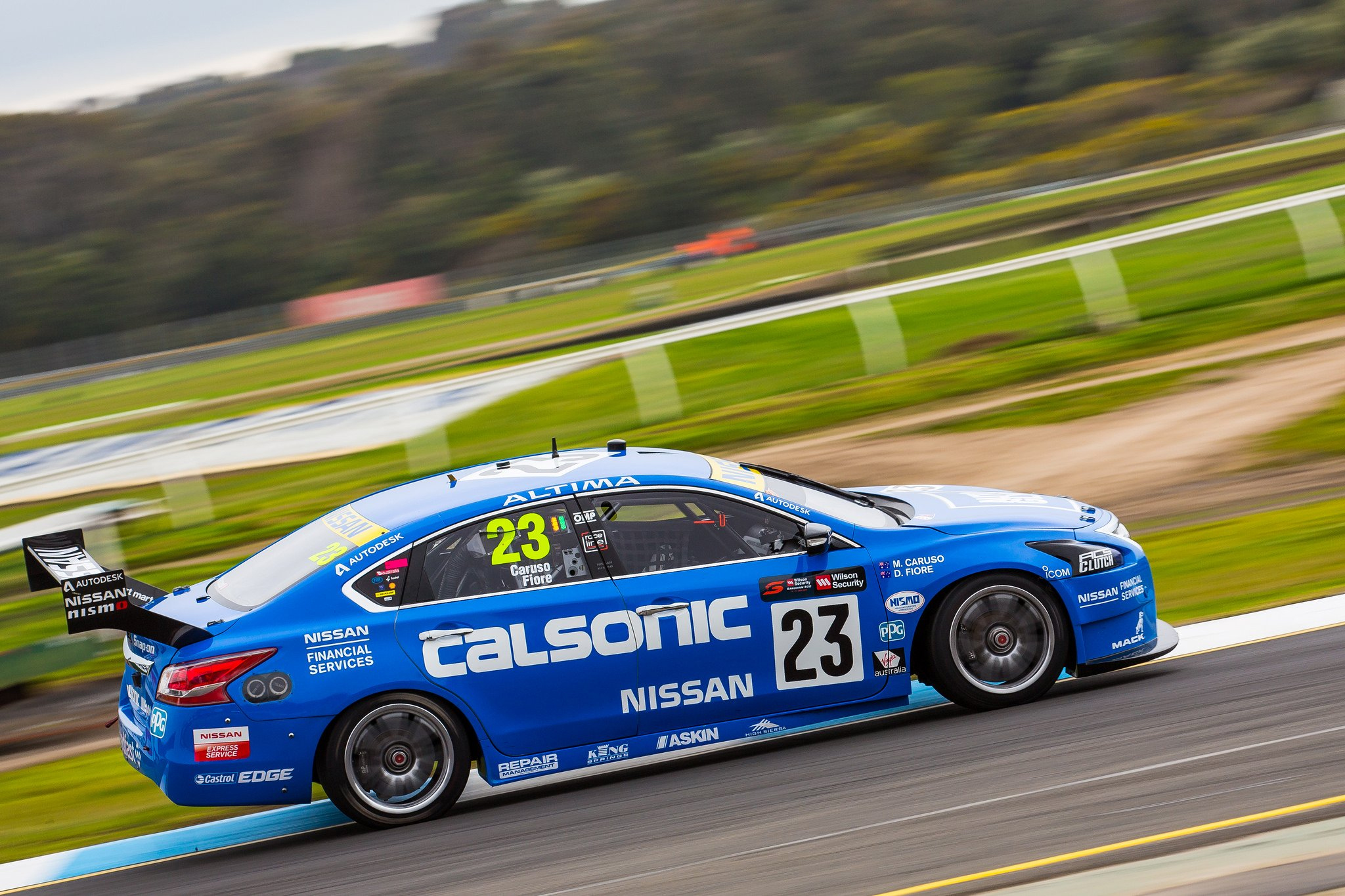
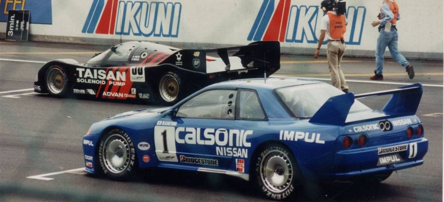
You know, if anyone dared to make such a plain ‘original’ livery nowadays, it would likely be trashed by design pundits, but putting on the nostalgia goggles really does wonders for this retro livery. The Caruso/Fiore Altima goes back to the early 90s with this Calsonic R32 Skyline re-creation, and this takes me back to my Gran Turismo days on Playstation. Amazing how such a basic livery can be so memorable, and good looking with the shade of blue they’ve chosen here!
And for those who were GT fans like me, how good is this little video Nissan Motorsport put up on Facebook!
#33 Tander/Golding
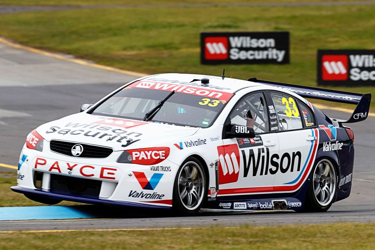
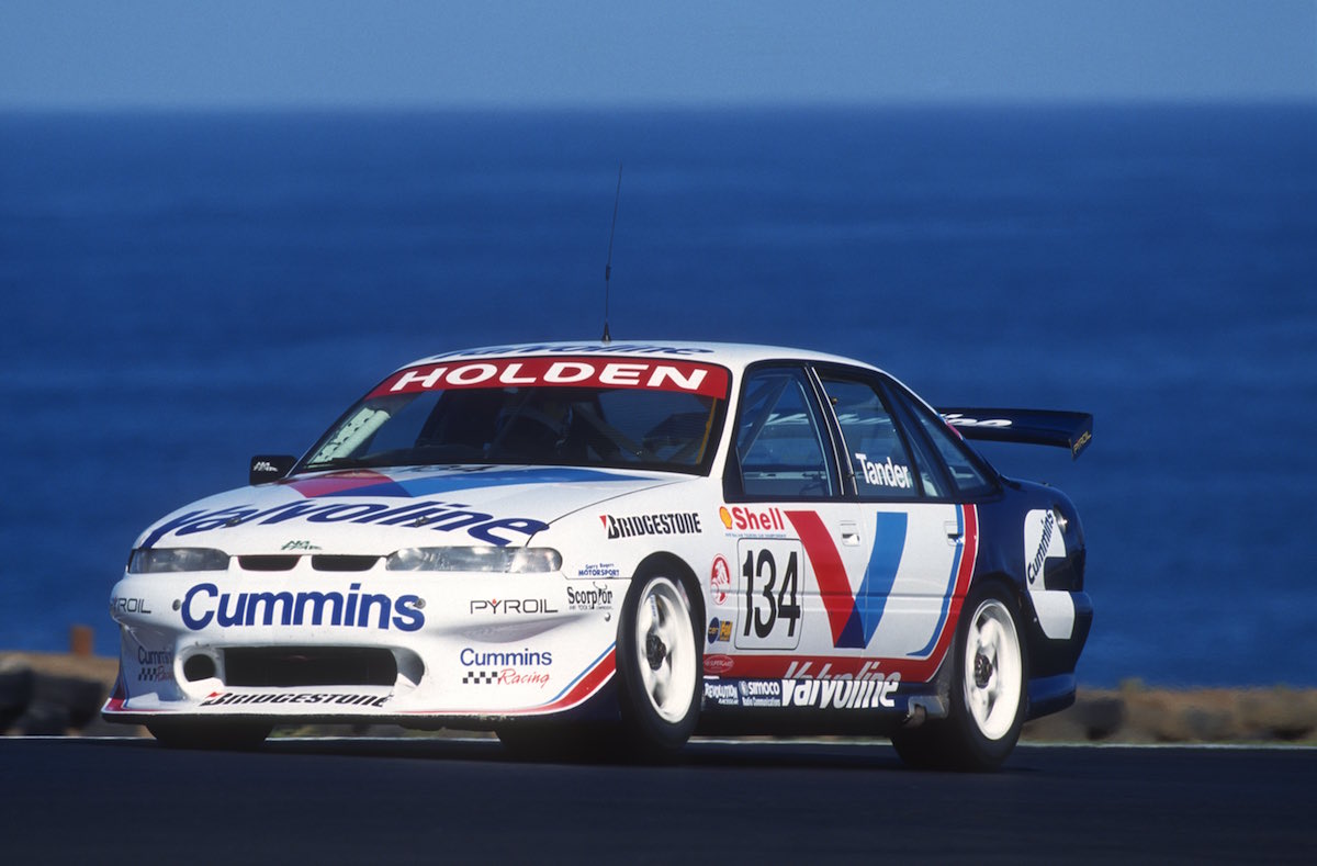
A pretty unique opportunity for GRM here, recreating the first livery that Garth Tander had raced in in V8 Supercars (then ATCC) back in 1998, which was also for GRM. Mainly white , with the navy rear split with a curved red line, accompanied by a thin light blue line in a colour scheme that is entirely uniform. It works very well on the 2017 car and it’s fantastic to see that GRM’s Valvoline partnership is still going 19 years on!
#34 Moffat/Muscat
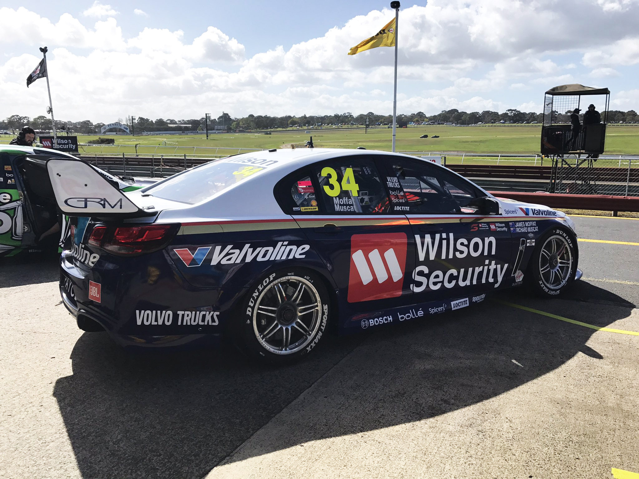
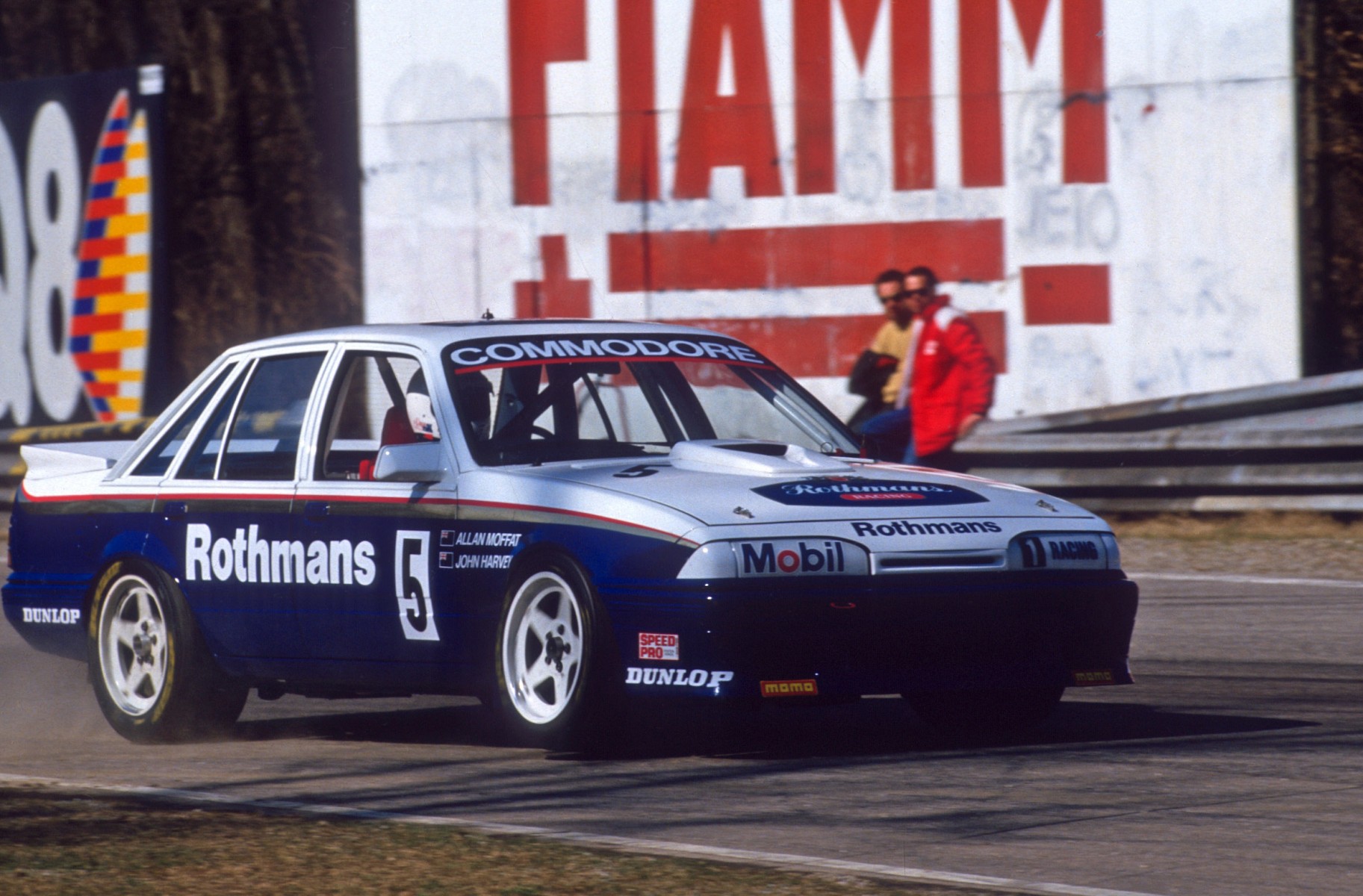
James Moffat’s goes back in time to his fathers time of racing, replicating the Rothmans sponsored Commodore that was raced in Europe. Is one of the more basic Rothmans liveries that existed, but clean and simple is all that is required on many occasions. It’s a perfectly appealing livery and makes me wonder why so many modern liveries feel the need to be so complicated.
#55 Mostert/Owen
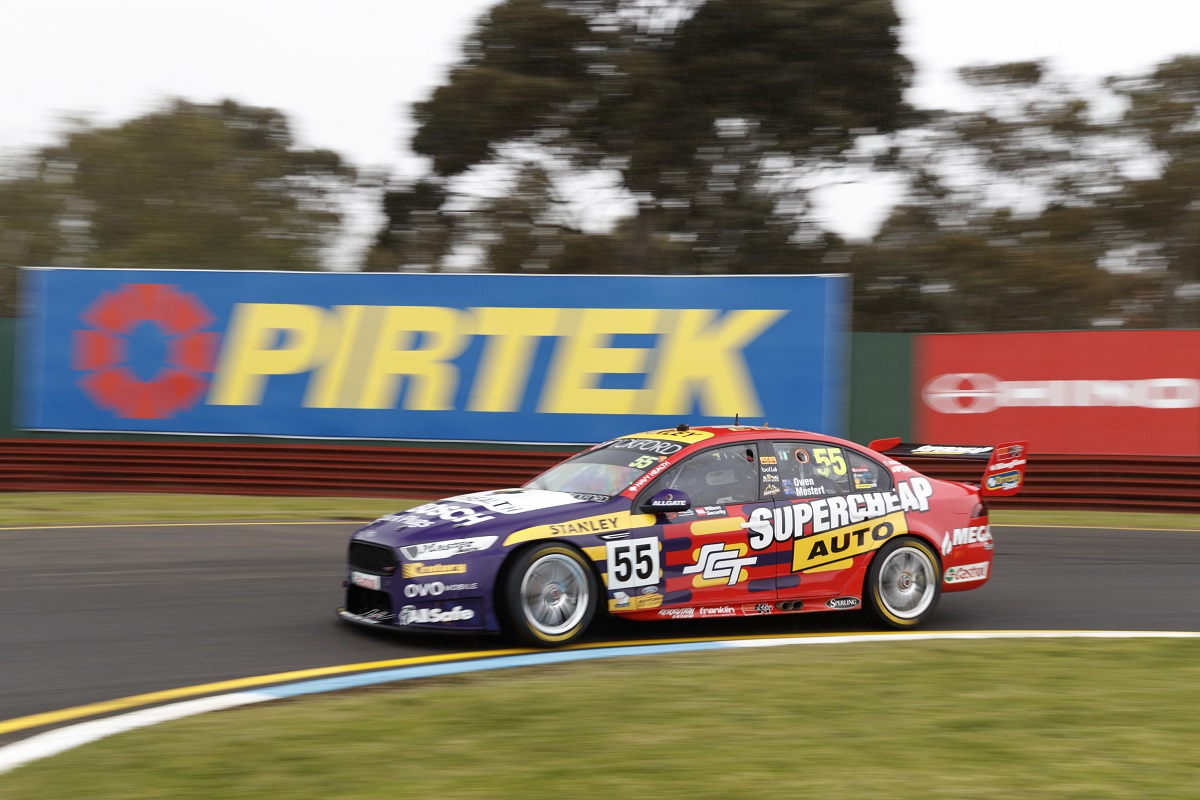
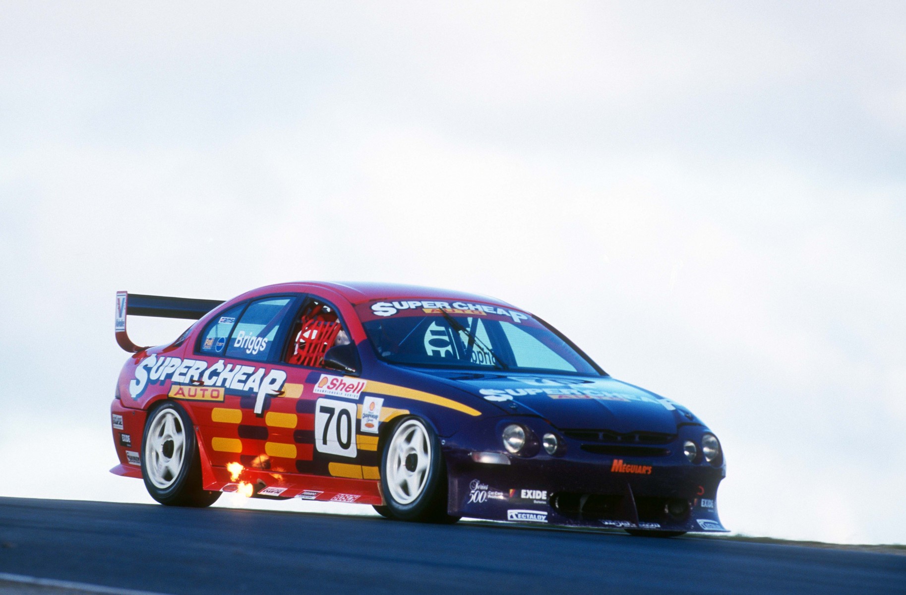
Prodrive and Supercheap Auto Racing have gone with another blast from the past this year, selecting another classic purple livery, but this time from 1999. It’s fair to say this was never a very attractive design, with the odd, almost netting design along the side, but the colour choice is so bold and unique, it’s almost admirable. Fun to see on a modern car, but really lacking some finesse, such as a retro Supercheap logo and white rims!
#62 Rullo/Davison
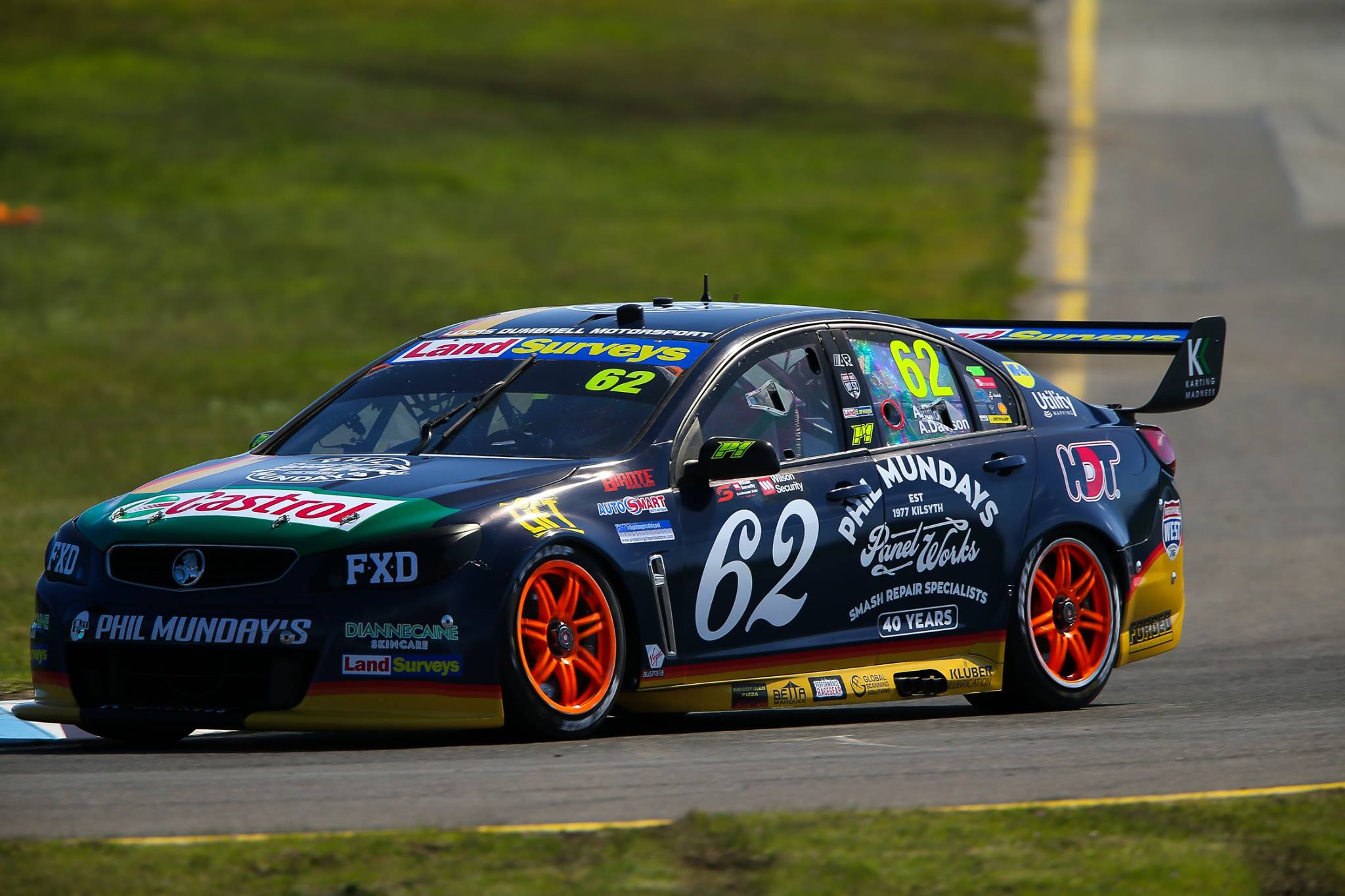
As with the #3, the #62 LDM goes back in time, to the first logo used by Phil Mundays, when it was a panel beaters in Bayswater, Victoria. It’s actually a very nice logo, and is matched well with a big retro looking number on the side. The design is also simple and definitely has a 70s feel to it. Wouldn’t be unhappy to see this used again.
#75 Slade/Walsh
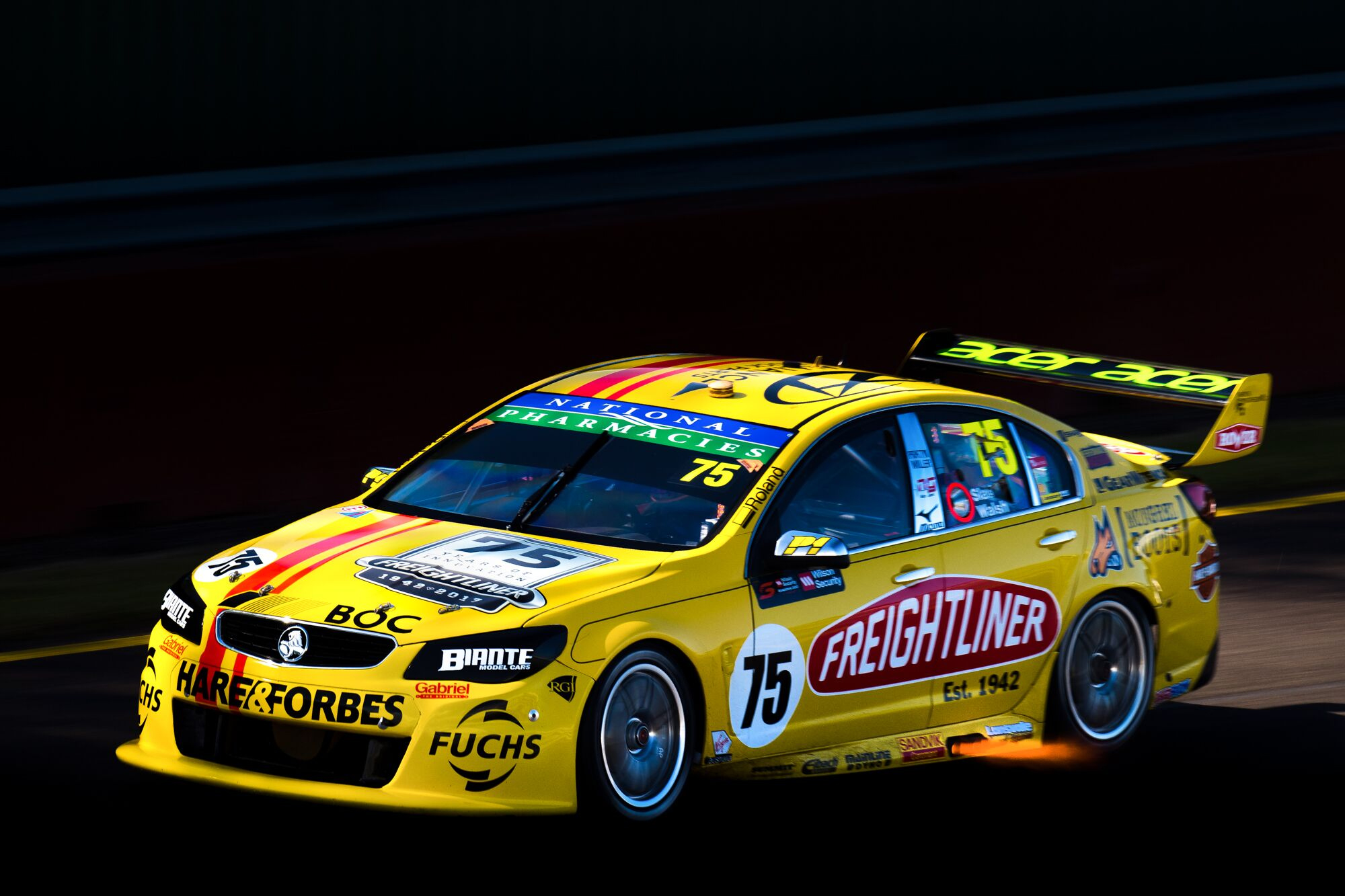
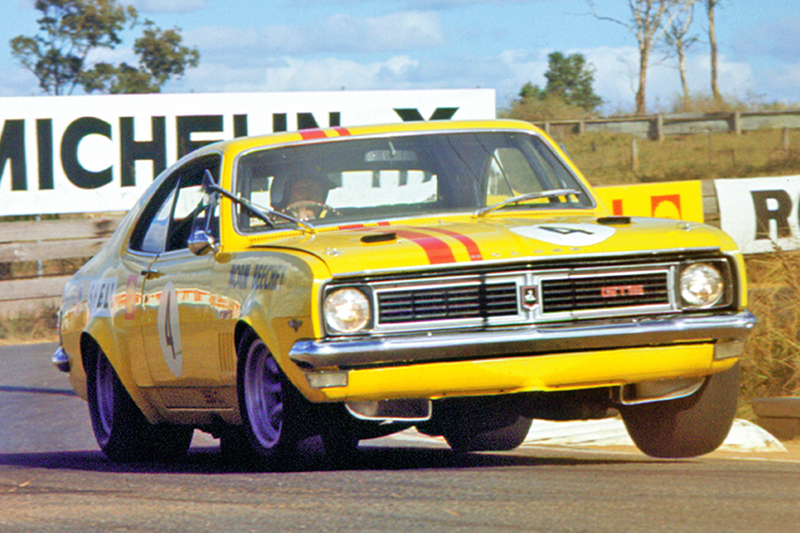
Completing the trio is yellow livery, referencing Beechey’s final championship winning Monaro in 1970. Here we see bright yellow, with uneven parallel red stripes along the top of the car. Again, very simple, but true to the original. It looks nice on the the modern Commodore, but perhaps a few too many logos on the BJR cars, ending in a cluttered look.
#78 De Silvestro/Russell
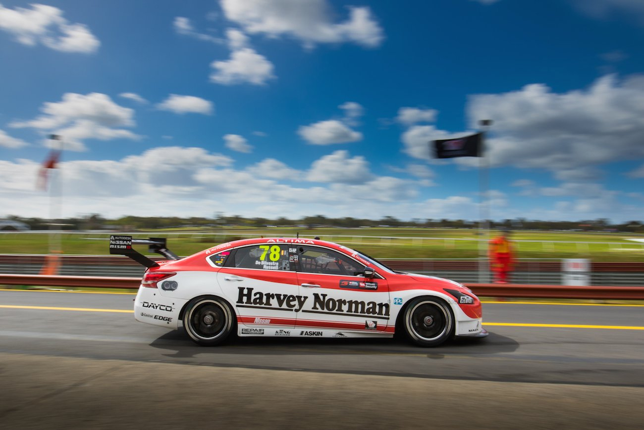
This was an interesting choice, perhaps due to the colour scheme of the Harvey Norman machine, but they’ve gone with recreating the Nissan R380 livery. It’s actually a clever design, emulating the very curvy body of the original car simply through the design, which curves above the wheel arches where the R380 does. It looks nice and does it’s best to not entirely disregard the natural flow of the Altima.
#88 Whincup/Dumbrell & #97 van Gisbergen/Campbell
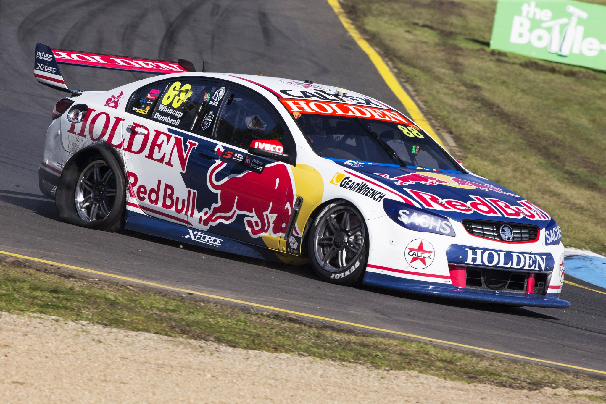
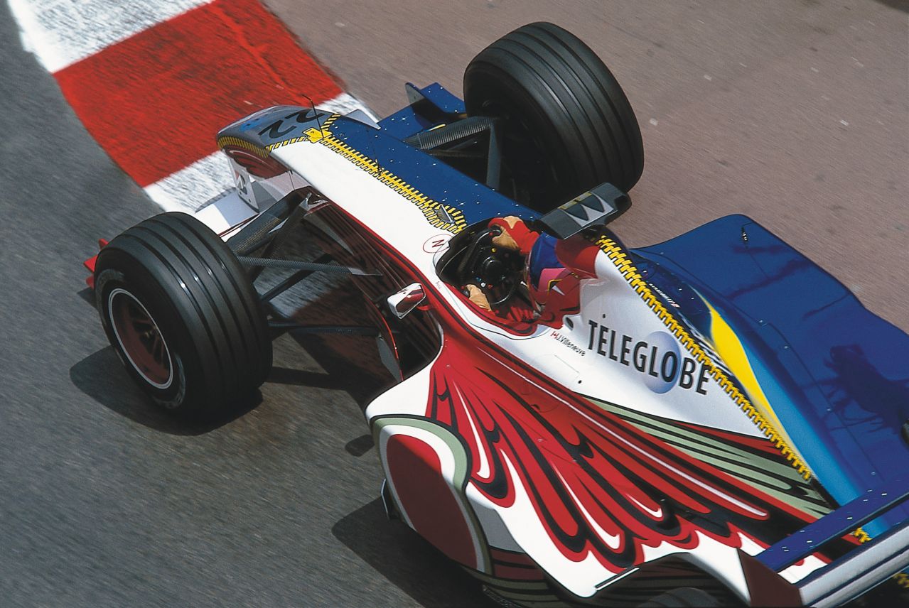
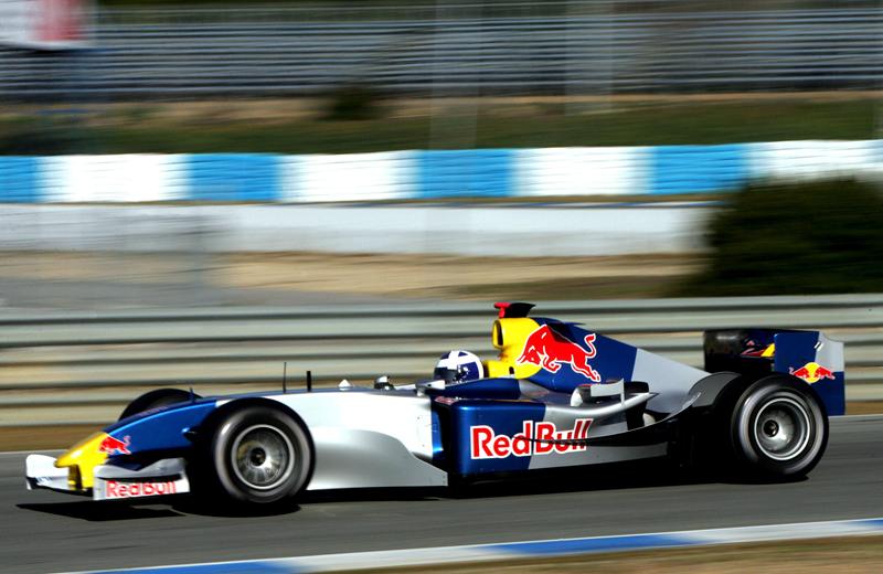
Red Bull HRT have gone for the ‘feel’ of the 1970s Toranas, and while it’s kind of there with the main white, blue hood and red trimmings, it’s majorly disrupted by Red Bull taking up most of the side and adding perhaps a tad too much blue to the design. It’s an attractive design overall and makes use of a retro Holden logo, but I’d be keen to see Red Bull use some of their own history in the future, such as the 1995 Sauber, or even the 2004 test livery. The logo doesn’t seem to have changed much at least!
#99 Wood/Pither
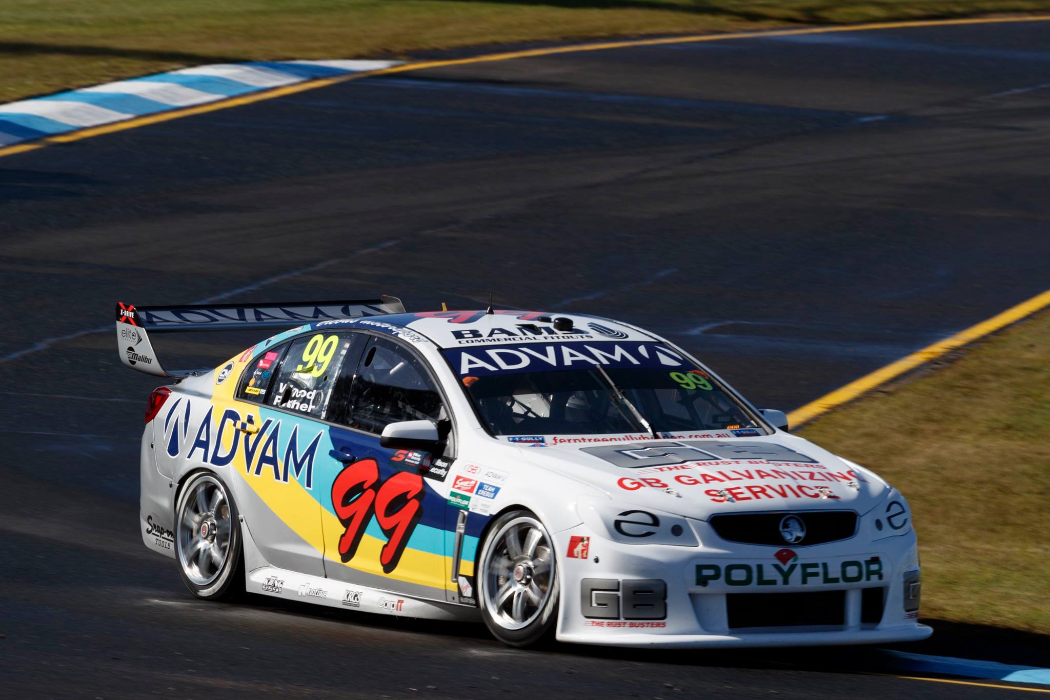
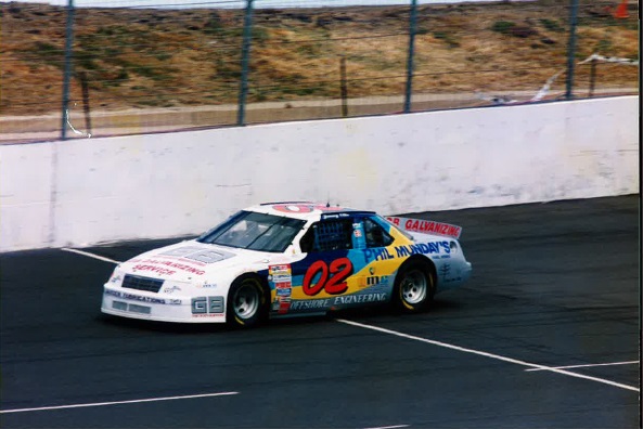
Similar to Nissan’s approach last year, Erebus have gone with a NASCAR/AUSCAR look for their second car. This livery gives me retro vibes probably more than any other, with the colour palette on show looking oh so 90s. The big number gives off the NASCAR vibes, but you just can’t get over the white/blue/yellow/silver combo. It’s hideously charming. Really fun to see GB Galvanizing on exactly the same part of the car all these years later.
#888 Lowndes/Richards
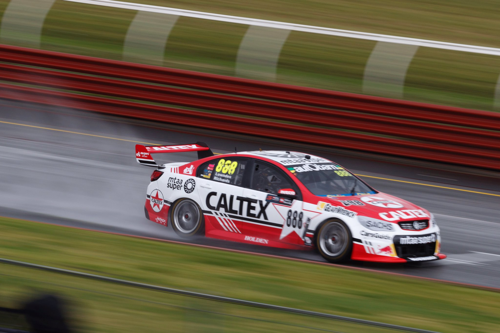
It’s a retro look, but a unique design for TeamVortex. They’ve taken the old Caltex logo and come up with a livery that oozes 80s, without actually copying a past livery. Props for the originality. The design uses simple straight lines, along with interesting use of lined gradients to accentuate the theme, whilst the star number plate is totally ridiculous but also fits the bill.

One thought on “Livery Updates – Sandown Retro Round”