The Formula E field has done well this season, with a few more interesting colours and designs popping up, thankfully moving us a little further away from nearly the entire grid using the same colour schemes. That said, which livery came up trumps, and which was most disappointing?
Top 3
#3 – Avalanche Andretti Formula E
It’s sad to see a big manufacturer like BMW leave Formula E, but it’s fantastic to see new sponsorship bring new ideas. In this instance its a complete colour change, somewhat unfortunately to red, black and white which has already saturated the grid, but thankfully it’s a new and interesting asymmetrical design that’s ensures it doesn’t get lost in the sea of samey colours.
Whilst I’m not traditionally a fan of asymmetry, it’s a very clever use of the cars natural body lines. It allows them to maximise the size of the sponsor, and incorporates it nicely into what’s really the sole design element on the car aside from the black sections, looking like a sash on a football jersey, which I’m also a fan of!
#2 – Envision Racing
Virgin has also left the sport, and have taken their lovely purple with them. Whilst Envision could have slipped back into the clutches of the bog standard Formula E colours, they’ve thankfully gone in the opposite direction and smashed us with some vibrant fluro green!
It’s paired with a delightful metallic navy blue, with the green only featuring on the top facing parts of the car. The two colours are separated by a thin white line which is good, but I wonder if it would have looked better without it. Either way, a nice refreshing colour for the grid.
#1 – NIO 333 Formula E Team
It was difficult not to pick the bright green of Envision as number one, but NIO 333 was really the cream of the crop this season. I guess it proves me wrong and that you can use the fairly generic ‘electric blue’ colour and still have a great and unique livery.
It’s a really well thought out livery here, with very thin turquoise/aqua lines on a royal blue base, producing almost a mini version of the classic Falken Nissan Skyline livery when you look at it up close. These thin lines follow the bodywork really nicely, creating a wavelike design flowing over the car. They are matched by thin red lines on the extremities of the car, ensuring the blue on blue isn’t too much…blue.
Bottom 3
#3 – Mahindra Racing
Now I must preface this by saying this is not a bad livery. In fact, after a few seasons of Formula E that has featured several poor liveries, 21-22 has been a big improvement overall. Whilst Mahindra has dropped down my order, it’s simply because there’s not enough happening. It’s a very basic livery with a nice, vibrant red on the top and contrasting black on the bottom.
They’ve taken away a lot of the intricacies of past seasons and with it, all of the excitement. It’s all just a little too standard, and you can see how with the same colours, Andretti created a much more interesting livery.
#2 – Jaguar TCS Racing
Something about the Jaguar colour scheme has just never sat well with me. Perhaps it’s that every team at one point seemed to be using this designated electric blue colour, but whilst most other teams moved on, Jaguar have doubled down. It’s such a bold colour that with every year it’s used in such large sections, it gets more and more tired. Credit to NIO who used it a lot more subtly this season.
The new honeycomb pattern is alright, but nothing mind blowing either. Again, I think it’s more to do with the aqua paired with the charcoal that is no longer interesting for me. They will have to do something far more out of the ordinary to impress with these colours next season. It’s a shame they didn’t find a way to incorporate British racing green back when they started in Formula E.
#1 – TAG Heuer Porsche Formula E Team
Well, it was kind of a shoe in when one of my least favourite liveries remained unchanged for several seasons. If you are going to pick an identity and stick with it, make sure it’s not boring. It’s different when Toyota in F1 picked something totally out there as a livery identity and kept it for nearly a decade, but imagine seeing this Porsche livery for years to come?
It’s just so boring! You really can’t get less exciting than these corporate colours laid out in this fashion. The thirds design only really works from a top view angle, but the car is only really every seen from front and side on. I mean look at the picture above, it’s almost camouflaged into the tarmac and track sponsors! I really can’t believe they didn’t bring anything new to the table for 21-22.
Let me know your thoughts! Does you agree with my choices? Which livery to you think was best and worst this season? Drop a comment below.
We’re ready for another year of Formula e action! Some massive players have joined the game, bringing many positive things to the series, but design inspiration isn’t one of them. It’s a tale of two colour schemes: Red/Black/White and Turquoise highlights. The majority have gone with one of these options, making the conscious choice to blend into the crowd rather than stand out, which is an unbelievable marketing choice if you ask me. It also leads to one of the least exciting full grid photos, possibly even more so than the 2015 F1 field.
Few flashes of vibrant colour, just like that F1 season. Either way, let’s dissect what each team has brought to the table, and hopefully we can pick some positives so we don’t leave feeling too disillusioned. For the sake of something different, lets go in reverse alphabetical order.
TAG Heuer Porsche Formule E Team
Porsche is one of the newcomers this season, and have taken a scalp, stealing the ever competitive Lotterer from Techeetah. He’s joined by racing stalwart Neel Jani. Their driver choices have been inspired, but their livery is not. It certainly follows their identity across other racing series like WEC, but unfortunately that identity is simply boring.
★★☆
The design gives me Minardi M198 vibes, in how the livery is split into three sections, with the same colours alternating as dividers to those colours. Maybe I’m a hypocrite in liking that livery and not this one, but colour choice is such an important aspect of overall livery design, and this red, black and white combination just brings no excitement to the table, the way the yellow does on that Minardi. It is not an ugly design, but I wish they’d entered the series with a bang, as opposed to something so corporate.
ROKiT Venturi Racing
Venturi have kept the same drivers as last year, and thankfully not the same livery. Unfortunately ROKiT has come on board, and the team have joined the red/black/white brigade. However, it is probably the best of that bunch. Whilst the red piping on that flows back from the nose gives me Mahindra vibes, it is really easy on the eyes, and works wonderfully paired with the flowing white pinstripe along the side.
It’s a well thought out livery which suits the shape of the car. I think I may have preferred jet black as opposed to the unpainted carbon, which looks a little flat rather than elegant or slick.
★★★★☆
Panasonic Jaguar Racing
Jaguar have brought in James Calado to partner Mitch Evans this season, and have persisted with their turquoise and black colour scheme. They’ve turned the dial up somewhat on the turquoise, which is now the majority colour on the top side of the car. I don’t mind this, but I do have an issue with the squared off design on the nose, which ruins the flow of the car’s otherwise sleek shape.
The side of the car is virtually unchanged, limiting the turquoise to flashes on the floor and aero panels. It would have been nice to see the Jaguar itself in the same turquoise colour, but the current effect with the majority of sponsors and other decals in white works just fine. Not sure it’s an improvement, so I’ll keep their rating steady.
★★★
Nissan e.dams
Same drivers, new livery for Nissan. They’ve gone for the unusual with an asymmetrical design, perhaps following BMW’s footsteps from last season. It’s simply majority black on the right hand side, and majority red on the left (at least on the nose and top section of the car). The way the colours intersect make an interesting diamond design, but remind me more of Stade Rennais than anything to do with Nissan.
I’ve always thought of Nissan’s colours to be blue, white and red (thanks Gran Turismo), but perhaps this is what they’re embracing moving forward. They’ve also gone for a half black, half unpainted carbon effect, which may be a weight saving technique across the board, but doesn’t look that great, especially on the wheel arches. An improvement from last year, with the effect from front on really saving an otherwise average livery.
★★★☆
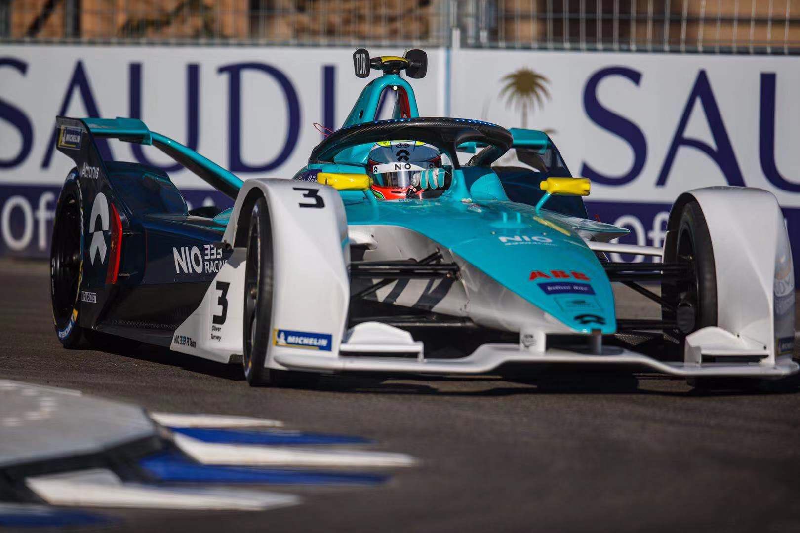
NIO 333 FE Team
Ma Qinghua joins Oliver Turvey at NIO, starting his Formula e career with an absolute nightmare in Saudi Arabia. The team has gone a little more traditional with the livery this year, but have continued their turquoise and white theme, adding to it a little blue this time around. This would have been incredibly useful on last year’s livery, which was in desperate need of an extra element.
I’m a fan of the clean separation of the turquoise and white from the top to the side, whilst the same can be said at the back, showing off the curves of the car between the blue and turquoise sections. Simple, clean and effective, doing well with the shapes the car provides. Thilst the red highlights for Ma work well, the Yellow ones for Turvey aren’t quite as complementary.
★★★★☆
Mercedes-Benz EQ Formula E Team
Mercedes have entered Formula e with a driver lineup that could be competitive in any series around the world, in Vandoorne and de Vries. The biggest winner in my eyes however, is Petronas, who will receive a tonne of brand awareness via association (if anyone else’s brain works like mine), due to the similarity with the F1 livery. This is ironically unintentional given there is no place for an oil company in an electric series, but it’s funny to see the similarity between the highlight colour on both teams’ cars.
The theme is similar across both liveries, with the tessellating Silver Arrow design across much of the car and of course the base colour of silver being complemented with smokey black. This is the livery we all expected, but I don’t think can be disappointed with. It’s a great effort with enough care put into intricate details to make it a pleasure to look at in detail.
★★★★
Mahindra Racing
Mahindra have kept the same drivers, and have evolved their livery as opposed to making wholesale changes. The most striking aspect of the car is the chunky, blocky horizontal red section on the nose of the car. It’s a little disruptive to the flow of the bodywork, and the blue lines bordering it aren’t the most visually appealing.
The main change year on year is the removal of the alternating red and white stripes, which were my favourite element of last year’s livery. These have evolved to red and blue ones (such as the nose above) which aren’t as impactful and can be easily missed if not paying close attention to the car. In theory it’s a slight downgrade, but not sure why I rated it so harshly last year. Nice to see they’ve kept the Indian themed rim paint too.
★★★
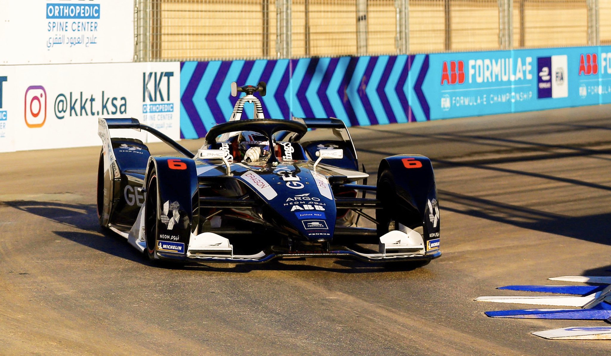
GEOX Dragon
Dragon have changed their drivers with Hartley and Müller joining the team, but their livery theme has remained constant. You’d think black and white would be boring, and whilst many of the above liveries prove that theory with even more colours, this one is an exception to the rule. It’s a more or less 50/50 split between the two colours, depending on which angle you look at it from, with the red flashes providing a bit of excitement where the two other colours can’t.
The side black section looks fairly simple on its own but looks quite jagged when mixed with other sections of the car. The front is almost all black and looks super clean. The roll hoop is covered in a neat stripey design, in contrast to the remainder of the car. It’s a case of simple sections mixed with hard angles and a few intricacies to make a really nice design overall. Who would have thought the car with the least colour would be one of the best.
★★★★☆
Envision Virgin Racing
Bird and Frijns remain at Virgin, but unfortunately their almost perfect livery has evolved! To be fair very little has changed, but the main difference is silver being used instead of white on the top of the car. The contrast of the purple and white is what really put the livery on another level last season, whereas the silver really dulls this down. Also, being a matte silver, it doesn’t even stick out or sparkle from any angle, which is a shame as the pattern is really neat.
Not much to add given the rest of the livery is more or less identical. I’m still a fan of the deep purple, just wish they hadn’t made the change from white to silver!
★★★★☆
DS Techeetah
Techeetah have brought in da Costa to replace Lotterer, and with him a few minor changes to the livery. The most obvious change is the gold section on the nose being narrowed. The car loses the sharp effect of having the gold meeting the black right on the nose’s edge, which is what I enjoyed so much about it last season.
There’s now a gold pattern on the barge board as opposed to solid gold which is a nice touch, and the whole halo is gold this season, much nicer than the awkwardly cut off design from last time. Unfortunately the unnecessary complication on the nose/cockpit area brings it down a notch for me.
★★★★
BMW i Andretti Motorsport
BMW have replaced da Costa with Maximilian Günther, and have taken their livery to another level of mess. From front on, I can’t really gather any sort of coherent design. There are way too many colours that don’t really complement each other, and overlap is a way that may make a nice powerpoint theme or cover page design, but not quite a racing livery.
It’s a little clearer from the side, but the blue and purple still don’t suit each other, whilst the black also doesn’t really look like it belongs given white is already so prominent on the car. The jagged shapes don’t really work the way they do on the Dragon car either, and instead look messy instead of functional. The asymmetry just adds to the dysfunction. Perhaps I’ll like it more in a year’s time and will think I was being harsh, but I just cannot rate it any higher right now.
★☆
Audi Sport ABT Schaeffler
Not sure why every manufacturer wants red, black and white as their main colours these days, but I’m glad Schaeffler have kept some green on the car to ensure this car doesn’t entirely fade into the rest of the grid. Their driver lineup remains the same, but their livery has turned to the dark side, with black, rather than white, playing the main role.
It’s unassuming from the front, but actually has some really nice design elements on the side. The red and black stripes on the floor look great, as do the compartmental red and white sections on the sidepods. The green helps to break up the business as usual colour scheme on the engine cover. It does a decent effort complementing the template the shape of the car has provided. A nice effort in a year bombarded with red, black and white machines.
★★★★
Bonus Awards
Best Red, Black and White Livery Award – Geox Dragon and ROKiT Venturi
Two liveries with totally different philosophies, but both looks great in their own way. Dragon barelly qualifies, but there is red on the car!
Best Turquoise Livery Award – NIO 333 FE Team
It’s quite simple at the end of the day and I may have rated it too highly, but I really enjoy the clean lines and complementary colours. A big improvement on last season.
Hire a New Livery Designer Award – BMW i Andretti Motorsport
This just is not a good design. I’m free if you guys need me.
A brand new car has brought Formula e to the next level in season five, and I have to say that while I’m not usually a fan of ‘futuristic’ looking cars, it’s marvelous. It’s a wonderful livery template that many teams have taken advantage of; some to greater extents than others.
Audi Sport ABT Schaeffler
Audi Sport is one of a few teams to have an unchanged lineup for the new season and perhaps with continuity in mind, also have a very similar livery to last year. The colour scheme looks great once again despite essentially having five colours, with yellow being more prominent than last year thanks to Deutsche Post.
It looks slightly neater too this year, thanks in part to the removal of the broken up design along the sidepod from last season. There’s a lot of white front on but is counteracted by the abundance of colour further back on the car. Overall, it’s a nice evolution of last year’s livery. Aggressive, but relatively neat.
★★★★☆
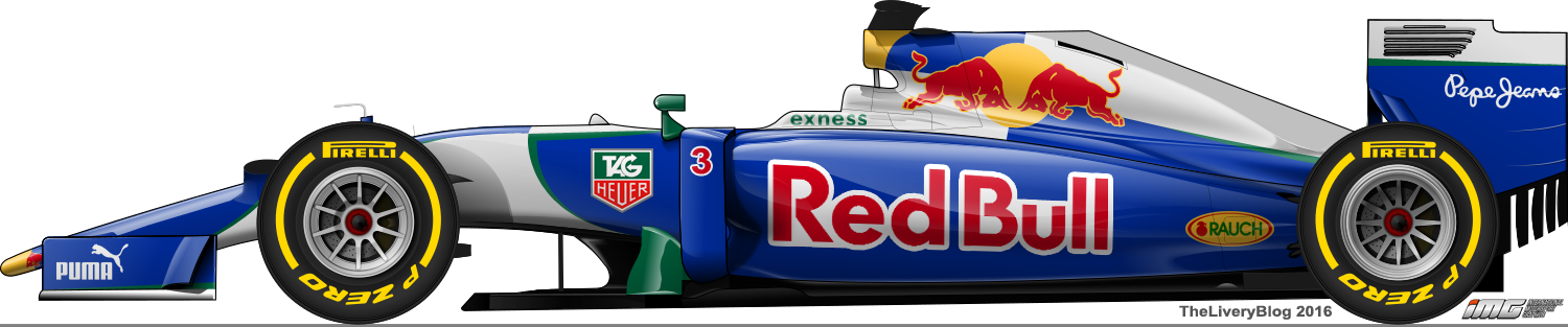
BMW i Andretti Motorsport
Andretti have teamed up with BMW, bringing another huge manufacturer into the series, proving how Formula e is gaining popularity, relevance and overall moving from strength to strength. António Félix da Costa has hung around from last year, whilst Alexander Sims has joined the team, after driving for BMW in sports cars in 2018 and being development driver for Andretti. BMW have taken charge of the livery design with an unmistakably on brand blue and white effort.
Despite some fundamental differences, I can’t help but be reminded of the HP/Compaq era Williams F1 liveries, whilst also wondering if a similar design would have worked for a ‘can’ based design for Red Bull; I’d attempted something kinda similar in the past. Not to mention that the quartered design is rarely seen, last I remember being the short lived Kronenbourg Larrousse livery. Regardless of the now to be expected gimmicky electric circuit board design elements, the quartered design (inspired by the BMW logo) is a fantastic effort, very eye catching from the side and top. I wish the purple slice wasn’t there as it’s a little jarring being the only purple element of the design, but it isn’t a deal breaker.
However, the design is asymmetric. I’m not against asymmetric liveries, but when one side looks so nice, and the other is so boring, it’s hard to see why they didn’t just make it a regular mirror image. Clearly they’ve given priority to the rear view angle of the car, but who actually views the car from this angle? A large majority of the time, the car is viewed from either the sides, or the nose, so I find this decision unusual. It’s also a big shame that they’ve left this side so blank; even if not quartered, there could be a lot more love put into this side of the car.
★★★☆
DS Techeetah Formula e Team
After winning the championship with Vergne, Techeetah have piled on the gold for 2018-19. However, it’s been done in a positive fashion. The shade of gold that has been used is thankfully a little closer to orange than brown, giving the car a warmer feel. They’ve also simplified the design significantly. Gone is the cartoon cheetah and the flashes of white and instead, they’ve followed the lines of the new chassis beautifully. This is a perfect instance of less is more.
The colour placement is distributed well, with gold only on the top portion of the car and black only on the sides (apart from the gold barge boards). As of Riyadh, the halo is also gold, furthering this effect. There’s not too much more to say, other than they have limited the Total red, which has ruined many a livery in the past.
★★★★
Envision Virgin Racing
Boy am I pleased about this! The silver and black on the Virgin liveries has been a gripe of mine for a few years now and I’m so happy to see that they’ve gone without them this season. As with Techeetah’s gold, the shade of purple selected is lovely and it’s actually a relief to see matte paint over the hyper reflective variation.
The white gradient design is reminiscent of Dragon’s two seasons ago, and works perfectly in adding some texture to the simple delivery. The red flashes are also distributed very well, especially in the piping along the bottom of the car and the rear diffuser – a neat use of the complex bodywork.
★★★★★
Geox Dragon
Dragon have brought in 21 year old Max Günther, quick in F3 and slightly less so in F2 last season, to drive alongside Lopez for 2018-19. They also have a new main sponsor in Geox, who have painted the car in black and white as of Riyadh. Some of last year’s Dragon identity has rolled over in the form of the thin stripes on the roll hoop.
The design itself is strong; the white contours along the shape of the body and contrasts with the adjacent black, giving the car the ‘coke bottle effect’ and looking very attractive. The black in the front of the cockpit is a nice touch, and is generally a very well balanced design. A nice, above average livery.
★★★★
HWA Racelab
Mercedes affiliate HWA has also joined the series this season, pairing McLaren reject (harsh wording perhaps) Stoffel Vandoorne with stalwart McLaren test driver and Merecedes DTM driver Gary Paffet. The livery, however, gets a yawn out of ten. Frustratingly, they’ve gone for a similar colour scheme to Jaguar, where we already had the issue of NIO and Andretti using near identical shades of turquoise/teal as them last season. Why use colours that make your cars indistinguishable from another team’s, from a distance? Corporate colours or not, if another team that’s already in the series uses them, choose something else, or get creative. Or both.
The blue does give the car a cool ‘Tron’ effect with the piping, but you can barely see the design in front of the rear wheel (which seemingly has n place on this livery), or the HWA logo, as the colour difference is so slight. The piping does use the car’s edges well, but the livery in total annoys me a little.
★★
Mahindra Racing
With d’Ambrosio making the switch from Dragon and Pascal Wehrlein set to take over from Rosenqvist in the coming races, Mahindra are surely set for some success this season. On the livery front, they’ve opted for evolution this season, building on their red, blue and white design of 2017-18. They’ve decided on a mainly white top body section, along with single orange and green stripes, harking to their Indian heritage. However, it clashes with the rest of the colour scheme, so it may have been better off placed elsewhere on the car – I feel the wheel rims were enough (and look quite nice).
The rest of the car is mainly red, and features some swooping red and white stripes along the edges of the bodywork, whilst maintaining the blue ‘engine’ cover for sponsor Renesas. A solid effort and marginally better than last season’s.
★★★
NIO Formula e Team
After having the ridiculous situation last season of NIO and Andretti bearing almost identical liveries, both have pivoted. Andretti have partnered with BMW and taken on their colours, whilst NIO have gone in another direction entirely. The result is a half turquoise, half white effort, which fails to impress. What this reminds me of running out of ideas when designing a livery, using the gradient tool over an entire car out of desperation, and hoping something interesting would happen.
It’s usually a disappointment, as this is to an extent. There is an attempt to spice it up; the charcoal section just below the NIO logo on the sidepod looks good, but that’s about it. There needs to be more going on. Whilst I like how neat it is, it does feel a little empty overall and leaves me wanting more.
★★
Nissan e.dams
After the announcement that Renault would pass the baton to subsidiary Nissan, I’m sure we all expected something in black, white and red as per Nissan’s recent corporate liveried cars, but I’m not sure how many of us expected silver. Starting with the positives, I’m happy to see the black and silver split cleanly along the body lines from the front angle; it’s a design technique I’m a big fan of. I also like the red piping, which multiple teams have used to great effect, contrasting very well against the black.
However, from the side, I see a familiar foe in smokey black against silver. I’ve dislike this for a number of years with Mercedes, and I’m not the biggest fan of it here either. That said, the more I look at it, the more I appreciate the thought in the placement and started to enjoy it as a whole. While I’m disappointed it isn’t more vibrant, it has to be scored at least just above average.
★★★☆
Panasonic Jaguar Racing
Much like their driver lineup, Jaguar’s colour scheme is unchanged this season. We have to embrace the fact that Jaguar have taken on this turquoise colour as their new racing colours, for electric racing at least, but it’s impossible to not wish this was British racing green. The design itself has evolved slightly with the some of the stripes slightly thicker than the last few seasons to suit the wider and curvier nose and body.
The tessellating pattern on the rear wheel covers adds some texture to the otherwise plain grey section, but from the side, it feels a little disjointed as not all panels have a second line parallel to the thicker section of turquoise. It’s nicer than last year, but I’m unsure how much of that has to do with the new chassis.
★★★
Venturi Formula e Team
Venturi have brought back Mortara for the new season, who showed promise and probably should have won his first Formula e race. They’ve also signed Felipe Massa, who last raced in F1 in 2017. Venturi have kept silver as the main colour from last season, but are now using blue as a secondary colour, as well as some black as a third. As mentioned for Nissan above, silver just fails to capture the imagination and ends up in most cases as a dull livery.
The design has a go at some form of piping around most of the panels but doesn’t do a great job of it due to the varying thicknesses at different parts. It also ends inexplicably above the Michelin logo on the front wing endplate, when it goes all the way to the edge everywhere else. Nitpicking, but very frustrating in my opinion. It just doesn’t feel like a very well thought out design.
★☆
A few surprises, but generally a pretty average field of cars for this season. A couple of exceptions though, with Virgin rising to the top with their new purple design. Let’s hope the racing looks as good as the new car does!
As the first round concludes in Hong Kong, there is no better time to have a look at the how the Formula e grid lined up for the first two races of the new season.
Audi Sport ABT Schaeffler
Abt Schaeffler is back for another year and this time with increased investment from Audi, which has now become an official manufacturer in the series. Di Grassi and Abt remain as drivers, as we see some significant changes to the team’s livery.
Audi has taken charge of the team and in doing so, the livery. Thankfully it’s not devoid of personality like their final WEC effort and have kept some of the original Abt Schaeffler character with the large green portion, although the distinctive yellow is now gone. Although I never disliked the yellow, it does now seem a little more coordinated with the all the colours not shouting for attention all at once like they were before.
The design is quite angular, as seems to have been the theme for Formula e so far. The main portions of colour are the green on the rear of the car, white on the sidepods and nose and black in front of the cockpit, although there are some interesting disruptions along the side where the colours interject. There is also a great red marking along the side and ‘airbox’ of Abt’s car, allowing for quick and easy distinction between the two cars. While they’ve turned down the colour, they’ve definitely designed a sharper and more refined livery this season.
★★★★☆
MS+AD Andretti Formula e
A big signature for Andretti in the off season, with Kamui Kobayashi joining the team for his first season in Formula e. They’ve also completely changed the livery, which I’m a little disappointed with, because last year’s effort was one of my favourites! The new 2017-18 livery is a two tone teal effort, which annoyingly infringes on NIO’s colour scheme, as they have moved from their grey/teal to a two tone teal livery this season.
Using another team’s colour like that will lose points for me, especially as it isn’t their first time doing something like this! Remember when Amlin moved from Aguri to Andretti, and Andretti used a near identical livery which confused everyone?
All that aside, the design is strong. It uses the darker teal as the main colour on the car, whilst the lighter teal highlights certain edges of the car. There are also some nice details on the side, similar to their wavy effort last year, but in the new colours. The light teal section on the top of the sidepods give me Sauber vibes which is nice. To distinguish their drivers, they’ve gone with white mirrors and airbox piping for da Costa, and purple for Kobayashi.
★★★★
DS Virgin Racing
Sam Bird is back after a strong season 2016-17 and joining him at DS Virgin is fellow Brit Alex Lynn, replacing Lopez. Not much to say here with the livery relatively unchanged.
I am becoming slightly tired of this livery and would have hoped for a least a little bit of tinkering from season to season. Perhaps adding more purple or replacing some of the black for white just to keep things fresh. Instead, it’s getting stale in here.
★★★
Dragon Racing
Duval out and Jani in for Dragon Racing, as they drop Faraday Future from their name entirely. Unfortunately they’ve also dropped their groundbreaking split livery from last season. It was a stunner and unfortunate to have only lasted one season, but it has been replaced with another great split effort.
They’ve gone with a lovely white and candy apple red colour scheme for Jani and D’Ambrosio respectively, with crisp piping along the edgy bodywork, which does appear to work very well with these design techniques. This red colour is one of my favourites to see on a racing livery, but I believe it looks just a little better with the dark piping on the light main colour as opposed to the reverse.
The design is intricate with neat little multi stripe segments, such as on the front wing, airbox and especially ‘engine’ cover. A great effort, but I do miss the unique design and burnt orange of last season’s cars.
★★★★☆
Panasonic Jaguar Racing
Nelson Piquet Jr. has moved across to join Mitch Evans at Jaguar this season. However, the livery has remained virtually identical. It’s the same futuristic, electric, circuit board themed design that everyone was slightly disappointed with last year after the (perhaps false) expectations of British racing green.
Perhaps this disappointment has faded because I don’t dislike this as much as last year and in fact quite like the vibrant cyan colour alongside the deep charcoal. Still not a fan of the gimmicky theme though…
★★☆
Mahindra Racing
It’s an unchanged line-up and another fan designed livery for Mahindra this year. Or at least I think so, as it looks a lot like last season’s livery with some added blue sections for Renesas. Perhaps they’ve not drawn the winner yet? Either way, this is a step down from last season, which was a very attractive mainly two colour livery with the vibrant red and blue not quite singing in harmony.
Not much more to add; it feels like a hurriedly adapted version of the 2016-17 livery for a last minute sponsor addition. Let’s see if anything changes in the coming rounds, because I got similar dodgy vibes last year with the fan livery.
★★☆
NIO Formula E Team
With Piquet moving over to Jaguar, NIO (now minus NextEV) have brought former IndyCar driver Luca Filippi to drive for the team in season 2017-18. They livery design theme is similar to last season, although with some big colour changes, moving to a two tone teal scheme. I feel like I’m repeating myself! Unfortunately Andretti have infringed on their colour territory, but pulled it off a little better too.
The thick diagonal stripe remains, but is now a dark teal, whilst the rest of the car is split between the dark and light teal. With the distinction between the two colours being very subtle its hard to get excited by this design. It’s just a shame we now have 4 cars in very similar colour schemes.
★★★
Renault e.dams
No driver changes and only some subtle livery changes for Renault this season. The main changes are that there is now no yellow whatsoever, the livery now has a glossy finish rather than matte, and black is more pronounced, extending along the sidepods rather than just on the wing end plates and wheel arches.
It’s still a lovely blue which was the main draw card last season, but the lack of a little punch of vibrant yellow brings it down a notch, and is not as eye catching. Perhaps the slow transition to Nissan has already begun!
★★★☆
Techeetah
Techeetah have hired the services of open wheel and endurance veteran Andre Lotterer for season 2017-18, hopefully putting to a stop what was a revolving door of second drivers accompanyin Vergne. They’ve also thankfully made some changes to the livery, although I’m still a little wishy washy about it. It’s a tale of two angles here. In the above picture, it looks stunning. A great mix of black and gold in an edgy, angular design, with the gold looking as though it’s everywhere it needs to be.
However, moving to a lower angle, side profile image, I’m less convinced of its beauty. Here, we get one large chunk of gold, proving that the colour is far prettier in smaller sections, as well as big black areas which look rather empty. I also feel sticking with a two tone black and gold livery would have been nicer than the including the little white sections lining the gold in parts. Either way, a definite upgrade on last year’s low quality effort. The stylised Cheetah on the side is also pretty neat.
★★★☆
Venturi Formula E
Finally to Venturi, who seem to have a turned a corner in pace, with the quick out of the box Mortara. They had one of the most interesting designs last year and have kept the same theme despite a significant colour change. Unfortunately it’s lost a lot of its charm in this configuration. Much of the sleek black is replaced with a rather dull silver, the two of which don’t work so well together, and the jutting section on the sidepod for ZF and Rohm has not been executed nearly as well this time around. The red lining of this section doesn’t look sharp at all, but I’m not sure if intentional or just an optical illusion from how it sits next to the silver.
The rest of the design is OK; the red and silver lines underlining Venturi on the black section beneath the cockpit actually looks great. It’s a shame they didn’t stick with black as the main colour and use red, silver and blue accents entirely.
★★☆
No 5 star liveries for me this season and unfortunately, mostly downgrades! What are your thoughts? Do you agree with my opinions or was I harsh on any of the teams? What’s your favourite? Let me know what you think below!
Lots of hype around season 3, with new teams joining including a big manufacturer in Jaguar and the promise of new, faster and better looking cars. Here’s a look into just how well the teams have pulled off their liveries this season, after the opening round in Hong Kong.
DS Virgin Racing
DS Virgin have hung on to Sam Bird for the new season, whilst making the surprise signing of triple WTCC champion José María López, who will make his Formula E debut at 33.
The livery is more or less the same as last year with purple on the top, chrome silver on the sides, black on the sidepods and red accents on the wing(lets). The most notable change is the actual purple colours they’ve chosen, which apart from being more reflective, is also a more vibrant shade, which really opens up the livery as it looked quite drab last season.
The biggest change to the physical appearance of the cars this season is the bulkier front wings, which now feature elements almost acting as wheel arches along the top. Virgin have used this space well, adding more purple, which looks great.
I can’t tell if they’ve used a lighter shade of silver to border the purple sections, or if they’ve cleverly placed the normal colour to appear that way with the reflection of the silver, but either way, it too a nice piece of design.
★★★☆
NextEV NIO
Piquet and Turvey remain at NextEV this season after a quite appalling season 2. However, where Virgin improved its livery, NextEV took a step backward. Whilst this livery also hasn’t changed dramatically, their colour choice went south. The bright cyan is gone and has been replaced by a darker, metallic aqua colour. I don’t despise this new colour, but I definitely feel as though it is inferior to the old one.
The design itself is still quite attractive, with the thick diagonal stripe on the side of the cockpit, which then goes over the cockpit and engulfing most of the top of the car. There’s a new design on the rear, with some thin coloured lines in the shape of forward arrows, much like their logo. Not a bad design, but with other yellow/red accents and green/red inside the roll hoop, perhaps there are a few too many colours on the car.
These lines are only noticeable from certain angles or on closer inspection, so from the TV cameras, it’s still a pretty uniform livery. Not too bad overall, but certainly a downgrade.
★★★
Venturi Formula E Team
Maro Engel comes in to replace Mike Conway at Venturi for Season 3, with Jacques Villeneuve nowhere to be seen! The livery has been changed this season, with the matte black gone in favour of classic glossy black. As I mentioned in my launch post, it does give me FC Basel vibes, but is in itself a very unique livery.
The secondary colours here are blue and red and are used evenly. The main design is on the sidepod, where the two colours are placed side by side in an interesting fashion. I find my self describing this as a 90 degree design, with red and blue sections folding over the top and side of the sidepods, going half way down each side. The ends of these sections are squared off, giving it a look I’ve never seen before on a racing car.
The rest of the car is mostly black, with a red section in front of the cockpit and blue on the tip of the nose and front wing. In this case odd and different work in Venturi’s favour and I approve of this livery!
★★★★
Faraday Future Dragon Racing
Dragon have kept the same two drivers for season 3, but have a new partner in Faraday Future, and have created a lot of buzz with their exciting new livery. The striking new design features the Faraday logo in an increasing size from front to back, creating a colour gradient which fades from black to white.
However, the fun doesn’t stop there. The direction of the gradient is the opposite on each car! This means Duval’s car is mainly white, whilst d’Ambrosio’s car is mainly black. While at first it seems like a great way to differentiate between the drivers, it can end up being a little more confusing. I recall back to when Ford Performance Racing tried this with Winterbottom and Davison and whilst many thought it was a good idea at first, it personally made things even more confusing on the track. Hopefully it’s a little more distinguishable in this front to back colour orientation, as opposed to side to side on the Falcons.
That aside, the design itself is fantastic. Great and subtle use of the Faraday Future logo, despite it being plastered all over the car, and a really pleasant use of texture which can often be unpleasant when used over an entire car. All of this is wonderful, but the third colour is pivotal to the livery looking complete. The use of burnt orange on the roll hoop, mirrors, nose and front wing add a needed touch of colour, and a classy one at that. It’s a great car to look at from any angle, although if I had to choose, I’d have to say I prefer d’Ambrosio’s mainly black livery.
★★★★★
Renault e.Dams
No changes at Renault for season 3 in terms of drivers, but the livery on the other hand is completely new. I say it every time, but colour is the most important part of a livery and Renault have absolutely NAILED it with this blue. This bright and open shade of blue is stunning. A plain livery in this colour would have been just fine, but the design takes things to another level of beauty.
Black wings often make cars look great and these matte black wings are no exception. They add a lovely contrast, and along with the perfectly placed yellow stripes, add some extra colour and necessary extra design elements to a simple livery. There’s nothing wrong with this livery, but I do feel teams should be looking past the tacky circuit board electronic futuristic designs, like on the sidepods and engine cover of the Renault.
★★★★☆
I’ve since been informed that it’s not at all a circuit board design, but in fact a design matching the “honeycomb” on the rear of the Renault F1 car this year. Thanks for alerting me to this guys!
ABT Schaeffler Audi Sport
ABT too have retained both drivers for the new season, but have kept their very distinctive colours. I instantly prefer this year’s design as their don’t appear to be any weird airbrushed sections. The colour combination I’m sure is still a little jarring for some, but I can’t help but find some enjoyment in seeing red, green and yellow alongside each other. The design itself if very nice, especially the green sidepod section which is split sharply from the red, as well as the yellow on the top front wing element.
In fact the yellow elements are quite well placed all over the car, although I’d have preferred to see it thicker on the nose, closer to the edge and having less of a point at the tip.
From what I can tell, all the colours are split by thin silver lines, which I feel may be helping separate the colours a bit better than if they were connected directly. The only thing I’m really confused about is the jumbled lettering on the side of the car and roll hoop. Just a strange design choice which I don’t feel looks very nice and alternatives such as simple flat colours, or perhaps pinstripes, would have worked a lot better.
★★★★
Mahindra Racing Formula E Team
Ladies and gentlemen, this is why you put the call out to the fans. You get a vast range of lovely designs to choose from, and you may even pick something as lovely as this! One lucky fan had their livery chosen to be used on the Mahindra cars this season and it looks great.
Lots of red and white stripes on this one, which follow the lines of the car beautifully, something that hasn’t been attempted much with these somewhat blocky Formula E cars. It’s all uniform too and black wings, as I mentioned earlier, will work with anything.
However, the longer I look at it, and the more I look back at the season 2 livery, the more design similarities I see. The front and rear wing end plates are identical, the front cockpit/nose design is almost the same but with different colours (and slightly different shaping), the roll-hoop is the same…either the fan livery designer was very unoriginal or perhaps the winning design wasn’t by a fan at all! #conspiracy! Either way, it does leave me feeling as though I was duped, which is a shame because it really is a nice looking livery, and one that looked so fresh when I first saw it. Hmm.
★★★
Panasonic Jaguar Racing
Everybody had high hopes for this livery. Jaguar was back in single seaters and what were they most recently known for in open wheel racing? British racing green! The hype was real. And then they launched their car. Unfortunately, what we got was grey, with a gimmicky circuit board electronic design. Perhaps I’m becoming more cynical the further I go into this round-up, but I’m really disappointed by this.
As mentioned above, it’s a base colour of charcoal grey, with light blue thin parallel lines going around the car, notably from the rear to the roll hoop and from the cockpit, wrapping around the nose, in a circuit board fashion.
I can’t blame Jaguar for the hype, but I can blame them for a somewhat generic design and pinching NextEV’s colours.
★☆
Techeetah
The new Chinese team have a great scalp in Jean-Éric Vergne, who they successfully attracted to move from DS Virgin, and have brought in Ma Qinghua, the experienced, albeit mostly unsuccessful Chinese driver who drove in four races of Team Aguri last season. Lotus Techeetah have gone for black and gold for their first livery. It is of course very reminiscent of Lotus, but not the beautiful JPS machines of the 70s and 80s, rather the underwhelming imitations of the last few years in F1. The spiked design created with the gold and red really do cast my mind back to the Lotus’ of 2014 and 2015, and it’s a shame because I never found those liveries to be very attractive.
That said, they’ve tried something new here, with both matte and glossy black creating a subtle black on black design which is difficult to make out from a distance (on further inspection it may just be glossy grey). The gold is reflective which is at least some point of difference and is mostly well placed, especially on the front wing and in front of the rear wheels. However, whilst it looks quite nice from the front, the side view is rather uninspiring. The logos also put me off a little bit too, The Peninsula logo especially looks a little too high and the odd one out in white. There are some intricacies, but certainly room for improvement here.
★
MS Amlin Andretti
Here’s a nice way to end the round-up! Amlin Andretti looks brilliant this season. Robin Frijns and António Félix da Costa are driving white and blue cars in 2016-17, as opposed to the livery copied over from Team Aguri the season before. The white is mainly allocated to the sides, whilst the reflective blue features on the engine cover, cockpit, nose and wing end plates, and looks far better split evenly with the white as opposed to covering the entire car.
The white and blue are split perfectly by red/purple ribbons, which edge sharply onto the white but fade slowly into the blue. The use of the car’s lines is perfect here, especially along the nose and cockpit, making it exceptionally visually pleasing in my eyes.
The red/purple sections curve along the car in varying widths which creates the interesting ribbon effect. All the logos fit the car’s colour scheme, creating a wonderfully uniform design and an overall great design. Great effort from these guys.
★★★★★
A few hits and a few misses for me this season and I’m eagerly anticipating the changes that will be coming. On to round 2!
So things are starting to warm up with the new Formula E season under two months away. Mahindra has shown its hand, presenting its new livery and driver pairing of Nick Heidfeld and Felix Rosenqvist.
Mahindra did the awesome thing of putting their 2016-17 livery up to their fans. The made a shortlist of 14 fan made liveries and decided on this one, made by Adra Haro Jorba of Spain, which just happened to be my pick of the bunch too.
A lovely unique design, split pretty evenly between red and white, with red lines of varying width all over the car. I’d also like to note that I don’t mind the new front wing introduced this season. Adds a bit of personality to what was a very bland and generic open wheeler for the first two seasons.
NextEV had a brilliant livery last season, so whilst having a similar design, I can’t help but feel the metallic, slightly darker shade of blue is a bit of a downgrade. Nice carbon touches though, so I’ll wait until round one before giving my full judgement! Nelson Piquet Jr. and Oliver Turvey have been retained by the team.
Venturi is another team that has launched its new livery, along with new driver Maro Engel, who will be joining Stéphane Sarrazin.
Despite still being mainly black, the livery has changed rather significantly. There are two red bands, one red and one blue, on the end of the sidepods, which are an interesting design choice for a single seater, but not much else. It gave me instant FC Basel vibes for understandable reasons, but at the same time, Basel invokes different memories for some when it comes to Motorpsort. Perhaps a story for another day…
KTM will be stepping up to the premier class for the first time next season and have launched the bike and livery they will be racing with. Bradley Smith and Pol Espargaró will be riding the machine which quite frankly, isn’t far off what I had expected. It takes a lot of inspiration from their Moto3 bikes, with the navy blue for Red Bull and orange of course for KTM, which might I add is a favourite colour combination of mine.
The bike will make its debut in Valencia this year, which has been tested this year by Mika Kallio, Alex Hofmann and Randy De Puniet.
First up, it’s a preview for next season from Amlin Andretti Formula E.
After a straight sponsorship and livery move from Team Aguri to Andretti, we finally have the livery we deserved at the beginning of the season. The reflective blue remains, but only on the top of the car. The sides are now white and adds a much needed main second colour to the car.
It actually harks back to Andretti’s season one livery, but is certainly an improvement. The white and blue are split nice and cleanly by a solid red line from half way down the nose to the rear. The most interesting bit now is the cool red ribbon effect on the white section, which waves its way from below the cockpit to the tip of the nose. A very pleasing effort overall.
DJR Team Penske
Well it was bound to happen. Hog’s Breath Cafe are finally main sponsors on a car and it certainly lives up to my expectations. The pink actually isn’t bad at all and seeing as it is the main colour, the Hog itself doesn’t stick out like a sore thumb and looks kinda cool on the side there. Everything more or less matches and despite being the same old Penske design, this is one of the better variations they’ve used this year. Definitely won’t miss it out on track!
Team Aguri made headlines by bringing an iconic motorsport sponsor to Formula E. Gulf has sponsored many famous race cars such as the Ford GT40 and more recently, Aston Martin in the WEC. It’s ironic to see an oil company sponsoring a team in an electric category, but either way, it’s good to see Aguri get some backing.
The livery design hasn’t changed much from the one it started the season in, with the Gulf colours somewhat incorporated into it. It makes for a design that doesn’t quite sing in unison. The lighter blue seems much brighter than the sky blue that is normally used on Gulf liveries, and this clashes quite hard with both the orange and the navy. Ideally this colour wouldn’t be on the car, or it would have been used in a much smaller quantity. A paler blue would have worked much better in the current state.
The design looks a little rushed too. The orange on the top of the nose section would have been great, if it didn’t looked like it was slapped on top of the design that was already there. The engine cover has a lot more going for it, with the tricolour, horizontal sections actually working very well. The orange, navy and white stripes coming across the blue are bearable, but I think once again it’s the strong light blue that clashes.
I feel as though this livery could have been executed much better and hopefully it is tinkered with before the next race.
DJR Team Penske
Not sure why these photos look so terrible, but they look fine when you click and expand them.
Well that didn’t take long! DJR Team Penske have already changed their liveries, with Detroit in big bold letters on one car once again and Western Star Trucks on the other. The new liveries are all black with bright blue highlights for Coulthard and red for Pye. I have to admit they are very attractive to look at with the simple designs and pleasing colour combinations.
Like I mentioned above, they are simple designs, with parallel, widening lines framing the sponsors well on the sides. It is minimalistic, but the colour is well placed and everything works well together. They’ve even managed to make Hog’s Breath Cafe look good! That said, I prefer the Shell livery, but who knows when we’ll see that again and what we’ll see in between. Either way, they haven pulled out a bad livery yet, so I’m not complaining.
It was only a matter of time before this beuty came up and with news of Jaguar replacing Trulli in Formula E still fresh in our memories, let’s have a look at what is one of the most universally liked liveries in the history of Formula 1.
From 1997 to 1999, Ford supplied engines to Stewart Grand Prix, in what proved to be a reasonably successful partnership at times. However, for the 2000 season, they bought the team from Sir Jackie and branded it Jaguar. They held onto Johnny Herbert and brought in Eddie Irvine, who was newly released from Ferrari. A solid, experienced pair for the new era.
Unfortunately, apart from the new Jaguar name, the team’s form continued to be mediocre all the way through to the end of their F1 stint in 2004 (until a certain Red Bull came along) and impressive results were few and far between during this time. The one thing that did consistently impress, however, was the famous green livery.
Not many teams have used green as a main colour for their liveries through the years, and any team that uses or has used green since will provoke memories of the Jaguar cars. These liveries are all very similar and all are fantastic, but my narrow winner for favourite has to be the original, the R1.
Firstly, what a brilliant choice of colour. British racing green as it is called, is a lovely deep green, slightly reflective and metallic, and just beautifully classy. The Jaguar outline on the engine cover, which was carried on in a way by the “Red Bull” now that I think of it, is low key, sleek and adds a bit of spark to an otherwise low key livery. The main design element however, is the thick white area which goes along the length the side, from the sidepod to the nose. It is bordered by a pinstripe of red and the whole area is a pefect fit with the green, breaking it up very well. I only wish it had ended closer to the tip of the nose rather than at the front wing mounts.
The important thing with this livery is that all the sponsors fit well. It has to be said, HSBC looked great on the Stewart too and despite the logo mostly being in black, having it on a white background makes it fit in seamlessly. What took this over the line in comparison to the later liveries are the Becks logo, which looked a little overstated on the 2001 car and the blue EDS logos on the front wing in the 2001-2003 cars, whereas the red DHL logo matches far better.
An interesting design element on this livery is the gradient on the front wing. It sharply fades from green to white, which is interesting, but doesn’t quite suit the car and looks out of place quite frankly. It’s odd and perhaps something you wouldn’t have noticed at first glance.
The R5 livery was also a very nice livery. It was the most different of the five as it didn’t use any of the letters in HSBC logo, and it worked very well, but something about having the letters on the R1 livery make it feel more complete for me. Then again, the more I look at it, the less sure I am which livery is my favourite!
Unfortunately, if the render shown with the press release is anything to go by, they won’t be going down the same path. It looks like another ‘futuristic’, electronic livery will be present on the grid next season, which is a theme that is quickly becoming common and tired. A shame because it is a nice livery, but lacks any originality. However, they’ve only just announced their participation, so there is still hope of seeing British racing green in a top single seater series once again!
Probably a few days late, but given the lack of (high quality) photographs from pre-season testing and potentially unfinished livery, I thought I’d wait a little longer before writing this up.
After a promising inaugural season, Formula E is back for season two, with 10 teams, 20 drivers and whole lot of excited and intrigued fans. Will the cars be faster? Will the racing be better? Most importantly, how are the liveries!
NEXTEV TCR Formula E Team
Inaugural Formula E Champion Nelson Piquet Jr has stayed with the team that helped him get the number 1 sticker on his car and will be joined by the driver that raced alongside him in the last two rounds of the 2014/2015 season, Oliver Turvey.
Happily, the new livery is just as good, if not better than its predecessors. It’s a lovely two-tone effort; a darker charcoal colour this year, with lovely sky blue accompanying it. The design itself brings back memories of Sauber’s 2012 livery, in the way the grey nose section is designed, but unlike that abomination, this one actually looks good. The sidepods and engine cover are well designed and that is helped by the fact that these two colours match superbly.
The top section of the front wing endplates makes use of chevrons, with the shade of blue used increasing in darkness. The chevrons in the three shades of blue are also used on the engine cover and it works really well. The intricate chrome pinstripes on the engine cover give a futuristic feel to the car (in a 90s futuristic film or video game kind of way) but I have to say, it looks great. Good work by Nextev, they’ve put a lot of effort into this livery.
DS Virgin Racing Formula E Team
Virgin have kept Sam Bird, who participated in every round for the team last year. To partner him, Virgin have acquired the services of Jean-Eric Vergne, who impressed for large parts of last season as an Andretti driver.
The 2015/2016 livery is largely the same as last year’s. With chrome covering the sides and purple along the top of the car, it is an ok livery, but nothing about it is very exciting. The only new addition is the black area on the sidepods due to the DS Automobile sponsorship, although it would have matched the livery much better if it had been purple. Actually, it slightly bothers me that they aren’t purple!
The red accents are somewhat necessary seeing as the Virgin logo is red, but seeing as almost every team has red accents (especially on the top of the front wing endplates), I wish they had used a different colour.
Not much to say about this one. The purple used is rather dull and looks almost as though it was designed by Ron Dennis.
Venturi Formula E Team
Stéphane Sarrazin stays with Venturi while Jacques Villeneuve comes in out of nowhere and replaces Nick Heidfeld.
Venturi’s livery is also very much like last season’s. In fact, minus the fact that the black is now matte rather than glossy, it is identical. It is a low key livery with red lines to accent the plain nature of the mostly black design, which in fact looks like dark grey with the matte finish. The main red line runs from the tip of the nose, along the side of the cockpit to the sidepod, where it widens and runs vertically down the sidepod. The chequered flag design on the engine cover remains and although it’s kind of tacky, it doesn’t look half bad on the car.
A rather plain livery, but not ugly by any means!
Dragon Racing
Loïc Duval and Jérôme d’Ambrosio both return for a second season at Dragon Racing. Their 2015/2016 livery is thankfully drastically different to their first effort, which was forgettable in a McLaren sort of way.
The new livery has swapped out the chrome silver for a lovely chrome red, which as I’ve mentioned before, is quite a beautiful colour. It is separated by matte black stripes (can you see the theme this season?) along the entire length of the car. I feel as though the black stripe closest to the bottom of the car isn’t entirely necessary and probably should have been left out. It squeezes the McAfee logo too tightly and doesn’t bring any positives to the livery for me.
The livery would look like an inverse Venturi livery if it wasn’t for a few differences. The red chrome has an interesting effect, with the sun’s reflection on the road creating a luminous halo around the car.
A lovely colour and a nice overall livery, although not quite perfect.
Renault e.Dams
e.Dams has an unchanged line-up for the new season, with the positive news that Renault is investing more heavily in Formula E.
With the extra investment comes an extra Mild Seven Renault looking livery. In fact, it has a number of (Formula 1) influences, and gives off the feeling of an early 2000s Renault F1 livery, thanks to the yellow top section, whilst using a 2001 Prost shade of blue. The new darker blue is a huge improvement and really is a stunning colour, as Alain Prost would know well!
The top of the car, from the nose to ‘exhaust’, is coloured in Renault yellow. It is rather basic, but it follows the contours of the car nicely and contrasts the blue well. This section is also bordered by a thin strip of white which adds a layer of complexity, keeping it from looking like a very basic lower category, Sauberish livery.
Very pleased with this livery, especially the move from the ‘ocean’ blue to the new, deeper, sexy blue. Not only because it’s a lovely colour, but because they no longer clash with the Amlin sponsored cars, which use a similar shade of blue.
Trulli Formula E Team
The 2015/2016 season is looking incredibly shaky for Trulli, with the team not completing a single timed lap in testing and then failing to take part at the season opener in Beijing. Trulli himself has stepped away from driving responsibilities, with Tonio Liuzzi and Salvador Durán racing for the team in season two.
There are precious few images available of the new car as a consequence of the aforementioned circumstances. Therefore, it will be tricky to give an accurate review of the livery. However, from what I understand (or see), the team is retaining the same livery used in season one, which was actually a lovely looking livery, albeit not exactly what I was expecting a Trulli livery to look like.
The livery is mainly sky blue, with the rest of the car split quite evenly between royal and navy blue, white and green. The design is intricate and looks as though plenty of effort has been put into making it look good. A two tone design sweeps from the start of the sidepod to the nose of the car, gradually getting lighter the closer it gets to the tip of the nose. White and green accents accompany this design, with the green line flowing all the way to the rear of the car beneath the sidepod, fading to white in the process. The sidepod itself is navy blue with an interesting set of sponsors which are placed well.
The engine cover is a nice green colour, which gradually fades to white as it reaches the rear of the car. The use of green as an accent colour is a welcome change from the red used on most of the other liveries.
Overall, the Trulli livery has to be one of the best designed and most pleasing to look at on the grid.
ABT Schaeffler Audi Sport
Speaking of original liveries, ABT have only slightly altered their unique livery from last season, which in 2015/2016 will once again be driven by Lucas Di Grassi and Daniel Abt.
I can’t recall another racing livery in a green yellow and red combination off the top of my head. For this reason alone, the ABT team deserves a big ‘thumbs up’. The colour combination works surprisingly well, despite each colour getting reasonable even coverage on the car.
The front of the car is mostly red, meeting with the yellow section just below the mirrors, in a diagonal design that ends at the front suspension. A yellow line runs into the red section along the top of the nose, but cuts off awkwardly above the VW logo. It seems strange how the line turns at 90 degree angles, when it would have been far more aesthetically pleasing to simply wrap around the front of the nosecone in a more traditional way.
The green rear section meets with the yellow with an unnecessary spray painted effect. It would have looked much nicer with regular sharp edges and would have made the livery look more uniform and complete. This is accentuated by the sharp Shaffler logo being surrounded by a soft green design.
I am also confused by the matte black section directly in front of the cockpit and the carbon fibre mirrors. Surely red or yellow would have sufficed. Unfortunately it looks like a sponsors requirement has further brought down the livery.
The overall livery looks great from a distance, but the closer you get and the harder you look, the more flaws you begin to notice. I want to say it’s a great livery, but my nit-picky nature means I’ll have to settle for just good.
Mahindra Racing Formula E Team
Bruno Senna returns for another season with Mahindra Racing, whilst Nick Heidfeld joins the team after a luckless season with Venturi.
Mahindra have kept the same colour scheme for the new season and have made a few changes when compared to the old livery. The most striking difference is the use of a brighter, more vibrant red colour. This helps the car to stand out on track, as the field is saturated with red as a secondary or highlight colour. Red stays on the sidepod, but features on less of the car than last season. The engine cover is now white and black, with only a small amount of red next to the roll-hoop.
The black section running along the side of the nose, from the tip to the start of the sidepod, is reminiscent of the old BAR F1 liveries. Below is an angled white area which adds some edginess to the livery, which looks fine from front on, but from the side, clashes with the sweeping nature of the black section above it.
The white lines separating the (black and red sections on the) top and side of the nose cone widen suddenly from the front suspension all the way to the cockpit. Whilst it’s a nice touch, I wish widened area was a little less exaggerated, perhaps getting wider at a constant rate rather than so suddenly. The Indian flag colours on the wheels are a nice touch, although they don’t really belong on this livery.
A very nice livery despite the commonality of the colour combination used.
Amlin Andretti Formula E
Amlin have moved their sponsorship from Aguri to Andretti for the new season. After a total of 8 different drivers piloting the team’s cars last season, Andretti have settled for Robin Frijns and Simona de Silvestro for the 2015/2016 season, but we’ll see how long that lasts.
Due to Amlin’s sponsorship, Andretti’s new livery looks almost identical to Aguri’s livery from last season. That is sure to confuse a lot of people. On the other hand, it’s good to see a sponsor invest as much in a team as to dictate the team’s livery.
The new livery is a big step up from last season’s rather generic looking livery (and wasn’t that one off orange livery in London interesting), as well as an improvement on last season’s Amlin Aguri livery. This effort takes away the unneeded white stripes and leaves only orange accents. The orange lines are cleverly placed along the car’s edges, making the most of their limited use.
The blue remains a shiny chrome version, but there is a big addition in the tessellating triangular design in multiple shades of blue, which is placed in front of the sidepods, on the engine cover and very rear of the sidepods. This helps to add some complexity to what would otherwise been a very simple livery.
Team Aguri
Aguri has secured António Félix da Costa for the new season, as well as newcomer and current GP2 driver, Nathanaël Berthon.
As mentioned above, Amlin jumped ship and therefore, Aguri has been left without a major sponsor. This usually goes one of two ways; a boring plain livery, or an exciting use of a blank canvas. Thankfully, Aguri went with the latter.
Rather than recycle an old Super Aguri livery, Team Aguri have gone for something new and original. Looking more an A1GP Team GBR livery than anything, the design uses mostly straight lines on what is, now that I think about it, a chasis with few curves. These straight lines remind me of the current Lotus F1 livery, which I’m not very fond of, but this is not nearly as disappointing in my opinion. The front of the nose is navy and red, with the two split by a thin white line. The rest of the nose up to the cockpit and along the sidepods is white.
The area behind the roll-hoop navy blue, with even sections of white and red under that. The white section features a Dutch flag single thin red and blue stripes which also extend all the way to the rear, adding some intricacy to what would have otherwise been a very simple livery. In fact, the livery could have used a couple more thing red and blue stripes, as the large white areas along the side and in front of the cockpit look quite empty.
A decent effort, thankfully original and not so boring, but could have filled the car a little more.
Other comments
My biggest gripe with this season’s liveries is the series’ sponsors which feature on all the cars. The Michelin logos are not so bad, as they feature on the wing endplates which are quite out of the way, although they are quite large. I understand the marketing reasons behind them, but the Julius Bär and #FanBoost (can’t believe they are still running this stupid idea by the way) logos beside the cockpit of every car look terrible. At the very least, they could have colour matched the logos for each team, but instead, it sticks out like a true eyesore. It’s even worse with the chunky DHL and Julius Bär logos on the tip of the nose.
This would have been a nice, albeit unlikely solution. The logo clashes worst on the blue cars (apart from Renault e.Dams) as it adds a different blue colour.
Secondly, the font and background used for team numbers’ is also awful. They stick out unnecessarily and don’t match at all on any of the cars (which is inexcusable, unlike the Julius Bär logos). I don’t see the need for a blanket number template on these cars when they could easily design their own to a higher standard and as a better match for each individual livery. Why on Earth have they not let them at least change the colours? Why is a background even needed?
The simplest possible number and yet it looks so much better. Imagine the teams had the freedom to make their own awesome number designs.
Then there’s the pointless little ‘e’ in front of the rear wheel. Why?
Well that was an unfortunately sour end to the post. Looking forward to the coming races and the inevitable livery change!


