The Arrows Formula 1 team was a perennial under performer, amassing a grand total of 1 pole, 8 podiums and 0 wins across 19 seasons in the sport. However, if you could hand out wins by livery, Arrows would have been World Champion many times over. Despite lack of on track success, the sponsors, colours and designs were more often than not just winners, but some of the best of all time.
Through their first four seasons in the sport, Arrows wore Warsteiner sponsorship on their cars. For the most part they used a bright, metallic shade of gold, but it was when the gold was paired with the 1979 A2 that the livery became truly memorable. The ambitious design was an attempt at wingless ground effect, but ultimately wasn’t competitive and lasted merely a half season.
The curvy, sweeping chassis formed a beautiful and unique template for the design, which for the most part is simply Warsteiner’s powerful gold. Whilst gold had already been used very successfully by Lotus on their JPS livery, this livery showed us you can cover an entire car in gold and it could look awesome.
That’s not to say it’s purely gold. There is a small black section neatly curving from in front of the cockpit all the way to the exposed engine bay, with a thin pinstripe perfectly suited for the era. The logos are also placed nicely on appropriate sections of the bodywork, and the large numbers look fantastic, matching the Wartseiner font perfectly.
I’m usually an advocate for warmer shades of gold on motorsport liveries, but when that gold is the majority colour, it is able to reflect so much more light, so a cooler shade isn’t an issue. The car was spectacular visually and that isn’t all down to the colour, it’s a perfect example of how a livery can’t be beautiful all on its own.
As you can see above, the same Warsteiner livery was retained and adapted to the 1980 Arrows A3, and yet, it’s nowhere near as good. The A3 was a much more traditional of-the-era car design, losing all the flowing curves the A2 flaunted so beautifully. The livery itself can’t make up for it. That’s how a feel about the current generation of Formula e cars – the car shape is a little ugly, so regardless of how nice each team’s livery is, they struggle to make up for those lost points.
So the 1979 Arrows A2 was a beautiful car, one of many Arrows designs that were absolutely fantastic. I’m sure it won’t be my last look at this memorable team!
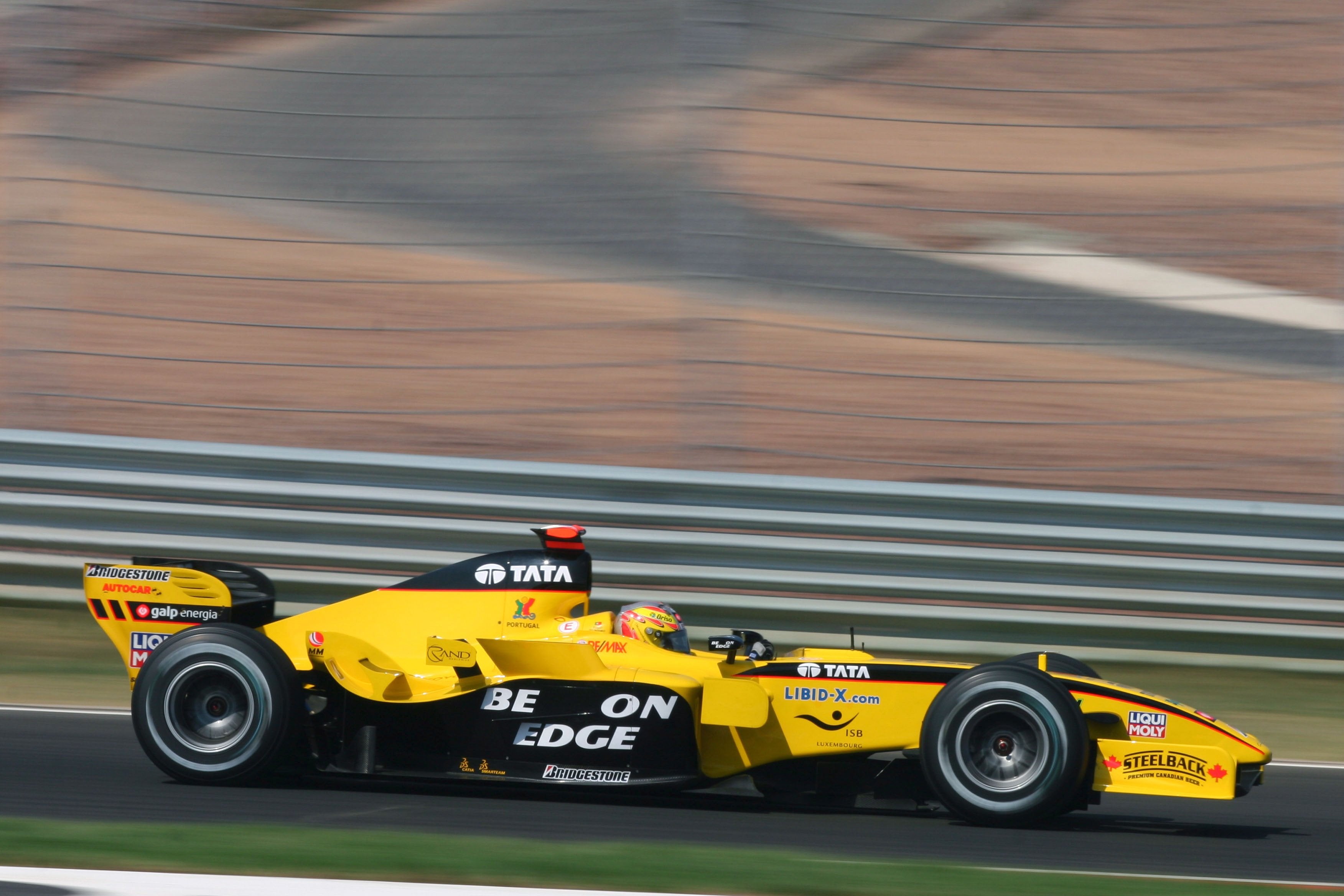
A year in Formula 1 feels like an age, so 14 years is like a lifetime. That’s how long Jordan Grand Prix entertained us for in Formula 1. Jordan was a team that to me as a kid had been in F1 seemingly forever, so to experience their slow decline and sad departure first hand was like a part of the sport dying. To lose Minardi and Jordan at the same time was really quite heartbreaking, so Jordan’s final car and livery are special for fans of my era.
The writing was on the wall for a couple of seasons before 2005, with dwindling points totals and securing less and less lucrative sponsorship deals. It resulted in launching their final car in wintry Moscow of all places, with a pretty bare looking yellow livery devoid on any major sponsors. Whilst it would have a better look come Melbourne, a true major sponsor would still evade them.
Two rookies would join the team for the new season; Tiago Monteiro, the first Portuguese driver in F1 since Pedro Lamy nearly a decade earlier, and Narain Karthikeyan, the first ever Indian driver in F1. Neither driver would set the world alight that season aside from THAT Indianapolis Grand Prix with Monteiro securing a podium. He also scored an impressive single point in Belgium that year, whilst Karthikeyan only managed points in the aforementioned US GP.
As mentioned, the livery did perk up for the first race of the season with the iconic yellow synonymous with Jordan joined by some black lines on the side of the nose, reaching all the way to the cockpit and bordered by a thin red stripe. The livery also featured a merry-go-round of sponsors on the sidepod, including Benson & Hedges (stylised as Be On Edge) and Sobranie, and also the driver’s name in races it would otherwise be blank. The sidepods would sometimes be yellow or on black, seemingly without rhyme or reason.
The livery also featured a similar black section on the airbox which worked well to complete the livery, along with the black rear wing. Perhaps black end plates would have been even better too, although the little black stripe they featured looked nice and matched the nose design well. I feel as though the more black this car had on it, the better it looked. The black sidepods with Be On Edge especially looked great, and also took us back to a better time for the team – as warm and fuzzy as cigarette money can make you feel.
The last season for Jordan was a poor one and they were only saved from total embarrassment by their one lucky podium, and also the fact that Minardi were abysmal and could not even compete with the second worst team in the series. Their final car, the EJ15B would debut at Monza and would earn them just the solitary point. It was quite fitting and memorable that in the team’s final race, Karthikeyan would lose control in a seemingly straight line and crash, totaling one of their cars one last time.
So it was incredibly sad to see Jordan, who punched above their weight so many years, die off with just a whimper like they did. That said, in our memories we have some unforgetable moments, some memorable liveries and of course the team’s spirit living on, with Aston Martin the latest iteration of the Silverstone team.
The 2022 Formula 1 season is well underway and the new regulations sure have provided us with a few surprises! In terms of pace, Ferrari now look like the team to beat, whilst Red Bull have surprised no one…both with their pace and their livery. Haas also jumped their way into the middle of the pack along with Alfa Romeo and from the other side of spectrum, so has Mercedes! On the livery front, it’s a very good looking field with very few disappointments, so the rankings being decided by very fine margins. Anyway, let’s take a look at this year’s liveries, from worst to best.
Oracle Red Bull Racing
To the surprise of absolutely no-one, Red Bull are using the exact same livery for the seventh straight season, aside from sponsor changes. For this reason, they are bottom of the list.
As I think I say every year, it is not a bad livery, but even the best livery would go stale after this many consecutive years in action. I’d have thought a refreshing update or slight variation of the livery would have been a nice touch to usher in the new look cars, but here we are.
Perhaps they wanted to keep the same look after a driver’s championship winning season, but at the very least it’s great to see the #1 proudly displayed on a car for the first time in a number of years.
★★☆
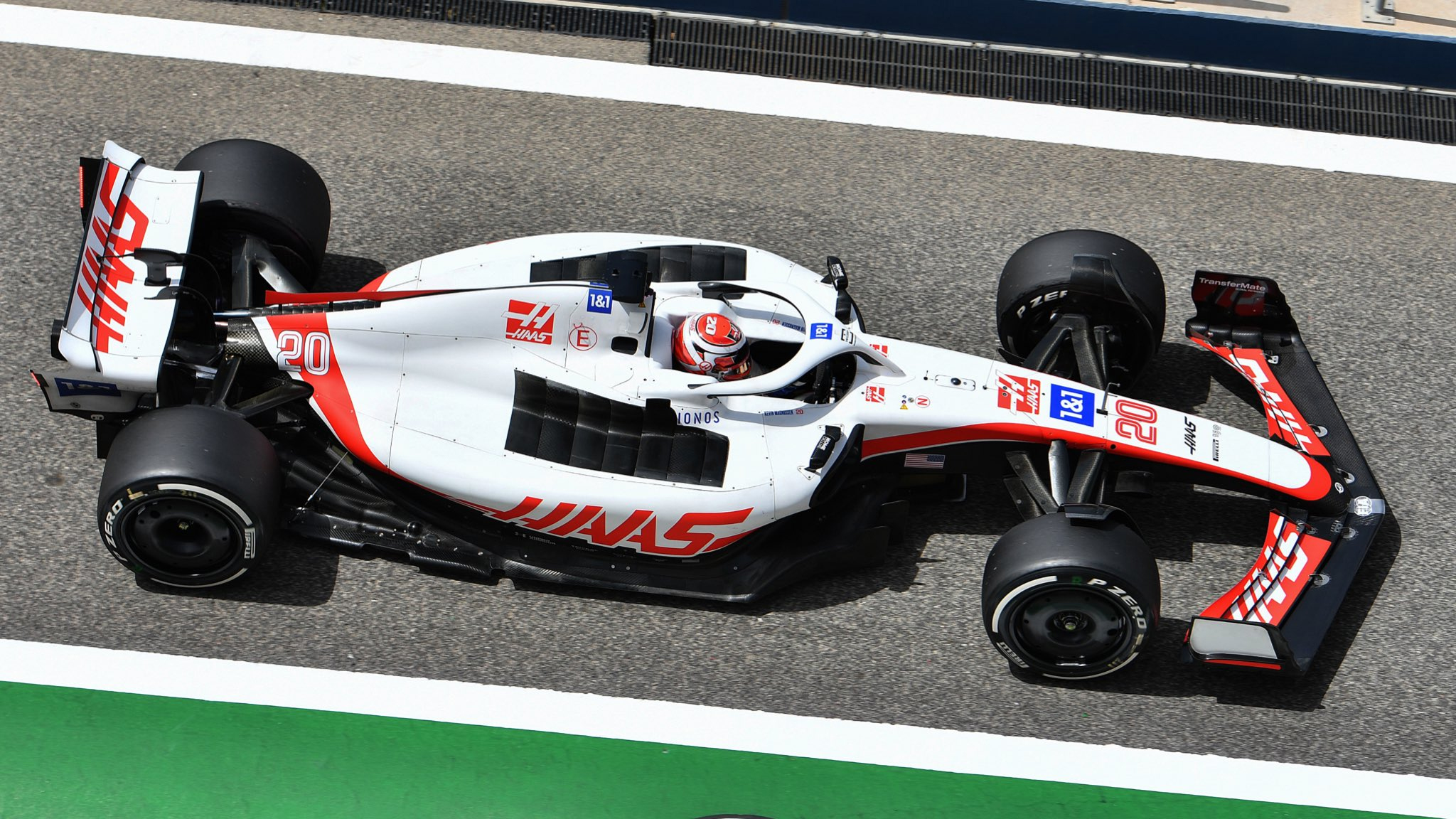
Haas F1 Team
Haas saw their F1 character arc change from villain to hero in a matter of days just before the start of the season. With Russia beginning a war in Ukraine, Haas decided it no longer wanted to be associated with Uralkali and the Mazepin family and with one fell swoop, the much maligned Nikita and Team Russia livery were gone!
Replacing said driver and livery were fan favourite Kevin Magnussen, and the more traditional Haas colours of red, white and black. The design itself is very simple but aesthetically pleasing, with one long swooping red line from front to back. It’s clean and simple, perhaps a wee bit plain, but a lot less tone deaf than what they had at launch.
They get a lot of kudos for all the changes made in very little time before the start of the season, but at the end of the day it isn’t the most exciting livery we’ve ever laid eyes on.
★★★
Alfa Romeo F1 Team Orlen
Even with four races already run, I’m still on the fence about this Alfa Romeo livery. I am glad to see that they changed direction after a very Sauber inspired liveries for the last couple of years, but I can’t get myself to love this one.
The large diagonal split on the side is a nice and bold look, especially with that lovely red, but I’m a little annoyed that they’ve felt the need to split the red and white with a thin black line. The red and white already contrast well enough, so it’s unnecessary and detracts from the look. The little white section on the nose also looks a little funny as it’s presented. It reminds me of someone’s toe poking out of a holey sock.
Had the livery used a plain, flat red it could well have been bottom of the list, but the beautiful deep metallic red saves it from any real embarassment. The retro Alfa Romeo lettering is also a neat touch on the engine cover, but it’s not as impactful as the graphical logo was in the same position.
★★★
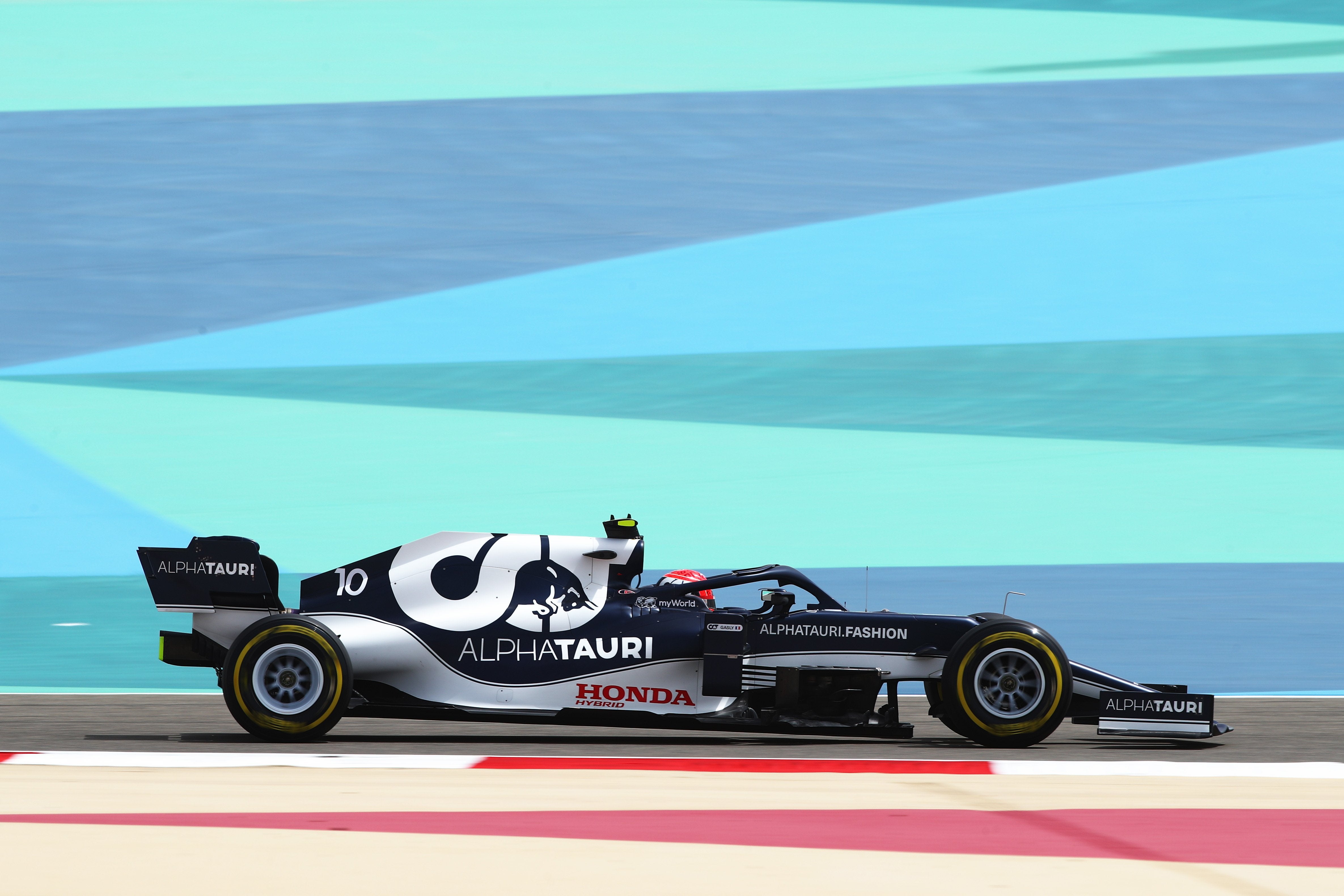
Scuderia AlphaTauri
AlphaTauri have tightened their livery game up a bit this year. The overall ethos is the same with the navy blue and white colour scheme, and engine cover still prominently displaying the AlphaTauri graphical logo. However, there is still something slightly off putting about this design.
One reason may be that the pinstriping is back for another year, although the thicker lines make it a lot less offensive, perhaps even trending toward attractive in some areas? It does look very busy though, and something just looks off from the side profile. Perhaps it’s how the sidepod shape makes the lettering of the AlphaTauri logo slope downward, like it’s sliding off the side of the car.
However, it looks really good from the angle above and this has to do with the thicker pinstripes, the lovely framing of the white cockpit and the inversing of the AlphaTauri logo colours on the engine compared to last year. Gives off Brabham vibes in the best way.
★★★☆
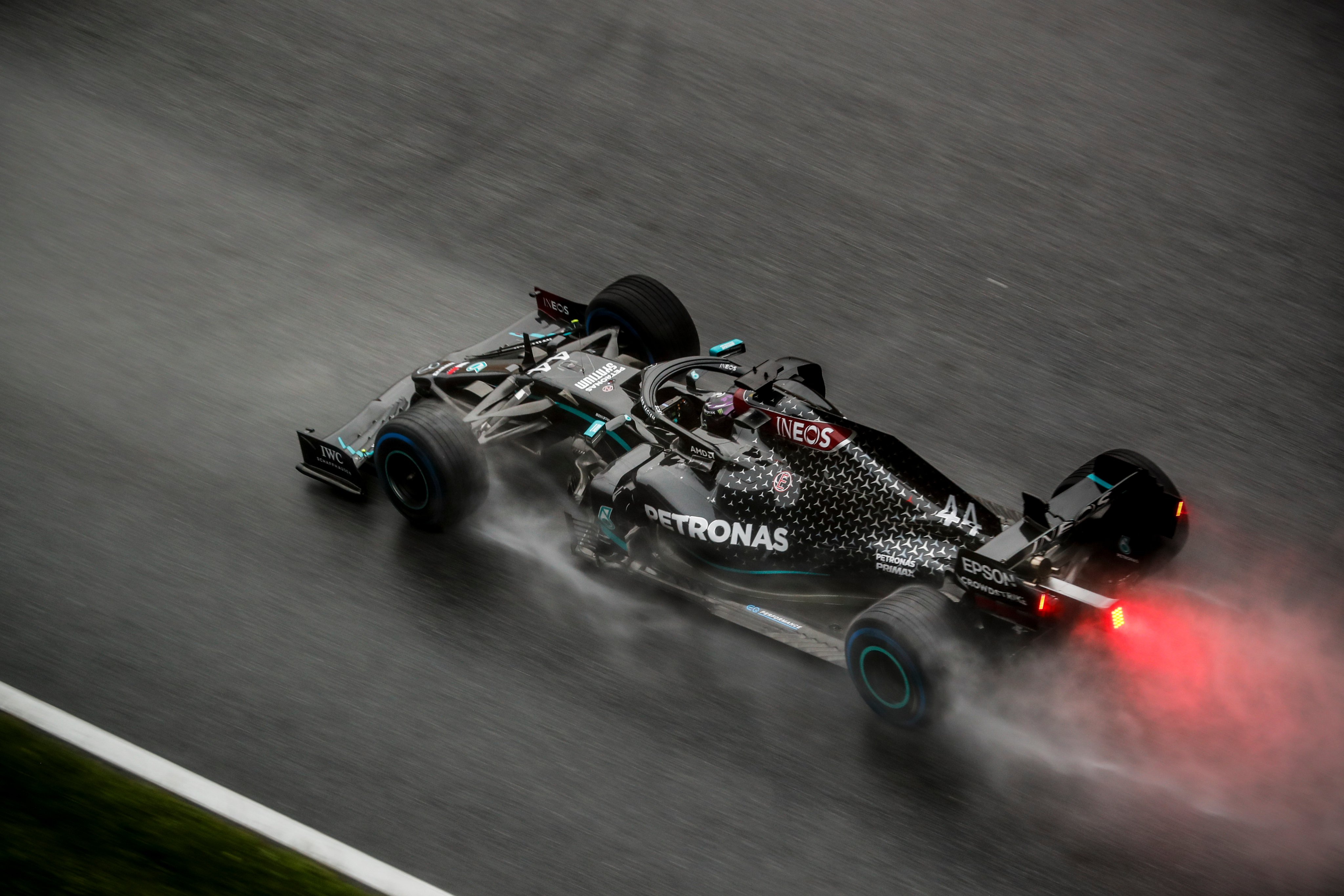
Mercedes-AMG Petronas F1 Team
The Mercedes machines are back in black silver for 2022! Whilst the last couple of years in black were very refreshing and had an important social impact, it’s a great way to ensure those liveries will be fondly remembered instead of being dragged on for too long a-la Red Bull. It’s also a great way of making silver look fresh again, where it can often look as empty as plain white.
This could well be one of the cleanest modern Mercedes liveries to date. The liveries of the early to mid 2010s tried a bit too hard to be cool, whilst subsequent designs still couldn’t really figure out how to make the Petronas turquoise look good with the silver. It’s kept fairly simple here and I think that’s the secret to success.
Other little flashes of turquoise on the car are very nice and the deep red Ineos sections are well placed and complement the car well. Even the Mercedes star graphics on the rear of the engine cover have been toned down successfully. Whilst there aren’t really any issues, it is silver which is crisp, but just not a very exciting colour, where the black liveries the last couple of years had that extra sex appeal. The only thing throwing me off this year are the Rossi-esque fluro yellow numbers on Hamilton’s car!
★★★★
BWT Alpine F1 Team
BWT is back with a bang in 2022! After a playing a minor role with Aston Martin last year, they’ve moved to Alpine and added a huge presence to their cars. Whilst the first 3 rounds were a pink overload akin to Force India/Racing Point, the livery has thankfully come back to Earth since Melbourne.
I wasn’t sure how they would pair the blue and pink together nicely (without copying the amazing 2019 Racing Point) but they’ve done a fine job here. Whilst I’m not sure they needed to be, the blue and pink are separated by a thin section of plain carbon fibre, but the distribution of the three colours on the car is great. However, I wonder if compromising and making the pink sidepod section (and consequently the BWT logo) smaller, if it may have made this a little neater and even better to look at.
Whilst the all pink car was a little much, the mainly blue car is very nice, and has a few nice touches, such as the Alpine ‘A’ pattern on the rear of the engine cover (zoom in) and the little French flags on the nose and in front of the cockpit.
★★★★
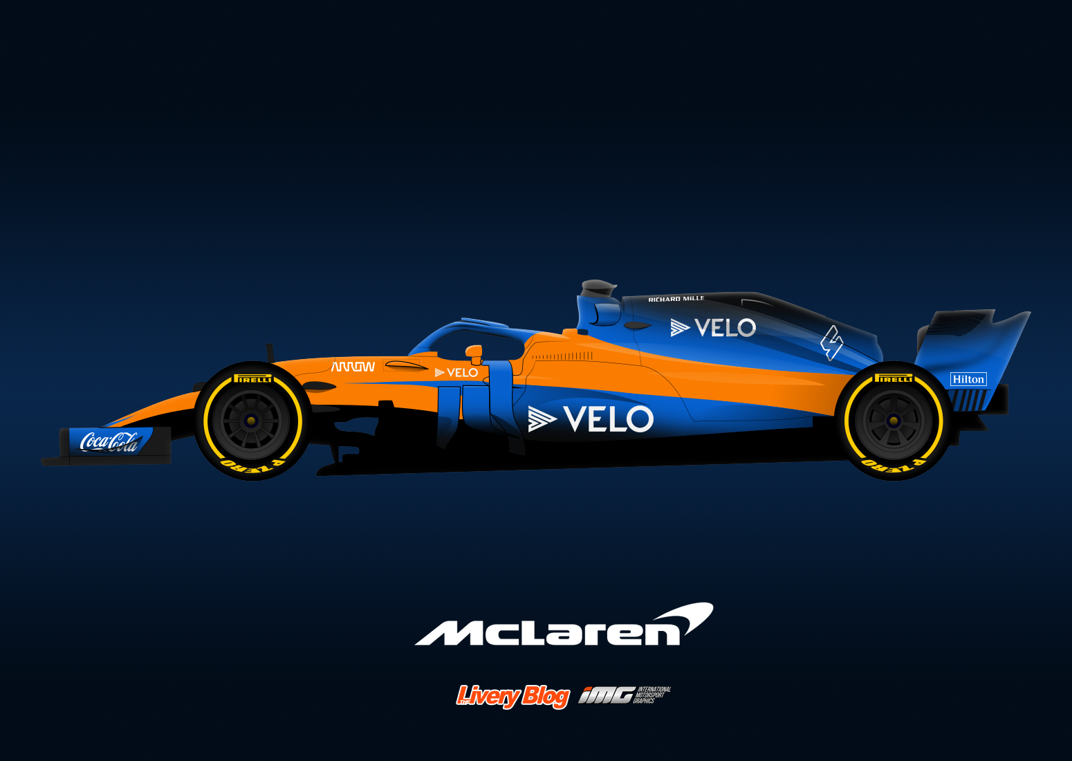
McLaren F1 Team
McLaren have managed to quite drastically change their livery this year, despite staying with just about the same colour scheme. The orange is a little more fluorescent and the blue is a lot lighter than the last couple of years. I’m not sure if this orange even classifies as papaya anymore! Radioactive papaya perhaps? Either way it’s a refreshing look and my immediate thought was if they saw how much everyone loved their 2021 Gulf Monaco livery with it and moved in that direction for 2022.
It’s also all matte paint now apart from the carbon sections, which have been added since the launch to accommodate for their Google sponsorship. It seems teams are now leaving areas unpainted where they would have previously painted them black. Makes sense from a weight perspective and you can barely tell from a distance. The design itself was a little busy to me at first, but the more I look at it, the more everything seems to have its place to create a harmonious livery overall.
The colours just pop so well and really makes last year’s livery look boring in comparison! The Google wheels are a fun and clever little addition and it just caps off a fun and colourful design, which goes against my preference a little for classic and clean liveries. Don’t forget we have mainly black livery (possibly?) coming during the season too, which could well be the stronger design.
★★★★☆
Williams Racing
Williams have done it again. Once more, they’ve used their lack of sponsorship as a blank canvas to make a creative, beautiful livery. Whilst McLaren went with in your face colour, Williams have gone with muted blacks and blues, but in a similarly or even more complex design.
The triangular pattern in different shades of blue not only looks fantastic, but in my eyes does a great job of forming a giant Williams ‘W’ on the side of the car. Whether it was intended, an optical illusion, or my brain overthinking the whole thing only they will know. Since the image above, the team have shed some weight, leaving the darkest blue bits as empty carbon fibre, which actually adds to the aggressive look of the car and creates a stronger contrast for those parts of the car.
Whilst not exactly livery related, the nose of this car is just really aesthetically pleasing and reminds me of the pointy, curved noses of the early 90s Williams cars. Similarly, the red chevrons on the top of the airbox accentuate the oddly flat nature of this part of the car, but it looks incredible. All the other red flashes are placed perfectly and add a tiny bit of needed to colour to a cool, dark livery.
★★★★☆
Scuderia Ferrari
Holy smokes, is this the best looking Ferrari of all time? After years of hoping and dreaming, my prayers have been answered. Not only has Ferrari chosen an absolutely gorgeous shade of red, but they’ve brought back the black wings! The red is a slightly deeper, slightly cooler shade that is incredible even in matte paint.
After we found out Santander was getting back on board, I was convinced that white wings were going to be back. What a relief and an incredible surprise. I have almost nothing to critique about this livery. The 75th anniversary insignia on the engine cover is probably the weakest part of the livery, and I can even look past the billboard of a sidepod because of how good the rest of the car looks. Even the black halo looks good now since black more of a theme on the car.
So what could possibly top this year’s Ferrari? Well I’m not sure it surpasses it, but it’s most certainly level. This is a beauty and improves on last year’s already great effort in just about every way. The most obvious change is the shade of green used. Whilst the 2021 green was metallic, it was a little too dark/dull and didn’t catch and reflect the suns rays brightly enough. This shade does just that, spectacularly.
Next is the departure of BWT which an absolute blessing for this livery. BWT did seem to be a late addition to the 2021 livery, but it’s just so much better without the pink. The inclusion of Aston Martin’s lime green in its place, sweeping minimally along the side the car, adds a fantastic touch of vivid colour.
Finally, the decision to use black wings instead of green lifts this livery from great to outstanding. Maybe it’s just my thing, but it really helps the green shine without it completely saturating the optical palate. Brings back very fond Caterham memories. All of this is capped off by sponsor logos in perfect uniformity with the colour scheme. What a livery!
★★★★★
The entire 2022 grid is honestly very, very good. We’ve had some stinkers over the years but I can honestly say there aren’t any this season. Perhaps it’s somewhat down to the new regulations creating some very attractive templates to work with, but it’s still very easy to screw it up so I’m glad none of the teams have. And the livery award goes to…
Redemption Award – Haas
They made the right decisions right before the start of the season and turned the whole motorsport world (apart from the Russians) back in their favour.
Back to Back Award – Williams
For years Williams’ livery matched their pace; mediocre to straight bad. Thankfully with new ownership the creative juices have started flowing again, and hopefully the pace follows suit. Two great liveries in a row.
Yawn Award – Red Bull
Marketing just makes me sad sometimes. I get you need to preserve and maintain a certain branding look and feel, but does it have to be exactly the same year after year? I think not.
Phoenix Award – Ferrari
Last year’s Ferrari was a steaming pile of doo doo. A burning trash heap of a livery. They have risen from the ashes and produced what may be Ferrari’s most attractive livery of all time. What an incredible turnaround.
So that’s the 2022 F1 field. Which is your favourite? Are you happy with the changes that some teams have already made since testing? Let me know below!
Well it’s the old template again as I couldn’t get my hands on a really good one for the new F1 regulations, but the liveries should work just about the same. There haven’t been a huge number of sponsorship changes so I’m not expecting an major alterations to colour schemes across the grid, but I’m sure we’ll see a couple of surprises. As always I’ve try to keep things realistic, but have given myself a few liberties just to avoid some of the designs looking a little stale. Just to be different, let’s go in championship finishing order this time!
Mercedes-AMG Petronas F1 Team
It has been more or less confirmed that Mercedes will be moving away from the black liveries of the past couple of seasons, and as lovely as they have been, I think it’s a great move. It doesn’t take long for a livery to overstay its welcome and it’s best to quit while you’re ahead. It’s certainly in the brand’s best interests to bring back its traditional silver, but there’s no saying the black can’t return for a once off run during the season as a nice surprise.
I’m hoping they clean it up a little this year so I’ve moved away from the repeating patterns along the engine cover and dialed up the Petronas turquoise just a little bit, which fades into black in each of its three main sections. I’ve also tried spicing up the sponsors a little, with a turquoise ‘shadow’ for each, just for something different, but very unlikely.
Red Bull Racing
Red Bull have been far too predictable the last few seasons; six seasons in a row now with an agonisingly unchanged design. Whilst I am hoping that they do go for something completely different considering we are entering a new era of regulations (who wouldn’t love a good old Red Bull can livery?), my gut tells me they’ll stick with their current branding. Hence, I’ve gone for some tweaks rather than a complete overhaul.
I’ve kept the important things the same, but have ditched the stale old red lines and replaced them with some thicker and shorter, broken up red lines, which are partially bordered by a lighter, royal blue line. This lighter blue isn’t completely foreign as it’s been used in other categories previously. For me, this would be enough of a change to freshen up the Bulls without a completely new format.
Scuderia Ferrari
The word is that Philip Morris is ending their sponsorship with Ferrari after decades of support, and this is fantastic news. Not only from an ethical standpoint, but also because the abomination that was the green Mission Winnow logo will be gone. That logo capped off possibly the most disgusting Ferrari livery of all time last season, so things can only get better. Let’s just hope the reports of a darker red being used isn’t the same terrible colour used on the rear of the 2021 machine.
Also gone will be UPS, so another colour in brown will also vacate the Ferrari for 2022. This hopefully means a much cleaner and more uniform livery which I’ve tried to emulate here. I’ve followed the same sponsor placement of the last few seasons, but it looks a little nicer without the brown UPS logo now. Santander now takes up the engine cover, although this all depends on how much cash they are actually putting into the team. I’ve been a little hopeful with the black front end plate under the Velas logo, and finally some Italian flavour with a few little green and white stripes along the car to keep it from being too monotonous.
McLaren F1 Team
McLaren have really settled into their colour scheme over the last few years, and have kept things fresh by making new design changes year on year. Barring any major sponsorship announcements in the next week, it seems the papaya and blue combo will be sticking around!
The 2021 livery was pretty, but fairly basic, so I’ve gone with a more angular, and perhaps more modern design. It’s still majority papaya, with large blue sections along the sidepod and engine cover, although there are thick black and papaya diagonal lines intersecting them at the rear, and a matching blue line on the nose in front of the cockpit. They did a great job displaying all their sponsors last season, so I’ve tried to follow this design ethos, fitting them nicely within the aforementioned lines.
Alpine F1 Team
Wholesale changes at Alpine weren’t restricted to team members, but also to sponsors, with the much adored BWT ditching Aston Martin and potentially bringing some pink to Alpine in 2022. This made the design extremely tough, as it was surprisingly tough to fit the pink into the very French blue, red and white livery.
I flirted with mixing the red and pink sections on the rear of the car but it just didn’t work out, so in the end I put my hopes in BWT investing enough into the team to adorn the engine cover. Therefore, it’s a clean cut pink section that seems to match fairly well the the rest of the Alpine blue, especially given the blue BWT lettering. This almost intersects with the red section at the rear, which I hope sticks around in 2022 as the design is lovely, and very distinctive to the team (although I’ve tweaked it a little in my version). I’ve also matched this section with a similar one next to the cockpit, which I think is nicer than the small red and mostly black design there in 2021.
Scuderia AlphaTauri
AlphaTauri’s livery last season was one of the more disappointing on the grid. It has such potential, and yet the design ended up being so generic, looking like little time had been put into it at all, which is surprising given how cutting edge and forward thinking Red Bull are as a company. Either way, I’ve tried to make amends for 2022.
I’ve gone with something way more intricate than they attempted, with some angular thick and thin stripes on the rear of the car. Matching ones can be seen in front of the cockpit, with these featuring another thick line that sweeps along the side of the nose. I’ve also added a white line along the sidepod to keep that area from being blank, and also serves a purpose in highlighting/underlining a potential Red Bull Powertrains logo where Honda appeared last season. Finally, whilst a two tone livery was tempting, I’ve decided to play with the pinky-red Red Bull colour and add some flashes on a few sections of the car, which also helps to break up the thick white lines a little.
Aston Martin Cognizant F1 Team
I’m confident that if BWT weren’t an afterthought coming into the 2021 season, that their inclusion on the livery would have been much better thought out, but I’m happy that they are moving on and that we’ll potentially see a much nicer pairing of Aston Martin’s two distinct green colours.
That said, I don’t expect anything too out of the ordinary for their 2022 livery, so I’ve changed their long pink stripe into two similar, yet slightly more understated and aesthetically pleasing bright green lines. I’ve also added a couple of flashes of this bright green colour in some key areas, as well as making the Aston Martin logo beneath the cockpit this colour, although I’m not sure of the possibility this would happen in real life.
Williams Racing
Williams went crazy with their livery last season, about as non-traditional as a Williams has ever looked, and it was awesome to see. It was a little weird, a little exciting, but overall passed the eye test. With no major sponsorship announcements just yet, it could pave the way for another wild design, and that’s the philosophy I’ve taken!
With a lot of empty space to work with, I’ve gone about filling it with a busy but cohesive use of the blue colours, making sure it doesn’t look empty despite the lack of sponsorship. It’s a little outside the box with sharp angles, multiple gradients, striped patterns and intersecting lines and colours, but I feel nothing is off limits after last season’s design. Williams’ light blue is still the main colour though, and the yellow-gold colour makes another appearance shadowing two of the dark blue sections, as well as appearing on the front of the nose cone, in front of the cockpit and two bits on the rear of the car.
Alfa Romeo F1 Team Orlen
My Alfa Romeo design from last year was probably my favourite of the bunch, and I was honestly a little disappointed with their actual livery for 2021. That said, I’ve moved on to a new concept for 2022.
I took some inadvertant inspiration from one of my favourite Indy Car liveries of the last few years – let’s call the white sections on this car an ode to the Italian/Swiss alps, given the team’s heritage. The Alfa logo and the beautiful red have always been the best parts of their liveries, I’m just hoping that the rest of the puzzle pieces get put together correctly for this season, and hopefully minus the pinstriping too.
Uralkali Haas F1 Team
No one was more surprised than I was when the Team Russia Haas F1 Team car was launched in 2021. It’s funny and a little ironic that the proudly American F1 Team was adorned by the Russian flag, and yet as long as Mazepin is a part of the team, I don’t see the design ethos changing direction.
That said, I’ve tried to make the flag design a little bolder, as it looked a little bit F2-ish last season. I’ve gone with some thick wavy stripes on nose section and engine cover, with very end of the blue part on the engine cover speckling away into a lighter blue.
So I hope I’ve done a decent job of coming up with some appealing and realistic liveries for the 2022 F1 field. Which fantasy livery was your favourite, and do you think there’s a chance any of these could be similar to what’s launched in the next couple of weeks?
The new season is finally upon us! There have been a few fun changes on the livery front for 2021, as well as a few not so fun changes. Let’s check them all out.
Alfa Romeo Racing Orlen
Whilst the colour scheme hasn’t changed on the Alfa Romeo cars this year, their placement has basically been flipped. Last season the engine cover was red and the sidepods white, but they’ve switched places this season which sadly gives the feel of less of the beautiful red and more white overall. They’ve also moved to a simpler design with a giant white pinstripe along the side, which doesn’t look as good as the 2020 design.
One part they’ve improved is the nose; cutting off the thicker red stripes half way down the nose whilst continuing the thin blue stripes to the very tip looks better. However, with the ‘top’ of the car now white, having the halo in red looks a little out of place. Similarly, I’m not sure why they didn’t continue the big red section from the sidepod all along the side of the nose to make the whole ‘bottom’ half of the car the same colour.
The very small shark fin section looks good in black, but the driver number half against the engine cover’s red and shark fin’s black doesn’t look great. The Quadrifoglio graphic on the other hand is a fantastic touch alongside the Alfa Romeo logo on the engine cover. The metallic shade of red also stars under lights, reflecting beautifully in the night.
★★★☆
Scuderia AlphaTauri Honda
A big change for 2021 over at AlphaTauri. Firstly, the main logo has been reduced in size from comically large, to very big. This has allowed for a design to really be created around the logo, as opposed to the logo itself being the main design. Unfortunately, it seems like the first draft was used as the final design. What I mean is, from experience, this kind of wavy shape for the white section looks like the very initial part of the creatives process – finding out what colours, lines and shapes work with the car shape and the sponsor logos. From there, I’d go on to refine the shapes, add some intricacies and flare and really test out some new elements, or remove some existing ones. It looks like they’ve stopped at that first step and not expanded on the initial design.
However, that’s not a cardinal sin and if anything, protects them from creating an overcomplicated design, but it simultaneously keeps them from standing out from the crowd. Alongside that, I’m just not a huge fan of pinstripes of this fashion. Either way, the good news is that they’ve fixed the ugly cut-off cockpit/nose design from last year. From the front, it’s a clean navy blue effort which I can’t really complain about.
So is it an improvement overall? I’d have to say yes. The logo is no longer obnoxious, and it’s certainly a more coherent design overall, whether I like pinstripes or not.
★★★
Alpine F1 Team
Given their promotional/mock up liveries, this design couldn’t have come as too much of a surprise to anyone. However, that most certainly isn’t a bad thing! Starting with the Alpine ‘A’ and the diagonal design on the rear of the car, this has all the hallmarks of being a classic feature of their cars for years to come. It looks great with the mix of solid colour and white pattern, and has the potential to evolve from year to year to stay fresh.
Secondly, that colour! Initially I was disappointed to find out it was matte paint, but that shade of blue and that iridescent structure of the paint makes up for the lack of gloss/metallic finish. It makes the matte paint really shine and reflect beautifully in the sun or under lights, where most matte paint jobs fall disappointingly flat.
They’ve also cleverly painted some sections black or kept them as plain carbon fibre, which help sponsors like Castrol fit on the car without clashing against the blue. Finally, there are some small, intricate additions to this livery which really make it look like a lot of care was put into making this look good, such as the French flag colours on the wing end plates. A really great design.
★★★★★
Aston Martin Cognizant F1 Team
A beautiful British racing green is all we expected from Aston Martin, and they delivered! Whilst it’s not my all time favourite shade of green ever to appear on an F1 car, it is quite wonderful. It’s a fairly unique shade – not too saturated and almost more teal than green, but it’s for this reason that I think the pink flashes don’t look horrible on the car. Of course, a lighter shade of pink could have helped the cause, and given they’ve used that on other cars, I’m not sure why they settled for such a strong pink.
The rest of the design is quite simple with pink very minimally bordering some sections of the car. There’s also a very subtle design along the side of the car in a slightly darker green which is neat, albeit perhaps too subtle as I didn’t notice it until writing this. All of the logos are well placed and match nicely too, given they are all in white (apart from JCB).
I can only imagine that those flashes would have looked better in Aston Martin’s neon green as opposed to pink. Also, I wonder if black wing end plates as opposed to green could have helped with breaking the car up a bit, but it works quite well as is.
★★★★
Scuderia Mission Winnow Ferrari
I can’t be the only one who made this face when the new Ferrari was first unveiled. It must be said that my sentiment hasn’t changed very much since. Firstly I thought that the green Mission Winnow logo was just a marketing ploy to get people talking about the ‘brand’ – why else would they pick a colour that clashed so horribly? To my surprise it was still on the car for round 1. Really bemusing considering the same Mission Winnow logos are black elsewhere on the car, but we are talking about it aren’t we so I guess it worked. Thankfully, that won’t be on all year as they legally can’t in many countries the championship visits.
Then there’s the two tone situation on the rear of the car. It looks like the weird brownish colour used in the Tuscan GP, poorly blended into the normal Ferrari red. It wasn’t nice then, and it certainly isn’t nice here, placed in a half-arsed manner, or perhaps by someone who doesn’t quite understand gradients. There are very few redeeming features on this livery, especially now that even the scarlet red has been matte for a few years.
The Ferrari has been an allotted sponsorship billboard for decades now, but up until 2021 it has been done is a clean and classy fashion. The 2021 livery is a bastardised version of the once beautiful Italian machine, and I have to say, the first time I’ve really found a Ferrari Formula 1 car to be truly ugly. This may be the worst thing since to hit F1 since the dong noses of the mid 2010s.
★
Uralkali Haas F1 Team
Then to the other most ridiculous livery of the year – the all American Haas team. They’ve become the least popular team by selling out the the Mazepin’s, with Nikita driving and dad Dmitry bankrolling the team. The result is F1’s only team from the USA in a livery that, thanks for Uralkali, shouts Russia more than Russia’s own A1GP team. The car is literally a giant Russian flag, in a year where ironically Russians can’t even race under their own nationality in F1.
Jokes aside, the livery itself actually isn’t bad. It is a little basic, but the flag designs on the side work well with the angles of the car, and the colour scheme is one you can’t really go wrong with. I like the red piping which is used to outline the white section of the flags, but also as an added design element on the cockpit, wrapping around the nose.
The crazy thing for me is how Haas really takes a back seat on this design. Not only as a team in general, but the Haas logos in red are really outshined by the Russian flag designs on the car. It defeats the purpose a little of having an F1 team to promote your brand just a tad doesn’t it?
★★★
McLaren F1 Team
A very subtle evolution for McLaren in 2021. The structure of the design is very much the same as 2020, from the colour scheme to how these colours are portioned on the car. The main difference is on the sidepod, where the blue section extends a little further as the curve has been inverted, and the rainbow colours end closer to the rear.
The one part I’d hope they’d change, they’ve only really slightly updated. Last year I felt the second colour on the nose should have only been visible form the side instead of leaking to the top/front. However, for 2021 they’ve changed that secondary colour from black to blue, which at least is not as harsh a contrast – it does look a lot better.
Not a hell of a lot else has changed, so perhaps they’re saving up a big change for the new shape of the 2022 car.
★★★★☆
Mercedes-AMG Petronas F1 Team
The new Mercedes is a bit of a mixed bag. They’ve stuck with black for another season which surprised a few – it’s definitely a more striking look that their traditional silver. That said, silver has made a bit of a comeback, with the rear part of the engine cover/shark fin featuring quite a bit of it. Sadly they got rid of the lovely, elegant star pattern on the engine cover, and replaced it with the AMG AMG AMG AMG AMG abomination. It doesn’t look nice.
There’s also some silver now bordering the main Turquoise section on the side of the car which I feel detracts from the clean light colour on black background look. It feels like an unnecessary addition. The Ineos section, however, has improved slightly. Whilst being bigger, it completely covers the airbox section instead of awkwardly jutting in from the intake only.
Overall it’s a bit of a downgrade. They’ve replaced some things that didn’t need replacing, and added some new things that didn’t need adding.
★★★☆
Red Bull Racing Honda
So it’s year number 6 for this version of the Red Bull livery, and in those 6 years it has changed very little. The formula of matte navy blue with a thin red line has been the same for many years and when comparing 2021 to 2020, save switching out Aston Martin for Honda, they are identical.
Time I feel has just about run out for this livery. I always like to use Mild Seven Renault or Panasonic Toyota as an example here – while we look back at them fondly now, at the time we were begging for a change up because everyone was sick of seeing the same design year after year. For me this is very much the case with the current Red Bull livery, and it comes across as lazy to not make any changes over time. They should know as well as anyone that there’s always room for improvement.
Nothing else to say! As with McLaren, hopefully they’ll blow our minds with some new and special for 2022.
★★★
Williams Racing
So after the disappointed of Red Bull comes the breath of fresh air that is Williams. I was a little sceptical after seeing the initial renders of this design, but it’s safe to say it looks the business in real life. The main design of diagonal light blue lines over a dark blue base is beautifully busy. They’ve worked well to fill the space available to them – a luxury teams with many sponsors do not have. It’s wonderfully multi-faceted, with half the thicker light blue lines cut short to reveal a semi circular design within the design. The diagonal thin yellow lines then complete the look at the rear. The only issue I have with that part of the design is the light blue lines going over rather than behind the Williams ‘W’, which looks a little clumsy, almost like a mistake.
Then we have the front of the livery, which almost looks like it belongs on a different car. Perhaps more diagonal lines at the front would have been too much, but the route they’ve gone with in an edgy light blue and yellow line is a little odd, albeit still managing to fit the aesthetic. That section may have also looked better ending right on the ‘edge’ of the cockpit/nose section as opposed to creeping to the top of the nose/cockpit, much like the issue I have with the McLaren.
All I can say is it’s great to have a livery pop up very much from left field. It’s a little odd, a little crazy and a little gorgeous! It’s great, albeit under new management, to have a team with the guts to put something outside the norm onto the F1 grid.
★★★★☆
So for some awards.
Best Looker Award – Alpine
It’s a stunning livery. The shade of blue used is wonderful. The design elements are all great. It’s just about a perfect livery.
Possibly the Worst Livery of All Time Award – Ferrari
This is a real stinker. It sucks, and I’m mad that it exists.
Identity Struggle Award – Haas
America or Russia’s F1 team? I wonder if they’ll add some stars to compliment the ‘stripes’ in time for COTA!
Low Effort Award – Red Bull
An identical livery is just a no-no for me. I’m not sure how many others agree with my sentiment, but it feels like a slap in the face (even though they don’t owe me anything)!
It seems as though now more than ever, the Formula 1 community is being flooded with fantasy F1 liveries from enthusiasts and professional designers alike. I’m certainly the former, but despite the array of fantastic looking efforts out there, I still highly anticipate piecing together news of teams, drivers and sponsorships to make what I think could at least semi-realistically appear on the cars in the new season. Let’s take a look at what I’ve put together this year.
Alfa Romeo Racing Orlen
I was pretty chuffed with my design last year to be honest, so I thought I’d follow the same theme. Alfa dropped the blue altogether in 2020, so I decided to stick to mainly red and white, whilst adding a little bit of black as third colour to make the inverse/reflection design work. I wanted to move away from the real life livery design on the nose which despite being reminiscent of Sauber, feels very early 2010s.
Thankfully the Alfa Romeo logo works very as a design element in itself. On second thought, I’m doubtful that they’d actually have the logo in two colours like this, but here’s to a little bit of creative freedom.
Scuderia AlphaTauri Honda
It was clear in their first livery as AlphaTauri that branding (as ever with Red Bull) was more important than anything else. The size of the main logo was almost eye watering, but that’s what we have to work with. It’s certainly not an offensive logo, but it does limit what else can be done with the livery.
There is more room toward the front of the car though, and that’s what disappointed me most with the 2020 design. It just looked a little lazy and slapped on, so I’ve tried to put a bit more though into how the white contours both the cars natural lines, and the main logo. I’ve added a long blue line along that section to avoid too much white space as well, plus some thin white flashes along edges for some added interest.
Alpine F1 Team
So the first of the new blood. I will really miss the vibrant yellow that Renault brought to the grid, but nothing quite beats the excitement around the launch of a brand new car and livery. What I’ve done is taken the proposed colour scheme from their teaser imagery, but tried not to stick too closely to that specific design. I’ve kept the Alpine logo prominent on the engine cover and used mainly the Alpine blue colour (albeit slightly little deeper shade places) which fades into red and forms the basis of the design with a bit of French flair.
Aston Martin F1 Team
The Pink Panthers will be gone for 2021, but will hopefully be replaced by some long missed British Racing Green! I’m predicting a simple design which uses a nice dark green alongside their accent bright green, in this instance used sparingly as piping only. This matches the big Aston Martin logo in that bright green colour on the engine cover. Cognizant is a rumoured new sponsor for the team, but I’ve kept their presence (and blue) to a minimum – on the sidepod only.
Scuderia Ferrari Mission Winnow
What to do with the big red billboard this year? The Mission Winnow branding didn’t last long in 2020, so I’ve left the engine cover almost blank, and have kept other design elements fairly minimalistic – big patches of colour have been trending down in the last few years for Ferrari anyway.
I’m still onboard the black end plates train, and my thoughts on glossy over matte for Ferrari haven’t changed either. The only other thing I’ve really experimented with is a translucent/slightly different shade prancing horse on the side of the car, given how much empty space is available. I hope it doesn’t come off tacky, but something similar has worked pretty well on Vettel’s helmet for a few years!
Haas F1 Team
Haas has quickly become the most disliked team on the grid due to signing and sticking with Mazepin, but I similarly don’t see them ditching their colour scheme anytime soon. It’s really quite dull and unimaginative (corporate, even), so I’ve tried to spice up the red, black and off-white, whilst somewhat following their existing theme (Haas being ‘underlined’ on the sidepod). Fairly happy with the result, and in the off chance BWT does stay on the grid, here is a version with a bit of hot pink on it.
McLaren F1 Team
I was surprised that McLaren moved away from their triangular pattern design of 2019, but happy to see their new colour palette in 2020 was still very nice. I’ve taken a look at those colours from a different angle using a gradient, with the blue blending into the black to create an almost night sky effect, minus the twinkling stars. I’m keen to see how much papaya is on the car in 2021, because it’s been a joy to see ever since they brought it back.
Mercedes-AMG Petronas Formula One Team
I was a little surprised to read that black is likely staying on the 2021 Mercedes, thanks not so much to activism than but Ineos’ part ownership of the team. Whilst everyone loved the all black 2020 car, I was keen to see how the black could blend harmoniously with the silver. For that reason I’ve used swooping intersections between the silver and black, whilst the turquoise and crimson flashes are edgy to create a happy contrast.
Red Bull Racing
I don’t see Red Bull changing much at all next season; they seem to go many consecutive seasons sticking to the one theme. If they were to make some sort of change though, perhaps something like this could be it. I’ve made a series of parallel nose to rear pinstripes, to create the effect of a single wave following the shape of the car, without distracting too much from the all important Red Bull logo on the sidepod. This keeps a decent amount of red on the car, without being any more overpowering than the amount of red on previous liveries, maintaining that navy look that Red Bull are known for. I’ve also kept this completely three tone, with no white for any sponsors, which is probably the most unrealistic part of this livery, but creates a fun neon theme with the bright red and yellow against the dark navy.
Williams Racing
Last but not least, Williams. I was a big fan of Williams’ second livery of 2020, especially the edgy look of the nose section, so I was looking to expand and evolve that idea. I went with something a little out of my comfort zone – straight lines! In fact there are no curved lines on this design, apart from the nose section, which otherwise would have looked a little funny. So lots of edges, including the broken up blue lines in the large near-black sections. Still quite sparse in terms of sponsorship, but the void is adequately filled.
So which of the above is your favourite? Let me know your thoughts and comments!
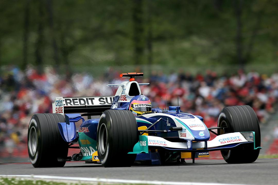
Sauber has had an impressive life in Formula 1, starting from scratch in 1993 and becoming a fan favourite as one of the last privateers, through to their eventual takeover by Alfa Romeo in 2019. They were loved for bringing in many talented drivers, although they never did quite break into the upper echelon in terms of performance and results; their best championship finish being 4th in 2001, at the hands of then young guns Nick Heidfeld and Kimi Raikkonen. Not counting the BMW days, Sauber never managed a win in F1, but did collect 10 podiums, four of which came in the exciting 2012 season thanks to Sergio Perez and Kamui Kobayashi.
2005 was Petronas’ 11th season as a sponsor of Sauber, with the livery dictating partnership beginning in 1996 and being a prime example of livery evolution. The Petronas sponsorship actually began in 1995 in less prominent fashion, but the now iconic turquoise was unleashed to the F1 world in 1996, long before Mercedes paired it with silver.
The most dramatic change between Petronas liveries was from 1997 to 1998, dropping the unique and attractive vertical stripes and forming the weakest livery of the bunch. However, as should always be the case with livery evolution, they took the primary idea, and along with some clever additions along the way, perfected it for its last iteration in 2005.
For the 2005 season, Sauber kept Felipe Massa for his fourth year at the team (third season as main driver), and brought in the now veteran Jacques Villeneuve after his three Grand Prix stint at Renault the year before. However, the season was a bit of a slump in comparison to 2004, with their best race finish being 4th on two occasions, ultimately ending the season with a tally of 20 points and 8th position in the standings. Mediocrity was a familiar feeling for the team, but another familiarity were the blue and teal colours that adorned the cars.
At first glance you may think the pairing of turquoise and this shade of blue may be quite weak. The blue used isn’t exactly stunning like the colour of the 2017 car was, and perhaps a stronger shade like this would have helped the two colours stand out against each other and take this livery to another level. However, it’s the supplementary colours that help this livery stand that much higher than its predecessors. The increased use of white thanks to Credit Suisse takes away some of that average blue and adds some much needed contrast to the blue and turquoise.
The main swooping sections of turquoise are similar to previous years, but are placed much more thoughtfully, respecting the cars natural lines which is pleasantly clear from side on. Whilst the Red Bull yellow on the airbox from the earlier versions of the livery was nice in its own right, the white works far better, taking away far more space from the blue. The yellow taking up as much space as the white may have been just as effective, but we’ll never know. Either way, yellow does remain on the barge boards thanks to MTS GSM and does look really nice as a fourth colour in that region of the car.
Sadly, despite being quite well disguised, the sidepod is a bit messy. Petronas itself is fine, but the thin yellow Syntium logo on turquoise isn’t very nice, and the Malaysia logo in red above it makes the whole sidepod look fairly disorganised and cluttered, especially given all three use different fonts. Thankfully it’s not super obvious though, and there aren’t too many complaints to follow!
Along with the added white, the nose is another element that improves on previous versions of the livery. It manages to use both blue and white in well placed harmony, swooping up the nose with a flash of turquoise to complete the look. This is then interjected by the turquoise and white section flowing from beside the cockpit. It’s abrupt but not out of place. It’s also cleverly done so that it looks great from all angles, which sadly isn’t always the case with F1 liveries.
Petronas continued in F1 with BMW when they took over Sauber for a few years, before moving to Mercedes in 2010. Whilst newer F1 fans may associate Petronas with Mercedes, their colours and logo will always scream Sauber to me. It was an iconic look all through the late 90s and 2000s, and whilst I’d always hoped they’d mix the colour scheme up a bit at the time, I’m glad I can look back at it so fondly now.
So how would this livery look on a modern day F1 car? The answer is pretty good! Sure, I could have used a little more creative freedom to suit the the 2020 style, especially with the sponsor placement, but 15 years on it still looks nice even on updated machinery.
As a fan of both AFL and Formula, I thought to myself, what kind of liveries would this unlikely combination produce? It turned out to be a little more difficult than anticipated, with the ethos of footy jumpers and F1 liveries being entirely different. An F1 team sells it’s livery to the highest bidder, whilst an AFL team adds their sponsors to the guernsey at the last minute, the club’s iconic and (almost) unchanging colours and design taking priority. This means that basing a livery on an AFL team’s colours and design, whilst incorporating sponsors onto the car becomes increasingly difficult. This is especially true as team and sponsor colours often clash, and are mostly slapped on square patches on the jumper, not giving much inspiration to follow from.
I’ve tried to stay true to the jumpers and be realistic to brand guidelines, which means not matching logos to team colours for the sake of aesthetics, as nice as that would be. I hope I haven’t done anyone’s favourite team an injustice, and if I have done anyone dirty, I sincerely apologise!
After a long, long wait, F1 is back! COVID-19 has played havoc on the world and with so much negativity, it’s great to have a favourite distraction back, with races almost every week. The delayed season start has also seen some surprising livery changes since the launches, so let’s see the who’s done well and who hasn’t, in reverse alphabetical order this time.
Williams Racing
There’s a lot to love about William’s revamped livery. Sure, the new Rokit design was good and brought some colour to the grid, but I don’t think anyone is sad to see the dodgy company go. The new livery is somewhat dictated by new sponsor Sofina, a financial investment group, but sings true to Williams roots of white and blue.
The red is gone, but the livery is way more refined with some traditional swooping blue and black lines along the length of the car. Everything appears to be well placed, including the black on the underside of the halo and the blue on the top of the engine cover/shark fin, as well as on the rear wing.
They’ve taken Mercedes’ lead with a neat repeating pattern toward the rear of the car, which gives the classic livery a much more modern look. It’s a mainly white car, but avoids looking empty with good sponsor and colour placement.
Probably my favourite part of the car is the little blue sections which cut in and out of the main black section on the car. Usually you’d see two colours running parallel, but this is another way they make this livery look modern. It looks especially great on the nose where it’s most obvious, and I feel possibly they’ve missed an opportunity to make further use of this toward the rear of the car. Only nitpicking though, because it looks fantastic.
★★★★☆
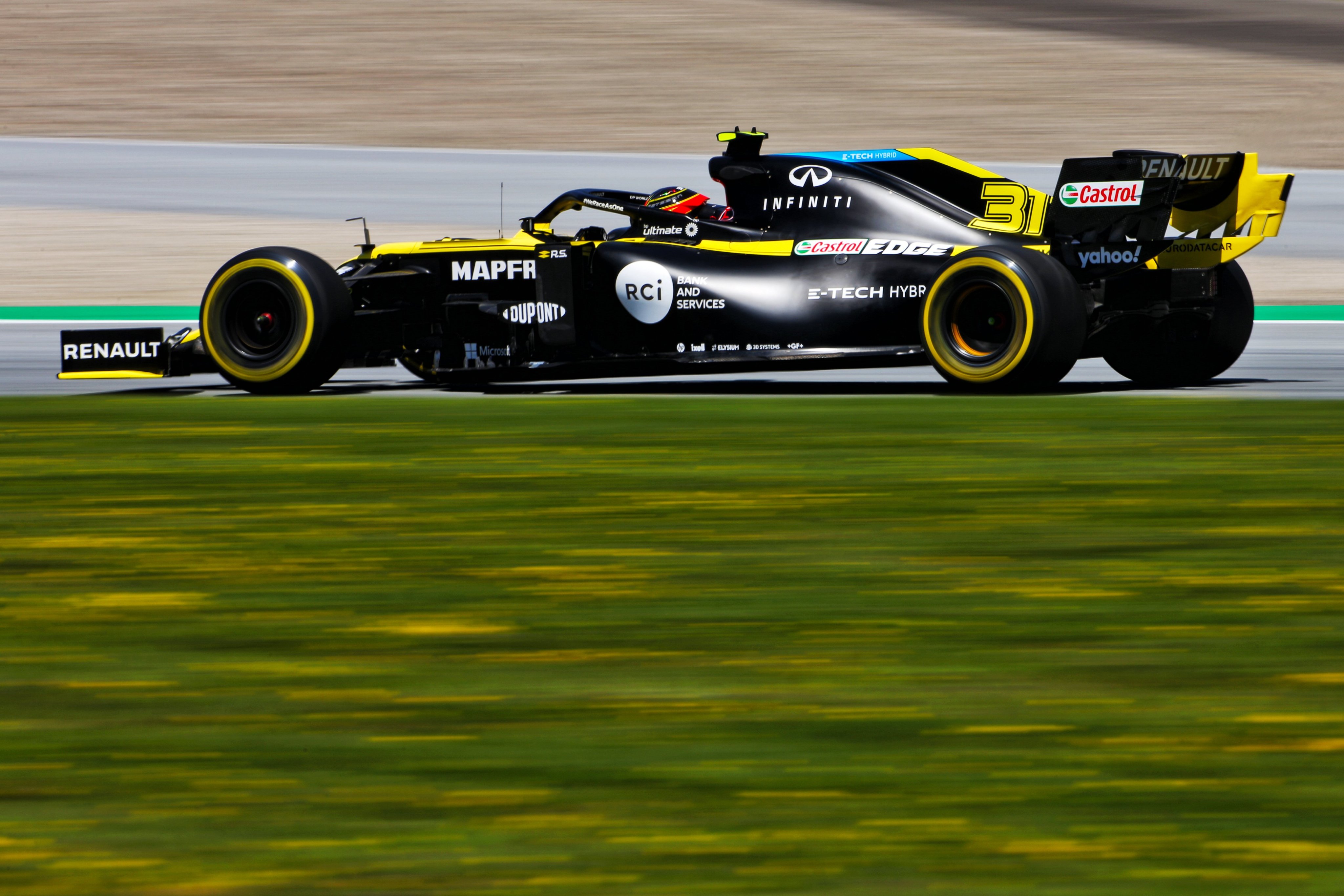
Renault DP World F1 Team
Renault has only made very minor changes to their livery this season, and why would you when it was already close to perfect.
Sure it might be the third year in the same livery, but it’s still quite wonderful. The slightly cooler, more bright yellow brought in last year remains, as does the placement of most of the colour and sponsors.
The biggest change, and a sign of the times really, is that the black portions of colour on the car are a matte paint, as opposed to the regular gloss for the yellow. I’m not against matte paint, but I feel as though gloss is fast becoming underrated, and I wonder if matte is here to stay or just a fad. Another big change is the very bottom yellow stripe being removed, replaced with technical sponsors that used to be on the floor’s carbon fibre.
Lastly, there’s the addition of the blue tripe on the top of the shark fin, promoting Renault’s hybrid brand, “E-Tech”. It works well, albeit disrupting the colour flow. Black and yellow is a great colour combo, it’s well placed on the car, and that’s why we love this livery.
★★★★☆
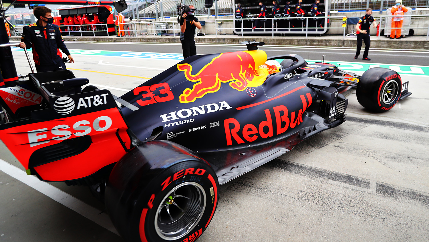
Aston Martin Red Bull Racing
Much like Renault, there’s very little change on this year’s Red Bull, in fact, I don’t think there’s any!
So not a whole lot to describe then. It’s still matte, there’s still a big bull on the engine cover and it still looks very nice.
I’m surprised to see so little evolution this year. Even in the Vettel days, Red Bull would tweak a couple of things here or there, but I guess if it ain’t broke, don’t fix it.
That said, I hope we see something at least a little different next year. I know we can’t hope for much, they have a brand identity they will always stick to, but we can hope at least for a livery that isn’t identical. Aston Martin becoming their own team next year is a sign of hope, but the likelihood is that they’ll just replace their logos with a new sponsor, or just more Red Bull stickers.
★★★★
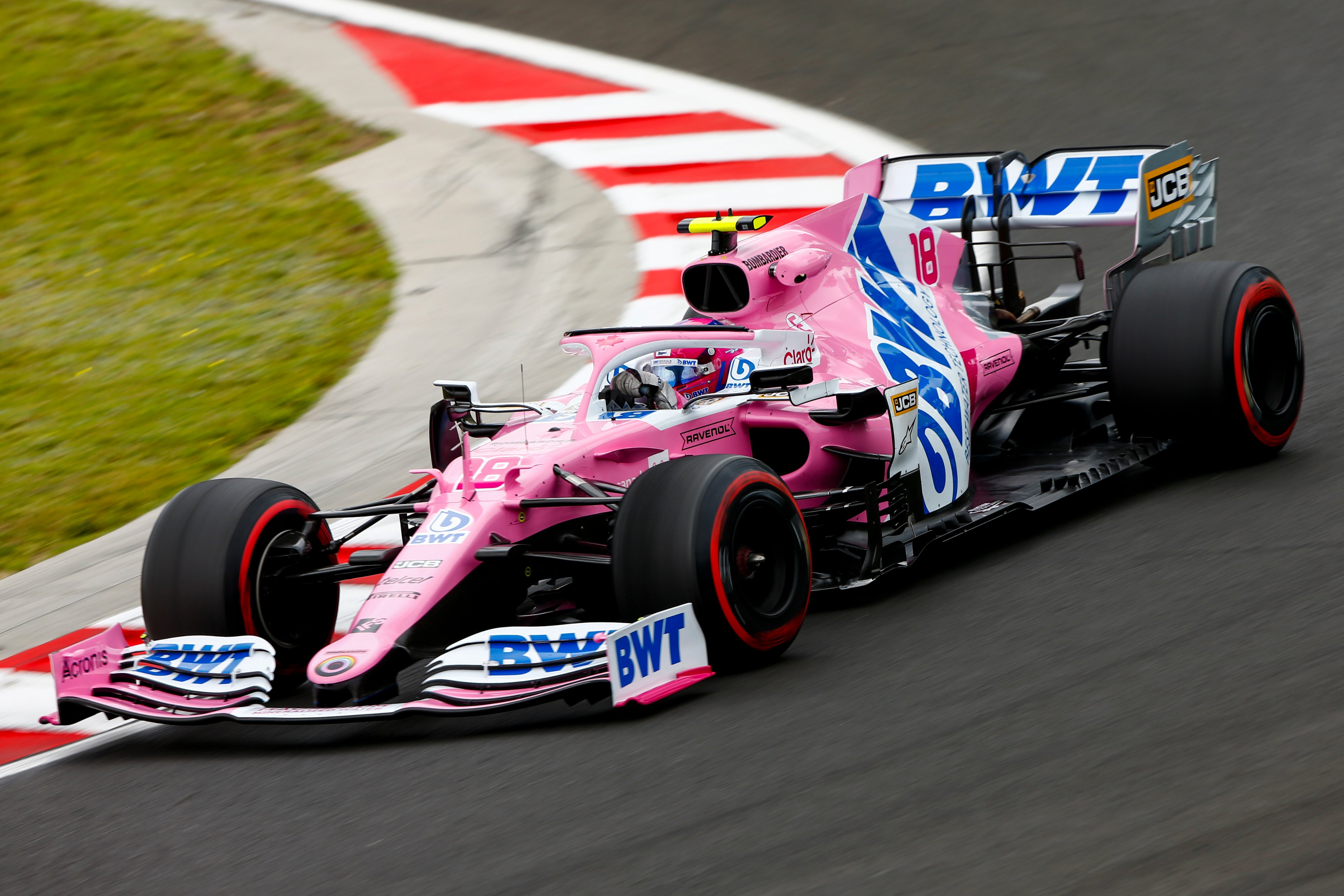
BWT Racing Point F1 Team
So it seems this may be the end of the pink panther in Formula 1! Sure, some pink may feature on next year’s car if BWT stay on as a sponsor, but Aston Martin will almost certainly dictate the colours, so enjoy it while it lasts.
It’s very difficult to beat last year’s livery, which I thought was pretty much perfect. The departure of SportPesa means the lovely deep metallic blue is gone and BWT are back to using their lighter shade of blue, which I don’t think provides as good a contract to the light, bright pink.
That said, they’ve gone against the grain with the BWT logo diagonally covering almost the entire side of the car, which is more common in oval racing. It makes the side look a little lacking in terms of design and kind of empty, although the angled white and pink lines along the logo are sufficient albeit basic.
The white around the cockpit is nice, and very nice on the underside of the halo, although it ends a little abruptly. There just isn’t the same level of intricacy when compared to some of it’s predecessors, and it makes this livery look a little bland in comparison.
★★★☆
Mercedes-AMG Petronas F1 Team
Well I don’t think anyone expected this! Perhaps at Hamilton’s request, who has in recent years become outspoken and a great activist for human rights, animal rights and other great causes, Mercedes has for the first time entered an F1 season in a colour other than silver.
The black livery supports Black Lives Matter and in supporting a great cause, they’ve created a stunning design. I’m so surprised to see so many white cars on the grid this year, when every time a black car is launched, everyone falls in love. This is no exception.
Everything that was great on the silver livery is even better here. The turquoise flashes of colour pop incredibly well against the black. The silver arrow pattern along the side and rear look even more elegant as a light on dark combination. The additions of red for Ineos blend in so much better here than they did on the silver version.
Everything works and looks fantastic. I can’t imagine they’ll stick to black for another season (but who knows with Hamilton still in the seat), so let’s enjoy this while it lasts. They’ve absolutely outdone themselves with this effort, in all aspects.
★★★★★
McLaren F1 Team
McLaren started the season with a bang, and with the team moving to Mercedes engines next season, it seems the only way is up. Sainz may need to make hay before he leaves for Ferrari! That said, the papaya is back for another year and it’s as wonderful as ever.
I for one am quite sad to see the triangle pattern ditched for this season. It quickly became the teams identity and was loved by fans, so I’m surprised they didn’t keep it in some form for 2020. That said, my disappointment quickly subsided as the new livery is also very, very good. As mentioned the lovely papaya remains, although the blue used this year is a little lighter, and doesn’t have that neat metallic look. The contrast isn’t as strong, but doesn’t bring the livery down much.
This livery is quite traditional, with the long, simply segmented sections split along the side of the car, as has been done for many decades. The complexity comes within these sections, with the piano key like designs (now in rainbow colours for #WeRaceAsOne) on the sidepod and on the engine cover spicing up the bold solid sections, rather than a simple fade to black. Another great thing is they’ve finally painted the halo in papaya, rather than black, which was the only real downside of last season’s livery.
What I’m not a big fan of is how the black section is brought up onto the nose. While it frames the logos well, I’d much prefer this secondary colour not spill onto the ‘top’ of the nose, and rather done like how the black is used on the Renault’s nose. I know it has to do with hiding the ugly nose tip and supports, but the Renault method is much nicer, and is in fact the one McLaren used successfully last season. It’s another papaya stunner from McLaren, but just not quite at the same level as 2019!
★★★★☆
Haas F1 Team
You know, what I said earlier about all black cars being stunning may have been an exaggeration, because the 2019 Haas wasn’t the prettiest or most elegant livery we’d ever seen. For that reason, I’m quite glad their factory colours are back, and in a slightly different fashion to its predecessors.
We’re back to black, white and red (no grey this time) and it’s nice to see. The classic Haas design has returned, with the black section on the sidepod half way up the main logo – it’s always looked great.
There’s a lot more black on this effort than it’s previous iterations (not including the Rich Energy livery) with the side sections in front of the sidepods in all black. The nose, which was my big gripe with the previous Haas cars, is also far cleaner. The black being on top of the nose isn’t so bad here as it start way back, not as abruptly as on the McLaren.
There’s a little red arrow arrow breaking up the black and white in front of the cockpit too, which is a nice touch, although probably could’ve been utilised elsewhere on the livery too. Overall, it’s a corporate livery done well.
★★★★
Scuderia Ferrari
Ferrari started the season with the shock announcement they wouldn’t be extending Vettel’s contract, and later announcing Sainz as their new driver. Given recent results, it may be a blessing in disguise for the German!
The team has been unable to use Mission Winnow logos on the car so far this season, leaving a gaping, empty hole on the engine cover. More than ever, this exposes the Ferrari for the giant moving red billboard it really is. The only design elements are the sponsor logos and I’ve never been a fan of Shell, UPS and Ray-Ban slapped on to the sidepod together in a row.
I lie, there are some subtle design elements on the car. There is a carbon fibre stripe along the bottom of the car featuring the technical sponsors, as well as some more carbon fibre on the halo and the wing tips. There has indeed been some effort put into the livery other than sponsor logos.
The only other thing to talk about really is that they have kept the matte red from last season, and I guess I can’t be mad about it. At least the red they’ve chosen is bright and really stands out from the rest (as usual). I can also mention that the numbers aren’t very nice, but pinstriping isn’t really my thing.
★★★
Scuderia AlphaTauri Honda
AlphaTauri was the one real unknown going into the new season. There was talk about a black livery and we all got pretty excited at the thought. It came out white and navy blue, and I have to say was a little underwhelming, especially when the Toro Rosso has been beautiful the last few years.
I was surprised to see so much white! If I was to make a statement as a ‘new’ team, promoting a new brand, majority white wouldn’t have been my first choice. That said, the main design feature on the car is one big ass AlphaTauri logo on the whole side of the car, so it’s not like they aren’t getting exposure.
The other is just the big swooping navy blue section acting as the background to the giant logo, which ends abruptly in front of the cockpit. There’s another logo each on the front and rear wings, in case you missed it on the whole side of the car. The design just seems a little uninspired, and quite frankly I think a plain navy blue would have looked way better and distracted less from the logo, which they clearly want to be seen as much as possible.
The only other annoyance is the Honda logo being in red. A perfect chance for a two tone livery ruined, and sure, while it makes it stand out more, it kinda disrupts the livery. Yeah, I’m a little disappointed by this one. It might be a little boring, but a plain navy blue version nice, doesn’t it?
★★
Alfa Romeo Racing Orlen
It’s been a disastrous start to the season for Alfa, struggling with Ferrari’s engine performance advantage all but gone. They’ve really been nowhere, which is a shame!
One upside this season is that with the arrival of Kubica as a test driver, Orlen has also jumped on board, filling the sponsor gap in their sidepod. Another good thing to see is they’ve kept the lovely shade of red from last season, which looks terrific under the shining sun.
Sadly it looks as though almost all reference of Sauber has now disappeared, with the navy blue stripes and Swisse references on the rear wing all gone. Just the Sauber Engineering logo remains is very small writing. Unfortunately, they’ve kept the same pinstripe design along the nose and changed it to red. Another annoying aspect is that Orlen and Huski are very slightly different shades to the main colour of the car. Curse those brand guidelines!
There is one nice new addition though, with some white flashes working as a very slight gradient on the engine cover, adding some complexity to what was a straight forward design the last couple of years. That said, it feels like two liveries in one, with the front and the rear not gelling perfectly at all. I wish they’d just use a solid chunk of red on the nose rather than those thin little stripes. It’s also a little cluttered, a little wordy, but not enough to lose points over.
★★★☆
Bonus Awards
Best Looker Award – Mercedes
They really have outdone themselves this year. At least it’s a beautiful car that will be winning every race!
Least Attractive Award – AlphaTauri
Maybe it has a little to do with high hopes, but this was a real disappointment. Could have been a really fantastic livery, but who knows, it will probably grow on me.
LARGEST LOGO AWARD – AlphaTauri
Who would’ve thought Racing Point’s BWT logo wouldn’t be the biggest? The AlphaTauri logo literally takes up half of the car, and there are two others on there to boot. When you have enough money to not need any other sponsors, you can do whatever you want!
Blessing in Disguise Award – Williams
Rokit are a no good company, and them leaving lead to an even better livery! We’re all winners in this one (apart from William’s probably not getting as much money as they’d expected).
So which was your favourite? Vote down below and leave a comment!
It’s that time of year again, and whilst I’m no graphic designer, I love having a go at mocking up some realistic-ish liveries for the year ahead. I take as much from the latest news and announcements in terms of sponsorships and try to stick to a team’s ethos as much as possible, with some artistic liberties here or there.
Alfa Romeo
Starting off with Alfa Romeo this year, and something a little more adventurous than last season. I had toyed at using as much of the lovely red as possible, but it ended up looking way too much like Ferrari, so went with a split design, keeping the Sauber spirit with the navy blue on white. It’s one long swoosh from nose to tail, changing abruptly between white and blue depending on the background. The car is quite sponsor heavy in the end, but based on last season’s design, it will probably continue that way.
Alpha Tauri
We’ll be introduced to the second generation of the “Red Bull B Team” in 2020, and the second Alpha (kinda) at the same time. Alfa Tauri, Red Bull’s fashion brand, will be taking over the car, and many are predicting a black and white car based on their branding, which I ran with. It’s a colour combo that’s been pulled off well in the past, especially when black is the main colour. I’ve used simple sections of black and white, accompanied by some more complex small parts of colour, with the diagonal lines breaking up the smooth flow. The graphic logo takes over the traditional big bull on the engine cover, although it’s soul remains, faintly behind the text logo.
Ferrari
My inspiration ran a little dry when it came to Ferrari this year, but I’m optimistic for the real thing, seeing as their last couple of liveries have been increasingly modern and experimental. They’ve ditched most of the white in their livery, so I’m continuing with a dark theme, white limited to sponsors only. The wings are black, along with a large strip starting from the exhaust to just in front of the cockpit. As with the Alfa Tauri livery, I’ve added some thin lines which mimic the Mission Winnow logo and help add some complexity to the otherwise simple livery. I for one hope they ditch the matte paint in favour of gloss this year.
Haas
I was disappointed when Haas’ calamitous relationship with Rich Energy ended, without really turning the great colours and (stolen) logo into an awesome design. It looks as thought we’re headed back to traditional Haas colours, but hopefully with a little more jazz than we’ve seen in the past. I’ve gone for a very simplified camouflage paint to the car in different shades of black and grey, with a long, sharp light grey/bright red accent line through the middle. The Haas logo also has a small red outline/shadow, to help it pop further from the dark background. I think it’s keeps things interesting in a subtle way, and not too outside the box for the team to realistically run.
McLaren
If any livery was going to be way off, it would be this one. McLaren are thankfully going to keep the papaya, but to what extent, nobody knows. My thinking is they’ve created a very strong brand image with the blue triangular pattern, so expanding on this would make sense. I’ve removed the black sections and made it just papaya and blue, but with new sponsors hopping aboard left and right, there’s no saying what colour will feature alongside papaya in 2020.
Mercedes
I must have been a fan of the logo pattern on the car last year, cause I’ve used it in hope that Mercedes will run with it again in 2020. It works really well on a dark background, fading into silver. I’ve kept it subtle with the turquoise as Mercedes always have, the thin line bouncing above and below the black section along the bottom of the car. Other turquoise flashes also appear on the car in a similar fashion.
Racing Point
Everyone was happy to hear that Racing Point will be renamed Aston Martin in 2021, but what will the car look like in 2020? Not sure the level of investment they’ll put into the team this year; maybe it will just be a logo on the side, just like last year’s Red Bull, or perhaps they’ll wait it out entirely til 2021. I’ve banked on them putting in some coin straight away, and dictating the livery from next year, with the twist of BWT also keeping some pink on the car. I’ve also gone against reality to an extent using majority British racing green as opposed the neon green from their sports car liveries, which is only used sparingly as a highlight. So do dark green and pink go together? Decide for yourselves. I’m biased but I kinda dig it in a very weird way.
Red Bull
So what do you do to a livery that already works very well, for a team with strict branding, that doesn’t change it’s liveries very often? It’s very restrictive. What I’ve tried here is a neon-ish theme, with outlines only for the areas of the car normally filled with colour, apart from the text and graphic logos. It’s not much of an evolution on last season’s livery, but enough to keep it interesting year on year. As good as it has been for the last few years, it risks getting stale without some form of evolution.
Renault
For Renault, it’s more of a refinement than a major change. I love the effect the current car has in being majority black from the side and yellow from the front, so I’ve kept this theme in my design (although you can’t really tell given the angle. I’ve kept each yellow section solid, rather than having pinstripes, and have kept the colour as vibrant as possible. I’ve added some extra yellow to the airbox area, as well as the halo, which more teams should start exploit with their designs as opposed to attempting to hide, now that everyone is used to its appearance. A little unrealistically, I’ve kept it entirely two tone, including sponsor logos. A man can dream – it’s a visual effect not seen often enough due to strict branding guidelines.
Williams
Finally, a team down in the dumps, without any real hope until the regulation changes in 2021. Traditionally, Williams will keep a livery design for 5 or so years (sponsorship permitting) without much variation at all, so given Rokit is still around, I don’t see much change afoot. That said, with a couple of new sponsors in thanks to Latifi, I do predict a couple of amendments. I’ve assumed Lavazza will appear on the sidepod, so I’ve had blue fade into Lavazza’s darker blue, to act as a background to their logo. What bothered me about the livery last year was that the blue looked like it was sprayed on top of everything at the very end, and how it looked a little careless on the nose. I’ve made sure the blue fits in better with the sponsors, and have broken up the gradient with a sharp transition to white from the side to the top of the nose and cockpit section. It’s a little bare, but not too obviously so.
Looking forward to an exciting year of racing ahead, and hopefully some pretty liveries to go with it.


