The first race of the season in St Pete is done and dusted, and what a victory it was for Scott McLaughlin. I was stoked to see him get his first win after watching his domination in Australia, but I wonder if Americans are as keen to see another Kiwi in victory lane! Either way, we’ve seen some familiar liveries return, and some new ones join the grid for 2022. Let’s see which ones impressed, and which ones disappointed.
Top 3
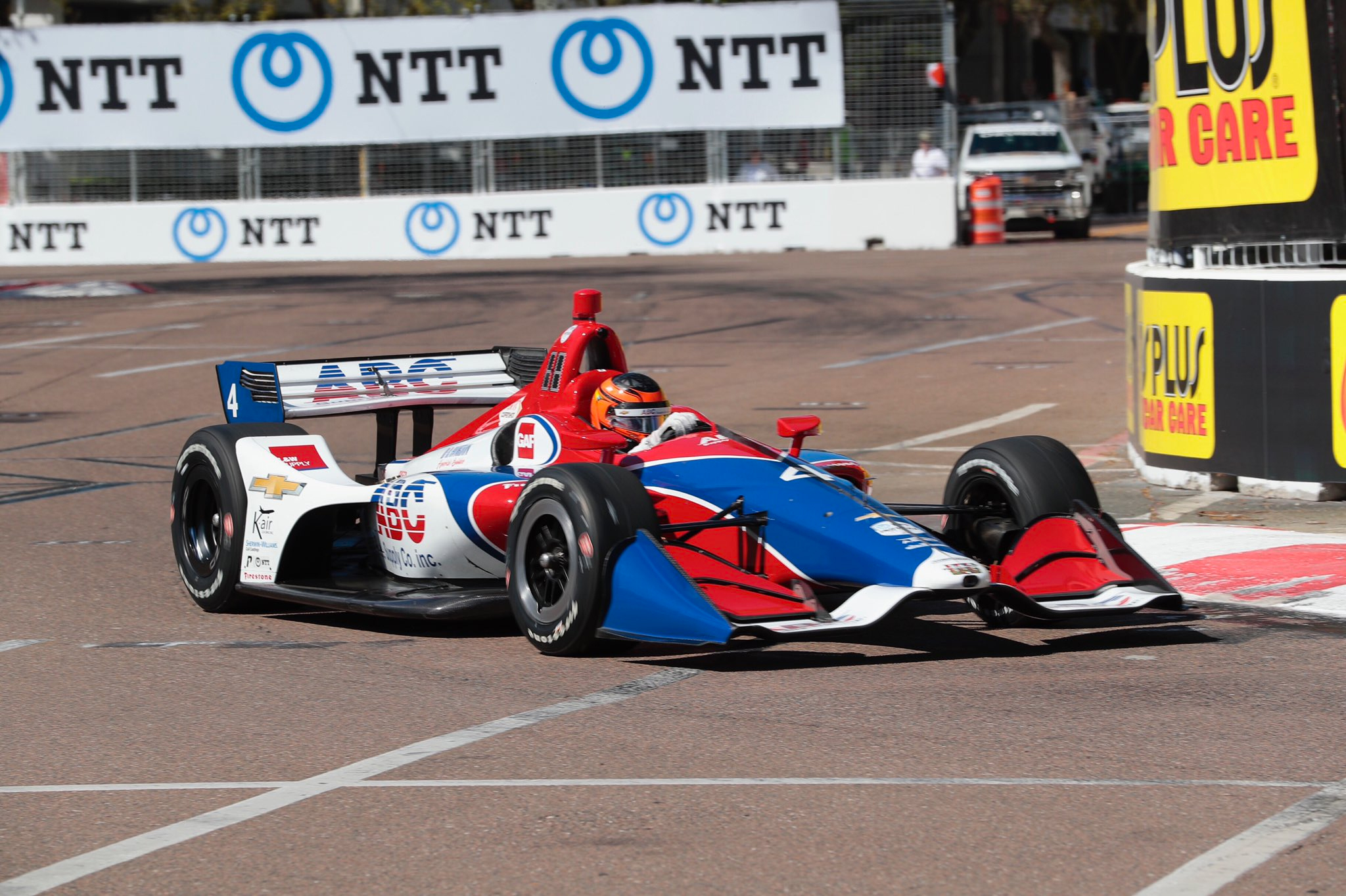
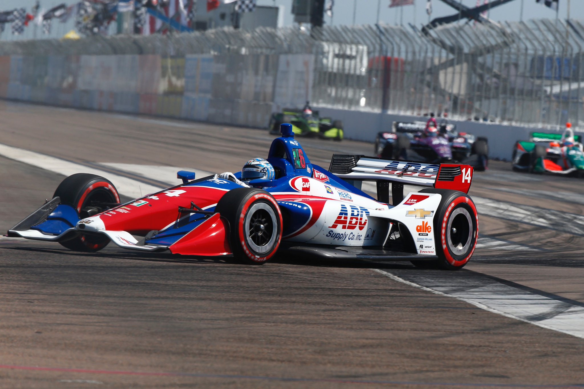
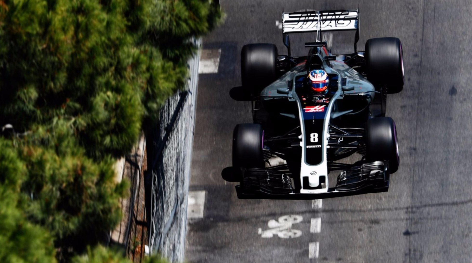
#3 – Kyle Kirkwood A.J. Foyt Enterprises
All black cars are thing of beauty, when executed correctly. Whilst all white cars can look plain and empty, all black cars usually look sleek and aggressive; this one is no exception. The livery is no frills, but with the two tone colour scheme using just about all white sponsors, it stays classy where it can’t be as exciting.
I’m usually a gloss paint fan, but the matte finish here give off a gritty, gunmetalor even military feel. Shame about the sponsor though, and the placement of Rokit on the side does look a little funny, but not enough to keep it out of the top 3.
#2 – Conor Daly Ed Carpenter Racing
I’ve become quite partial to two tone blue liveries of late (foreshadowing?) and this effort from Ed Carpenter Racing passes the test. The deep navy is a real winner of a colour, and the lighter blue that accompanies it is a terrific partner on the car. The linework and placement is well thought out too.
Gold on motorsport liveries is pretty contentious and difficult to get right. It can go from beautifully iconic (e.g. JPS Lotus) to pretty gross (e.g. Wannabe JPS ‘Lotus’ Renault). The shade of gold has to perfectly match the rest of the livery. This one is a good choice – not too dark or cool so it complements and contrasts the blues well, and the metallic nature helps it sparkle in the sun where the other colours don’t. A good overall livery.
#1 – Pato O’Ward Arrow McLaren SP
McLaren’s new fluro orange has been quite a revelation this new year. Their old papaya was obviously a fan favourite and whilst I was a sad to see it go, this is a really interesting new colour, and very attractive in its own way. Paired with this mostly black livery and alongside the light blue accents, it ends up in a beautiful livery.
Whilst the two McLaren cars are very similar, I think the Arrow car looks much nicer than the mainly blue Vuse car. There was a lot of buzz around the Gulf livery at Monaco last year which I think the team is trying to cash in on with some of their liveries this year, but I don’t think they are as pleasing to the eye as the mainly black version above. A well thought out colour scheme and placement has lead to a fantastic livery.
Bottom 3
#3 – Josef Newgarden Team Penske
There aren’t many hideous liveries this year, but there are quite a few really average ones. Given my disdain for this livery in the past and the fact it’s been around for so many years, it really was a shoe in for the bottom 3.
Give us something different Penske! Mix up the design a little, give us a bit of a refresh, maybe throw in a new colour or at least a different shade? They managed it with Will Power’s Verizon livery, so not sure why the Hitachi car is so set in stone. So bored of this, so I’m very glad it won’t be seen at every race and even more happy to hear the wonderful PPG livery McLaughlin raced in last year will be one of the replacements.
#2 – Graham Rahal Rahal Letterman Lanigan Racing
Like the Newgarden livery, this is by no means an ugly design, it’s just so uninspiring. I can understand that a team template needs to be versatile, but it also doesn’t mean it needs to be boring. These are just stock standard colours, with a really basic design.
Just some real generic/default livery vibes from United Rentals car, especially given there’s so much white on the car. I feel like a majority blue design could have spiced this up a little, or at the very least taken it out of the bottom 3.
#1 – Alexander Rossi Andretti Autosport
Well this livery is just kinda gross. It very much reminds me of the early 90s Brabham F1 car which was also quite hideous. If BWT has taught us anything, it’s that the right shade of pink is vital when mixing it with other colours, and this ain’t it.
The super vibrant pink and the saturated blue clash horribly in my opinion. Add the yellow Napa logo and it just compounds the disharmony. Perhaps with a unique design as opposed to the standard Andretti template, these colours could have worked better to together, but it stands, it is the worst livery in the field.
So what do you guys think? Do you agree with my choices, or are there other cars on the grid that you think are more deserving? Either way, it seems IndyCar liveries get chopped and changed pretty frequently, so we’ll see if these standing change come the 500.
Who needs a review of every single car that entered the 2021 Indy 500? Who would even bother reading that! For this reason I’ve decided to do a summary of the best and worst liveries that we saw during this years running of the race, starting with the three best!
Top 3
#3 – Santino Ferrucci
#45 Rahal Letterman lanigan racing
I had really intended to put this livery in the bottom 3 when I first saw it. It’s pretty damn weird, and photo realistic graphics never seem to work well on liveries, yet for some reason I’m quite partial to it! The contrasting colours and styles of the plain red section and the big green splash work very well together, like a watermelon that’s just been split open.
I do wish the splash hadn’t crept behind the HyVee logo as much as it did, but that said, they’ve done very well to create a nice space for that logo to stand out on its own. The darker green section isn’t quite as nice as the lighter green splash graphic, but it doesn’t attract as much attention anyway. It’s a type livery that I’ve trained myself to hate over the year, but just can’t bring myself to do so on this occasion.
#2 – Marcus Ericsson
#8 chip ganassi Racing
I know it’s not it’s not a special Indy 500 livery, and that it’s pretty much the same livery as last year, but I still really like it. I can’t say the same for most red and white liveries, but the really clever alp design separating the red and white halves of the car is just really, really neat.
Not much else to say apart from it’s really clean, all the sponsor logos are uniform in their colours and placement and that it’s just a great car to look at from close up and from a distance.
#1 – Rinus VeeKay
#21 Ed Carpenter Racing
Has there been a livery more relevant to current events and culture than this one? Bitcoin on an Indycar! And what a funky design at that. Black with orange polka dots! It’s quite bizarre but in a really attractive way. Each dot is well spaced and thoughtfully placed across the car, ensuring it doesn’t look too clustered, and also doesn’t detract from any of the sponsors. It actually gives me really strong Christijan Albers vibes, like an inverse version of his helmet.
It’s a really fun and out there in a world of very serious liveries, but also pays great attention to detail, for example the suspension being painted orange when it is usually untouched carbon fibre. This cheeky design stood out superbly in an extensive Indy 500 field, and for this reason and the others stated above, it’s my pick of the bunch.
Bottom 3
#3 – Josef Newgarden
#2 Team Penske
The Penske livery template can be a blessing and a curse. In the hands of Pennzoil, it can be quite attractive. In this instance, it’s probably one of the most boring iterations of the design. Black and white liveries need to be either wild or super sophisticated to stand out, but it’s neither of those things on the #2 here.
The same sponsor on another team could have had a lot of potential, but being forced to stick with this standard design template really killed this livery before it could even begin. I’m not sure why this is the case for the #2 though, because Scott McGlaughlin has been racing in the absolutely stunning PPG machine most of the season, which I’m sure would have been ruined itself if it had to follow the template.
#2 – JR Hildebrand
#1 A.J. Foyt Enterprises
I’m not sure if I’m going to offend anyone with this as I know it’s a tribute livery for Foyt’s first Indy 500 win, but it just isn’t that nice! Tribute liveries are pretty good more often than not, but on this occasion it really leaves a lot to be desired. Maybe the nostalgia of this livery just doesn’t resonate with me, but the shapes of the cars have changed so much in the last 60 years that it’s very hard to make something resemble the original livery whilst looking good.
I’m not sure what could have been changed to make this better, but perhaps that’s the point. A livery that took up the entire car in the 60s only really take up a third of a modern IndyCar, leaving a lot of unfilled space, most obvious on the completely blank engine cover. Perhaps some more creative freedom as opposed to exactly matching the original would have helped the cause. It’s a great idea in theory, but misses the mark in reality.
#2 – Pietro Fittiapldi
#51 Dale Coyne Racing with RWR
The #51 is a textbook combination of elements that leads to a bad livery: disjointed design, clutter and white space. The orange section kinda just stops on the sidepods; it doesn’t flow anywhere, it just ends abruptly. Why is the little blue ribbon behind that orange section there? It needs to either feature alongside the nose orange section as well, or not exist at all. The sponsor on this orange section also just doesn’t look good on the car.
Then there’s the white space. Despite being plastered over with minor sponsors, it still feels like a big empty space due to the lack of actual design on those parts of the car. A couple of small, intricate elements would certainly have helped here, both to break up the white and put the logos into some order. Speaking of sponsors, there are so many of them. Sadly not every team can partner up with companies that hand over the big bucks, and therefore this car would have been destined to suffer from clutter from the outset. It’s unavoidable to an extent (although it can be conquered on the rare occasion), and is another element that helps this livery to be the worst of the 2021 Indy 500 field.
Not a whole lot of excitement on the livery front for IndyCar this season. Most of the cars haven’t changed! Let’s look into them anyway – in reverse alphabetical order for a change!
Team Penske #2 Josef Newgarden
No change for Penske’s overall team design, or for Newgarden’s car in 2019. They’re not the most inspiring or exciting colours, but I’ve grown to be content with the simple design.
It’s been the same for a number of years which is slightly frustrating, but the aging effect would be more prominent on a more complicated livery.
★★★
Team Penske #12 Will Power
There isn’t a whole lot to say for any of the Penske liveries – Power’s is also the same.
I think this has solidified the #12 as my pick of the Penske bunch, I guess I’ve got a new thing for silver cars of late.
★★★★
Team Penske #22 Simon Pagenaud
See above! I still like the thin red and black lines in parallel along the car, as opposed to the thick ones on the #2 & #12.
A little indifferent to the fluro yellow at this stage, but it definitely stands out of the pack.
★★★☆
Rahal Letterman Lanigan Racing #15 Graham Rahal
Graham Rahal ran in a fun design at St Pete, using those same black, white and red colours as the #2 to a much greater effect. It reminds me a bit of the Team Mugen Super Formula livery from a couple of years ago, in how the red Total stripe wraps across the side and top of the sidepods.
It looks fantastic from the top view; the thick Total stripe curving beautifully all the way to the exhaust. Keeping the black on the cockpit side of the red line and away from the white is a great choice, as is the red directly in front of the cockpit, which wraps the section up perfectly.
★★★★★
Rahal Letterman Lanigan Racing #30 Takuma Sato
There’s a bit of a theme this season in lack of change, and the same almost goes Sato’s #30. This was one of my five star liveries last season, and the only difference is the nose, where the metallic blue extends further and is bordered by white instead of navy blue in front of the cockpit.
Not sure if it’s the change above, but I’m not quite as in love with this as last season, but it’s still a great looker. Great to see Taku back on the top step of the podium again this week too!
★★★★☆
Meyer Shank Racing with Arrow Schmidt Peterson #60 Jack Harvey
There have been some slight alterations to the colours of the Schmidt Peterson cars – the purple on Harvey’s car appears to be slightly lighter and less metallic. This works wonders, because last year’s effort was just too dark, with the already dark shade of purple only have black for light to reflect off.
It looks very different because of this, despite the design being the same. It’s opened up the car nicely and is therefore, a lovely improvement.
★★★☆
Harding Steinbrenner Racing #88 Colton Herta
Harding has teamed up with George Steinbrenner for 2019 (who’s family has a long legacy in baseball) and at 22, young George is blazing a trail in Motorsport as the youngest team owner in IndyCar. Last year’s Harding car was already a good looker, and despite changing colours, has remained so.
They’ve gone with black, white and sky blue accents which is terrific. The white, feathery design on top of the sidepods has evolved and almost looks like a Kiwi silver fern design. It’s almost regal from the top view, and the pinstripes along the side of the nose and rear really top it off. The blue on the usually unpainted suspension is also a neat touch.
★★★★★
Ed Carpenter Racing Scuderia Corsa #20 Ed Jones
I’m slightly confused by the lack of change on the Ed Carpenter machines. Whilst they weren’t ugly, there was absolutely nothing spectacular about these liveries last season, and I’d even compared them to the messy mid 2000’s Minardis.
Ed Carpenter Racing #21 Spencer Pigot
Nostalgia aspect aside, there’s not much to love about this livery. It’s very simple, but not in the most aesthetic way.
However, black is probably the correct choice given the multicoloured sponsor logos, but I’m sure a little more red and blue rather than white could have given some more personality to the livery.
★★
Dragonspeed #81 Ben Hanley
Ben Hanley and Dragonspeed are only racing at five events this season, but I’ve included them seeing as they raced in St. Pete. It’s a mainly white, patriotic livery, and almost looks as if someone was trying to put the 76ers uniform on a car. However, it suffers in that it looks quite bland and a little cheesy with with stars and stripes.
The Rembrandt Charms logo is awkwardly small on the sidepod, and I’m confused by the camera on the roll hoop being yellow – it goes against the rest of the livery. It does however, match Hanley’s helmet, which is likely what they were going for.
★
Dale Coyne Racing with Vasser-Sullivan #18 Sébastien Bourdais]
Only minor changes for Bourdais this year, in fact, the only change of note is the #18 being black instead of red on the nose.
Sponsors and all, I’m fairly sure that’s about it! It’s still a really nice, distinctive livery, and tones down the fluro yellow sufficiently enough to not be confused in any way with Pagenaud’s car.
★★★★
Dale Coyne Racing #19 Santino Ferrucci
After being booted by his F2 team last season, Ferrucci was picked up by Dale Coyne for the last two races of 2018, and now for the full 2019 season. Chrome is a look that was pioneered by McLaren in the mid 2000s and has seen a bit of renaissance of late. What I disliked most about those McLaren liveries was the Vodafone red that went along with it, but there’s no such problem here.
It’s beautifully understated, with only the lightest of touches, such as the black on the engine cover and red mirrors and numbers. I’d have preferred only black as a secondary colour – it looks fantastic for the main sponsors, but perhaps red stands out better. Oh, and don’t forget the little American flag on the rear wing end plate.
★★★★☆
Chip Ganassi Racing #9 Scott Dixon
No change at all for Scott Dixon’s design this year. It’s a strong enough livery to keep around for a second season but given the busy pattern, it will age quickly.
The pattern itself is a clever use of the PNC Bank logo, but is a little clunky looking close up, especially in the thicker areas. Orange and blue is one of my favourite combinations going back to my childhood, but I still don’t find myself loving this one.
★★★
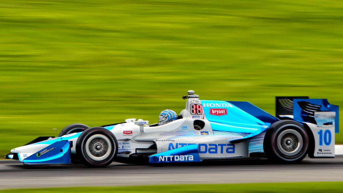
Chip Ganassi Racing #10 Felix Rosenqvist
The NTT Data car, now with Rosenqvist at the helm, has undergone a bit of an evolution on the livery front. The dark blue area has expanded to cover most the of the ‘top’ of the car, which is an effect I really enjoy. However, I feel as though these usually look best with the lighter colour on top – not to say this isn’t a good effort. It’s still bordered by a a strip of chrome which is a nice touch.
Some white has also been added to the wings, as well as a touch on the engine cover, which is welcome and an improvement on last season. The whole livery, especially from front on, has a distinct old school feel. Perhaps it’s Player’s Forsythe vibes, but whatever it is, it’s welcome.
★★★★
Carlin #23 Charlie Kimball
Kimball won’t be a full time driver in IndyCar this year, but when he is racing, he’ll be rocking the same colours as 2018 (or at least he did in round 1). I’d have loved to see more of the green in pinstripe form as opposed to the faded pattern on top of the green, as they are my favourite feature, just in front of the rear wheels.
Black rather than charcoal also may have better choice, but unfortunately we don’t get a say in the matter.
★★★☆
Carlin #31 Patricio O’Ward
Alternating with Kimball at Carlin will be rookie Patricio O’Ward. The young Mexican, who’s name threw me off for a short while, has seemingly been successful in everything he’s driven so far, so there’s no saying it won’t be the same in IndyCar. His livery is proudly emblazoned in his home country’s colours, but not your stock standard ones! The green used here hints toward mint – a refreshing (sorry) shade not often used in Motorsport.
The design is a little generic, but is spiced up not only by the non traditional choice of green, but also by the non-traditional line-work, with each section not perfectly bordered by the next. To nitpick, what could have been nice would be leaving an edge of the red sections not bordered at all by green and instead against white, but it’s a pleasing all round effort nonetheless.
★★★☆
Carlin #59 Max Chilton
The Gallagher car of Max Chilton has seen some significant movement for 2019, changing to a mainly sky blue colour scheme. It’s a questionable decision given how cohesive the car was last year, but also as the NTT Data Chip Ganassi car has owned the colour for a few years now. While it isn’t difficult to tell the two apart, Gallagher isn’t the first thought that pops to mind when I see the colour scheme.
The design is strong in parts – I especially like the engine cover and cockpit area, where the white sections are thicker and more evenly distributed with the dark blue. It has a stronger effect there than when it is piped on as a thin border to the dark blue on other parts of the car. It’s still a good looking livery, but some tweaks could have turned it into a stunner.
★★★★
Arrow Schmidt Peterson Motorsports #5 James Hinchcliffe
As mentioned previously, Schmidt Peterson Motorsports have tweaked their paintwork, using less reflective colours on their cars than in previous years. While this resulted in a more vibrant livery for the Meyer Shank car, it’s had an opposite effect here. The gold colour used is a little too far to the brown side, so moving away from the highly reflective paint has actually caused this car to look quite dull.
Arrow Schmidt Peterson Motorsports #5 Marcus Ericsson
Same goes for new boy Marcus Ericsson, who looks forever destined to be three Grands Prix shy of a century in Formula 1. The #5 uses same livery, and suffers from the same issue. The design itself hasn’t really changed, and is a simple but attractive effort, with the black contrasting sharply against the colour it borders.
★★★
Andretti Autosport #26 Zach Veach
The Andretti design also looks to be unchanged this year, however, Veach’s sponsor and livery has. Gainsbridge has brought some striking black and yellow to the #26, with some subtle blue complementing the overall effort.
While based on the same design, each Andretti car has its own quirks, the main one I can see here being the yellow arrow on the front wing end plate. It’s a nice little touch, and a little improvement where a plain blue end plate would have sufficed. It still looks a little plain from directly side on, but pretty snazzy from the angles above.
★★★☆
Andretti Autosport #27 Alexander Rossi
Continuing the theme, the NAPA car driven by Rossi is unchanged, but rightly so. It was a solid improvement from 2017 to 2018, so a safe bet to not make further alterations.
Whilst I like the red in flashes on the mirrors, camera and suspension, I’m not as big a fan of it bordering the yellow along the engine cover and cockpit. Sticking with just blue and yellow, as is the case on every other part of the car, would have looked better.
★★★☆
Andretti Autosport #28 Ryan Hunter-Reay
No changes for RHR either. I’m a big fan of two-tone, and it works really well with yellow and red. It’s rare to have a main sponsor logo comply in this fashion, so great to see them make the most of it. Shame every sponsor couldn’t conform!
Not much to say given it’s identical to 2018, so let’s take a moment to admire the beauty of the IndyCar chassis from this angle!
★★★★
Andretti Herta Autosport with Marco Andretti & Curb-Agajanian #98 Marco Andretti
Marco Andretti drove in more traditional colours in St. Pete compared to last season, and given the awesome design put out by Rahal Letterman Lanigan Racing, it really does look basic.
The Andretti design really compliments bold and well paired colours. This colour scheme is just ordinary, and really exaggerates its flaws.
★★☆
A.J. Foyt Enterprises #4 Matheus Leist
What a way to cap it all off – with a livery that hasn’t changed in at least 8 seasons now. Good for them I guess?
A.J. Foyt Enterprises #14 Tony Kanaan
I’ll point out again that the colours are somewhat subtly inverted on either car, which I embarrassingly didn’t notice for a number of years. Yawn!
★★
Bonus Awards
Best Looker Award –Rahal Letterman Lanigan Racing
I know I gave out 5 stars twice this year, but if I had to pick one, it would be the #15. It’s beautifully thought out and put together. Total has never looked better on a racing car.
Least Attractive Award – Dragonspeed
It looks like it was designed by someone who isn’t really into Motorsport. A little tacky and very generic.
Is it Indy 500 time already? Let’s take a look into the one off cars and other livery changes for the cars that qualified for the great race.
A. J. Foyt Enterprises with Byrd-Hollinger-Belardi
#33 James Davison
A really basic, plain livery for the cousin of Supercars racers Alex & Will, who has finished each of the last 3 Indy 500s, although not quite close to the front. Not a whole lot to say, just a nice red colour, but no flashy design or excitement to attribute to it.
★☆
Andretti Autosport
#25 Stefan Wilson
Stefan will be driving a nice blue, silver and orange variation of the Andretti livery. All the colours work well together, although the logo, albeit a good cause, is a little unsightly on the sidepod.
★★☆
#26 Zach Veach
This is a colour combination I can’t remember seeing on a racing car before. The yellow in this configuration immediately makes me think of RHR’s DHL car, but the bright orange definitely makes it its own car. It could have used a little more black to break up the orange/yellow, as they are almost too similar a hue to have entirely side by side like that.
★★★☆
#29 Carlos Muñoz
Carlos adopts the colours Marco started the year with, in a two tone livery that actually stands out pretty well. Ruoff’s teal colour is unique and actually blends well with the shade of blue used on the rest of the car. The design is simple, but a more complexity could have thrown the balance off entirely
★★★★
Andretti Herta Autosport with Curb-Agajanian
#98 Marco Andretti
Speaking of Marco, he’s got some very basic colours in red, black and white. They are hard to screw up and they haven’t at all here, working well in the Andretti design, but it isn’t very memorable.
★★★
Carlin
#23 Charlie Kimball
Kimball is pushing another Insulin brand for the 500 this year, bringing with it a lovely livery. The blue is very dark and close to teal, but is very reflective and looks fantastic when in shining in the sunlight. The design itself is quite complex, with yellow bordered white section filling in the major panels of the car, and the blue whisping between them nicely. Perhaps not bordering the white with yellow would have looked nicer overall, as it does on the nose and engine cover, but still a well worked design overall.
★★★★☆
Dale Coyne Racing
#19 Zachary Claman DeMelo
Zach was not meant to take part in the 500, but caught a lucky break when Pietro Fittipaldi was unfortunately injured in a WEC race earlier this month. He takes to the brickyard in a rather simplified version of the livery he started the season with. Whilst the unique mint colour was interesting, the overall combination of colours was not so cohesive, and simplifying to a classic red, white and blue and worked wonders. That said, it is a little too simple. A bit too much white space, but clean is good.
★★★☆
Dale Coyne Racing dba Thom Burns Racing
#17 Conor Daly
Daly is driving with US Air Force sponsorship and as above, using a classic red, white and blue livery. However, this is a tribute to the USAF Thunderbirds, and does a great job to mimic the livery that adorns the planes. I’d have liked to see the stripes on the nose curve over the nose, rather than spike up the side to better represent the actual design, but apart from that, it is a solid representation.
★★★
Dreyer & Reinbold Racing
#24 Sage Karam
This is a neat design. We’ve got jet black accompanied by two very bright secondary colours in orange and green. I initially thought of the old Toyota F1 tear design, but then was reminded of the of one time HRT F1 sponsor KH-7, so that’s what I’ll be thinking of on Sunday. That said, it works very well, epscially with the smaller green section really complementing and popping with the livery overall.
★★★★☆
#66 J.R. Hildebrand
Another great combination of colours on Hildebrand’s car, making use of light and dark blue, accompanied by orange and white. The SalesForce logo is integrated perfectly into the design and whilst using just about the same colours as the Gabby Chaves car, does a slightly better job.
★★★★☆
Ed Carpenter Racing
#13 Danica Patrick
Danica is back with Go Daddy once again, this time bringing an almost entirely fluro-green car to the brickyard. It’s very simple but works well as it isn’t cluttered with lots of little sponsors as Davison’s car is above. The black section at the bottom is a nice way to add some volume to the livery, but I’m not a big fan of the magenta line splitting the two colours – could have been better without as a clean two-tone livery.
★★☆
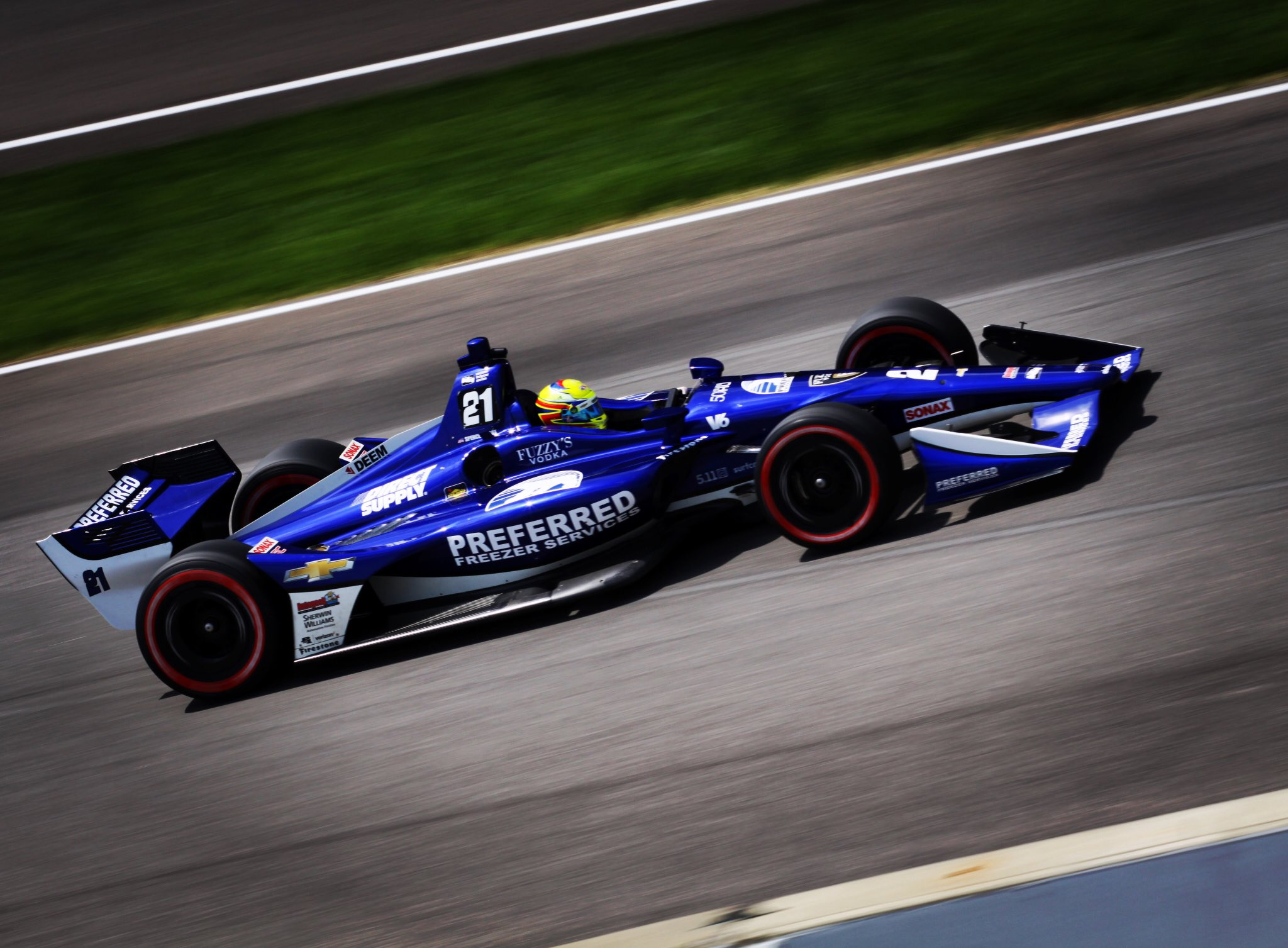
#21 Spencer Pigot
It’s a classic Ed Carpenter livery for Pigot, with a blue and white Preferred Freezer Services design. It’s a lovely shade of blue with a minimalistic design incorporating white sparingly.
★★☆
Schmidt Peterson Motorsports with AFS Racing
#7 Jay Howard
The Schmidt Peterson theme is respected on this car, using a nice emerald green to go with the purple, red and hold of the other cars, although the latter won’t be racing! The reflective green works well with the black and the flashes on top of the sidepod are also a nice touch, possibly looking nicer in green than on other cars.
★★★★
Scuderia Corsa with Rahal Letterman Lanigan Racing
#64 Oriol Servià
Servià probably had one of the most boring liveries of the 500 last year, and while this isn’t the most complex design of all time, it’s a significant improvement. It’s only two tone, but getting rid of the yellow does wonders. The single red stripe from the rear, wrapping around the nose is wonderful and is complemented well by by the second line on the contour of the sidepod. Super clean and looking good despite some empty white space.
★★★
Team Penske
#1 Josef Newgarden
Newgarden’s livery is now the same as Power’s, with the red stripe replaced for a black one. Very nice, but lucking the punch that the red version does.
★★★☆
#3 Hélio Castroneves
Not the first time Castroneves has raced in this livery, but the design has been updated to fit the new IndyCar chasis. If anything it’s an improvement, but can’t see myself giving 5 stars so easily today! Lovely livery, with the helmet completing the look.
As with Supercars last week, let’s check out how the IndyCar field will line up in 2018. Also as with Supercars, I’m assuming half of these won’t apply for round two, but oh well.
A.J. Foyt Enterprises
#4 Matheus Leist & #14 Tony Kanaan
After four seasons with Chip Ganassi, TK has moved to A.J. Foyt racing and will form an all Brazilian team with Rookie Matheus Leist, who finished a strong 4th in Indy Lights last year. The livery on the perennially unsuccessful ABC car has remained the same once more, which would be more disappointing if the livery was poor.
Thankfully it still looks OK, but what better time to try something new than with the introduction of the new chassis of the NEXT car.
★★★
Andretti Autosport
#26 Zach Veach
Zach Veach is another of a significant amount of rookies this season, and is driving for Andretti. Andretti Autosport have continued with the same team design this year, so it’s just a few colour changes to suit new sponsors, for example here with the #26, using charcoal, burnt orange (which was used well by Faraday in Formula E last year), and baby blue, which is very uncommon in Motorsport.
The burnt orange colour is for the corporate colours of Group One Thousand One, and wish there was more of it on the car rather than the charcoal. The baby blue is a bit of an odd touch, but works well enough and could have been more interesting with a greater presence on the car. However, not the most thrilling to look at.
★★☆
#27 Alexander Rossi
Rossi came out of round one as the villain after the late race drama, but his car is near identical to St Pete last year. There is perhaps a slight pull back in the amount of red, but other than that, nothing of significance to report.
Still a great colour combo though, so happy to see it retained.
★★★☆
#28 Ryan Hunter-Reay
As above, it’s an unchanged livery for RHR, in his familiar DHL colours.
Just a good colour combination. Bold and vibrant.
★★★☆
Andretti Herta Autosport with Cerb-Agajanian
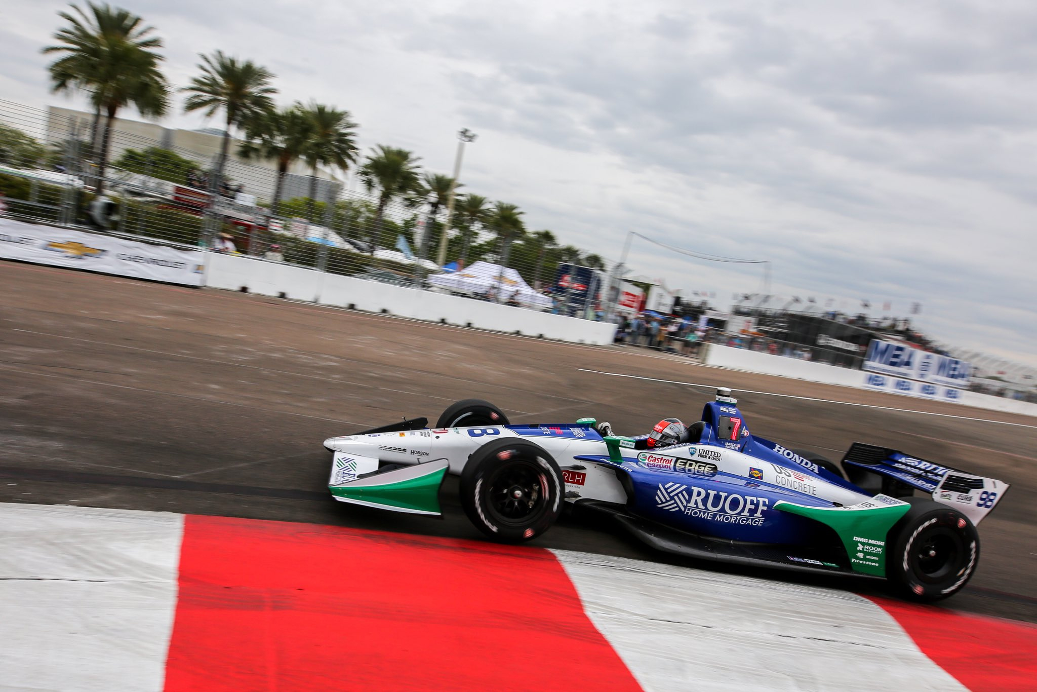
#98 Marco Andretti
The colours which famously took Sato to the Indy 500 victory last year are back at Andretti thanks to Ruoff, this time for Marco. This time, however, the colour placement has been wiser, making the livery a lot more interesting. The colours have been inverted, so it’s blue that takes the section in front of the cockpit and engine cover, whilst also making the sidepods blue, leaving a nice white strip in the middle and through to the nose.
There are also some extra teal sections, most notably in front of the rear wheel and front wing endplate. These add some extra interest to what would otherwise be an attractive but slightly basic blue and white livery.
★★★☆
Carlin
#23 Charlie Kimball
Kimball has moved on from Chip Ganassi, and has joined the new team Carlin, who have been racing in the junior Formulae for a number of years, as well as Indy Lights for the last three. The good news for us livery enthusiasts is that while Tresiba has followed Kimball across, significant improvements have been made! The most important change is that grey is gone, and has been replaced by a much darker charcoal colour. This is just a much more appealing shade on a racing car and works far better with the tennis ball green.
Speaking of which, the green/yellow bits have also been improved. The multi shade stripes have stuck around but look much better in this variation. This pattern has also been used in the green only on the charcoal, which looks fantastic toward the rear.
★★★★
#59 Max Chilton
Max Chilton has also moved to the new team, for which he raced in British F3 and Indy Lights. He has also retained his sponsor, however, the livery has not really improved. That isn’t to say it’s significantly worse, but it does have more of a generic, GP2 feel to it than the previous design.
The shapes used are pleasing and follow the natural flow of the chassis well, but there’s a lot more silver on this occasion, and missing the light blue which was a nice element of the 2017 livery.
★★★★
Chip Ganassi Racing
#9 Scott Dixon
As unbelievable as it sounds, Scott Dixon will race for Chip Ganassi for the 17th straight season in CART/Indycar in 2018, and only for the second time without a Target livery! PNC Bank has stepped in for NTT Data/GE this year and produced a deceptively simple design. It is in essence, a simple gradient from orange to blue to white. The gradient itself, however, is an intricate tessellated design at closer inspection.
The distribution of colour is also good, and the addition of a couple of sharp lines, in front of the cockpit and on the shark fine, are a welcome touch to break up the abundant gradient theme.
★★★☆
#10 Ed Jones
Ed Jones has moved from Dale Coyne Racing, and while his livery is also simplistic, it takes a completely different approach. This livery is clean. The shade of blue is strong enough to not require a significant amount of any other colour and this is exploited well by the designer, with the only other colour being the dark blue in front of the cockpit, and the simple chrome silver stripe along the edge of the sidepod.
Following these lines works incredibly well, and the two tone nature of the car gives it an organic feel that any clean freak can appreciate. Less is more.
★★★★
Dale Coyne Racing
#19 Zachary Claman DeMelo & Pietro Fittipaldi
Dale Coyne brings two rookies into the Championship this year, along with a very rarely used colour in what I can only describe as light green or mint. The design makes good use of the shape of the car for the top section, but annoyingly ignores it on the sidepod. They would have been better off using the #10 above as an example here for this section.
That said, it is a fairly simple livery, with just two large swooping sections really, looking as though it was put together fairly quickly. The overall quality does suffer for this as does the combo of yellow, mint and grey.
★★☆
Dale Coyne Racing with Jimmy Vasser-Sullivan
#18 Sébastien Bourdais
Who’d have thought this guy would have won again in St Pete? He matched his 2017 result after coming back from that horrific Indy crash. Let’s hope this form can carry on for the rest of the season. Brand new livery for the #18 this year, moving away from the solid, simple livery to something a little busier.
We have some very bright yellow, accompanied by black in a striped design akin to caution tape. It’s executed quite well so it doesn’t look tacky at all with the symmetrical design (apart from the rear wing annoyingly) designed purposefully. The face on the side of the nose is a nice touch too.
★★★★
Ed Carpenter Racing
#20 Jordan King & Ed Carpenter
Jordan King is another rookie in 2018, joining Ed Carpenter Racing, who have dropped what to me was a very recognisable green on the Fuzzy’s Vodka livery. This new colour scheme gives me Jack Daniel’s vibes, but in a good way.
Black almost always works well on simple liveries, and this is no exception. The small white sections are basic and lack any flare, but work well enough to at least this above average.
★★☆
#21 Spencer Pigot
The #21 of Spencer Pigot likely took no inspiration from, but has some striking similarities to the 2003 Minardi PS03. It’s actually scarily similar the more compare them. From the colour scheme overall (including the awkward green logos), to the diagonal shaped section along the side, to the white and red section on the side of the nose but not on top, I’d be surprised if there wasn’t even some unconscious influence in the design of this livery.
That said, what an odd choice it would be to replicate, if that was indeed the case! It is a bang average design at the end of the day, but gets some super unexpected but strong nostalgia points, considering this was the first season I started watching F1 full time.
★★☆
Harding Racing
#88 Gabby Chaves
Precious little sponsorship on the #88 of Gabby Chaves, but Harding Racing have followed on from their 2017 Indy 500 effort in producing an interesting design given the opportunity. The colour theme has also carried through, with an nice cyan colour accompanied by a darker yellow or perhaps orange on this occasion. The ‘yolk’ in front of the cockpit is odd but works in filling up some space.
What helps this design stand out is the white striped section on top of the sidepods. They’re unique and look great, whilst filling up space which would have otherwise been left empty due to the lack of sponsors. Not exactly a stunner, but a strong livery overall, considering a lot of the time sponsors are what help a livery look great.
★★★☆
Juncos Racing
#32 René Binder & Kyle Kaiser
As with Harding, Juncos are in for a full season in 2018, and are bringing in two alternating rookies. The livery is exactly the same as last year’s Indy 500.
It’s an odd design with the orange bordering the green in some areas and not others, but the colour scheme is interesting at least. However, I do feel this is something I’ll get bored of very quickly.
★★
Michael Shank Racing with Schmidt Peterson
#60 Jack Harvey
This Schmidt Peterson car is slightly out of order here, but definitely follows the team’s livery philosophy. Jack Harvey’s car (another rookie by the way) uses a chrome purple alongside black. Everything works with black so there’s no issue there, and the purple stands out in what is a very colourful grid.
There are a lot of logos on this car however, cluttering it slightly and not allowing the colour to shine to its best ability. Hence I don’t feel it’s a strong as its sister liveries.
★★★
Rahal Letterman Lanigan Racing
#15 Graham Rahal
Rahal has a solid first (likely of many) livery of the year. The blue used is deep and metallic, and is bordered by red, with the remainder of the car in white. It works well in a Compaq Williams sort of way, although this tries to follow the lines of the car slightly.
The colour scheme is pretty standard but well executed. Also, nothing like some American Flag stripes on the front wing elements to spice up a livery!
★★★☆
#30 Takuma Sato
Now this is a unique livery! While I’m relating everything to F1 liveries, this does remind me of the 1995 Pacific livery, but not significantly. This is very strong in its own right, using different shades of blue very successfully, whilst making large white sections look very attractive.
The main attraction is the complex nose which very difficult to explain. It uses 3 different colours in what in some angles looks like patchwork, and in others a beautiful, semi interrupted flowing blue section. The different blues all work really well together and am just happy to see some lovely creativity without going too far.
★★★★★
Schmidt Peterson Motorsport
#5 James Hinchcliffe
Virtually no change to the #5 this year, retaining it’s black and reflective gold of the past few season and an almost identical design to 2017. The main change here is the gold section having moved up, following the car along the top of the driver’s headrest rather than down to the top of the sidepod.
The other change is the intricate design on the side, which looks like stylised inner workings of the car (although I’m likely wrong). While I’m usually against graphics like this taking up large sections of the car, this is subtle enough to almost blend in from a distance whilst actually look very interesting close up. A well designed evolution of the 2017 livery.
★★★★
#6 Robert Wickens
Rookie Robert Wickens almost had a dream start to his IndyCar career until Rossi put an end to those plans! Misfortune aside, this livery is just about the same as Hinch’s, jsut in red as Aleshin’s was last year.
The red works perhaps a little better than the gold in my opinion, but not by much, so gets the same strong four star rating.
★★★★
Team Penske
#1 Josef Newgarden
Penske have cut down to 3 cars for 2018, but have kept the same liveries from 2017. I’d probably been a little harsh on these last year – they aren’t so bad. The colours are standard and the design is simple, but not bad by any means.
Castonevez used this livery for most of last year. It isn’t thrilling mainly due to the colour scheme, but a decent yet standard livery.
★★☆
#12 Will Power
Power is back in the livery he started 2017 with and as was the case then, the removal of the third colour makes this livery much simpler and that much stronger.
As with the Ed Jones livery, nice colours and little more can mean a very pleasant car to look at. No change, no problem.
★★★★
#22 Simon Pagenaud
The in your face Menards livery is also back for Pagenaud. The thin red and black parallel lines work far better than the thick red line on Newgarden’s livery, and contrast well on the super bright yellow.
I am slightly conflicted in regards to Pagenaud’s helmet though. I’m a big fan of drivers keeping the same design as it is their own personal identity, but I also love how it matches the car.
★★★★
Time for some bonus awards!
Best Looker Award – #30 Rahal Letterman Lanigan Racing
There were a lot of four star liveries this season, but only one five star. There are many reasons why, but this design just lights up in my eyes. Looks fantastic.
Least Attractive Award – Juncos Racing
Perhaps I’ve been a little harsh here, but something is off with this livery in my opinion. Just needs some refining. Thin lines don’t work so well when you’re ignoring the chassis’ curves.
Grand Slam Award – #22 Penske, #18 Dale Coyne and #23 Carlin
These guys may as well be fighting it out on a tennis court with the amount of tennis ball green on the grid this year!
Sorry for the lack of posts, but hoping this monthly review of livery changes could lead to more frequent posting of more than just catch ups in the future. Let’s start with Indycar this time!
Marco Andretti had Oberto as a main sponsor last month, and in doing so, gave the Andretti template a funky new feel. The main red and white’s were well complimented with a light green, giving an undoubtedly Italian theme to the car.
We also saw Sato in a livery with very minor changes in August. Expedite brought a very slightly lighter blue, along with yellow as for the trimmings, where we’d seen red and teal earlier in the season.
Gutierrez, and then Bourdais on his return, drove the #18 in straight blue and white last month, in what does look quite empty and dull now. This livery was far more striking in red at the beginning of the season, and without the sponsor on the sidepod, looks empty.
Graham Rahal sported two different liveries in August, the first a minimal red effort, sponsored by his father’s car dealership. A single white stripe down the side of the car complements an appealing shade of red, with some black on the wings completing the look.
It’s the same design as above, but looks entirely different in this colour scheme for Fifth Third Bank. Slightly clashing colours here, the two blues and the minty green not quite gelling. Definitely interesting, but not ugly!
Off to the Supercars! Tekno was sponsored by Cars 3 at Eastern Creek Sydney Motorsport Park, and went the logical route of painting the car in the film’s main character, Lightning McQueen’s livery. It is gimmicky but makes total sense. Could only imagine it would succeed in making younger Motorsport fans want to watch the movie, and parents think about taking them.
ACDelco was the latest sponsor for Percat and BJR, putting a pleasant metallic blue on the grid, along with pink and white stripes, in what is a basic livery.
Looks like we’re at the end of the month already! Let’s take a look at what we’ve missed throughout July, starting with the good old Supercars.
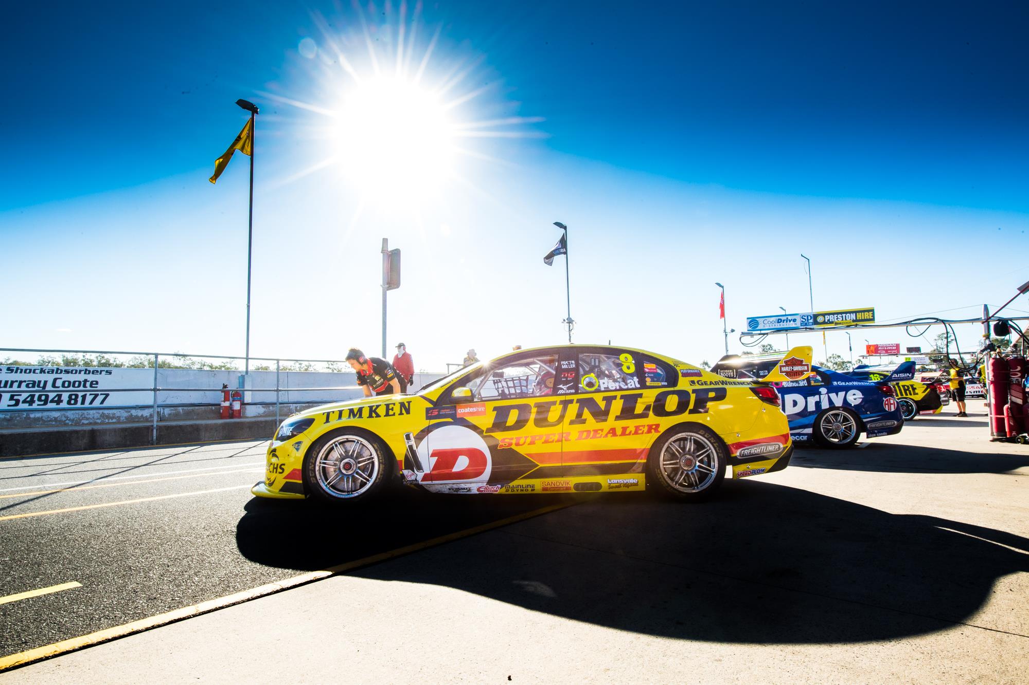
Another week another sponsor for Percat, who has Dunlop Super Dealer backing this weekend in Ipswich. The iconic lettering never looks out of place on a racing car and the black on yellow background looks as good as ever. Keeping it simple here with two parallel stripes in red and black along the bottom of the car and giant Dunlop logo on the front door, which I associate more with shoes than cars these days.
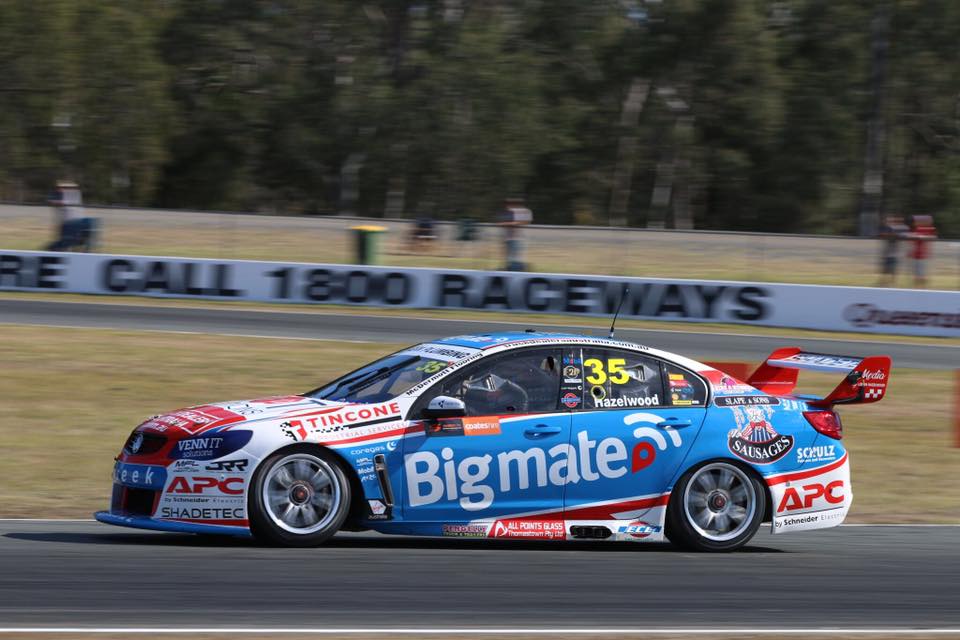
The last of the wildcards has joined the grid in Ipswich, in the shape of the #35 Commodore, driven by Todd Hazelwood. Big Mate are the main sponsor of the car, who appear to be involved in GPS monitoring solutions, and have brought with them some pretty standard colours in red, white and blue. There’s a main diagonal blue section across the side, bordered by white and red, with white the main colour over the rest of the car. Very logo heavy this one, bringing a cluttered look to the livery.
Just quickly, it appears as though Castrol have reduced their backing on Mostert’s Super Cheap Auto car, which is great news, as Bosch now takes up the bonnet space with a black background. This allows the livery to look uniform and complete once again!
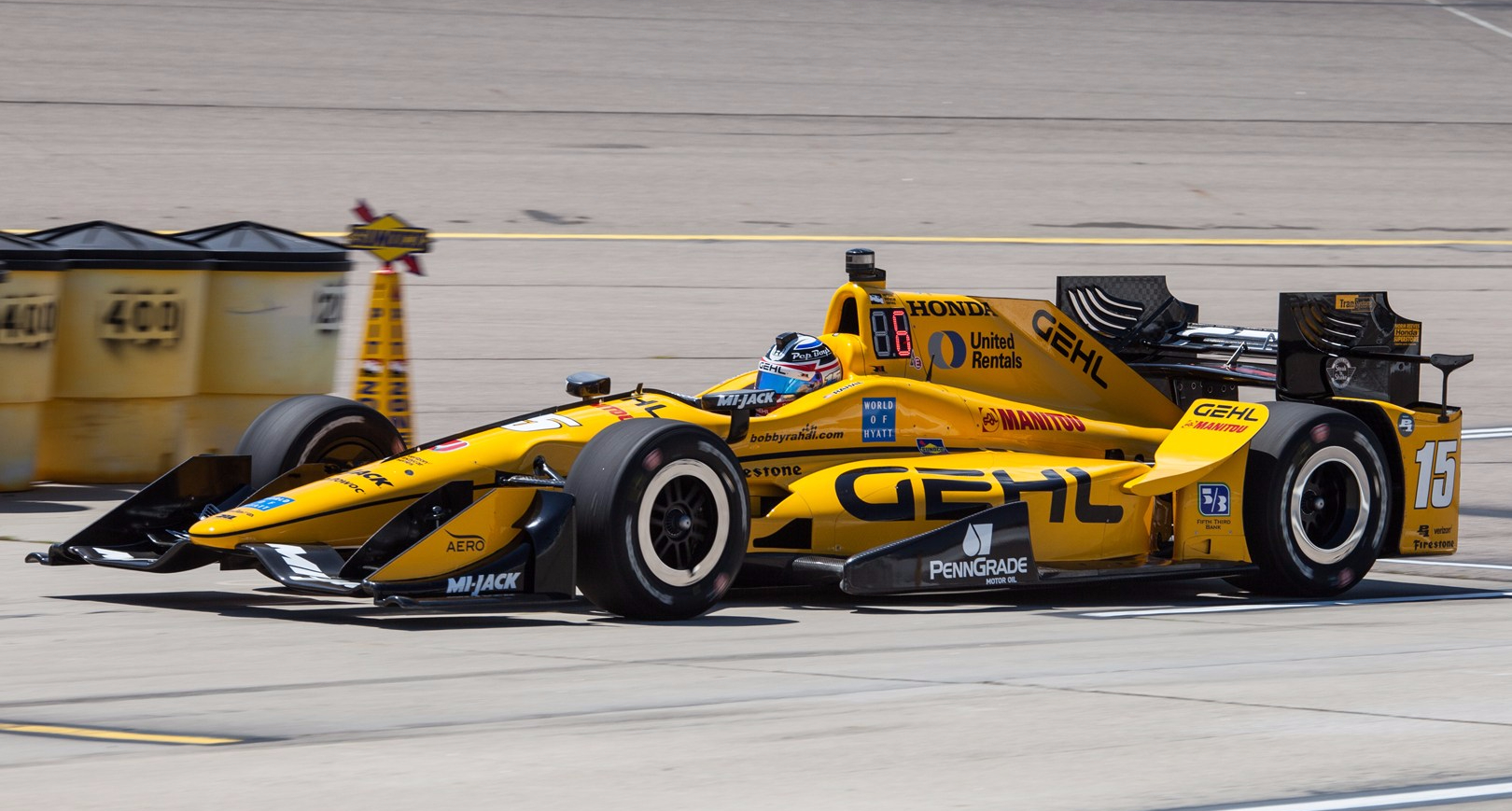
Skipping across to the States, we saw Rahal in an uncustomary yellow livery for Iowa. The Gehl sponsored machine was a beautiful shade of yellow, looking super simple and clean with just the single black line from nose to tail. The majority black wings help contrast the yellow making for a very nice livery overall.
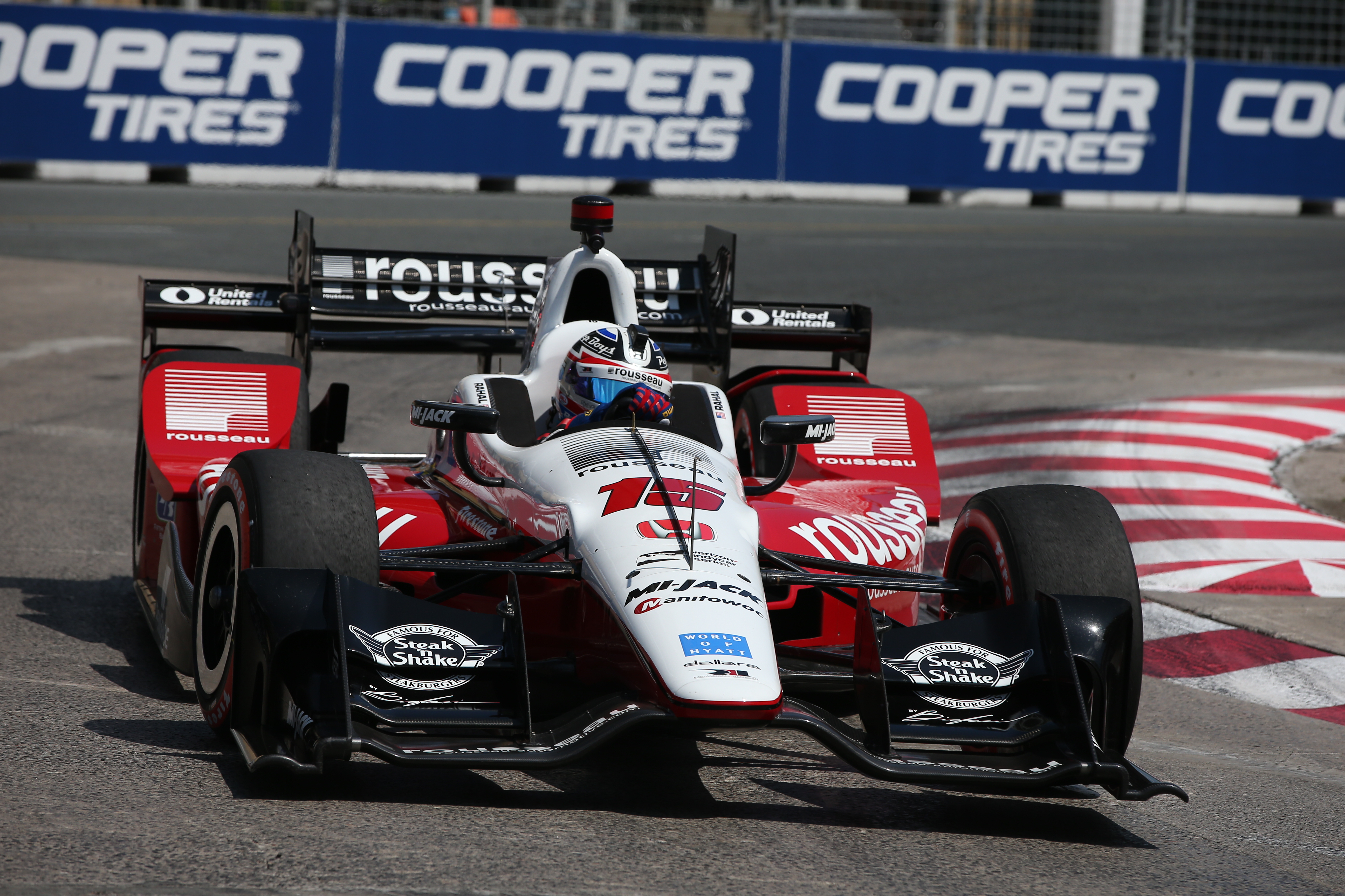
One week later, however, Graham was back in red, but again, not his usual Steak ‘n Shake livery. This Rousseau backed livery was mainly red, with white over the top of the nose, cockpit and engine cover. As far as basic designs go, this is probably my favourite style, having the lighter shade of the ‘top’ surfaces of the car. Black wings bring a welcome third colour to the design.
We’ve also seen Rossi change colours since the start of the season. The blue is the same, but now features red where the yellow of Napa used to be. In this case, the entire sidepod is red rather than just what the Napa logo covered previously, on the usual Andretti design.
Penske had a couple of livery changes in Toronto, with Pagenaud switching to a car seemingly in greyscale. While I’m not usually a big fan of liveries without colour *cough* Haas *cough*, this is a decent looking novelty that should only last a race or two. Also important to note that silver, not grey, is used, and as the third colour, not the primary.
A simple change for Newgarden too, with DeVilbiss bringing a bright orange in place of the Verizon silver. I love organge as a colour, but this is certainly a downgrade.
Most recently, Chip Ginassi have joined in on the Indycar chrome livery fad, spicing up the usual NTT Data livery. It’s a nice super reflective blue along the engine cover, nose and wings, complementing the plain white well. There are also a neat detail in what resembles a big brush stroke, in different colours of blue, filling up some of the white space. A nice livery but we’ll see if it’s only a one off.
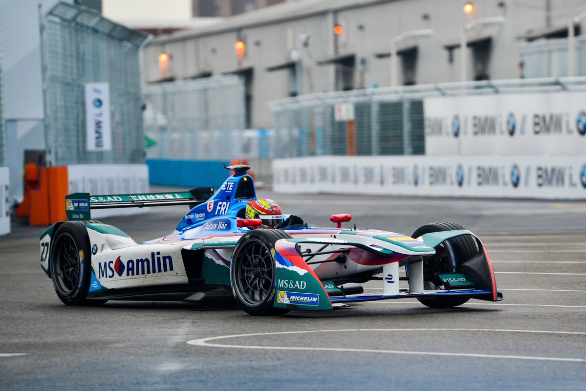
Finally, switching over to Formula e and MS Amlin Andretti have made significant changes to their livery, adding some big chunks of teal, literally on top of the existing livery. They’ve gone about it with a torn paper effect, which actually looks quite nice and hides to lazy thought behind the idea.
Finally, this update isn’t new but one I guess I should cover. Haas went and made their livery EVEN MORE BORING since the disappointment they revealed at the beginning of the season. In a corporate move Ron Dennis would have applauded, they’ve made the red sections white, so they could stand out more. Technically this may be the case in terms of copywriting, but I can’t imagine a time that white would be more eye-catching than red? Either way, boo to you, Haas, the biggest livery let down on the grid.
Race of the year? It’s certainly one of the biggest events on the Motorsport calendar, and this year wasn’t a let down. How good was it to see all around nice guy Takuma Sato win it all! Throw in a few wild crashes (Dixon is a very lucky boy) and you have an awesome 200 laps around the Indianapolis Motor Speedway.
Let’s take a look at the new or one-off liveries that adorned the cars for the 101st running of the famous Brickyard 500.
A.J Foyt Enterprises
#40 Zach Veach
Veach was one of four rookies in the field this year, racing for A.J Foyt. While it’s exactly the same design as usual for the team, you wouldn’t instantly make that association, given the purple for sponsor ‘Women In Tech’ taking over the usual red and blue sections.
However, the purple doesn’t quite have the same effect; a second colour would another layer of interest to the livery. It ends up looking basic, when the original does not have this problem.
★★
Andretti Autosport
#20 Takuma Sato
After heartbreak in 2012, Sato put it all behind him to extraordinarily win the 2017 Indianapolis 500, and I couldn’t be more pleased. His livery was slightly different too, with the red highlights changed in favour of mint green, which I believe to be for sidepod sponsor Ruoff.
It’s a unique colour which is great, but doesn’t quite sing like the red did and is really missing a punch of vibrant colour.
★★☆
#27 Marco Andretti
United Fiber & Data painted Marco’s car blue and white for the 500. In a pleasant variation of the Andretti design, we see an almost two-tone livery, pulled of simply and effectively. The shade of blue chosen is beautiful and makes for a great combination with the white.
The stylised wings on the top of the sidepods are a neat touch, a great implementation of an element of the sponsor’s logo on the car, and look fantastic from above. A lot of white, but not too much, with just enough blue keeping this interesting.
★★★★
Chip Ganassi Racing
#9 Scott Dixon
Camping World sponsored the #9 car for the big race, but not for the better. This livery is weaker in every way compared to the usual. It is completely basic, with the design being way too simplistic. Just a single line from the rear, wrapping over in front of the cockpit. It’s actually very similar to Sato’s livery, but at least that design follows the shapes and angles of the car, whilst this is just a straight line.
There is a yellow section separating the blue and white along the side, but it doesn’t do much in terms of good looks or excitement.
★☆
Dale Coyne Racing
#19 Ed Jones
No big design change here, just a small colour change with the addition of FXTM as a sponsor. This brings a tennis ball green in place of the usual Scouting blue. It doesn’t look better or worse, just different.
★★★
#24 Sage Karam
Here’s a stunning classic look for Karam. Black always looks sleek and classy as a main colour, with sponsor Mecum Auctions deciding on a bright neon yellow as a secondary colour. This is placed along the side of the nose section all the way into the sidepod intakes, whilst only a sliver is carried onto the top of the sidepods. This section is split from the black with a thin red line.
There are lots of lovely little yellow and red flashes on the car, including the edges of the wings, the mirrors, airbox and fuel nozzle. A very pleasant visual experience overall!
★★★★☆
#63 Pippa Mann
Pippa is back with her mandatory pink Indy 500 livery. Supporting a great cause in Susan G. Komen, the Dale Coyne design looks fantastic in pink and white.
It’s still one of my favourite designs on grid, and proves to be versatile, looking good in just about every colour combination so far.
★★★★
Ed Carpenter Racing
#21 J.R. Hildebrand
Hildebrand ran an identical livery to his 2016 entry. If it ain’t broke don’t fix it! Still a great colour combo and the design works a lot better with the blue and white than the green and gold on the Fuzzy’s cars.
★★★★☆
Harding Racing
#88 Gabby Chaves
No main sponsor on the #88, so a great opportunity for the team to get something creative on the grid. They didn’t disappoint, choosing some interesting and well matching colours in cyan, white and yellow. The design isn’t too complicated but very does well to not make the car look empty, given the lack of sponsorship.
The wavy design along the side is a little GP3ish, but not enough to detract from the overall good looks of the car. Fresh!
★★★★☆
Juncos Racing
#11 Spencer Pigot & #17 Sebastián Saavedra
Pigot headed to Juncos Racing for the Indy 500 and was joined by Saavedra, with the team stepping up from Indy Lights for the big race. The colours match the Indy Lights team, although the lovely metallic green, orange and white are laid out very differently. It’s a linear design, but accounts for the curves of the car, meaning the lines look straight from the front rather than the side.
The colours give vibes of Force India from a few years ago. Not a huge fan of the giant logo sprawling across the side and top of the sidepods (on Pigot’s car), but it seems to be how some teams are making use of the space on the skinny sidepods.
★★☆
Lazier Racing Partners
#44 Buddy Lazier
Lazier’s livery is almost identical to last year, with the exception of the wings, as well as having next to no sponsorship this time. It certainly benefits from the latter, because the number of mismatching stickers on the car really detracted from what was already a very basic design. A slight improvement.
★★☆
McLaren Honda Andretti
#29 Fernando Alonso
Alonso was the talk of the town for pretty much the entire month leading up to the 500, given the unprecedented circumstances of on of the best drivers in the world missing a championship Formula 1 race to participate. Fate had a Honda engine let down Alonso once again in the race, but didn’t the car look great?
The livery was based on a previous McLaren entry in the 500, with only minimal Andretti influences.
To me, this is what McLaren’s F1 cars should have looked like this season. A simple almost one colour livery, proudly displaying McLaren’s gorgeous Papaya orange over the entire car. I’m glad we got to see this one way or another. The blue highlights are true to the original and add another colour, although I’m not sure it’s entirely necessary with a main colour that good, especially with the sponsors all in black.
★★★★☆
Michael Shank Racing Andretti
#50 Jack Harvey
This is probably the most interesting livery of the 500. We’ve got a black base, supported by yellow and pink in even parts, as well as some white piping. They work surprisingly well together, and the layout definitely helps.
We see the majority of the yellow on the engine cover and cockpit with pink along the rest of the side. The sponsors all mostly match which is a great plus. An unexpectedly pretty and very interesting livery.
★★★★☆
Rahal Letterman Lanigan Racing
#16 Oriol Servià
Servia was back again this year in what looked confusingly like a Team Pesnke rip off livery (forgive me if there’s a relation I don’t know about). The colours are OK, although not particularly strong in this layout.
I do like seeing the nose colours being split on the top and side, but there isn’t a lot else to say about this. Very basic and not much to speak about.
★☆
Schmidt Peterson Motorsports
#77 Jay Howard
I’m sure a few more people know who Jay Howard is after the Indy 500 than before! His incident, propelling Dixon into the air was incredible, and glad to see no-one was injured. The livery on the #50 was great. Whilst it’s another blue and white car, it’s similar to Hildebrand’s in using a reflective blue, but more of it.
The design is nice too; the blue starting at the nose before spreading around the cockpit and all the way to the rear of the car. With the addition of the blue on the engine cover, a nice strip of white is left along the sides and cockpit, as well as the sidepods, really helping Lucas pop and allowing for a strong, even look.
★★★★☆
Team Penske
#1 Simon Pagenaud
Pagenaud was back in his Menards livery for the big race, which as I’ve said previously is a very good take on the Penske design. Could see it from a mile away!
★★★★
#2 Josef Newgarden
Yet another iteration of the Penske design, this time mainly in black with silver and blue highlights for Hum. Not sure if the silver is a Hitachi or PPG sponsorship requirement, but it really throws the livery out of balance, where black or blue wings would have looked a lot better.
The single blue line on black looks fantastic and makes the livery look just a little bit classy. Great looking car, just wish the silver wasn’t on it, or in a more subtle fashion.
★★★★
#3 Hélio Castroneves
This was a weird choice. Out with the Penske design which I’m happy to see, but not like this! Mostly white, but with an odd shade of gold which looks less than fresh. It matches well with the white I guess, but I’m not a fan of the gold. The design too is a little confused, especially with the solid black sections on the gold, which don’t look good.
The black/red pinstripes alone separating the white would have been enough, and would’ve looked a lot better on their own. Not sure why they couldn’t match the gold on the car to his overalls! Would’ve opened the car up, as the shade used it dull.
★★
#22 Juan Pablo Montoya
Finally, JPM was back, showing just how good Newgarden’s car could have looked. The all black livery is fantastic, with just some simple green and white piping along the sides, and some green flashes on the mirrors and camera. Using the template well.
The IndyCar season crept up on me this year! With all the hype around Formula 1’s 2017 regulations and livery launches, IndyCar personally flew under the radar, so when I heard round one was upon us, I was super keen to have proper racing back!
There have been some big changes over the winter with drivers switching teams and teams switching manufacturers, but there hasn’t been too much movement in the livery space, especially when compared to F1. Either way, here’s what we’ve got for the new season.
A.J. Foyt Enterprises
#4 Connor Daly & #14 Carlos Muñoz
As mentioned above, there haven’t been many radical livery changes amongst the teams in 2017. Two new drivers this year but ABC remains with A.J. Foyt Enterprises and therefore, so does the livery. It’s still a good livery, but being unchanged for the 6th straight season, it gains some boredom points. It’s great to have loyal sponsors, but it’s time for an evolution!
★★★☆
Andretti Autosport
#26 Takuma Sato
Whilst Andretti have kept the same blanket design for all four cars again this year, it’s new colours on the #26 with the incoming Sato, bringing with him Panasonic backing. Unsurprisingly it’s blue and white and flashes of red. Not the strongest colour combination, but not bad either. Looks a little empty on the sidepods though.
★★☆
#28 Ryan Hunter-Reay
Unchanged livery here, leading to an unchanged rating. Still a great look with the DHL yellow and red, with the Andretti silver tip nose working especially well with the #28. Could be spectacular with a design spruce up, but instead remains simply above average.
★★★☆
#27 Marco Andretti
Now this livery takes some liberties that drastically improve on the base design. The red, white and yellow work very well together, and it’s great to see red used on both the engine cover and sidepods. Having white on the sidepods, as the design dictates on the others, would’ve led to a very plain car. The red section on the side of the nose adds some nice colour to an otherwise empty space, and the use of the three colours on different wing elements is simple, yet terrific.
★★★★
#98 Alexander Rossi
I guess NAPA were pretty happy with Rossi’s Indy 500 win as they’re back on the #98 in 2017. I’m glad for this, as the blue, yellow and flashes of red make for a great colour combination, that works very well with the Andretti design. What helps this car is the NAPA logo, which in being re-worked this year, has turned into a design element of its own, filling up the sidepod with some more lovely yellow. A little annoying that the red is pinstriped along the cockpit, but that’s just my personal, nitpicky opinion.
★★★☆
Chip Ganassi Racing
Liveries aside, Chip Ganassi made the bold move of switching from Chevy to Honda. Most people thought this was a crazy move, considering Honda’s inferior performance in 2016, but the decision has seemingly paid off, with great results all round at St. Petersburg.
#8 Max Chilton
This was one of my favourite liveries of 2016 and I have to say I still like it a lot. The multiple shades of blue go very well with the white and are placed slightly differently in 2017. This is most notable on the nose, where a large navy blue section replaces the sky blue stripes, bringing with it a far stronger contrast. The engine cover has also changed, with a larger logo bringing with it an equally large section of sky blue. A great evolution of the 2016 livery.
★★★★☆
#9 Scott Dixon
For the first time in their history, Chip Ganassi Racing will not have Target backing on any of their cars, a partnership lasting since the very beginning, in 1990. Therefore, it’s going to take a while getting used to Scott Dixon’s new livery. The GE Lighting and NTT Data sponsored car is mainly blue, with secondary light blue and orange sections. These secondary design sections flow in opposite directions and to my annoyance, overlap. It isn’t that big a deal, but gives it an odd look. Interesting too is the choice of the main colour, azure blue, being fairly similar to Kanaan’s car, but also quite odd and unique in its own right.
★★★
#10 Tony Kanaan
An almost identical effort to last year. A simple two tone effort that doesn’t offend, but also doesn’t excite. An above average mark again, although I don’t get the same visual pleasure I did last season.
★★★☆
#83 Charlie Kimball
Apparently I quite liked this livery last year, but the feeling has worn off. I’m just about sick of grey in Motorsport right about now, and the tennis ball green isn’t really doing anything for me either. The sharp and contrasting sections of yellow and grey are still nice, but I now dislike the faded stripes along the side. Removing them would leave a stronger overall livery, albeit slightly more simple and generic.
★★☆
Dale Coyne Racing
#18 Sébastien Bourdais
Who saw this coming? Bourdais moving to one of the weakest teams of 2016, bringing with him some old friends, and winning from the back of the grid. Incredible.
The livery design is unchanged and while it was one of my favourites last year, it isn’t quite as spectacular in this configuration. I do still love the red lines running along the side of the nose and the other red lines angled along the body. The black wings do a great job of contrasting with the majority white.
★★★★☆
#19 Ed Jones
As above really. Identical to last season, although I prefer the Sonny’s car, which doesn’t include any blue. A different shade would have worked far better in this instance.
No major change to the Fuzzy’s livery this year. The deep metallic green still looks great and with some added gold along the cockpit, the combo overall is still pretty good.
★★★
Rahal Letterman Lanigan racing
#15 Graham Rahal
No changes here either, but this is still a surprisingly nice livery. Again, just the Steak n Shake logo on the engine cover, with some black front and rear wing elements allowing this to be simple and yet not too boring. Nice shade of red too, which is important.
★★★☆
Schmidt Peterson Motorsports
#5 James Hinchcliffe
The #5 machine retains its unique reflective gold for another season, paired with black alone this time (apart from the red flashes on the mirrors and airbox). Just some minor changes this year, which include the removal of white trimming between the black and gold, with the black creeping further up the nose, wrapping around the tip. This black section has gold either side of it which is nice, and no explosions behind the Arrow logo either, which I’m glad about. Definitely an improvement!
★★★★
#7 Mikhail Aleshin
After a generic design last season, Aleshin’s car has leapt into allure in 2016 . The design is exactly the same as Hinchcliffe’s, with the difference being way fewer sponsors, and of course the beautiful reflective red. It’s taken a while, but we’ve finally seen this lovely colour once more. While the lack of sponsors gives the livery an empty feeling, it does a great job in showcasing the chrome red, which I could look at for hours. Unfortunately, the black doesn’t pair as well as it does with the gold, so it’s a bit weaker overall than its counterpart.
★★★☆
Team Penske
To my dismay, Team Penske haven’t changed their livery design for 2017. We can only hope that we see some sponsors come in to push the design’s boundaries.
#1 Simon Pagenaud
Identical to last season. This is one of the better colour combinations though and looks good despite the tired design. We’ll inevitably see a number of sponsors and colours on this car (and the others) throughout the season.
★★★
#2 Josef Newgarden & #12 Will Power
With Montoya being relegated to an Indy only seat, Newgarden has come in off the back of an impressive 2016. This livery too has not changed, but the simplicity is quite stunning. The red line not wrapping around the very edge of the nose annoys me more on this car than the others, but this main attraction, the colour silver, is a more or less perfect shade for Motorsport.
★★★★
#3 Helio Castroneves
So we end with Castroneves, who has finished top five in the championship for the last five seasons despite only winning five four races during this period. He flies under the radar but always does a solid job. Much like Helio, the #3 retains its no fuss 2016 livery, although this is the weakest of the three due to its standard, unimaginative colouring.
★★
So of the 18 liveries, only five are are significantly changed from last season, and really only Dixon’s car bears an entirely different design to 2016. A little disappointing for people as into liveries as I am, but happily there are still a number of very good looking cars on the grid.
Bonus Awards
Best Looker Award – Chilton & Bourdais
No five star liveries this year, but these two are great. Did I mention I love Chilton’s helmet?
Least Attractive Award – Castroneves
Those standard racing colours mixed with a nagger of a design.
Most Improved Award – Aleshin
It’s amazing what an interesting colour can do to a car. Oh, and little effort in design!
Biggest Nagger Award – Team Penske
As mentioned above, quite bored of this design and dislike it’s adaptation to different sponsors. Andretti do a far better job of this.
What Year Is It? Award – A.J Foyt Enterprises
6 years! Beautiful livery or not, you have to make some changes every now and this. This is Williams levels of perseverance, or perhaps stubbornness.
The Indy 500 was run last Sunday and what a race it was! So unpredictable right to the end. If only it wasn’t on at a stupid hour in the morning over here so I could watch the whole thing live. Anyway, here are the many alternate and one-off liveries from the 500!
A.J. Foyt Enterprises
#35 Alex Tagliani
Not much to say about this one. Mainly black, with a red section along the side that increases in size from front to back. Some nice red flashes here and there, but then there are orange ones too which shouldn’t really be there.
★★
Andretti Autosport
#26 Carlos Muñoz
A far better effort than the usual empty livery. Completely different colours in black and light blue, which go very well together. Interesting design that features a yolk over the cockpit which ends just before the nose number and goes toward the rear. It also juts out and carries along the top of the sidepods. The blue and black are split by a thin white pinstripe. He still has the Colombian flag on the front wing end plates, which surprisingly doesn’t match as well as on the other livery. Nice overall and gives and the colour scheme gives off a NEXTEV feel.
★★★★
#29 Townsend Bell
This livery is odd. We have bright yellow on the top half, light grey on the sidepods and a blue stripey textured section on the side of the nose and front portion of the sidepods. A really odd choice of colours, seemingly due to the sponsors, but surely there was a better way to lay them out? As proven by HAAS F1, white would have worked better than light grey and the thin red lines separating all the colours only adds another colour to the already overflowing palette.
The very front of the nose, where the blue fades into the white on top is actually quite nice and if the livery was based around that, it would achieve a much higher rating. As it is, it looks like three liveries mashed into one and doesn’t work.
★☆
Andretti Herta Autosport
#98 Alexander Rossi
What a story! A rookie winning the 500. Absolutely awesome. The livery wasn’t half bad either. Nice blue and yellow combo in the usual Andretti design, although the black Castrol section doesn’t work as well as it did on the black and white livery.
★★★
Dale Coyne Racing
#18 Conor Daly
As patriotic livery as you could expect for an Indy 500! The same great design as the other DCR cars, but with the added twist of an american flag fill on the nose and engine cover. As cheesy as it is, it works pretty well.
The downsides for me start at the different shades of blue, which don’t seem to match. Considering how well the greens on the other car work, I thought they’d manage to make it work on this one too. Secondly, apart from the reds on the flag and elsewhere not exactly matching either, the flag design is placed on the car oddly, so it looks like it cuts into the normal red lines. Perhaps its just how it was done on this occasion and looks a little better here, but it’s a little off putting. Still appealing overall, without looking too closely at the details.
Also has to be noted that Daly’s usual livery was seemingly transferred to Brian Clauson.
★★☆
#63 Pippa Mann
A little cliche perhaps to see the only woman in the field in a pink car, but the main sponsor in a breast cancer organisation is a great cause, so I can’t fault the choice. It’s actually a little refreshing to see this colour, since it’s very rare to see pink in any form of motorsport. The design is the same as the other Coyne cars, but is a little empty on the engine cover.
★★★☆
Dreyer & Reinbold Racing
#24 Sage Karam
This reminds me a lot of Pagenaud’s HP livery. Similar design with similar colours although you can’t confuse the big GasMonkey logo on the sidpod. Quite basic, surely they could have put a little more of that green on the car to help it stand out a bit more?
★★
Ed Carpenter Racing
#6 J.R. Hildebrand
Not too plain for a white car. The dark blue accents look nice against the bright white, especially on the wings. The line along the nose is actually the same design as on Carpenter’s car, but works better with this colour combo and no outline. Really liking that shade of slightly metallic blue.
★★★★☆
#21 Josef Newgarden
This is the same design as Hildebrand’s car with the colours inverted and a few different sponsors. Looks just as good, although I think the dark accents on the light background work a little better. Perhaps white wings could have completed the look.
★★★★
KVSH Racing
#25 Stefan Wilson
This one is a little strange. Too many colours that don’t match I’m afraid. Yellow, orange, green and blue all on the same car? You’d be hard pressed to find a livery designer to make those look good, especially in those shades. The design itself isn’t groundbreaking, but feels kind of traditional IndyCar in a way (if you disregard the colours). Just unusual and unpleasant.
★
Lazier Burns Racing
#4 Buddy Lazier
A low key effort here. Mainly white with some bright red along the bottom half, sweeping onto the nose and the rear wing. It has a black pinstripe following that section, as well as some yellow on the mirrors and T-cam. Kinda forgettable.
★★
PIRTEK Team Murray
#61 Matthew Brabham
Pirtek often lends itself to great liveries and this one is up there. IT’s a dark blue with black on the top, split nicely with a darker shade of red than I’d usually expect from a Pirtek livery. It’s simple, clean, has some nice colour trimming on the endplates and mirrors and is generally pleasing to look at. Missing something to make it incredible, but a very good effort nonetheless.
★★★★
Rahal Letterman Lanigan Racing
#16 Spencer Pigot
I like this colour combination, as I’ve mentioned before when referring to earlier Hunter-Reay DHL liveries. This one is simple, but it’s a pleasant yellow and split nicely from the white with a thin black line. May have looked nicer if the white section had gone all the way behind the cockpit rather than cut through it, but overall it’s a simple, neat livery.
★★★
Schmidt Peterson Motorsport
#7 Mikhail Aleshin
How many video game sponsored liveries have there been in world motorsport? Can’t name any off the top of my head, so it’s pretty neat to see SPM pull sponsorship from the new Doom game, the original of which I spent many hours on. It’s mostly black, and features a character surrounded by explosions in front of and surrounding the cockpit. I’ve never been a big fan of “images” being stuck on a car, but it doesn’t look so bad here.
I do wish they’d used a yellow or amber instead of red for the accents, to match the explosions for some colour. The rest is black and a little empty, and could have probably used a little more of that yellow/orange in one form or another.
★★
#77 Oriol Servià
Well this is a bit of a lazy effort. Plain white with sponsors in multiple colours. A bit of uniformity would have gone a long way on this one. Ugh.
☆
Team Penske
#3 Hélio Castroneves
This is an identical livery to Pagenaud’s Menards livery, but with a different sponsor in Pennzoil, and a far more natural yellow. This is in fact a brilliant throwback to Rick Mears’ Penske machines that ran in the 1983 Indy 500. I’ve gone over the design before, but this colour takes it it another level. Really classy and despite taking its inspiration from a car three decades old, has been transferred to this a modern day IndyCar brilliantly.


