Top 20 Motorsport Liveries of 2023

Livery appreciation is incredibly subjective. I don’t think I could find a single person in the world to agree with all 20 below. Hell, I doubt I’ll be happy with these same picks tomorrow! Make sure as you read through this list that you take each entry with a grain of salt, and maybe even treat this as an introduction to a few liveries you may have never seen before.

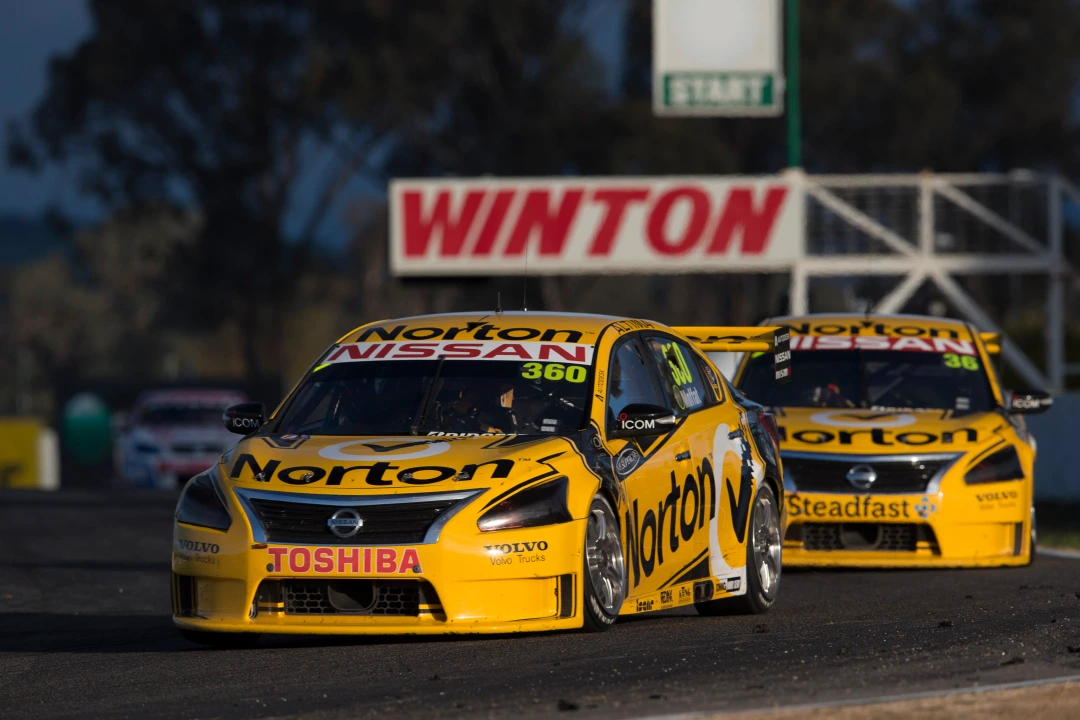
#20 | Brad Jones Racing (Pizza Hut) | Supercars

brad jones racing pizza hut supercars 2023 adelaide kids drawing

Did I mention this list is a bit of fun? You’ll quickly find that not all of the liveries on this list are conventionally beautiful, but all are special in a way. This design was literally dawn by a 10 year old girl with pencils on paper, and transformed into a real life livery just for the last round of the season. How cool of BJR and Pizza Hut to make this happen. Sure, it looks any child’s crayon creation, but that’s the fun of it and would have been a dream come true for me if I was a kid in her shoes!

#19 | Kids com Team KCMG | Super Formula

super formula kids com kcmg kobayashi 2023

In the same vein, this Super Formula livery is very childlike, but fitting given the sponsor. It has a simple, almost 90s design style, but at the same time has oddly bright colour choices that don’t belong on an open wheel racing car. These colours specifically give off late 80s Benetton vibes such as the B188 here, but at the sime time belongs in a kids indoor play centre. A playful livery that some boring people would think shouldn’t be on this list!

#18 | Iron Dames | World Endurance Championship

iron dames wec world endurance championship 2023

Pink makes an appearance every so often in motorsport, even less frequently as the main colour. It was used very nicely here for the all female Iron Dames WEC team. Hot pink is less forgiving than lighter pastel shades, but it’s done well with some clever black and yellow sections, almost appearing to tear away from the pink to uncover the black underneath. It mirrors the team’s other car, but with pink as the main colour instead of yellow, and I think that makes it stand out more and a nicer livery overall.

#17 | docomo business ROOKIE | Super Formula

docomo business rookie super formula 2023

This livery took me back to the white and tartan Stewart Grand Prix liveries of the late 90s, and I’m a sucker for nostalgia. Whilst the design is clearly different, the red and black pattern gives off feint tartan vibes – almost a modern, Toyota-fied version of those memorable Stewart cars. It’s a unique pattern that you’d more commonly see on a shopping bag or Christmas card, but looks great the way it’s been placed on the car.

#16 | GR Racing | WEC

gr racing wec world endurance championship 2023

Black based liveries have a head start in the looks department, but the accents added to this car are what make it so nice. The fluro orange piping here is a great contrast to the black, and is placed naturally along the curves of the Porsche perfectly. They also had a very interesting half and half livery for Le Mans which I considered putting in this place, but apart from being a neat gimmick, the all black one took the cake.

#15 | Joe Gibbs Racing | NASCAR

joe gibbs racing nascar 2023 fedex

So, a palate cleanser. This FedEx livery might be as classy a NASCAR livery as you’ll see. It’s mainly white but highlighted really well with FedEx’s signature purple and orange, which neatly transition via a gradient along the side of the car. The number is huge but fits perfectly in the design. Just neat use of colour, executed very nicely on the template provided.

#14 | Scuderia AlphaTauri | Formula 1

alphatauri formula 1 2023 ricciardo

It’s sad to me that Toro Rosso rebranded to AlphaTauri just as they had landed on a great livery, just to hit us with several more years mediocrity. They didn’t do anything to excite us with the navy and blue combination for the next few years…until the very end of the team’s existence (before the next rebrand)! For the last two races of 2023, the car has worn an out there, in your face design with stacks of white stripes on the navy base. It’s fun to look at, and fills me with annoyance that they could have made something this good and just decided not to. Brand guidelines be damned! Can’t wait for another lacklustre corporate livery from Racing Bulls to replace this in 2024.

#13 | Team Penske (Pennzoil) | IndyCar

team penske pennzoil 2023 indycar mclaughlin

This livery is a timeless classic. The base yellow with the black and red pinstripes is the epitome of simplicity and class. The fact it doesn’t run very frequently helps this to not lose it’s lustre and earn a place on the list. Perhaps there’s a bit of a trend appearing though, a bunch of the liveries already covered are not full timers…not sure if that says something about the liveries, or about me.

#12 | Marc VDS Racing Team | Moto2

marc vds 2023 moto2

The iconic lion has emblazoned the Marc VDS team bikes for decades now, but often the sponsor pairing leads to a very average colour scheme and an ordinary livery. The metallic burgundy and silver are a classic combination for the team, but often in the past silver was the main colour. Here, the classy burgundy leads the way and it makes for a really nice base. Ordinarily I’d say a fourth colour would be too much, but I’m a huge sucker for the orange Beta sponsorship. The fluro orange accents the burgundy really well in my opinion, and I wish they’d pony up some cash to be a majority sponsor more often in motorsport.

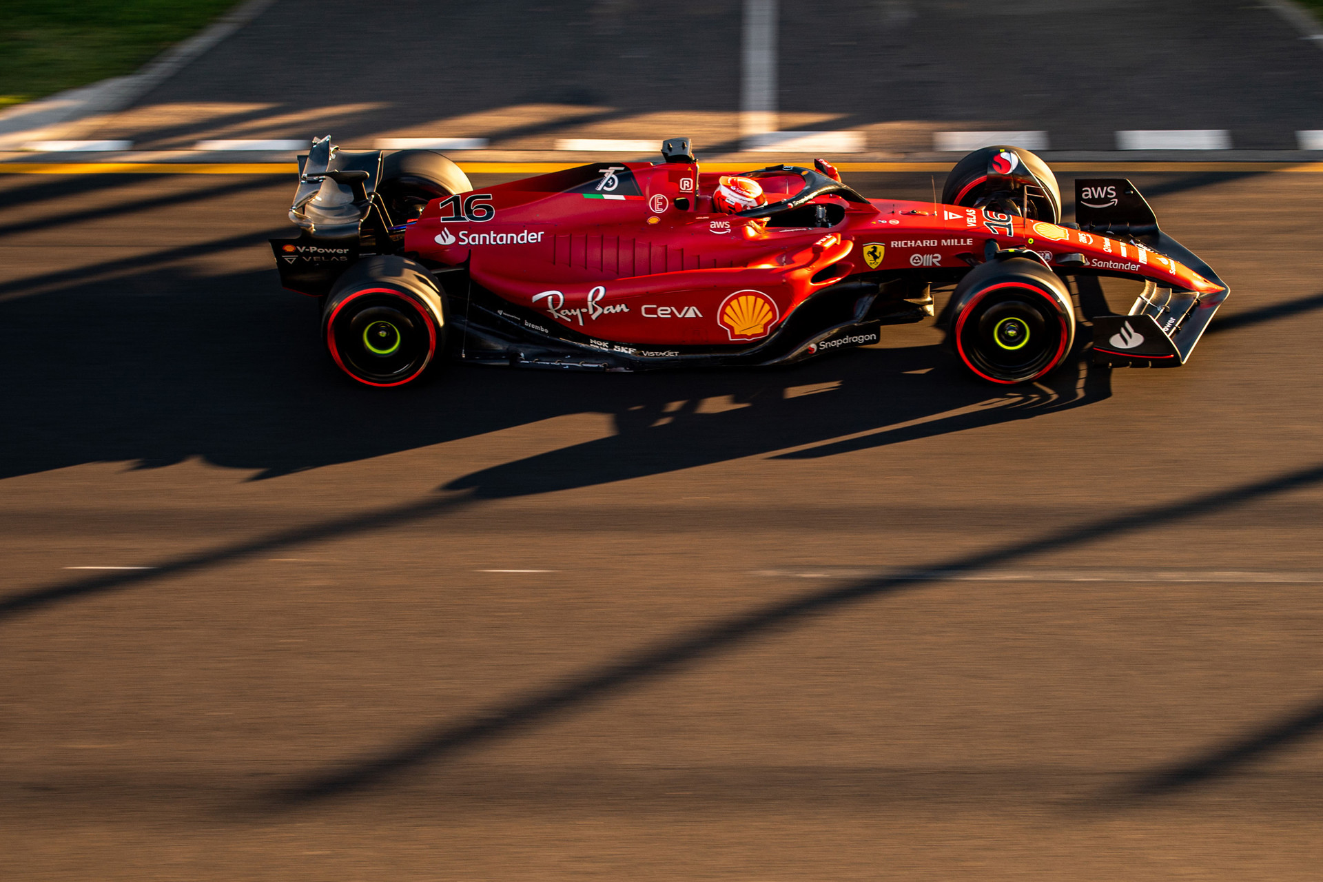
#11 | Scuderia Ferrari | Formula 1

ferrari f1 2023 leclerc monaco

After suffering through many boring and borderline ugly Ferrari liveries over the last couple of decades, it’s so nice to see the team string a few good ones in a row. I thought I’d always prefer the darker shades of red, but the brighter one used in 2023 was wonderful. Paired with the black wings, black side of cockpit and nose, and that Ferrari text logo on the rear wing, it’s quite beautiful – if only that Ferrari logo was yellow! Also, the black section as a background for the Ceva logo helps a lot in making that sidepod look less a crammed billboard than in recent years. Perhaps this is too low on the list, but there’s plenty of interesting liveries coming up.

#10 | Juncos Hollinger Racing | IndyCar

juncos hollinger racing 2023 indycar

It’s fair to say politics haven’t been taken into consideration for my top ten. The Juncos Hollinger cars have looked class all year long. I didn’t realise this until right now but the cool graphic on the side is actually the team logo, a very stylised JHR – probably too abstract for the purpose. That said, the black, green and white colour scheme is wonderful, with very aggressive lines and sharp edges. Let’s see if any sponsors are game enough to put their colours on the cars in 2024.

#9 | Andretti Steinbrenner Autosport | IndyCar

andretti steinbrenner autosport 2023 indycar trubar

DeFrancesco must have raced in 100 different liveries throughout the year, but this one was special. I love this unusual combination of super bright turquoise and pink. It’s in your face and a little candy like, but I’m enjoying the strange and the odd more and more every year. The two main colours are separated nicely by thin lines of black, and I especially like the simple block placement of the Trubar logo. It reminds me of player names on some hockey jerseys – it both fits in and contrasts the design at the same time.

#8 | PHM Racing | Formula 2

My biggest pet peeve with the junior formulas at the moment is how academies take over the liveries overthan team sponsors. Sure, the money must be sorely needed, but there must have been 6 Red Bull liveries on the grid this season. Say what you want about the team and its drivers, but the PHM cars stood out. The bronze colour is one I’m not sure I’ve seen before on a livery, and paired with the reflective, almost rose gold section along the bottom, it made for a beautifully unique design. The intricate pattern on the engine cover really completes the livery, which otherwise may have been too simply. It’s probably the right amount of rose gold as it is, but I wonder how it may have looked on the wings as well, because it really is a stunning colour and effect when used in moderation.

#7 | Tickford Racing (Snowy River Caravans) | Supercars

tickford racing 2023 snowy river caravans darwin indiginous

Darwin brought the indigenous liveries to the Supercars Championship again this year and whilst there weren’t as many spectacular designs as 2022, the Snowy River Caravans car was the pick of the bunch. The full time livery was itself a lovely cyan effort, but they went mainly orange here – the colour more suitable to the indiginous theme, with the Aboriginal art style in flowing wonderfully along the car, creating a traditional look with a modern twist.

#6 | Toksport WRT | DTM

toksport wrt 2023 dtm

If a toddler could effectively translate their love for unicorns and fairy floss into a beautiful real world livery, this is what it would be. These are the bright and in your face colours that glare at you in the toy aisle, but never would I have thought they’d have a place on a Porsche. Well I’ve been proven wrong. The different shades of purple and blue are really nice on the side of the car, with a mixture of straight lines and torn paper sections. Then its contrasted with plain black and bubbly grey sections that give you a break from the strong colour and smack you with texture instead. Another pretty and distinctive livery.

#5 | Peugeot TotalEnergies | WEC

We’ve been blasted with rainbows big and small in recent years but it’s rarely been more than an afterthought. This Peugeot livery looks simultaneously as though a bunch of buckets of paint have been thrown onto it, and also as if someone has spent several months meticulously placing brush strokes one by one to complete a masterpiece. The pattern of thin, colourful lines is fresh and vibrant, and cleverly paired with a simple white, grid paper like design. It’s modern and almost abstract; a much needed splash of colour for a category that has been plagued with boring, corporate blacks, reds and greys in recent years.

#4 | Maserati MSG Racing | Formula E

Let’s face it – the Gen3 Formula e chassis is butt ugly and provides a terrible template for graphic designers. It’s pointy, triangular, seemingly has no curves; only the Cybertruck has polygonal. That said, Maserati have done the unthinkable and made it onto 4th on this list. The designers have expertly hidden all the disgusting features by having black on bottom half and blue on the top half, outlined by a thin white line. It’s classy as hell and makes the paper aeroplane chassis look beautiful!

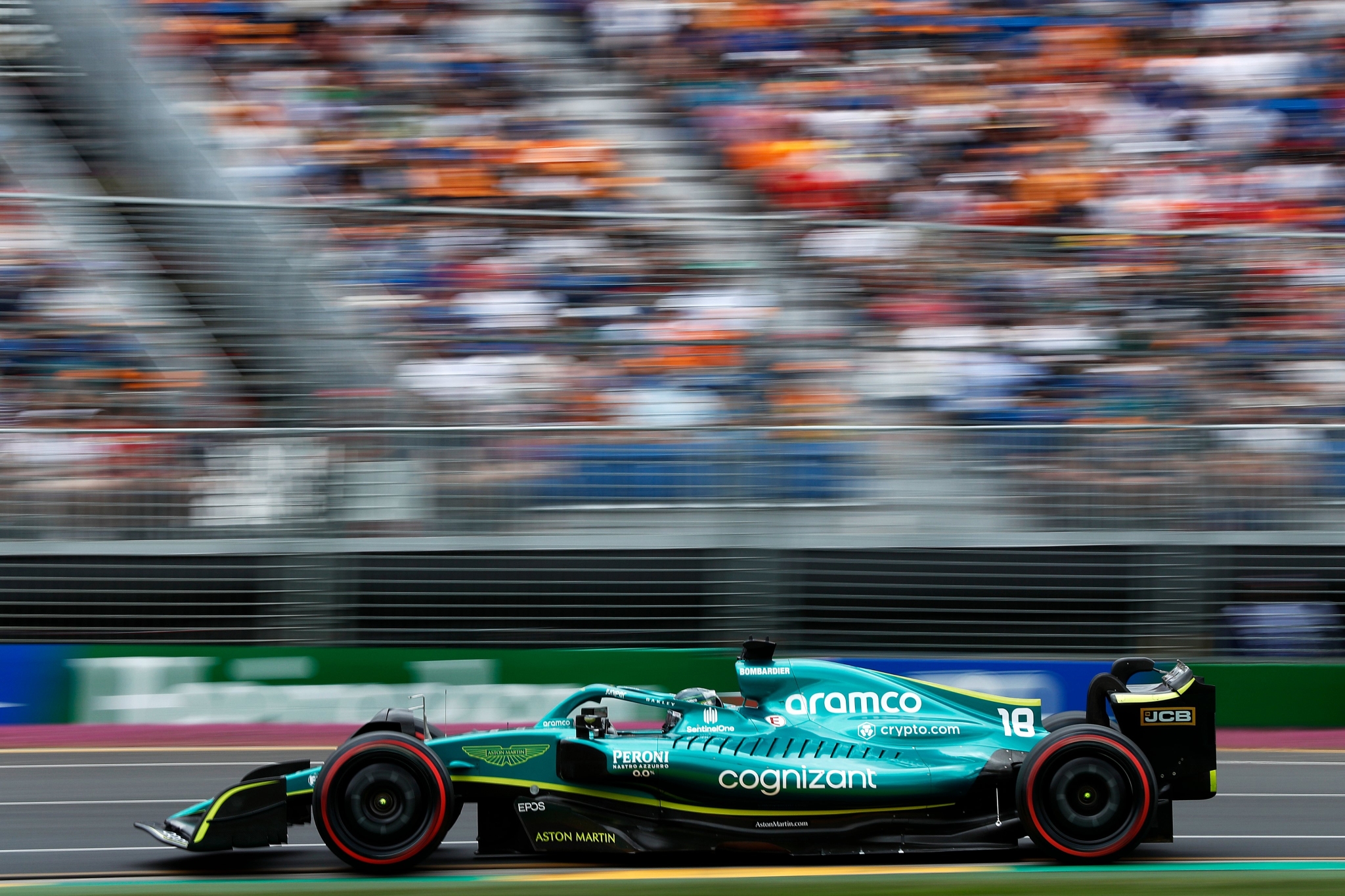
#3 | Aston Martin Aramco Cognizant F1 Team | Formula 1

A modern classic. This livery will be fondly remember in years to come, and who knows, with some more success it could even go down in history as one of the top F1 designs ever. Technically this has fallen from first place last year despite some improvement with the black wings, but that’s the penalty for a near identical livery year on year. It really is an almost perfect livery with the spectacular British racing green, all sponsors uniformly white and the little flashes of fluro green adding some excitement, not to mention the aforementioned black wings. I do hope it evolves next year so we don’t get bored of it and we can look back at it in awe in the future.

#2 | Tickford Racing (Monster Energy) | Supercars

monster energy tickford supercars 2023

Tickford with two liveries in the top 10, but both one off designs. Are the main liveries too conservative? Or is it the limited edition nature that allows the one off liveries to be a bit more experimental and stay in our memories a little longer. Who knows, but this chaotic design is a tribute to the late Ken Block and it’s awesome. It’s unlike any Supercars livery I have seen before and melts the mind with the thin black and white stripes, changing in size and direction all over the car. Add some flashes of colour to the mix and it completes what is the polar opposite of the all black Monster machine of recent years. Perhaps recency bias also plays a role in this placing so high up the list, but who cares, it’s a fantastic livery.

#1 | Arrow McLaren (NTT Data) | IndyCar

arrow mclaren indycar 2023 triple crown indy 500

This year McLaren celebrated their historical Triple Crown victories in the Indy 500, Monaco GP and Le Mans with throwback liveries in IndyCar and F1. Whilst the F1 livery tried to pay homage to all three in one go and looked terrible, McLaren was able to paint three different liveries on three of the team’s IndyCar machines (plus Kanaan’s bonus tribute livery) and it worked so much better. The Alain Prost McLaren throwback was especially beautiful. Whilst clearly a Marlboro livery, papaya orange was used cleverly to skirt any cigarette sponsorship controversy whilst simultaneously honouring the teams past and present. Whilst it was before my time, I imagine I would have grown tired of the Marlboro livery given its roughly 3 decade run in the sport, so its funny how in 2023 we can gaze upon this, embrace the beauty and the meaning, and award it the number one livery of the year.

So there you have it, the top 20 liveries of 2023. The year has flown and I’d love to know if there were any beauties I missed, or if there on this list that are controversial! Let me know in the comments below!

Livery of the Day – Arrows A2

The Arrows Formula 1 team was a perennial under performer, amassing a grand total of 1 pole, 8 podiums and 0 wins across 19 seasons in the sport. However, if you could hand out wins by livery, Arrows would have been World Champion many times over. Despite lack of on track success, the sponsors, colours and designs were more often than not just winners, but some of the best of all time.

arrows a2 formula 1 1979 riccardo pastrese mass

Through their first four seasons in the sport, Arrows wore Warsteiner sponsorship on their cars. For the most part they used a bright, metallic shade of gold, but it was when the gold was paired with the 1979 A2 that the livery became truly memorable. The ambitious design was an attempt at wingless ground effect, but ultimately wasn’t competitive and lasted merely a half season.

arrows a2 formula 1 1979 riccardo pastrese warsteiner

The curvy, sweeping chassis formed a beautiful and unique template for the design, which for the most part is simply Warsteiner’s powerful gold. Whilst gold had already been used very successfully by Lotus on their JPS livery, this livery showed us you can cover an entire car in gold and it could look awesome.

arrows a2 formula 1 1979 riccardo pastrese warsteiner

That’s not to say it’s purely gold. There is a small black section neatly curving from in front of the cockpit all the way to the exposed engine bay, with a thin pinstripe perfectly suited for the era. The logos are also placed nicely on appropriate sections of the bodywork, and the large numbers look fantastic, matching the Wartseiner font perfectly.

arrows a2 formula 1 1979 riccardo pastrese warsteiner

I’m usually an advocate for warmer shades of gold on motorsport liveries, but when that gold is the majority colour, it is able to reflect so much more light, so a cooler shade isn’t an issue. The car was spectacular visually and that isn’t all down to the colour, it’s a perfect example of how a livery can’t be beautiful all on its own.

arrows a3 jochen mass 1982 warsteiner f1

As you can see above, the same Warsteiner livery was retained and adapted to the 1980 Arrows A3, and yet, it’s nowhere near as good. The A3 was a much more traditional of-the-era car design, losing all the flowing curves the A2 flaunted so beautifully. The livery itself can’t make up for it. That’s how a feel about the current generation of Formula e cars – the car shape is a little ugly, so regardless of how nice each team’s livery is, they struggle to make up for those lost points.

arrows a2 formula 1 1979 riccardo mass warsteiner

So the 1979 Arrows A2 was a beautiful car, one of many Arrows designs that were absolutely fantastic. I’m sure it won’t be my last look at this memorable team!

Top 20 Motorsport Liveries of 2022

As 2022 draws to a close, I thought I’d browse through the offerings of as many of the worlds motorsport series’ as I could, to nail down the best 20 motorsport liveries of 2022. While I already had a few favourites from categories I watch on the regular, there are several really nice designs I came across for the first time.

#20 | Ed Carpenter Racing (Carpenter #33) | IndyCar

ed carpenter racing ed carpenter indycar 2022 alzamend

It’s tough to track IndyCar liveries as they seem to change race by race, not mention cars wildcards that don’t appear all season long, just like this one! Ed Carpenter’s machine donned a wild colour combination of purple and aqua for a few races this year, including the Indy 500. The design it fairly basic, but the colours are unlike a combo I’ve ever seen before, so had to pop this one onto the list. Strong and memorable.

#19 | CD Sport | Asian Le Mans

cd sport asian le mans alm adjust4sleep 2022

Here’s one of those liveries I’d not seen before researching for this list. This little gem from Asian Le Mans has a really nice mirror finish candy apple red, working alongside a vibrant fluro yellow, creating a great contrast. Considering the Ligier is not the most beautiful canvas of all time, they’ve used nice colours and a inoffensive design to great effect.

#18 | Envision Racing | Formula E

envision racing frijns cassidy formula e 2022

With Virgin and their purple leaving the team, Envision really beefed up the green and brought some much needed colour to the Formula E grid this season. Whilst clean and well placed, the design isn’t quite groundbreaking in itself, but the bright green alongside the subdued secondary blue really stuck out in what is a somewhat corporate looking Formule E field.

#17 | Andretti Autosport (Grosjean #28) | IndyCar

andretti autosport dhl grosjean indycar 2022

Now I know I’m a bit of a hypocrite, considering I generally hate teams having the same livery year after year, but the Andretti DHL colour scheme continues to stay in my good books. It evolves slightly every season so at the very least it avoids my wrath for being completely stagnant, so I can safely say it deserves a place in the top 20. That said, did anyone else keep bugging out when realising it was Grosjean and not Ryan Hunter-Reay in the car?

#16 | Mercedes-AMG Team HRT (Stolz #4) | DTM

mercedes amg team hrt stolz dtm 2022

This design from Mercedes in the DTM looks like it could well be representing Sweden rather than Germany. In fact, it reminds me a lot of Marcus Ericsson’s F1 helmet and therefore, the mock I made based on it. It’s a bright design, not too complex, and the textured blue adds a little something extra compared to a flat blue that lifts the livery overall.

#15 | PremiAir Racing (Pither #22) | Supercars Championship

premiair racing coca cola pither supercars 2022 darwin indigenous

The Coke machine has one of the nicest, albeit most basic liveries in the field, but they really stepped it up for Indigenous round in Darwin this year. The patterns of the Aboriginal artwork are mesmerising and make for a stunning two tone livery. The design is asymmetrical but it’s created so seamlessly that I didn’t even notice until I was writing this post. It’s also unique in that the sponsor kinda blends into the design as opposed to standing out which is a nice touch, as the Indigenous design deserves to be the focus – not that Coca Cola needs anymore brand exposure!

#14 | PremiAir Racing (Jacobson #76) | Supercars Championship

premiair racing subway jacobson supercars 2022 darwin indigenous

Well PremiAir racing did something right this year; both of their Indigenous liveries were fantastic. The Subway car had a bit more going on in terms of colour that the Coca Cola machine, but there was a great blend of the green, yellow and white in the artwork. It’s a shame it was only used at Hidden Valley as it was much better than their standard livery. If only they kept it for a few more rounds!

#13 | Hyundai | World Rally Championship

hyundai shell mobis wrt wrc 2022 rally

There’s not a whole lot of variety in the WRC with just three makes participating at the moment, but despite the slim pickings, Hyundai have used their team colours in a really exciting and intricate design. The circuit board design doesn’t actually look tacky at all and the positioning of the light blue, red and black is exceptional. A really coherent design, and one that Shell can’t even hinder!

#12 | Puma W Series Team | W Series

puma w series 2022

Single spec series’ in my eyes produce some of the most dull and corporate looking liveries – imagination seems to take a backseat when in reality, something loud and exciting makes you stand out of a boring crowd. Puma have bucked the trend though this season. Neon yellow plus bright aqua and magenta is a weird mixture of colours, but I’m really digging weird of late, so this gets the tick of approval. The patterns aren’t to garish and the big Puma logo on the engine cover is a neat touch and brings back some happy Jaguar memories.

#11 | Peugeot TotalEnergies | World Endurance Championship

peugeot totalenergies wec 2022 world endurance

On a completely different plane of the beauty spectrum, here’s Peugeot who joined the Hypercar class for half the 2022 WEC season. The new Hypercar cars are quite stunning compared to the fairly ugly LMP1 cars that came before, providing a lovely livery canvas, and the incredibly elegant Peugeot takes the cake. First and foremost, the shade of grey used is sublime. It’s funny how a couple of notches lighter can turn a grey livery from hideous to pretty. The design is really simple, in fact it’s only really a few black diagonal strokes that keep this from being completely plain, but it does the job perfectly, offsetting the potentially the extremities of the car from what could have been too much grey.

#10 | Gresini Racing | MotoGP

gresini racing ducati 2022 motogp

Satellite teams in MotoGP often have 2 or 3 sponsors fighting for position, creating an incoherent mess of logos and colours. That wasn’t the case for Gresini this year, sporting a clean sky blue and red combo for their move to Ducati. The design on the bike and leathers is memorable, even more so considering the success of Bastianini during the year. 4 wins and several more high placings made sure this livery was proudly displayed at the front of the field in most races, creating a colourful pack.

#9 | Erebus Motorsport (Murphy/Stanaway #51) | Supercars Championship

erebus motorsport boost mobile bathurst 1000 2022 supercars

Teams can take a few more livery risks when it comes to one off entries, and when it’s done well it really pays off. I’m also a sucker for two tone liveries and apart from a couple of little white sponsor logos, this is completely black and orange. A tip of the hat to Erebus and Boost for pulling this off, because I’m sure it’s difficult to get every sponsor to agree to a uniform colour scheme. Black and orange is a winning combo and the orange flashes really help this car pop. Good stuff.

#8 | Williams Racing | Formula 1

williams racing formula 1 2022 f1

I’m all for plain and simple, but on the contrary, Williams pulled out a really lovely complex pattern for the start of the 2022 season. There’s a lot of space available on the car due to their lack of a major sponsor, but they’ve expertly avoided an empty and boring livery with this busy design. The triangular pattern, vaguely ‘W’ shaped on the sidepod is great, as are the black sections with red stripes on the edges of the car.

I have to stress that I’m specifically speaking to the livery at the beginning of the season. Whilst the Duracell sponsorship placed on the airbox was really clever, the addition of a bunch more carbon fibre areas really take away from the appeal of this car. I’m really not looking forward to the day when every team is 80% carbon fibre black in the pursuit of those last milliseconds of performance.

#7 | Monster Energy Yamaha | MotoGP

monster energy yamaha motogp 2022

I think I’ve spoken about how good this livery in the recent past. The blue and black colour combo, the slick pinstripes, and even the Monster logo make for a really attractive design. It’s subtly complex without being over the top and even the red flashes on Quartararo’s leathers add some nice extra colour to the overall package.

#6 | Virtuosi Racing (Doohan #3) | Formula 2

virtuosi racing formula 2 doohan 2022

As mentioned earlier, spec series’ rarely produce any bangers, but this Virtuosi Alpine themed livery hit the spot. It uses the signature Alpine blue and a toned down version of their previous F1 design on the engine cover to great effect. The sponsors are classy looking, placed well and all uniform in white, and the large black sections contrast the blue well, making for a neat, aggressive livery.

#5 | A. J. Foyt Enterprises (Kirkwood #14) | IndyCar

aj foyt enterprises kirkwood 2022 gateway

A plain black car isn’t a secret to success in itself – it still needs to be executed well. For example, this car had potential for most of the season, but the obnoxious ROKiT logo took all the class away in the races it appeared. However, when Bommarito took its place, the car was transformed into a thing of beauty. This iteration had everything you need on a sleek all black car. A sleek black beauty that really took me back to THAT 1998 Arrows.

#4 | Walkinshaw Andretti United (Mostert #25) | Supercars Championship

walkinshaw andretti united mostert optus 2022 darwin indigenous supercars

The regular Optus livery for Chaz Mostert in 2022 was great on its own, but the Indigenous livery for Darwin was on another level. The blue, yellow and white dotted pattern along the car is fantastic both close up when checking the intricacies, and also from afar when it blends into a teal backdrop for the livery. I didn’t expect to enjoy these Indigenous liveries so much this year, but the three on this list were more than deserved. Looking forward to June next year!

#3 | NIO 333 | Formula E

nio 333 formula e 2022

You know, I’ve made exceptions to many of my own rules in this list, and here’s another. I do have a general disdain for these aqua and teal colours which flooded the Formula E field for the last few years, but NIO pulled them off SO well this season. The curvy aqua pinstripes follow the car’s body so damn well, highlighting the teal perfectly, and giving it a beautiful wind tunnel effect. The red flashes follow the theme superbly too and make for an awesome livery, earning a deserved podium on this list.

#2 | Scuderia Ferrari | Formula 1

scuderia ferrari formula 1 f1 2022

This season, the unthinkable happened. After several years of livery disappointment, all my dreams came true with Ferrari’s F1-75. It checked all of my boxes: A beautiful, deeper red, no garish design on the engine cover, and black wings! All on one of the prettier chassis’ on the grid really cemented this as one of the best liveries of the year. It harked back to scarlet beauties of the early 90s. Nostalgia of the early 2000s Marlboro machines aside, this really is the best looking Ferrari in several decades.

#1 | Aston Martin | Formula 1

aston martin cognizant formula 1 f1 2022

Whilst the car was utter crap performance wise for most of the season, it looked incredible right from the get go. What was a bit of a missed opportunity in 2021 was really perfected in 2022. With BWT gone so was the obligation to pink, and it allowed Aston Martin to unleash their real identity. In came the tennis ball green to replace the bitter pink in accenting the universally loved British racing green. Those swooping lines framed the car brilliantly, as did the black wing end plates that completed the livery’s perfect look. Add to that the uniform and well placed sponsor logos and you can’t help but give this livery the #1 spot.

So what do you think? Do you agree with the list? What liveries should have made the cut? Let me know what you think below!

Livery of the Day – Jordan EJ15/EJ15B

A year in Formula 1 feels like an age, so 14 years is like a lifetime. That’s how long Jordan Grand Prix entertained us for in Formula 1. Jordan was a team that to me as a kid had been in F1 seemingly forever, so to experience their slow decline and sad departure first hand was like a part of the sport dying. To lose Minardi and Jordan at the same time was really quite heartbreaking, so Jordan’s final car and livery are special for fans of my era.

The writing was on the wall for a couple of seasons before 2005, with dwindling points totals and securing less and less lucrative sponsorship deals. It resulted in launching their final car in wintry Moscow of all places, with a pretty bare looking yellow livery devoid on any major sponsors. Whilst it would have a better look come Melbourne, a true major sponsor would still evade them.

jordan f1 ej15b 2005 monteiro

Two rookies would join the team for the new season; Tiago Monteiro, the first Portuguese driver in F1 since Pedro Lamy nearly a decade earlier, and Narain Karthikeyan, the first ever Indian driver in F1. Neither driver would set the world alight that season aside from THAT Indianapolis Grand Prix with Monteiro securing a podium. He also scored an impressive single point in Belgium that year, whilst Karthikeyan only managed points in the aforementioned US GP.

jordan f1 2005 ej15b monza monteiro

As mentioned, the livery did perk up for the first race of the season with the iconic yellow synonymous with Jordan joined by some black lines on the side of the nose, reaching all the way to the cockpit and bordered by a thin red stripe. The livery also featured a merry-go-round of sponsors on the sidepod, including Benson & Hedges (stylised as Be On Edge) and Sobranie, and also the driver’s name in races it would otherwise be blank. The sidepods would sometimes be yellow or on black, seemingly without rhyme or reason.

jordan f1 ej15 turkey monteiro 2005

The livery also featured a similar black section on the airbox which worked well to complete the livery, along with the black rear wing. Perhaps black end plates would have been even better too, although the little black stripe they featured looked nice and matched the nose design well. I feel as though the more black this car had on it, the better it looked. The black sidepods with Be On Edge especially looked great, and also took us back to a better time for the team – as warm and fuzzy as cigarette money can make you feel.

jordan f1 ej15b karthikeyan china crash 2005 alonso

The last season for Jordan was a poor one and they were only saved from total embarrassment by their one lucky podium, and also the fact that Minardi were abysmal and could not even compete with the second worst team in the series. Their final car, the EJ15B would debut at Monza and would earn them just the solitary point. It was quite fitting and memorable that in the team’s final race, Karthikeyan would lose control in a seemingly straight line and crash, totaling one of their cars one last time.

jordan ej15b monteiro belgium spa 2005

So it was incredibly sad to see Jordan, who punched above their weight so many years, die off with just a whimper like they did. That said, in our memories we have some unforgetable moments, some memorable liveries and of course the team’s spirit living on, with Aston Martin the latest iteration of the Silverstone team.

Round-Up – 2022 Formula 1 Field

The 2022 Formula 1 season is well underway and the new regulations sure have provided us with a few surprises! In terms of pace, Ferrari now look like the team to beat, whilst Red Bull have surprised no one…both with their pace and their livery. Haas also jumped their way into the middle of the pack along with Alfa Romeo and from the other side of spectrum, so has Mercedes! On the livery front, it’s a very good looking field with very few disappointments, so the rankings being decided by very fine margins. Anyway, let’s take a look at this year’s liveries, from worst to best.

Oracle Red Bull Racing

oracle red bull racing f1 2022

To the surprise of absolutely no-one, Red Bull are using the exact same livery for the seventh straight season, aside from sponsor changes. For this reason, they are bottom of the list.

oracle red bull racing f1 2022

As I think I say every year, it is not a bad livery, but even the best livery would go stale after this many consecutive years in action. I’d have thought a refreshing update or slight variation of the livery would have been a nice touch to usher in the new look cars, but here we are.

oracle red bull racing f1 2022

Perhaps they wanted to keep the same look after a driver’s championship winning season, but at the very least it’s great to see the #1 proudly displayed on a car for the first time in a number of years.

★★☆

Haas F1 Team

haas f1 2022

Haas saw their F1 character arc change from villain to hero in a matter of days just before the start of the season. With Russia beginning a war in Ukraine, Haas decided it no longer wanted to be associated with Uralkali and the Mazepin family and with one fell swoop, the much maligned Nikita and Team Russia livery were gone!

haas f1 2022

Replacing said driver and livery were fan favourite Kevin Magnussen, and the more traditional Haas colours of red, white and black. The design itself is very simple but aesthetically pleasing, with one long swooping red line from front to back. It’s clean and simple, perhaps a wee bit plain, but a lot less tone deaf than what they had at launch.

haas f1 2022

They get a lot of kudos for all the changes made in very little time before the start of the season, but at the end of the day it isn’t the most exciting livery we’ve ever laid eyes on.

★★★

Alfa Romeo F1 Team Orlen

alfa romeo orlen f1 2022

Even with four races already run, I’m still on the fence about this Alfa Romeo livery. I am glad to see that they changed direction after a very Sauber inspired liveries for the last couple of years, but I can’t get myself to love this one.

alfa romeo orlen f1 2022

The large diagonal split on the side is a nice and bold look, especially with that lovely red, but I’m a little annoyed that they’ve felt the need to split the red and white with a thin black line. The red and white already contrast well enough, so it’s unnecessary and detracts from the look. The little white section on the nose also looks a little funny as it’s presented. It reminds me of someone’s toe poking out of a holey sock.

alfa romeo orlen f1 2022

Had the livery used a plain, flat red it could well have been bottom of the list, but the beautiful deep metallic red saves it from any real embarassment. The retro Alfa Romeo lettering is also a neat touch on the engine cover, but it’s not as impactful as the graphical logo was in the same position.

★★★

Scuderia AlphaTauri

scuderia alphatauri f1 2022

AlphaTauri have tightened their livery game up a bit this year. The overall ethos is the same with the navy blue and white colour scheme, and engine cover still prominently displaying the AlphaTauri graphical logo. However, there is still something slightly off putting about this design.

scuderia alphatauri f1 2022

One reason may be that the pinstriping is back for another year, although the thicker lines make it a lot less offensive, perhaps even trending toward attractive in some areas? It does look very busy though, and something just looks off from the side profile. Perhaps it’s how the sidepod shape makes the lettering of the AlphaTauri logo slope downward, like it’s sliding off the side of the car.

scuderia alphatauri f1 2022

However, it looks really good from the angle above and this has to do with the thicker pinstripes, the lovely framing of the white cockpit and the inversing of the AlphaTauri logo colours on the engine compared to last year. Gives off Brabham vibes in the best way.

★★★☆

Mercedes-AMG Petronas F1 Team

mercedes-amg petronas f1 2022

The Mercedes machines are back in black silver for 2022! Whilst the last couple of years in black were very refreshing and had an important social impact, it’s a great way to ensure those liveries will be fondly remembered instead of being dragged on for too long a-la Red Bull. It’s also a great way of making silver look fresh again, where it can often look as empty as plain white.

mercedes-amg petronas f1 2022

This could well be one of the cleanest modern Mercedes liveries to date. The liveries of the early to mid 2010s tried a bit too hard to be cool, whilst subsequent designs still couldn’t really figure out how to make the Petronas turquoise look good with the silver. It’s kept fairly simple here and I think that’s the secret to success.

mercedes-amg petronas f1 2022

Other little flashes of turquoise on the car are very nice and the deep red Ineos sections are well placed and complement the car well. Even the Mercedes star graphics on the rear of the engine cover have been toned down successfully. Whilst there aren’t really any issues, it is silver which is crisp, but just not a very exciting colour, where the black liveries the last couple of years had that extra sex appeal. The only thing throwing me off this year are the Rossi-esque fluro yellow numbers on Hamilton’s car!

★★★★

BWT Alpine F1 Team

bwt alpine f1 team 2022

BWT is back with a bang in 2022! After a playing a minor role with Aston Martin last year, they’ve moved to Alpine and added a huge presence to their cars. Whilst the first 3 rounds were a pink overload akin to Force India/Racing Point, the livery has thankfully come back to Earth since Melbourne.

bwt alpine f1 team 2022

I wasn’t sure how they would pair the blue and pink together nicely (without copying the amazing 2019 Racing Point) but they’ve done a fine job here. Whilst I’m not sure they needed to be, the blue and pink are separated by a thin section of plain carbon fibre, but the distribution of the three colours on the car is great. However, I wonder if compromising and making the pink sidepod section (and consequently the BWT logo) smaller, if it may have made this a little neater and even better to look at.

bwt alpine f1 team 2022

Whilst the all pink car was a little much, the mainly blue car is very nice, and has a few nice touches, such as the Alpine ‘A’ pattern on the rear of the engine cover (zoom in) and the little French flags on the nose and in front of the cockpit.

★★★★

McLaren F1 Team

mclaren f1 team 2022

McLaren have managed to quite drastically change their livery this year, despite staying with just about the same colour scheme. The orange is a little more fluorescent and the blue is a lot lighter than the last couple of years. I’m not sure if this orange even classifies as papaya anymore! Radioactive papaya perhaps? Either way it’s a refreshing look and my immediate thought was if they saw how much everyone loved their 2021 Gulf Monaco livery with it and moved in that direction for 2022.

mclaren f1 team 2022

It’s also all matte paint now apart from the carbon sections, which have been added since the launch to accommodate for their Google sponsorship. It seems teams are now leaving areas unpainted where they would have previously painted them black. Makes sense from a weight perspective and you can barely tell from a distance. The design itself was a little busy to me at first, but the more I look at it, the more everything seems to have its place to create a harmonious livery overall.

mclaren f1 team 2022

The colours just pop so well and really makes last year’s livery look boring in comparison! The Google wheels are a fun and clever little addition and it just caps off a fun and colourful design, which goes against my preference a little for classic and clean liveries. Don’t forget we have mainly black livery (possibly?) coming during the season too, which could well be the stronger design.

★★★★☆

Williams Racing

williams racing f1 2022

Williams have done it again. Once more, they’ve used their lack of sponsorship as a blank canvas to make a creative, beautiful livery. Whilst McLaren went with in your face colour, Williams have gone with muted blacks and blues, but in a similarly or even more complex design.

williams racing f1 2022

The triangular pattern in different shades of blue not only looks fantastic, but in my eyes does a great job of forming a giant Williams ‘W’ on the side of the car. Whether it was intended, an optical illusion, or my brain overthinking the whole thing only they will know. Since the image above, the team have shed some weight, leaving the darkest blue bits as empty carbon fibre, which actually adds to the aggressive look of the car and creates a stronger contrast for those parts of the car.

williams racing f1 2022

Whilst not exactly livery related, the nose of this car is just really aesthetically pleasing and reminds me of the pointy, curved noses of the early 90s Williams cars. Similarly, the red chevrons on the top of the airbox accentuate the oddly flat nature of this part of the car, but it looks incredible. All the other red flashes are placed perfectly and add a tiny bit of needed to colour to a cool, dark livery.

★★★★☆

Scuderia Ferrari

scuderia ferrari f1 2022

Holy smokes, is this the best looking Ferrari of all time? After years of hoping and dreaming, my prayers have been answered. Not only has Ferrari chosen an absolutely gorgeous shade of red, but they’ve brought back the black wings! The red is a slightly deeper, slightly cooler shade that is incredible even in matte paint.

scuderia ferrari f1 2022

After we found out Santander was getting back on board, I was convinced that white wings were going to be back. What a relief and an incredible surprise. I have almost nothing to critique about this livery. The 75th anniversary insignia on the engine cover is probably the weakest part of the livery, and I can even look past the billboard of a sidepod because of how good the rest of the car looks. Even the black halo looks good now since black more of a theme on the car.

scuderia ferrari f1 2022

They’ve done a complete 180 from last year’s abomination. I never thought we’d ever see a more beautiful Ferrari than the 2007 championship winning machine, but by God I think they’ve gone and done it. Full marks.

★★★★★

Aston Martin Aramco Cognizant F1 Team

Aston Martin Aramco Cognizant F1 Team 2022

So what could possibly top this year’s Ferrari? Well I’m not sure it surpasses it, but it’s most certainly level. This is a beauty and improves on last year’s already great effort in just about every way. The most obvious change is the shade of green used. Whilst the 2021 green was metallic, it was a little too dark/dull and didn’t catch and reflect the suns rays brightly enough. This shade does just that, spectacularly.

Aston Martin Aramco Cognizant F1 Team 2022

Next is the departure of BWT which an absolute blessing for this livery. BWT did seem to be a late addition to the 2021 livery, but it’s just so much better without the pink. The inclusion of Aston Martin’s lime green in its place, sweeping minimally along the side the car, adds a fantastic touch of vivid colour.

Aston Martin Aramco Cognizant F1 Team 2022

Finally, the decision to use black wings instead of green lifts this livery from great to outstanding. Maybe it’s just my thing, but it really helps the green shine without it completely saturating the optical palate. Brings back very fond Caterham memories. All of this is capped off by sponsor logos in perfect uniformity with the colour scheme. What a livery!

★★★★★

The entire 2022 grid is honestly very, very good. We’ve had some stinkers over the years but I can honestly say there aren’t any this season. Perhaps it’s somewhat down to the new regulations creating some very attractive templates to work with, but it’s still very easy to screw it up so I’m glad none of the teams have. And the livery award goes to…

Redemption Award – Haas

They made the right decisions right before the start of the season and turned the whole motorsport world (apart from the Russians) back in their favour.

Back to Back Award – Williams

For years Williams’ livery matched their pace; mediocre to straight bad. Thankfully with new ownership the creative juices have started flowing again, and hopefully the pace follows suit. Two great liveries in a row.

Yawn Award – Red Bull

Marketing just makes me sad sometimes. I get you need to preserve and maintain a certain branding look and feel, but does it have to be exactly the same year after year? I think not.

Phoenix Award – Ferrari

Last year’s Ferrari was a steaming pile of doo doo. A burning trash heap of a livery. They have risen from the ashes and produced what may be Ferrari’s most attractive livery of all time. What an incredible turnaround.

So that’s the 2022 F1 field. Which is your favourite? Are you happy with the changes that some teams have already made since testing? Let me know below!

Top 3/Bottom 3 – The Best and Worst Liveries from the 2022 IndyCar Field

The first race of the season in St Pete is done and dusted, and what a victory it was for Scott McLaughlin. I was stoked to see him get his first win after watching his domination in Australia, but I wonder if Americans are as keen to see another Kiwi in victory lane! Either way, we’ve seen some familiar liveries return, and some new ones join the grid for 2022. Let’s see which ones impressed, and which ones disappointed.

Top 3

#3 – Kyle Kirkwood A.J. Foyt Enterprises

kyle kirkwood a.j. foyt enterprises indycar 2022 livery

All black cars are thing of beauty, when executed correctly. Whilst all white cars can look plain and empty, all black cars usually look sleek and aggressive; this one is no exception. The livery is no frills, but with the two tone colour scheme using just about all white sponsors, it stays classy where it can’t be as exciting.

kyle kirkwood a.j. foyt enterprises indycar 2022 livery

I’m usually a gloss paint fan, but the matte finish here give off a gritty, gunmetalor even military feel. Shame about the sponsor though, and the placement of Rokit on the side does look a little funny, but not enough to keep it out of the top 3.

#2 – Conor Daly Ed Carpenter Racing

Conor Daly Ed Carpenter Racing indycar 2022 livery

I’ve become quite partial to two tone blue liveries of late (foreshadowing?) and this effort from Ed Carpenter Racing passes the test. The deep navy is a real winner of a colour, and the lighter blue that accompanies it is a terrific partner on the car. The linework and placement is well thought out too.

Conor Daly Ed Carpenter Racing indycar 2022 livery

Gold on motorsport liveries is pretty contentious and difficult to get right. It can go from beautifully iconic (e.g. JPS Lotus) to pretty gross (e.g. Wannabe JPS ‘Lotus’ Renault). The shade of gold has to perfectly match the rest of the livery. This one is a good choice – not too dark or cool so it complements and contrasts the blues well, and the metallic nature helps it sparkle in the sun where the other colours don’t. A good overall livery.

#1 – Pato O’Ward Arrow McLaren SP

Pato O'Ward Arrow McLaren SP indycar 2022 livery

McLaren’s new fluro orange has been quite a revelation this new year. Their old papaya was obviously a fan favourite and whilst I was a sad to see it go, this is a really interesting new colour, and very attractive in its own way. Paired with this mostly black livery and alongside the light blue accents, it ends up in a beautiful livery.

Pato O'Ward Arrow McLaren SP indycar 2022 livery

Whilst the two McLaren cars are very similar, I think the Arrow car looks much nicer than the mainly blue Vuse car. There was a lot of buzz around the Gulf livery at Monaco last year which I think the team is trying to cash in on with some of their liveries this year, but I don’t think they are as pleasing to the eye as the mainly black version above. A well thought out colour scheme and placement has lead to a fantastic livery.

Bottom 3

#3 – Josef Newgarden Team Penske

Josef Newgarden Team Penske indycar 2022 livery

There aren’t many hideous liveries this year, but there are quite a few really average ones. Given my disdain for this livery in the past and the fact it’s been around for so many years, it really was a shoe in for the bottom 3.

Josef Newgarden Team Penske indycar 2022 livery

Give us something different Penske! Mix up the design a little, give us a bit of a refresh, maybe throw in a new colour or at least a different shade? They managed it with Will Power’s Verizon livery, so not sure why the Hitachi car is so set in stone. So bored of this, so I’m very glad it won’t be seen at every race and even more happy to hear the wonderful PPG livery McLaughlin raced in last year will be one of the replacements.

#2 – Graham Rahal Rahal Letterman Lanigan Racing

Graham Rahal Rahal Letterman Lanigan Racing indycar 2022 livery

Like the Newgarden livery, this is by no means an ugly design, it’s just so uninspiring. I can understand that a team template needs to be versatile, but it also doesn’t mean it needs to be boring. These are just stock standard colours, with a really basic design.

Graham Rahal Rahal Letterman Lanigan Racing indycar 2022 livery

Just some real generic/default livery vibes from United Rentals car, especially given there’s so much white on the car. I feel like a majority blue design could have spiced this up a little, or at the very least taken it out of the bottom 3.

#1 – Alexander Rossi Andretti Autosport

Alexander Rossi Andretti Autosport indycar 2022 livery

Well this livery is just kinda gross. It very much reminds me of the early 90s Brabham F1 car which was also quite hideous. If BWT has taught us anything, it’s that the right shade of pink is vital when mixing it with other colours, and this ain’t it.

Alexander Rossi Andretti Autosport indycar 2022 livery

The super vibrant pink and the saturated blue clash horribly in my opinion. Add the yellow Napa logo and it just compounds the disharmony. Perhaps with a unique design as opposed to the standard Andretti template, these colours could have worked better to together, but it stands, it is the worst livery in the field.

So what do you guys think? Do you agree with my choices, or are there other cars on the grid that you think are more deserving? Either way, it seems IndyCar liveries get chopped and changed pretty frequently, so we’ll see if these standing change come the 500.

Livery Mockups – 2022 Formula 1 Field

Well it’s the old template again as I couldn’t get my hands on a really good one for the new F1 regulations, but the liveries should work just about the same. There haven’t been a huge number of sponsorship changes so I’m not expecting an major alterations to colour schemes across the grid, but I’m sure we’ll see a couple of surprises. As always I’ve try to keep things realistic, but have given myself a few liberties just to avoid some of the designs looking a little stale. Just to be different, let’s go in championship finishing order this time!

Mercedes-AMG Petronas F1 Team

mercedes amd petronas 2022 fantasy mockup livery

It has been more or less confirmed that Mercedes will be moving away from the black liveries of the past couple of seasons, and as lovely as they have been, I think it’s a great move. It doesn’t take long for a livery to overstay its welcome and it’s best to quit while you’re ahead. It’s certainly in the brand’s best interests to bring back its traditional silver, but there’s no saying the black can’t return for a once off run during the season as a nice surprise.

I’m hoping they clean it up a little this year so I’ve moved away from the repeating patterns along the engine cover and dialed up the Petronas turquoise just a little bit, which fades into black in each of its three main sections. I’ve also tried spicing up the sponsors a little, with a turquoise ‘shadow’ for each, just for something different, but very unlikely.

Red Bull Racing

red bull racing f1 2022 fantasy mockup livery

Red Bull have been far too predictable the last few seasons; six seasons in a row now with an agonisingly unchanged design. Whilst I am hoping that they do go for something completely different considering we are entering a new era of regulations (who wouldn’t love a good old Red Bull can livery?), my gut tells me they’ll stick with their current branding. Hence, I’ve gone for some tweaks rather than a complete overhaul.

I’ve kept the important things the same, but have ditched the stale old red lines and replaced them with some thicker and shorter, broken up red lines, which are partially bordered by a lighter, royal blue line. This lighter blue isn’t completely foreign as it’s been used in other categories previously. For me, this would be enough of a change to freshen up the Bulls without a completely new format.

Scuderia Ferrari

scuderia ferrari f1 2022 fantasy mockup livery

The word is that Philip Morris is ending their sponsorship with Ferrari after decades of support, and this is fantastic news. Not only from an ethical standpoint, but also because the abomination that was the green Mission Winnow logo will be gone. That logo capped off possibly the most disgusting Ferrari livery of all time last season, so things can only get better. Let’s just hope the reports of a darker red being used isn’t the same terrible colour used on the rear of the 2021 machine.

Also gone will be UPS, so another colour in brown will also vacate the Ferrari for 2022. This hopefully means a much cleaner and more uniform livery which I’ve tried to emulate here. I’ve followed the same sponsor placement of the last few seasons, but it looks a little nicer without the brown UPS logo now. Santander now takes up the engine cover, although this all depends on how much cash they are actually putting into the team. I’ve been a little hopeful with the black front end plate under the Velas logo, and finally some Italian flavour with a few little green and white stripes along the car to keep it from being too monotonous.

McLaren F1 Team

mclaren f1 team 2022 fantasy mockup livery

McLaren have really settled into their colour scheme over the last few years, and have kept things fresh by making new design changes year on year. Barring any major sponsorship announcements in the next week, it seems the papaya and blue combo will be sticking around!

The 2021 livery was pretty, but fairly basic, so I’ve gone with a more angular, and perhaps more modern design. It’s still majority papaya, with large blue sections along the sidepod and engine cover, although there are thick black and papaya diagonal lines intersecting them at the rear, and a matching blue line on the nose in front of the cockpit. They did a great job displaying all their sponsors last season, so I’ve tried to follow this design ethos, fitting them nicely within the aforementioned lines.

Alpine F1 Team

Wholesale changes at Alpine weren’t restricted to team members, but also to sponsors, with the much adored BWT ditching Aston Martin and potentially bringing some pink to Alpine in 2022. This made the design extremely tough, as it was surprisingly tough to fit the pink into the very French blue, red and white livery.

I flirted with mixing the red and pink sections on the rear of the car but it just didn’t work out, so in the end I put my hopes in BWT investing enough into the team to adorn the engine cover. Therefore, it’s a clean cut pink section that seems to match fairly well the the rest of the Alpine blue, especially given the blue BWT lettering. This almost intersects with the red section at the rear, which I hope sticks around in 2022 as the design is lovely, and very distinctive to the team (although I’ve tweaked it a little in my version). I’ve also matched this section with a similar one next to the cockpit, which I think is nicer than the small red and mostly black design there in 2021.

Scuderia AlphaTauri

scuderia alphatauri f1 2022 fantasy mockup livery

AlphaTauri’s livery last season was one of the more disappointing on the grid. It has such potential, and yet the design ended up being so generic, looking like little time had been put into it at all, which is surprising given how cutting edge and forward thinking Red Bull are as a company. Either way, I’ve tried to make amends for 2022.

I’ve gone with something way more intricate than they attempted, with some angular thick and thin stripes on the rear of the car. Matching ones can be seen in front of the cockpit, with these featuring another thick line that sweeps along the side of the nose. I’ve also added a white line along the sidepod to keep that area from being blank, and also serves a purpose in highlighting/underlining a potential Red Bull Powertrains logo where Honda appeared last season. Finally, whilst a two tone livery was tempting, I’ve decided to play with the pinky-red Red Bull colour and add some flashes on a few sections of the car, which also helps to break up the thick white lines a little.

Aston Martin Cognizant F1 Team

aston martin cognizant f1 2022 fantasy mockup livery

I’m confident that if BWT weren’t an afterthought coming into the 2021 season, that their inclusion on the livery would have been much better thought out, but I’m happy that they are moving on and that we’ll potentially see a much nicer pairing of Aston Martin’s two distinct green colours.

That said, I don’t expect anything too out of the ordinary for their 2022 livery, so I’ve changed their long pink stripe into two similar, yet slightly more understated and aesthetically pleasing bright green lines. I’ve also added a couple of flashes of this bright green colour in some key areas, as well as making the Aston Martin logo beneath the cockpit this colour, although I’m not sure of the possibility this would happen in real life.

Williams Racing

william racing f1 2022 fantasy mockup livery

Williams went crazy with their livery last season, about as non-traditional as a Williams has ever looked, and it was awesome to see. It was a little weird, a little exciting, but overall passed the eye test. With no major sponsorship announcements just yet, it could pave the way for another wild design, and that’s the philosophy I’ve taken!

With a lot of empty space to work with, I’ve gone about filling it with a busy but cohesive use of the blue colours, making sure it doesn’t look empty despite the lack of sponsorship. It’s a little outside the box with sharp angles, multiple gradients, striped patterns and intersecting lines and colours, but I feel nothing is off limits after last season’s design. Williams’ light blue is still the main colour though, and the yellow-gold colour makes another appearance shadowing two of the dark blue sections, as well as appearing on the front of the nose cone, in front of the cockpit and two bits on the rear of the car.

Alfa Romeo F1 Team Orlen

alfa romeo f1 team 2022 fantasy mockup livery

My Alfa Romeo design from last year was probably my favourite of the bunch, and I was honestly a little disappointed with their actual livery for 2021. That said, I’ve moved on to a new concept for 2022.

I took some inadvertant inspiration from one of my favourite Indy Car liveries of the last few years – let’s call the white sections on this car an ode to the Italian/Swiss alps, given the team’s heritage. The Alfa logo and the beautiful red have always been the best parts of their liveries, I’m just hoping that the rest of the puzzle pieces get put together correctly for this season, and hopefully minus the pinstriping too.

Uralkali Haas F1 Team

uralkali haas f1 team 2022 fantasy mockup livery

No one was more surprised than I was when the Team Russia Haas F1 Team car was launched in 2021. It’s funny and a little ironic that the proudly American F1 Team was adorned by the Russian flag, and yet as long as Mazepin is a part of the team, I don’t see the design ethos changing direction.

That said, I’ve tried to make the flag design a little bolder, as it looked a little bit F2-ish last season. I’ve gone with some thick wavy stripes on nose section and engine cover, with very end of the blue part on the engine cover speckling away into a lighter blue.

So I hope I’ve done a decent job of coming up with some appealing and realistic liveries for the 2022 F1 field. Which fantasy livery was your favourite, and do you think there’s a chance any of these could be similar to what’s launched in the next couple of weeks?

Top 3/Bottom 3 – The Best and Worst Liveries from the 2021-22 Formula E Field

The Formula E field has done well this season, with a few more interesting colours and designs popping up, thankfully moving us a little further away from nearly the entire grid using the same colour schemes. That said, which livery came up trumps, and which was most disappointing?

Top 3

#3 – Avalanche Andretti Formula E

avalanche andretti formula e 2021 2022

It’s sad to see a big manufacturer like BMW leave Formula E, but it’s fantastic to see new sponsorship bring new ideas. In this instance its a complete colour change, somewhat unfortunately to red, black and white which has already saturated the grid, but thankfully it’s a new and interesting asymmetrical design that’s ensures it doesn’t get lost in the sea of samey colours.

avalanche andretti formula e 2021 2022

Whilst I’m not traditionally a fan of asymmetry, it’s a very clever use of the cars natural body lines. It allows them to maximise the size of the sponsor, and incorporates it nicely into what’s really the sole design element on the car aside from the black sections, looking like a sash on a football jersey, which I’m also a fan of!

#2 – Envision Racing

envision racing formula e 2021 2022

Virgin has also left the sport, and have taken their lovely purple with them. Whilst Envision could have slipped back into the clutches of the bog standard Formula E colours, they’ve thankfully gone in the opposite direction and smashed us with some vibrant fluro green!

envision racing formula e 2021 2022

It’s paired with a delightful metallic navy blue, with the green only featuring on the top facing parts of the car. The two colours are separated by a thin white line which is good, but I wonder if it would have looked better without it. Either way, a nice refreshing colour for the grid.

#1 – NIO 333 Formula E Team

nio 333 formula e 2021 2022

It was difficult not to pick the bright green of Envision as number one, but NIO 333 was really the cream of the crop this season. I guess it proves me wrong and that you can use the fairly generic ‘electric blue’ colour and still have a great and unique livery.

nio 333 formula e 2021 2022

It’s a really well thought out livery here, with very thin turquoise/aqua lines on a royal blue base, producing almost a mini version of the classic Falken Nissan Skyline livery when you look at it up close. These thin lines follow the bodywork really nicely, creating a wavelike design flowing over the car. They are matched by thin red lines on the extremities of the car, ensuring the blue on blue isn’t too much…blue.

Bottom 3

#3 – Mahindra Racing

mahindra racing formula e 2021 2022

Now I must preface this by saying this is not a bad livery. In fact, after a few seasons of Formula E that has featured several poor liveries, 21-22 has been a big improvement overall. Whilst Mahindra has dropped down my order, it’s simply because there’s not enough happening. It’s a very basic livery with a nice, vibrant red on the top and contrasting black on the bottom.

mahindra racing formula e 2021 2022

They’ve taken away a lot of the intricacies of past seasons and with it, all of the excitement. It’s all just a little too standard, and you can see how with the same colours, Andretti created a much more interesting livery.

#2 – Jaguar TCS Racing

jaguar tcs racing formula e 2021 2022

Something about the Jaguar colour scheme has just never sat well with me. Perhaps it’s that every team at one point seemed to be using this designated electric blue colour, but whilst most other teams moved on, Jaguar have doubled down. It’s such a bold colour that with every year it’s used in such large sections, it gets more and more tired. Credit to NIO who used it a lot more subtly this season.

jaguar tcs racing formula e 2021 2022

The new honeycomb pattern is alright, but nothing mind blowing either. Again, I think it’s more to do with the aqua paired with the charcoal that is no longer interesting for me. They will have to do something far more out of the ordinary to impress with these colours next season. It’s a shame they didn’t find a way to incorporate British racing green back when they started in Formula E.

#1 – TAG Heuer Porsche Formula E Team

tag heuer porsche formula e 2021 2022

Well, it was kind of a shoe in when one of my least favourite liveries remained unchanged for several seasons. If you are going to pick an identity and stick with it, make sure it’s not boring. It’s different when Toyota in F1 picked something totally out there as a livery identity and kept it for nearly a decade, but imagine seeing this Porsche livery for years to come?

tag heuer porsche formula e 2021 2022

It’s just so boring! You really can’t get less exciting than these corporate colours laid out in this fashion. The thirds design only really works from a top view angle, but the car is only really every seen from front and side on. I mean look at the picture above, it’s almost camouflaged into the tarmac and track sponsors! I really can’t believe they didn’t bring anything new to the table for 21-22.

Let me know your thoughts! Does you agree with my choices? Which livery to you think was best and worst this season? Drop a comment below.

Livery of the Day – Nissan Motorsport ‘Norton Hornets’

2013 saw some huge changes in the V8 Supercars championship. After decades of a two make competition, two new brands joined the series, with Mercedes-Benz entering the E63, and Nissan entering the Altima. Whilst neither car would achieve anywhere near the success of their Ford and Holden counterparts and would leave the series within a few years, Nissan did at least bring us some memorable liveries.

moffat and caruso nissan norton altima 2013

Whilst the Todd and Rick Kelly Nissans retained their Jack Daniel’s liveries through their switch from Commodore to Altima, their other two cars brought in a new sponsor in Norton. The digital security company adorned the cars in their logos and distinct yellow and black colours, giving them the nickname the Norton Hornets.

moffat and caruso nissan norton altima 2013

Early in the season the cars ran a majority yellow design, featuring just a black and white stripe along each side, as well as black roof. It was quite basic, but the bright yellow was enough for the two cars to stand out from the crowd (don’t forget the ekol Commodore!), especially being towards the back of the grid a lot of the time!

moffat and caruso nissan norton altima winton 2013

It didn’t take long for them to make some changes to the livery though, and they moved to a new design featuring a more cleverly placed Norton logo and some thick diagonal black lines with piping that frame the logo well too. It was certainly an improvement and a more distinct and unique livery to the one presented at the beginning of the season.

moffat and caruso nissan norton altima winton 2013

With the livery change came some success too. While Nissan were consistently poor throughout their tenure in the V8 Supercars Championship, only cracking the top 10 a handful of times in 2013 specifically, they had a major and memorable breakthrough at Winton that year. It all came together perfectly that weekend, with James Moffat leading Michael Caruso home in a Norton Hornet 1-2 finish in the first race of the weekend. It was the most unlikely of results and would be one of just three victories a Nissan take in their seven season stint in the series. Did the livery have anything to do with it? Unlikely, but it’s the bright yellow livery was one of the more memorable parts of Altima’s journey in Australian Motorsport.

Top 3/Bottom 3 – The Best and Worst Liveries from the 2021 MotoGP Field

So we’re just about half way through the 2021 season with a few weeks off until the next race, so let’s take a look at the best and worst liveries the teams have brought us this year.

Top 3

#3 – Monster Energy Yamaha

moster energy yamaha 2021 maverick vinales

There haven’t really been any changes to the Yamaha livery this year, but it’s still one of the best on the grid. The black and blue work very well together, especially with the pinstripe design on the front and side.

moster energy yamaha 2021 fabio quartararo

Even the Monster logo works well here, the vibrant green popping out against the dark blue and black. It’s a coherent and well thought out design; happy to see it out there despite not being updated this year.

#2 – Tech3 KTM

tech3 ktm factory racing 2021 iker lecuona

Tech3 had a great livery last year with the orange and blue combo, but they’ve turned the orange up to the max this year, with nearly the entire bike covered in it. There’s no blue on the bike at all this time, instead replaced with black which may be to it’s detriment slightly, but it certainly doesn’t stop the bike looking great.

tech3 ktm factory racing 2021 iker lecuona

While I don’t think it’s quite as perfect as last season’s design, it’s an interesting and refreshing design, and gives the two KTM teams a little bit of individuality.

#1 – Suzuki Ecstar

team suzuki ecstar 2021 joan mir

Silver is usually a really middle of the road colour when it comes to livery design. However, paired as it has been with the lovely Suzuki blue, it takes this livery to the top of the pile. Their design last season was a little generic with the white and yellow flashes, whilst this one is unique and more appealing overall.

team suzuki ecstar 2021 alex rins

They’ve also managed to add the black Monster section to the bottom of the bike in a really positive way, integrating well into the livery and not slapping it on as an afterthought. It’s a massive improvement on 2020, and is my #1 livery for the year.

Bottom 3

#3 – Petronas Yamaha

petronas yamaha srt franco morbidelli 2021 motogp

The only thing more disappointing than Petronas Yamaha’s pace this season is their livery. From winning races a year ago to fighting to stay in the points, it’s been a bit of a disaster. The livery too is just a little boring I’m afraid. The turquoise is full of promise but paired with the dark grey, it just falls flat.

petronas yamaha srt valentino rossi 2021 motogp

It certainly isn’t a stinker, but it really fails to excite, especially when their livery last year at least more interesting, albeit also not an amazing effort. Perhaps more turquoise and less charcoal would be make things a little more exciting.

#2 – Aprilia Gresini

aprilia racing team gresini motogp 2021 aleix espargaro

Aprilia seems to have one of the least impressive liveries year after year. They’ve got some very standard but workable colours in the Italian red, white and green, but instead they use these as accents against matte black. It’s a really odd choice because their liveries end up lacking excitement and personality.

aprilia racing team gresini motogp 2021 aleix espargaro

Then you have the Aprilia logo in yellow which doesn’t match any other part of the livery (perhaps the leathers, but that’s about it). It’s really uninspiring, matching their lacklustre pace, although Espargaro has dragged it up the field at the start of races often this year which is fantastic to see.

#1 – LCR Honda Castrol

lcr honda castrol alex marquez motogp 2021

This design looks like it’s trying to fit three separate liveries onto one bike. I guess this is the issue when you can’t snag a single big money sponsor, but there’s certainly a better way to get many sponsors looking good on the one machine.

lcr honda castrol alex marquez motogp 2021

There’s just a little too much going on this Honda, especially when compared to the stable mate Idemitsu bike, which with one major sponsor, looks so clean and uniform in comparison. It’s a design with a little too much going on, and whether by necessity or not, it makes it my least favourite livery of the year.

Do you agree with my choices? Let me know which bike you think looks best and worst this year!