
Another season is upon us and fingers crossed we can get through this one without interruptions. Not a tonne of big surprises on the livery front, but let’s check out this seasons designs.
Brad Jones Racing
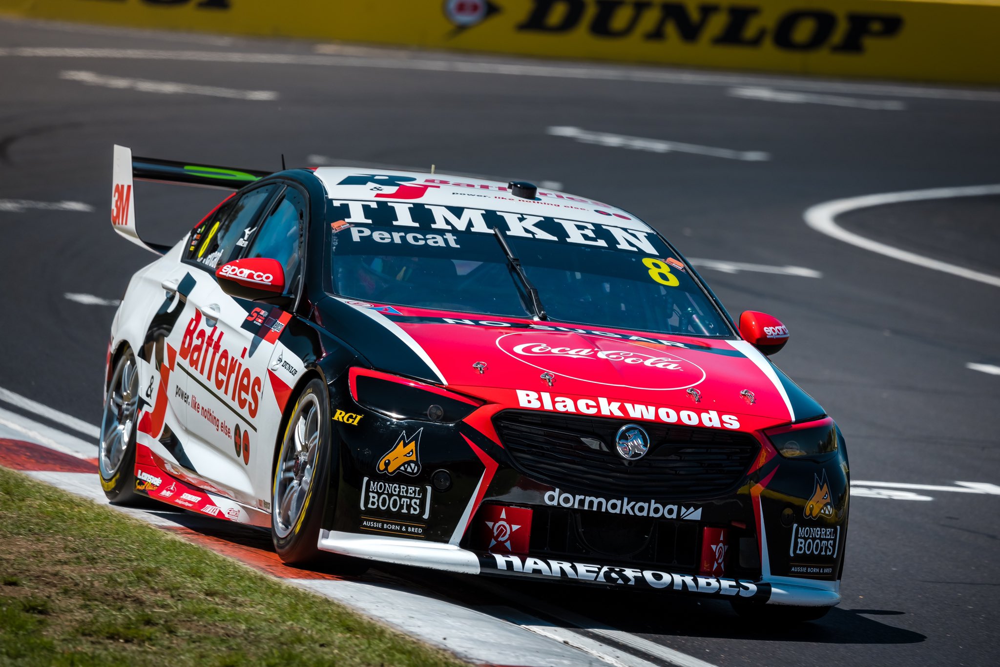
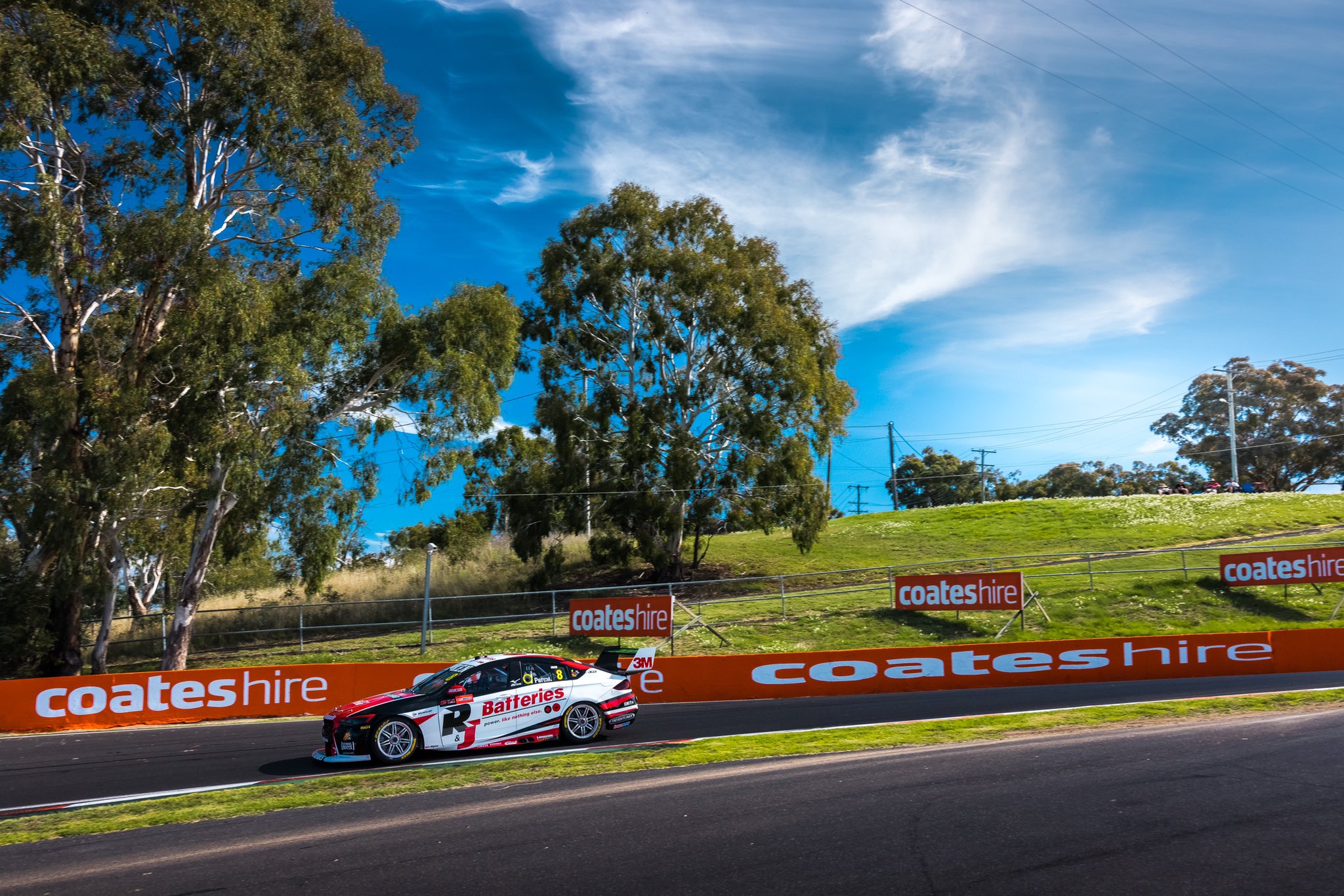
Looks like R&J Batteries will be sponsoring Percat throughout 2021 in what is a pretty middle of the road livery to kick us off. Some standard colours in white/red/black, placed on the car in not so ground breaking fashion, but certainly in no way ugly. Some nice flashes of red and white on the front lights and bumper.
Majority white along the side suits this one well, especially with the sponsor naturally being red & black. The large spike along the side from the bumper works well to fill that space on the left, but interferes with the main sponsor logo a bit on the right – kind of annoying but not the end of the world.
★★★
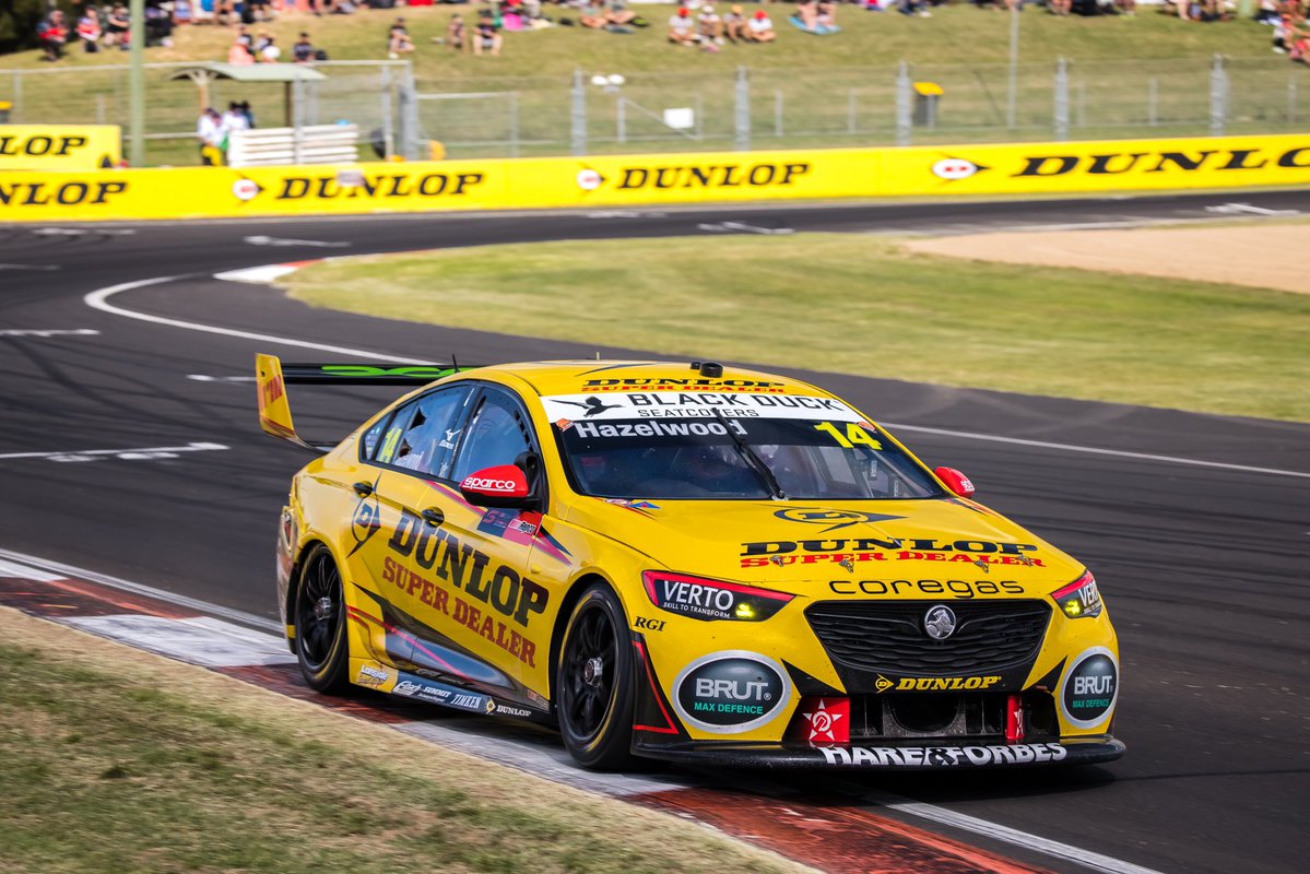
As for Hazelwood’s #14, it looks as though the sponsor will change race by race, but for Bathurst it was a Dunlop Super Dealer livery. It’s a pleasant mainly yellow effort, with similar flashes to the R&J batteries livery. It’s just a nice shade of yellow, one that doesn’t need a lot of help to make it look good.
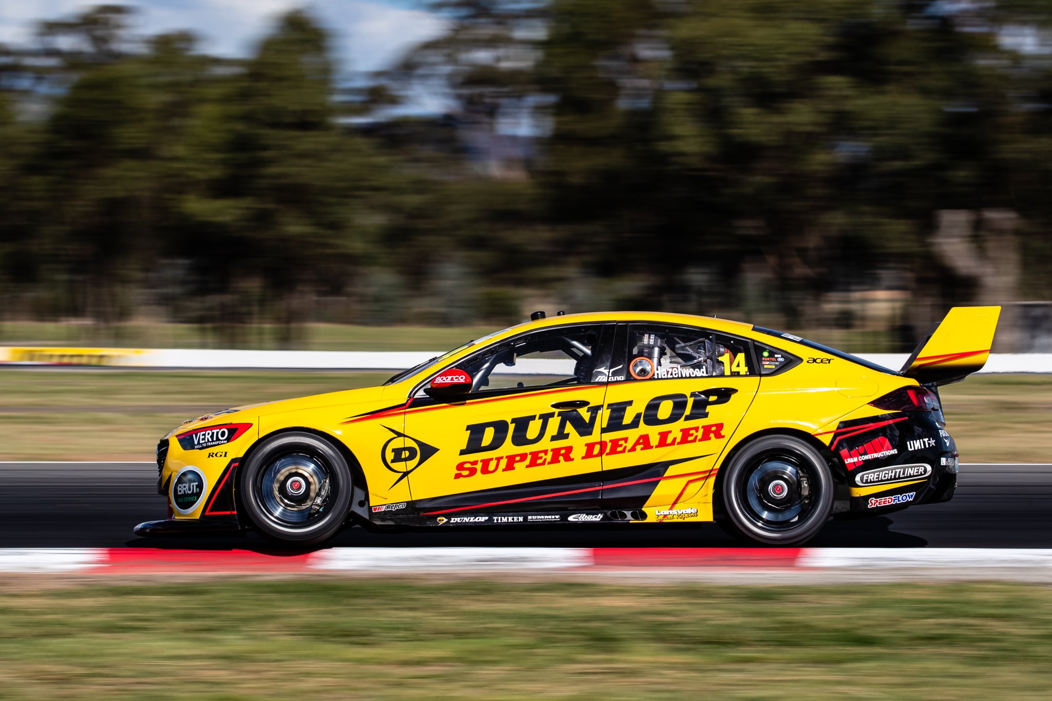
For that reason I’m glad there are some of the red and black flashes, but not taking up too much space on the car. I’m not sure if this style of design is a bit dated? Either way, the colour does most of the work in making it look good. Glad to see black rims too.
★★★
CoolDrive Racing
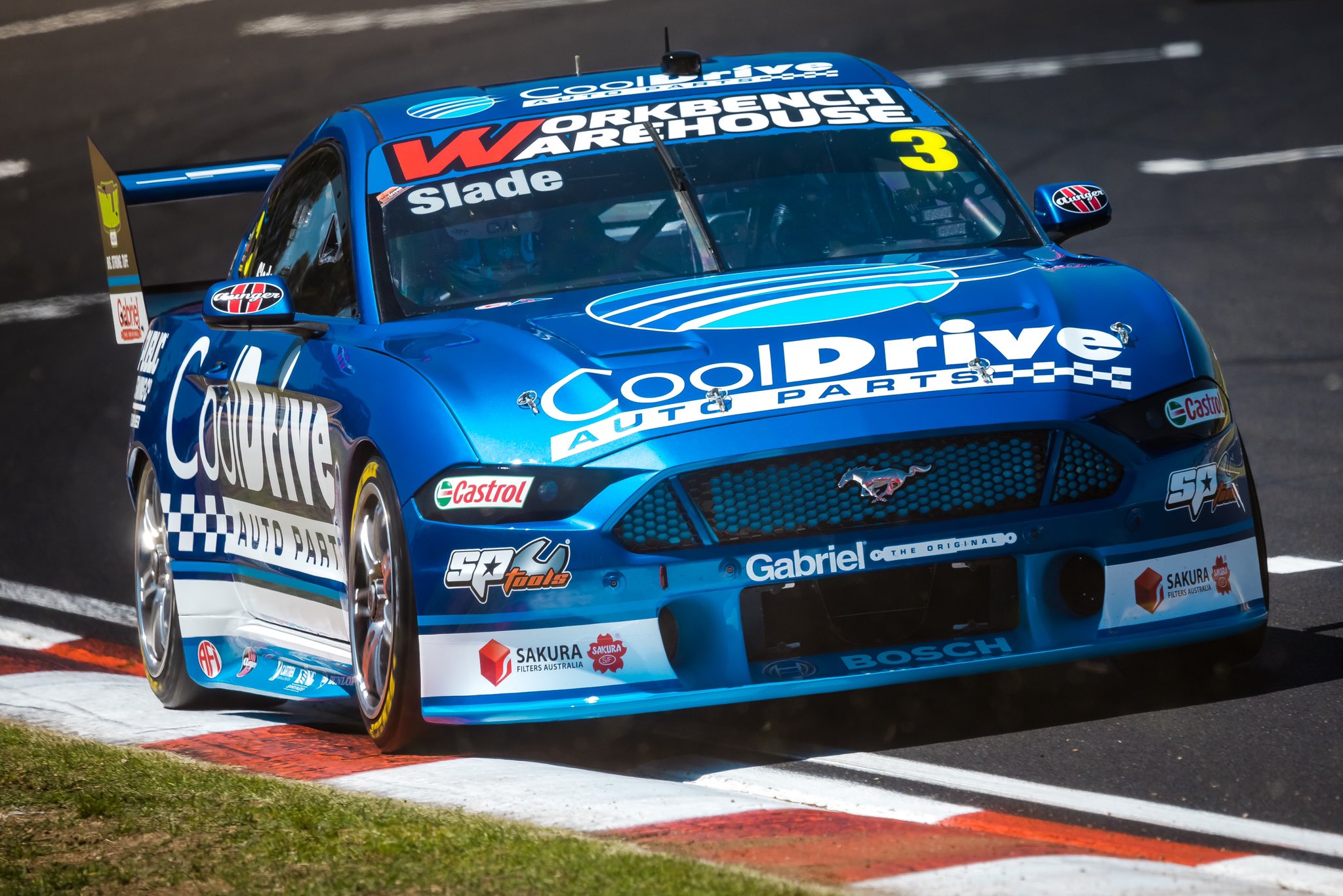
After years of driving around the back of the field in a Brad Jones Commodore, Tim Blanchard has grabbed a Mustang and immediately found some competitiveness in 2021! It was great, if not unusual, to see the familiar CoolDrive colours toward the front of the grid. The wonderful metallic blue is back which is fantastic, and with the amount of the secondary flat light blue colour reduced on the car, the metallic blue has been able to shine through even more.
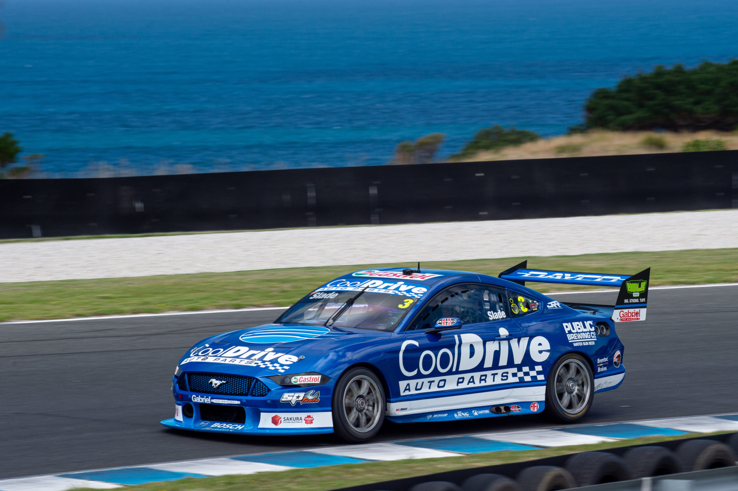
The design is very simple – a thick white line along the entire side of the car, bordered some of that lighter blue. Really uncomplicated, but the real beauty is obvious once the sun hits that metallic blue. It does look a little too linear though, and perhaps a slight angling of the lines and logo might have made it look a little speedier, as can be seen on many of the other cars. Another contributor to this may be that it’s a little text heavy – perhaps it does miss the graphic CoolDrive logo which has been on the side on previous renditions.
★★★☆
Erebus Boost Mobile & WD-40 Racing
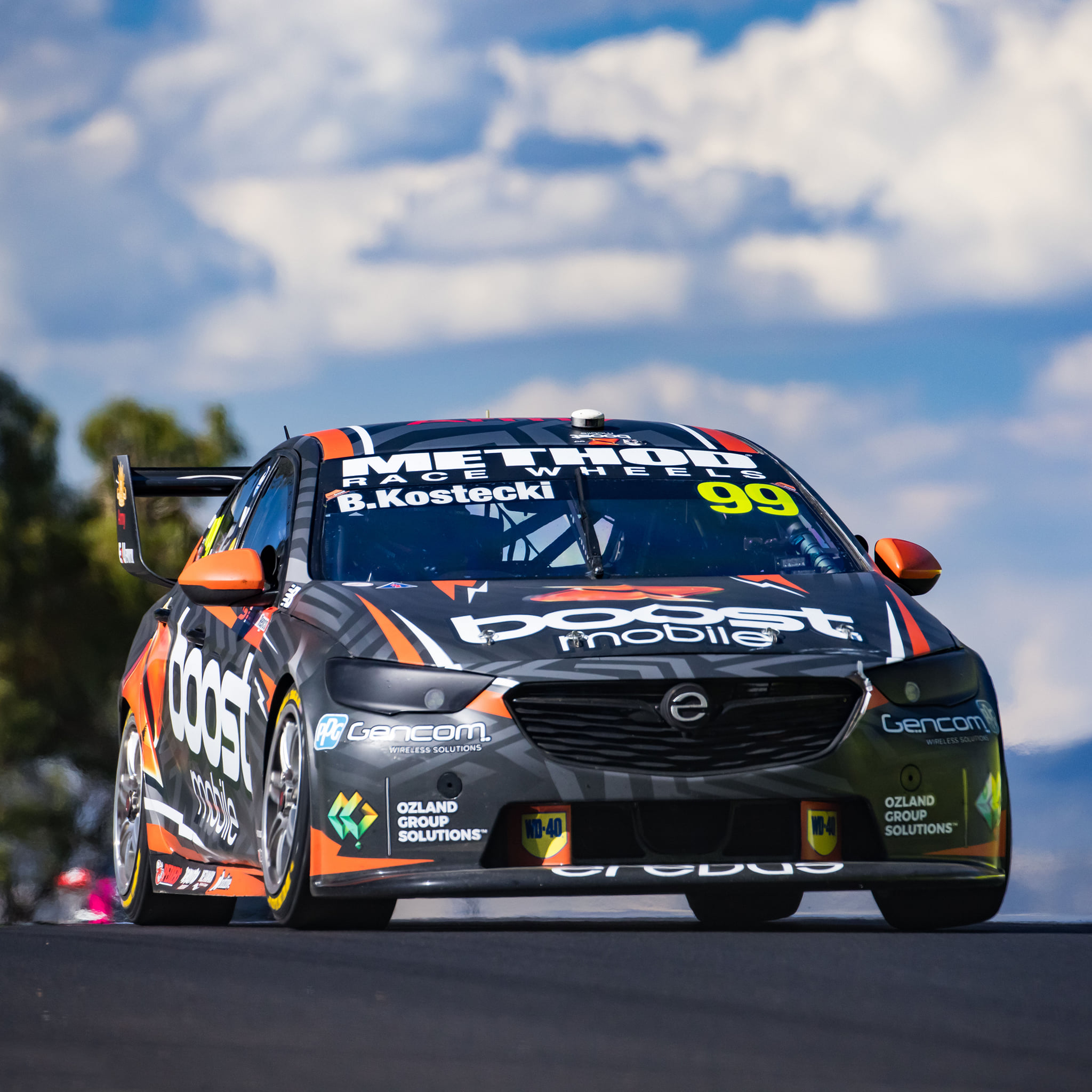
It’s very odd to see Erebus without Penrite, and it’s also odd (albeit not the first time) to see Boost Mobile sponsoring two cars from different teams. Which car has the best Boost livery? Spoiler alert – it’s this one. This livery sticks mainly to charcoal and orange with some flashes of white, which is a great combo. It’s a very modern looking livery with the pattern that isn’t overwhelming, whilst the orange & white flashes add some necessary colour to the car.
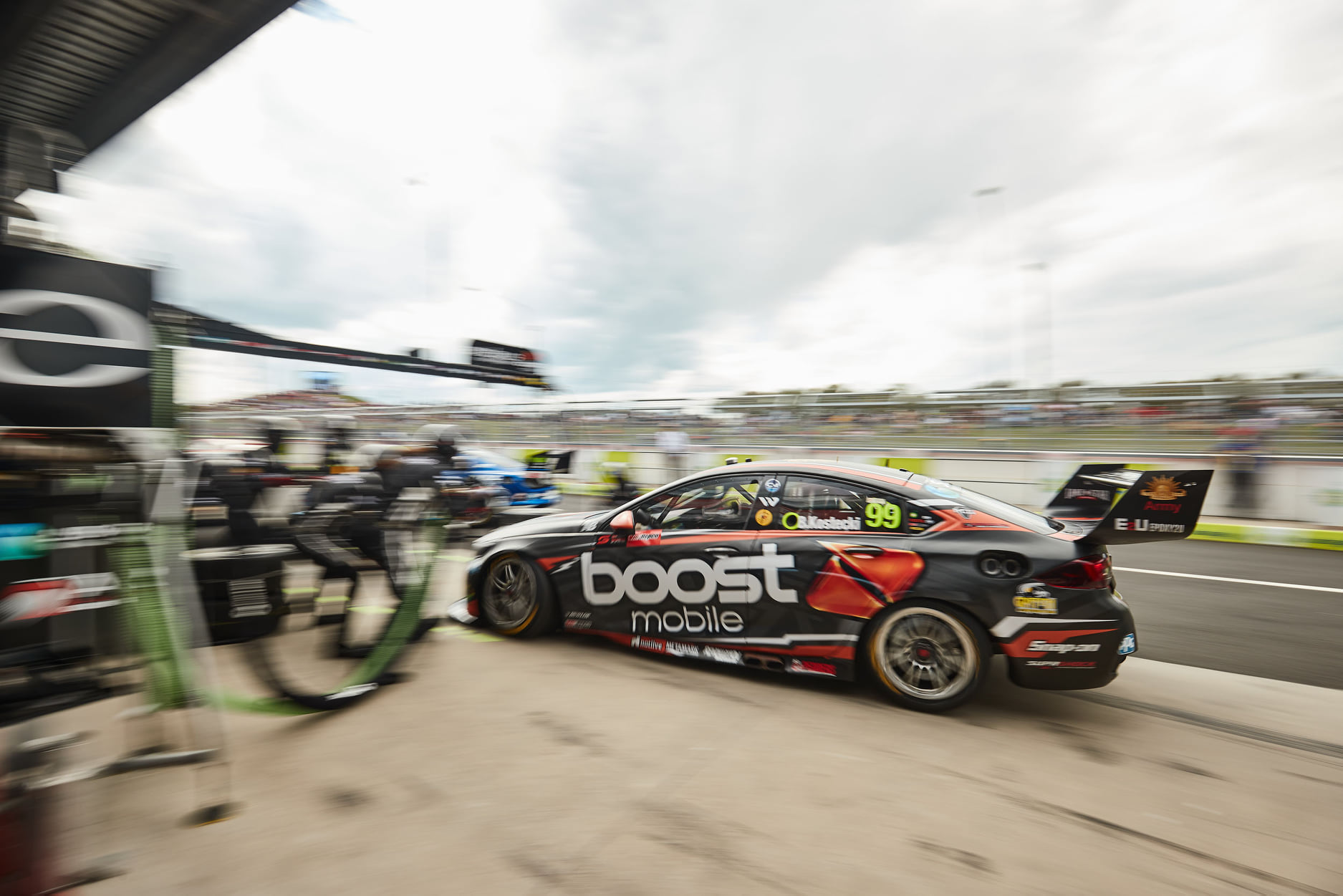
It’s pretty clean despite its complex pattern, rightly pushing all focus to the sponsors logo from a distance, whilst the intricacies really make their mark from close up.
★★★★
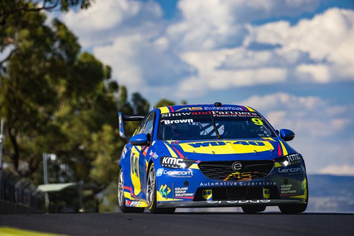
This one should look pretty familiar for any recent IndyCar fans! Alexander Rossi has raced in a similar livery on several occasions; the colours translate really well onto a racing car. The WD-40 logo is simple and clean, which looks especially nice on the bonnet – it fills the space perfectly.
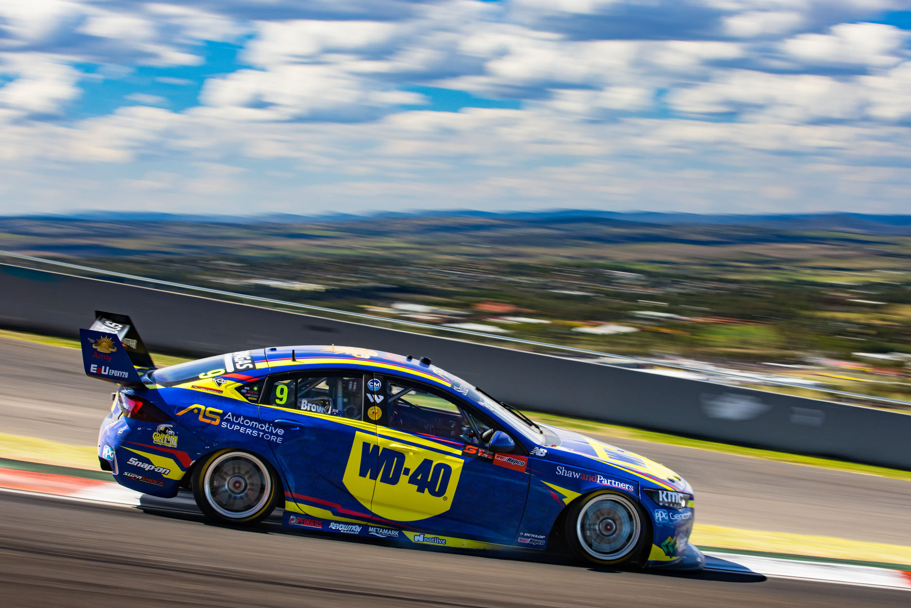
As for the design itself, it mirrors the Boost car aside from the base pattern, but it doesn’t suffer from the flat blue or lack of complexity. It’s actually refreshing to see a team template look so different from one car to the other.
★★★★
IRWIN Racing & DEWALT Racing
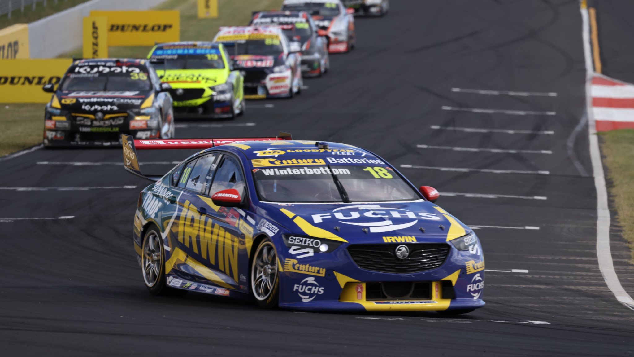
Some slight changes to the IRWIN Tool cars this year, although it keeps the same aesthetic as last season. A lot of yellow has come off the car leaving it mainly blue, so it could be a little difficult to differentiate this and the DW40 car above from a distance. A key difference in the Bunnings Trade section, which I’d say intentionally sticks out like a sore thumb. It’s not the nicest combination of colours but could have been more palatable if it didn’t extend above the window and just follow the lines of the car to the rear wing.
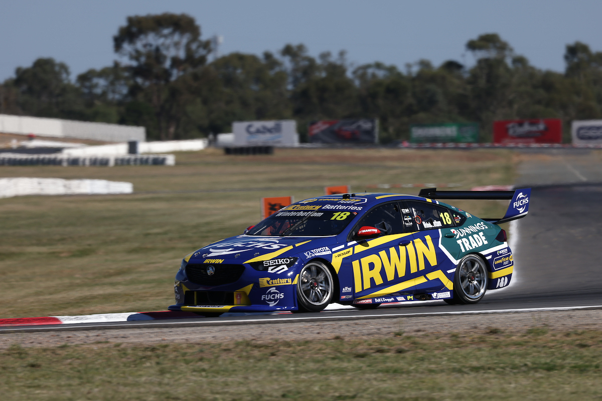
My mind may be playing tricks on me, but it gives me vibes of a couple of other liveries; both the Ambrose Pirtek cars of the year 2000s and Winterbottom’s own Orrcon liveries of the late 2000s. I looked back and it might just be the blues and yellows, because they aren’t as alike as I was thinking!
★★☆
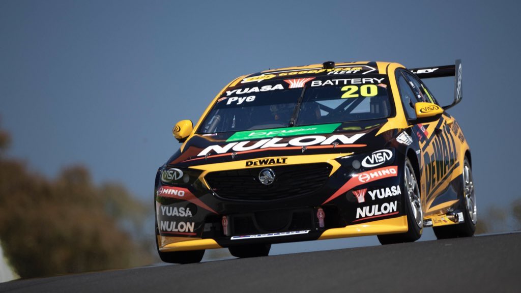
The DeWalt car carries a lot of similar elements to last year’s livery, in fact, bar some sponsors, the whole front end is almost exactly the same. The rest of the car has some other changes which I wouldn’t call evolutionary so much as shuffling the deck. The balance of the colours is still pretty close to 50/50, just some lines have changed orientation.
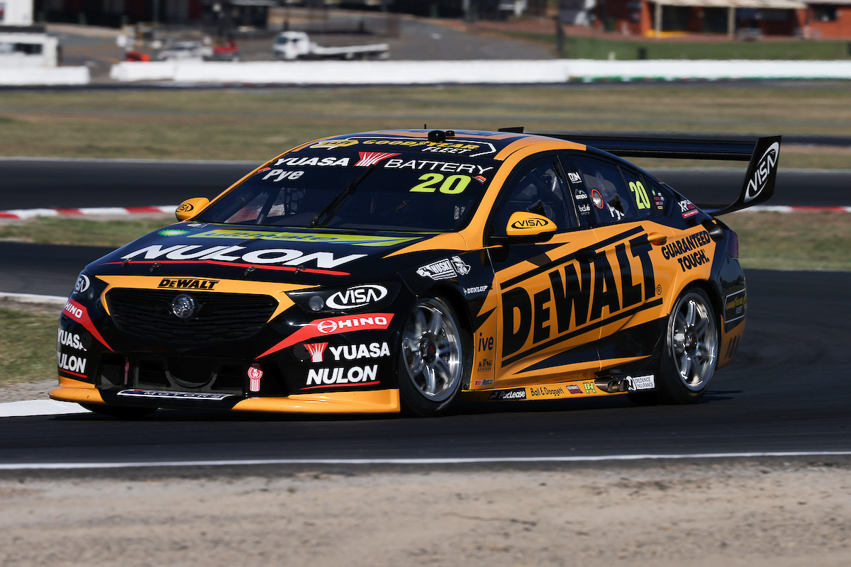
Really, you’d only notice the changes if you put the liveries side by side, so take a look below. At this point, I’m not sure why they’d have spent time making such unnoticeable changes – even I’d advocate to just use the same design, and I don’t think I’ve ever said the before in my life.
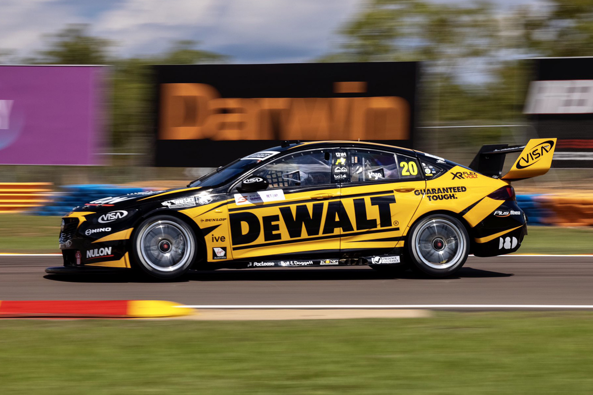
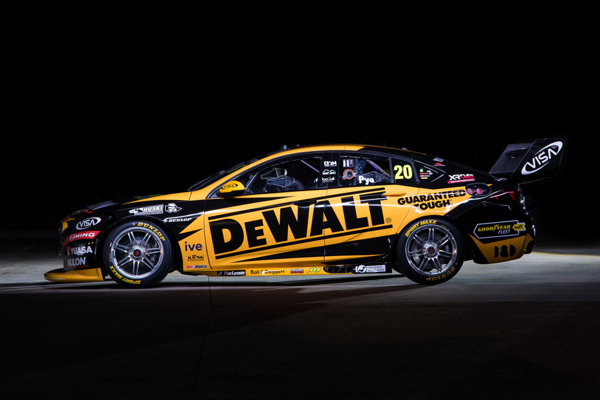
★★★★
Matt Stone Racing
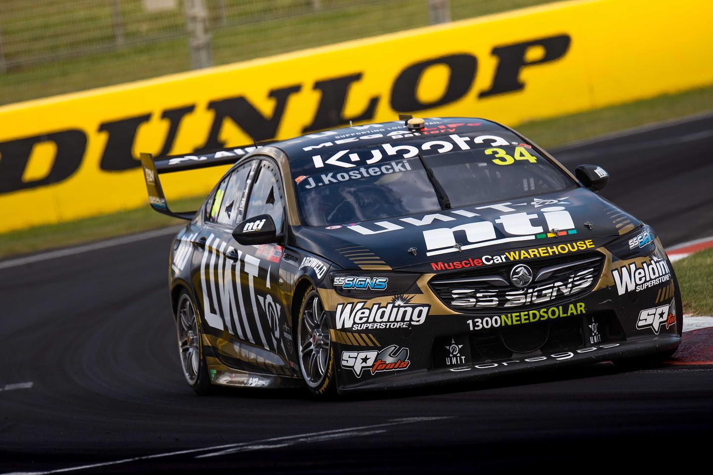
There has been quite a bit of experimentation with the Unit livery in recent seasons, but it sadly looks like they’ve settled on this black and gold colour scheme. Not to say black and gold aren’t a terrific combo, just that this dull shade of gold against the black means it doesn’t pop at all, and is a little lacklustre where it should really excel. I’m sure I’ve been through this all before, but the use of a lighter, more saturated (or a hue closer to orange than green) shade of gold like in this crude edit would have been way better. Save that, just reverting to the awesome first Unit livery which was short lived!
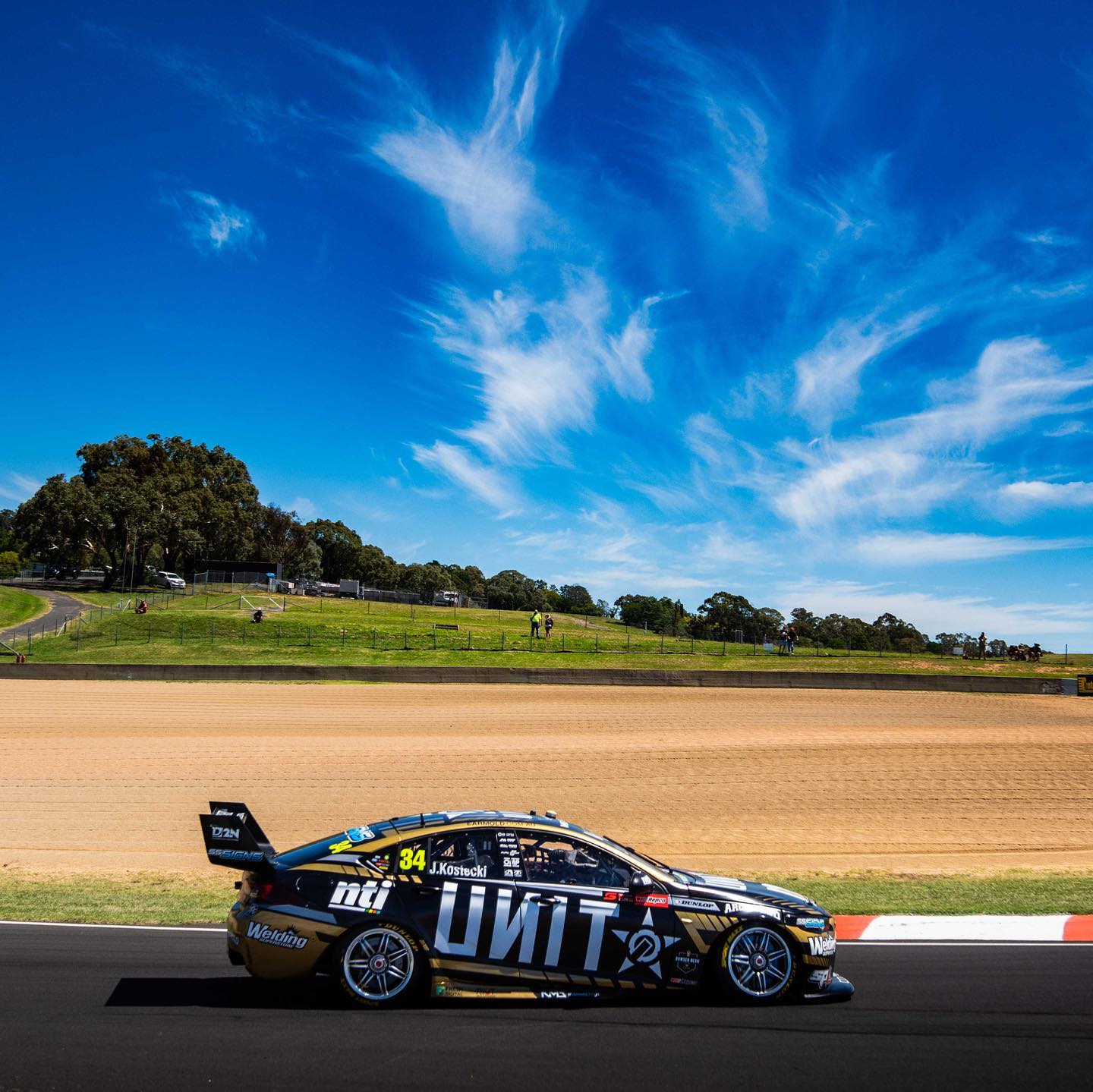
It’s a shame because the design itself is actually really good and has great potential. It does a lovely job of framing the car and sponsor, and the use of gaps of increasing size along the gold sections is very nice, especially on the bonnet and front bumper.
★★★
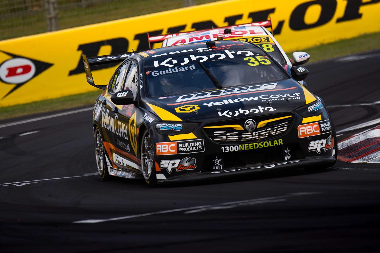
The YellowCover livery continues to be an uninspiring use of some fairly original colours. Black and yellow are pretty common of late, but the addition of orange give Matt Stone Racing a chance to do something completely different. That said, they’ve churned out another mainly black livery with some intertwining lines of each colour along the length of the car.
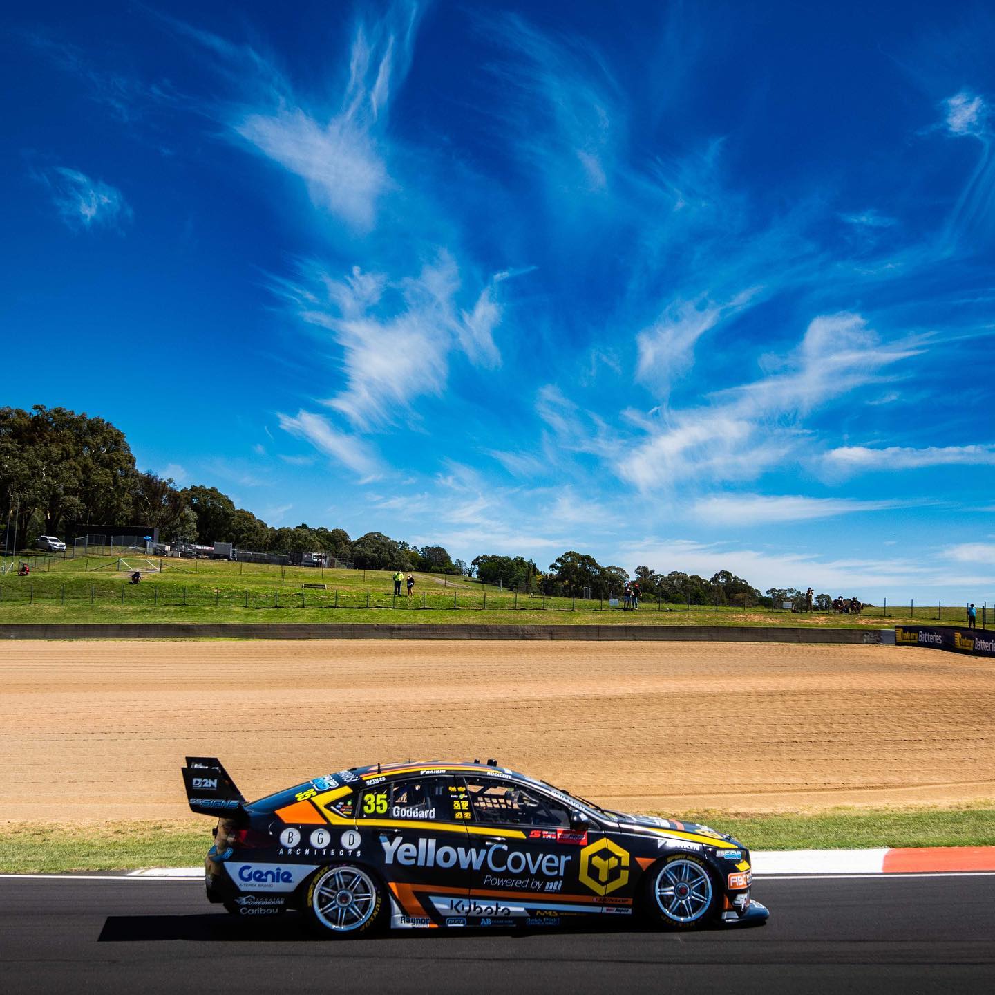
It’s a fairly generic design, but they could have got away with it with better use of colour. The sponsors and their placement too, don’t make it feel like a top category livery. It gives off backmarker or Super 2 vibes if I’m honest. Splash some more of the orange and yellow on the car and I’m sure we’d get something cool and original.
★★☆
Mobil 1 Appliances Online / Middy’s Racing
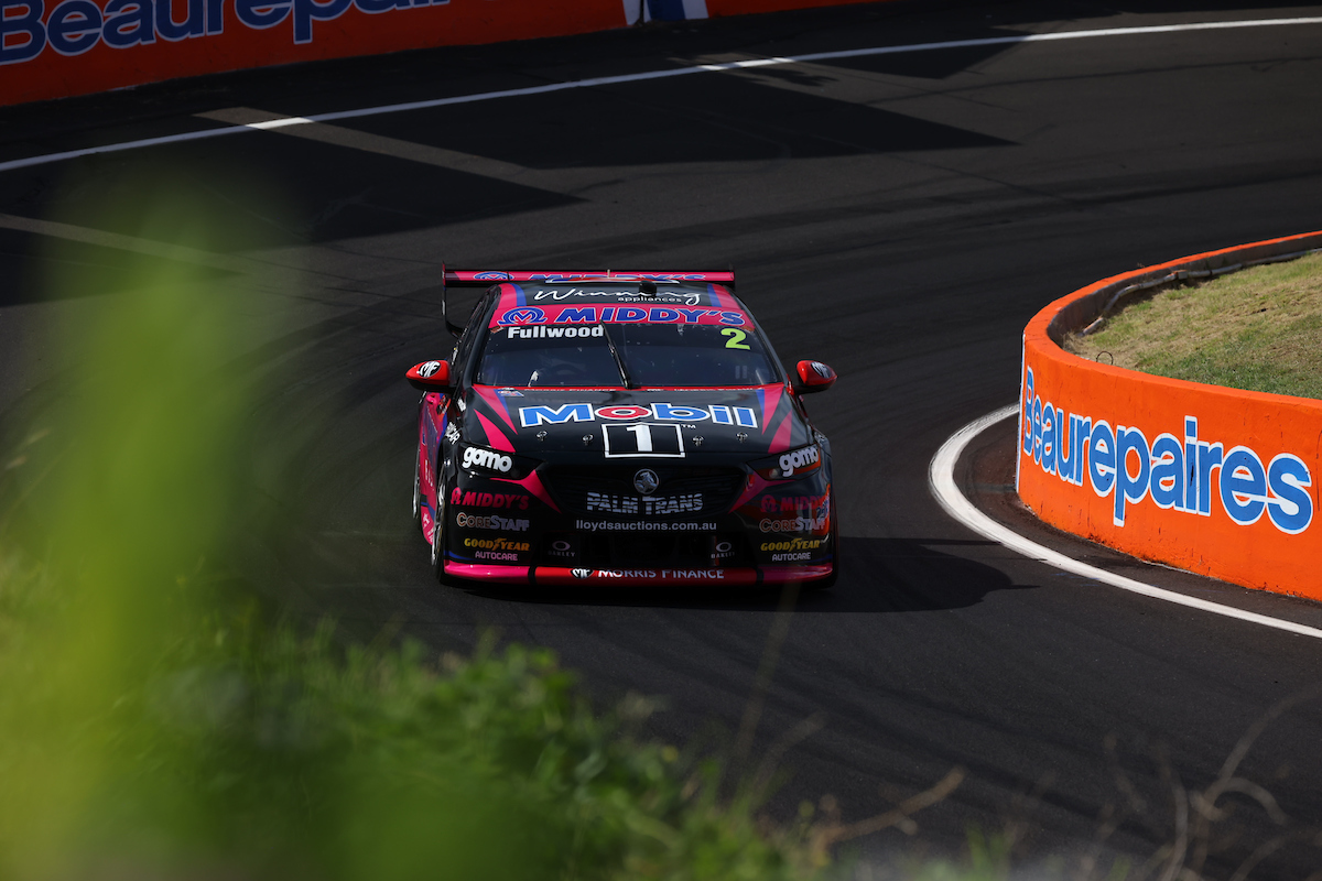
It was always going to be tough to beat what were some almost perfect liveries in 2020, so WAU have done a great job to make them so different and still so good in 2021. The base colours interestingly have inverted from white to black which makes for an strong contrast against the Middy’s pink. It’s not that I have an issue with though, it’s the blue the separates the black and the pink. This is obviously a requirement for Middy’s branding, but it’s a shame a different shade couldn’t have been used, to separate the black and pink in a more complementary fashion.
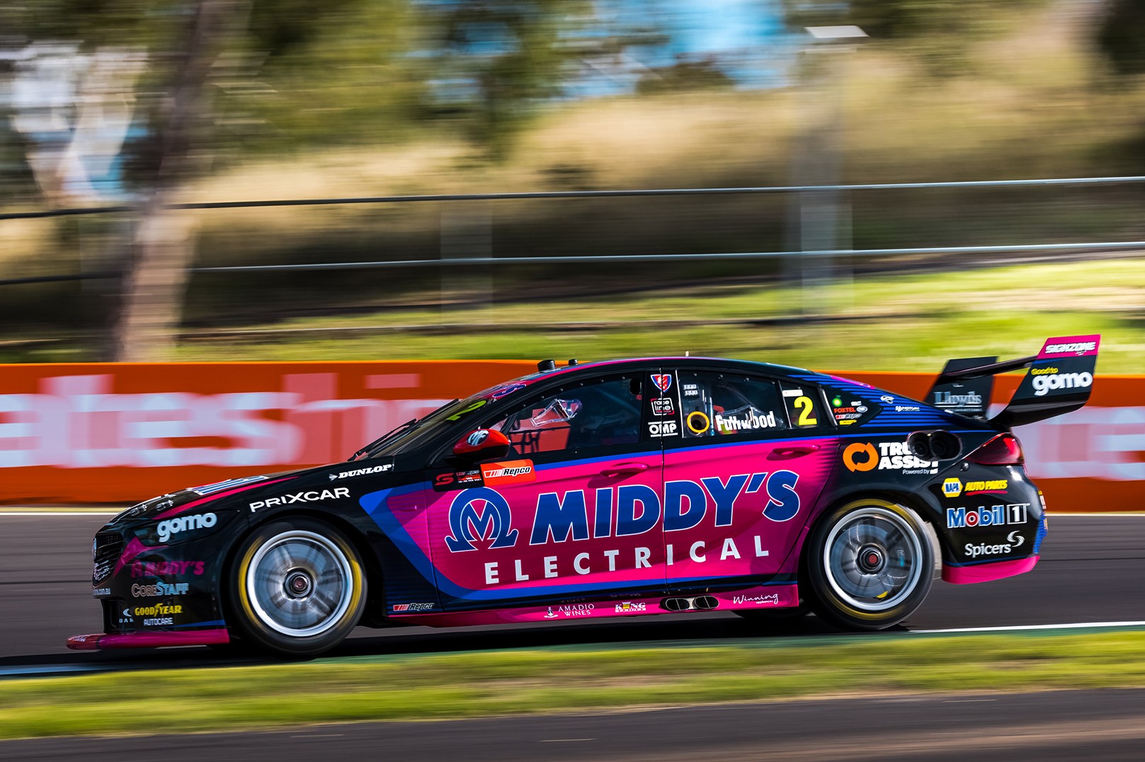
Come to think of it, perhaps a slightly thinner blue line may have worked better even with that shade of blue. There are also some really nice touches to this livery, mainly the pinstriping behind the rear windows on the sides, and a similar pattern which fades the pink to black just at the end of the rear door. All make for really nice overall livery, but all of works much better on the car below.
★★★★
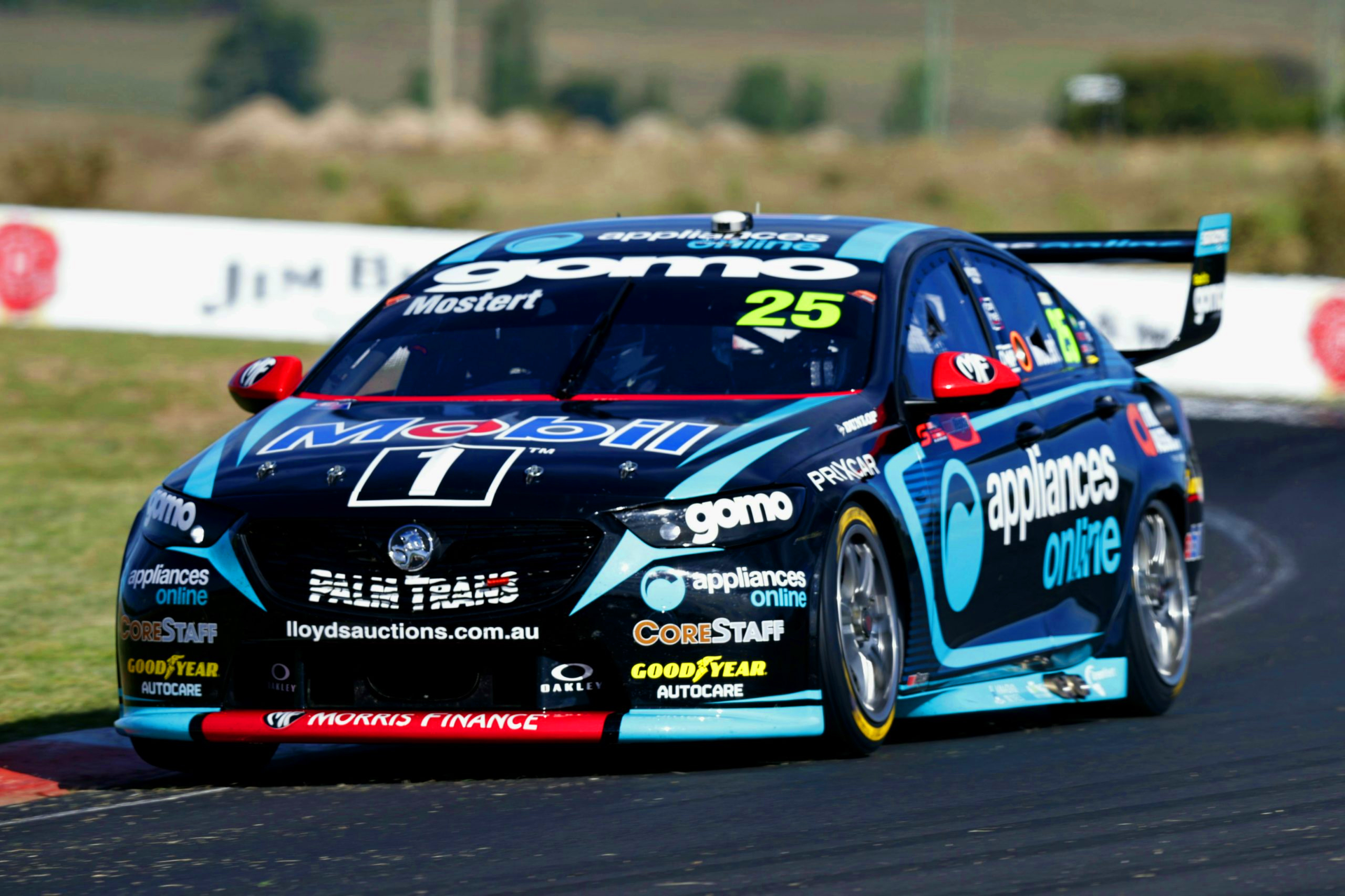
On the other side of the garage, the Appliances Online car has done a much better job with this design, if not perfected it. It’s simply down to using more black in comparison, and without the need to show off a third colour. The Middy’s car would have been much better placed following this theme, with mostly black on the side and just the pink highlights, and using only flashes of the blue elsewhere on the car.
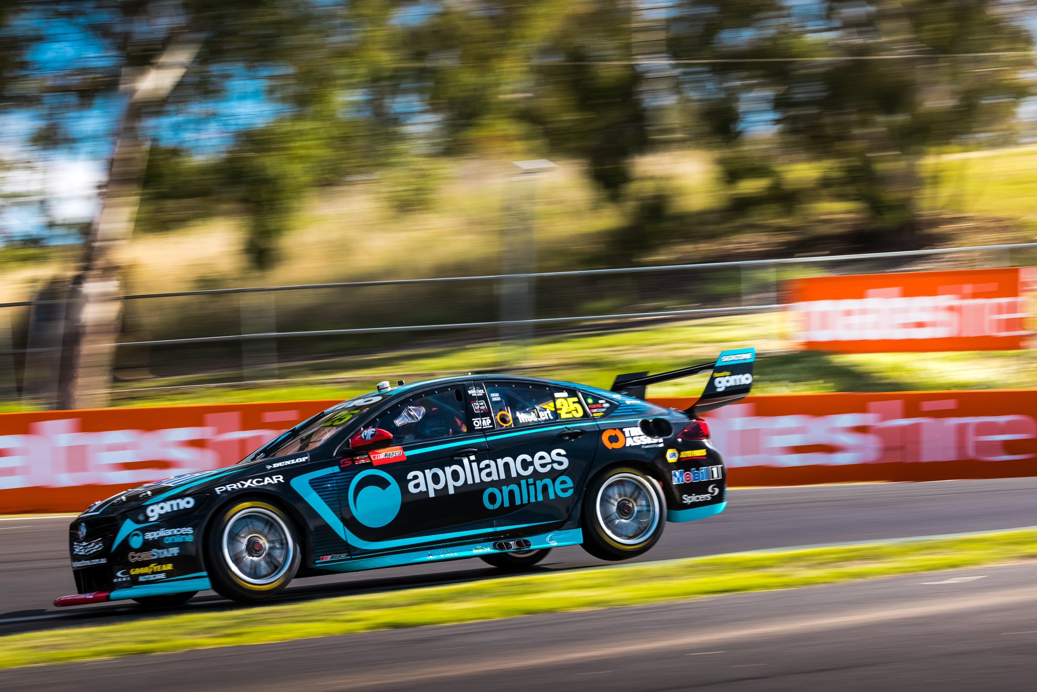
It’s quite a striking effort with the almost two tone, highly contrasting colours. I don’t think I have a bad word to say about this one, just a wonderful application of design and colour. Great to see WAU could pull it of two years in a row.
★★★★★
Monster Energy & Boost Mobile Racing
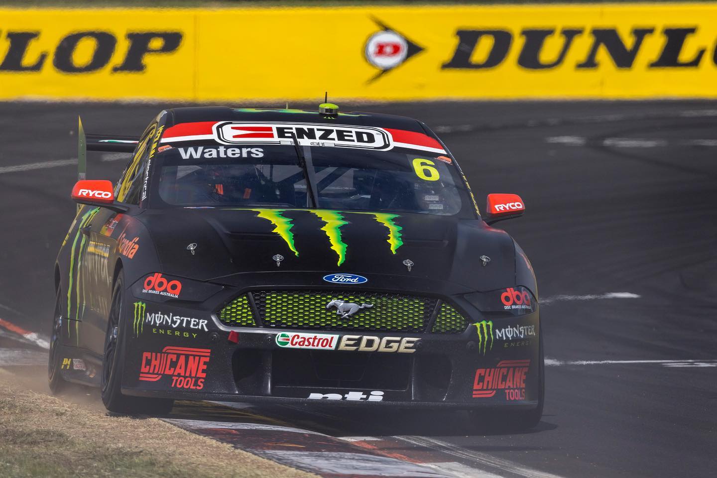
Well it’s evidently clear that Tickford and Monster are quite happy having the same livery year on year. The good news is, a plain black livery can’t really get old and daggy, but I’d really have appreciated some sort of an evolution. There’s a lot you can do with it, whether it’s more green accents, or even a mix of matte and gloss black.
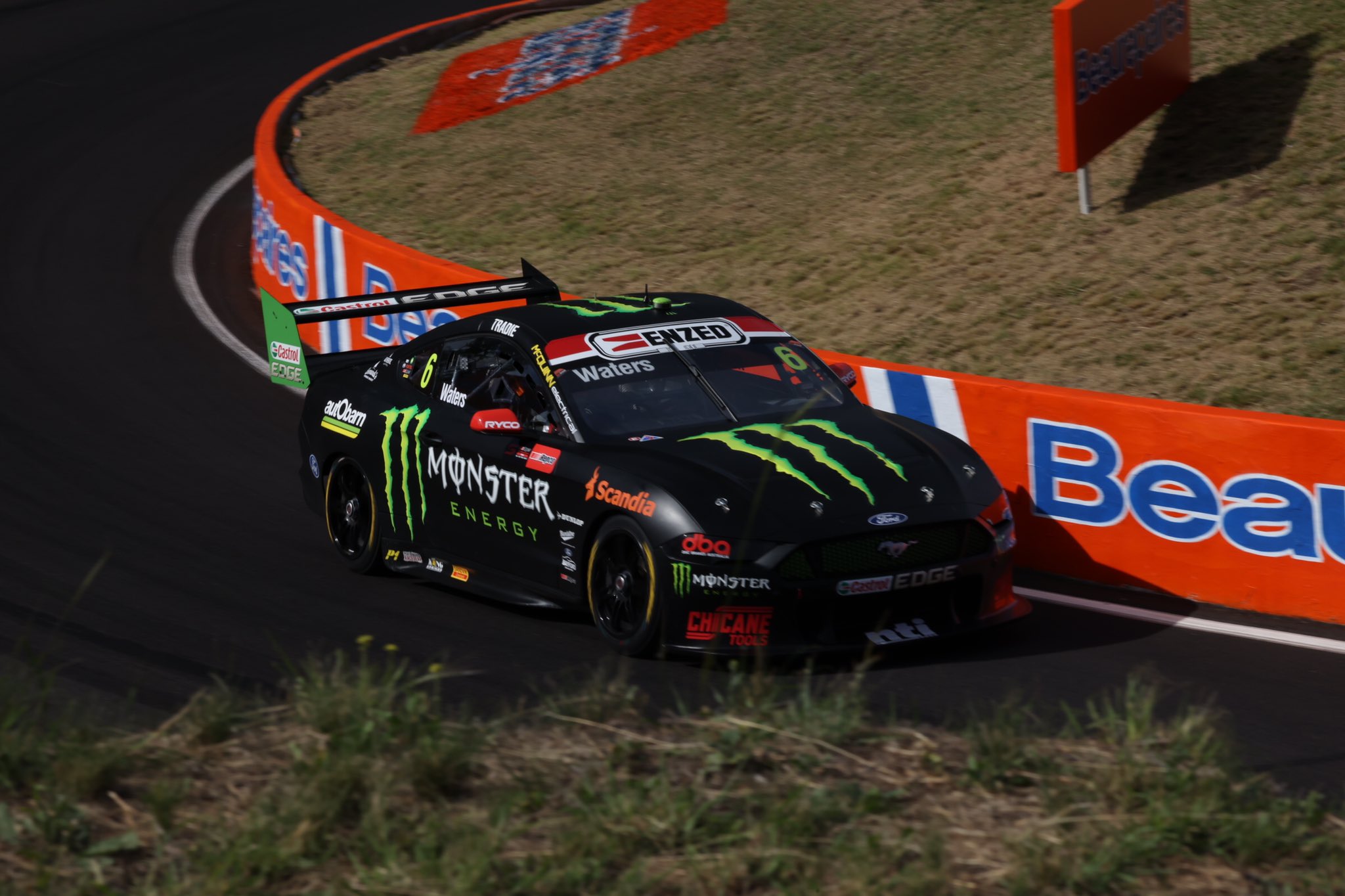
Either way, it’s simplistic nature allows it to still look good, where keeping a busy livery for this many years would have become old, fast.
★★★
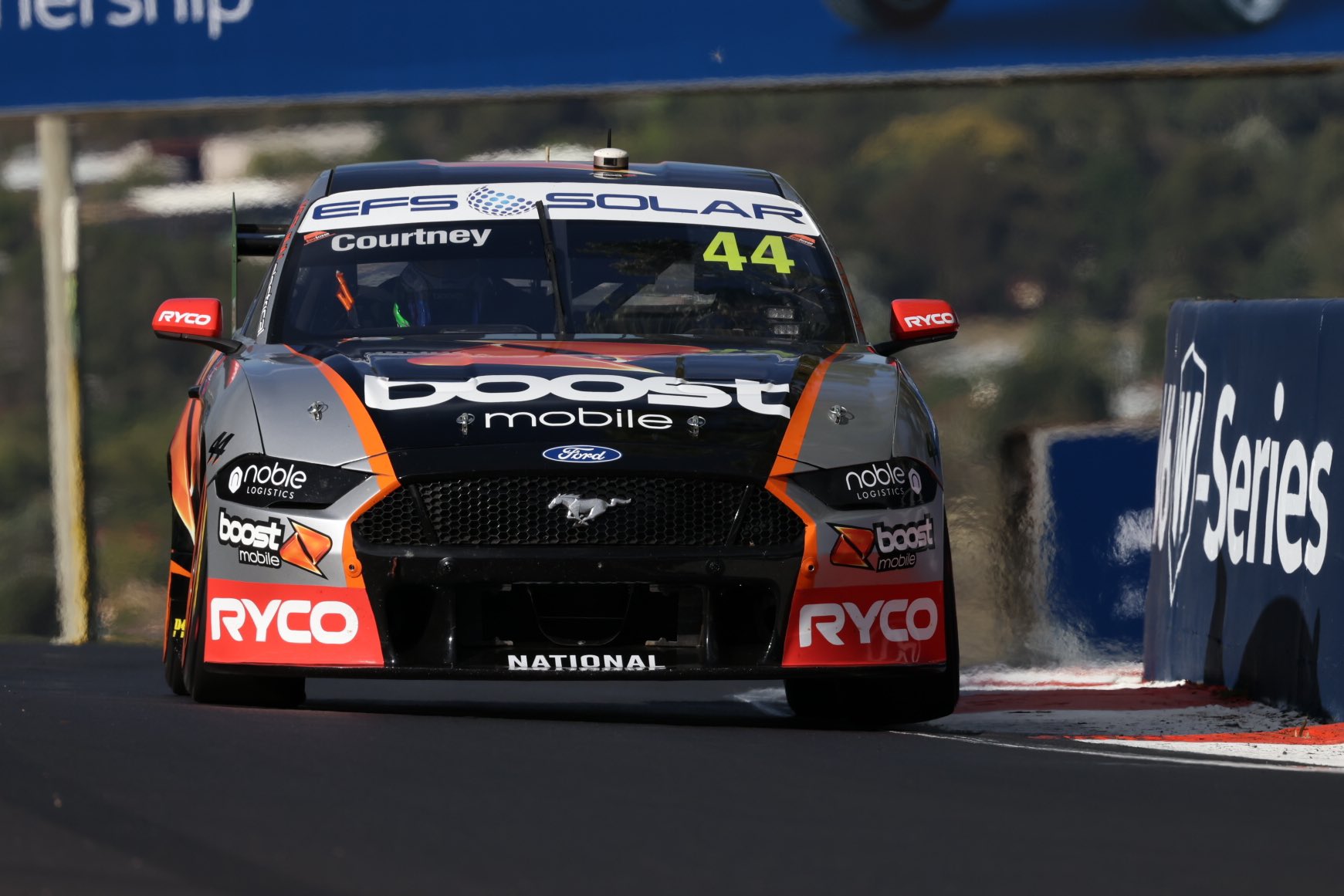
So here’s the other Boost car on the grid, the less impressive effort of the two. If you removed all the silver on the car and kept the orange flashes, this would have been an awesome livery. Instead, the silver really dulls it down, makes it a tonne less aggressive, and overall less attractive to view.
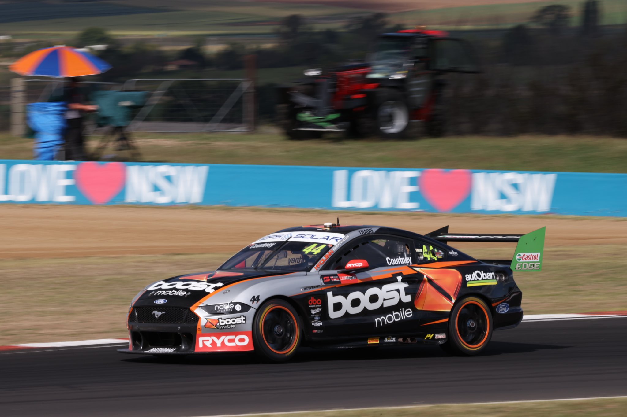
That’s really the only detriment to this livery, but it’s a huge one. The other is possibly the orange line on the side jutting behind the Boost logo, but that’s the consequence of getting your logo to be as big as possible on the car. Castrol green on the wing is also a bad clash – whilst it’s a sponsor across both cars, it would have looked far better if the green didn’t cover the whole end plate.
★★
Penrite Racing & NED Whisky Racing
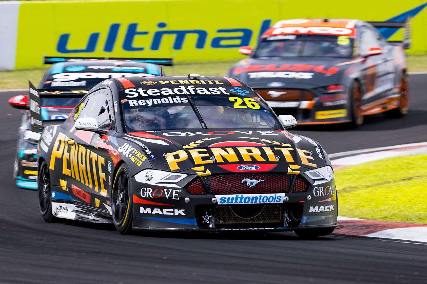
It was an absolute shock, SHOCK I tell you, to see that Reynold’s ten year contract with Erebus ended early. With that, he’s found a new home at Kelly Racing and sponsor Penrite has followed him across. They’ve taken a more traditional approach with this livery, with classic little red and blue sections as opposed to the modern smoky design of 2020.
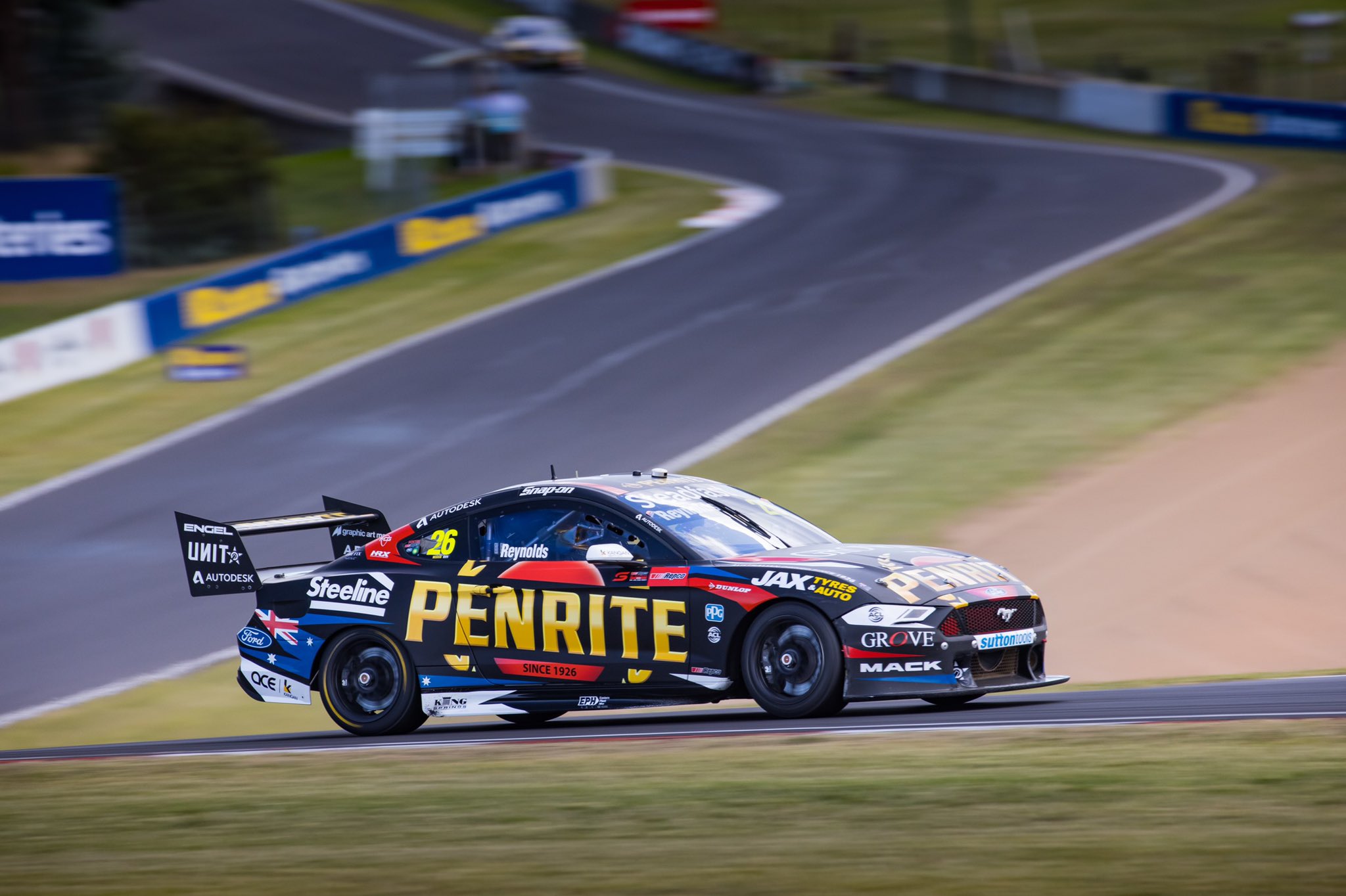
It’s not the most cohesive design because while the coloured lines on the side flow from one end to the other, the big black gaps between them look like two completely separate sections. It’s also very busy with graphics and sponsor logos, probably too cluttered for my liking. Penrite are still as patriotic as ever, albeit toned down slightly. Taking a little while to get used to seeing Penrite on a Mustang, but it’s a decent effort.
★★★☆
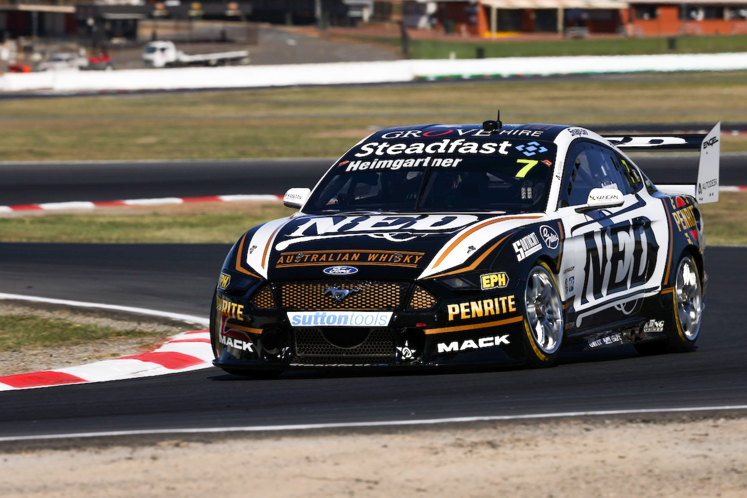
I was initially a little annoyed they changed the Ned livery! It was really simple and quite beautiful last season, making use and showing off of their very nice logo, but it’s taken a side step for 2021 with a lot more black added to the fold. The amount of gold has also been beefed up, but still used to smartly frame the larger white and black sections on the car.
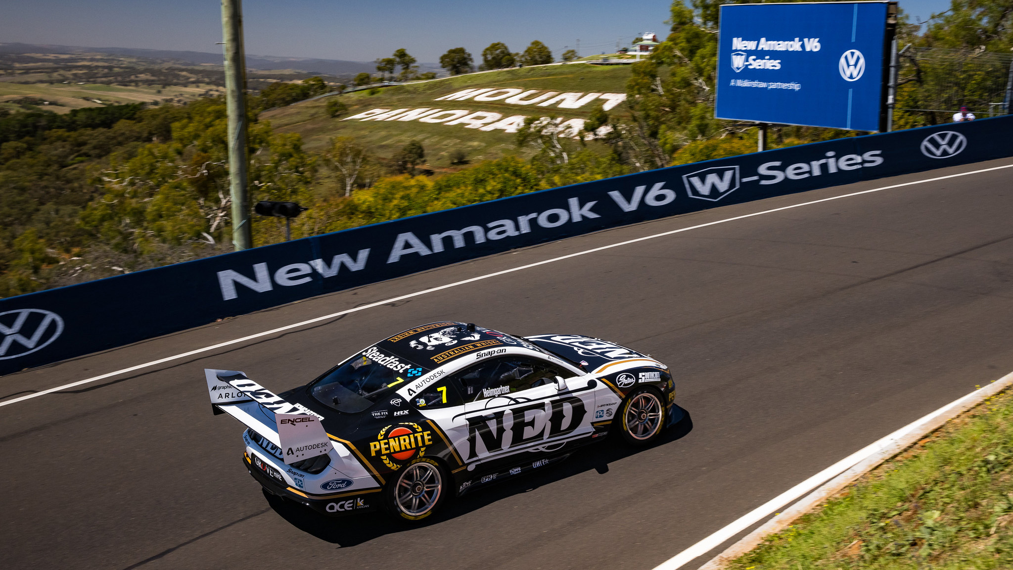
The increased black was probably necessary to help add some new sponsors to the car, such as Penrite above, but the way they’ve used it has worked out pretty well. A side effect of this is whilst the Ned logo is the same size as last season, the added black sections make it look smaller and take attention away from it. The good thing is that they’ve used the right shade of gold, where the Unit livery really suffers in comparison.
★★★★
Red Bull Ampol Racing

At initial glance this might appear to be just like the last few Red Bull liveries, but with Holden ceasing and Ampol pouring money into their rebrand, there are quite a few changes to this car. For one, they’ve stuck with one shade of blue this time as opposed to having multiple lighter shades on the car. The jagged design evolved to a cleaner look too.
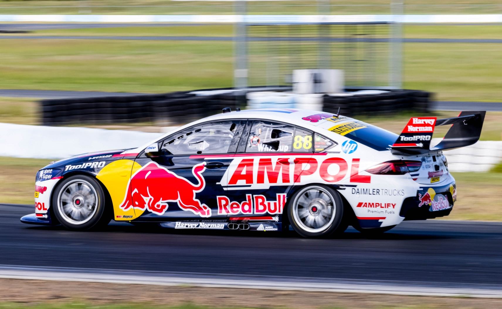
The biggest change is in colour, with Ampol bringing a lot more red to the car that it has seen in recent seasons. There’s a lot of red many sponsor logos, heavily on the rear wing, and also framing the side and front of the car. It’s a pretty good effort and matches better than the Holden logo did last year, but I’ll never be a big fan of two big sponsor logos fighting for attention on the side of the same car. You almost need a BAR style zipper livery for Red Bull these days, one side for Red Bull and one side for Ampol or whoever else is the major partner that season.
★★★☆
SCT Logistics & Coca-Cola Racing
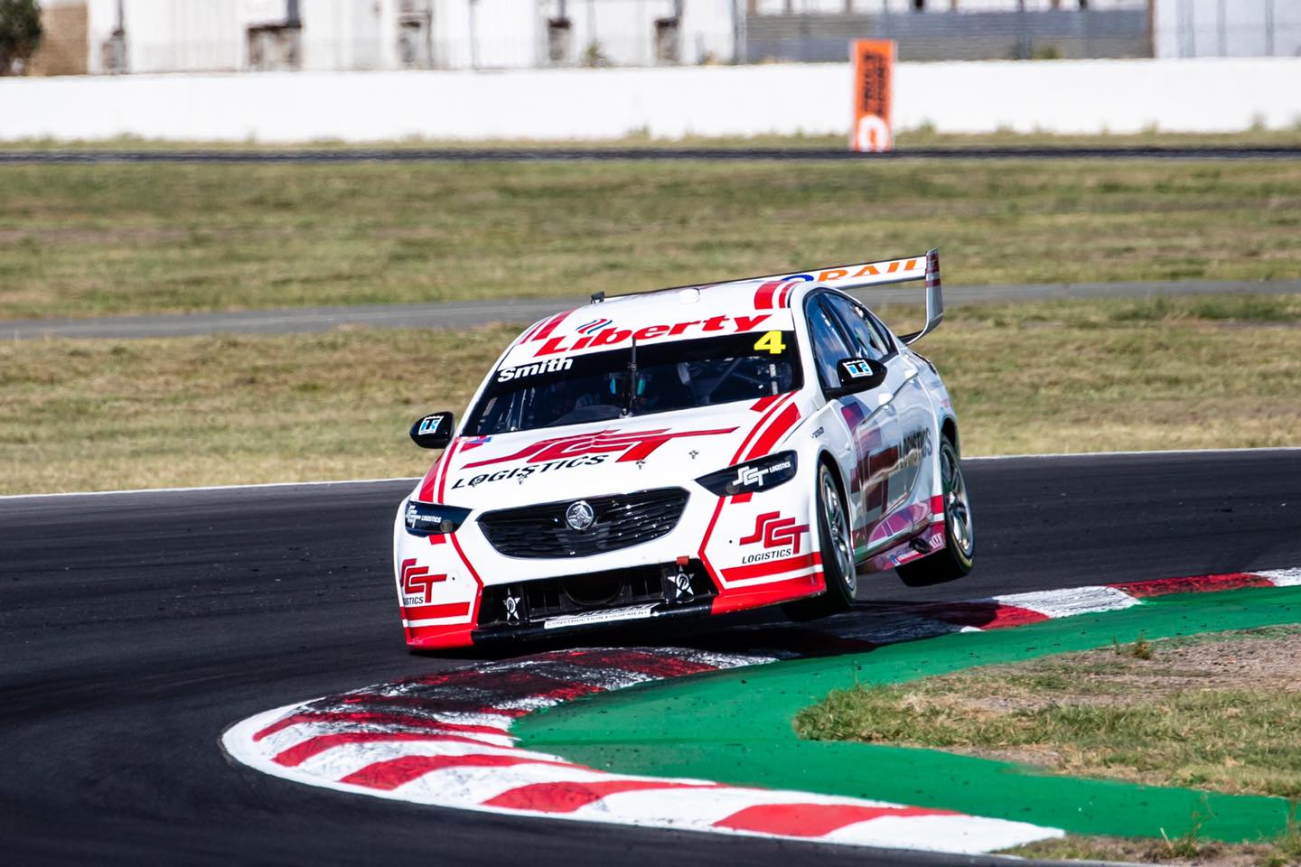
Jack Smith’s back for another go in his SCT Logistics car and whilst few have high hopes for his performances, his livery has taken a step in the right direction. They’ve simplified it by taking out the large black section on the rear, which has cleaned it up immensely and improved it greatly in doing so.
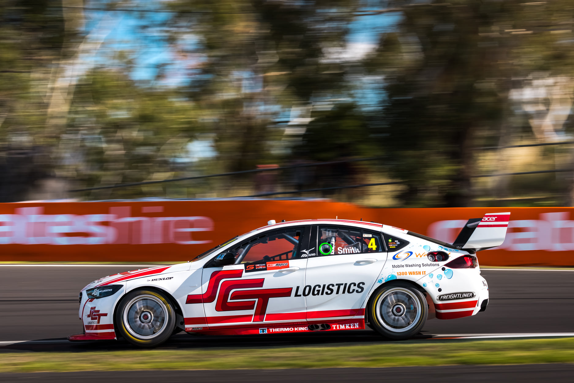
The SCT logo matches the dual stripes along the side of the car perfectly, and whilst the front end hasn’t changed at all really, the whole car is in a wonderful harmony now that the black section has been removed. I used to hate mainly white cars, but I’m a bit of a sucker for their cleanliness and simplicity nowadays. Heck, even the bubbles look alright!
★★★★☆
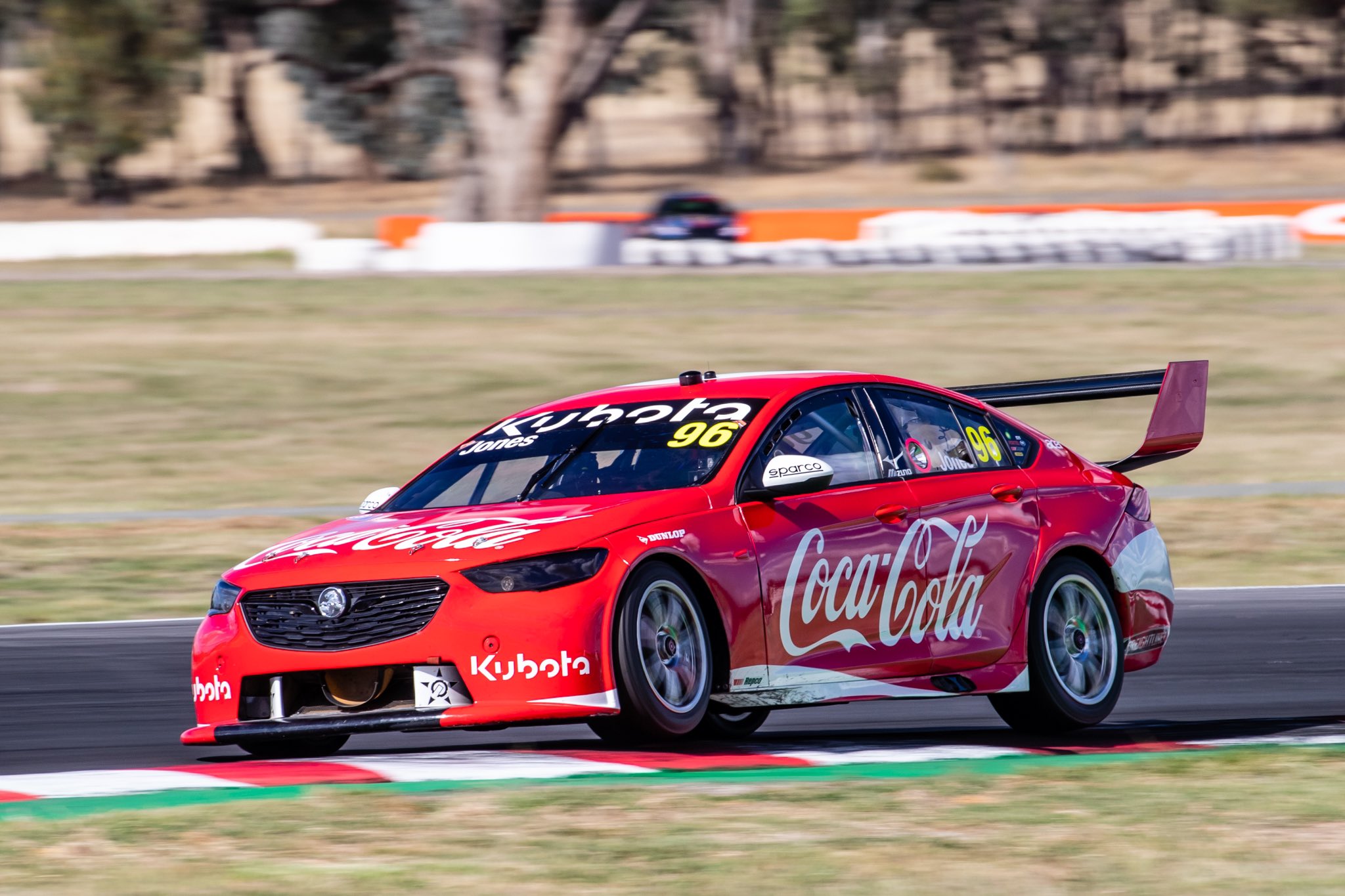
When we heard a Coca Cola (or Cocla-Cola according to the Supercars website) car would be on the grid last season, I think this is what most of us would have imagined! Last years attempt (for Team Sydney) was nice albeit quite plain, however, the minimalist recreation of their iconic can design is exactly what needed to be done to this car.
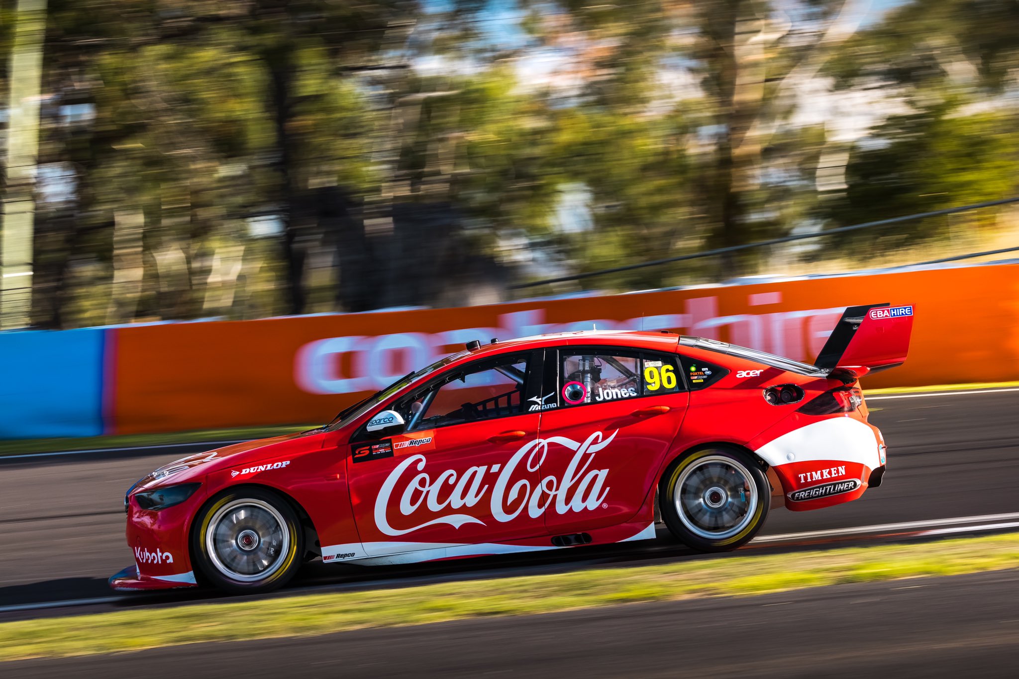
You don’t become the most recognisable brand in the world without some beautiful branding, so this livery really is a no brainer and was always destined to look good. No overcomplicated tricks or flashes required on this one and thankfully the low density of sponsors accentuates the design and doesn’t look too empty in the process. I may have rated this one too high last year, but as it’s improved, there’s only one rating I can give it.
★★★★★
Shell V-Power Racing Team
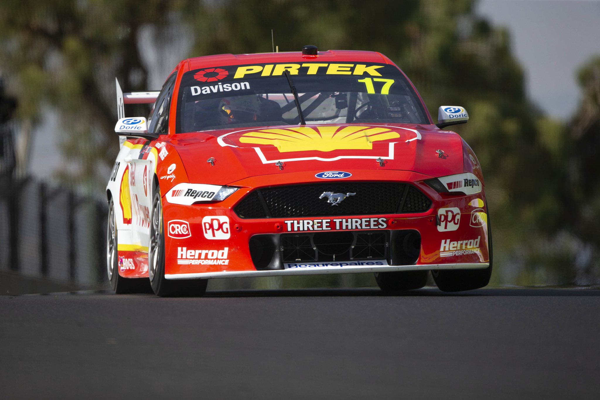
If there’s one team that cares less about updating its livery than the Monster team, it’s the Shell V-Power gang. Apart from literally two or three sponsors, the livery is identical to last season.
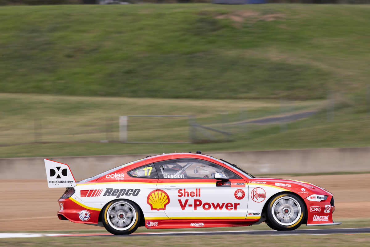
It’s certainly become an iconic livery at this point, but that doesn’t mean it won’t wear out. I for one am just about over this design, so time for it to be spiced up.
★★★
Team Sydney
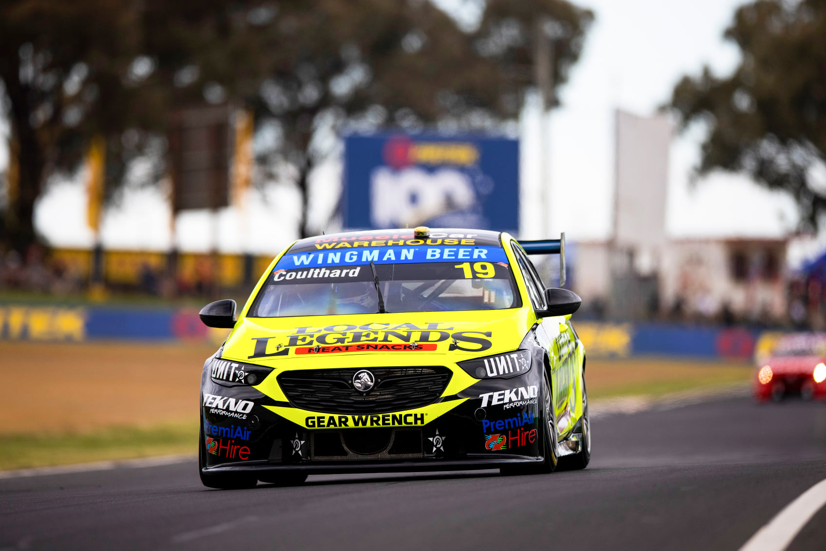
Team Sydney has decked out both cars in fluorescent yellow this season! It’s quite nice actually, refreshing to see an unusual colour like this in the mix. It stands out from the pack, and with a colour like this, it’s the bright yellow that makes the impact for the livery as opposed to the design itself.
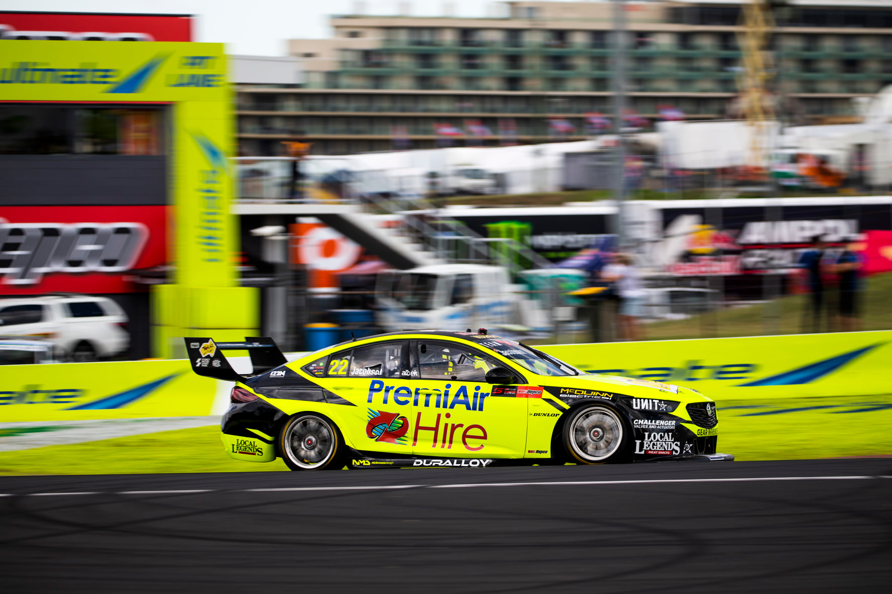
Both cars use the same spiky (for lack of a word) design, but the black Local Legends logo fares far better on the bright background compared to the blue and red PremiAir Hire logo. Clearly, neither sponsor paid the team enough to use their own brand colours on either car. That said, I’m glad about it as we get to see some funky colours on the grid to mix things up.
★★★★
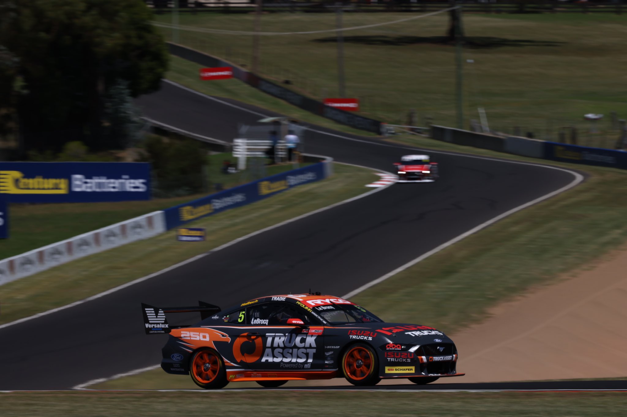
Truck Assist Racing
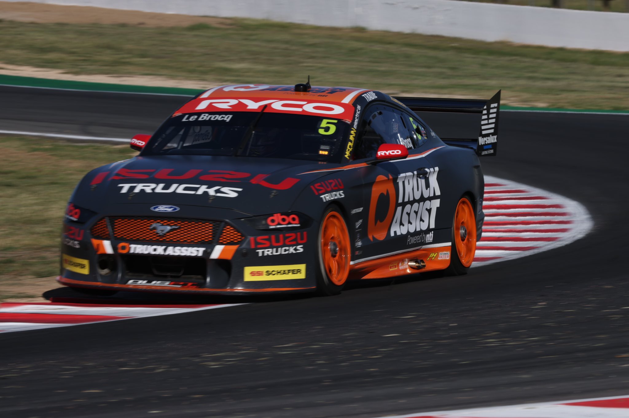
Last and in fact least, it’s the big grey Truck Assist machine. Whilst the bright yellow colour is makes the Team Sydney liveries, it’s the dull grey that completely detracts from this one. It’s funny how just a couple of shades of grey away, the Boost Erebus machine looks fantastic. With an almost identical colour palette, Erebus chosen the rights greys and oranges, whilst Truck Assist have not. It’s very difficult to describe what’s wrong with this grey. A little darker and it would be closer to a charcoal colour which would be fine. A little lighter and it would have a flat light grey look which is pretty neat and popular on road cars these days. Along with that, the placement of orange on the car doesn’t really spark joy either.
While I’m a fan of painted rims, it’s almost too much for this car and white may have suited better, although the white piping added this season doesn’t help the cause. I did like the nod to the Falcon on the Bathurst livery, but that won’t stay for the rest of the season either, and of course the Isuzu red clashes like no tomorrow. A bit of a bummer to end on!
★☆
On to the awards!
Best Looker Award – Mobil 1 Appliances Online
Whilst I gave both the Coke and the Appliances Online cars 5 stars, there’s definitely more time, effort and precision that has gone into the latter, so it get’s my top pick!
Least Attractive Award – Truck Assist Racing
It’s a double wooden spoon for the Truck Assist team, and sadly they’ve regressed if I so say so myself. Time for a total refresh – I’m totally available for some mock-ups guys.
Fear of Change Award – Monster Energy & Shell V-Power Racing
Some people don’t like change, perhaps it’s fear, perhaps it’s laziness. Either way, these teams may never change their designs again as long as their major sponsors to change.
Backup Safety Car Award – Team Sydney
They may not have flashing lights, but if the safety car went caput, maybe Supercars officials would ask Coulthard or Jacobsen to lead the field in their fluro yellow cars.
Out of Place Award – Bunnings Trade (IRWIN Racing)
It’s tough to blend teal and royal blue at the best of times, but it doesn’t look like IRWIN Racing went too far out of their way to get Bunnings Trade to match the rest of the Irwin livery.

One thought on “Round-Up – 2021 Supercars Field”