Livery of the Day – Arrows A2

The Arrows Formula 1 team was a perennial under performer, amassing a grand total of 1 pole, 8 podiums and 0 wins across 19 seasons in the sport. However, if you could hand out wins by livery, Arrows would have been World Champion many times over. Despite lack of on track success, the sponsors, colours and designs were more often than not just winners, but some of the best of all time.

arrows a2 formula 1 1979 riccardo pastrese mass

Through their first four seasons in the sport, Arrows wore Warsteiner sponsorship on their cars. For the most part they used a bright, metallic shade of gold, but it was when the gold was paired with the 1979 A2 that the livery became truly memorable. The ambitious design was an attempt at wingless ground effect, but ultimately wasn’t competitive and lasted merely a half season.

arrows a2 formula 1 1979 riccardo pastrese warsteiner

The curvy, sweeping chassis formed a beautiful and unique template for the design, which for the most part is simply Warsteiner’s powerful gold. Whilst gold had already been used very successfully by Lotus on their JPS livery, this livery showed us you can cover an entire car in gold and it could look awesome.

arrows a2 formula 1 1979 riccardo pastrese warsteiner

That’s not to say it’s purely gold. There is a small black section neatly curving from in front of the cockpit all the way to the exposed engine bay, with a thin pinstripe perfectly suited for the era. The logos are also placed nicely on appropriate sections of the bodywork, and the large numbers look fantastic, matching the Wartseiner font perfectly.

arrows a2 formula 1 1979 riccardo pastrese warsteiner

I’m usually an advocate for warmer shades of gold on motorsport liveries, but when that gold is the majority colour, it is able to reflect so much more light, so a cooler shade isn’t an issue. The car was spectacular visually and that isn’t all down to the colour, it’s a perfect example of how a livery can’t be beautiful all on its own.

arrows a3 jochen mass 1982 warsteiner f1

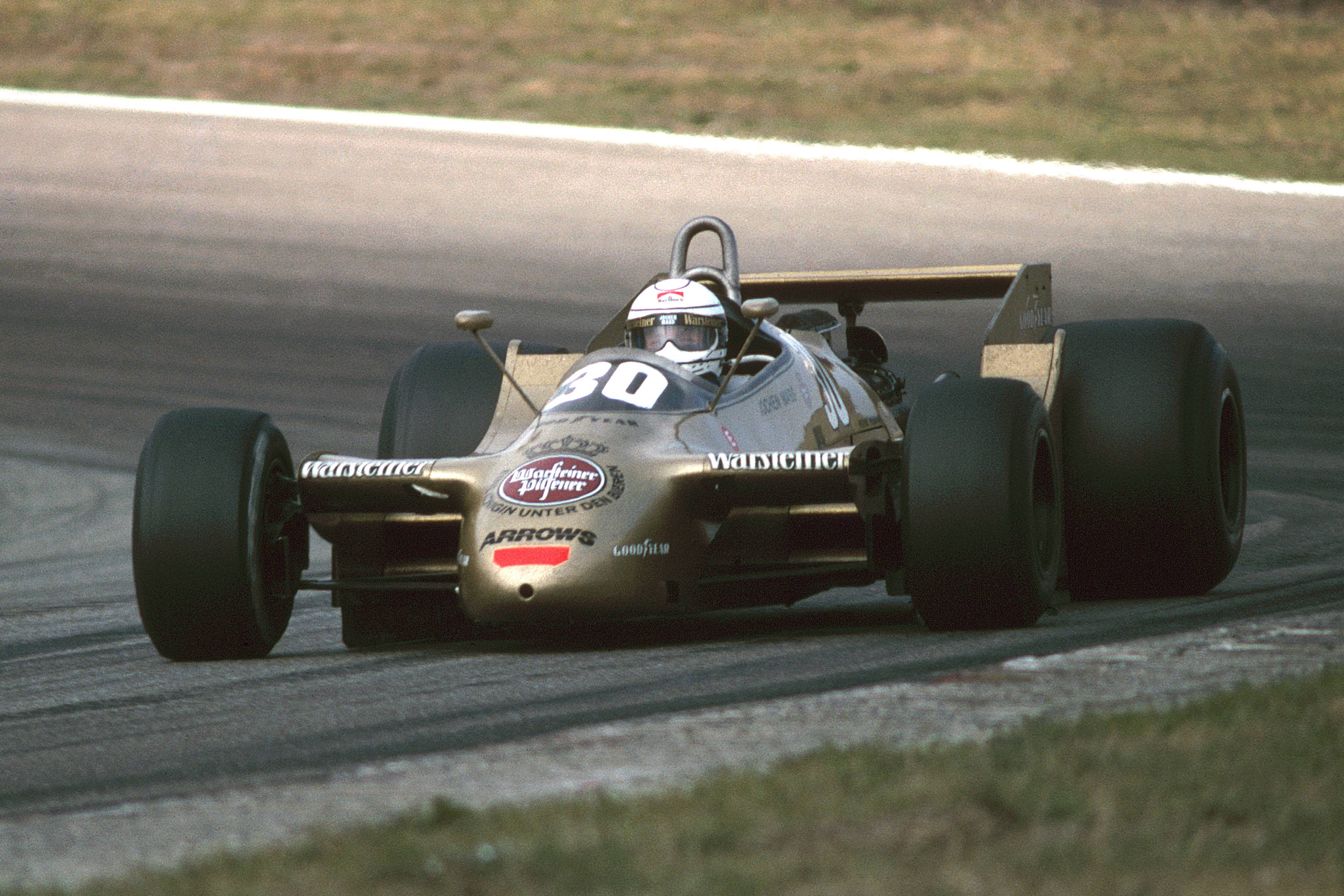
As you can see above, the same Warsteiner livery was retained and adapted to the 1980 Arrows A3, and yet, it’s nowhere near as good. The A3 was a much more traditional of-the-era car design, losing all the flowing curves the A2 flaunted so beautifully. The livery itself can’t make up for it. That’s how a feel about the current generation of Formula e cars – the car shape is a little ugly, so regardless of how nice each team’s livery is, they struggle to make up for those lost points.

arrows a2 formula 1 1979 riccardo mass warsteiner

So the 1979 Arrows A2 was a beautiful car, one of many Arrows designs that were absolutely fantastic. I’m sure it won’t be my last look at this memorable team!

Livery of the Day – Jordan EJ15/EJ15B

A year in Formula 1 feels like an age, so 14 years is like a lifetime. That’s how long Jordan Grand Prix entertained us for in Formula 1. Jordan was a team that to me as a kid had been in F1 seemingly forever, so to experience their slow decline and sad departure first hand was like a part of the sport dying. To lose Minardi and Jordan at the same time was really quite heartbreaking, so Jordan’s final car and livery are special for fans of my era.

The writing was on the wall for a couple of seasons before 2005, with dwindling points totals and securing less and less lucrative sponsorship deals. It resulted in launching their final car in wintry Moscow of all places, with a pretty bare looking yellow livery devoid on any major sponsors. Whilst it would have a better look come Melbourne, a true major sponsor would still evade them.

jordan f1 ej15b 2005 monteiro

Two rookies would join the team for the new season; Tiago Monteiro, the first Portuguese driver in F1 since Pedro Lamy nearly a decade earlier, and Narain Karthikeyan, the first ever Indian driver in F1. Neither driver would set the world alight that season aside from THAT Indianapolis Grand Prix with Monteiro securing a podium. He also scored an impressive single point in Belgium that year, whilst Karthikeyan only managed points in the aforementioned US GP.

jordan f1 2005 ej15b monza monteiro

As mentioned, the livery did perk up for the first race of the season with the iconic yellow synonymous with Jordan joined by some black lines on the side of the nose, reaching all the way to the cockpit and bordered by a thin red stripe. The livery also featured a merry-go-round of sponsors on the sidepod, including Benson & Hedges (stylised as Be On Edge) and Sobranie, and also the driver’s name in races it would otherwise be blank. The sidepods would sometimes be yellow or on black, seemingly without rhyme or reason.

jordan f1 ej15 turkey monteiro 2005

The livery also featured a similar black section on the airbox which worked well to complete the livery, along with the black rear wing. Perhaps black end plates would have been even better too, although the little black stripe they featured looked nice and matched the nose design well. I feel as though the more black this car had on it, the better it looked. The black sidepods with Be On Edge especially looked great, and also took us back to a better time for the team – as warm and fuzzy as cigarette money can make you feel.

jordan f1 ej15b karthikeyan china crash 2005 alonso

The last season for Jordan was a poor one and they were only saved from total embarrassment by their one lucky podium, and also the fact that Minardi were abysmal and could not even compete with the second worst team in the series. Their final car, the EJ15B would debut at Monza and would earn them just the solitary point. It was quite fitting and memorable that in the team’s final race, Karthikeyan would lose control in a seemingly straight line and crash, totaling one of their cars one last time.

jordan ej15b monteiro belgium spa 2005

So it was incredibly sad to see Jordan, who punched above their weight so many years, die off with just a whimper like they did. That said, in our memories we have some unforgetable moments, some memorable liveries and of course the team’s spirit living on, with Aston Martin the latest iteration of the Silverstone team.

Livery of the Day – Nissan Motorsport ‘Norton Hornets’

2013 saw some huge changes in the V8 Supercars championship. After decades of a two make competition, two new brands joined the series, with Mercedes-Benz entering the E63, and Nissan entering the Altima. Whilst neither car would achieve anywhere near the success of their Ford and Holden counterparts and would leave the series within a few years, Nissan did at least bring us some memorable liveries.

moffat and caruso nissan norton altima 2013

Whilst the Todd and Rick Kelly Nissans retained their Jack Daniel’s liveries through their switch from Commodore to Altima, their other two cars brought in a new sponsor in Norton. The digital security company adorned the cars in their logos and distinct yellow and black colours, giving them the nickname the Norton Hornets.

moffat and caruso nissan norton altima 2013

Early in the season the cars ran a majority yellow design, featuring just a black and white stripe along each side, as well as black roof. It was quite basic, but the bright yellow was enough for the two cars to stand out from the crowd (don’t forget the ekol Commodore!), especially being towards the back of the grid a lot of the time!

moffat and caruso nissan norton altima winton 2013

It didn’t take long for them to make some changes to the livery though, and they moved to a new design featuring a more cleverly placed Norton logo and some thick diagonal black lines with piping that frame the logo well too. It was certainly an improvement and a more distinct and unique livery to the one presented at the beginning of the season.

moffat and caruso nissan norton altima winton 2013

With the livery change came some success too. While Nissan were consistently poor throughout their tenure in the V8 Supercars Championship, only cracking the top 10 a handful of times in 2013 specifically, they had a major and memorable breakthrough at Winton that year. It all came together perfectly that weekend, with James Moffat leading Michael Caruso home in a Norton Hornet 1-2 finish in the first race of the weekend. It was the most unlikely of results and would be one of just three victories a Nissan take in their seven season stint in the series. Did the livery have anything to do with it? Unlikely, but it’s the bright yellow livery was one of the more memorable parts of Altima’s journey in Australian Motorsport.

Livery of the Day – Sauber C24

Sauber has had an impressive life in Formula 1, starting from scratch in 1993 and becoming a fan favourite as one of the last privateers, through to their eventual takeover by Alfa Romeo in 2019. They were loved for bringing in many talented drivers, although they never did quite break into the upper echelon in terms of performance and results; their best championship finish being 4th in 2001, at the hands of then young guns Nick Heidfeld and Kimi Raikkonen. Not counting the BMW days, Sauber never managed a win in F1, but did collect 10 podiums, four of which came in the exciting 2012 season thanks to Sergio Perez and Kamui Kobayashi.

2005 was Petronas’ 11th season as a sponsor of Sauber, with the livery dictating partnership beginning in 1996 and being a prime example of livery evolution. The Petronas sponsorship actually began in 1995 in less prominent fashion, but the now iconic turquoise was unleashed to the F1 world in 1996, long before Mercedes paired it with silver.

The most dramatic change between Petronas liveries was from 1997 to 1998, dropping the unique and attractive vertical stripes and forming the weakest livery of the bunch. However, as should always be the case with livery evolution, they took the primary idea, and along with some clever additions along the way, perfected it for its last iteration in 2005.

For the 2005 season, Sauber kept Felipe Massa for his fourth year at the team (third season as main driver), and brought in the now veteran Jacques Villeneuve after his three Grand Prix stint at Renault the year before. However, the season was a bit of a slump in comparison to 2004, with their best race finish being 4th on two occasions, ultimately ending the season with a tally of 20 points and 8th position in the standings. Mediocrity was a familiar feeling for the team, but another familiarity were the blue and teal colours that adorned the cars.

At first glance you may think the pairing of turquoise and this shade of blue may be quite weak. The blue used isn’t exactly stunning like the colour of the 2017 car was, and perhaps a stronger shade like this would have helped the two colours stand out against each other and take this livery to another level. However, it’s the supplementary colours that help this livery stand that much higher than its predecessors. The increased use of white thanks to Credit Suisse takes away some of that average blue and adds some much needed contrast to the blue and turquoise.

The main swooping sections of turquoise are similar to previous years, but are placed much more thoughtfully, respecting the cars natural lines which is pleasantly clear from side on. Whilst the Red Bull yellow on the airbox from the earlier versions of the livery was nice in its own right, the white works far better, taking away far more space from the blue. The yellow taking up as much space as the white may have been just as effective, but we’ll never know. Either way, yellow does remain on the barge boards thanks to MTS GSM and does look really nice as a fourth colour in that region of the car.

Sadly, despite being quite well disguised, the sidepod is a bit messy. Petronas itself is fine, but the thin yellow Syntium logo on turquoise isn’t very nice, and the Malaysia logo in red above it makes the whole sidepod look fairly disorganised and cluttered, especially given all three use different fonts. Thankfully it’s not super obvious though, and there aren’t too many complaints to follow!

Along with the added white, the nose is another element that improves on previous versions of the livery. It manages to use both blue and white in well placed harmony, swooping up the nose with a flash of turquoise to complete the look. This is then interjected by the turquoise and white section flowing from beside the cockpit. It’s abrupt but not out of place. It’s also cleverly done so that it looks great from all angles, which sadly isn’t always the case with F1 liveries.

Petronas continued in F1 with BMW when they took over Sauber for a few years, before moving to Mercedes in 2010. Whilst newer F1 fans may associate Petronas with Mercedes, their colours and logo will always scream Sauber to me. It was an iconic look all through the late 90s and 2000s, and whilst I’d always hoped they’d mix the colour scheme up a bit at the time, I’m glad I can look back at it so fondly now.

So how would this livery look on a modern day F1 car? The answer is pretty good! Sure, I could have used a little more creative freedom to suit the the 2020 style, especially with the sponsor placement, but 15 years on it still looks nice even on updated machinery.

Livery of the Day – Tyrrell 012

Tyrrell had a season to forget in 1984. What had some promise, including a podium for Brundle in Detroit, turned into an exclusion from the championship, when it was discovered (ironically after said podium) their cheeky tactics were outside the rules. They had been running their cars underweight during the race, before adding lead to the water tanks to meet weight requirements in scrutineering. Despite this disappointment, they had at least one of the best looking cars on the grid.

bellof 1984 tyrrell monaco

It’s unusual to see teams run different liveries on their cars in F1. It’s often a once off, such as David Coulthard’s Red Bull in the last race of his career, but Martin Brundle and Stefan Bellof had different liveries for the whole 1984 season. Despite some sponsors being shared by both cars, the two didn’t have many other visual similarities.

bellof tyrrell 1984

Bellof’s livery looked to have significant inspiration from his own helmet design. While Maredo brought a base of black to the car, it took Bellof’s signature red and yellow lines, and placed them along the top sides of the car, from nose to engine. It may be the best helmet to car colour coordination of all time! The massive number on the nose is not my favourite part of the livery – not that it looks awful, but that the yellow, red and white lines end so abruptly above the number.

That aside, the colours on this car work really well, with the sponsor colours also blending in very well for the most part. Even the DeLonghi blue even fits in pretty well, as it’s so subtle against the black. It’s simple, uncomplicated, and objectively attractive!

On the other side of the garage, Brundle’s car had a very different approach. Yardley had a fairly rich history in Formula 1 up to this point, sponsoring both BRM and McLaren in the 70s, and had a brief (and final) stint in the sport on this car. It meant their brown aftershave bottle design was translated to an F1 car. It is surprisingly not appalling and actually quite memorable, bordering on good looking. It gives off some brown JPS Lotus vibes with the gold piping, and the black wings are a welcome relief from the almost flat brown. I always thought the nose design was a little strange, but have just realised it is meant to be a gold medal. Not sure if the design was ambiguous or if I was just clueless!

DeLonghi, which appears on both cars, works fairly well here too. It stands out a lot more on Brundle’s car and even works quite well wrapped around the front of the cockpit, but the blue rectangle could have been placed a little more thoughtfully on the side. The section near the front suspension is especially careless and would detract significantly from the livery if it wasn’t partially hidden by the tyres.

It was a doomed season for Tyrrell in the end, but at least gave us F1 and livery buffs something to talk about, even 25 years later!

Let me know what you think in the comments below! If you have any suggestions for future liveries, pop them in there too.

Livery of the Day – AGS JH25B/JH27

AGS, short for Automobiles Gonfaronnaises Sportives, was a French Formula 1 team based out of Gonfaron (as the name suggests), a small town in the south of France.  Approximately half way between Marseilles and Cannes and with a population of no more than 3,500, it perfectly fits the no mans land which was the back of the grid in the late 80s and early 90s.

AGS 5

In their 6 season stint in Formula one from 1986 to 1991, AGS managed to score two points, actually quite an achievement with 1st – 6th points structure, but failed to pre-qualify 48 times (counting both cars), not to mentioned many more failed attempts to qualify on a Saturday afternoon. There was hope initially, but various setbacks such as sponsor Bouygues Group pulling funding while a new facility was being built, creating a huge financial hole and causing owner Henri Julien to sell the team, as well as driver Philippe Streiff being paralysed in a testing crash in 1989, contributed to their eventual collapse one race before the end of the 1991 season.

AGS 4

Going into 1991, the team had retained Gabriele Tarquini, and had brought in one time championship hopeful Stefan Johansson. His tenure only lasted two races, neither of which he qualified for, before being replaced by Fabrizio Barbazza, whilst Olivier Grouillard also made an appearance in the team’s final event. The season began with this asymmetric white, blue and silver livery, before it changed along with new ownership, to what we see in the images above and below. Does it look familiar?

Grand Prix of France

A striking resemblance to Fernando Alonso’s new 2018 helmet! Now it must be a coincidence – his helmet has always used these colours in one way or another, but the similarities are uncanny. Perhaps this is foreshadowing? With all things pointing to a future in Indycar to complete his triple crown, maybe he’ll follow AGS’ path in this being the last helmet livery he uses in F1. Amazing how similar the colours and design are, but can’t imagine he took inspiration from a perennial backmarker…

AGS 3

Moving on from ridiculous asumptions, the livery’s main colour is navy blue, filling almost the entire rear and side of the car, with sky blue in front of the cockpit and nose. The two sections are separated by a yellow and red ribbon, starting just behind the nose and wrapping over the airbox.

AGS 6

And that’s about all there is to it. Sponsorship is minimal, leaving plenty of empty space on the livery, and what logos do appear are small and don’t add much to the overall design. The design is a little off but not offensive, the colours work but only just, it is memorable but also an afterthought. A perfect summary of the team.

Livery Updates – Supercars Townsville

We saw a few welcome changes for Townsville this past weekend, with some alterations made to a couple of the weakest liveries on the grid!

Davison Townsville 1

The Tekno Autosports car suffered from an incredibly generic design to start off the year and have thankfully moved to something with a little more flavour and personality from Townsville onwards. Woodstock’s rebranding brings a fresh and attractive new logo to the car, along with a lovely champagne gold colour, reminiscent of the Warsteiner Arrows of the late 70s, and more recently the 1996 B + H Jordan.

Davison Townsville 2

While I’d have liked to see this colour extend rearward, the majority of the rest of the car is black, with neat strips of red and gold along the side. The rear features a little more red than black giving an asymmetric feel to car, which is borderline nagger status for me. A huge improvement nonetheless!

Bright Townsville

The other major change was Jason Bright’s Falcon, and as above, quite an improvement! Both of my major gripes are gone; no more blue on the car means there can’t be a clash with the lovely purple, and the design no longer looks like it belongs in Super2. A simple yet attractive use of the logo and straight parallel lines makes for two thumbs up from me. Perhaps a little black heavy given the cool purple available for use.

Percat Townsville 2

Percat had local sponsor McHitch on board this weekend, in what understandably comes off a little amateurish. The yellow fading to white is OK but slightly too simple, and paired with the bright purple, albeit sponsor colours, doesn’t work so well.

Percat Townsville 1

This car is also getting a little crowded, with a number of logos competing for space and clashing too heavily in terms of colour.

Todd Kelly Townsville

Todd Kelly was also back in a Boatsales livery, albeit slightly different to last time.


Livery of the Day – Jordan 198

Jordan had some of the most loved liveries of all time in Formula 1. Their Benson & Hedges sponsorship got off to a sketchy start with the gold cars which ended up looking brown on camera, before moving to the yellow that they became so well known for. There was a fantastic progression with these liveries, each year evolving just enough to stay fresh. While they were all great, I can only choose one to single out, so let’s look at the 198.

Jordan 198 6

1998 was a coming of age for the team. In came stalwart champion Damon Hill after a brief and very frustrating year with Arrows to partner the promising young German Ralf Schumacher. It turned out to be a great move, as Hill scored Jordan’s maiden Grand Prix victory (albeit controversially) on his way to 6th in the Championship. Jordan would finish 4th in the constructors championship, the best result in their history up to that point.

Damon Hill of Great Britain and Jordan Mugen Honda

For me, this livery is possibly the strongest of the B&H era, and probably my favourite ‘Buzzin Hornets’ iteration. The most important part of the livery is perfect here. The strong, warm yellow is so pleasant to look at in any light, where the fluorescent yellow in later versions was slightly jarring. This also meant the black accompanying it worked in perfect harmony, and there was plenty of it here. The large dark presence on the sidepods and nose left a strong impression, but ended perhaps to abruptly on the latter.

Jordan 198 4


Then there’s the part that many remember so fondly, even though it’s quite a minor part of the livery in terms of scale. The hornet on the side of the nose is a brilliant idea, replacing 1997’s snake, and I wonder if this or the non-tobacco slogan came first. It’s a fantastic graphic, despite not exactly being an attractive creature, but really sets the tone for the theme of the livery, which other sections add to so well to. It makes clever use of the front wing supports and ever so slightly bleeds onto the top of the nose, creating a 3D feel.

Damon Hill

The creativity in this design comes to the fore when looking from a higher angle. The jagged, angled, black stripes work brilliantly along the engine cover, as they do creeping over the top of the sidepods, bringing the hornet theme to life in exceptional fashion. Even the straight, rectangular Mugen Honda section fits in nicely when it really has no right to.

Damon Hill

The black wings with yellow end plates are exactly what is needed to complete this design. It helps the nose blend into the wing, although as mentioned above, I’d have loved to see this section worked into the yellow of rest of the a little more softly.

Jordan 198 5

It’s a great looking car from every angle. The design makes perfect use of every curve and crevice, and despite having potential to be a brilliant two tone livery, the MasterCard colours blend in very well and end up being very welcome third and fourth colours.

Livery of the Day – BRM P153

BRM, short for British Racing Motors, had a long and distinguished history in Formula 1. Racing in F1 from 1951 through to 1977, the team took 17 wins, 1 world championship and had legendary drivers such as Hill, Stewart, Rodriguez, Lauda and Regazzoni at the wheel throughout the years (to name a few!).

yardley-brm-1

Disclaimer: I know, some images may not be of the P135.

The team was no stranger to historic liveries, with their iconic black with orange accent colours of the 60s, as well being pioneers with what I believe to be the first ever Marlboro livery in Motorsport in 1972.

However, after years of reading F1 encyclopedias as a kid, the one I think back to is the Yardley sponsored BRM of 1970-71. Yardley were the first company to sponsor BRM after Lotus’ revolutionised the sport with their Gold Leaf deal in 1968, and made an impact with this memorable livery.

Pedro Rodriguez

The livery was rather basic, as was the norm at the time, but a little more involved than most. The single stripe up the middle was used for years, but BRM took it further, fashioning a Y by splitting the line before the cockpit. This was was to “represent the motto of Yardley’s range of men’s toiletries“. Each section of the Y was a different colour, a prong each being gold, black and brown. That’s right, brown according the above link, although I always thought it was red, as it does have a rather reddish hue. I’m sure I’m not the only one!

yardley-brm-2

The sides of the car featured similar designs, although the Ys aren’t quite as obvious. That said, the line along the side sits very nicely above the lower bulge, framing the car well. It’s interesting to note that opposite colours are used on each side, which is easy to miss at first glance, despite the colours on the Y being so obviously asymmetrical on the nose. Side note, that’s Helmut Marko in the photo above!

sl

The livery as a whole is so retro, with the gold and brown looking hideously lovely on the white (or off-white, depending on the picture), whilst the design itself looks straight out of a 70s text book or poster. Mix this with the huge circle numbers on the side and slanted numbers on the nose and classic logos and you’ve got a whole lot of retro goodness all on one car.

Pedro Rodriguez(MEX)BRM P160, 2nd place
Dutch GP, Zandvoort,  20 June 1971

After two years, Yardley moved their sponsorship over to McLaren, in effect giving birth to the Marlboro livery. The Yardley McLaren livery was very similar, the only difference at first being a section of the famous McLaren orange below the lines on the sides, before the boxier car of 1973 saw further changes.

This livery was one that encapsulated Formula 1 and design in the 70s just about perfectly. I just wonder why brown hasn’t been used in F1 more often! Eh, maybe there is a reason

Livery of the Day – A1GP Team Malaysia

With more and more designs being made of Formula 1 cars under the 2017 rules, I can’t help but feel a little nostalgic. Every time I see a side on drawing or rendering, or more specifically, the slanted 2017 rear wings, I get flashbacks. My mind jumps back a decade, to a far simpler time. A time when nations could battle it out on track. A1GP – the World Cup of Motorsport.

a1gp-1

This series was an awesome idea. Pitting country against country in a spec open wheel series. It was great while it lasted with fun racing and some decent drivers involved, all of which had to be of the same nationality as the country they represented, which I always thought to be an important rule.

Despite some famous national colours being proudly displayed over the series’ four year history, not many of the liveries were terribly memorable. One of the exceptions, for me, was Team Malaysia.

a1-malaysia-2

Team Malaysia didn’t fair too badly in A1GP, finishing with a championship best result of 5th, and racking up five wins along the way. Four of those wins were taken by Yoong, the other one by Fairuz Fauzy.

It was through A1GP that I discovered that Malaysia’s national sporting colour is yellow, and it translates well onto a racing car. Me paying special attention to this car was probably due to former F1 driver Alex Yoong being at the wheel.

A1GP 2007/08, Rd 5, Taupo

This design follows my  #1 and #2 rules – choose the right colours, and respect the natural lines of the car. While it may seem that the teams had no choice in the colours they raced in due to national colours being used, picking the right shade was completely their decision and an important one. Team Malaysia chose well and had a lovely bold yellow as the majority colour on the car.

a1-malaysia-5

Supporting this yellow was largely white, which as far as my research tells me is unusual. Generally for Malaysian national sports teams, yellow is accompanied by black, and often in the style of tiger stripes, which is Malaysia’s national animal. This decision to go with white could have been just to show of the sponsors better, but either way, I do like the combination.

a1-malaysia-6

Team Malaysia kept the same design for the majority of A1GP’s lifespan, slightly changing with the new car in 2008, but the original design was lovely. With yellow as the main colour, the entire engine cover was white, as were the front wing end plates and the rear wing. The main design elements, however, were the thin black stripes that ran along the sides. One of these stripes ran the length of the car, thinning to a point at the nose and exhaust. The other line was along the top edge of the sidepod, contouring it nicely.

a1-malaysia-1

Like I mentioned earlier, what I love most about these lines is that they run along the natural curves and edges of the car, framing it nicely. Can’t really go long utilising rule #2. There is also black on the front wing supports and the wing itself, as well as the mirrors.

A memorable livery that looked great from every angle. Maybe (and hopefully) one day we’ll see a similar championship pop up. ROC doesn’t quite cut it for me!