Round-Up – 2022 Formula 1 Field

The 2022 Formula 1 season is well underway and the new regulations sure have provided us with a few surprises! In terms of pace, Ferrari now look like the team to beat, whilst Red Bull have surprised no one…both with their pace and their livery. Haas also jumped their way into the middle of the pack along with Alfa Romeo and from the other side of spectrum, so has Mercedes! On the livery front, it’s a very good looking field with very few disappointments, so the rankings being decided by very fine margins. Anyway, let’s take a look at this year’s liveries, from worst to best.

Oracle Red Bull Racing

oracle red bull racing f1 2022

To the surprise of absolutely no-one, Red Bull are using the exact same livery for the seventh straight season, aside from sponsor changes. For this reason, they are bottom of the list.

oracle red bull racing f1 2022

As I think I say every year, it is not a bad livery, but even the best livery would go stale after this many consecutive years in action. I’d have thought a refreshing update or slight variation of the livery would have been a nice touch to usher in the new look cars, but here we are.

oracle red bull racing f1 2022

Perhaps they wanted to keep the same look after a driver’s championship winning season, but at the very least it’s great to see the #1 proudly displayed on a car for the first time in a number of years.

★★☆

Haas F1 Team

haas f1 2022

Haas saw their F1 character arc change from villain to hero in a matter of days just before the start of the season. With Russia beginning a war in Ukraine, Haas decided it no longer wanted to be associated with Uralkali and the Mazepin family and with one fell swoop, the much maligned Nikita and Team Russia livery were gone!

haas f1 2022

Replacing said driver and livery were fan favourite Kevin Magnussen, and the more traditional Haas colours of red, white and black. The design itself is very simple but aesthetically pleasing, with one long swooping red line from front to back. It’s clean and simple, perhaps a wee bit plain, but a lot less tone deaf than what they had at launch.

haas f1 2022

They get a lot of kudos for all the changes made in very little time before the start of the season, but at the end of the day it isn’t the most exciting livery we’ve ever laid eyes on.

★★★

Alfa Romeo F1 Team Orlen

alfa romeo orlen f1 2022

Even with four races already run, I’m still on the fence about this Alfa Romeo livery. I am glad to see that they changed direction after a very Sauber inspired liveries for the last couple of years, but I can’t get myself to love this one.

alfa romeo orlen f1 2022

The large diagonal split on the side is a nice and bold look, especially with that lovely red, but I’m a little annoyed that they’ve felt the need to split the red and white with a thin black line. The red and white already contrast well enough, so it’s unnecessary and detracts from the look. The little white section on the nose also looks a little funny as it’s presented. It reminds me of someone’s toe poking out of a holey sock.

alfa romeo orlen f1 2022

Had the livery used a plain, flat red it could well have been bottom of the list, but the beautiful deep metallic red saves it from any real embarassment. The retro Alfa Romeo lettering is also a neat touch on the engine cover, but it’s not as impactful as the graphical logo was in the same position.

★★★

Scuderia AlphaTauri

scuderia alphatauri f1 2022

AlphaTauri have tightened their livery game up a bit this year. The overall ethos is the same with the navy blue and white colour scheme, and engine cover still prominently displaying the AlphaTauri graphical logo. However, there is still something slightly off putting about this design.

scuderia alphatauri f1 2022

One reason may be that the pinstriping is back for another year, although the thicker lines make it a lot less offensive, perhaps even trending toward attractive in some areas? It does look very busy though, and something just looks off from the side profile. Perhaps it’s how the sidepod shape makes the lettering of the AlphaTauri logo slope downward, like it’s sliding off the side of the car.

scuderia alphatauri f1 2022

However, it looks really good from the angle above and this has to do with the thicker pinstripes, the lovely framing of the white cockpit and the inversing of the AlphaTauri logo colours on the engine compared to last year. Gives off Brabham vibes in the best way.

★★★☆

Mercedes-AMG Petronas F1 Team

mercedes-amg petronas f1 2022

The Mercedes machines are back in black silver for 2022! Whilst the last couple of years in black were very refreshing and had an important social impact, it’s a great way to ensure those liveries will be fondly remembered instead of being dragged on for too long a-la Red Bull. It’s also a great way of making silver look fresh again, where it can often look as empty as plain white.

mercedes-amg petronas f1 2022

This could well be one of the cleanest modern Mercedes liveries to date. The liveries of the early to mid 2010s tried a bit too hard to be cool, whilst subsequent designs still couldn’t really figure out how to make the Petronas turquoise look good with the silver. It’s kept fairly simple here and I think that’s the secret to success.

mercedes-amg petronas f1 2022

Other little flashes of turquoise on the car are very nice and the deep red Ineos sections are well placed and complement the car well. Even the Mercedes star graphics on the rear of the engine cover have been toned down successfully. Whilst there aren’t really any issues, it is silver which is crisp, but just not a very exciting colour, where the black liveries the last couple of years had that extra sex appeal. The only thing throwing me off this year are the Rossi-esque fluro yellow numbers on Hamilton’s car!

★★★★

BWT Alpine F1 Team

bwt alpine f1 team 2022

BWT is back with a bang in 2022! After a playing a minor role with Aston Martin last year, they’ve moved to Alpine and added a huge presence to their cars. Whilst the first 3 rounds were a pink overload akin to Force India/Racing Point, the livery has thankfully come back to Earth since Melbourne.

bwt alpine f1 team 2022

I wasn’t sure how they would pair the blue and pink together nicely (without copying the amazing 2019 Racing Point) but they’ve done a fine job here. Whilst I’m not sure they needed to be, the blue and pink are separated by a thin section of plain carbon fibre, but the distribution of the three colours on the car is great. However, I wonder if compromising and making the pink sidepod section (and consequently the BWT logo) smaller, if it may have made this a little neater and even better to look at.

bwt alpine f1 team 2022

Whilst the all pink car was a little much, the mainly blue car is very nice, and has a few nice touches, such as the Alpine ‘A’ pattern on the rear of the engine cover (zoom in) and the little French flags on the nose and in front of the cockpit.

★★★★

McLaren F1 Team

mclaren f1 team 2022

McLaren have managed to quite drastically change their livery this year, despite staying with just about the same colour scheme. The orange is a little more fluorescent and the blue is a lot lighter than the last couple of years. I’m not sure if this orange even classifies as papaya anymore! Radioactive papaya perhaps? Either way it’s a refreshing look and my immediate thought was if they saw how much everyone loved their 2021 Gulf Monaco livery with it and moved in that direction for 2022.

mclaren f1 team 2022

It’s also all matte paint now apart from the carbon sections, which have been added since the launch to accommodate for their Google sponsorship. It seems teams are now leaving areas unpainted where they would have previously painted them black. Makes sense from a weight perspective and you can barely tell from a distance. The design itself was a little busy to me at first, but the more I look at it, the more everything seems to have its place to create a harmonious livery overall.

mclaren f1 team 2022

The colours just pop so well and really makes last year’s livery look boring in comparison! The Google wheels are a fun and clever little addition and it just caps off a fun and colourful design, which goes against my preference a little for classic and clean liveries. Don’t forget we have mainly black livery (possibly?) coming during the season too, which could well be the stronger design.

★★★★☆

Williams Racing

williams racing f1 2022

Williams have done it again. Once more, they’ve used their lack of sponsorship as a blank canvas to make a creative, beautiful livery. Whilst McLaren went with in your face colour, Williams have gone with muted blacks and blues, but in a similarly or even more complex design.

williams racing f1 2022

The triangular pattern in different shades of blue not only looks fantastic, but in my eyes does a great job of forming a giant Williams ‘W’ on the side of the car. Whether it was intended, an optical illusion, or my brain overthinking the whole thing only they will know. Since the image above, the team have shed some weight, leaving the darkest blue bits as empty carbon fibre, which actually adds to the aggressive look of the car and creates a stronger contrast for those parts of the car.

williams racing f1 2022

Whilst not exactly livery related, the nose of this car is just really aesthetically pleasing and reminds me of the pointy, curved noses of the early 90s Williams cars. Similarly, the red chevrons on the top of the airbox accentuate the oddly flat nature of this part of the car, but it looks incredible. All the other red flashes are placed perfectly and add a tiny bit of needed to colour to a cool, dark livery.

★★★★☆

Scuderia Ferrari

scuderia ferrari f1 2022

Holy smokes, is this the best looking Ferrari of all time? After years of hoping and dreaming, my prayers have been answered. Not only has Ferrari chosen an absolutely gorgeous shade of red, but they’ve brought back the black wings! The red is a slightly deeper, slightly cooler shade that is incredible even in matte paint.

scuderia ferrari f1 2022

After we found out Santander was getting back on board, I was convinced that white wings were going to be back. What a relief and an incredible surprise. I have almost nothing to critique about this livery. The 75th anniversary insignia on the engine cover is probably the weakest part of the livery, and I can even look past the billboard of a sidepod because of how good the rest of the car looks. Even the black halo looks good now since black more of a theme on the car.

scuderia ferrari f1 2022

They’ve done a complete 180 from last year’s abomination. I never thought we’d ever see a more beautiful Ferrari than the 2007 championship winning machine, but by God I think they’ve gone and done it. Full marks.

★★★★★

Aston Martin Aramco Cognizant F1 Team

Aston Martin Aramco Cognizant F1 Team 2022

So what could possibly top this year’s Ferrari? Well I’m not sure it surpasses it, but it’s most certainly level. This is a beauty and improves on last year’s already great effort in just about every way. The most obvious change is the shade of green used. Whilst the 2021 green was metallic, it was a little too dark/dull and didn’t catch and reflect the suns rays brightly enough. This shade does just that, spectacularly.

Aston Martin Aramco Cognizant F1 Team 2022

Next is the departure of BWT which an absolute blessing for this livery. BWT did seem to be a late addition to the 2021 livery, but it’s just so much better without the pink. The inclusion of Aston Martin’s lime green in its place, sweeping minimally along the side the car, adds a fantastic touch of vivid colour.

Aston Martin Aramco Cognizant F1 Team 2022

Finally, the decision to use black wings instead of green lifts this livery from great to outstanding. Maybe it’s just my thing, but it really helps the green shine without it completely saturating the optical palate. Brings back very fond Caterham memories. All of this is capped off by sponsor logos in perfect uniformity with the colour scheme. What a livery!

★★★★★

The entire 2022 grid is honestly very, very good. We’ve had some stinkers over the years but I can honestly say there aren’t any this season. Perhaps it’s somewhat down to the new regulations creating some very attractive templates to work with, but it’s still very easy to screw it up so I’m glad none of the teams have. And the livery award goes to…

Redemption Award – Haas

They made the right decisions right before the start of the season and turned the whole motorsport world (apart from the Russians) back in their favour.

Back to Back Award – Williams

For years Williams’ livery matched their pace; mediocre to straight bad. Thankfully with new ownership the creative juices have started flowing again, and hopefully the pace follows suit. Two great liveries in a row.

Yawn Award – Red Bull

Marketing just makes me sad sometimes. I get you need to preserve and maintain a certain branding look and feel, but does it have to be exactly the same year after year? I think not.

Phoenix Award – Ferrari

Last year’s Ferrari was a steaming pile of doo doo. A burning trash heap of a livery. They have risen from the ashes and produced what may be Ferrari’s most attractive livery of all time. What an incredible turnaround.

So that’s the 2022 F1 field. Which is your favourite? Are you happy with the changes that some teams have already made since testing? Let me know below!

Round-Up – 2021 Formula 1 Field

The new season is finally upon us! There have been a few fun changes on the livery front for 2021, as well as a few not so fun changes. Let’s check them all out.

Alfa Romeo Racing Orlen

Whilst the colour scheme hasn’t changed on the Alfa Romeo cars this year, their placement has basically been flipped. Last season the engine cover was red and the sidepods white, but they’ve switched places this season which sadly gives the feel of less of the beautiful red and more white overall. They’ve also moved to a simpler design with a giant white pinstripe along the side, which doesn’t look as good as the 2020 design.

One part they’ve improved is the nose; cutting off the thicker red stripes half way down the nose whilst continuing the thin blue stripes to the very tip looks better. However, with the ‘top’ of the car now white, having the halo in red looks a little out of place. Similarly, I’m not sure why they didn’t continue the big red section from the sidepod all along the side of the nose to make the whole ‘bottom’ half of the car the same colour.

The very small shark fin section looks good in black, but the driver number half against the engine cover’s red and shark fin’s black doesn’t look great. The Quadrifoglio graphic on the other hand is a fantastic touch alongside the Alfa Romeo logo on the engine cover. The metallic shade of red also stars under lights, reflecting beautifully in the night.

★★★☆

Scuderia AlphaTauri Honda

A big change for 2021 over at AlphaTauri. Firstly, the main logo has been reduced in size from comically large, to very big. This has allowed for a design to really be created around the logo, as opposed to the logo itself being the main design. Unfortunately, it seems like the first draft was used as the final design. What I mean is, from experience, this kind of wavy shape for the white section looks like the very initial part of the creatives process – finding out what colours, lines and shapes work with the car shape and the sponsor logos. From there, I’d go on to refine the shapes, add some intricacies and flare and really test out some new elements, or remove some existing ones. It looks like they’ve stopped at that first step and not expanded on the initial design.

However, that’s not a cardinal sin and if anything, protects them from creating an overcomplicated design, but it simultaneously keeps them from standing out from the crowd. Alongside that, I’m just not a huge fan of pinstripes of this fashion. Either way, the good news is that they’ve fixed the ugly cut-off cockpit/nose design from last year. From the front, it’s a clean navy blue effort which I can’t really complain about.

So is it an improvement overall? I’d have to say yes. The logo is no longer obnoxious, and it’s certainly a more coherent design overall, whether I like pinstripes or not.

★★★

Alpine F1 Team

Given their promotional/mock up liveries, this design couldn’t have come as too much of a surprise to anyone. However, that most certainly isn’t a bad thing! Starting with the Alpine ‘A’ and the diagonal design on the rear of the car, this has all the hallmarks of being a classic feature of their cars for years to come. It looks great with the mix of solid colour and white pattern, and has the potential to evolve from year to year to stay fresh.

Secondly, that colour! Initially I was disappointed to find out it was matte paint, but that shade of blue and that iridescent structure of the paint makes up for the lack of gloss/metallic finish. It makes the matte paint really shine and reflect beautifully in the sun or under lights, where most matte paint jobs fall disappointingly flat.

They’ve also cleverly painted some sections black or kept them as plain carbon fibre, which help sponsors like Castrol fit on the car without clashing against the blue. Finally, there are some small, intricate additions to this livery which really make it look like a lot of care was put into making this look good, such as the French flag colours on the wing end plates. A really great design.

★★★★★

Aston Martin Cognizant F1 Team

A beautiful British racing green is all we expected from Aston Martin, and they delivered! Whilst it’s not my all time favourite shade of green ever to appear on an F1 car, it is quite wonderful. It’s a fairly unique shade – not too saturated and almost more teal than green, but it’s for this reason that I think the pink flashes don’t look horrible on the car. Of course, a lighter shade of pink could have helped the cause, and given they’ve used that on other cars, I’m not sure why they settled for such a strong pink.

The rest of the design is quite simple with pink very minimally bordering some sections of the car. There’s also a very subtle design along the side of the car in a slightly darker green which is neat, albeit perhaps too subtle as I didn’t notice it until writing this. All of the logos are well placed and match nicely too, given they are all in white (apart from JCB).

I can only imagine that those flashes would have looked better in Aston Martin’s neon green as opposed to pink. Also, I wonder if black wing end plates as opposed to green could have helped with breaking the car up a bit, but it works quite well as is.

★★★★

Scuderia Mission Winnow Ferrari

I can’t be the only one who made this face when the new Ferrari was first unveiled. It must be said that my sentiment hasn’t changed very much since. Firstly I thought that the green Mission Winnow logo was just a marketing ploy to get people talking about the ‘brand’ – why else would they pick a colour that clashed so horribly? To my surprise it was still on the car for round 1. Really bemusing considering the same Mission Winnow logos are black elsewhere on the car, but we are talking about it aren’t we so I guess it worked. Thankfully, that won’t be on all year as they legally can’t in many countries the championship visits.

Then there’s the two tone situation on the rear of the car. It looks like the weird brownish colour used in the Tuscan GP, poorly blended into the normal Ferrari red. It wasn’t nice then, and it certainly isn’t nice here, placed in a half-arsed manner, or perhaps by someone who doesn’t quite understand gradients. There are very few redeeming features on this livery, especially now that even the scarlet red has been matte for a few years.

The Ferrari has been an allotted sponsorship billboard for decades now, but up until 2021 it has been done is a clean and classy fashion. The 2021 livery is a bastardised version of the once beautiful Italian machine, and I have to say, the first time I’ve really found a Ferrari Formula 1 car to be truly ugly. This may be the worst thing since to hit F1 since the dong noses of the mid 2010s.

Uralkali Haas F1 Team

Then to the other most ridiculous livery of the year – the all American Haas team. They’ve become the least popular team by selling out the the Mazepin’s, with Nikita driving and dad Dmitry bankrolling the team. The result is F1’s only team from the USA in a livery that, thanks for Uralkali, shouts Russia more than Russia’s own A1GP team. The car is literally a giant Russian flag, in a year where ironically Russians can’t even race under their own nationality in F1.

Jokes aside, the livery itself actually isn’t bad. It is a little basic, but the flag designs on the side work well with the angles of the car, and the colour scheme is one you can’t really go wrong with. I like the red piping which is used to outline the white section of the flags, but also as an added design element on the cockpit, wrapping around the nose.

The crazy thing for me is how Haas really takes a back seat on this design. Not only as a team in general, but the Haas logos in red are really outshined by the Russian flag designs on the car. It defeats the purpose a little of having an F1 team to promote your brand just a tad doesn’t it?

★★★

McLaren F1 Team

A very subtle evolution for McLaren in 2021. The structure of the design is very much the same as 2020, from the colour scheme to how these colours are portioned on the car. The main difference is on the sidepod, where the blue section extends a little further as the curve has been inverted, and the rainbow colours end closer to the rear.

The one part I’d hope they’d change, they’ve only really slightly updated. Last year I felt the second colour on the nose should have only been visible form the side instead of leaking to the top/front. However, for 2021 they’ve changed that secondary colour from black to blue, which at least is not as harsh a contrast – it does look a lot better.

Not a hell of a lot else has changed, so perhaps they’re saving up a big change for the new shape of the 2022 car.

★★★★☆

Mercedes-AMG Petronas F1 Team

The new Mercedes is a bit of a mixed bag. They’ve stuck with black for another season which surprised a few – it’s definitely a more striking look that their traditional silver. That said, silver has made a bit of a comeback, with the rear part of the engine cover/shark fin featuring quite a bit of it. Sadly they got rid of the lovely, elegant star pattern on the engine cover, and replaced it with the AMG AMG AMG AMG AMG abomination. It doesn’t look nice.

There’s also some silver now bordering the main Turquoise section on the side of the car which I feel detracts from the clean light colour on black background look. It feels like an unnecessary addition. The Ineos section, however, has improved slightly. Whilst being bigger, it completely covers the airbox section instead of awkwardly jutting in from the intake only.

Overall it’s a bit of a downgrade. They’ve replaced some things that didn’t need replacing, and added some new things that didn’t need adding.

★★★☆

Red Bull Racing Honda

So it’s year number 6 for this version of the Red Bull livery, and in those 6 years it has changed very little. The formula of matte navy blue with a thin red line has been the same for many years and when comparing 2021 to 2020, save switching out Aston Martin for Honda, they are identical.

Time I feel has just about run out for this livery. I always like to use Mild Seven Renault or Panasonic Toyota as an example here – while we look back at them fondly now, at the time we were begging for a change up because everyone was sick of seeing the same design year after year. For me this is very much the case with the current Red Bull livery, and it comes across as lazy to not make any changes over time. They should know as well as anyone that there’s always room for improvement.

Nothing else to say! As with McLaren, hopefully they’ll blow our minds with some new and special for 2022.

★★★

Williams Racing

So after the disappointed of Red Bull comes the breath of fresh air that is Williams. I was a little sceptical after seeing the initial renders of this design, but it’s safe to say it looks the business in real life. The main design of diagonal light blue lines over a dark blue base is beautifully busy. They’ve worked well to fill the space available to them – a luxury teams with many sponsors do not have. It’s wonderfully multi-faceted, with half the thicker light blue lines cut short to reveal a semi circular design within the design. The diagonal thin yellow lines then complete the look at the rear. The only issue I have with that part of the design is the light blue lines going over rather than behind the Williams ‘W’, which looks a little clumsy, almost like a mistake.

Then we have the front of the livery, which almost looks like it belongs on a different car. Perhaps more diagonal lines at the front would have been too much, but the route they’ve gone with in an edgy light blue and yellow line is a little odd, albeit still managing to fit the aesthetic. That section may have also looked better ending right on the ‘edge’ of the cockpit/nose section as opposed to creeping to the top of the nose/cockpit, much like the issue I have with the McLaren.

All I can say is it’s great to have a livery pop up very much from left field. It’s a little odd, a little crazy and a little gorgeous! It’s great, albeit under new management, to have a team with the guts to put something outside the norm onto the F1 grid.

★★★★☆

So for some awards.

Best Looker Award – Alpine

It’s a stunning livery. The shade of blue used is wonderful. The design elements are all great. It’s just about a perfect livery.

Possibly the Worst Livery of All Time Award – Ferrari

This is a real stinker. It sucks, and I’m mad that it exists.

Identity Struggle Award – Haas

America or Russia’s F1 team? I wonder if they’ll add some stars to compliment the ‘stripes’ in time for COTA!

Low Effort Award – Red Bull

An identical livery is just a no-no for me. I’m not sure how many others agree with my sentiment, but it feels like a slap in the face (even though they don’t owe me anything)!

Round-Up – 2021 Supercars Field

Another season is upon us and fingers crossed we can get through this one without interruptions. Not a tonne of big surprises on the livery front, but let’s check out this seasons designs.

Brad Jones Racing

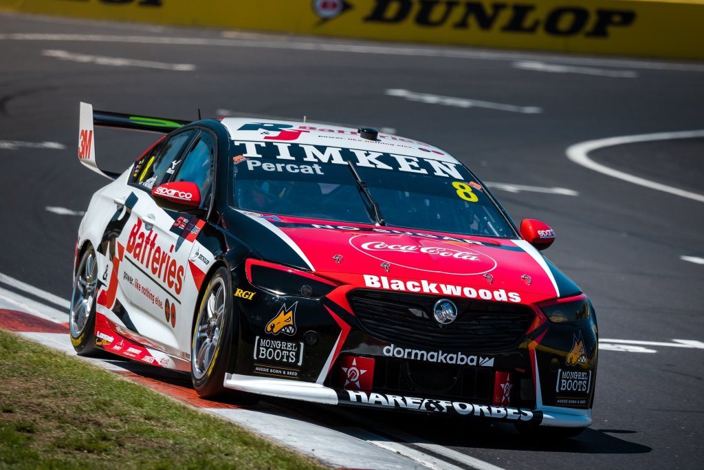
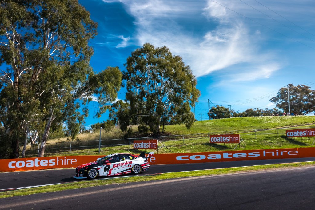
Looks like R&J Batteries will be sponsoring Percat throughout 2021 in what is a pretty middle of the road livery to kick us off. Some standard colours in white/red/black, placed on the car in not so ground breaking fashion, but certainly in no way ugly. Some nice flashes of red and white on the front lights and bumper.

Majority white along the side suits this one well, especially with the sponsor naturally being red & black. The large spike along the side from the bumper works well to fill that space on the left, but interferes with the main sponsor logo a bit on the right – kind of annoying but not the end of the world.

★★★

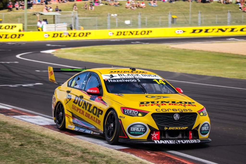
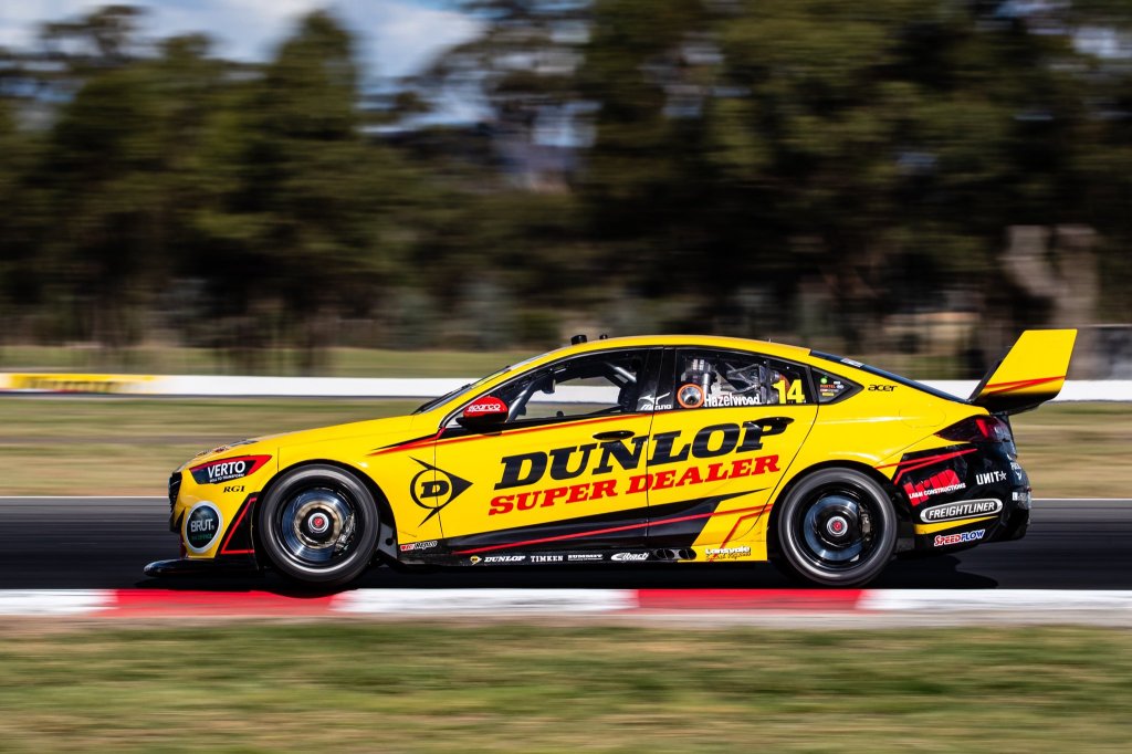
As for Hazelwood’s #14, it looks as though the sponsor will change race by race, but for Bathurst it was a Dunlop Super Dealer livery. It’s a pleasant mainly yellow effort, with similar flashes to the R&J batteries livery. It’s just a nice shade of yellow, one that doesn’t need a lot of help to make it look good.

For that reason I’m glad there are some of the red and black flashes, but not taking up too much space on the car. I’m not sure if this style of design is a bit dated? Either way, the colour does most of the work in making it look good. Glad to see black rims too.

★★★

CoolDrive Racing

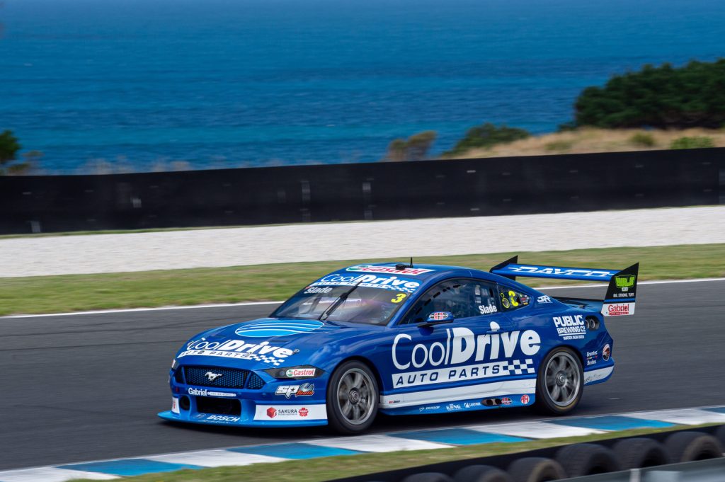
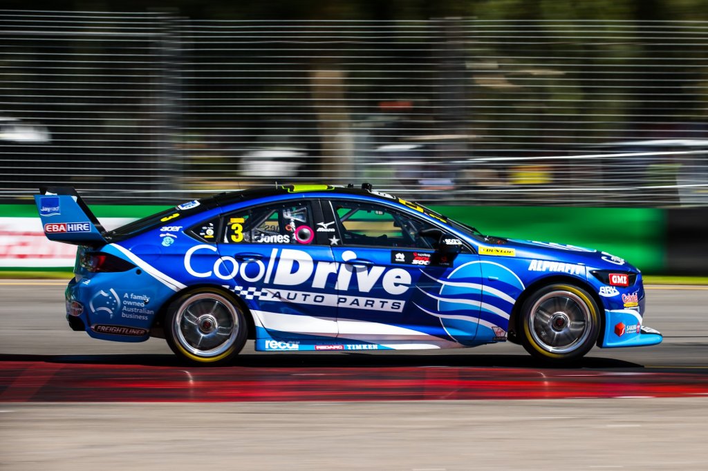
After years of driving around the back of the field in a Brad Jones Commodore, Tim Blanchard has grabbed a Mustang and immediately found some competitiveness in 2021! It was great, if not unusual, to see the familiar CoolDrive colours toward the front of the grid. The wonderful metallic blue is back which is fantastic, and with the amount of the secondary flat light blue colour reduced on the car, the metallic blue has been able to shine through even more.

The design is very simple – a thick white line along the entire side of the car, bordered some of that lighter blue. Really uncomplicated, but the real beauty is obvious once the sun hits that metallic blue. It does look a little too linear though, and perhaps a slight angling of the lines and logo might have made it look a little speedier, as can be seen on many of the other cars. Another contributor to this may be that it’s a little text heavy – perhaps it does miss the graphic CoolDrive logo which has been on the side on previous renditions.

★★★☆

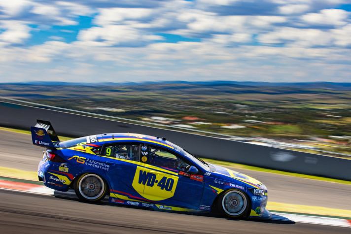
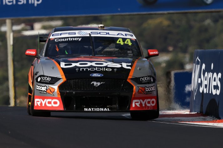
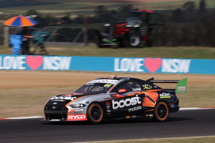
Erebus Boost Mobile & WD-40 Racing

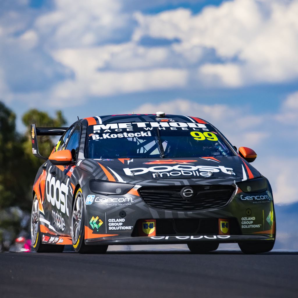
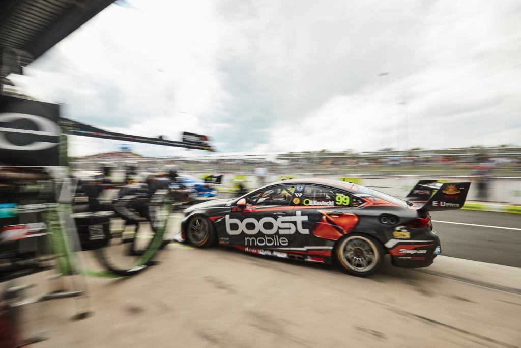
It’s very odd to see Erebus without Penrite, and it’s also odd (albeit not the first time) to see Boost Mobile sponsoring two cars from different teams. Which car has the best Boost livery? Spoiler alert – it’s this one. This livery sticks mainly to charcoal and orange with some flashes of white, which is a great combo. It’s a very modern looking livery with the pattern that isn’t overwhelming, whilst the orange & white flashes add some necessary colour to the car.

It’s pretty clean despite its complex pattern, rightly pushing all focus to the sponsors logo from a distance, whilst the intricacies really make their mark from close up.

★★★★

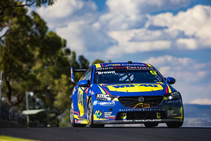
This one should look pretty familiar for any recent IndyCar fans! Alexander Rossi has raced in a similar livery on several occasions; the colours translate really well onto a racing car. The WD-40 logo is simple and clean, which looks especially nice on the bonnet – it fills the space perfectly.

As for the design itself, it mirrors the Boost car aside from the base pattern, but it doesn’t suffer from the flat blue or lack of complexity. It’s actually refreshing to see a team template look so different from one car to the other.

★★★★

IRWIN Racing & DEWALT Racing

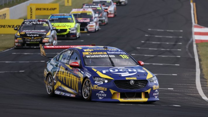
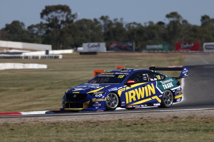
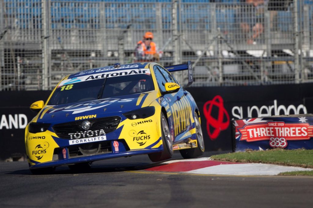
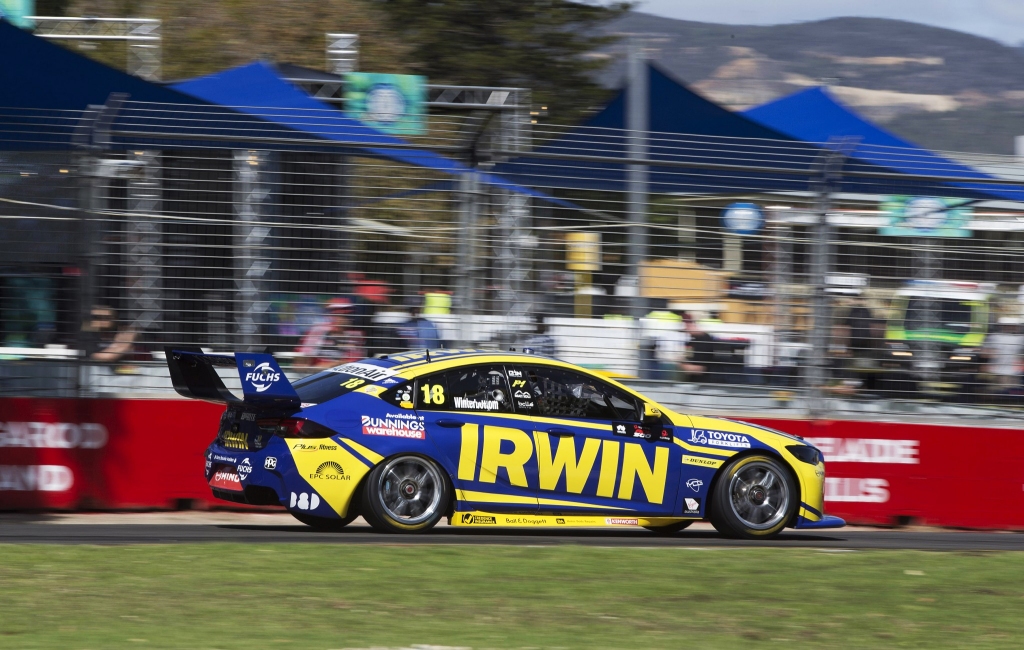
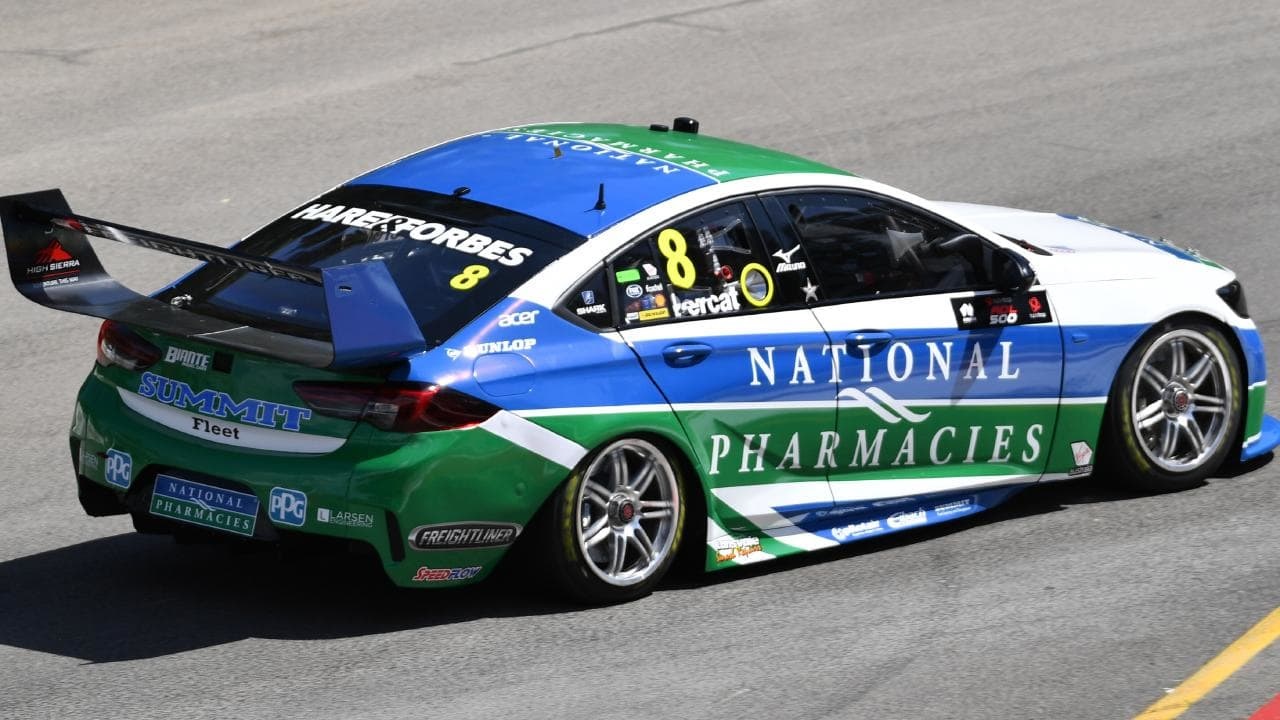
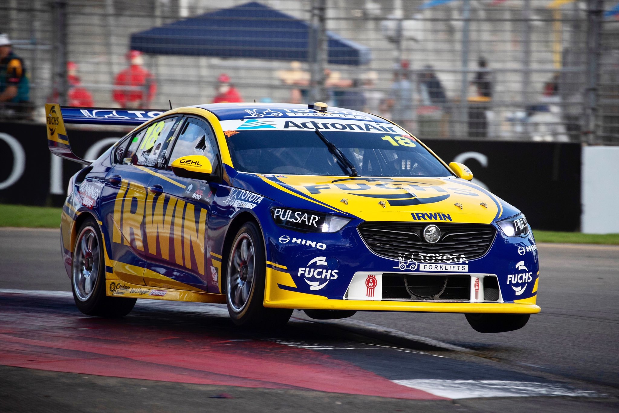
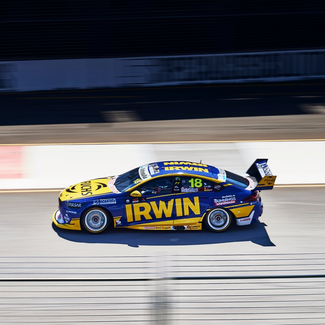
Some slight changes to the IRWIN Tool cars this year, although it keeps the same aesthetic as last season. A lot of yellow has come off the car leaving it mainly blue, so it could be a little difficult to differentiate this and the DW40 car above from a distance. A key difference in the Bunnings Trade section, which I’d say intentionally sticks out like a sore thumb. It’s not the nicest combination of colours but could have been more palatable if it didn’t extend above the window and just follow the lines of the car to the rear wing.

My mind may be playing tricks on me, but it gives me vibes of a couple of other liveries; both the Ambrose Pirtek cars of the year 2000s and Winterbottom’s own Orrcon liveries of the late 2000s. I looked back and it might just be the blues and yellows, because they aren’t as alike as I was thinking!

★★☆

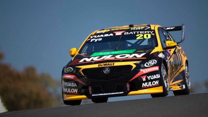
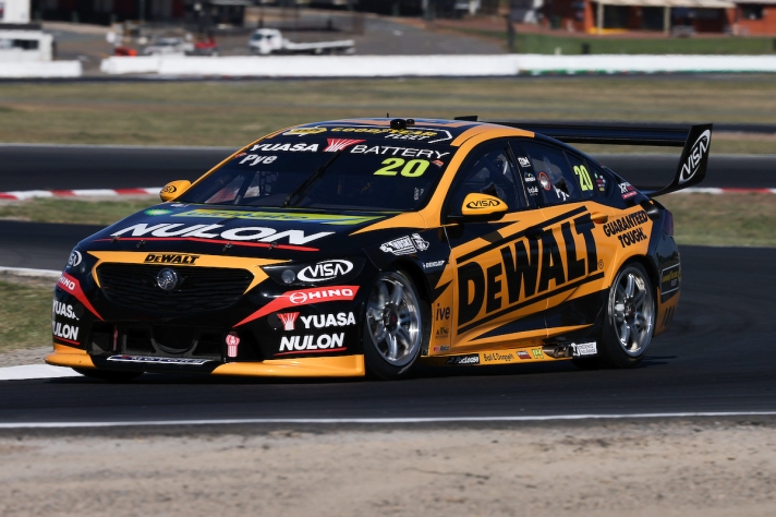
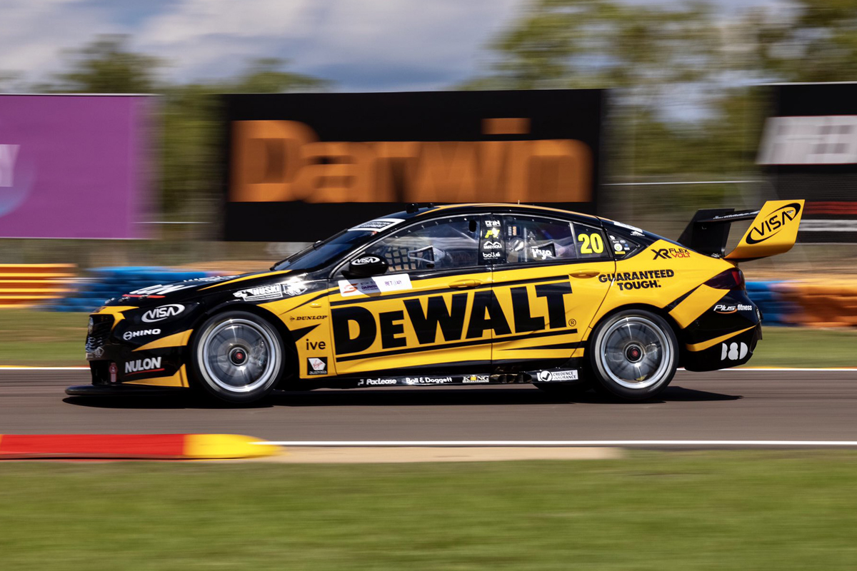
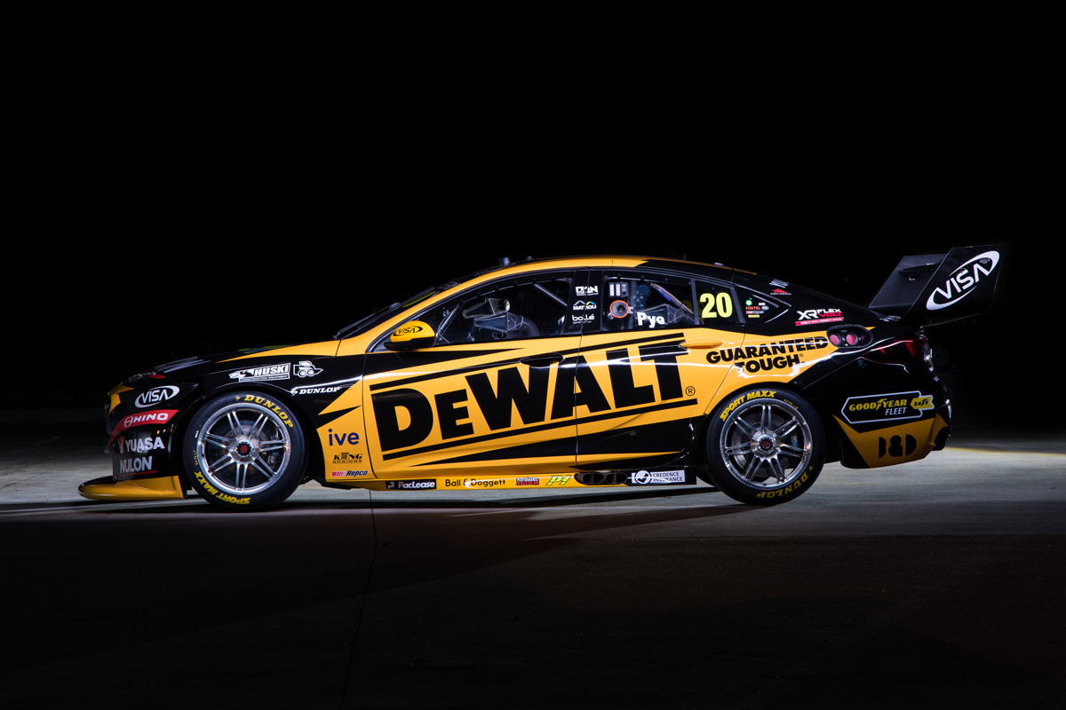
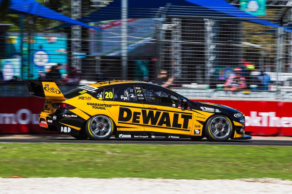
The DeWalt car carries a lot of similar elements to last year’s livery, in fact, bar some sponsors, the whole front end is almost exactly the same. The rest of the car has some other changes which I wouldn’t call evolutionary so much as shuffling the deck. The balance of the colours is still pretty close to 50/50, just some lines have changed orientation.

Really, you’d only notice the changes if you put the liveries side by side, so take a look below. At this point, I’m not sure why they’d have spent time making such unnoticeable changes – even I’d advocate to just use the same design, and I don’t think I’ve ever said the before in my life.

★★★★

Matt Stone Racing

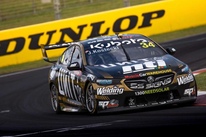
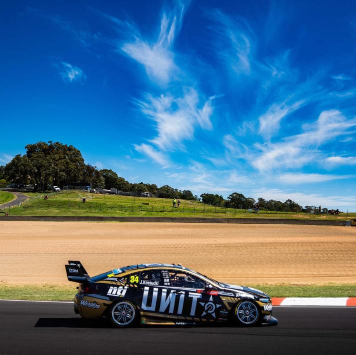
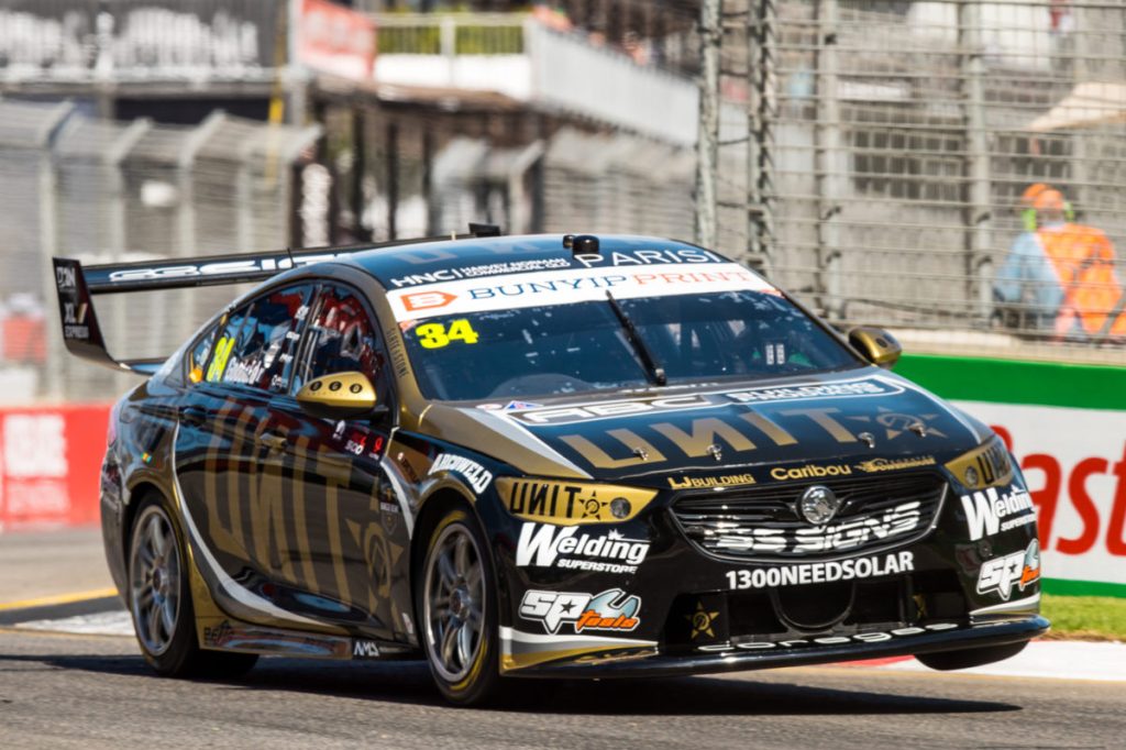
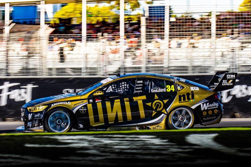
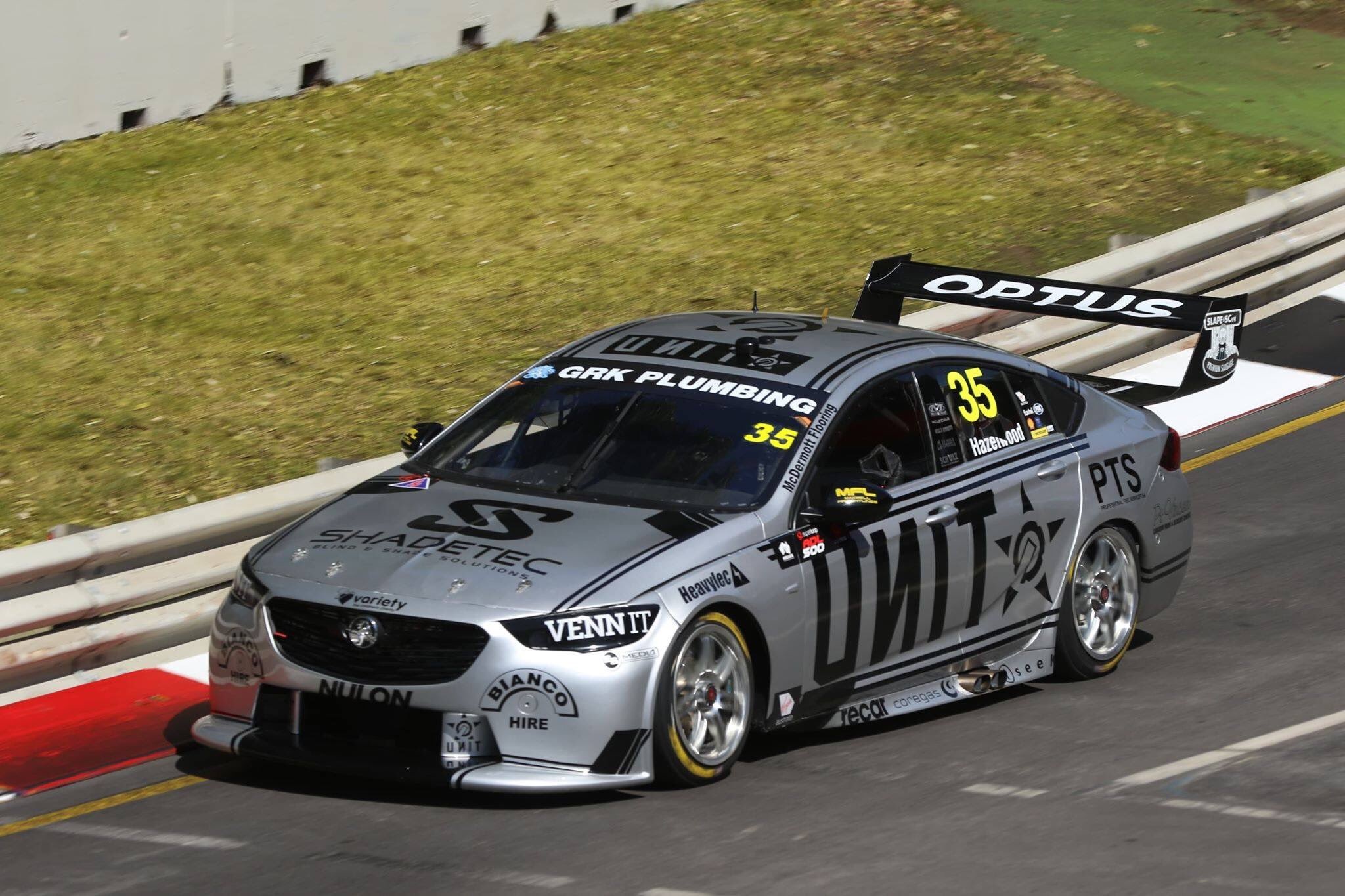
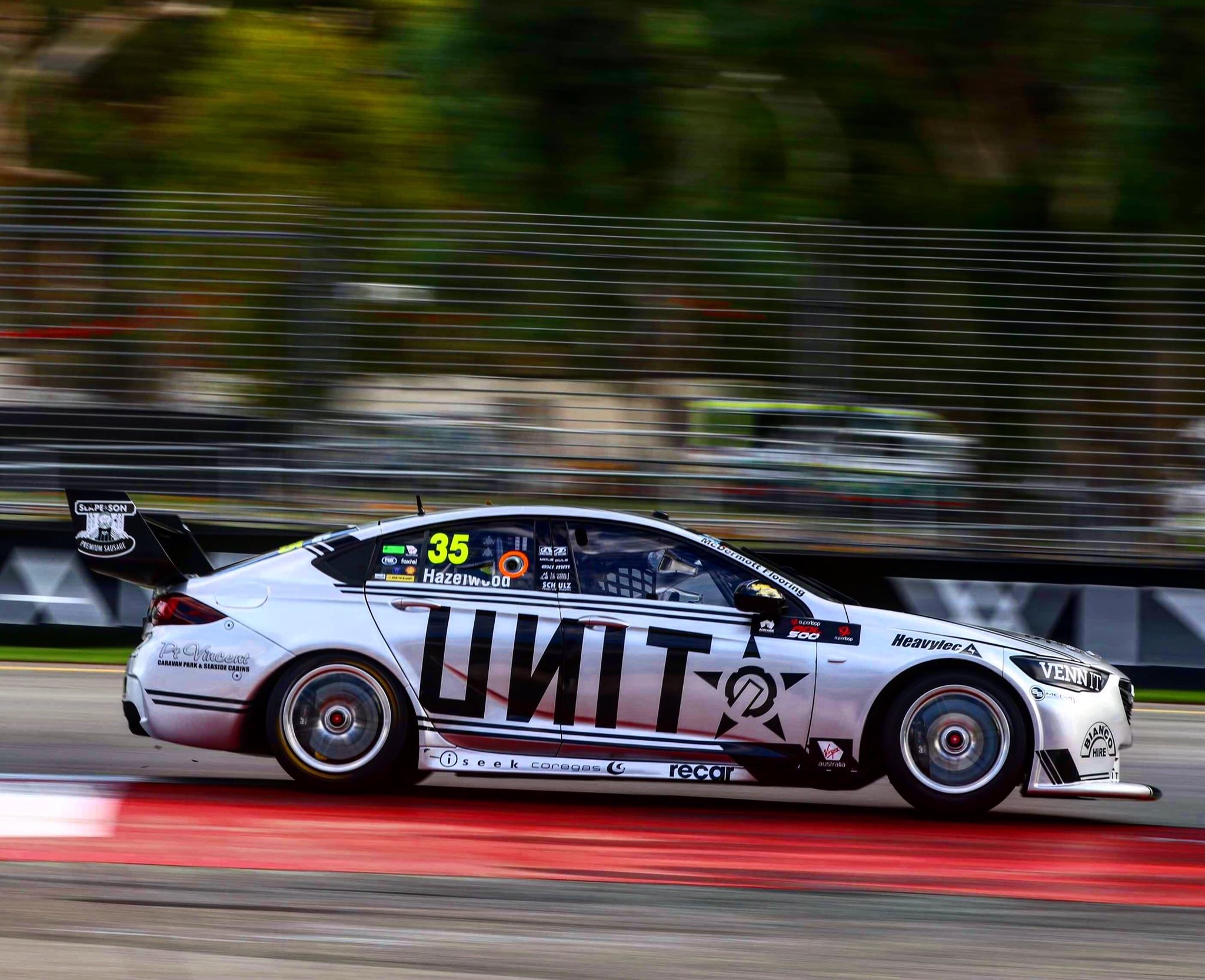
There has been quite a bit of experimentation with the Unit livery in recent seasons, but it sadly looks like they’ve settled on this black and gold colour scheme. Not to say black and gold aren’t a terrific combo, just that this dull shade of gold against the black means it doesn’t pop at all, and is a little lacklustre where it should really excel. I’m sure I’ve been through this all before, but the use of a lighter, more saturated (or a hue closer to orange than green) shade of gold like in this crude edit would have been way better. Save that, just reverting to the awesome first Unit livery which was short lived!

It’s a shame because the design itself is actually really good and has great potential. It does a lovely job of framing the car and sponsor, and the use of gaps of increasing size along the gold sections is very nice, especially on the bonnet and front bumper.

★★★

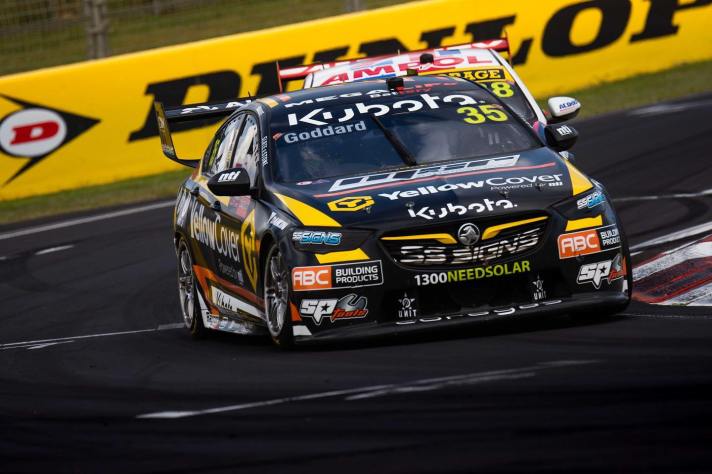
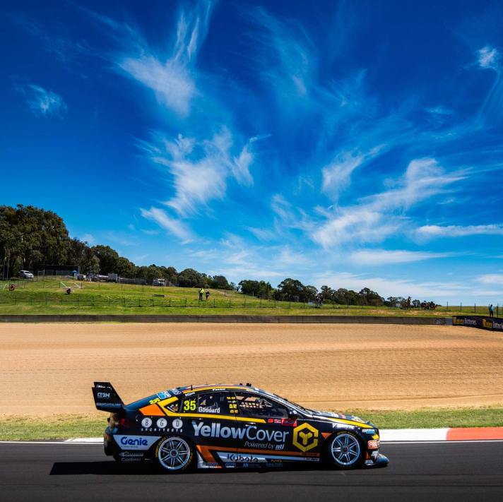
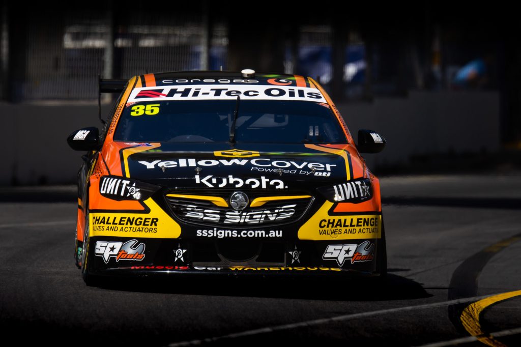
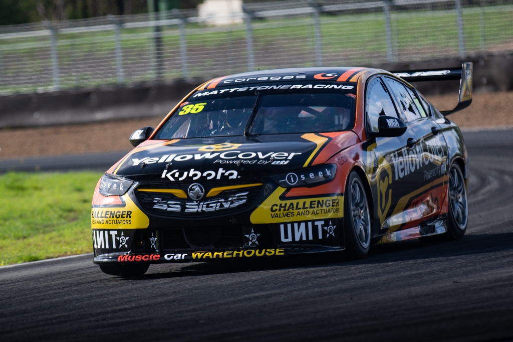
The YellowCover livery continues to be an uninspiring use of some fairly original colours. Black and yellow are pretty common of late, but the addition of orange give Matt Stone Racing a chance to do something completely different. That said, they’ve churned out another mainly black livery with some intertwining lines of each colour along the length of the car.

It’s a fairly generic design, but they could have got away with it with better use of colour. The sponsors and their placement too, don’t make it feel like a top category livery. It gives off backmarker or Super 2 vibes if I’m honest. Splash some more of the orange and yellow on the car and I’m sure we’d get something cool and original.

★★☆

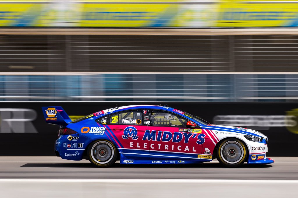
Mobil 1 Appliances Online / Middy’s Racing

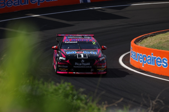
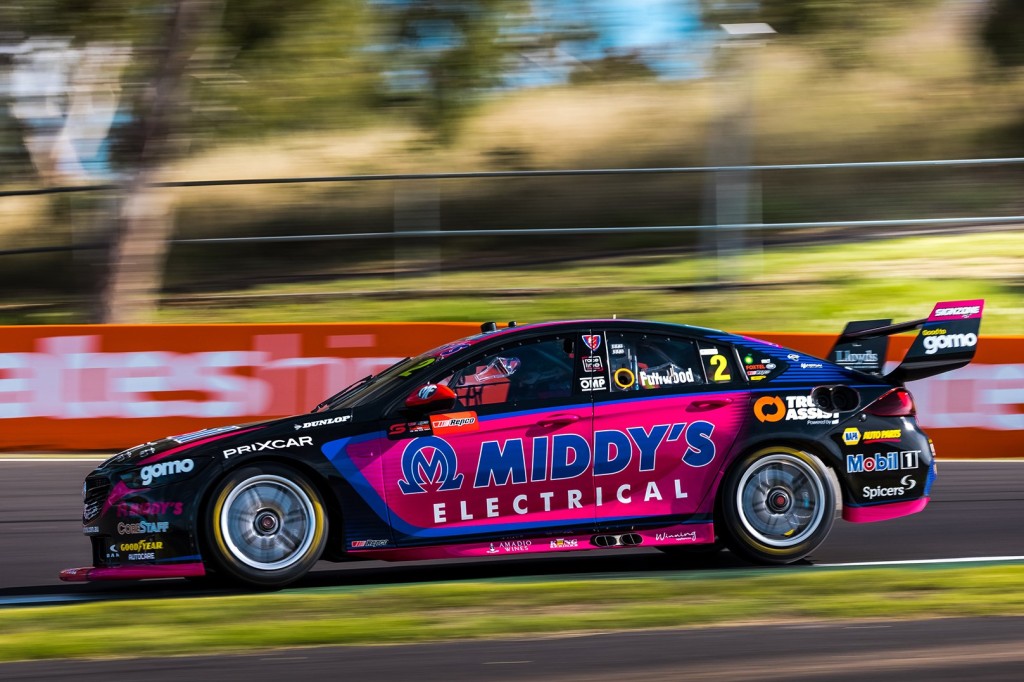
It was always going to be tough to beat what were some almost perfect liveries in 2020, so WAU have done a great job to make them so different and still so good in 2021. The base colours interestingly have inverted from white to black which makes for an strong contrast against the Middy’s pink. It’s not that I have an issue with though, it’s the blue the separates the black and the pink. This is obviously a requirement for Middy’s branding, but it’s a shame a different shade couldn’t have been used, to separate the black and pink in a more complementary fashion.

Come to think of it, perhaps a slightly thinner blue line may have worked better even with that shade of blue. There are also some really nice touches to this livery, mainly the pinstriping behind the rear windows on the sides, and a similar pattern which fades the pink to black just at the end of the rear door. All make for really nice overall livery, but all of works much better on the car below.

★★★★

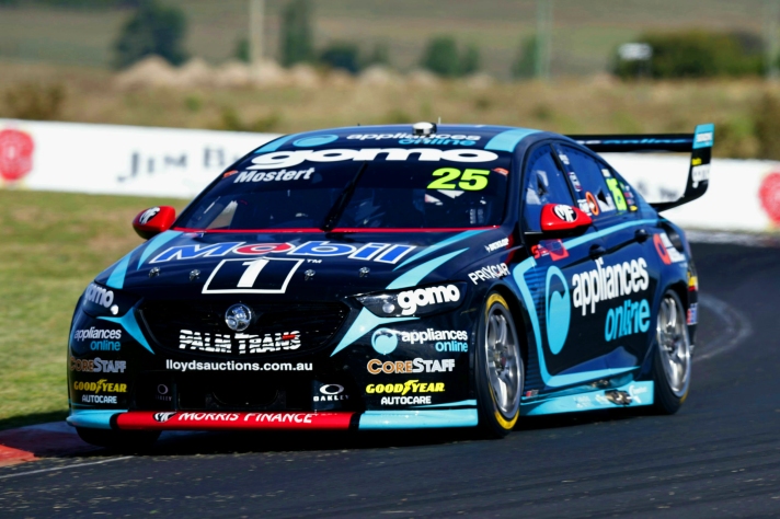
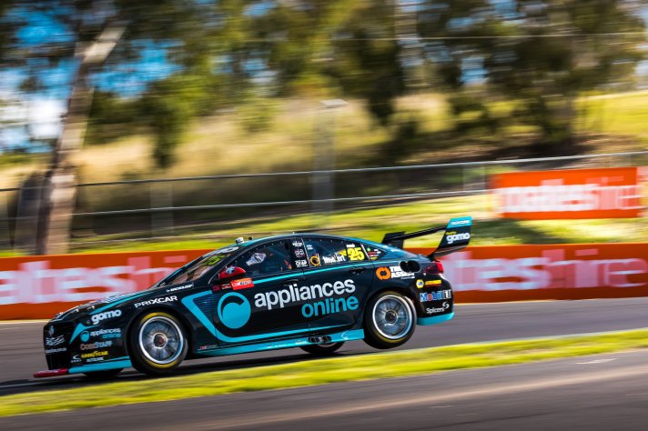
On the other side of the garage, the Appliances Online car has done a much better job with this design, if not perfected it. It’s simply down to using more black in comparison, and without the need to show off a third colour. The Middy’s car would have been much better placed following this theme, with mostly black on the side and just the pink highlights, and using only flashes of the blue elsewhere on the car.

It’s quite a striking effort with the almost two tone, highly contrasting colours. I don’t think I have a bad word to say about this one, just a wonderful application of design and colour. Great to see WAU could pull it of two years in a row.

★★★★★

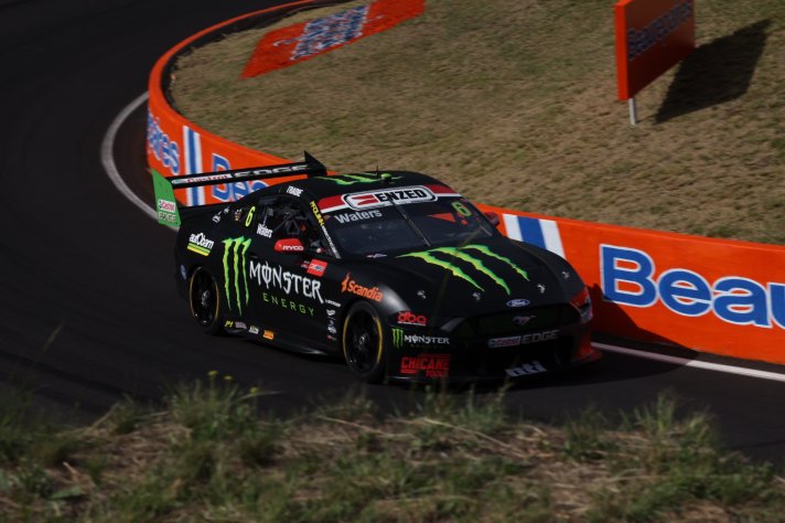
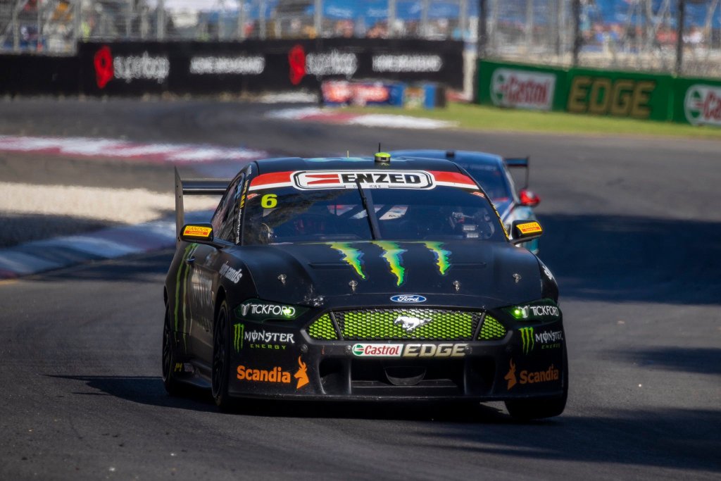
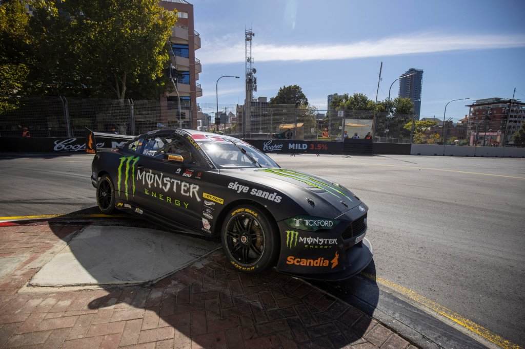
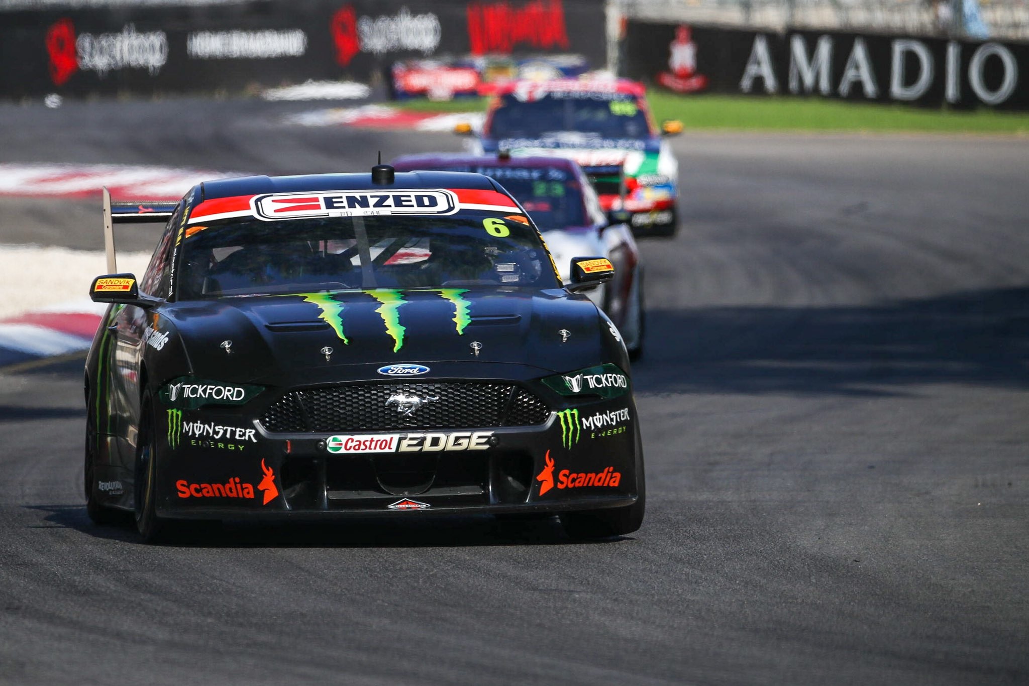
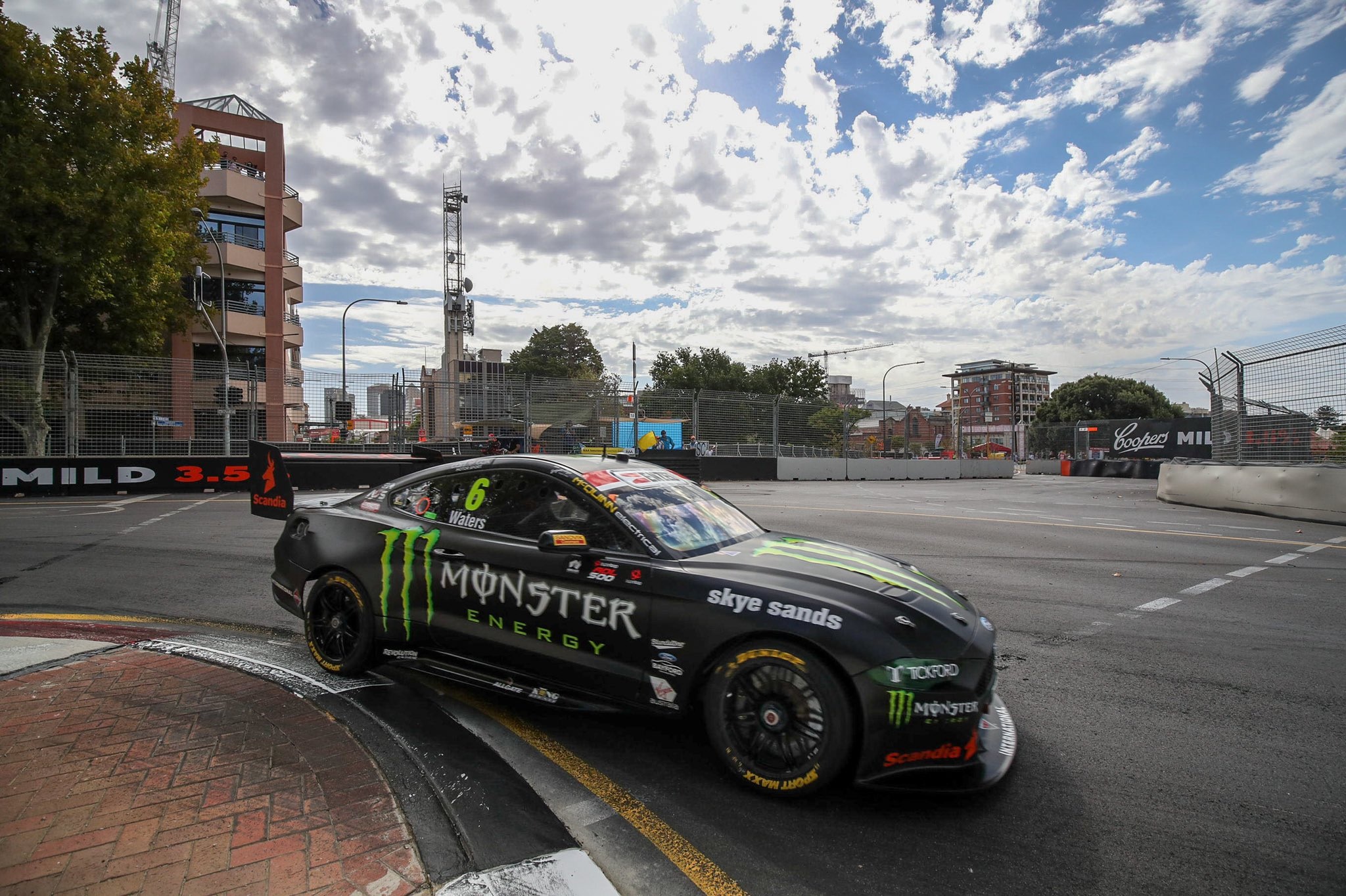
Monster Energy & Boost Mobile Racing

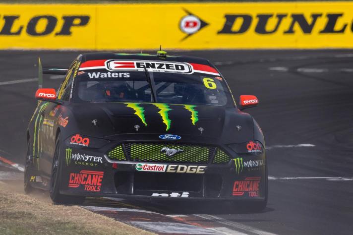
Well it’s evidently clear that Tickford and Monster are quite happy having the same livery year on year. The good news is, a plain black livery can’t really get old and daggy, but I’d really have appreciated some sort of an evolution. There’s a lot you can do with it, whether it’s more green accents, or even a mix of matte and gloss black.

Either way, it’s simplistic nature allows it to still look good, where keeping a busy livery for this many years would have become old, fast.

★★★

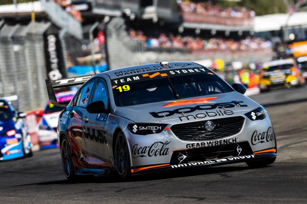
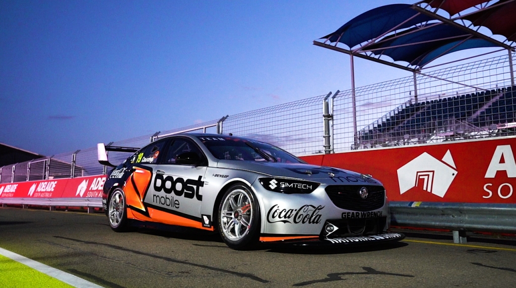
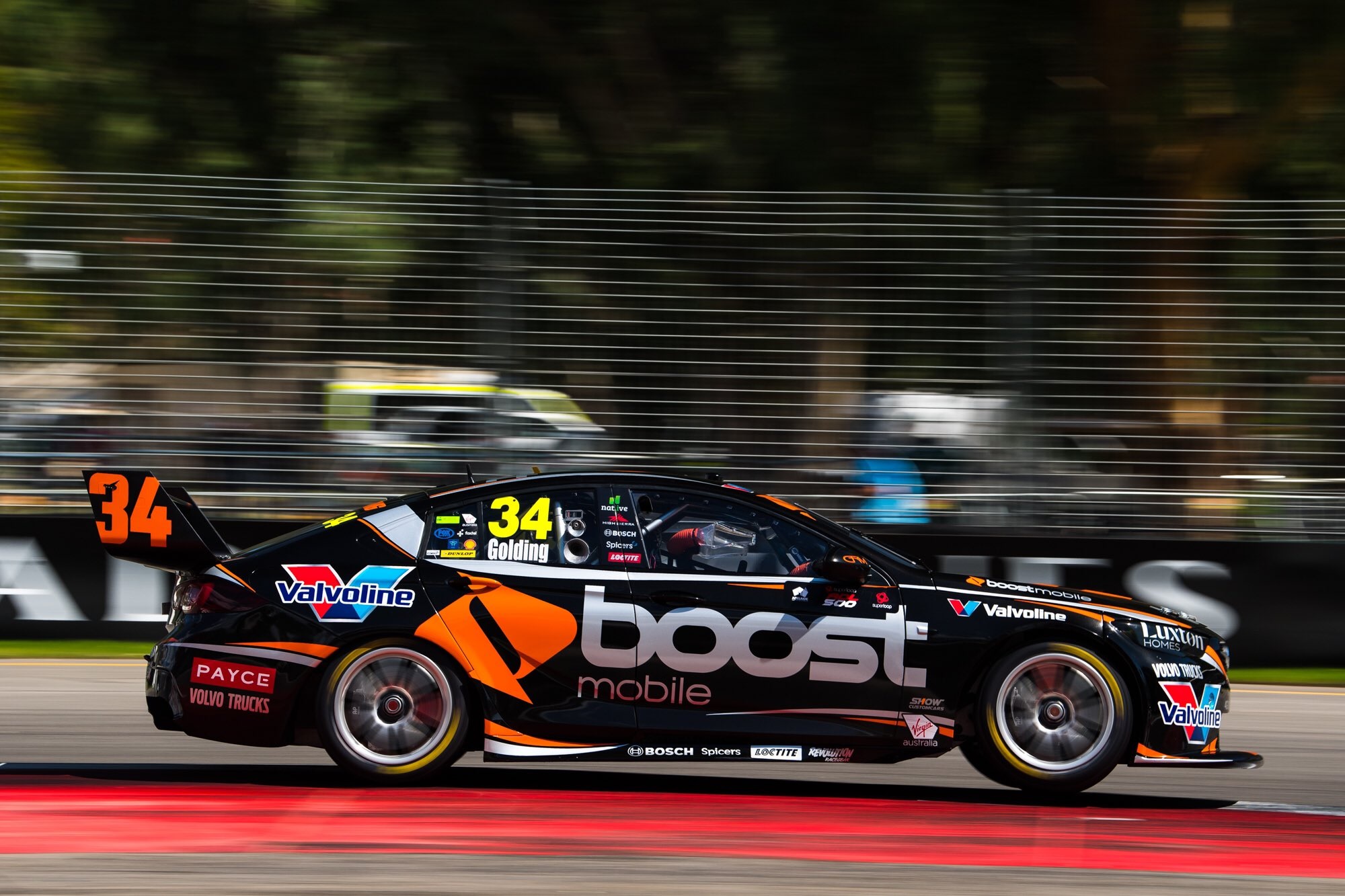
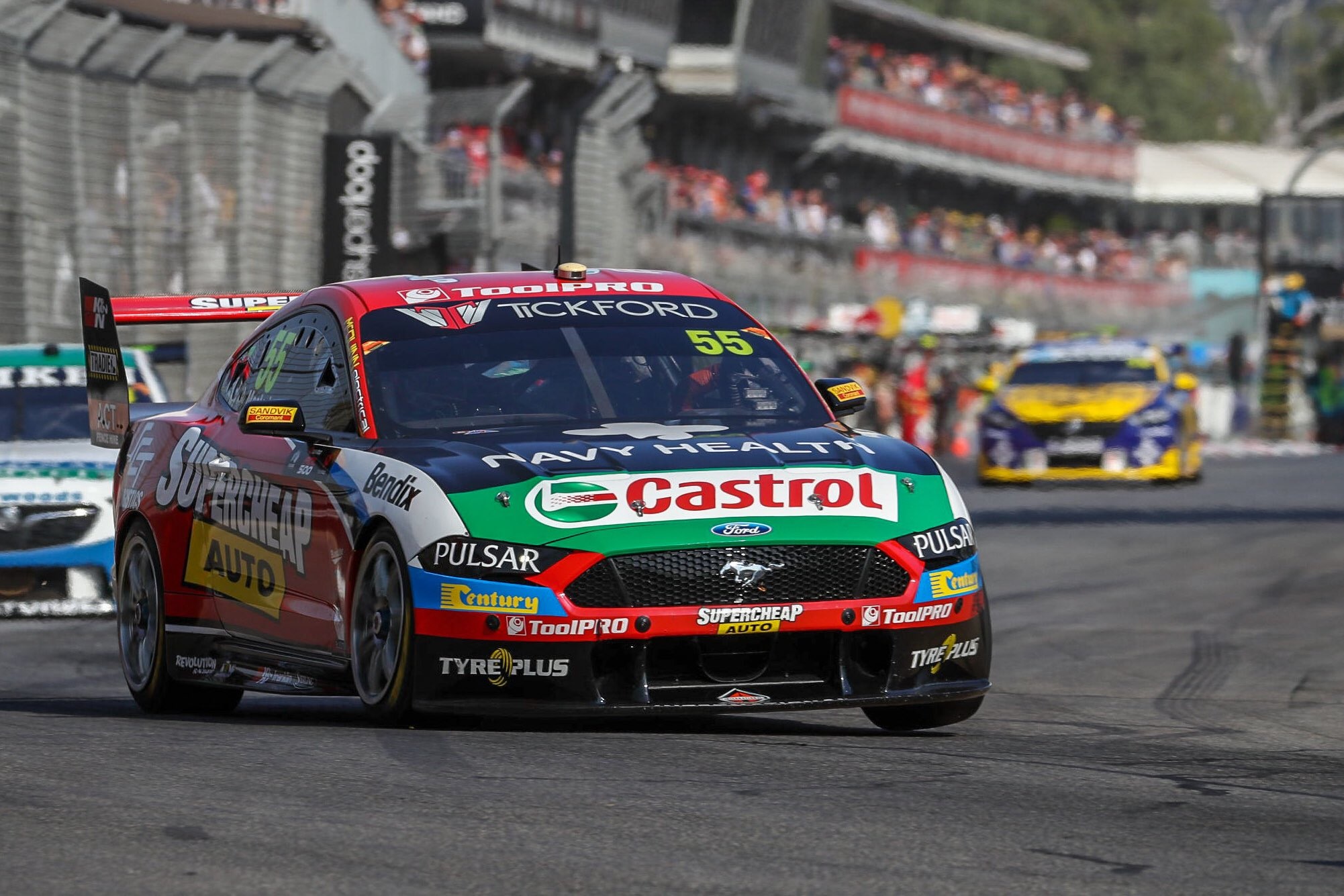
So here’s the other Boost car on the grid, the less impressive effort of the two. If you removed all the silver on the car and kept the orange flashes, this would have been an awesome livery. Instead, the silver really dulls it down, makes it a tonne less aggressive, and overall less attractive to view.

That’s really the only detriment to this livery, but it’s a huge one. The other is possibly the orange line on the side jutting behind the Boost logo, but that’s the consequence of getting your logo to be as big as possible on the car. Castrol green on the wing is also a bad clash – whilst it’s a sponsor across both cars, it would have looked far better if the green didn’t cover the whole end plate.

★★

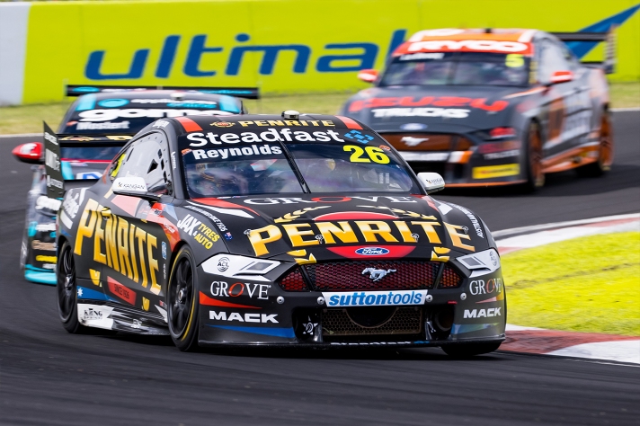
Penrite Racing & NED Whisky Racing

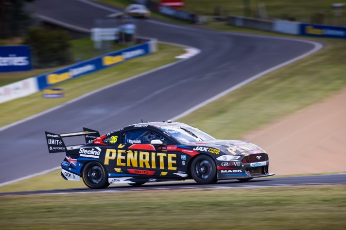
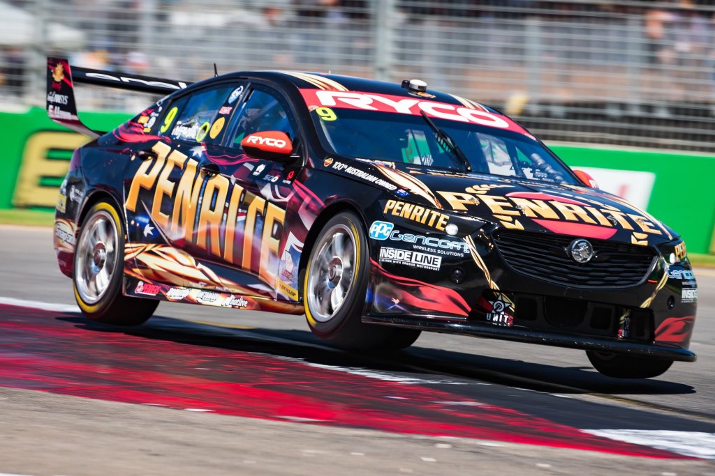
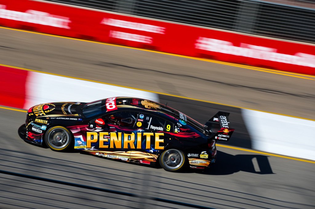
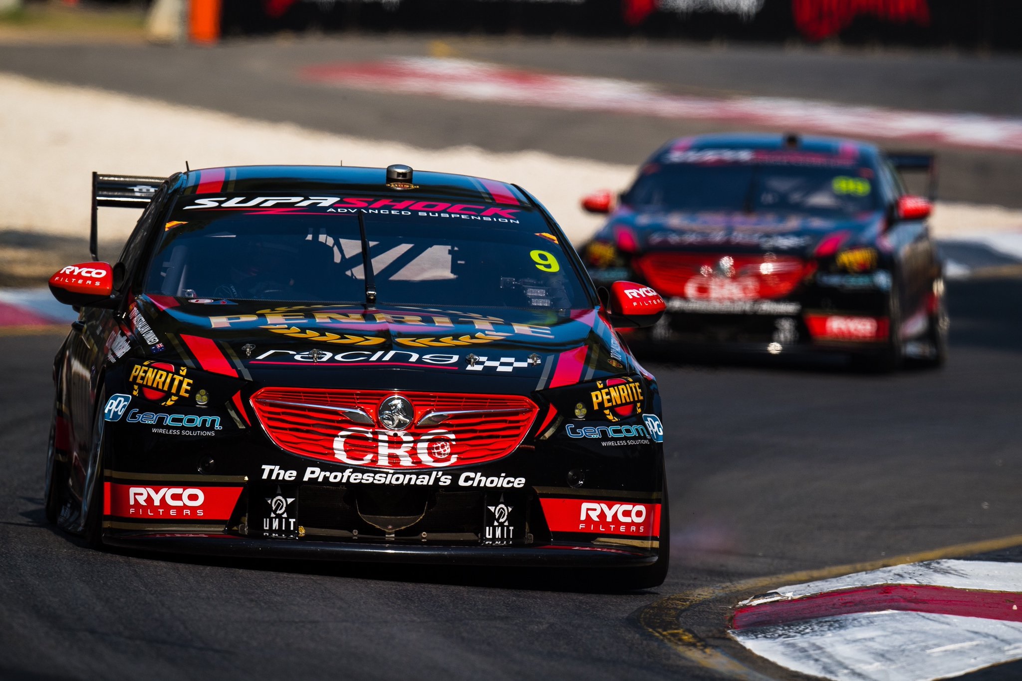
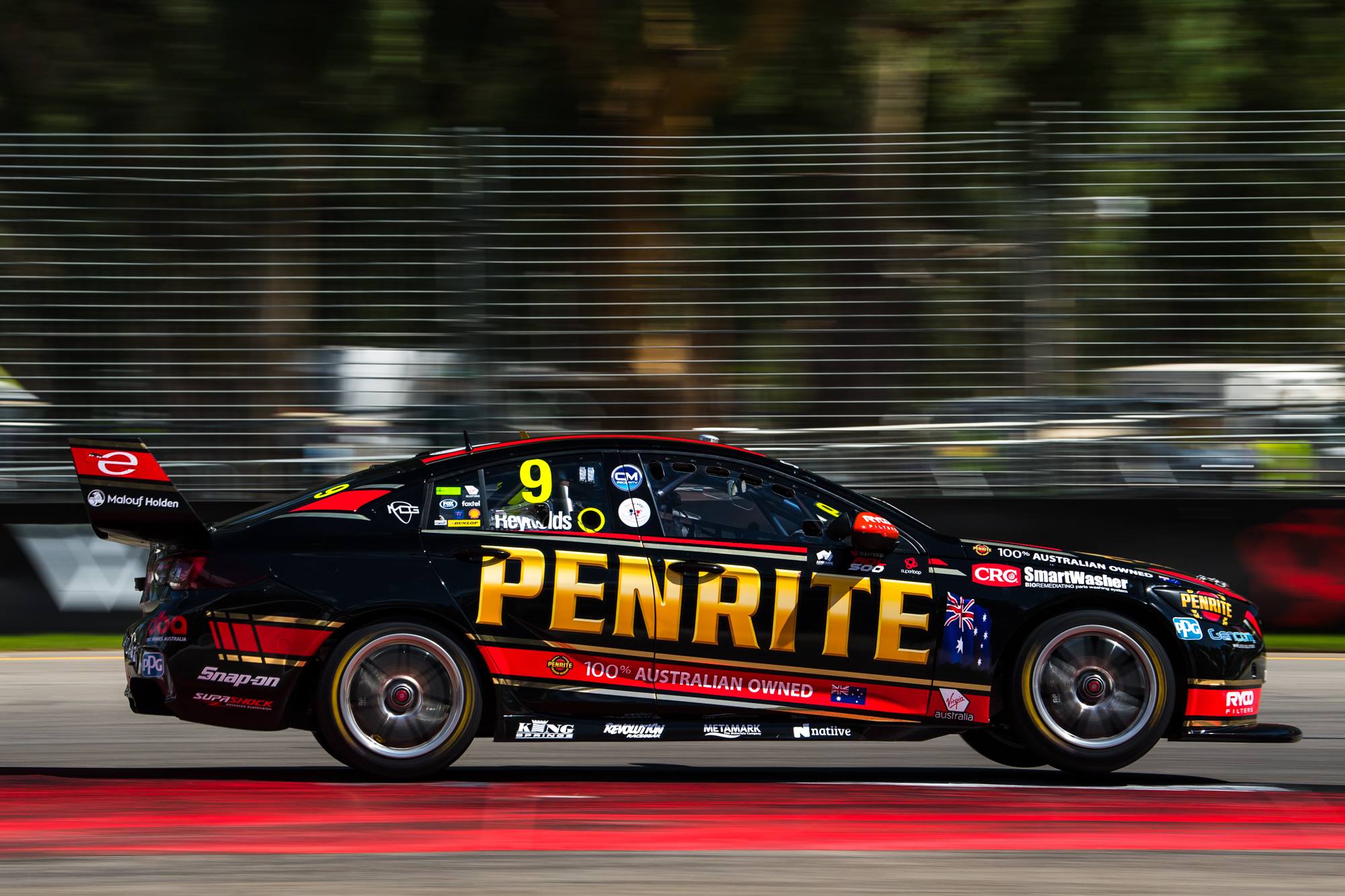
It was an absolute shock, SHOCK I tell you, to see that Reynold’s ten year contract with Erebus ended early. With that, he’s found a new home at Kelly Racing and sponsor Penrite has followed him across. They’ve taken a more traditional approach with this livery, with classic little red and blue sections as opposed to the modern smoky design of 2020.

It’s not the most cohesive design because while the coloured lines on the side flow from one end to the other, the big black gaps between them look like two completely separate sections. It’s also very busy with graphics and sponsor logos, probably too cluttered for my liking. Penrite are still as patriotic as ever, albeit toned down slightly. Taking a little while to get used to seeing Penrite on a Mustang, but it’s a decent effort.

★★★☆

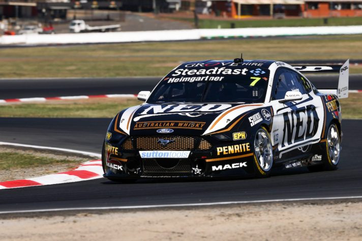
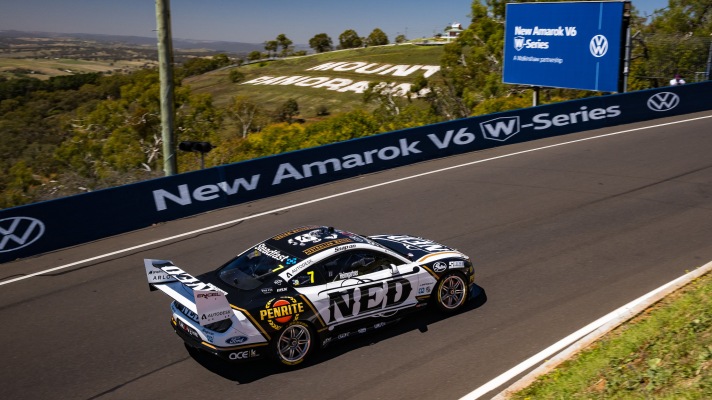
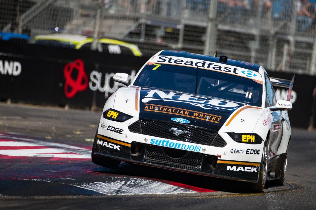
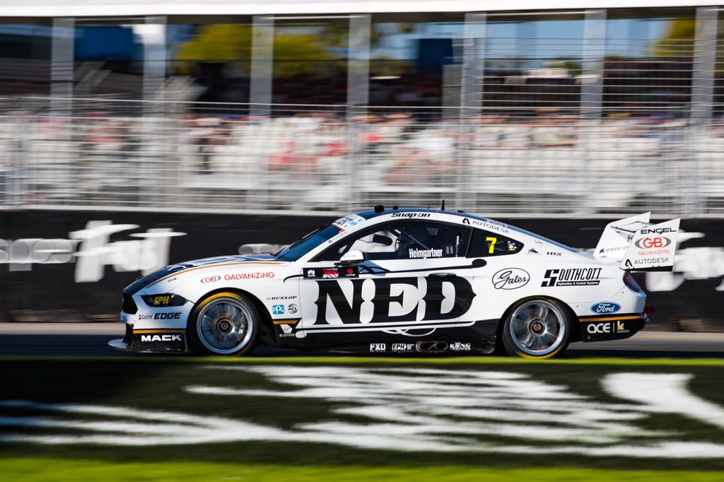
I was initially a little annoyed they changed the Ned livery! It was really simple and quite beautiful last season, making use and showing off of their very nice logo, but it’s taken a side step for 2021 with a lot more black added to the fold. The amount of gold has also been beefed up, but still used to smartly frame the larger white and black sections on the car.

The increased black was probably necessary to help add some new sponsors to the car, such as Penrite above, but the way they’ve used it has worked out pretty well. A side effect of this is whilst the Ned logo is the same size as last season, the added black sections make it look smaller and take attention away from it. The good thing is that they’ve used the right shade of gold, where the Unit livery really suffers in comparison.

★★★★

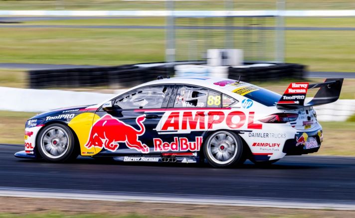
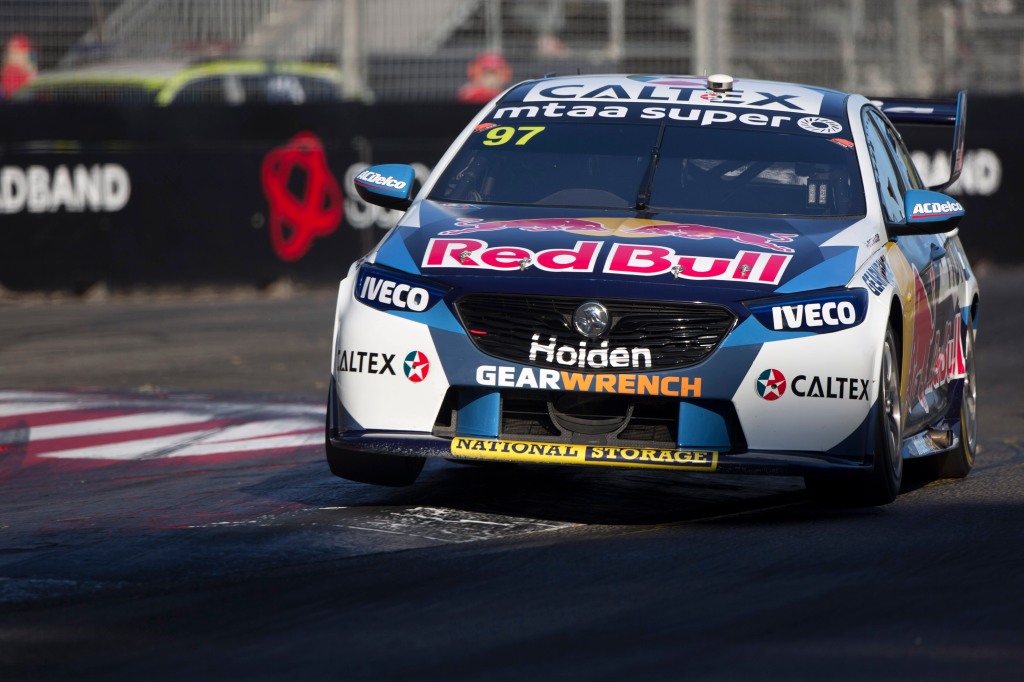
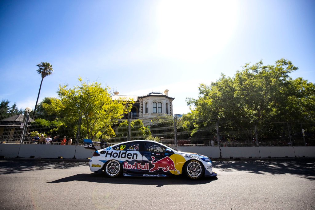
Red Bull Ampol Racing

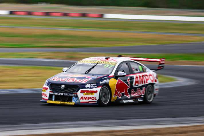
At initial glance this might appear to be just like the last few Red Bull liveries, but with Holden ceasing and Ampol pouring money into their rebrand, there are quite a few changes to this car. For one, they’ve stuck with one shade of blue this time as opposed to having multiple lighter shades on the car. The jagged design evolved to a cleaner look too.

The biggest change is in colour, with Ampol bringing a lot more red to the car that it has seen in recent seasons. There’s a lot of red many sponsor logos, heavily on the rear wing, and also framing the side and front of the car. It’s a pretty good effort and matches better than the Holden logo did last year, but I’ll never be a big fan of two big sponsor logos fighting for attention on the side of the same car. You almost need a BAR style zipper livery for Red Bull these days, one side for Red Bull and one side for Ampol or whoever else is the major partner that season.

★★★☆

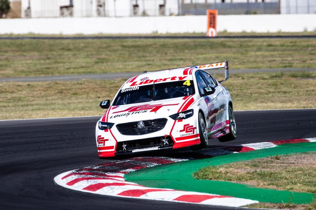
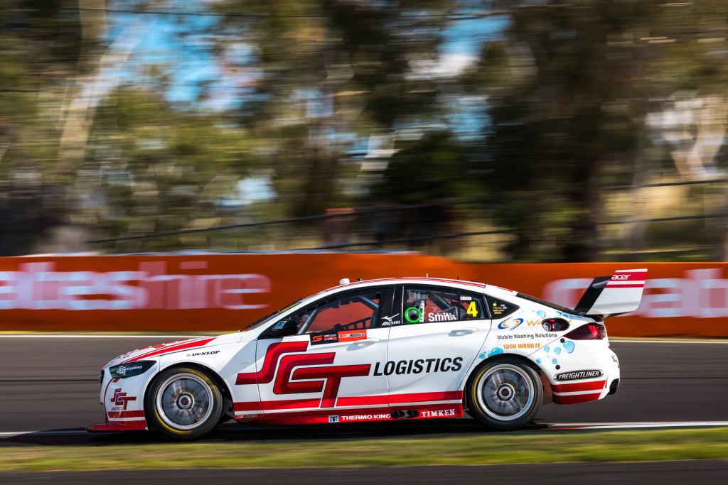
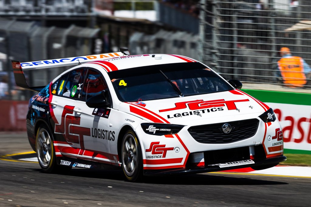
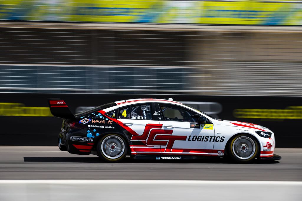
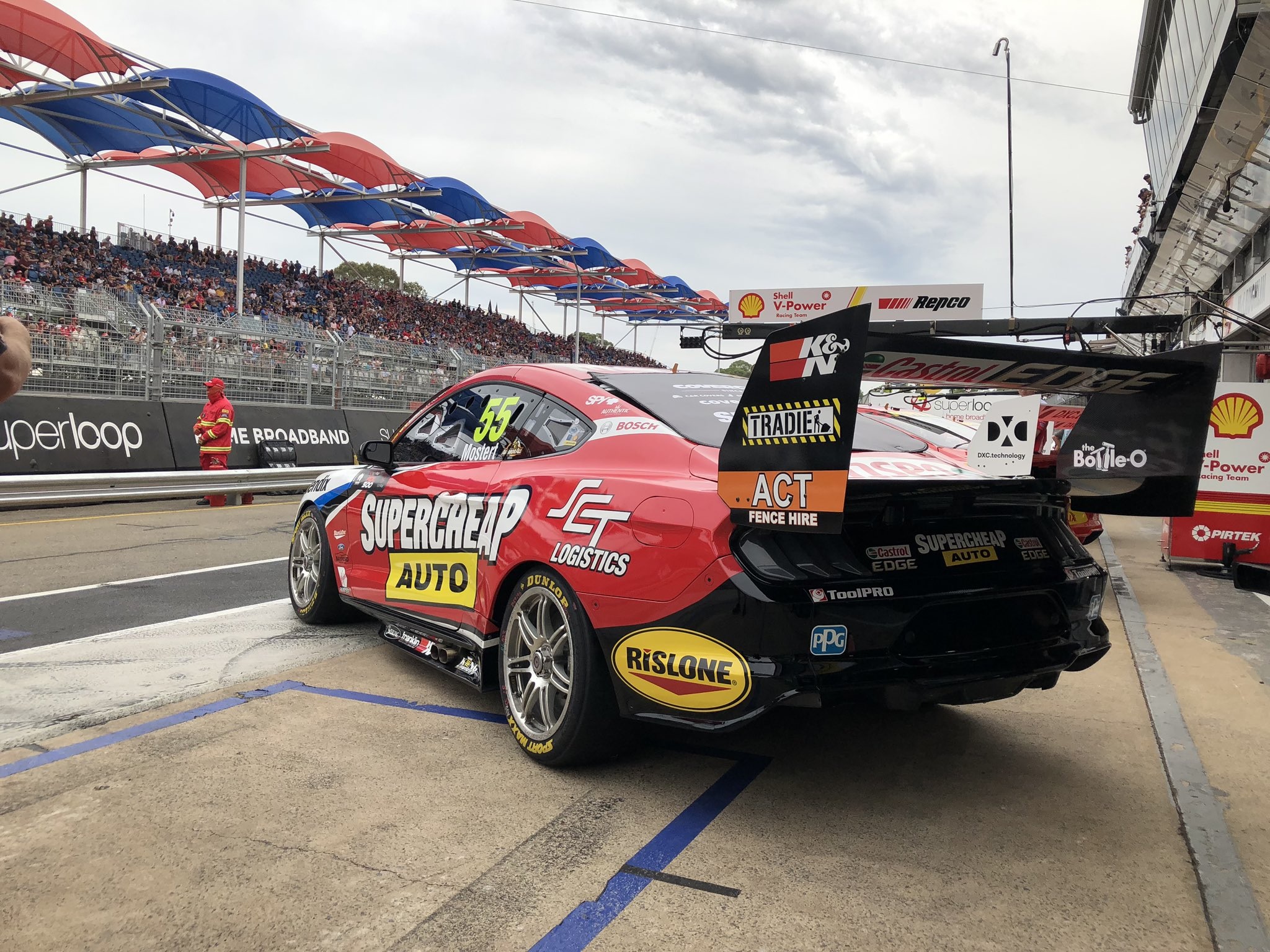
SCT Logistics & Coca-Cola Racing

Jack Smith’s back for another go in his SCT Logistics car and whilst few have high hopes for his performances, his livery has taken a step in the right direction. They’ve simplified it by taking out the large black section on the rear, which has cleaned it up immensely and improved it greatly in doing so.

The SCT logo matches the dual stripes along the side of the car perfectly, and whilst the front end hasn’t changed at all really, the whole car is in a wonderful harmony now that the black section has been removed. I used to hate mainly white cars, but I’m a bit of a sucker for their cleanliness and simplicity nowadays. Heck, even the bubbles look alright!

★★★★☆

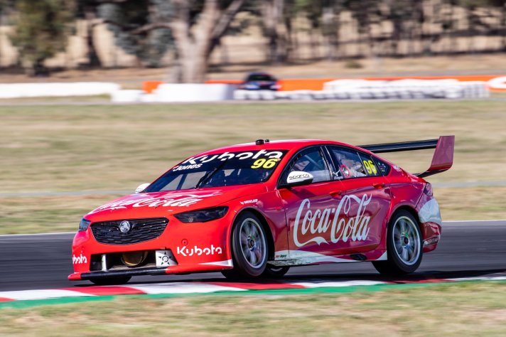
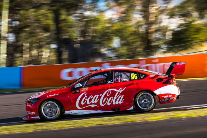
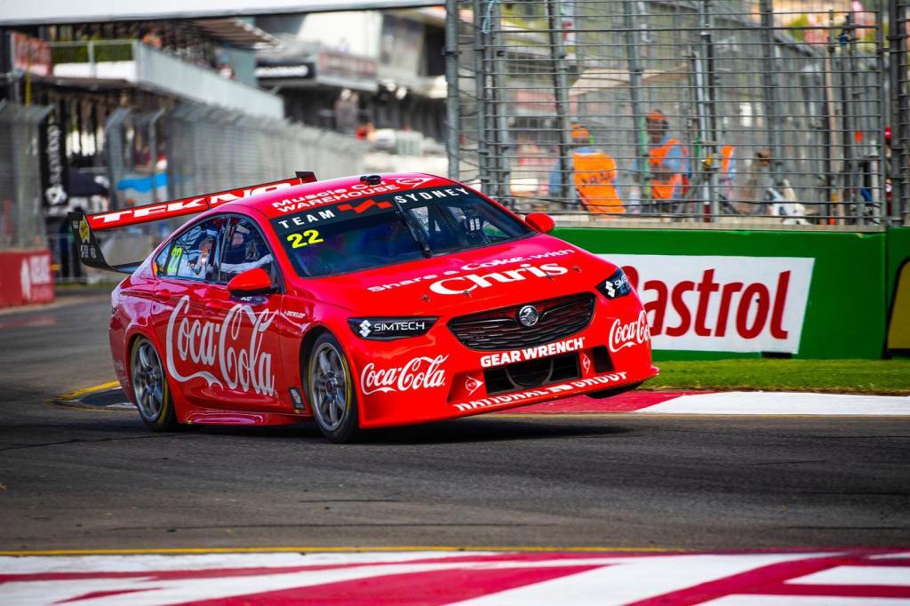
When we heard a Coca Cola (or Cocla-Cola according to the Supercars website) car would be on the grid last season, I think this is what most of us would have imagined! Last years attempt (for Team Sydney) was nice albeit quite plain, however, the minimalist recreation of their iconic can design is exactly what needed to be done to this car.

You don’t become the most recognisable brand in the world without some beautiful branding, so this livery really is a no brainer and was always destined to look good. No overcomplicated tricks or flashes required on this one and thankfully the low density of sponsors accentuates the design and doesn’t look too empty in the process. I may have rated this one too high last year, but as it’s improved, there’s only one rating I can give it.

★★★★★

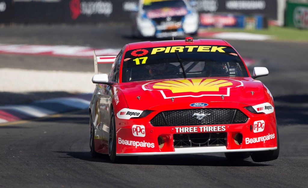
Shell V-Power Racing Team

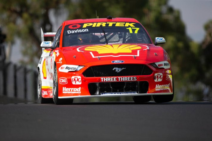
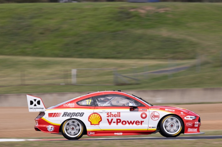
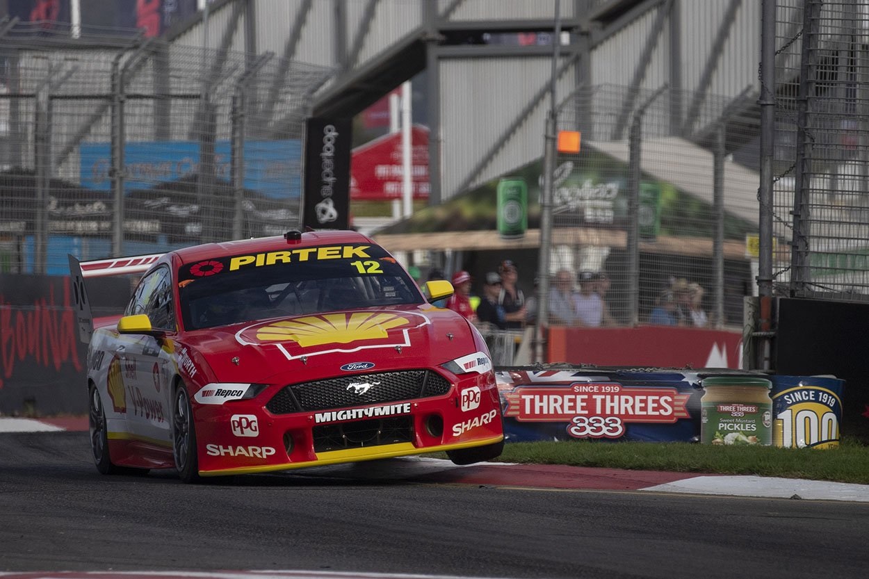
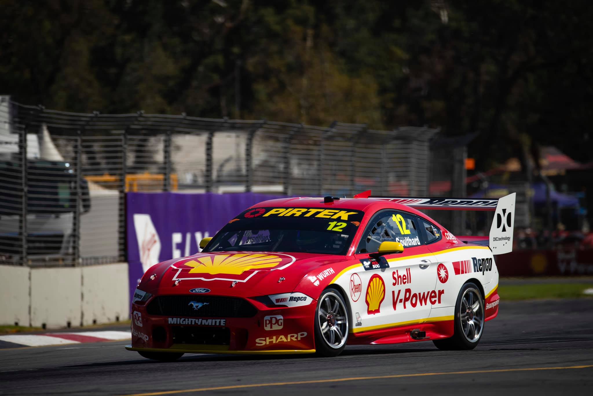
If there’s one team that cares less about updating its livery than the Monster team, it’s the Shell V-Power gang. Apart from literally two or three sponsors, the livery is identical to last season.

It’s certainly become an iconic livery at this point, but that doesn’t mean it won’t wear out. I for one am just about over this design, so time for it to be spiced up.

★★★

Team Sydney

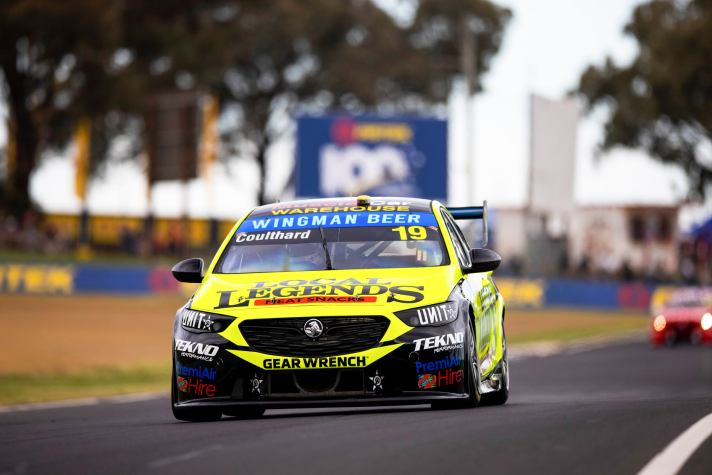
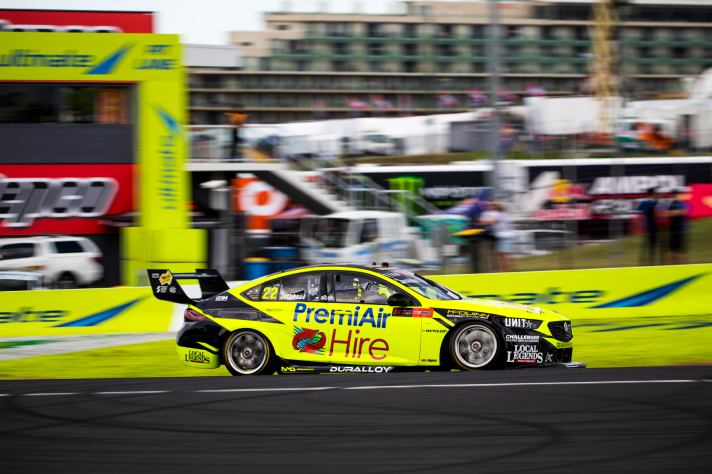
Team Sydney has decked out both cars in fluorescent yellow this season! It’s quite nice actually, refreshing to see an unusual colour like this in the mix. It stands out from the pack, and with a colour like this, it’s the bright yellow that makes the impact for the livery as opposed to the design itself.

Both cars use the same spiky (for lack of a word) design, but the black Local Legends logo fares far better on the bright background compared to the blue and red PremiAir Hire logo. Clearly, neither sponsor paid the team enough to use their own brand colours on either car. That said, I’m glad about it as we get to see some funky colours on the grid to mix things up.

★★★★

Truck Assist Racing

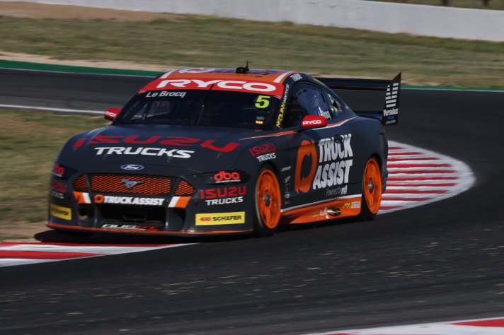
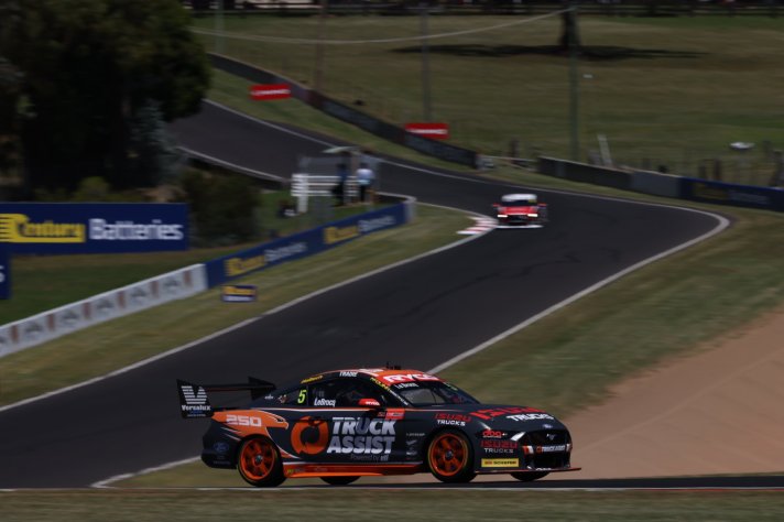
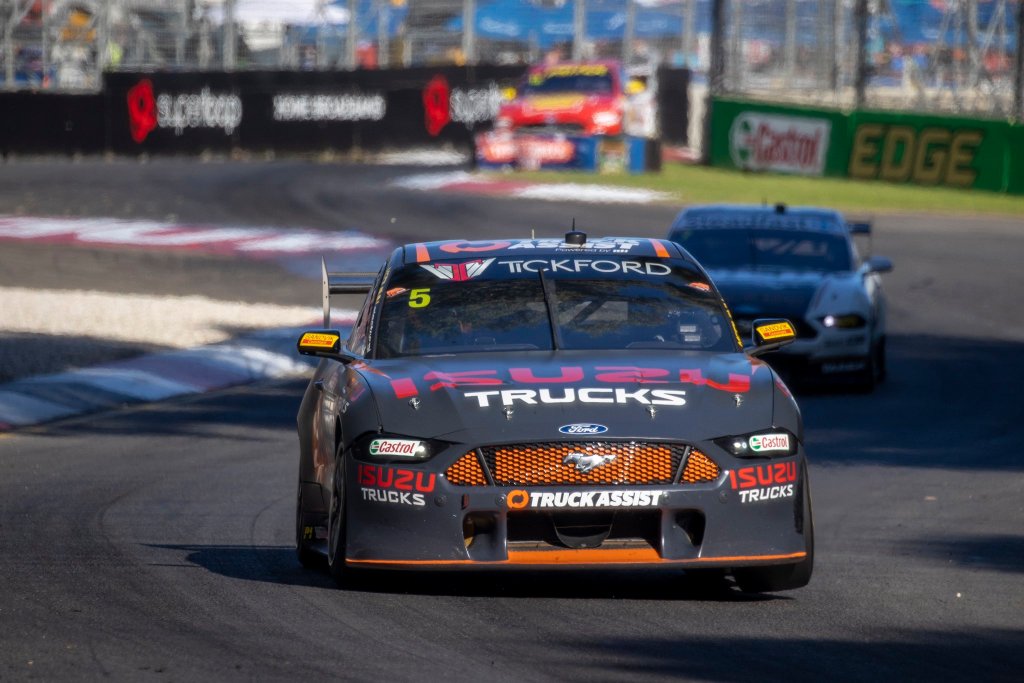
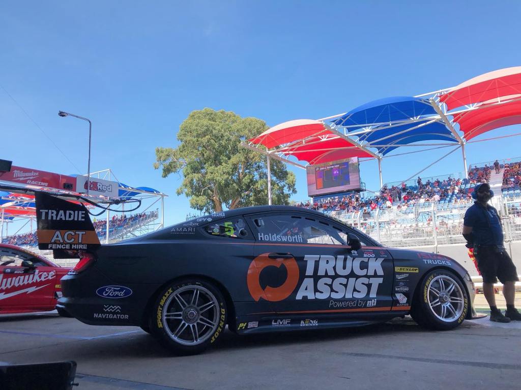
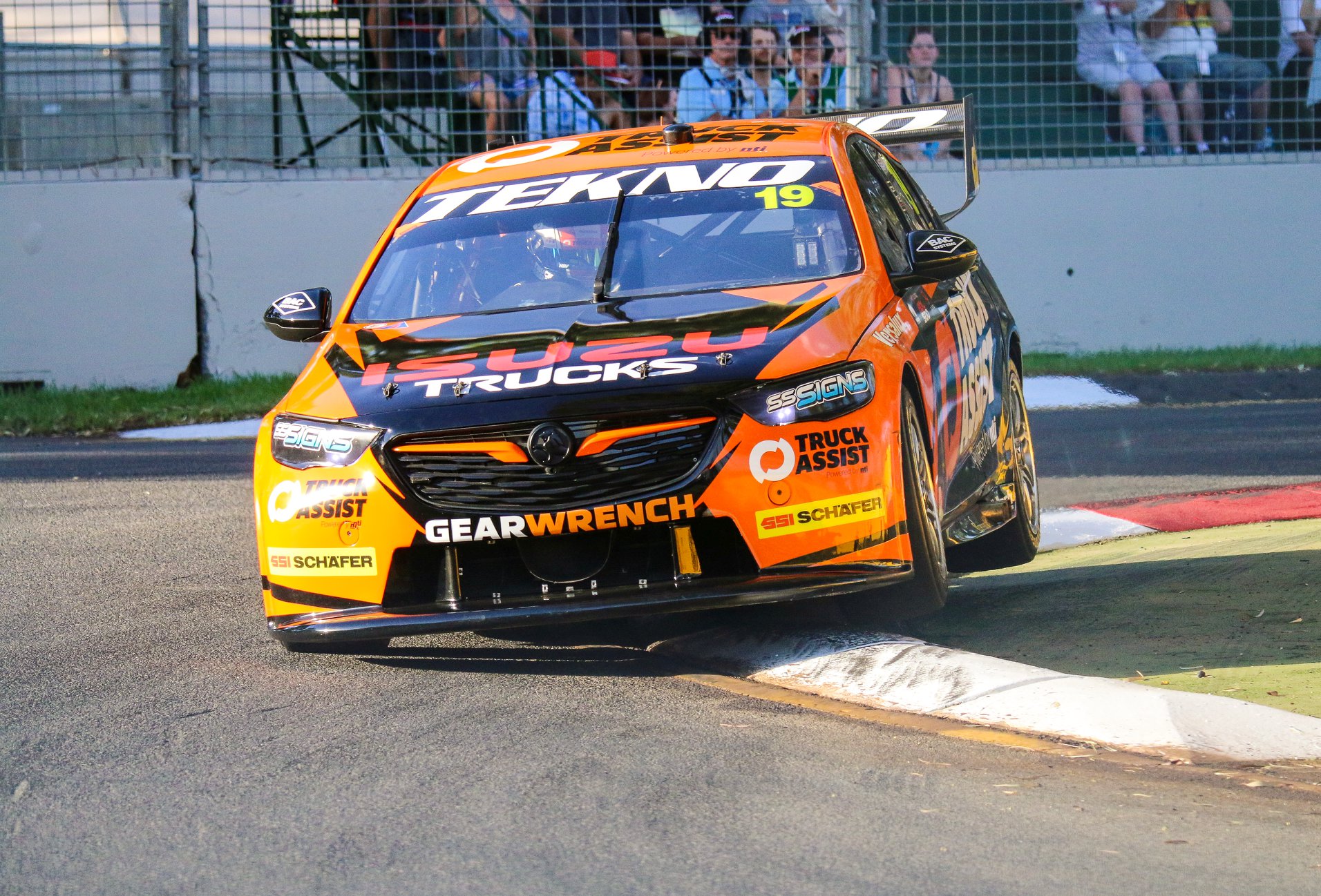
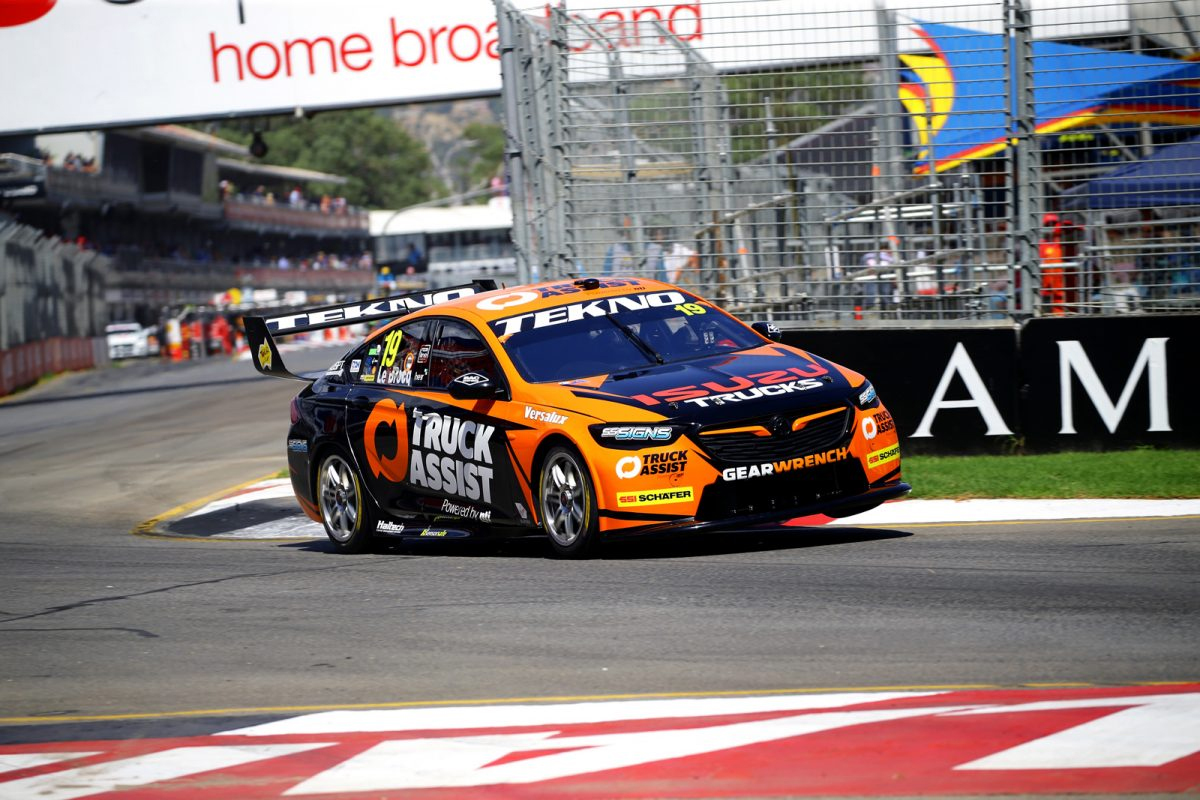
Last and in fact least, it’s the big grey Truck Assist machine. Whilst the bright yellow colour is makes the Team Sydney liveries, it’s the dull grey that completely detracts from this one. It’s funny how just a couple of shades of grey away, the Boost Erebus machine looks fantastic. With an almost identical colour palette, Erebus chosen the rights greys and oranges, whilst Truck Assist have not. It’s very difficult to describe what’s wrong with this grey. A little darker and it would be closer to a charcoal colour which would be fine. A little lighter and it would have a flat light grey look which is pretty neat and popular on road cars these days. Along with that, the placement of orange on the car doesn’t really spark joy either.

While I’m a fan of painted rims, it’s almost too much for this car and white may have suited better, although the white piping added this season doesn’t help the cause. I did like the nod to the Falcon on the Bathurst livery, but that won’t stay for the rest of the season either, and of course the Isuzu red clashes like no tomorrow. A bit of a bummer to end on!

★☆

On to the awards!

Best Looker Award – Mobil 1 Appliances Online

Whilst I gave both the Coke and the Appliances Online cars 5 stars, there’s definitely more time, effort and precision that has gone into the latter, so it get’s my top pick!

Least Attractive Award – Truck Assist Racing

It’s a double wooden spoon for the Truck Assist team, and sadly they’ve regressed if I so say so myself. Time for a total refresh – I’m totally available for some mock-ups guys.

Fear of Change Award – Monster Energy & Shell V-Power Racing

Some people don’t like change, perhaps it’s fear, perhaps it’s laziness. Either way, these teams may never change their designs again as long as their major sponsors to change.

Backup Safety Car Award – Team Sydney

They may not have flashing lights, but if the safety car went caput, maybe Supercars officials would ask Coulthard or Jacobsen to lead the field in their fluro yellow cars.

Out of Place Award – Bunnings Trade (IRWIN Racing)

It’s tough to blend teal and royal blue at the best of times, but it doesn’t look like IRWIN Racing went too far out of their way to get Bunnings Trade to match the rest of the Irwin livery.

Round-Up – 2020 Formula 1 Field

After a long, long wait, F1 is back! COVID-19 has played havoc on the world and with so much negativity, it’s great to have a favourite distraction back, with races almost every week. The delayed season start has also seen some surprising livery changes since the launches, so let’s see the who’s done well and who hasn’t, in reverse alphabetical order this time.

Williams Racing

There’s a lot to love about William’s revamped livery. Sure, the new Rokit design was good and brought some colour to the grid, but I don’t think anyone is sad to see the dodgy company go. The new livery is somewhat dictated by new sponsor Sofina, a financial investment group, but sings true to Williams roots of white and blue.

williams-2020-livery-1

The red is gone, but the livery is way more refined with some traditional swooping blue and black lines along the length of the car. Everything appears to be well placed, including the black on the underside of the halo and the blue on the top of the engine cover/shark fin, as well as on the rear wing.

williams-2020-livery-2

They’ve taken Mercedes’ lead with a neat repeating pattern toward the rear of the car, which gives the classic livery a much more modern look. It’s a mainly white car, but avoids looking empty with good sponsor and colour placement.

williams-2020-livery-3

Probably my favourite part of the car is the little blue sections which cut in and out of the main black section on the car. Usually you’d see two colours running parallel, but this is another way they make this livery look modern. It looks especially great on the nose where it’s most obvious, and I feel possibly they’ve missed an opportunity to make further use of this toward the rear of the car. Only nitpicking though, because it looks fantastic.

★★★★☆

Renault DP World F1 Team

Renault has only made very minor changes to their livery this season, and why would you when it was already close to perfect.

renault-f1-2020-livery-1

Sure it might be the third year in the same livery, but it’s still quite wonderful. The slightly cooler, more bright yellow brought in last year remains, as does the placement of most of the colour and sponsors.

renault-f1-2020-livery-2

The biggest change, and a sign of the times really, is that the black portions of colour on the car are a matte paint, as opposed to the regular gloss for the yellow. I’m not against matte paint, but I feel as though gloss is fast becoming underrated, and I wonder if matte is here to stay or just a fad. Another big change is the very bottom yellow stripe being removed, replaced with technical sponsors that used to be on the floor’s carbon fibre.

renault-f1-2020-livery-3

Lastly, there’s the addition of the blue tripe on the top of the shark fin, promoting Renault’s hybrid brand, “E-Tech”. It works well, albeit disrupting the colour flow. Black and yellow is a great colour combo, it’s well placed on the car, and that’s why we love this livery.

★★★★☆

 Aston Martin Red Bull Racing

Much like Renault, there’s very little change on this year’s Red Bull, in fact, I don’t think there’s any!

red-bull-f1-2020-livery-1

So not a whole lot to describe then. It’s still matte, there’s still a big bull on the engine cover and it still looks very nice.

red-bull-f1-2020-livery-2

I’m surprised to see so little evolution this year. Even in the Vettel days, Red Bull would tweak a couple of things here or there, but I guess if it ain’t broke, don’t fix it.

red-bull-f1-2020-livery-3

That said, I hope we see something at least a little different next year. I know we can’t hope for much, they have a brand identity they will always stick to, but we can hope at least for a livery that isn’t identical. Aston Martin becoming their own team next year is a sign of hope, but the likelihood is that they’ll just replace their logos with a new sponsor, or just more Red Bull stickers.

★★★★

BWT Racing Point F1 Team

So it seems this may be the end of the pink panther in Formula 1! Sure, some pink may feature on next year’s car if BWT stay on as a sponsor, but Aston Martin will almost certainly dictate the colours, so enjoy it while it lasts.

racing-point-f1-2020-livery-1

It’s very difficult to beat last year’s livery, which I thought was pretty much perfect. The departure of SportPesa means the lovely deep metallic blue is gone and BWT are back to using their lighter shade of blue, which I don’t think provides as good a contract to the light, bright pink.

racing-point-f1-2020-livery-2

That said, they’ve gone against the grain with the BWT logo diagonally covering almost the entire side of the car, which is more common in oval racing. It makes the side look a little lacking in terms of design and kind of empty, although the angled white and pink lines along the logo are sufficient albeit basic.

racing-point-f1-2020-livery-3

The white around the cockpit is nice, and very nice on the underside of the halo, although it ends a little abruptly. There just isn’t the same level of intricacy when compared to some of it’s predecessors, and it makes this livery look a little bland in comparison.

★★★☆

Mercedes-AMG Petronas F1 Team

Well I don’t think anyone expected this! Perhaps at Hamilton’s request, who has in recent years become outspoken and a great activist for human rights, animal rights and other great causes, Mercedes has for the first time entered an F1 season in a colour other than silver.

mercedes-f1-2020-livery-1

The black livery supports Black Lives Matter and in supporting a great cause, they’ve created a stunning design. I’m so surprised to see so many white cars on the grid this year, when every time a black car is launched, everyone falls in love. This is no exception.

mercedes-f1-2020-livery-2

Everything that was great on the silver livery is even better here. The turquoise flashes of colour pop incredibly well against the black. The silver arrow pattern along the side and rear look even more elegant as a light on dark combination. The additions of red for Ineos blend in so much better here than they did on the silver version.

mercedes-f1-2020-livery-3

Everything works and looks fantastic. I can’t imagine they’ll stick to black for another season (but who knows with Hamilton still in the seat), so let’s enjoy this while it lasts. They’ve absolutely outdone themselves with this effort, in all aspects.

★★★★★

McLaren F1 Team

McLaren started the season with a bang, and with the team moving to Mercedes engines next season, it seems the only way is up. Sainz may need to make hay before he leaves for Ferrari! That said, the papaya is back for another year and it’s as wonderful as ever.

mclaren-f1-2020-livery-1

I for one am quite sad to see the triangle pattern ditched for this season. It quickly became the teams identity and was loved by fans, so I’m surprised they didn’t keep it in some form for 2020. That said, my disappointment quickly subsided as the new livery is also very, very good. As mentioned the lovely papaya remains, although the blue used this year is a little lighter, and doesn’t have that neat metallic look. The contrast isn’t as strong, but doesn’t bring the livery down much.

mclaren-f1-2020-livery-2

This livery is quite traditional, with the long, simply segmented sections split along the side of the car, as has been done for many decades. The complexity comes within these sections, with the piano key like designs (now in rainbow colours for #WeRaceAsOne) on the sidepod and on the engine cover spicing up the bold solid sections, rather than a simple fade to black. Another great thing is they’ve finally painted the halo in papaya, rather than black, which was the only real downside of last season’s livery.

mclaren-f1-2020-livery-4

What I’m not a big fan of is how the black section is brought up onto the nose. While it frames the logos well, I’d much prefer this secondary colour not spill onto the ‘top’ of the nose, and rather done like how the black is used on the Renault’s nose. I know it has to do with hiding the ugly nose tip and supports, but the Renault method is much nicer, and is in fact the one McLaren used successfully last season. It’s another papaya stunner from McLaren, but just not quite at the same level as 2019!

★★★★☆

Haas F1 Team

You know, what I said earlier about all black cars being stunning may have been an exaggeration, because the 2019 Haas wasn’t the prettiest or most elegant livery we’d ever seen. For that reason, I’m quite glad their factory colours are back, and in a slightly different fashion to its predecessors.

haas-f1-livery-2020-1

We’re back to black, white and red (no grey this time) and it’s nice to see. The classic Haas design has returned, with the black section on the sidepod half way up the main logo – it’s always looked great.

haas-f1-livery-2020-2

There’s a lot more black on this effort than it’s previous iterations (not including the Rich Energy livery) with the side sections in front of the sidepods in all black. The nose, which was my big gripe with the previous Haas cars, is also far cleaner. The black being on top of the nose isn’t so bad here as it start way back, not as abruptly as on the McLaren.

haas-f1-livery-2020-3

There’s a little red arrow arrow breaking up the black and white in front of the cockpit too, which is a nice touch, although probably could’ve been utilised elsewhere on the livery too. Overall, it’s a corporate livery done well.

★★★★

Scuderia Ferrari

Ferrari started the season with the shock announcement they wouldn’t be extending Vettel’s contract, and later announcing Sainz as their new driver. Given recent results, it may be a blessing in disguise for the German!

ferrari-livery-2020-1

The team has been unable to use Mission Winnow logos on the car so far this season, leaving a gaping, empty hole on the engine cover. More than ever, this exposes the Ferrari for the giant moving red billboard it really is. The only design elements are the sponsor logos and I’ve never been a fan of Shell, UPS and Ray-Ban slapped on to the sidepod together in a row.

ferrari-livery-2020-2

I lie, there are some subtle design elements on the car. There is a carbon fibre stripe along the bottom of the car featuring the technical sponsors, as well as some more carbon fibre on the halo and the wing tips. There has indeed been some effort put into the livery other than sponsor logos.

ferrari-livery-2020-3

The only other thing to talk about really is that they have kept the matte red from last season, and I guess I can’t be mad about it. At least the red they’ve chosen is bright and really stands out from the rest (as usual). I can also mention that the numbers aren’t very nice, but pinstriping isn’t really my thing.

★★★

Scuderia AlphaTauri Honda

AlphaTauri was the one real unknown going into the new season. There was talk about a black livery and we all got pretty excited at the thought. It came out white and navy blue, and I have to say was a little underwhelming, especially when the Toro Rosso has been beautiful the last few years.

alpha-tauri-livery-2020-f1

I was surprised to see so much white! If I was to make a statement as a ‘new’ team, promoting a new brand, majority white wouldn’t have been my first choice. That said, the main design feature on the car is one big ass AlphaTauri logo on the whole side of the car, so it’s not like they aren’t getting exposure.

alpha-tauri-livery-2020-f2

The other is just the big swooping navy blue section acting as the background to the giant logo, which ends abruptly in front of the cockpit. There’s another logo each on the front and rear wings, in case you missed it on the whole side of the car. The design just seems a little uninspired, and quite frankly I think a plain navy blue would have looked way better and distracted less from the logo, which they clearly want to be seen as much as possible.

alpha-tauri-livery-2020-f3

The only other annoyance is the Honda logo being in red. A perfect chance for a two tone livery ruined, and sure, while it makes it stand out more, it kinda disrupts the livery. Yeah, I’m a little disappointed by this one. It might be a little boring, but a plain navy blue version nice, doesn’t it?

★★

Alfa Romeo Racing Orlen

It’s been a disastrous start to the season for Alfa, struggling with Ferrari’s engine performance advantage all but gone. They’ve really been nowhere, which is a shame!

alfa-romeo-f1-livery-2020-1

One upside this season is that with the arrival of Kubica as a test driver, Orlen has also jumped on board, filling the sponsor gap in their sidepod. Another good thing to see is they’ve kept the lovely shade of red from last season, which looks terrific under the shining sun.

alfa-romeo-f1-livery-2020-2

Sadly it looks as though almost all reference of Sauber has now disappeared, with the navy blue stripes and Swisse references on the rear wing all gone. Just the Sauber Engineering logo remains is very small writing. Unfortunately, they’ve kept the same pinstripe design along the nose and changed it to red. Another annoying aspect is that Orlen and Huski are very slightly different shades to the main colour of the car. Curse those brand guidelines!

alfa-romeo-f1-livery-2020-3

There is one nice new addition though, with some white flashes working as a very slight gradient on the engine cover, adding some complexity to what was a straight forward design the last couple of years. That said, it feels like two liveries in one, with the front and the rear not gelling perfectly at all. I wish they’d just use a solid chunk of red on the nose rather than those thin little stripes. It’s also a little cluttered, a little wordy, but not enough to lose points over.

★★★☆

Bonus Awards

Best Looker Award – Mercedes

They really have outdone themselves this year. At least it’s a beautiful car that will be winning every race!

Least Attractive Award – AlphaTauri

Maybe it has a little to do with high hopes, but this was a real disappointment. Could have been a really fantastic livery, but who knows, it will probably grow on me.

LARGEST LOGO AWARD – AlphaTauri

Who would’ve thought Racing Point’s BWT logo wouldn’t be the biggest? The AlphaTauri logo literally takes up half of the car, and there are two others on there to boot. When you have enough money to not need any other sponsors, you can do whatever you want!

Blessing in Disguise Award – Williams

Rokit are a no good company, and them leaving lead to an even better livery! We’re all winners in this one (apart from William’s probably not getting as much money as they’d expected).

So which was your favourite? Vote down below and leave a comment!

Round-Up – 2020 Supercars Field

We started the season with a bombshell, that at the end of the year, the Holden name would be discontinued by GM. While the ‘Commodore’ will run in Supercars until the end of next year, there’s plenty of uncertainty moving forward. There are rumours of Mostert helping to bring BMW to Walkinshaw, and everyone continues to bang on about a KIA Stinger Supercar, but at the end of the day a major overhaul for the series is likely given the biggest (and most favoured) manufacturer in the sport is leaving. All we can do in the meantime is watch the racing that we love, while it lasts, and admire these cars for better or worse.

Boost Mobile Racing

james courtney boost mobile racing team sydney

It hasn’t taken long for a Boost Mobile car’s season to get flushed down the toilet. For unknown reasons, Courtney has split with Team Sydney after just one race, but controversy is never far away when Adderton is involved. Either way, they were running silver Boost livery with a similar theme to those that came before it.

https://scontent-syd2-1.xx.fbcdn.net/v/t1.0-9/87763290_3212458822115975_7854236054591635456_o.jpg?_nc_cat=107&_nc_sid=9e2e56&_nc_ohc=lodpjAuCh8sAX8CJVwR&_nc_ht=scontent-syd2-1.xx&oh=fec8a4f02e400b1dd85b93b21dce77d0&oe=5E9288A3

It’s comparatively weaker than last year’s GRM livery, mainly because the black livery looked more aggressive. This one is a lot simpler, which is more detrimental on a lighter car than a darker car. Let’s see where Courtney and Boost end up next!

★★★☆

Brad Jones Racing

brad jones racing nick percat mobil

Percat looks to be back to his livery changing ways, starting of with a clean Mobil livery for the Superloop 500. I wonder how much time and resource BJR put into designing and applying a different livery each race?

brad jones racing nick percat mobil

There isn’t that much going on, just a large blue section toward the rear and along the edge of the roof and bonnet. The fading red line is a great idea, but makes the Mobil logo look way off centre because it’s avoiding the series wide sticker on the driver side door. This lopsided look could have been avoided with a parallel red line above, which would have framed the logo far better.

★★★

todd hazelwood brad jones racing plus fitness

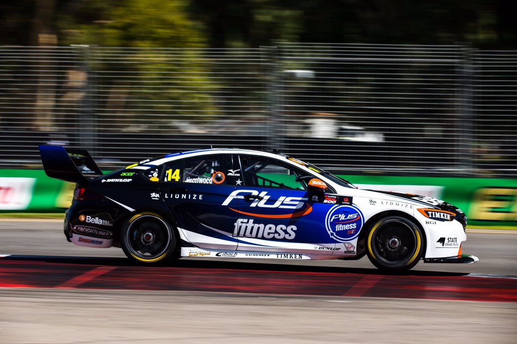
On the other side of the garage, Todd Hazelwood in running in Plus Fitness colours, with a cool fading blue to black design along the side of the car. This is a great effect, but I think they’ve missed a great opportunity to extend this to the bumper, as the white takes away from the car’s identity. Makes it a little generic and bland from the front.

todd hazelwood brad jones racing plus fitness

It looks fantastic from the side, the fade from dark to darker is really nice, as are the white spikes that curve up into the empty space. The orange flashes are a great touch too, especially on the headlights, making the car look extra aggressive. Just wish there was less white on the front of the car.

★★★★

Castrol Racing

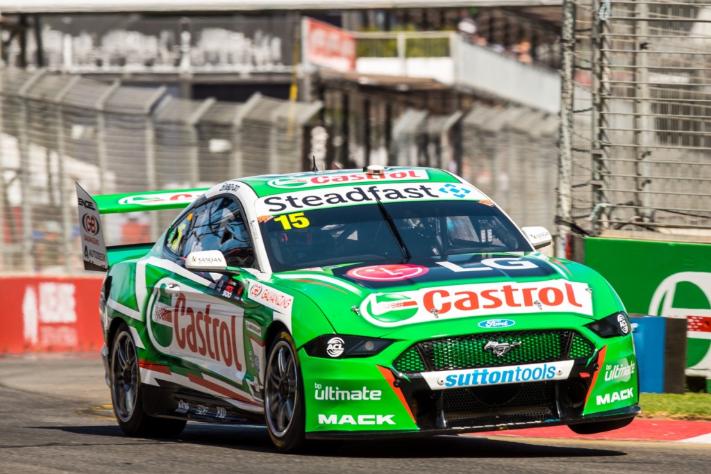
rick  kelly kelly racing castrol

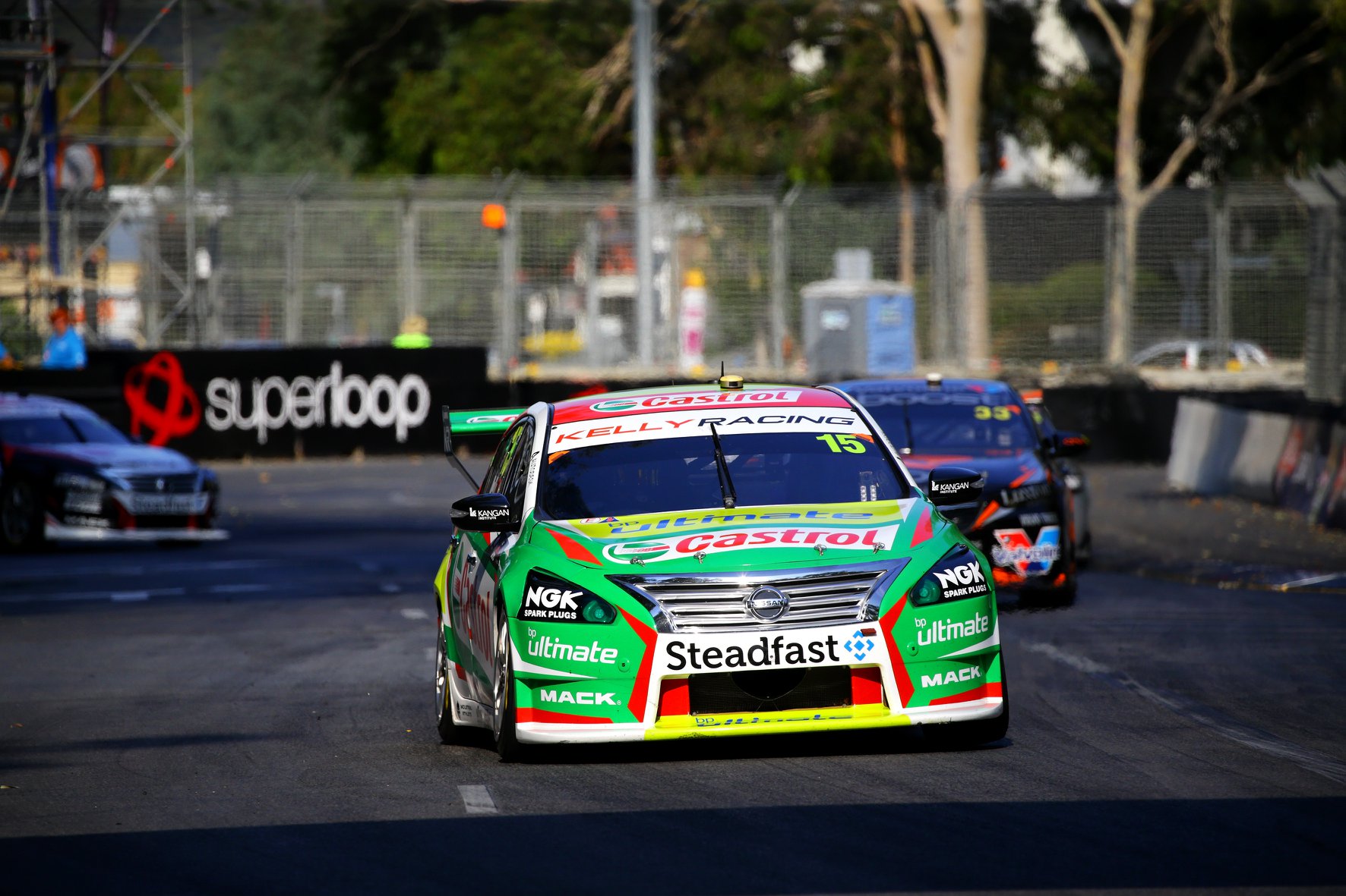
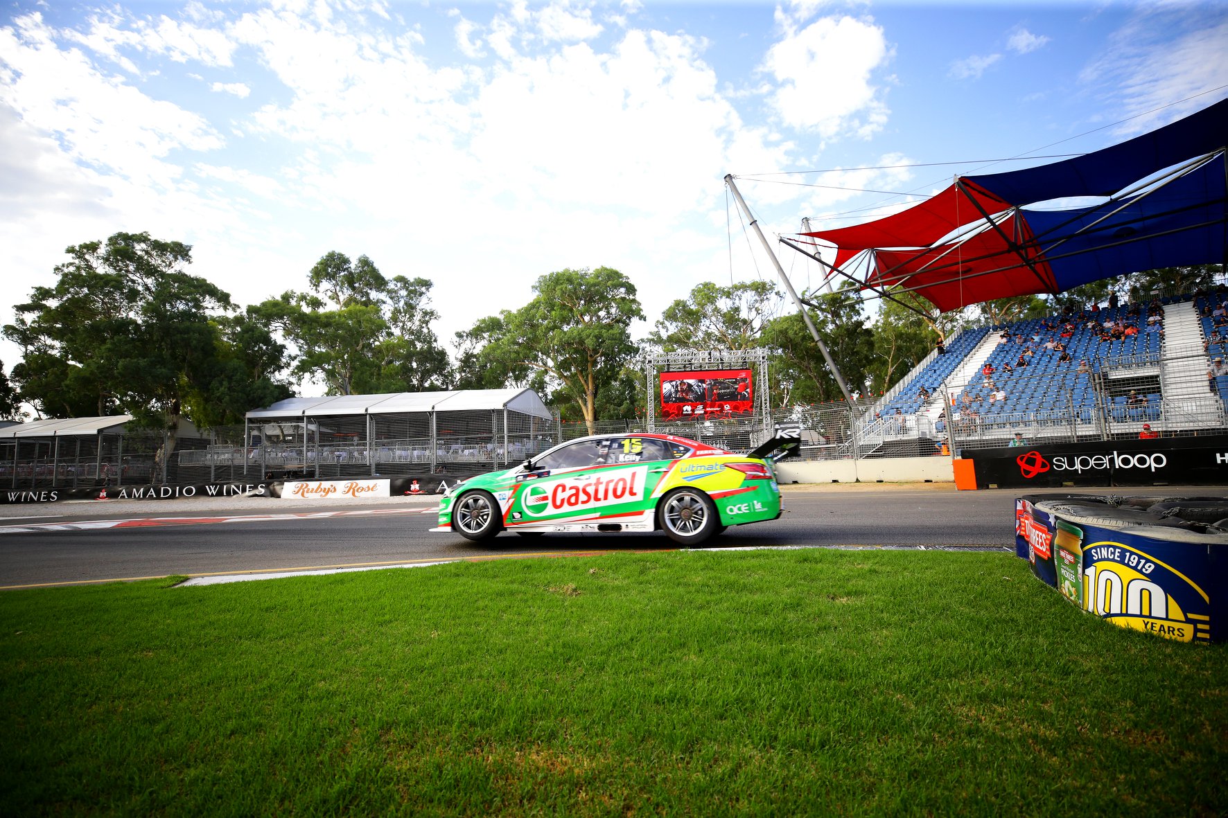
Kelly Racing had a big task over the summer, moving from Nissan to Ford, although downsizing from four to two cars would have helped. There’s also some continuity, Castrol sticking with Rick Kelly and painting a Mustang green. They’ve also stuck with a jagged livery theme, although it’s executed far better on this occasion.

rick  kelly kelly racing castrol

No BP Ultimate on the car helps significantly by removing a colour clash, as does the toning down of the red on the car overall – it was a little rough to look at when overlapping the green. The small black sections toward the bottom of the car work well too, and aren’t bad on the roof and bonnet either.

★★★★

DEWALT Racing

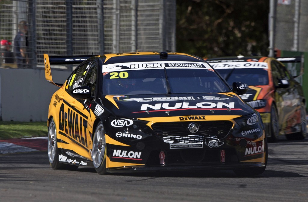
dewlat racing team 18 scott pye

Team 18 expanded to two cars this season, with Scott Pye joining the new DEWALT Racing. DEWALT has brought black and yellow back to the team; Preston Hire used these colours successfully with Holdsworth a few years ago. It’s a strong, near two tone effort with a fairly standard spiky design. The design and main logo are lined up well which is aesthetically pleasing.

dewlat racing team 18 scott pye

There is not a whole lot to it. Yellow and black is a great combo and everything is planned and laid out well.

★★★★

IRWIN Racing

mark winterbottom irwin racing team 18

Winterbottom is back in the IRWIN car this year, and the livery is only subtly different. There are parts I prefer about this one, such as the removal of the white sections, and parts of last year’s one I like better, such as the jagged, broken lines along the side of the car.

mark winterbottom irwin racing team 18

If I had to choose one, I’d choose the 2020 car. It’s super clean and although the designs are different, the teams’ two cars match each other well, which is ironic considering they are competitors. Once again, Team 18 don’t disappoint.

★★★★

Matt Stone Racing

zane goddard unit matt stone racing msr

Matt Stone Racing also moved to two cars in 2020 and whilst they’ve retained Unit as a sponsor, they’ve unfortunately gone for a new theme with the livery. Last year’s almost all silver livery was my pick of the bunch, but moved from silver to gold. It’s a slightly too cool (rather than warm) and dark gold, which doesn’t really shine unless you catch it in the right angle, in the sun. Paired with black, it looks quite dull in most cases.

zane goddard unit matt stone racing msr

The main Unit logo is well framed by a fairly standard design, with white a silver being used to separate the black and gold sections. I can’t help but compare it to the 2019 livery – it just isn’t on the same level. Sometimes simple is better! That said, not bad at all, but some better choice in colour at the least could have improved this one significantly.

★★★

garry jacobson matt stone racing msr yellowcover

The other MSR car is piloted by Garry Jacobson. It’s also mainly black, but supported by some vibrant yellow and orange. This helps it pop out in the field, distinguishing itself from the competition.

garry jacobson matt stone racing msr yellowcover

I’m not a huge fan of the design and how it curves on the bonnet and bumper, and the side is a little bit unimaginative – while the colours stand out to me, the design doesn’t. It’s pros and cons are the opposite to the Unit car. Just lacking some oomph and personality.

★★★

Milwaukee Racing

will davison milwakee racing 23red racing

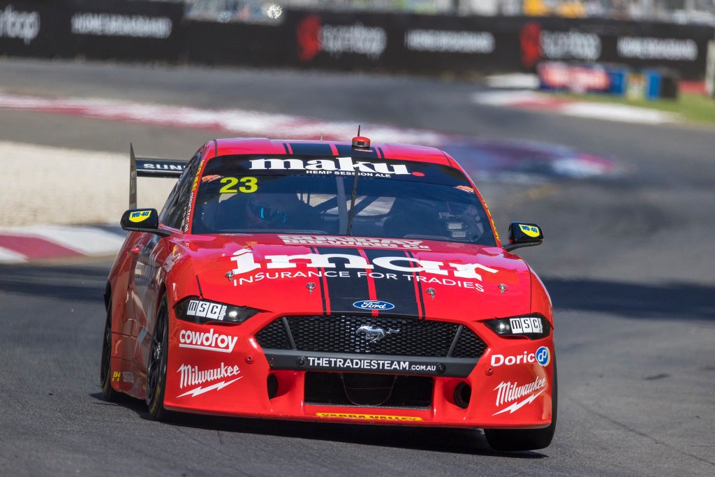
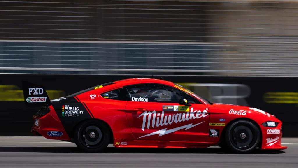
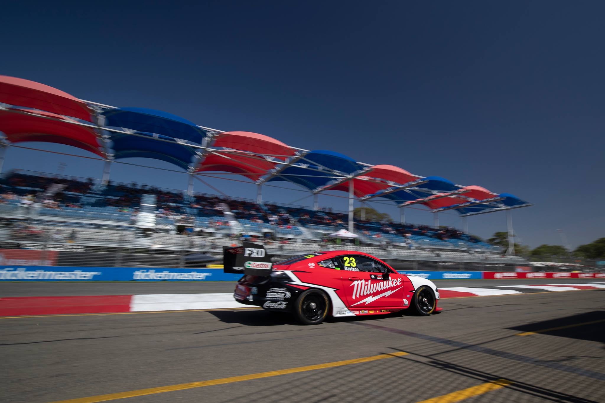
Milwaukee have gone for an absolute Mustang classic – the double racing stripes. It doesn’t get much simpler! With some pinstriping on the sides, you can’t really go wrong, especially when the bumper sponsor doesn’t interfere.

will davison milwakee racing 23red racing

The side also harks back to a prior generation, with one fat stripe coming from the wheel arch on an angle, pinstriped on one side. That’s pretty much it! It detracts as little from the main sponsors as possible and as plain as it is, looks good from all angles. Could there have been a couple of other additions to make it more interesting? Yes. However, I’d rather clean and simple than a little too complicated.

★★★☆

Mobil 1 Appliances Online Racing

chaz mostert appliances online walkinshaw andretti united wau

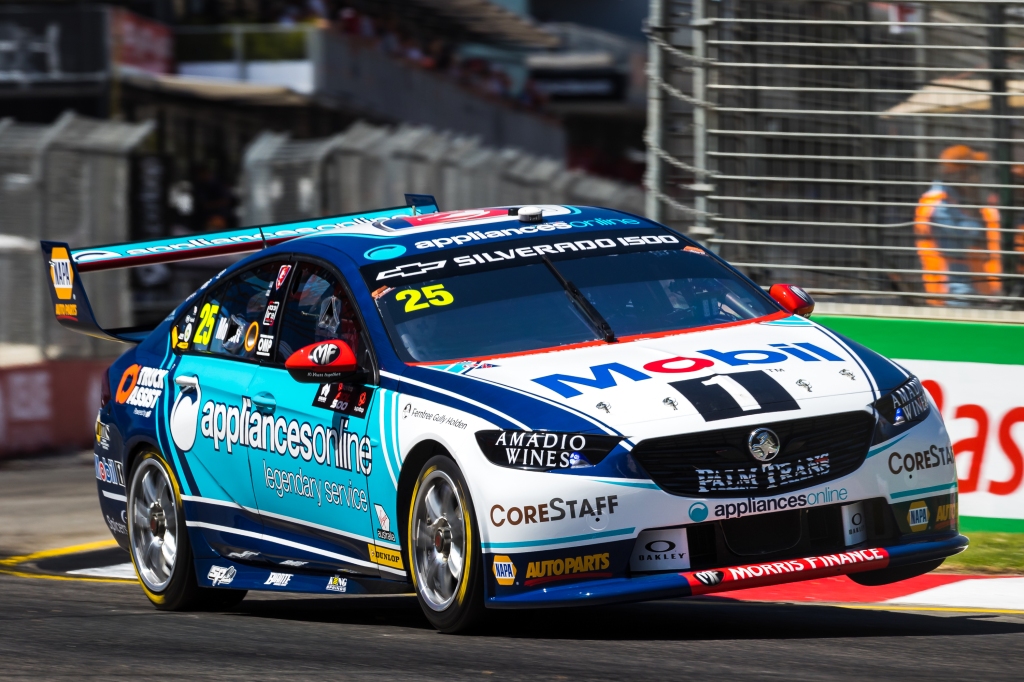
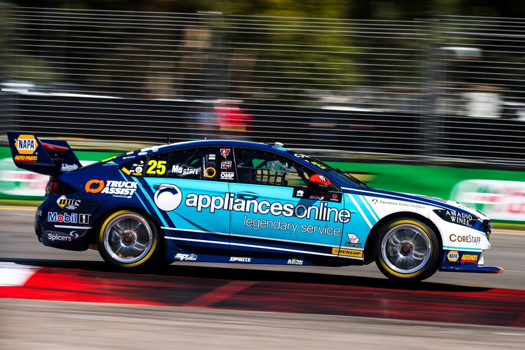
After losing a sponsor mid way through last year and bringing some new ones in for the latter part, WAU have settled on Mobil 1 as a primary sponsor, with a different secondary sponsor on each car. Whilst both cars share the same template, they looks drastically different thanks to these secondary sponsors.

chaz mostert appliances online walkinshaw andretti united wau

The blue used by Appliances Online pairs very well with Mobil’s blue, as well as with the white on the front of the car. The design is very well thought out and I love the clever transition from dark blue to light blue to white, using the thinning diagonal lines of colour. The parallel white lines on the bottom of the side also work really well, and look great cutting off the light blue sections. The extra flashes and lines of colour about the car are great and I don’t really have any complaints about this one, apart from perhaps the pin striping on the bonnet being a little too thin on the inside.

★★★★★

Mobil 1 Middy’s Racing

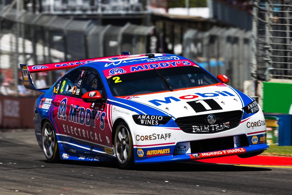
Pretty much everything that was said about the Appliances Online car applies to the Middy’s car. The pink is a fantastic contrast to the team’s other car and pairs well with the blue and white on this one.

The only issue I have with this one is the shade of blue used it too light. A darker blue would have paired better with the pink, such as in this example. Apart from that, it has all the great qualities of the other WAU car. A great effort from the team.

★★★★☆

Monster Energy Racing

monster energy racing cam waters

Sadly, little imagination used by the team at Monster Energy Racing. For the fourth season in a row they are going with a plain black livery with Monster logos on it.

monster energy racing cam waters

I apparently quite liked this last year, but very much indifferent this year. It’s a little boring without any extra touches year on year. Some sort of evolution would be nice after this many years of no change.

★★☆

NED Racing

andre heimgartner ned austalian whisky  kelly racing

On the other hand it’s all change at Kelly Racing, with NED jumping on board Andre Heimgartner’s new Mustang. The livery definitely brings back Jim Beam Falcon memories with the colour scheme, although the design is understandably more modern and sophisticated. The bonnet section follows the body shape perfectly, with the gold lines framing the black part well.

andre heimgartner ned austalian whisky  kelly racing

The logo has been integrated on the side of the car seamlessly, using its own design as a priority and blending it in with the rest of the car well. Perhaps it separates the gold lines a little too much, and maybe a plain black and white livery would have been neat, but the extra flashes of colour don’t hurt it at all.

★★★★

Penrite Racing

penrite racing erebus motorsport david reynolds

Something new again for Penrite, this time going for a smokey theme. I was initially quite pessimistic as it looked very busy and hard to distinguish, but the closer you look the better it gets. There’s an Aussie flag in there, getting all patriotic alongside Penrite’s gold, and the smoke effect does flow very nicely from the front to the rear of the car.

penrite racing erebus motorsport david reynolds

The Penrite logo works better than in recent years as there are no solid colours to harshly contrast against the logo. I’d previously said the logo looked dated, but appears as though it was simply everything else on the canvas that was creating that illusion. It’s an attractive, modern effort, that looks great despite my usual traditional tastes.

★★★★☆

Red Bull Holden Racing Team

red bull holden racing team shane van gisbergen

The trickiest part of Red Bull Holden the last few years has been how to balance both of those logos on the car at once. The positioning hasn’t changed this year, but they’ve gone with a white background for Holden this time, keeping most of the rest understandably blue. The fragmented design is actually very nice from the front where Holden doesn’t interfere.

red bull holden racing team shane van gisbergen

The symmetry makes the front look great, but the side looks a little random with perhaps a few too many little bits and pieces jutting around. Holden also takes up a lot of space on the side, and despite trying to make one cohesive livery, I just don’t think they gel well together. I guess this won’t be a problem next year anyway.

★★★☆

SCT Logistics Racing

sct logistics racing jack smith

Animosity with whether Jack Smith should be in the series aside, the SCT Logistics Commodore looks pretty good. You’ve got the standard black, white and red, the logo placed well on both the side and bonnet, and support of some speedy red stripes over the car.

sct logistics racing jack smith

I especially like the bottom most red line which travels all the way from the rear, up from the splitter and along the bonnet and the roof. It does a great job of framing the car and its aggressive angles. The secondary thick red lines also work well and although the black section toward the rear is a little generic, it fits in with the theme and certainly isn’t offensive. That said, his 2019 Super2 livery was a stunner! Shame this couldn’t be carried over.

★★★★

Shell V-Power Racing

dick johnson team penske shell v-power racing team djr team penske scott mcglaughlin

If we’re yawning at Monster Energy Racing, we’re definitely yawning at Shell V-Power Racing. They’ve decided to go with another year in their weakest livery since 2016, which I don’t think ever suited the Mustang as well as it did the Falcon. The way the yellow and white droops off at the front wheel arch is the opposite of racy if you ask me.

dick johnson team penske shell v-power racing team djr team penske fabian coulthard

So the same again, but I guess a fitting way to see off Scotty as he competes in his last season in Supercars before embarking on what looks to be an open wheel adventure in the USA.

★★★

Supercheap Auto Racing

jack lebrocq super cheap auto racing tickford

Jack LeBrocq has joined Tickford for 2020 and has jumped straight into the Supercheap Auto car. The livery looks a little nicer than its predecessor, but still lacks the punch that the yellow had given it in previous years. As it stands, there are a lot of other logos from other sponsors that really take away from the cars identity, and make it look like a bit of a mish-mash.

jack lebrocq super cheap auto racing tickford

The side is plain but clean, but overall it looks like Supercheap has paid for the sponsorship, then sold off bits and pieces of the livery to the highest bidders. Perhaps a slight improvement on last year with a few more sponsors fitting into the colour scheme, but lots of room for improvement.

★★★

Team Cooldrive

macauley jones team cooldrive

Macauley Jones is back in the CoolDrive Commodore this year, a car that never seems to be in the top half of the field. It’s a shame, because it’s consistently one of the best looking. It’s a similar effort this year, with the brilliant metallic blue supported by a light blue this time, and a neat white stripe along the side.

macauley jones team cooldrive

It’s almost like they’ve flipped the white and light blue from last year, but it’s good to see some form of evolution as opposed to stagnation. The main logo placement is great as always, and nothing messy about the other sponsors either. Solid again.

★★★★

Team Sydney

chris pither team sydney coca cola

Chris Pither somehow snagged a full time drive for 2020, but who knows how long that will last with Team Sydney! Now every fibre in my body tells me I shouldn’t like this. It’s plain, basically no actual design apart from the logos – should be boring right? Maybe it’s nostalgia or maybe it’s just a livery I’ve wanted to see for some reason. I like it.

chris pither team sydney coca cola

There’s nothing fancy about the red they’ve used, but it is stunningly vibrant. The Coca Cola logo is one of the most recognisable in the world and doesn’t look out of place anywhere. Every brand is on board, making it a perfectly uniform two tone livery. The cheeky branding on the bonnet is clever and relatable. Everything on this livery works. I can’t imagine it would have the same impact if used for another year, but for now, it’s great.

★★★★☆

Truck Assist Racing

Finally, Truck Assist has joined Tickford, replacing Bottle-O which had backed the team for many a year. Out goes the bright green, in comes the old Hispania grey, which I hate a little less than I used to but I’ve never understood why a team would want their car to blend in with the track.

They’ve gone with matte grey as opposed to gloss which adds some form of interest to the car, and just a wee bit of orange – a missed opportunity to bring a more excitement with a lot of orange. It’s simple, the lines are clean and the logos are well placed, although red on grey isn’t ideal for Isuzu. Just not an attractive main colour which hinders the livey from the get go.

★★

And the award goes to…

Best Looker Award – Mobil 1 Appliances Online Racing

The perfect colour and design choice. Thanks Appliances Online!

Least Attractive Award – Truck Assist Racing

Ever look at a car and think “That would look way better in tarmac grey.”? Me neither.

Most Improved Award – Castrol Racing

In previous years Kelly Racing tried to make a design to suit all cars, which didn’t really suit any of the cars. Fortunately they’ve made a livery specially for Castrol, and it shows.

Press Rewind Award – Matt Stone Racing (Unit)

The all silver car was brilliant last year, shame they moved so far away from it.

Award to Enjoy a Coke With – Team Sydney

Maybe with Courtney and Boost gone, we’ll be able to enjoy two Cokes with Team Sydney!

So, thoughts? What’s your fav? Let me know!

Round-Up – Formula e 2019-20

We’re ready for another year of Formula e action! Some massive players have joined the game, bringing many positive things to the series, but design inspiration isn’t one of them. It’s a tale of two colour schemes: Red/Black/White and Turquoise highlights. The majority have gone with one of these options, making the conscious choice to blend into the crowd rather than stand out, which is an unbelievable marketing choice if you ask me. It also leads to one of the least exciting full grid photos, possibly even more so than the 2015 F1 field.

Few flashes of vibrant colour, just like that F1 season. Either way, let’s dissect what each team has brought to the table, and hopefully we can pick some positives so we don’t leave feeling too disillusioned. For the sake of something different, lets go in reverse alphabetical order.

TAG Heuer Porsche Formule E Team

Porsche is one of the newcomers this season, and have taken a scalp, stealing the ever competitive Lotterer from Techeetah. He’s joined by racing stalwart Neel Jani. Their driver choices have been inspired, but their livery is not. It certainly follows their identity across other racing series like WEC, but unfortunately that identity is simply boring.

★★☆

The design gives me Minardi M198 vibes, in how the livery is split into three sections, with the same colours alternating as dividers to those colours. Maybe I’m a hypocrite in liking that livery and not this one, but colour choice is such an important aspect of overall livery design, and this red, black and white combination just brings no excitement to the table, the way the yellow does on that Minardi. It is not an ugly design, but I wish they’d entered the series with a bang, as opposed to something so corporate.

ROKiT Venturi Racing

Venturi have kept the same drivers as last year, and thankfully not the same livery. Unfortunately ROKiT has come on board, and the team have joined the red/black/white brigade. However, it is probably the best of that bunch. Whilst the red piping on that flows back from the nose gives me Mahindra vibes, it is really easy on the eyes, and works wonderfully paired with the flowing white pinstripe along the side.

It’s a well thought out livery which suits the shape of the car. I think I may have preferred jet black as opposed to the unpainted carbon, which looks a little flat rather than elegant or slick.

★★★★☆

Panasonic Jaguar Racing

Jaguar have brought in James Calado to partner Mitch Evans this season, and have persisted with their turquoise and black colour scheme. They’ve turned the dial up somewhat on the turquoise, which is now the majority colour on the top side of the car. I don’t mind this, but I do have an issue with the squared off design on the nose, which ruins the flow of the car’s otherwise sleek shape.

The side of the car is virtually unchanged, limiting the turquoise to flashes on the floor and aero panels. It would have been nice to see the Jaguar itself in the same turquoise colour, but the current effect with the majority of sponsors and other decals in white works just fine. Not sure it’s an improvement, so I’ll keep their rating steady.

★★★

Nissan e.dams

Same drivers, new livery for Nissan. They’ve gone for the unusual with an asymmetrical design, perhaps following BMW’s footsteps from last season. It’s simply majority black on the right hand side, and majority red on the left (at least on the nose and top section of the car). The way the colours intersect make an interesting diamond design, but remind me more of Stade Rennais than anything to do with Nissan.

I’ve always thought of Nissan’s colours to be blue, white and red (thanks Gran Turismo), but perhaps this is what they’re embracing moving forward. They’ve also gone for a half black, half unpainted carbon effect, which may be a weight saving technique across the board, but doesn’t look that great, especially on the wheel arches. An improvement from last year, with the effect from front on really saving an otherwise average livery.

★★★☆

NIO 333 FE Team

Ma Qinghua joins Oliver Turvey at NIO, starting his Formula e career with an absolute nightmare in Saudi Arabia. The team has gone a little more traditional with the livery this year, but have continued their turquoise and white theme, adding to it a little blue this time around. This would have been incredibly useful on last year’s livery, which was in desperate need of an extra element.

I’m a fan of the clean separation of the turquoise and white from the top to the side, whilst the same can be said at the back, showing off the curves of the car between the blue and turquoise sections. Simple, clean and effective, doing well with the shapes the car provides. Thilst the red highlights for Ma work well, the Yellow ones for Turvey aren’t quite as complementary.

★★★★☆

Mercedes-Benz EQ Formula E Team

Mercedes have entered Formula e with a driver lineup that could be competitive in any series around the world, in Vandoorne and de Vries. The biggest winner in my eyes however, is Petronas, who will receive a tonne of brand awareness via association (if anyone else’s brain works like mine), due to the similarity with the F1 livery. This is ironically unintentional given there is no place for an oil company in an electric series, but it’s funny to see the similarity between the highlight colour on both teams’ cars.

The theme is similar across both liveries, with the tessellating Silver Arrow design across much of the car and of course the base colour of silver being complemented with smokey black. This is the livery we all expected, but I don’t think can be disappointed with. It’s a great effort with enough care put into intricate details to make it a pleasure to look at in detail.

★★★★

Mahindra Racing

Mahindra have kept the same drivers, and have evolved their livery as opposed to making wholesale changes. The most striking aspect of the car is the chunky, blocky horizontal red section on the nose of the car. It’s a little disruptive to the flow of the bodywork, and the blue lines bordering it aren’t the most visually appealing.

The main change year on year is the removal of the alternating red and white stripes, which were my favourite element of last year’s livery. These have evolved to red and blue ones (such as the nose above) which aren’t as impactful and can be easily missed if not paying close attention to the car. In theory it’s a slight downgrade, but not sure why I rated it so harshly last year. Nice to see they’ve kept the Indian themed rim paint too.

★★★

GEOX Dragon

Dragon have changed their drivers with Hartley and Müller joining the team, but their livery theme has remained constant. You’d think black and white would be boring, and whilst many of the above liveries prove that theory with even more colours, this one is an exception to the rule. It’s a more or less 50/50 split between the two colours, depending on which angle you look at it from, with the red flashes providing a bit of excitement where the two other colours can’t.

The side black section looks fairly simple on its own but looks quite jagged when mixed with other sections of the car. The front is almost all black and looks super clean. The roll hoop is covered in a neat stripey design, in contrast to the remainder of the car. It’s a case of simple sections mixed with hard angles and a few intricacies to make a really nice design overall. Who would have thought the car with the least colour would be one of the best.

★★★★☆

Envision Virgin Racing

Bird and Frijns remain at Virgin, but unfortunately their almost perfect livery has evolved! To be fair very little has changed, but the main difference is silver being used instead of white on the top of the car. The contrast of the purple and white is what really put the livery on another level last season, whereas the silver really dulls this down. Also, being a matte silver, it doesn’t even stick out or sparkle from any angle, which is a shame as the pattern is really neat.

Not much to add given the rest of the livery is more or less identical. I’m still a fan of the deep purple, just wish they hadn’t made the change from white to silver!

★★★★☆

DS Techeetah

Techeetah have brought in da Costa to replace Lotterer, and with him a few minor changes to the livery. The most obvious change is the gold section on the nose being narrowed. The car loses the sharp effect of having the gold meeting the black right on the nose’s edge, which is what I enjoyed so much about it last season.

There’s now a gold pattern on the barge board as opposed to solid gold which is a nice touch, and the whole halo is gold this season, much nicer than the awkwardly cut off design from last time. Unfortunately the unnecessary complication on the nose/cockpit area brings it down a notch for me.

★★★★

BMW i Andretti Motorsport

BMW have replaced da Costa with Maximilian Günther, and have taken their livery to another level of mess. From front on, I can’t really gather any sort of coherent design. There are way too many colours that don’t really complement each other, and overlap is a way that may make a nice powerpoint theme or cover page design, but not quite a racing livery.

It’s a little clearer from the side, but the blue and purple still don’t suit each other, whilst the black also doesn’t really look like it belongs given white is already so prominent on the car. The jagged shapes don’t really work the way they do on the Dragon car either, and instead look messy instead of functional. The asymmetry just adds to the dysfunction. Perhaps I’ll like it more in a year’s time and will think I was being harsh, but I just cannot rate it any higher right now.

★☆

Audi Sport ABT Schaeffler

Not sure why every manufacturer wants red, black and white as their main colours these days, but I’m glad Schaeffler have kept some green on the car to ensure this car doesn’t entirely fade into the rest of the grid. Their driver lineup remains the same, but their livery has turned to the dark side, with black, rather than white, playing the main role.

It’s unassuming from the front, but actually has some really nice design elements on the side. The red and black stripes on the floor look great, as do the compartmental red and white sections on the sidepods. The green helps to break up the business as usual colour scheme on the engine cover. It does a decent effort complementing the template the shape of the car has provided. A nice effort in a year bombarded with red, black and white machines.

★★★★

Bonus Awards

Best Red, Black and White Livery Award – Geox Dragon and ROKiT Venturi

Two liveries with totally different philosophies, but both looks great in their own way. Dragon barelly qualifies, but there is red on the car!

Best Turquoise Livery Award – NIO 333 FE Team

It’s quite simple at the end of the day and I may have rated it too highly, but I really enjoy the clean lines and complementary colours. A big improvement on last season.

Hire a New Livery Designer Award – BMW i Andretti Motorsport

This just is not a good design. I’m free if you guys need me.

Round-Up – 2019 MotoGP Field

This is my first time reviewing the full MotoGP grid, so hopefully I’m not too far out of my depth. MotoGP is always exciting to watch, especially when Marquez doesn’t take off into the distance, so thought that given I watch it most weekends, I may as well put this together.

Alma Pramac Ducati

It was a promising first race of the season for Pramac, with Miller shooting to the front of the grid before his seat failed. He’s joined by Francesco Bagnaia this season, after Petrucci’s promotion to the Ducati factory team. The bike itself is split pretty evenly between red and blue this year, divided by a diagonal white line on the sides – I’m uncertain as to how well this actually works, especially with the thinly outlined white Pramac logo on top of it.

The front doesn’t quite match the side, but looks great in its own regard – the spiked design fits the bike well. The white sections are nicely outlined with black, framing the number well. The black lines in front of the seat help the leathers match the bike in terms of design, and they are themselves nicely asymmetric with the colouring.

★★☆

Aprilia Factory Racing

It’s mainly black for Aprilia this year, supported by the classic Italian red, white and green. The fluro yellow might be one colour too many though, and it clashes pretty hard with the green on the bike and leathers.

The front of the bike is laid out well; the matte black helps of the number to stick out, and the red, white and green distributed well next to the windscreen only. A similar design is used to great effect on the tail of the bike too.

★★★

LCR Honda Idemitsu

The two LCR bikes are painted in separate designs, with Idemitsu clearly the major sponsor on Nakagami’s bike. The colours are distributed fairly evenly on the bike, mainly white on the side to show of the main sponsor, with a nice shade of red the other main colour on the bike. Black with gold piping is also used wisely, most prominently on the front and on the side sweeping to the tail.

I’m not the biggest fan of the design on the front. While it suits the shape of the windscreen, the shape of the white section is just a little off putting. Similarly, the way the number overlaps the gold lines is a little annoying, where it could have been smaller, or lines made a wider to avoid the issue.

★★★★

LCR Honda Castrol

Only some subtle changes for Crutchlow in 2019, with Givi still the main sponsor. The Italian colours feature again here, this time with a large red section for the main sponsor, with the smaller green sections seemingly placed for Castrol.

I like the green stripe that leads toward the tail; it’s adjacent to the Givi section but works very well given the forced separation of the two panels. The front is nicer here than the Idemitsu machine, but the number still overlaps the linework.

★★★☆

Mission Winnow Ducati

A fairly big change for 2019, with Ducati moving quite close to 100% red on their bikes, apart from two white lines which frame the Mission Winnow logo, and some cleverly placed black sections on mainly the underside.

It isn’t just plain red though, there’s an interesting pattern of different shades of red behind the Mission Winnow logo. Lenovo looks to have requested grey for their logo to sit on top of. Some other subtle touches include a tiny Italian flag under the NetApp logo, whilst rims are piped with the red, which looks fantastic.

★★★☆

Reale Avintia Racing

The Avintia team bring a fluorescent yellow onto the bike to accompany the white and blue this season. It’s a clean livery, with each sponsor given an appropriate amount of space and framing, although it ends up looking quite full with little room to spare.

The colour combination works just fine although I have some slight continuity issues, with the yellow lines directly against the other colours in most sections, whilst leave a tiny space of blue along the top section of the bike. Nothing super memorable about the design, apart from the suitcase handle winglets!

★★★

Red Bull KTM Factory Racing

After succeeding in pretty much every other level of Motorsport, you’d think Red Bull KTM are due to break through any year now. That said, even with a lot of KTM orange on the bike, you’d be hard pressed to find someone who doesn’t feel this is unmistakably a Red Bull livery.

Navy blue and orange are a combination I’ve loved since my childhood, but the contrast of the orange, red and yellow is a bit too much, and fight for superiority rather than work in harmony. It’s essentially two different liveries on the one bike and ends up more disappointing than impressive. Not to say I entirely dislike it, but it could have looked a lot nicer if they favoured one style over the other.

★★

Red Bull KTM Tech 3

Now the Tech 3 livery takes the above issues and laughs at them. Subtract the red and yellow, replace with the Toro Rosso silver, and boom, a beautiful livery. The lovely blue colour complements the orange perfectly, whilst the silver works harmoniously with both.

Rather than 4 or 5 main colours, they’ve nailed just the 3. Colours aside, the designs of both the Red Bull KTMs is identical, yet this one is miles ahead in the looks department. Thank goodness for the Red Bull/Toro Rosso rebrand.

★★★★★

Repsol Honda Team

Marquez continues to dominate, winning all but one race he’s finished, whilst Lorenzo, who looked to have turned a corner last year, is yet to finish in the top 10 as I write this article. Thanks to Repsol backing, the factory Honda team livery hasn’t changed substantially since 1994, which is an incredible 25 year stretch of continuity.

That in mind, there isn’t much to talk about! The Repsol logo and colours are still proudly emblazoned across the whole bike, although the main design is not as circular as it used to be. The front of the bike is one of the cleanest though, which I am a fan of.

★★★★

Monster Energy Yamaha MotoGP

Yamaha have made a slight change of livery direction. Monster has beefed up it’s sponsorship to take over almost the entire side of the bike and in turn, just about making black the main colour. It’s a cool, aggressive look, giving the design a negative space look, exaggerated by the blue pinstripes broken up by the Monster logo.

The pattern continues on the front where the Monster logos look a little messier crammed amongst the rider numbers and other design elements. The chrome strip diving the main sponsor and the rest on the side is a neat touch.

★★★★☆

Petronas Yamaha SRT

After years in Formula 1 and other car/bike categories, Petronas has joined the MotoGP field with Yamaha SRT. It’s refreshing that they haven’t followed Red Bull in a strict branding policy across all categories, going with a blend of turquoise, black and silver on this effort.

I can’t say I’m in love as for some reason, my first connection to the spray paint style gradients was those custom airbrushed trucker caps you’d find at tourist markets on holidays. OK, definitely a bit of a stretch, but despite my weird association, I can’t entirely dislike the livery. What it does do, is help me appreciate that silver and turquoise work better together than I gave it credit for (in F1), the black combo not looking quite as amazing as I’d imagined.

★★☆

Team SUZUKI ECSTAR

Suzuki are sticking with their royal blue and flashes of fluro yellow and white. It just sends me generic vibes, not just with the fairly standard shade of blue, but also the approach of the secondary colours, placed without a whole lot of ingenuity.

It ends up looking like a cookie cutter livery and makes it hard for them to stick out of the pack, especially when squads like Yamaha have owned a similar shade of blue for many years. I’d much sooner associate the Rizla Cyan colour with Suzuki than the current colour combination.

★★

Bonus Awards

Best Looker Award – Red Bull KTM Tech 3

The Toro Rosso Formula 1 livery is beautiful, and switching the red to orange doesn’t change that fact. Lovely design.

Least Attractive Award – Suzuki / Red Bull KTM

It’s not that Suzuki is ugly, it’s just a little boring and lacks a unique touch. KTM on the other hand is torn between two liveries and suffers for it.

So which was your favourite? Vote below! Don’t hesitate to leave a comment – let me know if there are any liveries you’d like me to review.

Round-Up – 2019 IndyCar Field

Not a whole lot of excitement on the livery front for IndyCar this season. Most of the cars haven’t changed! Let’s look into them anyway – in reverse alphabetical order for a change!
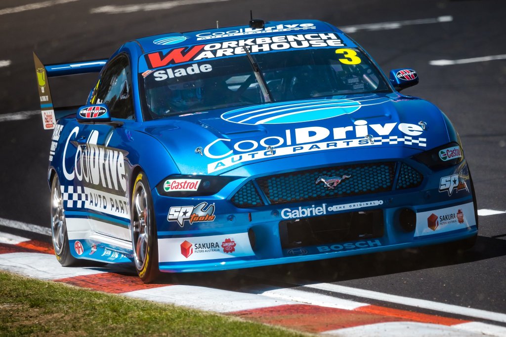
Team Penske #2 Josef Newgarden

No change for Penske’s overall team design, or for Newgarden’s car in 2019. They’re not the most inspiring or exciting colours, but I’ve grown to be content with the simple design.

It’s been the same for a number of years which is slightly frustrating, but the aging effect would be more prominent on a more complicated livery.

★★★

Team Penske #12 Will Power

There isn’t a whole lot to say for any of the Penske liveries – Power’s is also the same.

I think this has solidified the #12 as my pick of the Penske bunch, I guess I’ve got a new thing for silver cars of late.


★★★★

Team Penske #22 Simon Pagenaud

See above! I still like the thin red and black lines in parallel along the car, as opposed to the thick ones on the #2 & #12.

A little indifferent to the fluro yellow at this stage, but it definitely stands out of the pack.

★★★☆

Rahal Letterman Lanigan Racing #15 Graham Rahal

Graham Rahal ran in a fun design at St Pete, using those same black, white and red colours as the #2 to a much greater effect. It reminds me a bit of the Team Mugen Super Formula livery from a couple of years ago, in how the red Total stripe wraps across the side and top of the sidepods.

It looks fantastic from the top view; the thick Total stripe curving beautifully all the way to the exhaust. Keeping the black on the cockpit side of the red line and away from the white is a great choice, as is the red directly in front of the cockpit, which wraps the section up perfectly.

★★★★★

Rahal Letterman Lanigan Racing #30 Takuma Sato

There’s a bit of a theme this season in lack of change, and the same almost goes Sato’s #30. This was one of my five star liveries last season, and the only difference is the nose, where the metallic blue extends further and is bordered by white instead of navy blue in front of the cockpit.

Not sure if it’s the change above, but I’m not quite as in love with this as last season, but it’s still a great looker. Great to see Taku back on the top step of the podium again this week too!

★★★★☆

Meyer Shank Racing with Arrow Schmidt Peterson #60 Jack Harvey

There have been some slight alterations to the colours of the Schmidt Peterson cars – the purple on Harvey’s car appears to be slightly lighter and less metallic. This works wonders, because last year’s effort was just too dark, with the already dark shade of purple only have black for light to reflect off.

It looks very different because of this, despite the design being the same. It’s opened up the car nicely and is therefore, a lovely improvement.

★★★☆

Harding Steinbrenner Racing #88 Colton Herta

Harding has teamed up with George Steinbrenner for 2019 (who’s family has a long legacy in baseball) and at 22, young George is blazing a trail in Motorsport as the youngest team owner in IndyCar. Last year’s Harding car was already a good looker, and despite changing colours, has remained so.

They’ve gone with black, white and sky blue accents which is terrific. The white, feathery design on top of the sidepods has evolved and almost looks like a Kiwi silver fern design. It’s almost regal from the top view, and the pinstripes along the side of the nose and rear really top it off. The blue on the usually unpainted suspension is also a neat touch.

★★★★★

Ed Carpenter Racing Scuderia Corsa #20 Ed Jones

I’m slightly confused by the lack of change on the Ed Carpenter machines. Whilst they weren’t ugly, there was absolutely nothing spectacular about these liveries last season, and I’d even compared them to the messy mid 2000’s Minardis.

Ed Carpenter Racing #21 Spencer Pigot

Nostalgia aspect aside, there’s not much to love about this livery. It’s very simple, but not in the most aesthetic way. However, black is probably the correct choice given the multicoloured sponsor logos, but I’m sure a little more red and blue rather than white could have given some more personality to the livery.

★★

Dragonspeed #81 Ben Hanley

Ben Hanley and Dragonspeed are only racing at five events this season, but I’ve included them seeing as they raced in St. Pete. It’s a mainly white, patriotic livery, and almost looks as if someone was trying to put the 76ers uniform on a car. However, it suffers in that it looks quite bland and a little cheesy with with stars and stripes.

The Rembrandt Charms logo is awkwardly small on the sidepod, and I’m confused by the camera on the roll hoop being yellow – it goes against the rest of the livery. It does however, match Hanley’s helmet, which is likely what they were going for.

Dale Coyne Racing with Vasser-Sullivan #18 Sébastien Bourdais]

Only minor changes for Bourdais this year, in fact, the only change of note is the #18 being black instead of red on the nose.

Sponsors and all, I’m fairly sure that’s about it! It’s still a really nice, distinctive livery, and tones down the fluro yellow sufficiently enough to not be confused in any way with Pagenaud’s car.

★★★★

Dale Coyne Racing #19 Santino Ferrucci

After being booted by his F2 team last season, Ferrucci was picked up by Dale Coyne for the last two races of 2018, and now for the full 2019 season. Chrome is a look that was pioneered by McLaren in the mid 2000s and has seen a bit of renaissance of late. What I disliked most about those McLaren liveries was the Vodafone red that went along with it, but there’s no such problem here.

It’s beautifully understated, with only the lightest of touches, such as the black on the engine cover and red mirrors and numbers. I’d have preferred only black as a secondary colour – it looks fantastic for the main sponsors, but perhaps red stands out better. Oh, and don’t forget the little American flag on the rear wing end plate.

★★★★☆

Chip Ganassi Racing #9 Scott Dixon

No change at all for Scott Dixon’s design this year. It’s a strong enough livery to keep around for a second season but given the busy pattern, it will age quickly.

The pattern itself is a clever use of the PNC Bank logo, but is a little clunky looking close up, especially in the thicker areas. Orange and blue is one of my favourite combinations going back to my childhood, but I still don’t find myself loving this one.

★★★

Chip Ganassi Racing #10 Felix Rosenqvist

The NTT Data car, now with Rosenqvist at the helm, has undergone a bit of an evolution on the livery front. The dark blue area has expanded to cover most the of the ‘top’ of the car, which is an effect I really enjoy. However, I feel as though these usually look best with the lighter colour on top – not to say this isn’t a good effort. It’s still bordered by a a strip of chrome which is a nice touch.

Some white has also been added to the wings, as well as a touch on the engine cover, which is welcome and an improvement on last season. The whole livery, especially from front on, has a distinct old school feel. Perhaps it’s Player’s Forsythe vibes, but whatever it is, it’s welcome.

★★★★

Carlin #23 Charlie Kimball

Kimball won’t be a full time driver in IndyCar this year, but when he is racing, he’ll be rocking the same colours as 2018 (or at least he did in round 1). I’d have loved to see more of the green in pinstripe form as opposed to the faded pattern on top of the green, as they are my favourite feature, just in front of the rear wheels.

Black rather than charcoal also may have better choice, but unfortunately we don’t get a say in the matter.

★★★☆

Carlin #31 Patricio O’Ward

Alternating with Kimball at Carlin will be rookie Patricio O’Ward. The young Mexican, who’s name threw me off for a short while, has seemingly been successful in everything he’s driven so far, so there’s no saying it won’t be the same in IndyCar. His livery is proudly emblazoned in his home country’s colours, but not your stock standard ones! The green used here hints toward mint – a refreshing (sorry) shade not often used in Motorsport.

The design is a little generic, but is spiced up not only by the non traditional choice of green, but also by the non-traditional line-work, with each section not perfectly bordered by the next. To nitpick, what could have been nice would be leaving an edge of the red sections not bordered at all by green and instead against white, but it’s a pleasing all round effort nonetheless.

★★★☆

Carlin #59 Max Chilton

The Gallagher car of Max Chilton has seen some significant movement for 2019, changing to a mainly sky blue colour scheme. It’s a questionable decision given how cohesive the car was last year, but also as the NTT Data Chip Ganassi car has owned the colour for a few years now. While it isn’t difficult to tell the two apart, Gallagher isn’t the first thought that pops to mind when I see the colour scheme.

The design is strong in parts – I especially like the engine cover and cockpit area, where the white sections are thicker and more evenly distributed with the dark blue. It has a stronger effect there than when it is piped on as a thin border to the dark blue on other parts of the car. It’s still a good looking livery, but some tweaks could have turned it into a stunner.

★★★★

Arrow Schmidt Peterson Motorsports #5 James Hinchcliffe

As mentioned previously, Schmidt Peterson Motorsports have tweaked their paintwork, using less reflective colours on their cars than in previous years. While this resulted in a more vibrant livery for the Meyer Shank car, it’s had an opposite effect here. The gold colour used is a little too far to the brown side, so moving away from the highly reflective paint has actually caused this car to look quite dull.

Arrow Schmidt Peterson Motorsports #5 Marcus Ericsson

Same goes for new boy Marcus Ericsson, who looks forever destined to be three Grands Prix shy of a century in Formula 1. The #5 uses same livery, and suffers from the same issue. The design itself hasn’t really changed, and is a simple but attractive effort, with the black contrasting sharply against the colour it borders.

★★★

Andretti Autosport #26 Zach Veach

The Andretti design also looks to be unchanged this year, however, Veach’s sponsor and livery has. Gainsbridge has brought some striking black and yellow to the #26, with some subtle blue complementing the overall effort.

While based on the same design, each Andretti car has its own quirks, the main one I can see here being the yellow arrow on the front wing end plate. It’s a nice little touch, and a little improvement where a plain blue end plate would have sufficed. It still looks a little plain from directly side on, but pretty snazzy from the angles above.

★★★☆

Andretti Autosport #27 Alexander Rossi

Continuing the theme, the NAPA car driven by Rossi is unchanged, but rightly so. It was a solid improvement from 2017 to 2018, so a safe bet to not make further alterations.

Whilst I like the red in flashes on the mirrors, camera and suspension, I’m not as big a fan of it bordering the yellow along the engine cover and cockpit. Sticking with just blue and yellow, as is the case on every other part of the car, would have looked better.

★★★☆

Andretti Autosport #28 Ryan Hunter-Reay

No changes for RHR either. I’m a big fan of two-tone, and it works really well with yellow and red. It’s rare to have a main sponsor logo comply in this fashion, so great to see them make the most of it. Shame every sponsor couldn’t conform!

Not much to say given it’s identical to 2018, so let’s take a moment to admire the beauty of the IndyCar chassis from this angle!

★★★★

Andretti Herta Autosport with Marco Andretti & Curb-Agajanian #98 Marco Andretti

Marco Andretti drove in more traditional colours in St. Pete compared to last season, and given the awesome design put out by Rahal Letterman Lanigan Racing, it really does look basic.

The Andretti design really compliments bold and well paired colours. This colour scheme is just ordinary, and really exaggerates its flaws.

★★☆

A.J. Foyt Enterprises #4 Matheus Leist

What a way to cap it all off – with a livery that hasn’t changed in at least 8 seasons now. Good for them I guess?

A.J. Foyt Enterprises #14 Tony Kanaan

I’ll point out again that the colours are somewhat subtly inverted on either car, which I embarrassingly didn’t notice for a number of years. Yawn!

★★

Bonus Awards

Best Looker Award – Rahal Letterman Lanigan Racing

I know I gave out 5 stars twice this year, but if I had to pick one, it would be the #15. It’s beautifully thought out and put together. Total has never looked better on a racing car.

Least Attractive Award – Dragonspeed

It looks like it was designed by someone who isn’t really into Motorsport. A little tacky and very generic.

What year is it? Award – A.J. Foyt Enterprises

No surprise here. It’s time to move on!

Round-Up – 2019 Formula 1 Field

After a winter that has seen more change than I can ever remember in my time watching Formula 1, we’re finally back in business. The first race has been run and it was a relieved Valtteri Bottas who crossed the line first in Melbourne. Unfortunately it’s looking like more of the same in terms of performance and success, but while it may be the same guys winning for another year, at least the grid has seen some interesting changes to its liveries.

Alfa Romeo Racing

In both sad and uplifting news, Alfa Romeo is officially back in the sport for the first time since 1985, but has taken the place of much loved Sauber. However, I’m glad to see that the team should, with solid financial backing, work its way out of the doldrums and into some upper midfield battles. I’m also glad that Alfa has kept some of the Sauber roots, both with the ‘Sauber Engineering’ logo in front of the rear wheel, and with the similar blue and white design used last year.

The overall theme, however, has well and truly shifted to Alfa, expanding on the beautiful metallic red used in 2018. More red is what I wanted last year and it’s what we’ve got. They’ve brought the red forward to cover the cockpit and halo, and have also used a smoother, prettier curve along the sidepod. The main logo on the engine cover has also had a bit more thought put into it, and looks much better larger and cut off. Every aspect of the livery is more refined and improved. Great job Alfa Romeo.

★★★★☆

Ferrari Scuderia Ferrari Mission Winnow

Ferrari have gone with as drastic a change as ever this year, firstly in hiring a very young, promising driver in Charles Leclerc who had a breakout 2018. Secondly, they’ve removed almost all white from the car and have followed Red Bull’s lead with a matte livery. Personally, I’m struggling to associate the livery with Ferrari, but it will come with time. It’s such a modern effort when we’ve always thought of Ferrari as an old school, conservative team.

What I’m a fan of is having black as a true second colour, as opposed to white. It’s still used sparingly, along the bottom of the car, the halo and some flashes on the wing end plates, but mainly on the very rear of the car, helping to contrast the white driver number exceptionally well. Whether it’s the lack of white, that black section being slightly more distracting, or the matte paint, the billboard of a sidepod is not as offensive this year.

Mission Winnow controversy aside, would the livery look better in glossy paint? Possibly. Would that help it look better from all angles? Yes – in especially sunny angles, the red does appear washed out. However, I’m excited to see this livery under lights. Bring on Bahrain.

★★★★

Haas Rich Energy Haas F1 Team

There was quite a bit of pessimism around the validity of Rich Energy and their sponsorship of the Haas F1 Team, but so far we’ve gone at least winter testing and round 1 with their logos on the car. I was initially super disappointed to see a largely generic, uninspired livery turn up to Barcelona testing, but am heartened to see they’ve put some thought and creativity to good use come Melbourne, whether that was inspired or not. Probably not.

The car is mainly black, but for the gold lines on the front and larger section on the engine cover fin. I had the same idea myself pre-season, so suffice to say, I love the use of the black antlers on the gold background. However, whilst necessary from a marketing perspective, the white Haas logos create some disharmony on the car.

Whether it’s the shade of gold to blame (which should perhaps be lighter, but the reflective nature of it look nice above) or another aspect of the livery, it and the white don’t really get along well enough in my opinion. A two tone effort of black and hold only would have looked great. It’s a livery with fantastic potential, which I’m sure they’ll build on either throughout the season or in 2020, should Rich Energy still be around!

★★★

McLaren F1 Team

It has been a double driver change for McLaren with Sainz and youngster Norris in for 2019. The ethos of the livery has thankfully remained, while some clever additions have been made to the design. The papaya orange remains in all its beauty, with the slightly metallic blue encroaching ever so slightly on it’s territory, creeping up the engine cover in a quirky, almost tessellating triangular pattern.

They’ve also cheekily increased the amount of black on the car, in a deceivingly large portion along the bottom of the car. I love the look of this section, especially the old school detailing of the technical sponsors along it. The halo is still black, but given the presence of black has been upped across the board, it makes a whole lot more sense this time around. The half black, half blue rear wing end plate is an attractive touch. It’s improved in all aspects. Props to the McLaren livery designers, although I wish they hadn’t caved to having red on the back of the rear wing for Huski.

★★★★★

Mercedes Mercedes AMG Petronas Motorsport

They’ve gone and done it, Mercedes removed that patch of smokey black below the airbox, so I’m already happy. It’s become redundant seeing as they’ve removed the large Mercedes logo on the engine cover, and instead gone with a repeating pattern of silver arrows, on top of a fading black to silver. It’s subtle from a distance, but makes a strong point from up close.

The turquoise section of the car follows the same shape as last year, but is a far simpler, cleaner rendition – just the one line from nose to rear. It looks like a smooth flow of energy along the car and am happy they’ve gone with this design. Another element I like is painting the halo black just on the underside. It’s been underutilised to this point but am glad a couple of the teams are taking the halo further in terms of livery. One last thing that I find odd is having the Petronas logo in black. It would certainly stand out more in white with a black border.

★★★★

Racing PointSportPesa Racing Point F1 Team

We weren’t quite sure what to expect from Racing Point after their transition from Force India. The largely unfancied Lance Stroll has already proved some doubters wrong by scoring a couple of points when his teammate Perez couldn’t manage any. The cars have also remained BWT pink, and thanks to the new ownership have actually added some significant sponsors, most notably SportPesa. This has boosted the amount of blue on the car, and made it a deeper shade, which suits the pink better.

Aside from the big blue section on the engine cover, the remainder of the design has stayed largely the same. That said, the deep pink and silver lines have also been brought forward due to the aforementioned change, now pleasantly connecting to the lines on the nose and finishing on the front of the sidepod. My only question is whether silver is needed at all, although it doesn’t take away any style points. I also have to point out the similar thinking to the halo design as Mercedes – looks just as good with a light colour on the underside here, as dark does for Merc. Side note, I wish Stroll had kept his blue helmet. It would have contrasted the pink and complemented the blue on the car perfectly.

★★★★★

Red Bull Aston Martin Red Bull Racing

Gasly will have a tough time to replace Ricciardo and match Verstappen in 2019, and after a disastrous round 1, he has a lot to prove. On the livery side of things, it’s the fourth year for this design and it is virtually unchanged from last year, bar a couple of logos, such as Honda at the rear. It’s still nice, but would have liked to have seen some more design variation.

With Ferrari now encroaching on Red Bull’s point of difference in matte paint, I wonder if this will spur some changes to design philosophy in 2020, or whether they’ll wait it out until the bigger set of rule changes in 2021.

★★★★

Renault F1 Team

Renault have brought in Aussie favourite Ricciardo for 2019, but have stuck with their design for a second year, only making a couple of improvements rather than another redesign like they had done the last three years. The most obvious and one I’m happiest about is the removal of the yellow around the edge of the sidepod entry.

Another change is the front halo support being half yellow where it was all black last year. Not sure what the thinking was for this, perhaps to lessen the appearance of a black beam jutting out, but it isn’t bad. The pinstripes over the car are still good and similarly, there’s a really nice touch with the very front facing edge of the rear wing end plate being painted in yellow.

★★★★☆

Toro Rosso Red Bull Toro Rosso Honda

The Red Bull junior program is really stretched at the moment, so much so that they’ve re-enlisted the unfortunately maligned Daniil Kvyat alongside debutante Alexander Albon. Toro Rosso has had my top livery pick for the last couple of years, partially due to the relief of ridding the grid of their previous boring efforts, but also because it just looks really good. The shades of blue and red are beautiful and match perfectly, and are complemented just as well by the metallic silver. However, the longer a livery exists, the more time we have to pick flaws.

It’s due to the shape of the sidepods, but the Red Bull logo appears more and more squished every year, tapering off from huge to tiny in dramatic fashion, far more so than the Red Bull. They really need to take it easy here – just because the real estate exists, it doesn’t mean you have to use it. Less would be more in this case. It also looks like they’ll be promoting their organics range on the inside of the rear wing end plates, although that really doesn’t receive much visibility. A neat touch regardless.

Williams ROKiT Williams Racing

Everyone was aboard the Kubica train and nobody is more glad than me to see him back in action, alongside youngster George Russell. However, the car looks to sadly be the slowest by far. At least they’ve given us something interesting to look at. My initial thoughts are who’s child did they get to play with a gradient tool in Photoshop? The Orlen and Rexona logos look terrible on the blue they’ve used, like they’ve used the screen tool to make them a little harder to read.

The nose is also a bit strange, and perhaps it’s a camera angle trick, but the gradient at the tip just never quite seems to sit directly in the centre of the nose which is annoying to say the least. However, it has grown on me since testing. The choice of blue and white is a new take on classic Williams colours, and the black along the side of the car helps to even out the ratio of blue and white. If blue had gone all the way to the bottom, it may have been overpowering. The use of gradient was an odd choice in my opinion, as were a couple of the other design decisions, but I can’t get myself to dislike this livery.

★★★☆

Bonus Awards

Best Looker Award – McLaren and Racing Point

Two completely different design philosophies, but both fantastic liveries in their own right. They’ve dethroned Toro Rosso and I’m happy that they have!

Least Attractive Award – Haas

I have to say that we’re lucky to see an abundance of beautiful liveries on the grid this year. I don’t any of them are ugly by any means, but Haas did receive my lowest rating. So much potential in the colours and design, especially with the antler logo to work with, so hoping for even better things in the future.

Breaking Tradition Award – Ferrari

It kinda just FEELS wrong that Ferrari is in matte, doesn’t it? I’m not sure Mr. Enzo would be spinning in his grave by any means, but they have taken a big step, and it does look really different. Keen to see it under the floodlights in Bahrain.

Best 90s Feel – McLaren

This car isn’t quite retro, but some of the design elements to irk back to the 90s. The listing of the tech sponsors along the side certainly gives off that vibe, and the triangular pattern could well have been taken from a textbook (or a mid 90s Footwork Formula 1 car). I think we’re really lucky to have such an attractive grid overall.

I think we’re really lucky to have such an attractive grid overall. Personally I’ve rated almost all the cars over 4 stars our of 5, so I’m enjoying this era as much as I can. Blink and we might be back to 6 grey teams and only Ferrari with some colour! Have your say on the people’s favourite below..

Round-Up – 2019 Supercars Field

Round one is done and dusted, but it’s going to take some time to get used to some of the driver and sponsor changes for 2019. Add in the new Mustang, and it’s a few new things to wrap your head around. Let’s take a look at the best and the worst of this year’s grid.

23Red Racing Milwaukee Racing

Milwaukee Racing 2

After a reasonable first season as a standalone organisation, Milwaukee have moved under the Tickford banner, and seem to have reaped the rewards so far with some solid top ten running for Davison in Adelaide. In terms of livery, the colours haven’t changed, but the overall design is neater.

Milwaukee Racing 1

The edgy angled lines are jarring against the curvy, flowing bodywork of the Mustang, especially over the rear wheel, but isn’t necessarily a bad look. However, the whole livery is just a little underwhelming, and can’t find an aspect about it that I love, not any more so than last year.

★★★

Brad Jones Racing Freightliner Racing

Freightliner Racing 1

Freightliner Racing have inverted their main colours, with black and yellow just about swapping places for 2019. Annoyingly, in my eyes, they’ve stuck with almost the same design on the side of the car. I don’t want to dwell on this for another year, but I really wish they’d make some lines that fit the Freightliner logo better, and didn’t look like the logo was slapped on after the fact.

Freightliner Racing 2

That said, black and yellow are foolproof colours, and they still looks nice here. I can’t say the same for the silver, but must be used to tie in the main sponsor. In fact, one of the few teams where silver wheels would have made sense, decided to go with black ones – not that they don’t look great in black. Overall, it’s neither here nor there in terms of improvement, so receives the same rating as last year.

★★☆

Brad Jones Racing National Pharmacies

Brad Jones Racing Percat 2

Nick Percat’s #8 machine appears as though it will have different sponsors race by race again this year, and first cab off the rank is National Pharmacies. These blue and teal colours are some that were pretty unfamiliar to Motorsport, up until Ruoff brought them to Indycar. Mixed with a good chunk of white, they work really well together.

Brad Jones Racing Percat 1

The design is simple, and a racing staple, with the two colours in thick parallel lines running nearly from bumper to bumper. The logo is a perfect size and shape for this design. Some complexity is added at the rear wheel with two white lines added, but feel it may have looked nicer with just the one on the rear door, as it completes the bottom blue section, whilst the other is doesn’t suit so well. Let’s see what’s up next for #8.

★★★☆

Charlie Schwerkolt Racing IRWIN Racing

Irwin Racing 3

I’m sad to see the back of what was a superb couple of years this car had in Preston Hire colours, but glad to see that they’ve produced something just as good in 2019. Irwin have joined Frosty at Charlie Schwerkolt Racing, and have put a big fat logo on the side of the car. Along with that comes a really pleasing design and combo of blue and yellow.

irwin-racing-2.jpg

The logo and main lines are angled nicely, with the solid yellow sections featuring yellow pinstripes on their borders. These lines are fragmented along the sides, ensuring it isn’t just another plain livery. There are also a couple of white sections – I’m not sure a third colour is necessary in this instance, but they’ve done well to fit in what are likely a sponsor requirement. One irk, however, is the Toyota logo that’s half on the bonnet, half on the grille. I get they’re making the most of the space that’s available, but an OCD I didn’t know I had is definitely flaring up looking at it.

★★★★☆

DJR Team Penske Shell V-Power Racing Team

Shell 1

The Shell V-Power livery is probably the one most affected by the move to the Mustang. They’ve tried to mould the existing livery as best they can into the shape of the new car, which itself has been transformed into a really awkward shape to fit the requirements. What was a gradual slope of the yellow line over the front wheel arch is now a steep drop off, which I’m not a fan of, whether or not its intent is to deceive the viewer of the bonnet’s droop.

Shell 2

Apart from that, there aren’t any significant changes, although the shade of red looks to be deeper, which is a big improvement and just about makes up for the aforementioned alteration. Although it’s still a nice livery overall, I hope for a new livery on these cars next year.

★★★☆

Erebus Motorsport Penrite Racing

Penrite 1

Penrite are back for another year, and back in gloss paint! They’ve also gone for some traditional racing stripes, in this instance thick red, with hyper reflective gold pinstripes. They’re simple, but effective, and are also included on either side of the bonnet and roof.

Penrite 2

My main issue is with the Penrite logo. The stylised gold looks dated, and would look a lot neater and more modern in a flat gold colour. Further to this, it clashes with the rest of the gold on the car; it may stand out more, but at the expense of non-uniformity. Still a looker and improvement, especially from front on. Super aggressive.

★★★★☆

Garry Rogers Motorsport Boost Mobile Racing

Boost Mobile GRM 2

It’s a new look GRM. Out with Tander and Wilson, in with Stanaway and Boost Mobile. It’s a sleek black and orange design, understandably very similar to last year’s WAU livery. There’s a bit more silver to this one which is slightly to it’s detriment, as orange worked well to contrast the black in larger sections last year.

Boost Mobile GRM 1

There’s a bit of a Coca Cola vibe at the bottom of the side, and wish the top lines were split as evenly between the two colours as the bottom, but that’s probably just nitpicking. The deeper I look into it the less I like it (look at the chopped off rear wing number…), so I’ll keep it a distance. Looks lovely from there.

★★★★☆

Kelly Racing Castrol Racing

Kelly Racing Kelly 1

The Kelly Racing liveries seem to have minor changes year on year, but the overall ethos is consistent – sharp, jagged edges with flashes of the third colour. It’s a decent look, but gives the team an identity.

Kelly Racing Kelly 2

Therefore, there’s not a whole heap to comment on as it’s like they’re putting in values and pressing randomise on a livery generator, apart from the fact that BP Ultimate lime green is hideously jarring against the Castrol green. We’ve seen a similar issue with Castrol in the past, especially on the FPR/Prodrive blue liveries, but here it’s just gross. Derails the livery.

★★

Kelly Racing Plus Fitness Racing

Kelly Racing Heimgartner 1

As above, it’s the same design, but without the BP Ultimate problem. I thought it looked better with more blue and more orange last season, and the layout was also stronger in 2018.

Kelly Racing Heimgartner 2

I also like the slightly metallic and darker blue used last year. It’s worse in almost every way, but not significantly so, and certainly isn’t ugly, just closer to middle of the road.

★★★

Kelly Racing RABBLE.club Racing

Rabble Club 2

Garry Jacobsen has entered the championship this year, sadly in place of Michael Caruso, who has signed for Tickford for the enduros. Joining Garry on the #3 car is RABBLE.club, which I finally took the time to research. Turns out it’s a ‘digital health & wellness club’, with a fairly shoddy website featuring a poorly designed tiled background, and a promo video of their Falcon livery. All this aside, they’ve made a fairly good effort of painting the Altima.

Rabble Club 1

It looks a lot more like last year’s Nissan design, with the large white portion on the side. The jagged edges look a lot better in thicker sections here compared to the other two liveries above. The reflective blue looks great alongside the white and black, and is overall a far more cohesive livery than the other Altimas.

★★★★

Kelly Racing Team Harvey Norman

Kelly Racing Simona 2

Simona looks set for another season of mediocrity (if that) in the Team Harvey Norman entry. It’s an interesting take on the black, white and red livery, which on this occasion has limited any overlapping of the jagged sections. Each section is separated by black which is nice to see, with some lovely detailing included too, such as the silver lines within the main white section.

Kelly Racing Simona 1

The Harvey Norman logo also looks much better as black on white. The design overall has made a much better attempt to pay attention to the shape of the car, compared to other version that seems slapped on without much care. One little thing that bothers me is the white section sharply dropping off after the mirror. Mainintaing the same angle toward the front bumper would have had a better effect.

★★★

Matt Stone Racing Unit

Matt Stone Racing 2

Ironically, the new MSR team and livery remind me very much of Team Penske. It’s rare to see, but props to the team for having all sponsors agree to appear in black in order to make an almost perfect two tone livery. It’s super clean and uniform, with the double stripes working brilliantly along the sides, bonnet and roof.

Matt Stone Racing 1

It looks superb from all angles, especially when the sun hits it just right, opening up the silver to a lovely bright shade. There isn’t always a need to complicate things! Unit may only be a one race sponsor, so hopefully this design sticks around, and looks just as good with whoever puts their name on the car next.

★★★★★

Tekno Autosports Truck Assist Tekno Racing

Truck Assist Tekno 1

After a short stint with the team last season, Truck Assist are back for a full season with Tekno in 2019. It’s a decent effort, with the orange mainly focused to the front and roof of the car. Not a huge fan of the spiky design on the side, but it looks much better on the bonnet.

truck assist tekno 3

It’s a good distribution of orange and black on the car, although I’d have preferred to see more orange toward the rear to make it more even. That said, it’s a lovely shade of orange, and am glad they’ve gone with a good chunk of it so we can tell it apart from the Boost cars despite the similar colour schemes.

★★★★

Tickford Racing Monster Energy Racing

Monster Racing 2

This is essentially the same livery as last year – pure black plus Monster logos. The matte effect works really well on this livery, however, and considering the lack of flashy design elements, it hasn’t tired either. This has also been helped by the transition to the Mustang, which I believe has been pulled off best by this car (probably because it hides all the ugly disproportionate features).

Monster Racing 1

Not a whole lot else to write about. Scandia sticks out as it’s the only prominent sponsor not in white or green, which is great for them. I’m also a fan of the green lights, now that Orrcon has departed. I may have been a little harsh with my previous ratings of this livery, or perhaps my tastes have changed slightly.

★★★★

Tickford Racing Supercheap Auto Racing

Supercheap 1

I was disappointed to see the large portion yellow had been taken away from the Supercheap livery this season. At first glance, this car almost looks like a patchwork of a number of different sponsors, like we used to see a lot of in the 90s. The main sponsor’s identity has been diluted, purely because others with their own colours, like Century and Castrol, demand more of the focus. It was not so much the case last year. This also has me questioning whether the blue bands below Bendix are part of the larger livery, or for Bendix itself.

Supercheap 2

The livery in general is weaker in design than 2018, but I’m just annoyed at how inharmoniously everything has been put together. Especially front on. Imagine the million dollar homepage was a livery…

★★

Tickford Racing The Bottle-O Racing Team

BottleO 1

Holdsworth has traded places with Frosty for 2019 and has jumped in the Bottle-O car, which is now in it’s tenth season of competition in the iconic green livery. This isn’t the strongest iteration of the design however, but not disappointing like the effort above. The design would have worked just fine without the curved black line behind the front wheel – it’s out of place between the straight green line and gold Southern Comfort line on the bonnet.

BottleO 2

The shade of green used is also a less saturated, which is a good thing as a colour like that can become tiresome quickly. It’s a good idea to swap it in every couple of years like they have been doing. Or maybe the photos I’ve found are not as heavily edited as previous years!

★★★

Tim Blanchard Racing Team CoolDrive

Team Cooldrive 2

I’ve always been a fan of the CoolDrive livery. Tim Blanchard may have retired after a lacklustre career, but the sponsor remains, with Macaulay Jones now piloting his Dad’s #21 car. There are some subtle changes to the design, with the light blue taking up a lot more real estate along the side of the car. White too is more pronounced this season, taking up most of the rear of the car.

Team Cooldrive 1

The main attraction to this car is the same, lovely metallic blue from last year, and am only disappointed to see less of it on the car in 2019. However, I’m glad the team makes tweaks year on year to keep it interesting. I also like how the design of the livery follows the wavy theme set by the CoolDrive logo. That’s Cool integration. Sorry.

★★★★

Triple Eight Race Engineering Red Bull Holden Racing Team

Red Bull 2

Red Bull were the first team to show off their cars this season, which was really early in fact, just a week into the new year. What they’ve popped out isn’t bad by any means, but doesn’t hit the same standard as season. There’s a lot of white on this one, and comes off looking a little generic, most likely due to how unique the 2018 livery was (which in hindsight I’d rate higher).

Red Bull 1

The Red Bull and Holden logos are still awkwardly squabbling for superiority on the sides like a couple of bickering brothers ; two large competing logos in different colours will never completely work on the side of a race car in this fashion. Logos aside, the design sticks mainly to large blue portions on the main panels of the car, with a bit of pin-striping in jagged forms along the edges. It’s an OK livery, but doesn’t get the same originality points as 2018.

★★★

Walkinshaw Andretti United Mobil 1 MEGA Racing

Walkinshaw 2

Finally it’s Walkinshaw, who have taken on Mega Fuels as a main sponsor, who have some fairly dodgy photoshops of stock photos on their homepage. This livery, however, is a huge improvement on the sponsors last major design. Here we have a coherent effort, mainly white, taking the odd route of using Mega’s own colours in a less noisy fashion. It’s an inspired choice, as the greater use of purple didn’t work out so well the last time.

Walkinshaw 1

That said, the purple, yellow and blue work very well as intricately intertwined ribbons of colour separating the black and white sections of the car. The theme is maintained across the sides, roof and bonnet and keep us interested enough with a splash of colour, as opposed to a mainly purple and yellow livery (which I’d have been intrigued to see). A good effort, and possibly thanks to Mobil, still maintains a strong Walkinshaw identity.

★★★★☆


Time for the bonus awards!

Best Look Award – Matt Stone Racing

I didn’t think this would be my pick, but it’s just a clean, satisfying car to look at.

Least Attractive Award – Kelly Racing Castrol Racing

BP Ultimate just kills this one, but isn’t the only fault. The weaker red lines don’t work well against the main green either.

Most Improved Award – Brad Jones Racing & WAU

Brad Jones for the National Pharmacies livery is a little unfair as it’s not a season long livery, so it’s probably more fair to give it to Walkinshaw. Mega have come a long way since Jason Bright’s Falcon in 2017, and is a lot better than Stanaway’s Falcon that they featured on last year too.

Almost There Award – 23 Red Milwaukee Racing

They’ve made changes this year, but still have the same rating. Red, white and black have lots of potential – a couple of inspired tweaks could see them move up the ranks in 2020.

Most Annoying Award – Freightliner Racing

So much potential with those colours, but they insist on having those yellow and silver lines more or less ignore the Freightliner logo. Drives me nuts.

Sponsor That Should Be Angriest Award – Supercheap Auto

I don’t know, maybe they did have a say in the livery design? Regardless, to dictate a livery and be so much less prominent than in previous years…I’d be annoyed if I was on their marketing team. Maybe this is just subjective though?


So, let me know your thoughts in the comments below. Do you agree with my opinions, or am I totally wrong on any of these?