Livery Updates – Supercars Bathurst and Gold Coast

Let’s take a look at some recent updates for the Supercars, starting with a true nagger. Nick Percat got another major round sponsor on board, this time in the shape of Boost. The only weird thing is, Boost already sponsors James Courtney’s car. What this has resulted in, is a weird situation where a car from Walkinshaw Racing and a car from Brad Jones Racing, are running almost identical liveries, despite being different teams.

It totally weird me out, and as you can see above, apart from a couple of sponsor logos, the designs are identical! Perhaps this is simply opportunistic, with both teams’ other cars sponsorships locked in, but doesn’t make it any less odd. Perhaps next year we’ll a single team with the Boost livery, although their logo is littered up and down the grid.

The design has changed slightly since it was introduced to the #22, with the main colour now a metallic charcoal, supported by a reflective ‘chrome’ orange on the roof. It’s a really nice retro looking design in its simplicity and layout, although is modernised with some spiked edges along the side and piping on the front and rear bumpers.

Prodrive missed the boat for Sandown retro round, and came to Bathurst with an old school livery instead. This was an ode to Alan Moffat’s Ford of the late 70s, and they’ve done a good job in translating the simple livery onto the 2017 Falcon. It’s not a direct copy and has had some slight changes, for example the gap between the red and blue lines is wider and the black outline thinner, which actually makes quite a big difference to the overall look.

caruso bathurst 17
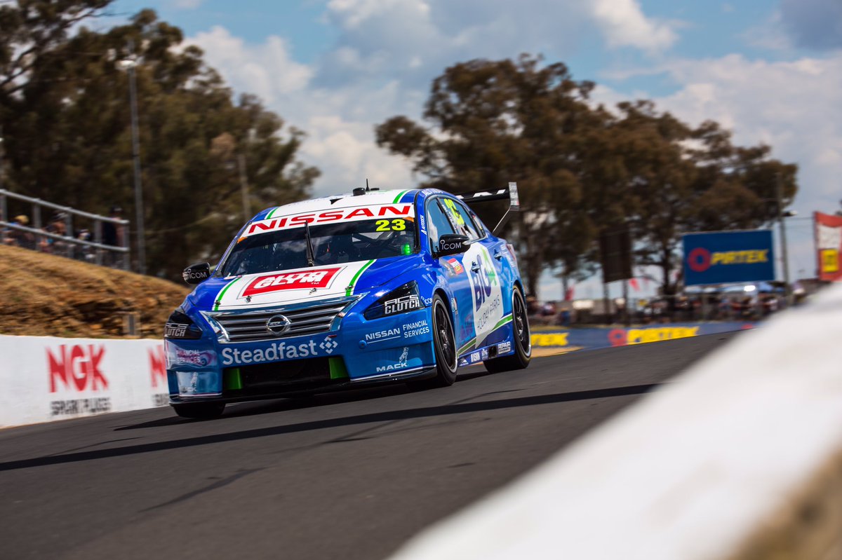
Elsewhere, Michael Caruso’s Nissan sported a different blue design, this time sponsored by BIG4 Holiday Parks. The blue had a slight gradient, giving it the feel of a blue summer’s sky, a clever way of getting people to think about their upcoming holidays! This was accompanied by a solid green line along the bottom of the side, outlined with white.

caruso gc 17

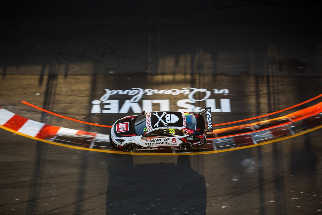
Caruso had yet another livery in the Gold Coast, a very Nissan livery, with the tagline ‘Beware of Strangers’ warning owners of  not taking their cars to cars to official Nissan service centers.

Livery Launches – Ferrari SF70H & McLaren MCL32

He’s what was revealed to us last night in Fiorano last night:

ferrari-2017

At first it looks like a downgrade, but really this is more or less a standard Ferrari livery. The white section is gone from the engine cover, allowing the Scuderia Ferrari logo to be massive. The white has therefore moved to the shark fin, and I think this was a good move, as white on the fin and the engine cover would have been overpowering. Just looks even more cluttered with logos this year.

mclaren-2017

Everyone was excited to see that McLaren lived up to their orange hype! It’s a lovely shade (although it looked way too dark at the launch) of orange and I’m glad to see it back. Unfortunately, the design is totally unimaginative. When I design liveries, this is usually my first stage, throwing some shapes on the car and getting inspiration, but looks like McLaren didn’t bother to go any further.

mclaren-2017-2

It ends up looking like a GP3 livery (in fact, that Arden livery is more impressive), or a Virgin Marussia as many have pointed out and while it isn’t ugly, it has a generic, basic quality to it. I feel as though they didn’t put as much effort as they should have into this. The white section on the sidepod could have been expanded to other parts of the car to make it more elaborate. This car is a true nagger.

Livery Launch – Ferrari SF16-H

Another day another launch, this time from the red team.

Ferrari 2

This SHOULD have been the best livery on the grid. Unfortunately, for me, it’s probably the biggest nagger on the grid. Let me explain.

By all means, this not a bad livery. However, there are just a couple of things that are bugging the hell out of me. To me, it looks like designer made two different liveries, one partially black and one partially white, and simply copied both onto the car. They don’t compliment each other the way they should. The wavy (did it HAVE to be wavy?) black section bordering the white on the cockpit/engine cover area looks strange, especially the way it overlaps both the red and white near the exhaust. Honestly, despite this, the top section does look good, but it just clashes with the bottom section.

The black section on the bottom, that spreads from the nose all the way to the rear is just fine, but the white on top of it puts me off. The way it juts away from the black under the Ferrari and Santander logos, rather than following the curve of the black is strange and the pinstripe on top of that is unnecessary and adds clutter to what is already a very full car. Also, the top section doesn’t have a pinstripe, so there goes any real continuity in that part of the design.

Ferrari 1

The sponsorship logo placements are also a little off. Kaspersky is squished on the nose, as is Weichai below Santander. Along with that, the Scuderia logo on the engine cover is too big; a little smaller and it wouldn’t have to run onto the red or black sections.

That was a whole lot of negativity, so lets look at what they did right. The large white section on the engine cover, a throwback it seems to the 70s, is fantastic. I always said Ferrari needs to lose the white, but they’ve proved me wrong by adding more. It’s excellent and I wish it carried all the way along, rather than stopping at the ‘fin’, if you can still call it that. The Italian flag on the airbox is great too. Similarly, the extended Italian flag on the front wing endplates and barge boards are great little bits of detail. The Santander logo is surrounded by minimal white again on the rear wing which is great too.

Unfortunately, that’s about where the positives stop for me. The more I look at this livery, the more I pick it apart. I hope it grows on me, but I have a feeling I’ll only get used to it, rather than begin to enjoy looking at it. I don’t hate it, it’s just a livery that annoys me.

Livery Updates – Manor, Prodrive and Nissan

Formula 1 – Manor Marussia

Alex Rossi posing with his Manor Marussia car in the COTA pit lane.

First up Manor Marussia. Just a couple of minor and yet instantly recognisable changes. The rear wing endplate now has a super patriotic American flag on it, which is has been added for Alex Rossi’s home Grand Prix. He is the first American to race at home since Scott Speed. The best part is that it suits the car just fine. The colours match and that’s important. Another addition is that of sponsor Coupons.com. Not the classiest logo to appear on an F1 car, but props to them for adjusting the colour of their logo to match the Manor livery as well.

The Manor livery is the empty livery it once was and every single one of the new sponsors matches the colour scheme. This makes me very happy!

V8 Supercars – Prodrive

The #6 Falcon in Back to the Future Colours

Prodrive unveiled a new livery for the #6 car as a nod to the Back to the Future series, most likely thanks to its Pepsi sponsorship. The livery mocks the look of the DMC DeLorean made so famous by the series, with a distinctive silver colour, as well as some extra decals to give the livery an extra feel of Doc Brown’s time travelling machine.

Doesn't look bad at all front on, but from the side it's a tad too messy.
Doesn’t look bad at all front on, but from the side it’s a tad too messy.

Pepsi have cleverly used the Pepsi Perfect logos, which was the version of Pepsi used in the “future” in the movie. It’s a nice touch which gives the car some authenticity. Overall, the livery is a little bit all over the place, with a few too many colours and the extra decals cluttering it a bit, but I don’t think it was meant to be taken too seriously, so good on Prodrive for making this. Also, if you haven’t checked out their “unveiling” video, go watch it!

Nissan

The #99 Nissan.
The #99 Nissan.

James Moffat and Taz Douglas’ Nissan also has a new main sponsor. Faresin, which is a maker of industrial farming equipment, adds another green livery to the field. Unfortunately, it looks like just another Nissan livery. Nissan have changed sponsors so many times this year and each of the liveries have been quite similar to each other. This follows that trend and puts up a livery, that if you changed the green to blue and put Carsales on the side, I would not think twice about calling Todd Kelly’s name upon seeing it.

This livery just doesn't feel right.
This livery just doesn’t feel right.

A great opportunity to make a unique and stand out green blue and yellow livery has been missed here. I guess Nissan will stick to their cookie cutter white, black + sponsor colour designs. This livery is very much a nagger.

Liveries of the Day – Team Penske 2015

It’s fun to look at beautiful liveries, it’s even interesting to pick apart awful liveries, but there’s something in between that doesn’t quite fit in either. I’m not talking about mediocre liveries, I’m talking about the “naggers”, the liveries that annoy you. A perfect example of this, are the liveries on the Team Penske machines in IndyCar this year.

What’s wrong with them you ask? On their own, they actually aren’t bad at all, in fact, they suit the car very nicely when you see it from above. It’s the fact that they’ve used the exact same livery on each car, with the colours swapped around, that grinds my gears. This is common in football (soccer), where the kit manufacturer has some cookie cutter template designs and the team just puts its colours and logos on it. Most football fans will tell you they hate this too. Why? Because a team deserves its own unique design and identity, and sharing a design with another team entirely contradicts that. Same goes for Team Penske.

Penske 3

Putting the same design on each car gives the impression that the team is being lazy. It looks lazy that each car doesn’t have its own identity. However, I have to cut Penske some slack. Every car is sponsored by Verizon, so there’s no real need to change up the design. In fact, it’s probably in Verizon’s best interests to keep the design static on each car. Secondly, it seems as though the colours on the cars are changed to match each driver’s helmet. It’s actually a cool idea and one I have to give Penske kudos for.

The livery design itself is quite basic. A half and half design, with a third colour splitting the two in the middle. The middle line wraps around the nose cone very nicely, but the squiggle on the sidepod doesn’t really look special unless you are looking at it from the top. The design works best in my opinion, on Power and Castroneves’ cars, with the white top and black bottom split with a strong red. Pagenaud’s yellow and white split by blue doesn’t quite work for me, and neither does Castroneves’ Indy 500 effort, with the red and yellow. If all the colour combinations worked well, maybe I wouldn’t be annoyed by the liveries at all. Props to the reflective burgundy used on Montoya’s car on one or two occasions though. Lovely colour!

At the end of the day, these liveries still somewhat annoy me, but not really for the same reasons that I had initially. Now, I’m more annoyed that the design itself lacks any real excitement, hit and miss colour combos and that each driver’s identity could have been put onto the car in a similar but more interesting fashion.

The best part of this blog is that I come into a post with an idea in my head and quite often, by the time I’ve done all of my research, my thoughts have changed considerably. I came into this with a deep seeded annoyance with the Team Penske liveries and after doing just a little bit of looking around, the annoyance has almost completely dissipated. How about that for a life tip: Do your research before you put your foot in it!