What a peculiar idea Superleague Formula was. The concept was put forward in 2005, to have a Motorsport championship featuring racing teams run by football clubs, with cars adorning that team’s colours. This became a reality when in 2008, 18 clubs from around the world lined up on the grid at Donington Park for the inaugural Superleague Formula race.

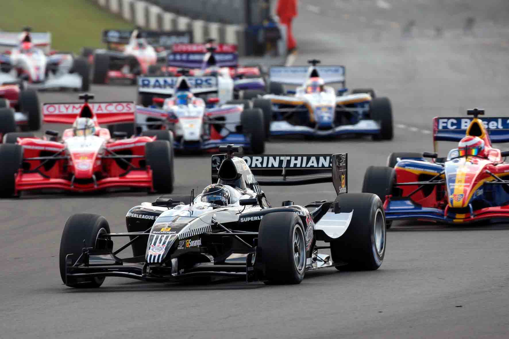
The championship was reasonably successful and reached its peak in 2010 with a total of 19 clubs participating in races during the season. Ultimately it wasn’t to be, with very few clubs renewing their contracts the next year, their places taken by national teams (erm, A1GP?). Two rounds were run before the championship folded. I tried to watch Superleague Formula when I could back in the day, but these occasions were few and far between. With my team not having participated in the series, I picked one at random to review today.

With little actual knowledge of the championship or Brazilian Football, my research tells me this livery is most likely from 2009 and oddly based on Corinthians’ away colours. With Antonio Pizzonia at the wheel, Corinthians managed two podiums and only 8th place that season. Luckily, their livery was somewhat interesting.
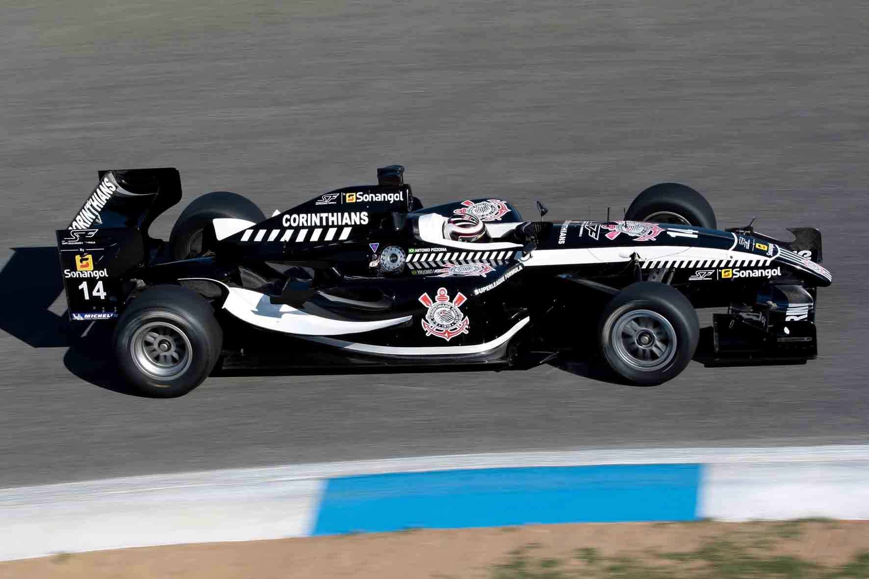
As mentioned above, it seems as though the livery is based on Corinthians’ away shirt, which is a bit unusual, but we all know how sleek black liveries look. Apart from a couple of sponsors and the Corinthians emblem, the car is purely black and white, perfectly matching what you’d see on the football pitch.
The few solid white areas on the car are wonderfully placed, along the side winglets, trimmed along the bottom of the sidepods, along the side edge of the nose/cockpit and surrounding Pizzonia’s head on the cockpit. This all creates a nice swooping design which is very pleasant to look at.
The unique parts of this livery are the parallel diagonal lines/dashes along the side of the engine cover, cockpit and nose. I think they look great creeping out of the larger white section on the nose, good on the side of the cockpit, but not so nice on the engine cover, where they are a lot bigger and not surrounded by more white. The real ode to the football club is on the nose cone, where the traditional pinstripes are displayed proudly with the club’s emblem. A nice touch, but it doesn’t really fit with the rest of the livery which is a little annoying.
The sharp contrasts along the cars natural edges makes this car a very pleasing livery to look at for me, although there are some small imperfections which can thankfully be overlooked for the most part.
