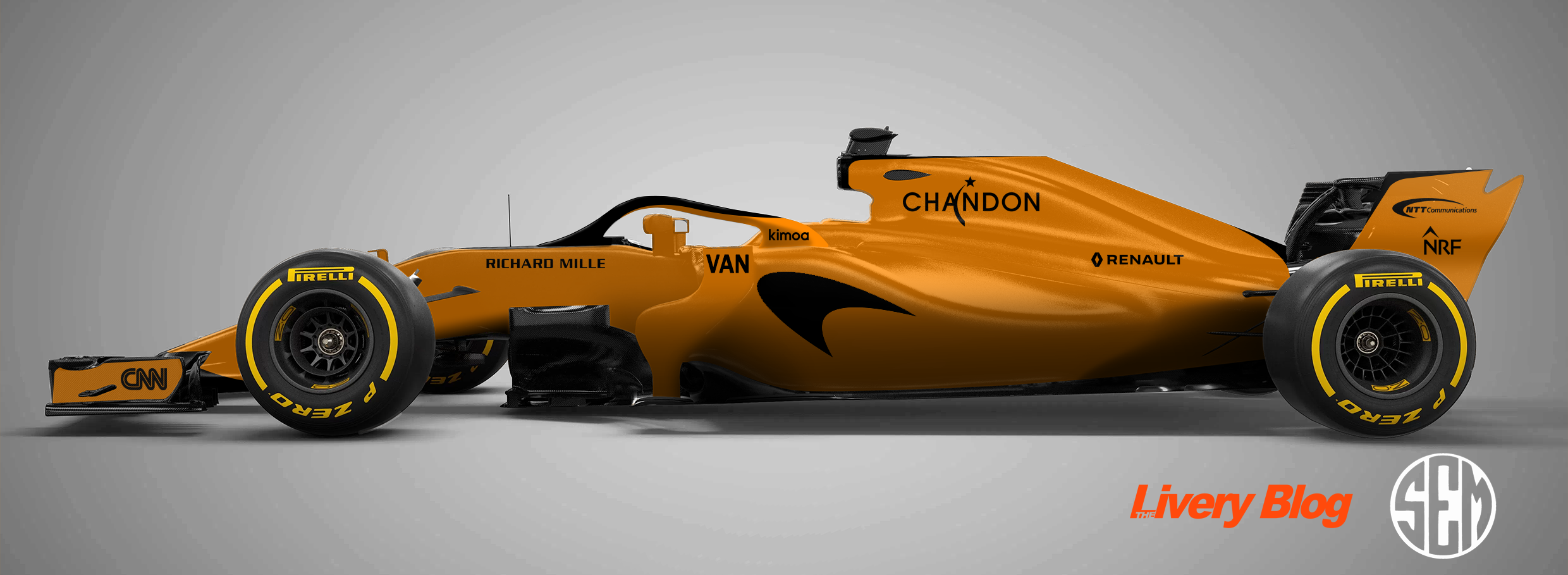
Livery Mockups – 2022 Formula 1 Field

Well it’s the old template again as I couldn’t get my hands on a really good one for the new F1 regulations, but the liveries should work just about the same. There haven’t been a huge number of sponsorship changes so I’m not expecting an major alterations to colour schemes across the grid, but I’m sure we’ll see a couple of surprises. As always I’ve try to keep things realistic, but have given myself a few liberties just to avoid some of the designs looking a little stale. Just to be different, let’s go in championship finishing order this time!

Mercedes-AMG Petronas F1 Team

mercedes amd petronas 2022 fantasy mockup livery

It has been more or less confirmed that Mercedes will be moving away from the black liveries of the past couple of seasons, and as lovely as they have been, I think it’s a great move. It doesn’t take long for a livery to overstay its welcome and it’s best to quit while you’re ahead. It’s certainly in the brand’s best interests to bring back its traditional silver, but there’s no saying the black can’t return for a once off run during the season as a nice surprise.

I’m hoping they clean it up a little this year so I’ve moved away from the repeating patterns along the engine cover and dialed up the Petronas turquoise just a little bit, which fades into black in each of its three main sections. I’ve also tried spicing up the sponsors a little, with a turquoise ‘shadow’ for each, just for something different, but very unlikely.

Red Bull Racing

red bull racing f1 2022 fantasy mockup livery

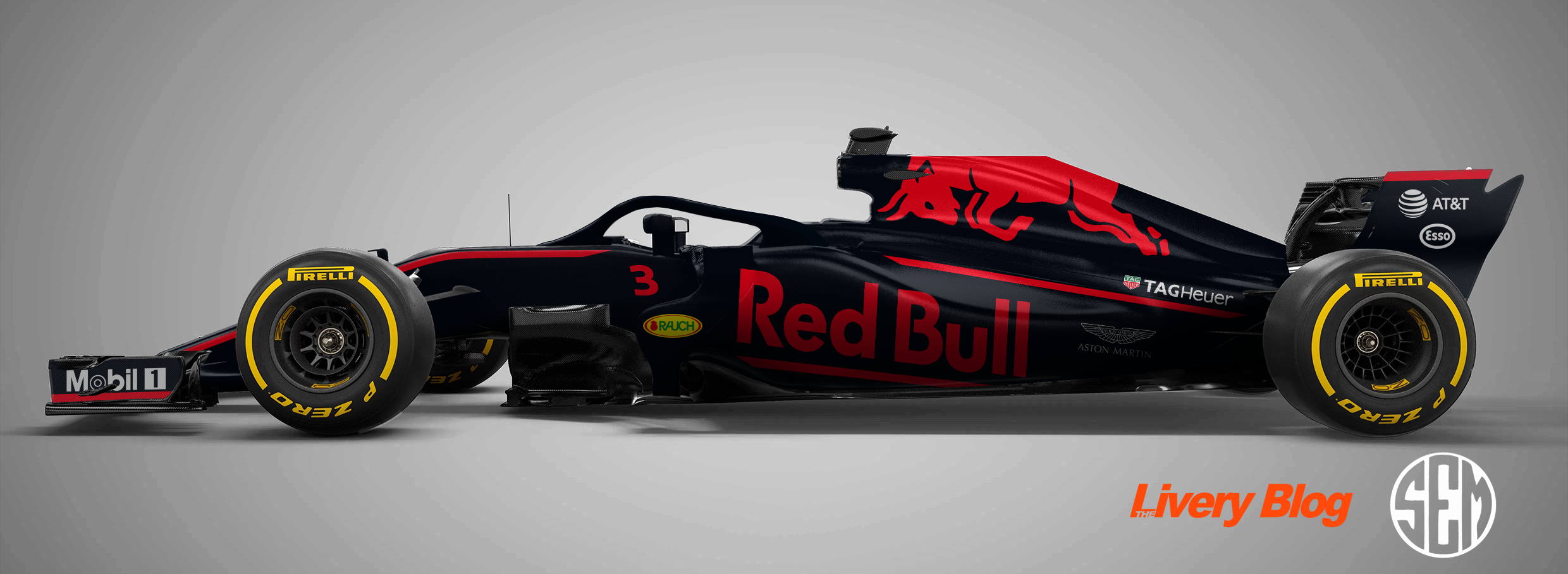
Red Bull have been far too predictable the last few seasons; six seasons in a row now with an agonisingly unchanged design. Whilst I am hoping that they do go for something completely different considering we are entering a new era of regulations (who wouldn’t love a good old Red Bull can livery?), my gut tells me they’ll stick with their current branding. Hence, I’ve gone for some tweaks rather than a complete overhaul.

I’ve kept the important things the same, but have ditched the stale old red lines and replaced them with some thicker and shorter, broken up red lines, which are partially bordered by a lighter, royal blue line. This lighter blue isn’t completely foreign as it’s been used in other categories previously. For me, this would be enough of a change to freshen up the Bulls without a completely new format.

Scuderia Ferrari

scuderia ferrari f1 2022 fantasy mockup livery

The word is that Philip Morris is ending their sponsorship with Ferrari after decades of support, and this is fantastic news. Not only from an ethical standpoint, but also because the abomination that was the green Mission Winnow logo will be gone. That logo capped off possibly the most disgusting Ferrari livery of all time last season, so things can only get better. Let’s just hope the reports of a darker red being used isn’t the same terrible colour used on the rear of the 2021 machine.

Also gone will be UPS, so another colour in brown will also vacate the Ferrari for 2022. This hopefully means a much cleaner and more uniform livery which I’ve tried to emulate here. I’ve followed the same sponsor placement of the last few seasons, but it looks a little nicer without the brown UPS logo now. Santander now takes up the engine cover, although this all depends on how much cash they are actually putting into the team. I’ve been a little hopeful with the black front end plate under the Velas logo, and finally some Italian flavour with a few little green and white stripes along the car to keep it from being too monotonous.

McLaren F1 Team

mclaren f1 team 2022 fantasy mockup livery

McLaren have really settled into their colour scheme over the last few years, and have kept things fresh by making new design changes year on year. Barring any major sponsorship announcements in the next week, it seems the papaya and blue combo will be sticking around!

The 2021 livery was pretty, but fairly basic, so I’ve gone with a more angular, and perhaps more modern design. It’s still majority papaya, with large blue sections along the sidepod and engine cover, although there are thick black and papaya diagonal lines intersecting them at the rear, and a matching blue line on the nose in front of the cockpit. They did a great job displaying all their sponsors last season, so I’ve tried to follow this design ethos, fitting them nicely within the aforementioned lines.

Alpine F1 Team

Wholesale changes at Alpine weren’t restricted to team members, but also to sponsors, with the much adored BWT ditching Aston Martin and potentially bringing some pink to Alpine in 2022. This made the design extremely tough, as it was surprisingly tough to fit the pink into the very French blue, red and white livery.

I flirted with mixing the red and pink sections on the rear of the car but it just didn’t work out, so in the end I put my hopes in BWT investing enough into the team to adorn the engine cover. Therefore, it’s a clean cut pink section that seems to match fairly well the the rest of the Alpine blue, especially given the blue BWT lettering. This almost intersects with the red section at the rear, which I hope sticks around in 2022 as the design is lovely, and very distinctive to the team (although I’ve tweaked it a little in my version). I’ve also matched this section with a similar one next to the cockpit, which I think is nicer than the small red and mostly black design there in 2021.

Scuderia AlphaTauri

scuderia alphatauri f1 2022 fantasy mockup livery

AlphaTauri’s livery last season was one of the more disappointing on the grid. It has such potential, and yet the design ended up being so generic, looking like little time had been put into it at all, which is surprising given how cutting edge and forward thinking Red Bull are as a company. Either way, I’ve tried to make amends for 2022.

I’ve gone with something way more intricate than they attempted, with some angular thick and thin stripes on the rear of the car. Matching ones can be seen in front of the cockpit, with these featuring another thick line that sweeps along the side of the nose. I’ve also added a white line along the sidepod to keep that area from being blank, and also serves a purpose in highlighting/underlining a potential Red Bull Powertrains logo where Honda appeared last season. Finally, whilst a two tone livery was tempting, I’ve decided to play with the pinky-red Red Bull colour and add some flashes on a few sections of the car, which also helps to break up the thick white lines a little.

Aston Martin Cognizant F1 Team

aston martin cognizant f1 2022 fantasy mockup livery

I’m confident that if BWT weren’t an afterthought coming into the 2021 season, that their inclusion on the livery would have been much better thought out, but I’m happy that they are moving on and that we’ll potentially see a much nicer pairing of Aston Martin’s two distinct green colours.

That said, I don’t expect anything too out of the ordinary for their 2022 livery, so I’ve changed their long pink stripe into two similar, yet slightly more understated and aesthetically pleasing bright green lines. I’ve also added a couple of flashes of this bright green colour in some key areas, as well as making the Aston Martin logo beneath the cockpit this colour, although I’m not sure of the possibility this would happen in real life.

Williams Racing

william racing f1 2022 fantasy mockup livery

Williams went crazy with their livery last season, about as non-traditional as a Williams has ever looked, and it was awesome to see. It was a little weird, a little exciting, but overall passed the eye test. With no major sponsorship announcements just yet, it could pave the way for another wild design, and that’s the philosophy I’ve taken!

With a lot of empty space to work with, I’ve gone about filling it with a busy but cohesive use of the blue colours, making sure it doesn’t look empty despite the lack of sponsorship. It’s a little outside the box with sharp angles, multiple gradients, striped patterns and intersecting lines and colours, but I feel nothing is off limits after last season’s design. Williams’ light blue is still the main colour though, and the yellow-gold colour makes another appearance shadowing two of the dark blue sections, as well as appearing on the front of the nose cone, in front of the cockpit and two bits on the rear of the car.

Alfa Romeo F1 Team Orlen

alfa romeo f1 team 2022 fantasy mockup livery

My Alfa Romeo design from last year was probably my favourite of the bunch, and I was honestly a little disappointed with their actual livery for 2021. That said, I’ve moved on to a new concept for 2022.

I took some inadvertant inspiration from one of my favourite Indy Car liveries of the last few years – let’s call the white sections on this car an ode to the Italian/Swiss alps, given the team’s heritage. The Alfa logo and the beautiful red have always been the best parts of their liveries, I’m just hoping that the rest of the puzzle pieces get put together correctly for this season, and hopefully minus the pinstriping too.

Uralkali Haas F1 Team

uralkali haas f1 team 2022 fantasy mockup livery

No one was more surprised than I was when the Team Russia Haas F1 Team car was launched in 2021. It’s funny and a little ironic that the proudly American F1 Team was adorned by the Russian flag, and yet as long as Mazepin is a part of the team, I don’t see the design ethos changing direction.

That said, I’ve tried to make the flag design a little bolder, as it looked a little bit F2-ish last season. I’ve gone with some thick wavy stripes on nose section and engine cover, with very end of the blue part on the engine cover speckling away into a lighter blue.

So I hope I’ve done a decent job of coming up with some appealing and realistic liveries for the 2022 F1 field. Which fantasy livery was your favourite, and do you think there’s a chance any of these could be similar to what’s launched in the next couple of weeks?

Livery Mockups – 2021 Formula 1 Field

It seems as though now more than ever, the Formula 1 community is being flooded with fantasy F1 liveries from enthusiasts and professional designers alike. I’m certainly the former, but despite the array of fantastic looking efforts out there, I still highly anticipate piecing together news of teams, drivers and sponsorships to make what I think could at least semi-realistically appear on the cars in the new season. Let’s take a look at what I’ve put together this year.

Alfa Romeo Racing Orlen

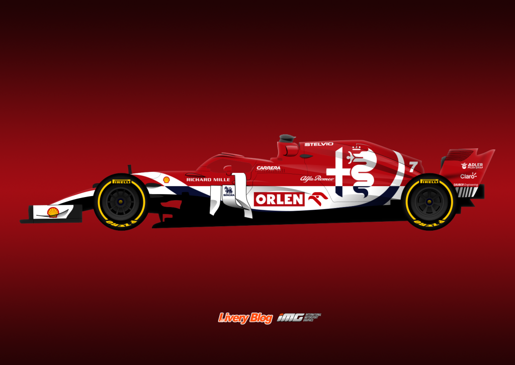
I was pretty chuffed with my design last year to be honest, so I thought I’d follow the same theme. Alfa dropped the blue altogether in 2020, so I decided to stick to mainly red and white, whilst adding a little bit of black as third colour to make the inverse/reflection design work. I wanted to move away from the real life livery design on the nose which despite being reminiscent of Sauber, feels very early 2010s.

Thankfully the Alfa Romeo logo works very as a design element in itself. On second thought, I’m doubtful that they’d actually have the logo in two colours like this, but here’s to a little bit of creative freedom.

Scuderia AlphaTauri Honda

It was clear in their first livery as AlphaTauri that branding (as ever with Red Bull) was more important than anything else. The size of the main logo was almost eye watering, but that’s what we have to work with. It’s certainly not an offensive logo, but it does limit what else can be done with the livery.

There is more room toward the front of the car though, and that’s what disappointed me most with the 2020 design. It just looked a little lazy and slapped on, so I’ve tried to put a bit more though into how the white contours both the cars natural lines, and the main logo. I’ve added a long blue line along that section to avoid too much white space as well, plus some thin white flashes along edges for some added interest.

Alpine F1 Team

So the first of the new blood. I will really miss the vibrant yellow that Renault brought to the grid, but nothing quite beats the excitement around the launch of a brand new car and livery. What I’ve done is taken the proposed colour scheme from their teaser imagery, but tried not to stick too closely to that specific design. I’ve kept the Alpine logo prominent on the engine cover and used mainly the Alpine blue colour (albeit slightly little deeper shade places) which fades into red and forms the basis of the design with a bit of French flair.

Aston Martin F1 Team

The Pink Panthers will be gone for 2021, but will hopefully be replaced by some long missed British Racing Green! I’m predicting a simple design which uses a nice dark green alongside their accent bright green, in this instance used sparingly as piping only. This matches the big Aston Martin logo in that bright green colour on the engine cover. Cognizant is a rumoured new sponsor for the team, but I’ve kept their presence (and blue) to a minimum – on the sidepod only.

Scuderia Ferrari Mission Winnow

What to do with the big red billboard this year? The Mission Winnow branding didn’t last long in 2020, so I’ve left the engine cover almost blank, and have kept other design elements fairly minimalistic – big patches of colour have been trending down in the last few years for Ferrari anyway.

I’m still onboard the black end plates train, and my thoughts on glossy over matte for Ferrari haven’t changed either. The only other thing I’ve really experimented with is a translucent/slightly different shade prancing horse on the side of the car, given how much empty space is available. I hope it doesn’t come off tacky, but something similar has worked pretty well on Vettel’s helmet for a few years!

Haas F1 Team

Haas has quickly become the most disliked team on the grid due to signing and sticking with Mazepin, but I similarly don’t see them ditching their colour scheme anytime soon. It’s really quite dull and unimaginative (corporate, even), so I’ve tried to spice up the red, black and off-white, whilst somewhat following their existing theme (Haas being ‘underlined’ on the sidepod). Fairly happy with the result, and in the off chance BWT does stay on the grid, here is a version with a bit of hot pink on it.

McLaren F1 Team

I was surprised that McLaren moved away from their triangular pattern design of 2019, but happy to see their new colour palette in 2020 was still very nice. I’ve taken a look at those colours from a different angle using a gradient, with the blue blending into the black to create an almost night sky effect, minus the twinkling stars. I’m keen to see how much papaya is on the car in 2021, because it’s been a joy to see ever since they brought it back.

Mercedes-AMG Petronas Formula One Team

I was a little surprised to read that black is likely staying on the 2021 Mercedes, thanks not so much to activism than but Ineos’ part ownership of the team. Whilst everyone loved the all black 2020 car, I was keen to see how the black could blend harmoniously with the silver. For that reason I’ve used swooping intersections between the silver and black, whilst the turquoise and crimson flashes are edgy to create a happy contrast.

Red Bull Racing

I don’t see Red Bull changing much at all next season; they seem to go many consecutive seasons sticking to the one theme. If they were to make some sort of change though, perhaps something like this could be it. I’ve made a series of parallel nose to rear pinstripes, to create the effect of a single wave following the shape of the car, without distracting too much from the all important Red Bull logo on the sidepod. This keeps a decent amount of red on the car, without being any more overpowering than the amount of red on previous liveries, maintaining that navy look that Red Bull are known for. I’ve also kept this completely three tone, with no white for any sponsors, which is probably the most unrealistic part of this livery, but creates a fun neon theme with the bright red and yellow against the dark navy.

Williams Racing

Last but not least, Williams. I was a big fan of Williams’ second livery of 2020, especially the edgy look of the nose section, so I was looking to expand and evolve that idea. I went with something a little out of my comfort zone – straight lines! In fact there are no curved lines on this design, apart from the nose section, which otherwise would have looked a little funny. So lots of edges, including the broken up blue lines in the large near-black sections. Still quite sparse in terms of sponsorship, but the void is adequately filled.

So which of the above is your favourite? Let me know your thoughts and comments!

Livery Mockups – AFL x Formula 1

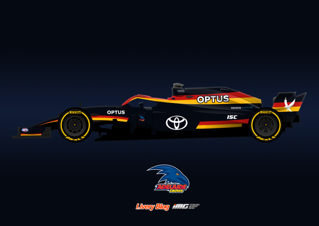
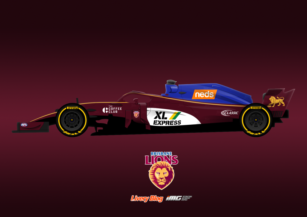
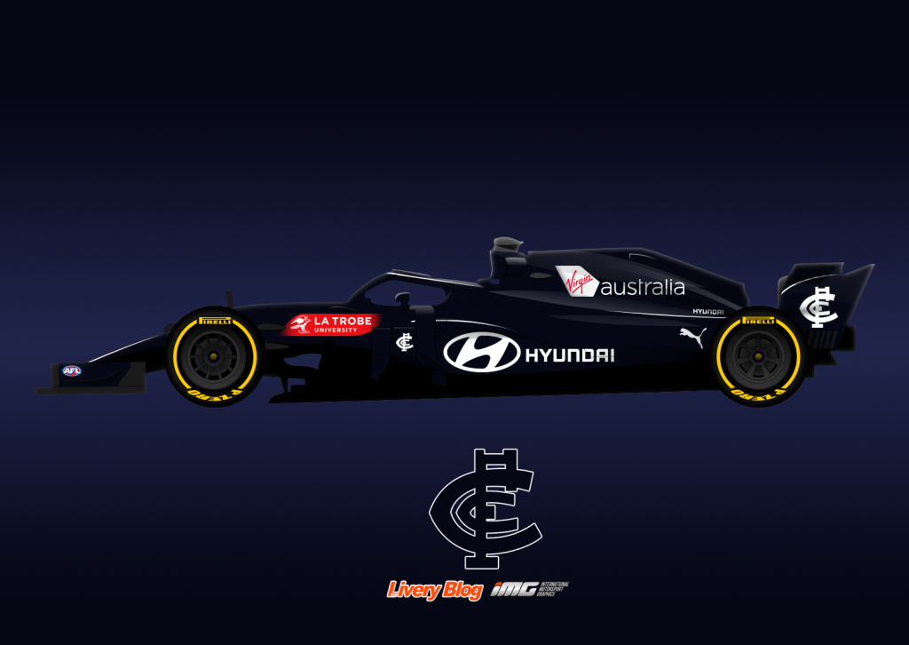
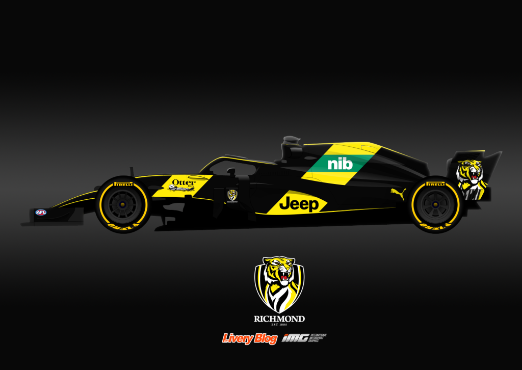
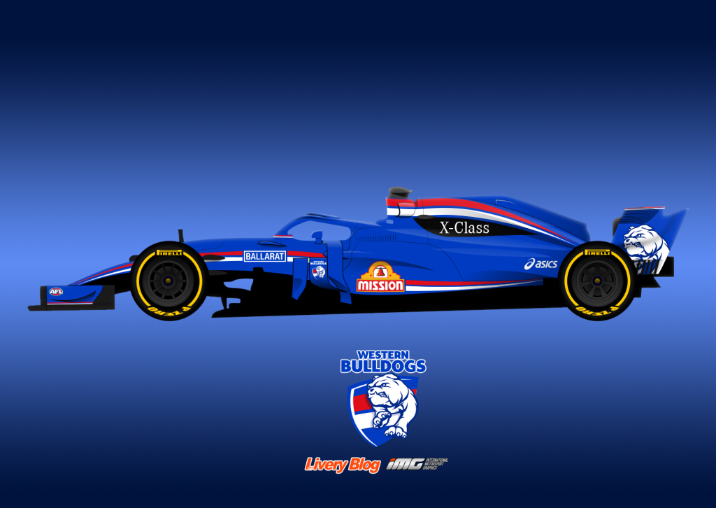
As a fan of both AFL and Formula, I thought to myself, what kind of liveries would this unlikely combination produce? It turned out to be a little more difficult than anticipated, with the ethos of footy jumpers and F1 liveries being entirely different. An F1 team sells it’s livery to the highest bidder, whilst an AFL team adds their sponsors to the guernsey at the last minute, the club’s iconic and (almost) unchanging colours and design taking priority. This means that basing a livery on an AFL team’s colours and design, whilst incorporating sponsors onto the car becomes increasingly difficult. This is especially true as team and sponsor colours often clash, and are mostly slapped on square patches on the jumper, not giving much inspiration to follow from.

I’ve tried to stay true to the jumpers and be realistic to brand guidelines, which means not matching logos to team colours for the sake of aesthetics, as nice as that would be. I hope I haven’t done anyone’s favourite team an injustice, and if I have done anyone dirty, I sincerely apologise!

Adelaide

Brisbane

Carlton

Collingwood

Essendon

Fremantle

Geelong

Gold Coast

GWS

Hawthorn

Melbourne

North Melbourne

Port Adelaide

Richmond

St Kilda

Sydney

West Coast

Western Bulldogs

Livery Mockups – 2020 Formula 1 Field

It’s that time of year again, and whilst I’m no graphic designer, I love having a go at mocking up some realistic-ish liveries for the year ahead. I take as much from the latest news and announcements in terms of sponsorships and try to stick to a team’s ethos as much as possible, with some artistic liberties here or there.

Alfa Romeo

Starting off with Alfa Romeo this year, and something a little more adventurous than last season. I had toyed at using as much of the lovely red as possible, but it ended up looking way too much like Ferrari, so went with a split design, keeping the Sauber spirit with the navy blue on white. It’s one long swoosh from nose to tail, changing abruptly between white and blue depending on the background. The car is quite sponsor heavy in the end, but based on last season’s design, it will probably continue that way.

Alpha Tauri

We’ll be introduced to the second generation of the “Red Bull B Team” in 2020, and the second Alpha (kinda) at the same time. Alfa Tauri, Red Bull’s fashion brand, will be taking over the car, and many are predicting a black and white car based on their branding, which I ran with. It’s a colour combo that’s been pulled off well in the past, especially when black is the main colour. I’ve used simple sections of black and white, accompanied by some more complex small parts of colour, with the diagonal lines breaking up the smooth flow. The graphic logo takes over the traditional big bull on the engine cover, although it’s soul remains, faintly behind the text logo.

Ferrari

My inspiration ran a little dry when it came to Ferrari this year, but I’m optimistic for the real thing, seeing as their last couple of liveries have been increasingly modern and experimental. They’ve ditched most of the white in their livery, so I’m continuing with a dark theme, white limited to sponsors only. The wings are black, along with a large strip starting from the exhaust to just in front of the cockpit. As with the Alfa Tauri livery, I’ve added some thin lines which mimic the Mission Winnow logo and help add some complexity to the otherwise simple livery. I for one hope they ditch the matte paint in favour of gloss this year.

Haas

I was disappointed when Haas’ calamitous relationship with Rich Energy ended, without really turning the great colours and (stolen) logo into an awesome design. It looks as thought we’re headed back to traditional Haas colours, but hopefully with a little more jazz than we’ve seen in the past. I’ve gone for a very simplified camouflage paint to the car in different shades of black and grey, with a long, sharp light grey/bright red accent line through the middle. The Haas logo also has a small red outline/shadow, to help it pop further from the dark background. I think it’s keeps things interesting in a subtle way, and not too outside the box for the team to realistically run.

McLaren

If any livery was going to be way off, it would be this one. McLaren are thankfully going to keep the papaya, but to what extent, nobody knows. My thinking is they’ve created a very strong brand image with the blue triangular pattern, so expanding on this would make sense. I’ve removed the black sections and made it just papaya and blue, but with new sponsors hopping aboard left and right, there’s no saying what colour will feature alongside papaya in 2020.

Mercedes

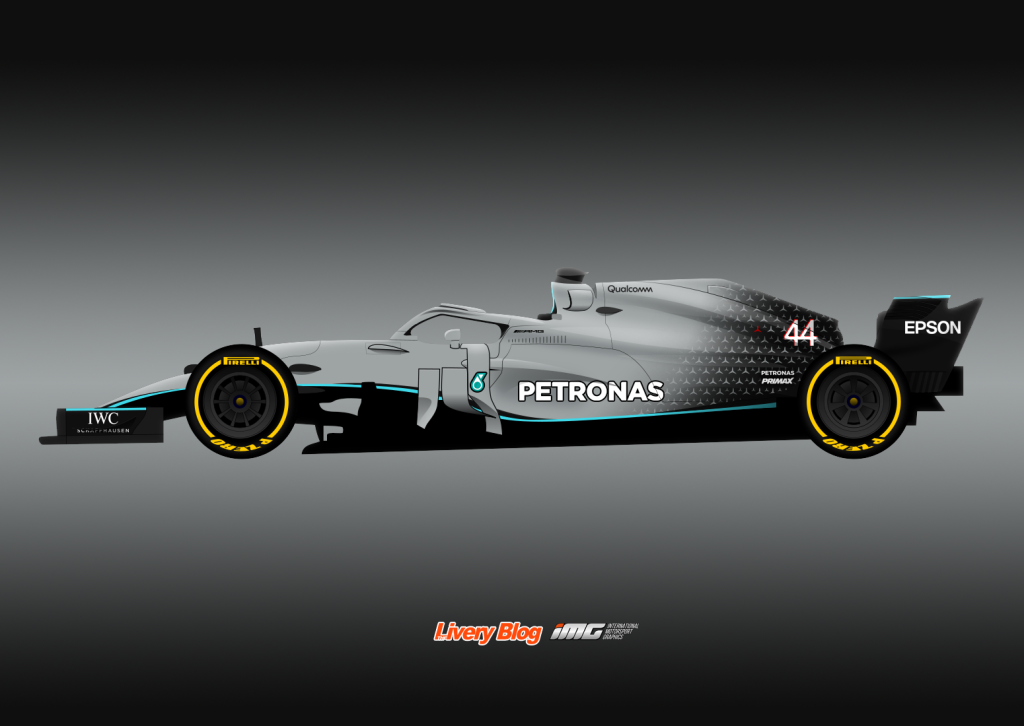
I must have been a fan of the logo pattern on the car last year, cause I’ve used it in hope that Mercedes will run with it again in 2020. It works really well on a dark background, fading into silver. I’ve kept it subtle with the turquoise as Mercedes always have, the thin line bouncing above and below the black section along the bottom of the car. Other turquoise flashes also appear on the car in a similar fashion.

Racing Point

Everyone was happy to hear that Racing Point will be renamed Aston Martin in 2021, but what will the car look like in 2020? Not sure the level of investment they’ll put into the team this year; maybe it will just be a logo on the side, just like last year’s Red Bull, or perhaps they’ll wait it out entirely til 2021. I’ve banked on them putting in some coin straight away, and dictating the livery from next year, with the twist of BWT also keeping some pink on the car. I’ve also gone against reality to an extent using majority British racing green as opposed the neon green from their sports car liveries, which is only used sparingly as a highlight. So do dark green and pink go together? Decide for yourselves. I’m biased but I kinda dig it in a very weird way.

Red Bull

So what do you do to a livery that already works very well, for a team with strict branding, that doesn’t change it’s liveries very often? It’s very restrictive. What I’ve tried here is a neon-ish theme, with outlines only for the areas of the car normally filled with colour, apart from the text and graphic logos. It’s not much of an evolution on last season’s livery, but enough to keep it interesting year on year. As good as it has been for the last few years, it risks getting stale without some form of evolution.

Renault

For Renault, it’s more of a refinement than a major change. I love the effect the current car has in being majority black from the side and yellow from the front, so I’ve kept this theme in my design (although you can’t really tell given the angle. I’ve kept each yellow section solid, rather than having pinstripes, and have kept the colour as vibrant as possible. I’ve added some extra yellow to the airbox area, as well as the halo, which more teams should start exploit with their designs as opposed to attempting to hide, now that everyone is used to its appearance. A little unrealistically, I’ve kept it entirely two tone, including sponsor logos. A man can dream – it’s a visual effect not seen often enough due to strict branding guidelines.

Williams

Finally, a team down in the dumps, without any real hope until the regulation changes in 2021. Traditionally, Williams will keep a livery design for 5 or so years (sponsorship permitting) without much variation at all, so given Rokit is still around, I don’t see much change afoot. That said, with a couple of new sponsors in thanks to Latifi, I do predict a couple of amendments. I’ve assumed Lavazza will appear on the sidepod, so I’ve had blue fade into Lavazza’s darker blue, to act as a background to their logo. What bothered me about the livery last year was that the blue looked like it was sprayed on top of everything at the very end, and how it looked a little careless on the nose. I’ve made sure the blue fits in better with the sponsors, and have broken up the gradient with a sharp transition to white from the side to the top of the nose and cockpit section. It’s a little bare, but not too obviously so.

Looking forward to an exciting year of racing ahead, and hopefully some pretty liveries to go with it.

Livery Mockups – 2019 Formula 1 Field

Thought I’d get in nice and early this year! I try my best to keep things realistic, and get as many hints as to what the teams will actually be doing in the new season, but some of that info is a little hard to come by given most team launches are still about a month away. Most teams do have up to date sponsor lists available, but apart from this, I’ve taken creative control. Thanks to legend WhiskeyTangoFoxtrot from IMG for the wonderful template!

Ferrari

ferrari 2019

I kept it simple last year, but this time I’ve let go, and gone for the black that many of us have been wishing for for years. The car is obviously still majority red, a very slightly darker shade than usual, with two large black sections on the back and front. The swooping nature of the black sections help to border the sponsors, especially on the sidepod, which usually look unappealing on their own given the different shapes and colours between them.

From a top view the car would be red, with red piping from the side on the shark fin and wings to suit. The Mission Winnow logo doesn’t even look half bad, and fills what would otherwise be an empty hole. While Ferrari is basically its form of Italian patriotism nowadays, there’s a little stripe of the Italian flag colours in front of the rear wheel.

Haashaas 2019

It was a bit of surprise when little known Rich Energy were announced as major partners of the Haas team. Dodgy backers aren’t new to F1, so hopefully this company is legitimate, but can’t say I’d be surprised if they didn’t see out the year.

I’ve used their logo as inspiration for this design, emblazoned across the side of the car, supporting the text logo along the sidepod. Other antler details have also been added on gold backgrounds, to add some colour to the car, but in form that is unique to the team and sponsor. The gold itself is more vibrant than that used on the real logo (from their website), as I feel the original colour was too dull to stand out, and generally wouldn’t look as nice. I’ve also been careful not to add too much gold, as it can look tacky. Also, minimal gold has a proven track record of looking great (e.g. JPS Lotus). The red flashes add another touch of colour, and make sure we don’t forget about HAAS (they’re trying to sell stuff too!).

McLarenmclaren 2019

McLaren have teased us with an all black logo on social media. This may point to an increased presence of black on the car in 2019, or it could mean nothing at all. I’ve gone with the latter, as I feel the black sections of last year’s car were the weakest parts of the livery.

I was pessimistic of the blue initially, but after seeing the lovely shade they applied to the car, it proved to be a great combination. I’ve decided to expand on these sections slightly, changing the halo from black to blue, as well as making the inside of the cockpit blue. The wing end plates are also blue and I’ve limited black to the logos only. I’d love to have used white rather than black for the logos, but they slightly too hard to read that way. Overall, I’m happy for McLaren to keep the car simple and let the papaya shine, but would be interested to see how others make a complex livery with these colours work.

Mercedesmercedes 2019

Once again, I’m hoping for Mercedes to simplify the livery, and also move away from the smokey gradient design theme. Here I’ve added some solid black sections along the top and bottom of the car, which are separated from the silver by bright turquoise and blue.

Mercedes over the last couple of years have added blue to the usual Petronas turquoise, promoting their hybrid technology. Rather than separate lines for the two, I’ve used both in gradients along the length of the respective sections of the car.

Racing Pointracing point 2019

There really isn’t much to go off in terms of sponsorship for Racing Point, so I’ve made the assumption that BWT will continue their sponsorship, post Force India. I’ve gone for a more cohesive design, because as appealing as last year’s livery was, I feel as though there were some clashing design elements on the car.

The pink and white looked great together so I’ve retained the colour combination, with the white sections fading to a very light silver as they reach the front and rear of the car, rather than having solid silver stripes. However, there are bright pink stripes, three in formation following the white sections, ending just short of the pink/white notches. Another slight touch is changing all black logos to blue; they are dark enough to be easily distinguished, and help to keep the colour scheme to four-ish colours rather than 5.

Red Bullred bull 2019

I’ve really enjoyed Red Bull’s liveries the past couple of years, but recently I’ve started to think that more could be done with the colours available. The single stripe may be beginning to get stale, so I’ve experimented with what adding more colour could do. One angle the team hasn’t explored is more yellow. They’ve only every stuck with yellow on the nose and airbox, accompanying the bulls, but alongside the very dark blue and bright red, make for a very strong combination of colours.

There are three main ‘swoops’ of yellow, the main one allowing for the bull to be entirely bordered, with each section following and then transitioning to a minor portion of red. It also helps to bring the halo into the design, that are a lot of teams have either tried to hide last season, or neglect altogether.

Renaultrenault 2019

I dream of an entirely two tone livery, and all my hopes are with Renault. Their most recent stint in Formula 1 has delivered three black and yellow cars, so ignoring that sponsors such as Castrol likely wouldn’t play ball, they are our best chance.

I’ve thought back to their 2016 all black test livery which looked so sleek for inspiration. It’s mainly black, with just a few yellow stripes, thoughtfully placed along the natural lines of the car’s body. As mentioned, there are only two colours on the car, including all sponsor logos. It makes for a nice effect, especially with the soft tyres and the yellow is bright enough against the black for legibility to be an issue.

Saubersauber 2019

Everybody loved the candy apple red on the 2018 Sauber, which left a few of us confused as to why more of the car wasn’t adorned with the beautiful colour. It’s a no brainer then that I’ve increased the amount of red on the car, but have tried to remain realistic, as Sauber’s colours of white and blue are very important to the team.

Red is along the top of the car with white on the bottom section, which is broken up by further red, along with some of the navy blue used last season. The lack of sponsors makes it tough to form a design, but I feel as though the above fills up the empty space well, whilst keeping the prime real estate enticing to potential sponsors.

Toro Rossotoro rosso 2019

There isn’t a whole lot of the current Toro Rosso that I would change. The colours are fantastic and distributed well, so I had a go to see what some minimal changes could do to the look of the car. I’ve moved one line to flow from the rear all the way to the front of the halo, whilst adding another along the length of the bottom of the car. There’s also a red section along the nose/cockpit.

I’ve also made use of negative space, with the circle usually behind the bull this time within the red section just under it. I’ve maintained this design theme in the other red sections too.

Williamswilliams 2019

With the return of Kubica and sadly waving goodbye to Martini, Polish oil company Orlen have come aboard as sponsor of the Williams team. I imagine Williams returning to their traditional blue and white (depending on how large Orlen’s investment is), and have tried to work with the curves of the car, but also with some slightly jarring straight lines against the grain.

This effect has been used well in the past, memorably with the Compaq/HP Williams cars, and feel it works well not only as a design, but with fitting in with the team’s heritage. It’s also an attempt to fill as much space as possible, as the team’s lack of sponsors could easily be exposed with a more simplistic livery.


So what are your favourites? What improvements would you make? Do you have any predictions on what the teams will be running in 2019? Let me know your thoughts in the comments below!

Livery Mockups – 2018 Formula 1 Field

A day late and a dollar short this year unfortunately! While I’d started to design these a couple of weeks ago, time got the best of me and alas, I’ve missed the boat in terms of getting these out before the launches. However, I can assure you these designs were started well before the launches, and therefore haven’t taken inspiration from any of the recent launches. In any case, here are my F1 mockups for the 2018 season, in reverse alphabetical order for something different.

Williams

Williams 2018

Every year I try to give the Williams a different look and feel, and while I went retro last year, I’ve gone with something (just about) substantially different for 2018. The Martini stripes are a lot more versatile than they look at first glance, and by simply placing them diagonally and against the grain of the car as opposed to the usual sweeping curves, it gives the livery a fresh new look.

However, I haven’t ignored the curves of the car entirely, sharply ending the stripes along the natural body lines on the nose, sidepod and rear wing endplate, as well as to leave a space for the Martini logo.

The actual 2018 car has followed the same theme of the last few years, they have added a large sweeping chunk of grey to fill up some white space. I wonder how it would have looked in navy blue.


Toro Rosso

Toro Rosso 2018

This is one livery I would be very happy to see stay the same in 2018. The vibrant blue and red, and sleek silver were a welcome change after 11 years of bleh, so I’ve made sure to keep true to the 2017 colour scheme.

The simple silver bull stays, and the red line isn’t too different from the actual 2017 livery. The slight changes are that it ends at the sidepod and the second half is moved to the sidepod from above it, and that there is a bull pattern in a slightly darker red just for something different.

For the first time ever, don’t change, Toro Rosso!


Sauber

Sauber 2018

Everyone was excited by the possibilities opened by Sauber’s new partnership with Alfa Romeo. Red was on the cards with the launch of the partnership and the actual 2018 didn’t deviate much from this, but my heart was set on the beautiful metallic dark red.

I thought it was a waste to not expand that lovely colour further along the car, so took the liberty to place it all over the top, whilst keeping the sides mainly white. Extending the red along the top helps the flow of the car, where keeping it just on the engine cover gives the impression of a lack of care in the design (just seems a little boring in application in the link above). Some extra flashes of red line the larger red sections and helps fill up the car, despite the void that is the Sauber sidepod of late.  I’ve also managed to keep this two tone, although realistically I should have added some blue, given that is Sauber’s team colour.

So glad to see this colour for the first time since Force India’s first winter test.


Renault

Renault 2018

Keeping the Renault two-tone wasn’t the plan originally, but it ended up working quite well. The black and yellow contrast enough for logos to be perfectly visible and the combination is one that just about always works perfectly.

I’d attempted a mainly yellow car, but ended up with the opposite; a sleek black design with a fair amount of yellow piping. I’ve attempted to make good use of the newly introduced halo (which is universally regarded as hideous) with the piping. How teams make use of this feature with their 2018 liveries will be a key factor in overall looks.

Simple and not overly complicated designs executed well can be some of the most memorable.


Red Bull

Red Bull 2018

Red Bull have unleashed a monster recently with the all blue ‘disruption’ livery which will almost certainly only be used in winter testing. Realistically, we’ll be seeing the navy blue and red for the 2018 season, and I’ve daringly avoided yellow too where possible. I’ve taken a chapter from the new Toro Rosso book in doing so, keeping the bull and logo super clean in red only, where the yellow outline almost looked out of place in 2017 in comparison to the rest of the livery.

The other elements of the design, being the red lines along the body, are slightly thicker and are cut off at an angle. There are also additional lines, underlining the Red Bull logo, as well as on the wing end plates.


Mercedes

Mercedes 2018

Mercedes always presents a challenge, in that I can never seem to make a good looking silver livery. Every single time it ends up looking plain and boring, so I go to colour extremes. As I did last year, and the year before, I’ve piled on the black, as it adds some interest to what really is a bit of a dull colour in silver.

I’ve kept true to Mercedes’ love for the airbrush gradient application of colour with the turquoise on silver, whilst keeping the edges between the black and turquoise sharp along the sidepod and nose lines of the car. There’s also a subtle black section along the bottom of the car, slightly reducing the amount of silver used, whilst accentuating the natural curves of the car.

The black also helps many of the logos pop out to the viewer, where they stand out less on the silver. Plain black also looks better than the dirty looking airbrushed black on the engine cover in recent years.


McLaren

McLaren 2018

This is probably the car I’ve had the most frustration with in terms of design. I believe McLaren understand that the strong orange livery in 2017 wasn’t very well received, so perhaps in hope, I’ve gone with papaya orange that everyone rightfully rages about and wishes to see in 2018.

The design is rather plain as the papaya orange is surprisingly difficult to complement with other colours. I’ve gone with black instead of the blue used in IndyCar as that was more a Indy throwback, but kept it to a minimum, with flashes on the halo, airbox, very rear of the engine cover and wing end plates.

Again, not in love with this by any means, but am sure McLaren will want to move on from their Honda disaster with a turn in the right livery colour direction.


Haas

Haas 2018

This design is seemingly irrelevant now as I’d started it back when the Maserati Haas rumour were lingering. Either way, I’ve followed the main Haas theme in splitting the colours half way up the sidepod, but in this instance, half charcoal grey and half blue.

The blue adds a bit of colour to what has was a very dull affair last year, with the white wing end plates especially opening the car up slightly. The white flashes act as a partial separation of the blue and grey, with some extra white sections wholly in the blue on the engine cover and rear of the sidepod. All white sections bordered on one edge with a red pinstripe.

A shame that this rumour never turned out to be true, but at least we’re in for less grey in 2018.


Force India

Force India 2018

Or is it FORCE F1? Either way, the pink panther has also been very tough to design. I attempted using just two shades of pink which didn’t turn out very well, and ended up with just pink and black, this time with a vapourwave (quite a stretch, I know) feel.

The four sections of  angular lines work in layers, and use odd shapes to fill up sections of the car without logos. They both create a feeling of unease, jutting against the grain, but also a sense of calm, cutting along the cars curves, especially on the nose section. The black wings work well against the largely bright pink car.


Ferrari

Ferrari 2018

Finally, Ferrari, in ditching Santander, have opened us up to the hope of getting rid of the majority of white on the car and reintroducing black as the secondary colour. This paired with the removal of the suspiciously Marlboro looking Scuderia logo from online media channels means we may even have an attractive engine cover too.

I have gone with some more black, mainly on the engine cover and wing end plates, but also along the bottom of the car. Flashes too have been added on both ends of the halo, as well as the tip of the nosecone.

I don’t know how Ferrari get away with it year after year, perhaps we get used to it very quickly, but their logo arrangement on the sidepod is quite jarring and makes designing a complete and beautiful livery very difficult. Red, white, brown and yellows of different hues is a bit of a nightmare. They’ve been doing it for years but somehow, it never specifically receives much negative feedback. Perhaps there will be more hope next year.


So they were my mockups for the 2018 Formula 1 season. Any in particular that you liked, or perhaps didn’t? Do you feel you have any improvements of your own? Let me know below!

Livery Mockups – 2017 F1 Helmet Liveries

I had some spare time over the summer break earlier this year and thought I’d mess around in Photoshop, to see which drivers’ helmet designs would translate well onto cars. Some fared better than others, while some I couldn’t get to work at all, which is why I don’t have a full ‘grid’ below. I’ve also made sure not to use any logos, which really accentuates the design. It’s helped me notice that while I love simple helmet designs, these end up looking the emptiest on an F1 car. Finally decided to post them up, so check them out below!

Fernando Alonso

Alonso

The colours and design work well on a car for Alonso, and I haven’t had to stray much at all from the helmet. Colour distribution makes this look a lot more yellow than the helmet, but I don’t feel it suffers much for it.

Valtteri Bottas

Bottas v4

Love Valtteri’s helmet, but without sponsorship, the lack of detail leads to quite a plain livery. I don’t hate it, but would be very sponsor friendly!

Marcus Ericsson

Ericsson

Marcus added some sparkle this year, and while this isn’t my preference, made for a decent looking F1 livery. The lines seem to flow nicely along the car and look nice and aggressive.

Lewis Hamilton

Hamilton

Struggled to get Lewis’ design to ‘fit’ on a car, therefore, the three stripes do look quote chunky. Not my favourite, but I do look forward to the day that we see a metallic candy apple red/maroon car on the grid.

Nico Hulkenberg

Hulkenberg

While I kinda despise Huklenberg’s new helmet, which went from unique to awfully generic at the start of the season, it works pretty well on the car. Definitely helped by the white section on the airbox, even the circus tent pattern looks alright over the entire car.

Daniil Kvyat

Kvyat

Almost unrecognisable without the Red Bull logo! Side on helmet design is well suited to the car, and has an almost entirely different personality minus the sponsorship.

Kevin Magnussen

Magnussen

I have to say I never really paid attention to Magnussen’s helmet until I made this, but I’m glad I did, because it’s a great design despite being mostly silver/grey. The giant stylised K fits well on the engine cover and the colours are simple, but pop with the red. The stripey pattern makes for a good, subtle secondary design.

Felipe Massa

Massa

This is one that I thought would never worked, but is actually OK! The rear of the car is quite plain with the solid yellow, but toward the front, the hexagonal patterns are quite interesting. The design flows well along the nose.

Esteban OconOcon

This is slightly ruined by my lack of design skills, sourcing a picture of bubbles on the internet, but that aside, Ocon’s colour choice is quite basic and monotonous (I wonder if it will be back next year, it’s quite gimmicky I feel), but the design flows well enough along the body.

Jolyon Palmer

Palmer

One of my favourites. Colour choice is slightly on and not entirely complementary, but the white stripe works really well, flowing effortlessly from the nose to the airbox. Nice little colour split from the top to the bottom as well.

Kimi Raikkonen

Raikkonen

Whether it’s the design of my lack of artistic skills, this livery looks very disjointed on a car compared to Kimi’s helmet. Lots of lines jutting at different angles makes me a little uncomfortable!

Lance Stroll

Stroll

What’s probably my favourite helmet looks a little boring on an F1 car! I’m sure I could have taken some liberties to spice this up a little, but going for realism leads to some lack of excitement.


Had a go at a few other helmets, but just couldn’t seem to get anything flowing for them. Let me know what you think of the above!

Livery Mockups – 2017 Formula 1 Field

The most exciting part of the year for us livery junkies is just around the corner; F1 launches! Big changes in the regulations mean the cars will look very different, but there’s every chance liveries will be quite different too. With a bunch of driver and sponsor changes, I’m very excited to see what the teams present to us this year.

After last year’s successful post, I’ve decided to get a few other designers from International Motorsports Graphics to draw up their thoughts, and explore liveries from a number different design angles. Thanks for your contributions WhiskyTangoFoxtrot and LiveriesAreTheBest!

Special thanks to StylePixelStudios for the beautiful template and without further ado, here are our 2017 Formula 1 field mockups, followed by a short description from each designer.

Ferrari

ferrari-wtf

WhiskeyTangoFoxtrot – Knowing that Ferrari is going to get rid of the white part in their livery – which I consider a mistake – I have chosen to keep it in this rather angular design. I have also added a cheeky touch of green to include all the colors of the Italian tricolor.

ferrari-latb

LiveriesAreTheBest – I made 2 other takes of what a Ferrari 2017 livery might look like, but this all-red one suits the best, taking inspiration from the 2007 Ferrari. A much different Scuderia Ferrari logo on the engine cover looks somewhat better for me than the original one.

ferrari-jarnooo

The Livery Blog – In the 2000s I got sick of the Marlboro/Vodafone white on the Ferraris and ever since, I had an aversion to the combo. This year, however, I discovered that I may have overcome it. Instead of going for black as a secondary colour, which I always thought looked best, I’ve played with distribution of white. Since the rumours in the Italian media (which are often true) say that the white engine cover will be gone, I’ve gone with small sections of white behind the airbox, in front of the cockpit and along the bottom side of the car. I’ve also kept the Italian flag on the airbox, which was a nice touch last year. The red used is also a slightly different hue. The Marlboro Scuderia Ferrari logo will inevitably remain , as will the white wings. That said, perhaps they will try to mimic the black of the 1990 Ferrari. Because emulating and old livery brought them so much success last year.

Force India

force-india-jarnooo

The Livery Blog – I’m not sure how big an investment Johnnie Walker have actually put into Force India, but here I’m assuming they’ll be on the sidepods. I’ve taken inspiration from the Force India liveries of 2009/10 which I really liked and applied swooping bright green and orange lines along the car, but with a black base, in line with their current image.

So what if Johnnie Walker had a beefy sponsorship and decided to promote one of their brands?

force-india-jarnooo-2

My alternative is a Johnnie Walker Black Label livery. I’ve tried my best to minimise the JPS/Renault/Lotus resemblance but the similarities can’t really be avoided. I’ve used the bottle label on the sidepod, a design I’ve always been a fan of, so no real need to mess with it. On the rest of the car, I’ve used two different shades of gold, a lighter shade on the logos and shape outlines, with a darker shade half filling those shapes. These colours just work incredibly well together.

force-india-latb

LiveriesAreTheBest – This one is inspired by Force India’s 2008 testing livery. Silver/orange at the front and orange/green at the back.

force-india-wtf

WhiskeyTangoFoxtrot – For Force India, I have created a very straight-lined design that attempts to have a place for each one of their many minor sponsors. The old combination of orange, white and green has replaced their predominantly black-and-silver designs of recent years.

Haas

haas-wtf

WhiskeyTangoFoxtrot – I made the American flag an integral part of the design on the Haas car while creating a splatter-based design using their old color scheme, only changing the shade of the red to match that of the Stars and Stripes.

haas-latb

LiveriesAreTheBest – Haas’ 2016 livery was with grey as main colour, but why not shuffle up these three colours? Red was the eventual pick as the base colour.

haas-jarnooo

TheLiveryBlog – I have to start by saying Haas’ current livery is great and I’d be happy to see it retained for another year. That said, I’ve tried to use their current colours in a new way. With the fondly remembered Compaq/HP Williams cars in mind, I’ve placed a flat design of alternating black, grey and red over multiple surfaces of the car. This is only interrupted by white sections on the ‘top’ surfaces of the car. I’ve used red as a highlight, placing it on the top edges of the car (engine cover, wings and mirrors), as well as extra accents on the nose and headrest. Only issue for Haas at the moment is the lack of sponsorship, so a complex design is required to stop the car looking empty.

Manor

manor-jarnooo

TheLiveryBlog – Although Manor are unlikely to race at this point, I’ve decided to make a livery anyway. Whilst the livery is similar to 2016, I’ve slightly altered the colours, going with a lighter blue and a brighter orange. I’ve also gone with white alone as a third colour (no black), using a major chunk of it along the side of the car which I feel brightens the livery a little. The logo on the engine cover remains, which looked great last year. However, I wouldn’t be disappointed to see the 2016 livery used again, which was a fan favourite…should they race 😦

manor-latb

LiveriesAreTheBest – It’s sad that we won’t see Manor on the grid…

manor-wtf

WhiskeyTangoFoxtrot – Without an idea of who their drivers and sponsors will be – and whether we’ll see them on the grid at all – I created a swirly flame design for Manor with last year’s sponsors and color scheme.

McLaren

mclaren-wtf

WhiskeyTangoFoxtrot – I still want to see an orange McLaren! As I feel like they will not have a main sponsor once again, I have just used McLaren, placing it in something of an awkward place for the benefit of the design. The orange part is meant to be pearlescent.

mclaren-jarnooo-1

TheLiveryBlog – Before all the orange speculation, I reverted back to 2015. I always loved the sparkly black colour seen on the majority of the McLaren that started the year. I’ve used this over the whole car, whilst retaining the dayglo design on top of the sidepods. I’ve also added a thin dayglo trimming on the entire side following the nose and engine cover, outlining the car and contrasting well with the sparkly black (which I may have put a bit too much blue hue in).

mclaren-jarnooo-2

However, the orange McLaren hype is real! So this design features a lot of the paler orange seen in the 70s, along with the current charcoal colour which I’m totally indifferent about. It’s a bit of a mish mash in my opinion, but Ron is gone so who knows what we might see next year. Perhaps it will be entirely orange?

mclaren-latb

LiveriesAreTheBest – I also made two other takes of a McLaren 2017 livery, but following the latest news that McLaren may go orange this year, I decided to make this all-orange version.

Mercedes

mercedes-jarnooo

TheLiveryBlog – For the second year in a row I’ve decided to throw caution to the wind for my Mercedes deisgn. I’ve cut down on silver again and included a lot of black and Petronas turquoise, the latter in thick strips along the engine cover, sidepods, rear wing end plates and wrapping over the nose. The silver is in two distinct sections, one engulfing the cockpit and the other the rear of the car. While there’s zero hope of this being even remotely similar to the 2017 livery, you can’t let the man get you down.

mercedes-latb

LiveriesAreTheBest – I actually do like Mercedes’ 2016 livery, but why not add some more turquoise to the livery? This is what it could look like with a black “Vodafone McLaren-ish” sidepod.

mercedes-wtf

WhiskeyTangoFoxtrot – For Mercedes, I have just created a simple design of swirly stripes while brightening the background color to almost white.

Red Bull

red-bull-wtf

WhiskeyTangoFoxtrot – Keeping Red Bull’s combination of matte black and bright red that was introduced last year, I have created a splatter design hoping to make it seem more aggressive, playful and exciting.

red-bull-jarnooo

TheLiveryBlog – I’ve stuck fairly close to last year’s livery, which was my favourite of the 2016 field. The major changes here are the removal of the Total red on the wings, extension of the thin red line to the end of the sidepods and removal of the Bull’s yellow outline, which I felt made the car look a little unbalanced, considering the Red Bull text didn’t have an outline. Another addition is having the cockpit all in yellow, which gives me happy Sauber 1999 vibes.

red-bull-latb

LiveriesAreTheBest – Nothing slightly different compared to RBR’s 2016 livery. Couldn’t think of anything else.

Renault

renault-latb

LiveriesAreTheBest – Inspired by the classic Renault liveries from the 1980’s. Replaced the Total logo with BP following the announcement that they will use BP/Castrol fuel.

renault-wtf

WhiskeyTangoFoxtrot – A plain yellow car has its merits, but that would not be very rewarding to create. Thus, a traditionally colored Renault with the addition of white in a swooping design.

renault-jarnooo

TheLiveryBlog – I struggled a little with the Renault, because I don’t think it will be as plain this year. I’ve added three main black sections; straight along the top edge of the engine cover, wrapping over the nose, and in the very rear of the sidepods (as well as the wings). These black sections are outlined by three shortening strips of reflective gold.

Sauber

sauber-jarnooo

TheLiveryBlog – After some pleasant emails with Sauber last year, where they explained the process behind the design of their livery and that their team colours are blue and white, I’ve designed a livery using a pleasantly vibrant blue with white the only other colour, assuming no major sponsors are coming on board this year. I’ve kept the design minimal, with just five white lines strategically placed across the car. There is one major white section, on the top of the nose, giving some significant contrast to the abundance of blue on the car and is a subtle design throwback to arguably my favourite all time livery.

sauber-wtf

WhiskeyTangoFoxtrot – Please do not adjust your computer screens – this car is not supposed to have color. With the withdrawal of Banco de Brasil, one can only guess what the 2017 livery will look like. Nonetheless, this one draws inspiration from their 1994 livery and upgrades Silanna to the position of main sponsor – of course, this could be any company.

sauber-latb

LiveriesAreTheBest – I decided to make a new take on the Sauber so this one is plain metallic blue.

Toro Rosso

str-latb

LiveriesAreTheBest – I seriously can’t think of a super-cool Toro Rosso livery so I made this one. Just a “blank” livery with a big bull they used from 2006 to 2008. This one is based off of my 2016 Toro Rosso concept.

str-jarnooo

TheLiveryBlog – Every year we labour to make nice STR liveries and every year we are left discouraged. Inevitable disappointment aside, this year I’ve added a whole bunch of white to the livery. The engine cover (where the cartoon Bull has once again been removed) features a Red Bull can style background, breaking up the navy blue. The gold used is a little lighter whilst the red has been nudged a notch or two lighter. The Red Bull logo on the sidepod sits on a large white section which is pointed at the tip. There are also large white sections on the bottom and on top of the nose/cockpit. Each of these white sections feature a fade to gold.

str-wtf

WhiskeyTangoFoxtrot – I’ll admit that I have no idea how to design a livery for STR. However, I am getting tired of the dark colors of their liveries, so I totally changed it. Also, seeing how they have previously used gold in their design elements, I made it into one of the main colors to create a unique color scheme that sets them apart from the other teams.

Williams

williams-wtf

WhiskeyTangoFoxtrot – Just another Martini design, nothing else.

williams-jarnooo

TheLiveryBlog – Finally, I’ve gone a little retro with Williams. As I’ve mentioned before, a fourth year of a nearly identical Martini livery would be too much. This time I’ve used straight horizontal lines and a retro logo harking back to the Martini liveries of the 70s. The Martini stripes extend to the wings and straight along the top of the nose. A welcome change in my opinion!

williams-latb

LiveriesAreTheBest – Same opinion as the Toro Rosso, so I ended up making this. This one is inspired by the 2008-2010 Williams liveries.

So that’s it for another year. Would love to get people’s thoughts and opinions, so let us know what you think! Here’s to some lovely liveries this season.

Livery Mockups – 2016 Formula 1 Field

The 2016 season is getting ever closer and one of the most exciting parts of the season, the launches, are just around the corner. I started a small tradition last year by making some livery mock ups (pre-blog), keeping in mind what I’d like to see but also what the team would realistically allow. This means, restraining my creativity to the team’s traditions and most importantly, sponsors. Here’s what I’ve created, in alphabetical order. Shout out to my peeps over at International Motorsport Graphics (IMG) and Pieczar especially for the beautiful template.


Ferrari

2016 Ferrari

This was the easiest livery to predict. Ferrari didn’t do much wrong with their livery last season and that was helped by having arguably the best looking chasis in the field. However, I’ve made a couple of changes. The first is the universally disliked Scuderia Ferrari logo. Phillip Morris inspired or not, it just doesn’t look good. I’ve taken the lettering from it and tucked it away next to the air box with the Ferrari logo underneath it. The second is the return of a deeper, metallic red (I wish I could better accentuate the metallic paint). They’ve been using a flat, bright red for a number of years now and a return to that 2008 shade or one similar would be fantastic. A third change is the removal of most of the white. Most notable behind the Santander logo (wishful thinking, I know), it’s a look Ferrari haven’t really had since the early 90s. Would love to see something like this. Possible? Yes. Likely? Probably not while Santander are around.

Force India

2016 Force India

The 2015 Force India was revealed to a chorus of groans, with another load of dull colours unleashed into the F1 world. What I’ve done with this is bring back Force India’s traditional, vibrant colours. Black is still the main colour, but rather than drab silver, orange takes up most of the sidepod and bright green compliments the other two colours. I’ve also de-cluttered the engine cover. I’d be happy to see this on the grid!

Haas

2016 Haas

Unfortunately, I feel as though a lot of people will be disappointed with Haas’ first livery. Despite rumours of a Ferrari yellow livery, all official pictures and video released by the team point to a white, red and black colour scheme. With no word on the team’s sponsors, I’ve turned to the drivers’ personal sponsors for some inspiration. Now that I mention it, I don’t see Total fuelling Ferrari engines, but it’s better than a blank space. Either way, the shade of red chosen by Haas is lovely and importantly, different to Ferrari. The black is somewhat inspired by the later BAR/Honda liveries. It will be interesting to see which sponsors will be announced and I’ll be pleasantly surprised if there is any yellow on the car.

Manor

2016 Manor

Until a few days ago, I had created a weird blue and orange livery, based on the colours on Flex-Box’s website. Since then, Manor released a new official logo which is straight black and white and has inspired me to start fresh. There’s been no word on whether or not any of Manor’s sponsors from 2015 will carry on to 2016 (apart from Airbnb), but it certainly helps get a livery started! I’ve decided to create a mostly plain black and white livery to match their new logo. It does slightly remind me of the West McLarens, but there’s no grey so I’ll let myself off. The black and white diagonal stripey bits are also based on the new logo and add some texture to the very basic colours. I’ve also included orange (as mentioned above, Flex-Box has orange in their logo on their website), to add some vibrancy and it pops on the black. It also creates a bit of a 60s BRM feel. Whatever happens, I do hope they move away from the red white and black, as not only is it getting old, but I’d hate to see Manor and Haas produce similar liveries.

McLaren

2016 McLaren Plain

The 2015 livery disappointed me on a number of levels. The first livery was boring and the level of disappointment was heightened by the expectation of the exciting new Honda partnership. Despite this, I thought the sparkly black that was used was unique and attractive. Later in the season, everyone was happy to see McLaren acknowledge the fact that people were disappointed and create something new. It was a decent livery, but unfortunately the sparkly black was gone, and the hideous bordering of the red sections remained.

I tried for days to create something with McLaren’s black and I couldn’t make anything I liked. I finally succumbed to my heart and reverted back to my prediction from the start of last season and went with Honda white. Suddenly, my creative juices were flowing, but knowing McLaren and a certain Mr. Dennis, I made sure to restrain myself. I decided on a very simple design, which retains McLaren’s orangey-red, but on a white background instead of black. The red lines flow from end to end and make a blank canvas a little more interesting. I’ve also added a couple of semi-realistic main sponsors, in Aegon and MasterCard (boring industries lol) just to see what the McLaren might look like with a full sidepod.

Mercedes

2016 Mercedes

If there’s any team I struggled on more than McLaren, it was Mercedes. I have to give credit to Mercedes; it was terribly difficult to create anything attractive with the silver and turquoise, so they’ve done well to not produce any awful liveries the last few years. That said, I’ve had to go for something quite unrealistic, both in terms of colour and design, in order to make something I considered semi-attractive.

A lot of black on this and I’d be happy to see more of a third colour to break up the other two on the real car. The swooping design may be a bit much for the usually classy Mercedes, but I’m hoping a more metallic silver at least could make for an exciting change for 2016.

Red Bull

2016 Red Bull

This would have to be one of the most ambitious of the lot, but for good reason. Infiniti are gone, as are Renault (well, at least by name), therefore, two big colour components, the large areas of purple and Total red, may be off the car.

The big changes I’ve made are the Red Bull logo going back on the sidepod and the Red Bull can design on the engine cover, with the double bulls as opposed to the one big single bull. Another big change is green as the highlight colour. With Tag Heuer coming on board, I’ve taken the liberty of using their green to border some of the silver sections from the blue. The more I look at this one, the more Sauber Petronas I see. Whatever happens, a break from the usual would be great. That said, last season’s livery was the biggest change in years.

Renault

2016 Renault

Renault is back as a constructor and I’m sure I’m not the only one happy about it! Most fantasy liveries so far have been yellow and black (and white), but I have a feeling that they will follow in the footsteps of the Formula E team and go with yellow and blue. The blue used by the Renault eDams is beautiful and I’d be stoked if the F1 team used something similar. I’ve gone with four main colours, which is risky, but I feel as though it’s not overwhelming. Regrettably, I’ve added a bit of red for PDVSA (yes, I believe Maldonado will stay) and Total, and while they do throw out the balance, I have to remain realistic. It does give off a bit of a Mild Seven feel though, doesn’t it.

Sauber

2016 Sauber

Sauber were spoilt with two colours that were not only great individually, but beautiful together. Unfortunately, they slapped us in the face with a boring, uninspired livery which disappointed me immensely. I’ve tried my best to make up for their mistakes with this effort for 2016. I’ve made it completely two tone, getting completely rid of the white and making the most of the great colour combination, with the top half blue and the bottom half yellow. The spikes have a bit of a GP2 vibe, but I feel as though the horizontal yellow lines give some F1 style class, creating a nice balance. Please Sauber, don’t let us down this year!

Toro Rosso

2016 Toro Rosso

This is very similar to my mockup from last season, but with even more justification. Cepsa and their loud red rear wings are gone and my hope for a simple livery grows. I’ve banished red and gold from my livery entirely and this creates, what I feel, a beautifully simple livery. The complicated, dated bull is gone and replaced with a simple, clean one. The Red Bull logo too is less obnoxious in its outlined state. The subtle pinstripes add some depth and the rear wing now contains an outline of the Red Bull can design. Unfortunately, it’s unlikely that we’ll ever see anything like this, but it’s not impossible.

Williams

2016 Williams

Last but not least, Williams. The introduction of the Martini livery was loved by all and still looks good. However, next season could be a chance to change it up a bit. I’ve gone with the Martini stripe along the entire side of the car. It’s something I don’t entirely believe is better than what they currently have, but it’s different. Three years with an identical livery is too long in my opinion. Small changes year by year (like Sauber and Jordan in the 1990s and 2000s) allow for a team and sponsor to be refreshed and re-loved for another couple of years.

Well these are my thoughts, hopes and expectations for the coming season. Let’s see just how happy or disappointed we will be come February.