The 2016 season is getting ever closer and one of the most exciting parts of the season, the launches, are just around the corner. I started a small tradition last year by making some livery mock ups (pre-blog), keeping in mind what I’d like to see but also what the team would realistically allow. This means, restraining my creativity to the team’s traditions and most importantly, sponsors. Here’s what I’ve created, in alphabetical order. Shout out to my peeps over at International Motorsport Graphics (IMG) and Pieczar especially for the beautiful template.
Ferrari
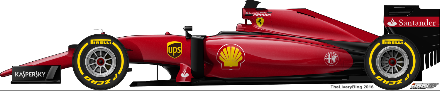
This was the easiest livery to predict. Ferrari didn’t do much wrong with their livery last season and that was helped by having arguably the best looking chasis in the field. However, I’ve made a couple of changes. The first is the universally disliked Scuderia Ferrari logo. Phillip Morris inspired or not, it just doesn’t look good. I’ve taken the lettering from it and tucked it away next to the air box with the Ferrari logo underneath it. The second is the return of a deeper, metallic red (I wish I could better accentuate the metallic paint). They’ve been using a flat, bright red for a number of years now and a return to that 2008 shade or one similar would be fantastic. A third change is the removal of most of the white. Most notable behind the Santander logo (wishful thinking, I know), it’s a look Ferrari haven’t really had since the early 90s. Would love to see something like this. Possible? Yes. Likely? Probably not while Santander are around.
Force India
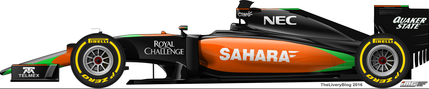
The 2015 Force India was revealed to a chorus of groans, with another load of dull colours unleashed into the F1 world. What I’ve done with this is bring back Force India’s traditional, vibrant colours. Black is still the main colour, but rather than drab silver, orange takes up most of the sidepod and bright green compliments the other two colours. I’ve also de-cluttered the engine cover. I’d be happy to see this on the grid!
Haas
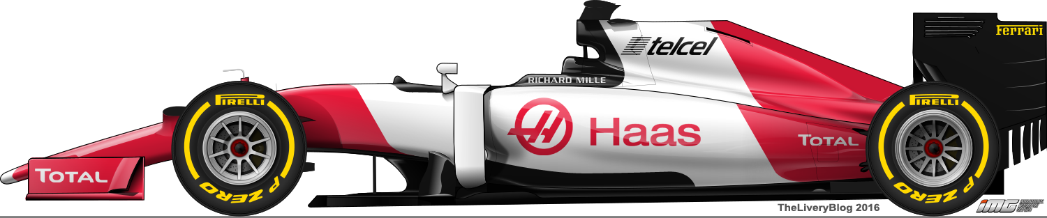
Unfortunately, I feel as though a lot of people will be disappointed with Haas’ first livery. Despite rumours of a Ferrari yellow livery, all official pictures and video released by the team point to a white, red and black colour scheme. With no word on the team’s sponsors, I’ve turned to the drivers’ personal sponsors for some inspiration. Now that I mention it, I don’t see Total fuelling Ferrari engines, but it’s better than a blank space. Either way, the shade of red chosen by Haas is lovely and importantly, different to Ferrari. The black is somewhat inspired by the later BAR/Honda liveries. It will be interesting to see which sponsors will be announced and I’ll be pleasantly surprised if there is any yellow on the car.
Manor
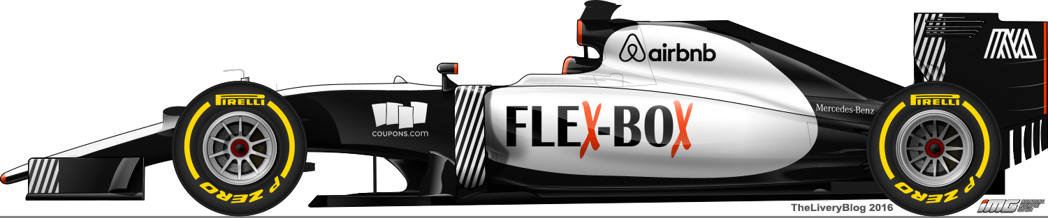
Until a few days ago, I had created a weird blue and orange livery, based on the colours on Flex-Box’s website. Since then, Manor released a new official logo which is straight black and white and has inspired me to start fresh. There’s been no word on whether or not any of Manor’s sponsors from 2015 will carry on to 2016 (apart from Airbnb), but it certainly helps get a livery started! I’ve decided to create a mostly plain black and white livery to match their new logo. It does slightly remind me of the West McLarens, but there’s no grey so I’ll let myself off. The black and white diagonal stripey bits are also based on the new logo and add some texture to the very basic colours. I’ve also included orange (as mentioned above, Flex-Box has orange in their logo on their website), to add some vibrancy and it pops on the black. It also creates a bit of a 60s BRM feel. Whatever happens, I do hope they move away from the red white and black, as not only is it getting old, but I’d hate to see Manor and Haas produce similar liveries.
McLaren
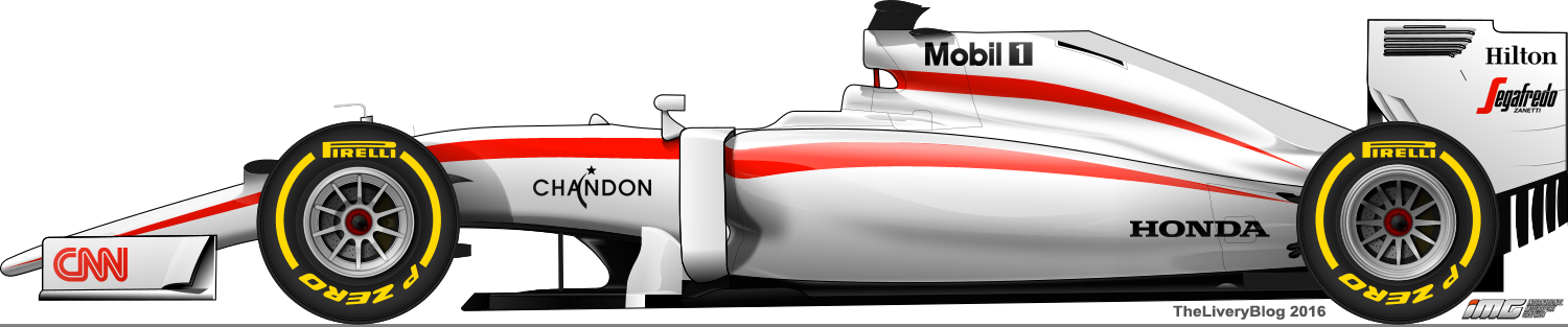
The 2015 livery disappointed me on a number of levels. The first livery was boring and the level of disappointment was heightened by the expectation of the exciting new Honda partnership. Despite this, I thought the sparkly black that was used was unique and attractive. Later in the season, everyone was happy to see McLaren acknowledge the fact that people were disappointed and create something new. It was a decent livery, but unfortunately the sparkly black was gone, and the hideous bordering of the red sections remained.
I tried for days to create something with McLaren’s black and I couldn’t make anything I liked. I finally succumbed to my heart and reverted back to my prediction from the start of last season and went with Honda white. Suddenly, my creative juices were flowing, but knowing McLaren and a certain Mr. Dennis, I made sure to restrain myself. I decided on a very simple design, which retains McLaren’s orangey-red, but on a white background instead of black. The red lines flow from end to end and make a blank canvas a little more interesting. I’ve also added a couple of semi-realistic main sponsors, in Aegon and MasterCard (boring industries lol) just to see what the McLaren might look like with a full sidepod.
Mercedes
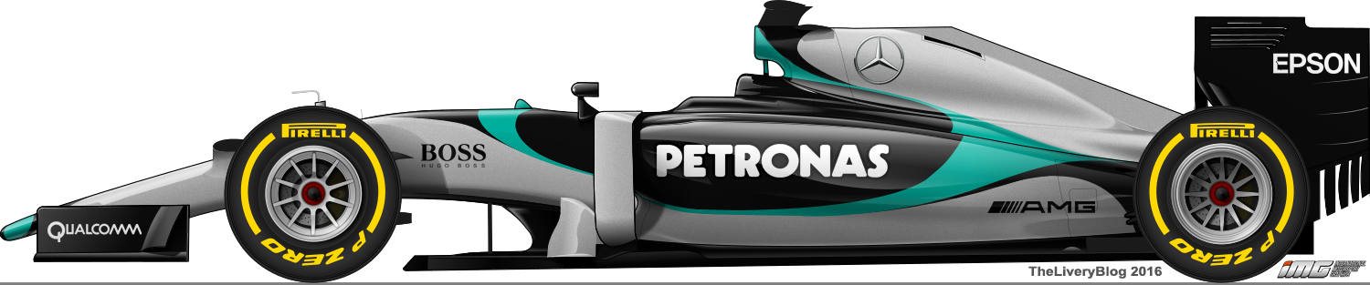
If there’s any team I struggled on more than McLaren, it was Mercedes. I have to give credit to Mercedes; it was terribly difficult to create anything attractive with the silver and turquoise, so they’ve done well to not produce any awful liveries the last few years. That said, I’ve had to go for something quite unrealistic, both in terms of colour and design, in order to make something I considered semi-attractive.
A lot of black on this and I’d be happy to see more of a third colour to break up the other two on the real car. The swooping design may be a bit much for the usually classy Mercedes, but I’m hoping a more metallic silver at least could make for an exciting change for 2016.
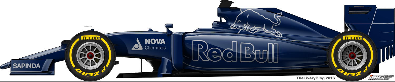
Red Bull
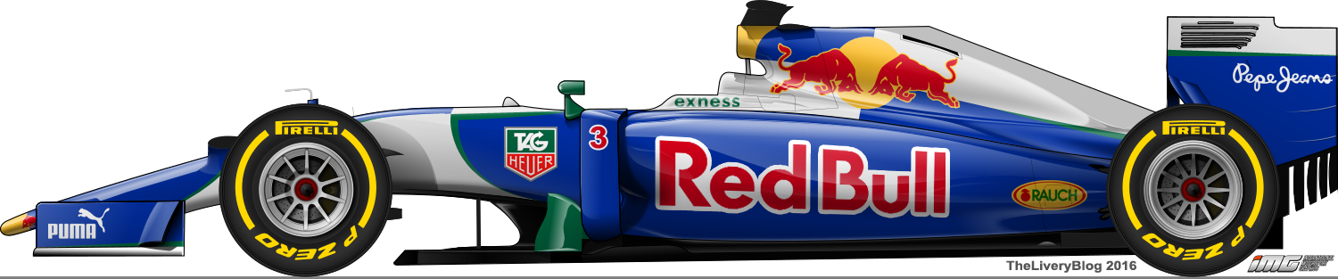
This would have to be one of the most ambitious of the lot, but for good reason. Infiniti are gone, as are Renault (well, at least by name), therefore, two big colour components, the large areas of purple and Total red, may be off the car.
The big changes I’ve made are the Red Bull logo going back on the sidepod and the Red Bull can design on the engine cover, with the double bulls as opposed to the one big single bull. Another big change is green as the highlight colour. With Tag Heuer coming on board, I’ve taken the liberty of using their green to border some of the silver sections from the blue. The more I look at this one, the more Sauber Petronas I see. Whatever happens, a break from the usual would be great. That said, last season’s livery was the biggest change in years.
Renault
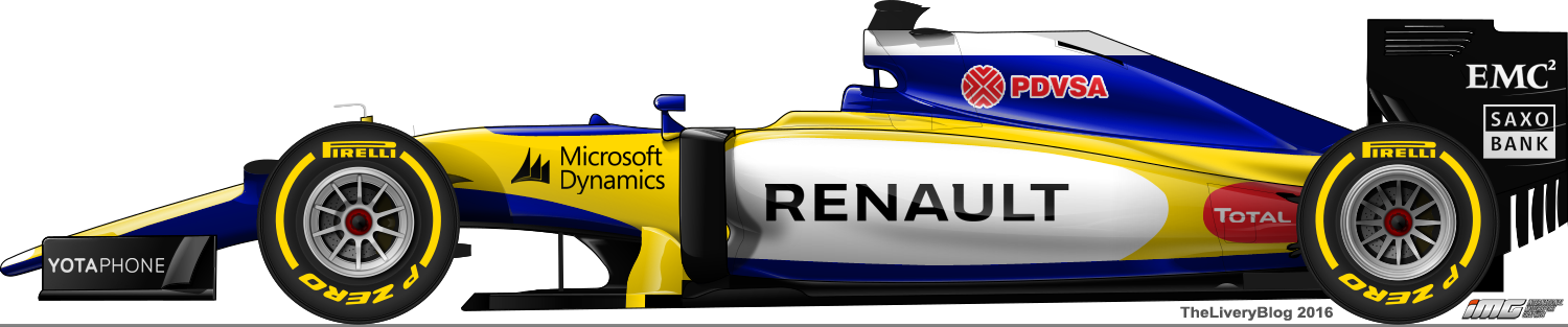
Renault is back as a constructor and I’m sure I’m not the only one happy about it! Most fantasy liveries so far have been yellow and black (and white), but I have a feeling that they will follow in the footsteps of the Formula E team and go with yellow and blue. The blue used by the Renault eDams is beautiful and I’d be stoked if the F1 team used something similar. I’ve gone with four main colours, which is risky, but I feel as though it’s not overwhelming. Regrettably, I’ve added a bit of red for PDVSA (yes, I believe Maldonado will stay) and Total, and while they do throw out the balance, I have to remain realistic. It does give off a bit of a Mild Seven feel though, doesn’t it.
Sauber
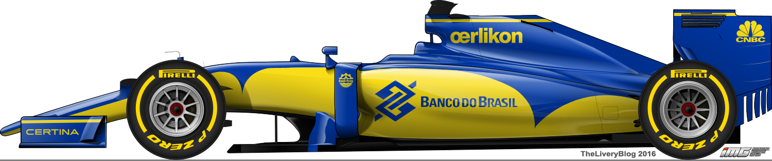
Sauber were spoilt with two colours that were not only great individually, but beautiful together. Unfortunately, they slapped us in the face with a boring, uninspired livery which disappointed me immensely. I’ve tried my best to make up for their mistakes with this effort for 2016. I’ve made it completely two tone, getting completely rid of the white and making the most of the great colour combination, with the top half blue and the bottom half yellow. The spikes have a bit of a GP2 vibe, but I feel as though the horizontal yellow lines give some F1 style class, creating a nice balance. Please Sauber, don’t let us down this year!
Toro Rosso
This is very similar to my mockup from last season, but with even more justification. Cepsa and their loud red rear wings are gone and my hope for a simple livery grows. I’ve banished red and gold from my livery entirely and this creates, what I feel, a beautifully simple livery. The complicated, dated bull is gone and replaced with a simple, clean one. The Red Bull logo too is less obnoxious in its outlined state. The subtle pinstripes add some depth and the rear wing now contains an outline of the Red Bull can design. Unfortunately, it’s unlikely that we’ll ever see anything like this, but it’s not impossible.
Williams
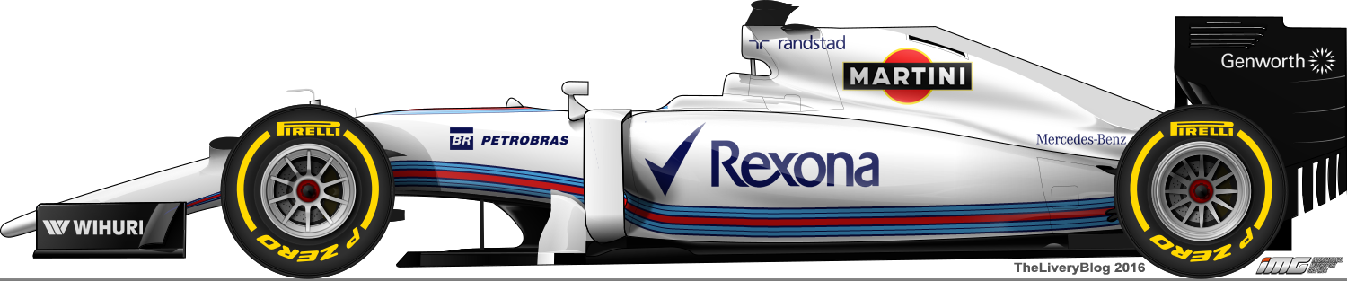
Last but not least, Williams. The introduction of the Martini livery was loved by all and still looks good. However, next season could be a chance to change it up a bit. I’ve gone with the Martini stripe along the entire side of the car. It’s something I don’t entirely believe is better than what they currently have, but it’s different. Three years with an identical livery is too long in my opinion. Small changes year by year (like Sauber and Jordan in the 1990s and 2000s) allow for a team and sponsor to be refreshed and re-loved for another couple of years.
Well these are my thoughts, hopes and expectations for the coming season. Let’s see just how happy or disappointed we will be come February.

That McLaren gives me some Super Aguri vibes! You should design all F1 liveries, that would be a huge improvement.
LikeLiked by 2 people
Someone hire me! haha
LikeLike
Hi Theo, do you have an email address, we’d love to share these liveries on our website. Thanks. Ryan – Grand Prix Times.
LikeLiked by 1 person
Hi mate, my email here is theliveryblog@gmail.com. Look forward to possibly getting an email!
LikeLike
Love what you did with the Ferrari, and I agree the white all over the car ruins what could otherwise be a beautiful livery.
LikeLiked by 1 person
Great designs. I do think Haas will look more like the NASCAR livery with black playing a bigger part. They ran a retro livery at Darlington last year that was pretty cool that used silver that looked great under the lights
LikeLiked by 1 person
Hi, we are looking for a fantasy livery of an F1 or FE car with our Dloky logo, do you have any suggestions?
LikeLike
Hello, feel free to send me an email at theliverblog@gmail.com with more details!
LikeLike
I’m a bit ruffled because of your explanations?
LikeLike