The break is finally over! F1 is back with a bang (and not just in a positive way), with a memorable race in Melbourne. It finally seems we can stop complaining about the grid being so dark. It’s not quite 2000, but I believe the field is just about sufficiently vibrant. Let’s have an in depth look into this year’s liveries all at once, along with how I would improve some of the liveries.
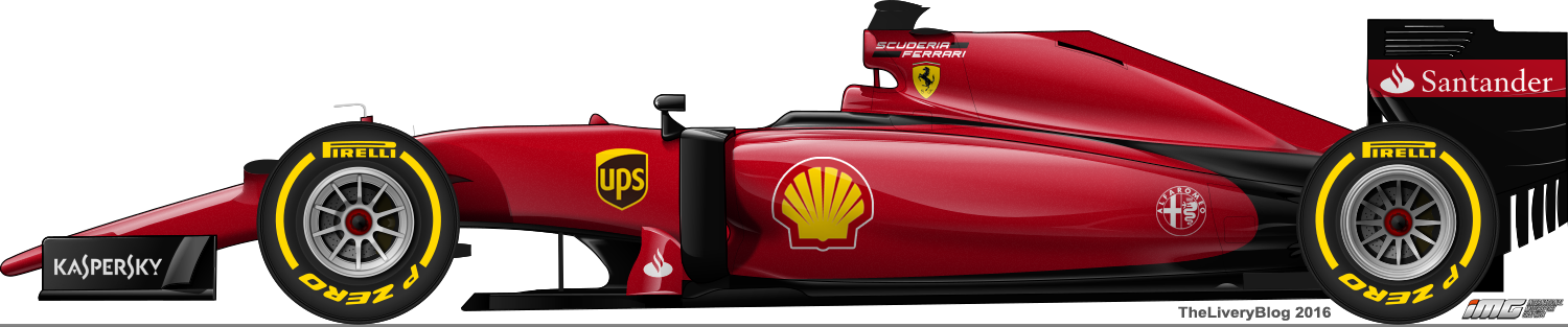
Ferrari

Minus the white, I was kind of close with my mock-up. What I’m pleased with is whilst I wanted a dark Ferrari, the added white looks fantastic. It’s the biggest change Ferrari have made to their livery in a long, long time and so glad that they’ve finally made that call. There are a few things that annoy me, mostly the pinstripe along the bottom side of the car. I’ve warmed up to the wavy black section on the engine cover, but it still bugs me how different elements and shapes of the design slightly clash with each other.

The red, white and green Italian flag stripes on the front wing endplates, airbox and barge boards (are they still called that?) are a great addition, but again, the number of different, clashing design elements keeps rising. That said, I can’t help but enjoy looking at this car. Perhaps it’s the big change that sweetens the deal for me, but I’m very happy with this. It also looks great from the front, with the front and rear wings half red, half white and the white beside the drivers’ helmets.
★★★★☆

If I was to make any changes, without deviating drastically from the actual design, it would be to remove the pin stripe along the bottom of the sides and allow the white to run all the way to edge of the engine cover.
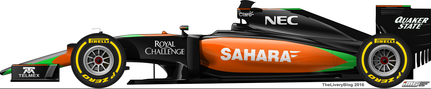
Force India

I’m pretty disappointed that Force India retained their 2015 livery. They’ve got some great colours to work with and they’ve decided to stick with black and silver. It’s a dull livery that blends into the scenery. Dark liveries can look exceptional and a car doesn’t need to be brightly coloured to stand out, but this one doesn’t live long in the memory.

The silver used isn’t very bright and the fact it either has the surrounding black or the tarmac to reflect off of is what adds another level of gloominess to the livery. Perhaps a highly metallic, or sparkly silver would help solve this problem to some extent, because at the moment, you have to look at the car from very specific angles or in just the right light to even be able to distinguish the sidepod sponsor. The small flashes of orange and green are just fine and like I said above, you don’t need lots of vibrant colour to have a good livery, but it’s probably the only thing I can say I genuinely like about the car. I feel as though there should either be a gap between the green/orange lines and the silver all the way or no gap all the way, not both.
★★
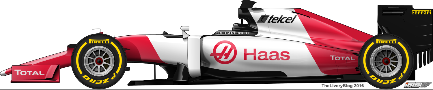
Haas

Improvements already at Haas! The silver has been replaced with plain white and the livery is all the better for it. It’s avoided being dull a la Force India, with the white opening up the car to some brightness, and contrasting well with the black and grey, whilst also complementing the red.

I do like the straight horizontal line along the side and how it sweeps up, meeting with the black on the way, which also separates it from the white along the top. The red line on the rear doesn’t bother me as much as it did at launch, but I wish it ended more sharply. The front is probably the weakest part of the livery, with the grey section on top not wide enough (I’d have preferred it to stretch the entire width of the nose section) and the red sort of joining in from nowhere. The endplates in red look great and the Haas logo on the side looks way better on a white background too.
★★★★☆

Not much I’d change, apart from sharpening the red line on the rear and a slightly different interpretation of the design on the front.
Manor

I think a lot of people reacted positively to this livery purely out of desperation for colour. I can’t deny that it’s good to see orange on the grid again as well as the blue (orange, blue and white are a favourite combo of mine, albeit with navy blue), but it’s not a particularly strong livery. It’s very simple, which isn’t always a bad thing, but it does look rather empty. It could definitely use another sponsor or two!

This will slightly contradict my comments above, but I don’t feel as though these specific shades of orange and blue work that well together. Perhaps it is the black that is the unwanted colour in this situation and without it on the body of the car, the other colours would work just fine together. That said, the black section behind the driver’s head looks great, so maybe the answer would be no white. The Manor logo hidden in the engine cover also looks a little strange to me and it may have looked better if it a slightly lighter shade of orange, as opposed to a darker shade.
Overall it does look a little empty and despite bringing some new colours to the grid, the 2015 livery is a far better design.
★★☆

What I’ve done here is removed the black from the rear of the car and extended the other colours all the way to the exhaust. I’ve added some piping behind the drivers head and airbox, where there was black before. The orange Manor logo on the engine cover is a lighter orange as opposed to the current darker orange and the logo on the sidepod fills in a big empty gap. Overall I feel this version is a little neater and has less colour clashes than the current livery.
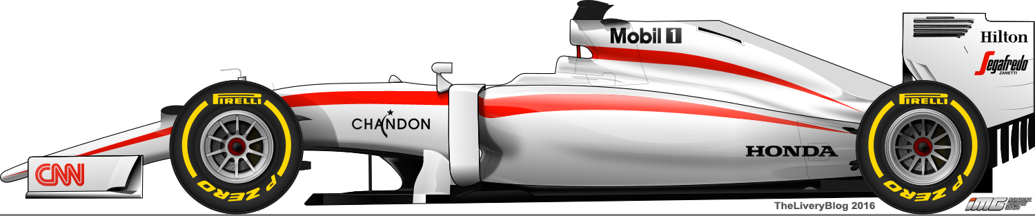
McLaren

McLaren have a plain livery which, unlike Manor, doesn’t look so empty. There are a few sponsors there to fill in the gaps that are placed well, which make up for the lack of actual design elements and help to make the livery less boring.
The charcoal colour used isn’t my favourite, but it’s definitely in a sweet spot ensuring it’s far from ugly. I’m so glad to see the back of the stripes on the nose, and the red on top of the sidepods and the engine cover look pretty good. Shame that the faux-3D borders remain.

The best thing about this livery is that everything is uniform. That alone gets a big tick from me. However, what bothers me most is the number on the nose, which is warped outward at the top. It looks as though it was designed to only work from one angle, but even front on it looks strange. Not sure why they decided on using that.
★★★
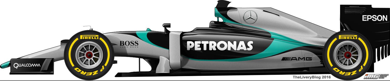
Mercedes

During the off season, we were told that the new Mercedes would have less black and more turquoise. I guess they kept half of their promise, with a little more turquoise, but the large areas of black remain, and this is what brings the livery down in my opinion. The turquoise design on the side is actually quite nice, but it fades into the black at the bottom, and I feel as though a sharp end would have been nice. Same goes for the shadow bordering that section. I’m also not a big fan of the smoky black on the engine cover.

The thin turquoise lines in front of the cockpit remain and are a nice touch, as is the full turquoise on the rear wing. The black endplates are just fine, but what this livery needed was less black everywhere else. Some black is probably necessary as a background for the silver Mercedes logo on the engine cover, but it doesn’t have to spread over so much of the car.
At the end of the day, a return to a 2011-2013 style livery would be a little more pleasant, although a more drastic change would be well received.
★★★☆

I’ve removed a lot of the black shadow sections in my version. It’s probably obvious by now, but I’m a fan of clean liveries (not exclusively though!) and taking out these parts give this result. Not done much else, but making these helped me notice just how few sponsor logos are actually on the car. They’ve done a good job of disguising that fact. It doesn’t look empty at all, so kudos for that, Mercedes livery designer!
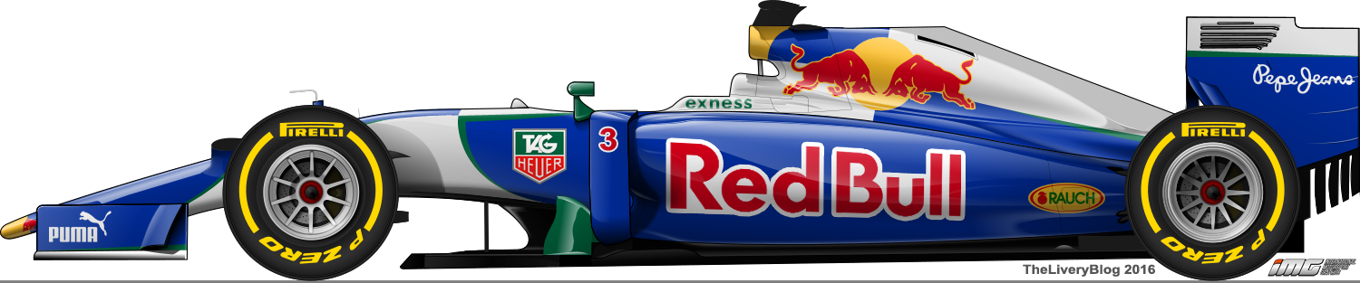
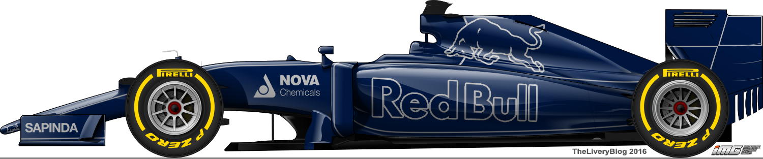
Red Bull

Of all the cars on the grid, the Red Bull is quite possibly my favourite. The matte finish is interesting, and the deep navy blue looks great. What I like most is the Red Bull logo without the outline. It’s a brave change which works so well because of the super bright, almost fluorescent red that is used. It contrasts well against the navy blue and whilst it looks great in photos, it pops even more in the flesh, as I witnessed at the Australian GP.

The simplicity of this design is a welcome change from the complexity of recent Red Bull liveries. All it is really is a couple of Red Bull logos, the bull on the engine cover and a thin red line long the side of the car, but there really isn’t much I’d change. If anything, I’d remove the yellow outline on the bull as I don’t feel it is needed. Even the Total red on the endplates doesn’t bother me!
★★★★☆
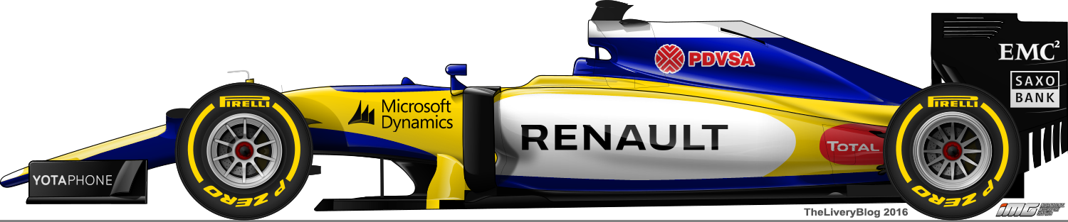
Renault

They said they’d be changing to a yellow livery for the start of the season and they weren’t kidding! It’s basically the same design as testing, but with the colours inverted and with a matte finish. I love the yellow used and it’s great to see another vibrant splash of colour on the grid. The matte finish is nice and in some angles it even gives off a pearlescent look to the paint, which I’m sure the team put a lot of effort into achieving.

That said, I’m torn as to which version I like better. The yellow colour is fantastic, but where the black design looked sleek and classy, this one looks a little empty and lacking in design. It looks quite plain and the nice little touches, such as opposite colour on the inside of the wing endplates, are missing on this version. However, the honeycomb design on the rear of the car is actually a reflective gold colour, which is a nice bit of intricate design.

The livery does look a tiny bit lacking in the end, but the choice of colour makes up for the absence of extensive design work.
★★★★
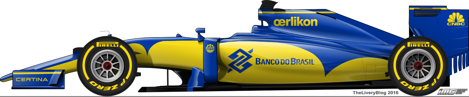
Sauber

Unfortunately, Sauber too have stuck with their 2015 livery. It’s an incredibly underwhelming design in my opinion, although I know there are plenty of people that disagree with me.
The sidepod design is very simple, but I think what hinders it is the white that borders part of the yellow section. The blue and yellow contrast superbly and the white in between is simply a hindrance. The nose design has the same problem, but this whole parabolic section completely ignores the squared off shape of the nose, which is a big no-no for me.
The worst thing has to be the rear wing endplates, which have a number of different logos, adding way too many colours in one space, harking back to the days of the struggling backmarkers of the early 90s. It’s not a good look and oozes cheap and nasty.

I actually contacted Sauber specifically about their livery, who were nice enough to reply to me! They did mention to me that the team’s colours are blue and white (so no plain blue and yellow car like I suggested), with yellow not extending beyond the sidepod, as this is all that the Banco do Brazil sponsorship entitles them to use. A limiting factor for them (and every team I guess) was weight, and I can only assume the simplicity of the design is to keep excess weight to a minimum. Cost also plays a big factor in that.
I was very humbled to get such a detailed reply from Sauber and for that I am thankful. While I understand how much goes into these liveries beyond just creative ideas, I do wish they would go for something more adventurous or at least something simple but classy.
★★

I’ve removed the white from the sidepods to allow the blue and yellow to contrast well. The yellow on the nose is all white now, fitting with the team’s colours and I’ve added some more small white sections in front of the cockpit, behind the driver’s head and airbox and on the engine cover. These help to fill up the otherwise boring and empty car, without adding much weight. Interesting doesn’t always mean bulky and heavy. The rear wing is still a mess, but fiddling with the sponsor logos wouldn’t be realistic.
Toro Rosso

Toro Rosso is the team that consistently disappoints me year on year. This year, much like past years, their livery is too messy, owing to the busy bull on the engine cover, Red Bull logo which is oddly squished onto the sidepods, the picture of the Red Bull Cola can (full colour pictures almost never work) and the design in front of the cockpit. There is too much going on and little to no uniformity, apart from colours I guess.

Speaking of colours, the navy blue is a great, but something irks me about how it works with the red, white and gold. The gold especially is a dull shade which I’ve never liked (at least in this combination of colours) and thought that perhaps a chrome version would work better, but that would further add to the dull feeling as it would have nothing bright to reflect off of, but something different would be great. The little design in front of the cockpit is just strange and doesn’t fit in with the rest of the design at all. The car would have looked better without it. With their decent pace, hopefully they’ll pick up a sponsor that will dictate some of the livery and change it up a bit. That’s my only hope at this point.
★★☆

I’ve taken some liberties with this one which is frustrating because I wanted to keep these as realistic as possible, but every time I fiddle with Toro Rosso, something creative pops up on the canvas. I’ve removed all the gold, which was most notable on the nose, but it really helps open up the livery. I’ve upped the presence of white and created an interrupted red and white striped design along the side. Also, the rear wing has a Red Bull Simply Cola that isn’t a can, which works infinitely better than a photo. However, I have kept the bloody bull on the engine cover and the obnoxious Red Bull logo on the sidepod, for the sake of real world accuracy.
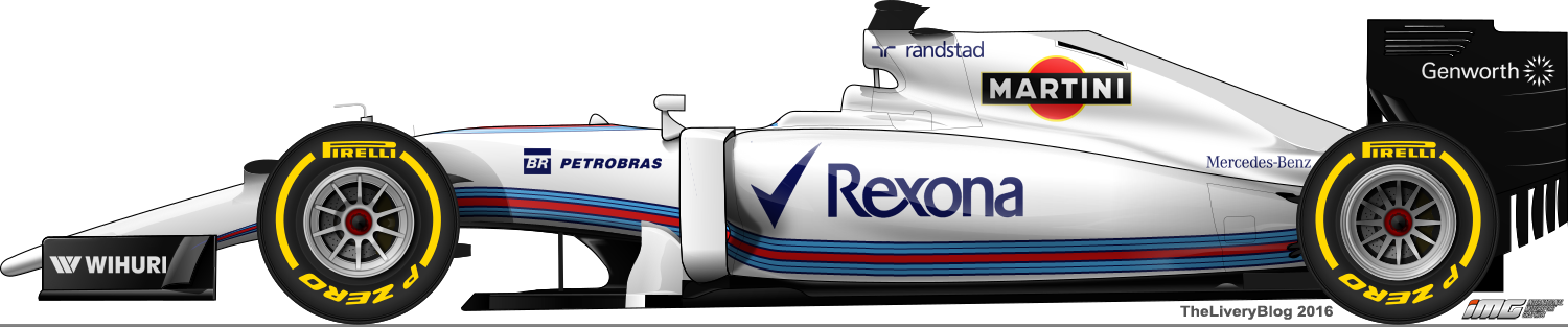
Williams

Williams is the same once again. It’s still a great livery, but we are now at a point where one more year could be too many. However, if history is anything to go by, we may be out of luck. Williams seem to have a tradition of sticking with the same livery throughout a main sponsor’s time with the team. This meant mainly unchanged Fly Saudia and Rothmans liveries for four years, Compaq/HP for five and Cannon for a solid nine years. If this is anything to go by, we’ve got at least one more year to go, sponsorship contracts permitting.

The livery itself is nice with the sweeping Martini design starting on the nose supports, running along the sides of the top of the nose, sweeping up over the driver’s head supports, before blooming on the engine covers. It’s a lovely design and impressive considering it’s one long unbroken piece of design. The black endplates are a great choice, as is the black that runs sneakily along the bottom of the car. All the sponsors are uniform which please me immensely and helps to create what is a very neat livery.
That said and as mentioned above, I do hope they make some alterations next year, no matter how slight, in order to keep their livery fresh and interesting.
★★★☆
A mixed bag this year, with some gorgeous liveries and some boring ones, some bright and some dull. All in all, this year’s grid is certainly easier on the eye in comparison to last year. There’s always room to improve but I’m quite content for the time being.


