
We’re ready for another year of Formula e action! Some massive players have joined the game, bringing many positive things to the series, but design inspiration isn’t one of them. It’s a tale of two colour schemes: Red/Black/White and Turquoise highlights. The majority have gone with one of these options, making the conscious choice to blend into the crowd rather than stand out, which is an unbelievable marketing choice if you ask me. It also leads to one of the least exciting full grid photos, possibly even more so than the 2015 F1 field.

Few flashes of vibrant colour, just like that F1 season. Either way, let’s dissect what each team has brought to the table, and hopefully we can pick some positives so we don’t leave feeling too disillusioned. For the sake of something different, lets go in reverse alphabetical order.
TAG Heuer Porsche Formule E Team

Porsche is one of the newcomers this season, and have taken a scalp, stealing the ever competitive Lotterer from Techeetah. He’s joined by racing stalwart Neel Jani. Their driver choices have been inspired, but their livery is not. It certainly follows their identity across other racing series like WEC, but unfortunately that identity is simply boring.
★★☆

The design gives me Minardi M198 vibes, in how the livery is split into three sections, with the same colours alternating as dividers to those colours. Maybe I’m a hypocrite in liking that livery and not this one, but colour choice is such an important aspect of overall livery design, and this red, black and white combination just brings no excitement to the table, the way the yellow does on that Minardi. It is not an ugly design, but I wish they’d entered the series with a bang, as opposed to something so corporate.
ROKiT Venturi Racing

Venturi have kept the same drivers as last year, and thankfully not the same livery. Unfortunately ROKiT has come on board, and the team have joined the red/black/white brigade. However, it is probably the best of that bunch. Whilst the red piping on that flows back from the nose gives me Mahindra vibes, it is really easy on the eyes, and works wonderfully paired with the flowing white pinstripe along the side.

It’s a well thought out livery which suits the shape of the car. I think I may have preferred jet black as opposed to the unpainted carbon, which looks a little flat rather than elegant or slick.
★★★★☆
Panasonic Jaguar Racing

Jaguar have brought in James Calado to partner Mitch Evans this season, and have persisted with their turquoise and black colour scheme. They’ve turned the dial up somewhat on the turquoise, which is now the majority colour on the top side of the car. I don’t mind this, but I do have an issue with the squared off design on the nose, which ruins the flow of the car’s otherwise sleek shape.

The side of the car is virtually unchanged, limiting the turquoise to flashes on the floor and aero panels. It would have been nice to see the Jaguar itself in the same turquoise colour, but the current effect with the majority of sponsors and other decals in white works just fine. Not sure it’s an improvement, so I’ll keep their rating steady.
★★★
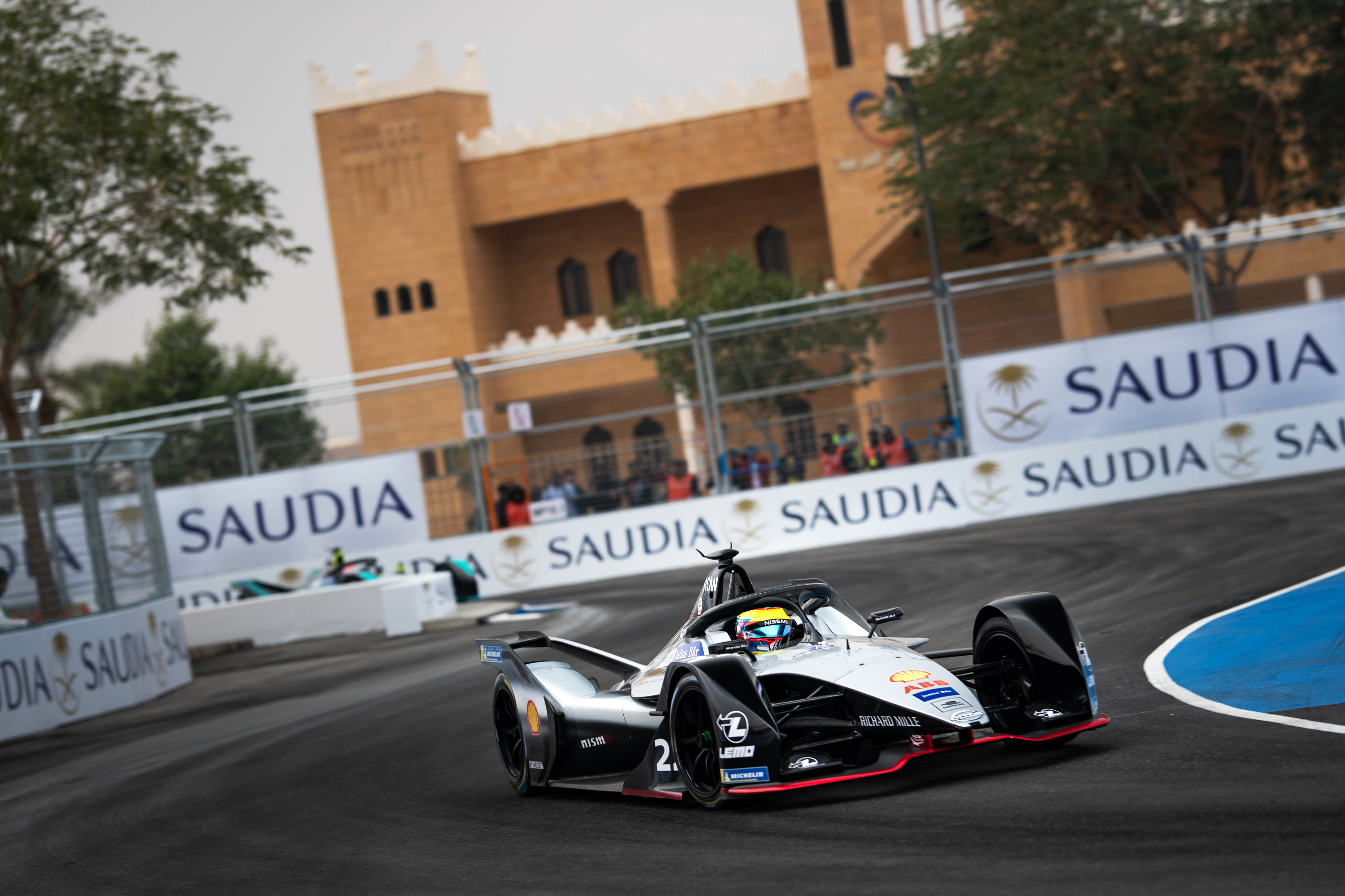
Nissan e.dams

Same drivers, new livery for Nissan. They’ve gone for the unusual with an asymmetrical design, perhaps following BMW’s footsteps from last season. It’s simply majority black on the right hand side, and majority red on the left (at least on the nose and top section of the car). The way the colours intersect make an interesting diamond design, but remind me more of Stade Rennais than anything to do with Nissan.

I’ve always thought of Nissan’s colours to be blue, white and red (thanks Gran Turismo), but perhaps this is what they’re embracing moving forward. They’ve also gone for a half black, half unpainted carbon effect, which may be a weight saving technique across the board, but doesn’t look that great, especially on the wheel arches. An improvement from last year, with the effect from front on really saving an otherwise average livery.
★★★☆
NIO 333 FE Team
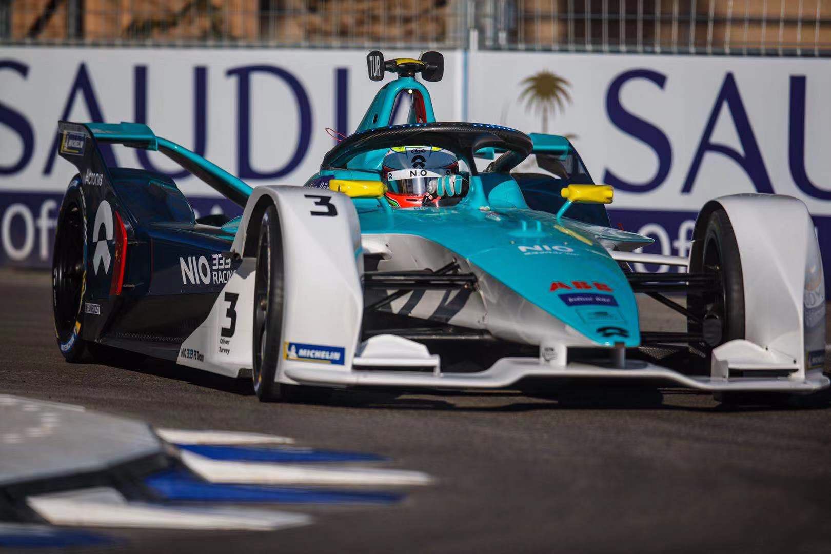
Ma Qinghua joins Oliver Turvey at NIO, starting his Formula e career with an absolute nightmare in Saudi Arabia. The team has gone a little more traditional with the livery this year, but have continued their turquoise and white theme, adding to it a little blue this time around. This would have been incredibly useful on last year’s livery, which was in desperate need of an extra element.

I’m a fan of the clean separation of the turquoise and white from the top to the side, whilst the same can be said at the back, showing off the curves of the car between the blue and turquoise sections. Simple, clean and effective, doing well with the shapes the car provides. Thilst the red highlights for Ma work well, the Yellow ones for Turvey aren’t quite as complementary.
★★★★☆
Mercedes-Benz EQ Formula E Team

Mercedes have entered Formula e with a driver lineup that could be competitive in any series around the world, in Vandoorne and de Vries. The biggest winner in my eyes however, is Petronas, who will receive a tonne of brand awareness via association (if anyone else’s brain works like mine), due to the similarity with the F1 livery. This is ironically unintentional given there is no place for an oil company in an electric series, but it’s funny to see the similarity between the highlight colour on both teams’ cars.

The theme is similar across both liveries, with the tessellating Silver Arrow design across much of the car and of course the base colour of silver being complemented with smokey black. This is the livery we all expected, but I don’t think can be disappointed with. It’s a great effort with enough care put into intricate details to make it a pleasure to look at in detail.
★★★★
Mahindra Racing

Mahindra have kept the same drivers, and have evolved their livery as opposed to making wholesale changes. The most striking aspect of the car is the chunky, blocky horizontal red section on the nose of the car. It’s a little disruptive to the flow of the bodywork, and the blue lines bordering it aren’t the most visually appealing.

The main change year on year is the removal of the alternating red and white stripes, which were my favourite element of last year’s livery. These have evolved to red and blue ones (such as the nose above) which aren’t as impactful and can be easily missed if not paying close attention to the car. In theory it’s a slight downgrade, but not sure why I rated it so harshly last year. Nice to see they’ve kept the Indian themed rim paint too.
★★★
GEOX Dragon
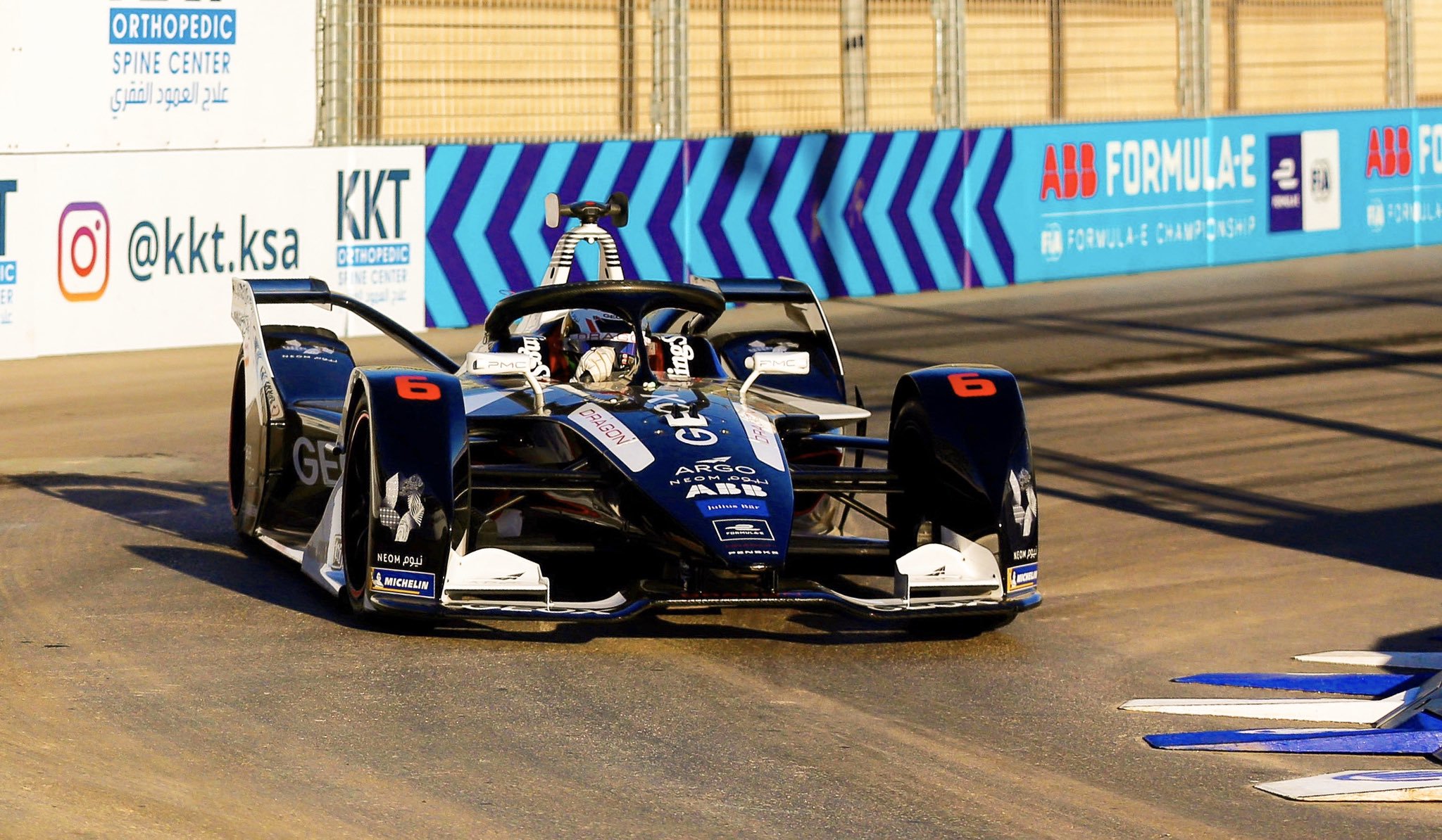
Dragon have changed their drivers with Hartley and Müller joining the team, but their livery theme has remained constant. You’d think black and white would be boring, and whilst many of the above liveries prove that theory with even more colours, this one is an exception to the rule. It’s a more or less 50/50 split between the two colours, depending on which angle you look at it from, with the red flashes providing a bit of excitement where the two other colours can’t.

The side black section looks fairly simple on its own but looks quite jagged when mixed with other sections of the car. The front is almost all black and looks super clean. The roll hoop is covered in a neat stripey design, in contrast to the remainder of the car. It’s a case of simple sections mixed with hard angles and a few intricacies to make a really nice design overall. Who would have thought the car with the least colour would be one of the best.
★★★★☆
Envision Virgin Racing

Bird and Frijns remain at Virgin, but unfortunately their almost perfect livery has evolved! To be fair very little has changed, but the main difference is silver being used instead of white on the top of the car. The contrast of the purple and white is what really put the livery on another level last season, whereas the silver really dulls this down. Also, being a matte silver, it doesn’t even stick out or sparkle from any angle, which is a shame as the pattern is really neat.

Not much to add given the rest of the livery is more or less identical. I’m still a fan of the deep purple, just wish they hadn’t made the change from white to silver!
★★★★☆
DS Techeetah

Techeetah have brought in da Costa to replace Lotterer, and with him a few minor changes to the livery. The most obvious change is the gold section on the nose being narrowed. The car loses the sharp effect of having the gold meeting the black right on the nose’s edge, which is what I enjoyed so much about it last season.

There’s now a gold pattern on the barge board as opposed to solid gold which is a nice touch, and the whole halo is gold this season, much nicer than the awkwardly cut off design from last time. Unfortunately the unnecessary complication on the nose/cockpit area brings it down a notch for me.
★★★★
BMW i Andretti Motorsport

BMW have replaced da Costa with Maximilian Günther, and have taken their livery to another level of mess. From front on, I can’t really gather any sort of coherent design. There are way too many colours that don’t really complement each other, and overlap is a way that may make a nice powerpoint theme or cover page design, but not quite a racing livery.

It’s a little clearer from the side, but the blue and purple still don’t suit each other, whilst the black also doesn’t really look like it belongs given white is already so prominent on the car. The jagged shapes don’t really work the way they do on the Dragon car either, and instead look messy instead of functional. The asymmetry just adds to the dysfunction. Perhaps I’ll like it more in a year’s time and will think I was being harsh, but I just cannot rate it any higher right now.
★☆
Audi Sport ABT Schaeffler

Not sure why every manufacturer wants red, black and white as their main colours these days, but I’m glad Schaeffler have kept some green on the car to ensure this car doesn’t entirely fade into the rest of the grid. Their driver lineup remains the same, but their livery has turned to the dark side, with black, rather than white, playing the main role.

It’s unassuming from the front, but actually has some really nice design elements on the side. The red and black stripes on the floor look great, as do the compartmental red and white sections on the sidepods. The green helps to break up the business as usual colour scheme on the engine cover. It does a decent effort complementing the template the shape of the car has provided. A nice effort in a year bombarded with red, black and white machines.
★★★★
Bonus Awards
Best Red, Black and White Livery Award – Geox Dragon and ROKiT Venturi
Two liveries with totally different philosophies, but both looks great in their own way. Dragon barelly qualifies, but there is red on the car!
Best Turquoise Livery Award – NIO 333 FE Team
It’s quite simple at the end of the day and I may have rated it too highly, but I really enjoy the clean lines and complementary colours. A big improvement on last season.
Hire a New Livery Designer Award – BMW i Andretti Motorsport
This just is not a good design. I’m free if you guys need me.


