As the first round concludes in Hong Kong, there is no better time to have a look at the how the Formula e grid lined up for the first two races of the new season.
Audi Sport ABT Schaeffler
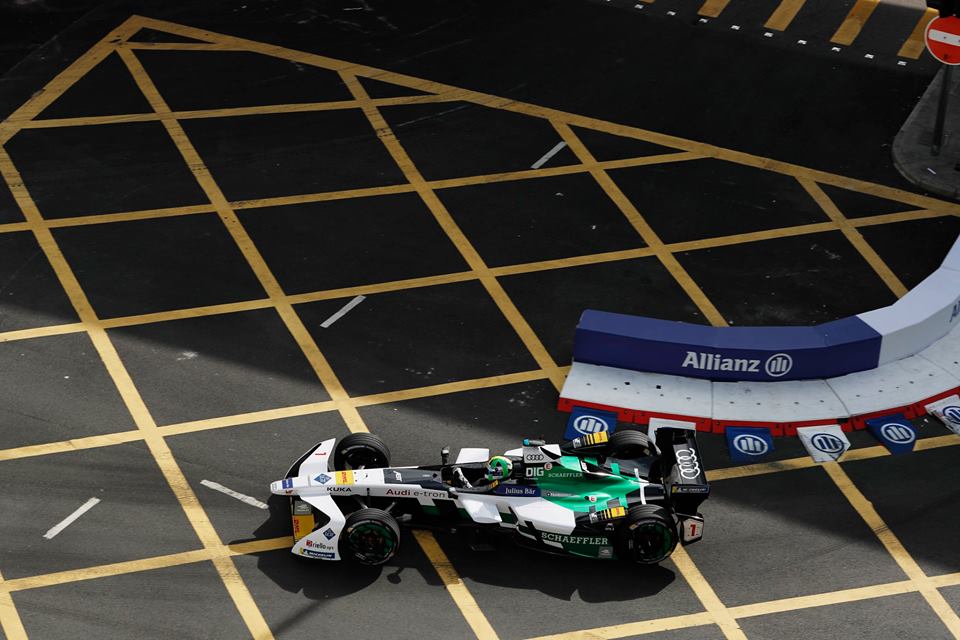
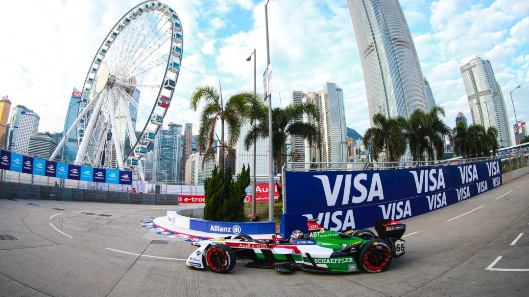
Abt Schaeffler is back for another year and this time with increased investment from Audi, which has now become an official manufacturer in the series. Di Grassi and Abt remain as drivers, as we see some significant changes to the team’s livery.
Audi has taken charge of the team and in doing so, the livery. Thankfully it’s not devoid of personality like their final WEC effort and have kept some of the original Abt Schaeffler character with the large green portion, although the distinctive yellow is now gone. Although I never disliked the yellow, it does now seem a little more coordinated with the all the colours not shouting for attention all at once like they were before.
The design is quite angular, as seems to have been the theme for Formula e so far. The main portions of colour are the green on the rear of the car, white on the sidepods and nose and black in front of the cockpit, although there are some interesting disruptions along the side where the colours interject. There is also a great red marking along the side and ‘airbox’ of Abt’s car, allowing for quick and easy distinction between the two cars. While they’ve turned down the colour, they’ve definitely designed a sharper and more refined livery this season.
★★★★☆
MS+AD Andretti Formula e
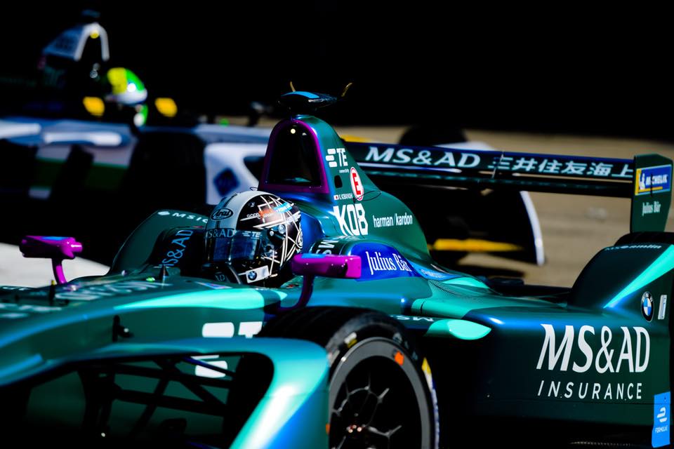
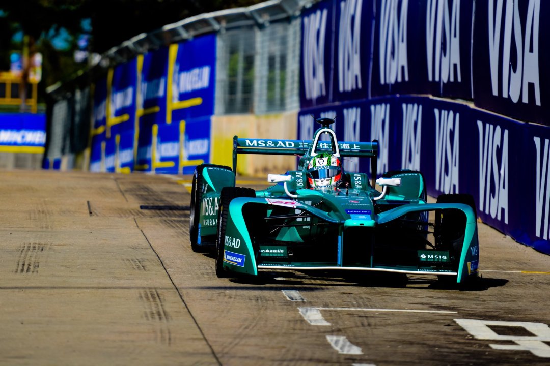
A big signature for Andretti in the off season, with Kamui Kobayashi joining the team for his first season in Formula e. They’ve also completely changed the livery, which I’m a little disappointed with, because last year’s effort was one of my favourites! The new 2017-18 livery is a two tone teal effort, which annoyingly infringes on NIO’s colour scheme, as they have moved from their grey/teal to a two tone teal livery this season.
Using another team’s colour like that will lose points for me, especially as it isn’t their first time doing something like this! Remember when Amlin moved from Aguri to Andretti, and Andretti used a near identical livery which confused everyone?
All that aside, the design is strong. It uses the darker teal as the main colour on the car, whilst the lighter teal highlights certain edges of the car. There are also some nice details on the side, similar to their wavy effort last year, but in the new colours. The light teal section on the top of the sidepods give me Sauber vibes which is nice. To distinguish their drivers, they’ve gone with white mirrors and airbox piping for da Costa, and purple for Kobayashi.
★★★★
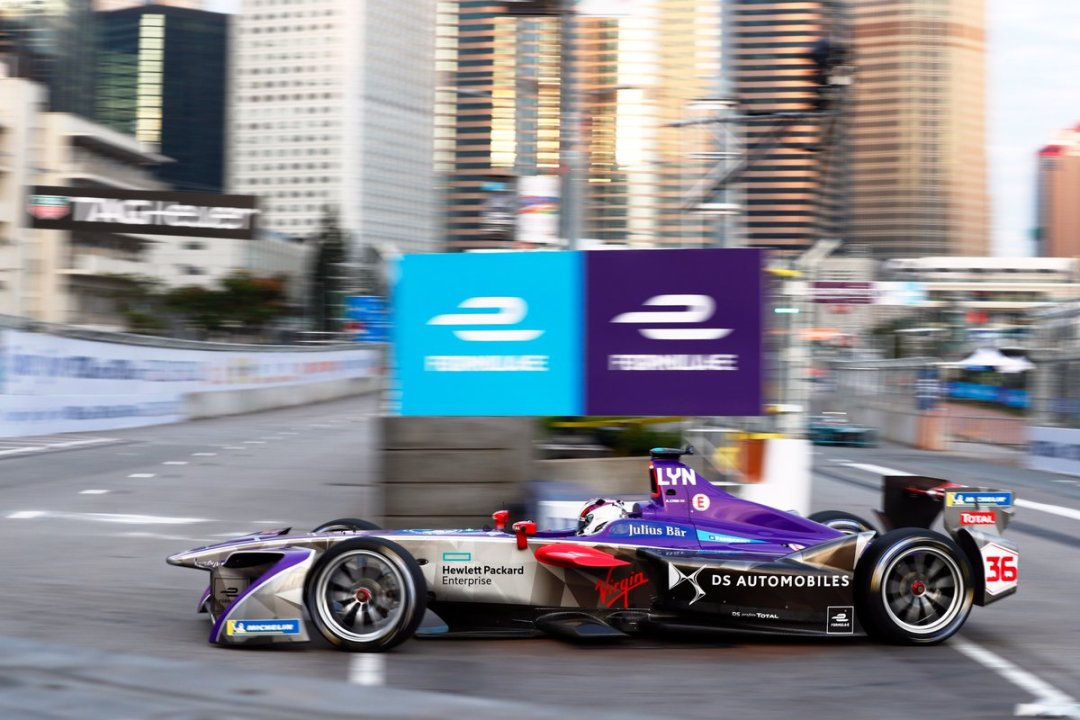
DS Virgin Racing
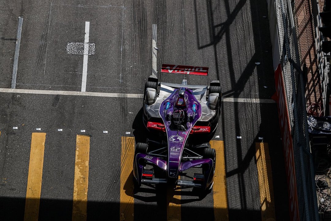
Sam Bird is back after a strong season 2016-17 and joining him at DS Virgin is fellow Brit Alex Lynn, replacing Lopez. Not much to say here with the livery relatively unchanged.
I am becoming slightly tired of this livery and would have hoped for a least a little bit of tinkering from season to season. Perhaps adding more purple or replacing some of the black for white just to keep things fresh. Instead, it’s getting stale in here.
★★★
Dragon Racing
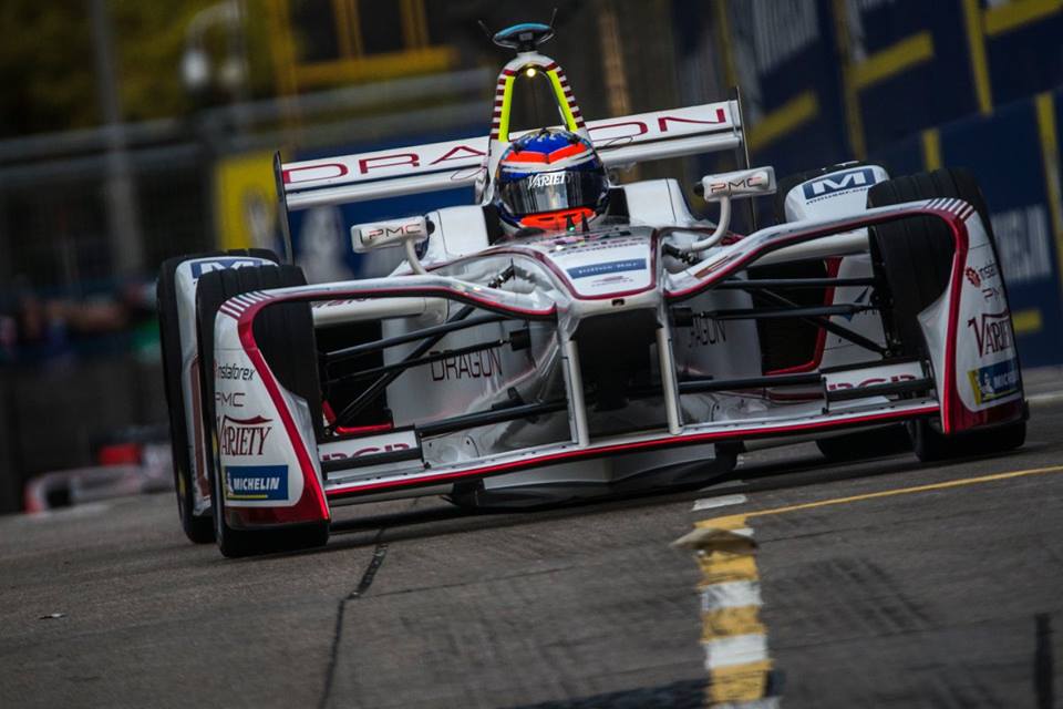
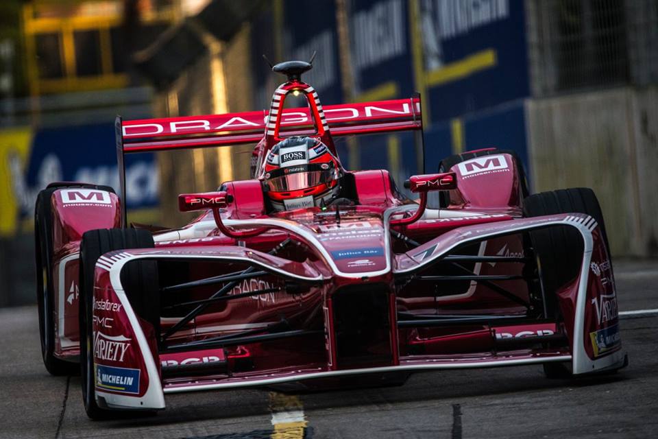
Duval out and Jani in for Dragon Racing, as they drop Faraday Future from their name entirely. Unfortunately they’ve also dropped their groundbreaking split livery from last season. It was a stunner and unfortunate to have only lasted one season, but it has been replaced with another great split effort.
They’ve gone with a lovely white and candy apple red colour scheme for Jani and D’Ambrosio respectively, with crisp piping along the edgy bodywork, which does appear to work very well with these design techniques. This red colour is one of my favourites to see on a racing livery, but I believe it looks just a little better with the dark piping on the light main colour as opposed to the reverse.
The design is intricate with neat little multi stripe segments, such as on the front wing, airbox and especially ‘engine’ cover. A great effort, but I do miss the unique design and burnt orange of last season’s cars.
★★★★☆
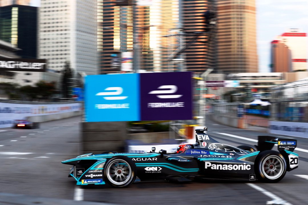
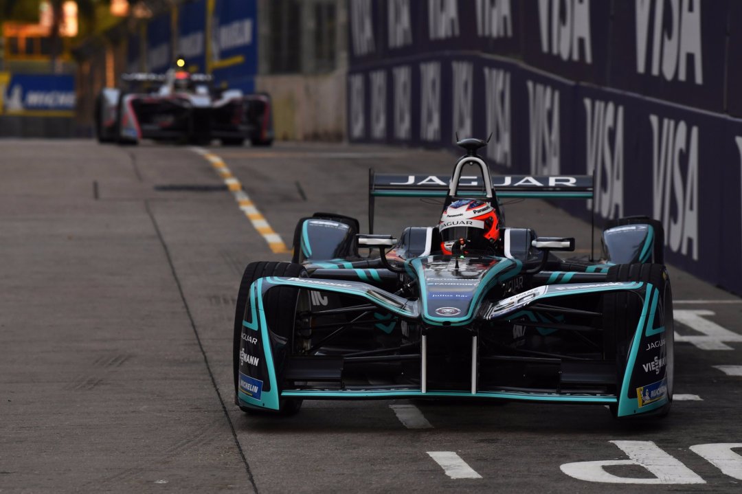
Panasonic Jaguar Racing
Nelson Piquet Jr. has moved across to join Mitch Evans at Jaguar this season. However, the livery has remained virtually identical. It’s the same futuristic, electric, circuit board themed design that everyone was slightly disappointed with last year after the (perhaps false) expectations of British racing green.
Perhaps this disappointment has faded because I don’t dislike this as much as last year and in fact quite like the vibrant cyan colour alongside the deep charcoal. Still not a fan of the gimmicky theme though…
★★☆
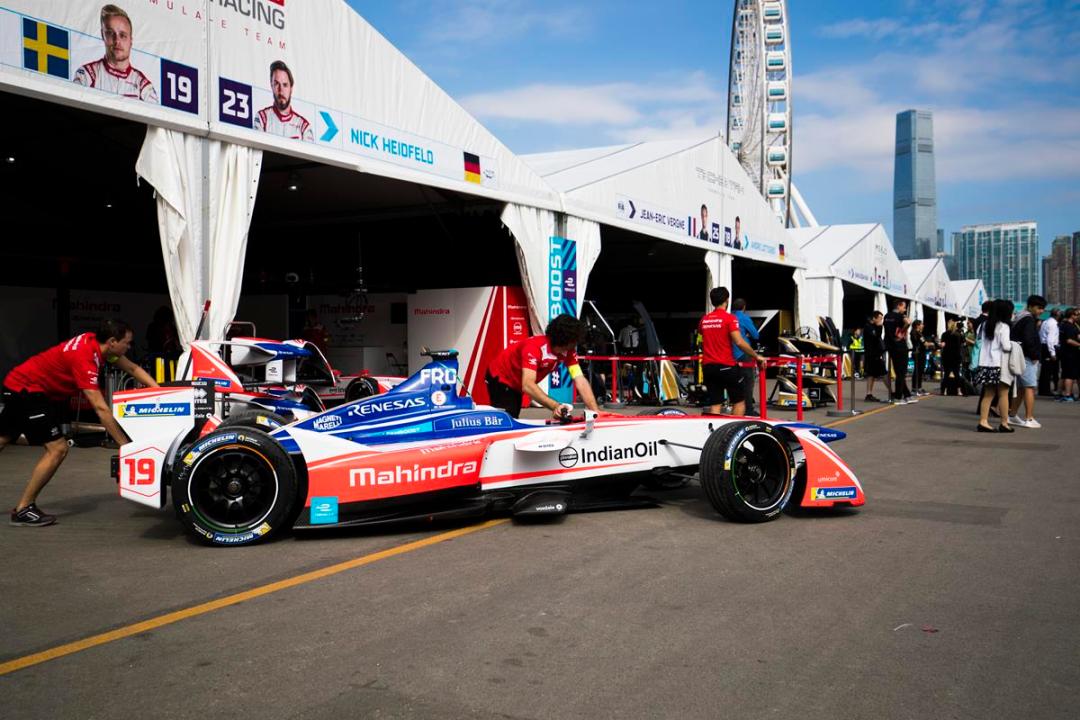
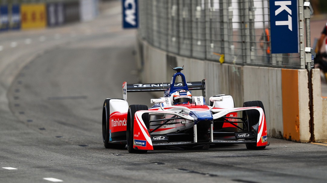
Mahindra Racing
It’s an unchanged line-up and another fan designed livery for Mahindra this year. Or at least I think so, as it looks a lot like last season’s livery with some added blue sections for Renesas. Perhaps they’ve not drawn the winner yet? Either way, this is a step down from last season, which was a very attractive mainly two colour livery with the vibrant red and blue not quite singing in harmony.
Not much more to add; it feels like a hurriedly adapted version of the 2016-17 livery for a last minute sponsor addition. Let’s see if anything changes in the coming rounds, because I got similar dodgy vibes last year with the fan livery.
★★☆
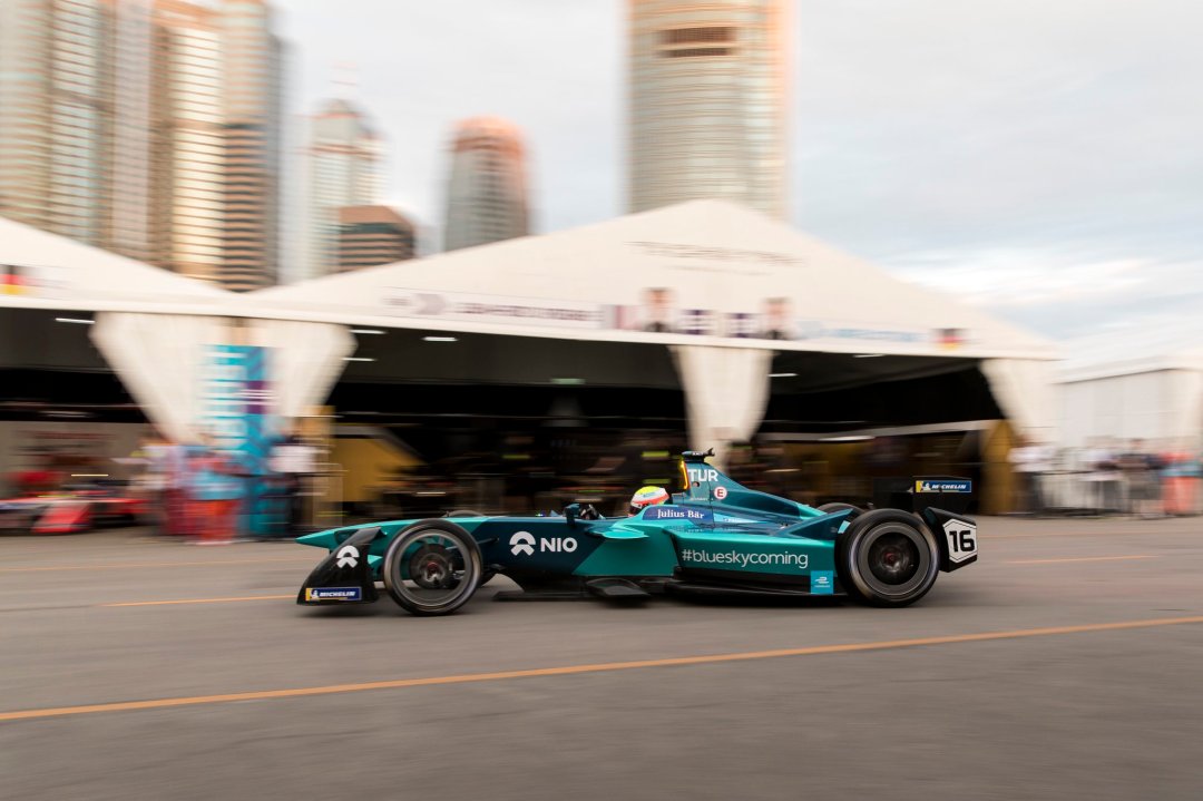
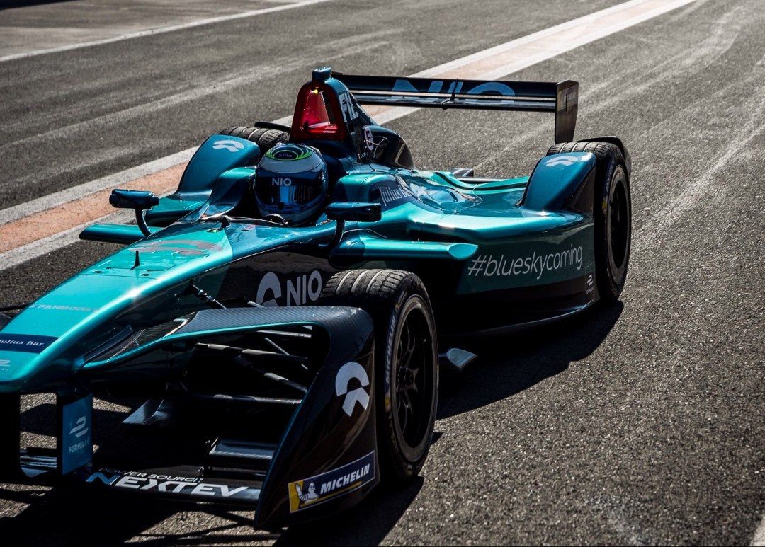
NIO Formula E Team
With Piquet moving over to Jaguar, NIO (now minus NextEV) have brought former IndyCar driver Luca Filippi to drive for the team in season 2017-18. They livery design theme is similar to last season, although with some big colour changes, moving to a two tone teal scheme. I feel like I’m repeating myself! Unfortunately Andretti have infringed on their colour territory, but pulled it off a little better too.
The thick diagonal stripe remains, but is now a dark teal, whilst the rest of the car is split between the dark and light teal. With the distinction between the two colours being very subtle its hard to get excited by this design. It’s just a shame we now have 4 cars in very similar colour schemes.
★★★
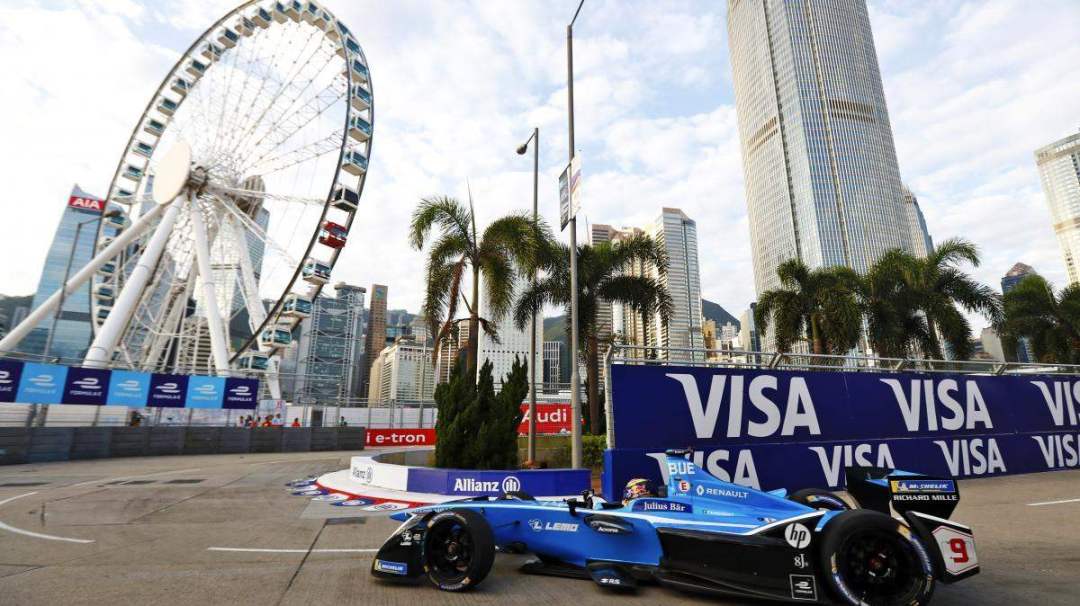
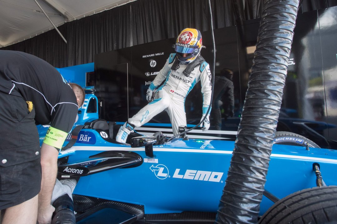
Renault e.dams
No driver changes and only some subtle livery changes for Renault this season. The main changes are that there is now no yellow whatsoever, the livery now has a glossy finish rather than matte, and black is more pronounced, extending along the sidepods rather than just on the wing end plates and wheel arches.
It’s still a lovely blue which was the main draw card last season, but the lack of a little punch of vibrant yellow brings it down a notch, and is not as eye catching. Perhaps the slow transition to Nissan has already begun!
★★★☆
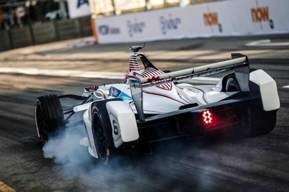
Techeetah
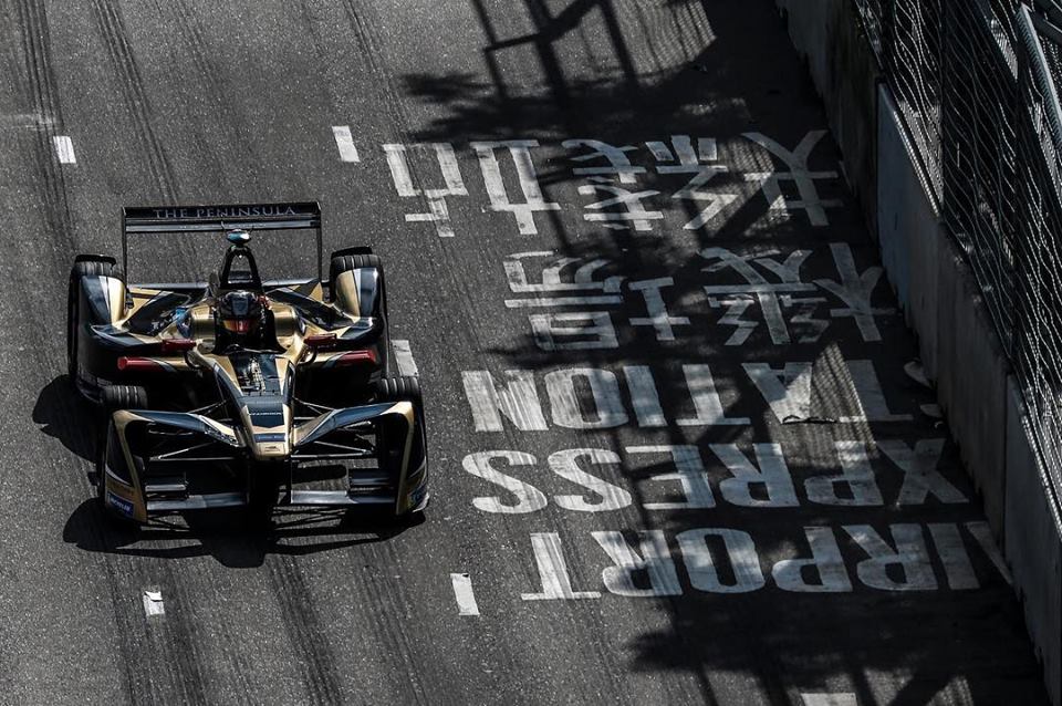
Techeetah have hired the services of open wheel and endurance veteran Andre Lotterer for season 2017-18, hopefully putting to a stop what was a revolving door of second drivers accompanyin Vergne. They’ve also thankfully made some changes to the livery, although I’m still a little wishy washy about it. It’s a tale of two angles here. In the above picture, it looks stunning. A great mix of black and gold in an edgy, angular design, with the gold looking as though it’s everywhere it needs to be.
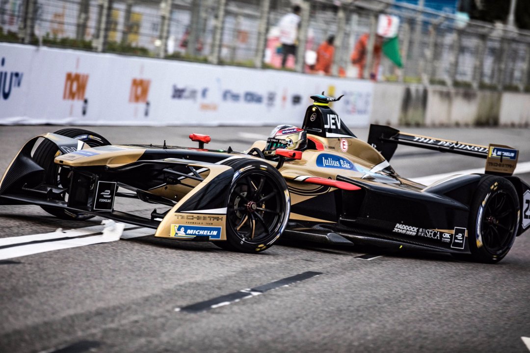
However, moving to a lower angle, side profile image, I’m less convinced of its beauty. Here, we get one large chunk of gold, proving that the colour is far prettier in smaller sections, as well as big black areas which look rather empty. I also feel sticking with a two tone black and gold livery would have been nicer than the including the little white sections lining the gold in parts. Either way, a definite upgrade on last year’s low quality effort. The stylised Cheetah on the side is also pretty neat.
★★★☆
Venturi Formula E
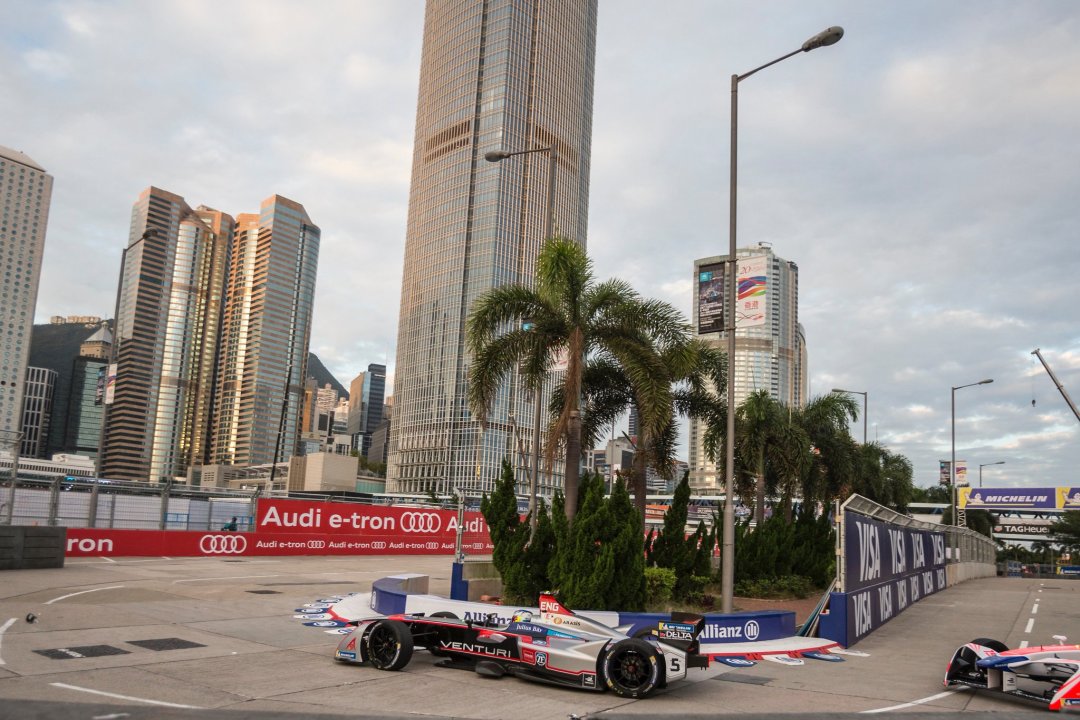
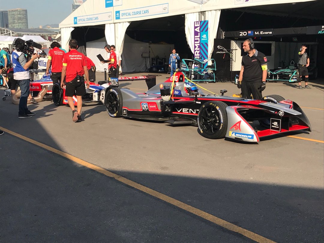
Finally to Venturi, who seem to have a turned a corner in pace, with the quick out of the box Mortara. They had one of the most interesting designs last year and have kept the same theme despite a significant colour change. Unfortunately it’s lost a lot of its charm in this configuration. Much of the sleek black is replaced with a rather dull silver, the two of which don’t work so well together, and the jutting section on the sidepod for ZF and Rohm has not been executed nearly as well this time around. The red lining of this section doesn’t look sharp at all, but I’m not sure if intentional or just an optical illusion from how it sits next to the silver.
The rest of the design is OK; the red and silver lines underlining Venturi on the black section beneath the cockpit actually looks great. It’s a shame they didn’t stick with black as the main colour and use red, silver and blue accents entirely.
★★☆
No 5 star liveries for me this season and unfortunately, mostly downgrades! What are your thoughts? Do you agree with my opinions or was I harsh on any of the teams? What’s your favourite? Let me know what you think below!


Sean Bull actually designed the livery for both the Dragon cars and won the contest held by Mahindra. Unfortunately Mahindra only chose to adopt a few aspects of his design (I.E. putting a bit more red on the top of the cockpit, a section which was white last year.) due to a new sponsor coming onboard (Renasas) who basically wanted their logo and blue colour on the car. So the result is a bit of a compromise, which from what I understand Sean basically agreed to. The design Sean sent in here also has a black section over the airbox quite similar to the blue Renasas section. http://www.mahindraracing.com/resources/cms-images/blog/the-final-stretch-what-inspired-the-20-drivenbydesign-finalists/14-united-kingdom-sean-bull.jpg
As for the Dragon livery, I liked the season 3 one as well, but Faraday Future are to blame not only for Dragon’s poor performance (I feel like when Dragon realised that Faraday were in financial issues, they substituted a replacement powertrain of a dying animal or something; it’s hopelessly slow) but also for taking away that amazing livery with them. I feel like Sean’s efforts weren’t in vain though; both cars look great, especially Jani’s.
I actually prefferred the Nio to the Andretti. I like how they’ve subtly tried to adopt the dark blue used on their EP9 hypercar…But I also think the Andretti is hampered by MS&AD who sadly seem to be fans of the Windows 98 desktop background colour, because that’s what their logo and the livery reminds me of. On TV bizarrely I though the car looked a lot better because the blue stood out more, however the car looks a lot greener in photos…It’s a strange one and I imagine the chameleon effect is deliberate.
LikeLiked by 2 people
Wow wasn’t aware that Sean won the Mahindra contest too, shame they’ve butchered it slightly with the blue. Great insights all round. Thank you!
LikeLike
I think the addition of silver on the Venturi cars was part of the partnership with HWA
LikeLike