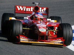
At the end of the 20th century, the Williams team spent 2 seasons in unfamiliar colours. After spending their entire history mainly in white or blue (bar the FW05 and perhaps the FW04), many criticised the red Williams’ cars, which especially in 1998, looked a little too similar to one particular Italian team.

For four seasons, Williams enjoyed enormous success in what are now the infamous Rothmans liveries. The big change for 1998, apart from the raft of new regulations, was new sponsorship from Winfield. The 1998 livery was a shock to the F1 world, in the fact it was a red Williams. At the same time, however, the livery itself wasn’t ground-breaking. It was a pleasing livery and the design itself wasn’t bad, but something was off for me, perhaps the shade of red, or the cluttered look of some of the logos. After a lacklustre 1998 season by Williams’ standards, more changes were to come for 1999. Two new drivers in Alexander Zanardi and Ralf Schumacher, and despite having the same main sponsors, an all new livery, and what a livery it was!
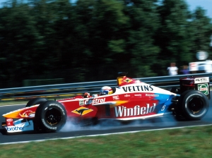
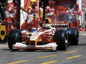
The livery on the new FW21 featured a brighter shade of red and a lot more white. The red sections were spiced up with what I would call tear designs, tearing from yellow to red on the nose, front of the sidepods and airbox, and red to blue toward the rear axle. Perhaps this is where Toyota got the idea. Along with that, the top half of the car, as if painted from a birds eye view, is in white, cutting sharply along the body lines of the nose, all the way to the rear of the car. This area has a red inset for another Winfield logo in front of the cockpit. Speaking of the Winfield logo, a new one had been designed since the end of the 1998 season, and therefore, the improved version adorned the 1999 car.
The use of the car’s lines, with the red and white placed as it has been, is some of the most natural and aesthetically pleasing livery design of all time. Seeing the red, yellow and blue split by the white along the car’s natural lines pleases me more than it should. Due to the colour placement, every logo, from Veltins to Nortel, looks as though it belongs on the car, without any forcibly coloured areas, a la Total.
It is an almost faultless livery. If anything did disturb the livery, it would be the Brother logo, as it is the only logo on the car that is blue on white, rather than black or red. However, this truly is nit-picking. Hell, Woody Woodpecker doesn’t really bother me on this!
There is plenty of nostalgic value in this for me due to my extensive playing of F1 Challenge, but I don’t think this has overly distorted my opinion of this livery. Unfortunately (for me anyway), Williams was to be sponsored by Compaq in the new millennium, which would be the beginning of a new era and another infamous livery.
The FW21 livery is quite possibly my favourite livery of all time. It isn’t as fondly remembered as its predecessor, nor its successor, and perhaps this is due to the lack of results while the livery adorned the cars, or possibly just its brief lifespan. A true beauty and a shame it didn’t last longer than a single season.


I also thought this was an ace livery though many people, as you say, didn’t seem to like it, either because a Williams couldn’t be red or because of the results. Loved the tear designs.
LikeLiked by 1 person
Very proud to take a look @ this material!
Thanks a lot cause these 20th and 21st FWs are still very beautiful as for me.
Good to remember now in 2016 (-;
LikeLiked by 1 person
Thank you! This really is one of my favourite liveries of all time. Doesn’t bother me that a Williams was red!
LikeLike
FW21 its unique so far, its unusual
like other williams livery, the “party” colour is not the my favourite but still good looking rather than FW20 livery…
LikeLiked by 1 person
Wow what a pleasant surprise , I was on the team that worked on this livery for our client Winfield back in the day , and for years it’s been hard to read people slating it as one of the worst ever, obviously we loved it . I’ll tell you this it was the best 6 months of my career and such fun. Thanks for your appreciation.
LikeLiked by 2 people
An honour to have you comment on this! Genuinely one of my favourites of all time. Definitely underappreciated in the F1 community.
LikeLike